Top 10 Pink Logos: A Guide to the Best Pink Brands
Pink has long been associated with femininity, love and romance, which makes it an attractive colour for many brands. But pink has more to offer than being pretty – it's a powerful tool for creating a solid brand identity. From playful and funny to sophisticated and stylish, pink can convey many emotions and ideas.
In this post, we take a closer look at the top 10 pink logos that have captured the hearts and minds of consumers. Whether you're a brand expert or just a fan of the colour pink, you're sure to be inspired by these awesome logos and the stories behind them.
Table of Contents
Top 10 Pink Logos
1 – The Barbie Logo: A Timeless Symbol of Fun and Femininity
For over 60 years, the Barbie logo has been synonymous with the most famous fashion doll in the world. But many people do not know that the iconic pink design has a rich history and has undergone several changes over the years.
Designer George Bartell designed the original Barbie logo in 1959, just a year after the first Barbie doll hit the market. The logo featured a simple cursive font in blue and was used on packaging, advertising and merchandise. However, it took until the 1970s for the Barbie logo to take on its distinctive pink colour. The change came from market research that revealed that pink is the preferred colour among young girls and would help the brand stand out on store shelves.
Today, the Barbie logo is one of the most recognisable symbols in the world of branding. The pink colour is synonymous with the brand and is used extensively in marketing and advertising. From pink packaging to bright pink billboards, Barbie has ensured that the logo and colour scheme are noticed.
But the Barbie logo is not just about being pretty in pink. The brand has always been associated with empowering young girls and helping them develop self-confidence and self-expression. This is reflected in the logo, which has a youthful and playful appeal that appeals to girls of all ages.
Whether you are a collector of Barbie dolls or appreciate good branding, there is no denying the influence of the Barbie logo on popular culture. Its timeless design and the use of pink have made it a true icon in marketing and advertising. And with over 60 years of success, it is clear that the Barbie logo will continue to inspire and inspire in the coming years.
2 – The Lyft Logo: A Symbol of Trust and Community in Transportation

Lyft is one of the most recognisable names in riding services. And the heart of the brand identity is the iconic pink logo.
The original Lyft logo was designed by the design company BrandNew School. It featured pink on a black background and was designed to be a playful and accessible symbol for the brand. The logo was intended to evoke a sense of fun and playfulness but also served a practical purpose: it was quickly recognisable. It could be attached to the front of the drivers' cars to make it easier for passengers to identify their trip.
Since its launch, the Lyft logo has become synonymous with the brand and its mission. The bright pink colour is eye-catching and gives a feeling of trust and kindness. The brand has taken advantage of this by using the colour extensively in marketing and advertising, from bright pink billboards to social media graphics.
In addition to its visual appeal, the Lyft logo represents the brand's commitment to community and inclusivity. With the colour pink, the brand sends a message that it's not just about getting from point A to point B but creating a feeling of connectedness and belonging.
3 – The Baskin Robbins Logo: A Sweet Celebration of Flavour and Fun
For over 70 years, Baskin Robbins has been serving smiles and delicious ice cream to people worldwide. And the heart of the brand identity is the iconic pink logo. The Duncan & Reed design company designed the Baskin Robbins logo in the 1950s. The design shows the brand name in a stylised font surrounded by 31 pink dots representing the brand's 31 types of ice cream. The bright pink colour was chosen to evoke a feeling of playfulness and fun, to stand out in the crowded world of ice cream brands.
Since its creation, the Baskin Robbins logo has become one of the most recognisable symbols in the world of desserts and sweets. The brand has used the colour pink in its marketing and advertising on the packaging, in-store signage and promotional materials. The bright and cheerful colour highlights the brand and creates a feeling of excitement and joy among consumers.
In addition to its visual appeal, the Baskin Robbins logo also represents the brand's commitment to taste and innovation. With 31 flavours to choose from, the brand has always been at the forefront of creating new and exciting flavours. And the pink colour is a nod to the playful and adventurous spirit of the brand.
4 – The LG Logo: A Symbol of Innovation and Style in Consumer Electronics
For over 50 years, LG has been a leading name in the world of consumer electronics. And at the heart of the brand identity is the iconic logo.
The LG logo was designed in the 1990s by the design company Lippincott & Margulies. The design features the brand name in a sleek, modern font and a stylised symbol representing the brand's commitment to innovation and technology. The brand has used a variety of colours over the years, but the most famous version has a bright pink colour, which is the stylish and playful side of the brand.
Since its creation, the LG logo has become one of the most recognisable symbols in consumer electronics. The brand has used the colour pink in its marketing and advertising on product packaging, in-store displays and promotional materials. The bright and eye-catching colour highlights the brand and creates a feeling of excitement and playfulness among consumers.
In addition to its visual appeal, the LG logo represents the brand's commitment to innovation and quality. With a wide range of state-of-the-art products, LG has always been at the forefront of the industry. And the pink colour is a nod to the stylish and adventurous side of the brand.
5 – The Dribbble Logo: A Symbol of Creativity and Community in the Design World

Dribbble has been the platform for designers to showcase their work, network with colleagues and find inspiration for over a decade. And at the heart of the brand identity is the iconic logo.
Co-founder Dan Cederholm created the Dribbble logo in 2009. The design shows a stylised basketball with a white line against a bright pink background. The design is playful, accessible and eye-catching, which makes it instantly recognisable for designers and fans of the platform.
Since its creation, the Dribbble logo has become one of the most recognisable symbols in the design community. The brand has used the colour pink in its marketing and advertising on its website, in-app graphics and promotional materials. The bright and cheerful colour highlights the brand and creates a feeling of excitement and positivity among its users.
In addition to its visual appeal, the Dribbble logo represents the brand's commitment to creativity and community. With a thriving community of designers and fans, Dribbble is a hub of inspiration and collaboration. And the pink colour is a nod to the playful and inclusive spirit of the brand.
6 – The Cosmopolitan Logo: A Symbol of Femininity and Fun in Women's Media
Cosmopolitan Magazine has been at the forefront of women's media for over a century, offering a mix of fashion, beauty, lifestyle and entertainment content. And at the heart of the brand identity is the iconic logo.
The Cosmopolitan logo has undergone several iterations over the years, but the most famous version was designed by graphic designer Steve Frankfurt in the 1960s. The design shows the brand name in a sleek, modern font against a bright pink background. The design is feminine, playful and eye-catching, making it immediately recognisable to magazine fans.
Since its creation, the Cosmopolitan logo has become one of the most recognisable symbols in women's media. The brand has used the colour pink in marketing and advertising on its front pages, promotional materials and social media channels. The bright and cheerful colour highlights the brand and creates a feeling of excitement and positivity among its readers.
In addition to its visual appeal, the cosmopolitan logo represents the brand's commitment to women's empowerment. With a focus on fashion, beauty and lifestyle, Cosmopolitan is a source of inspiration and advice for women worldwide. And the pink colour is a nod to the playful and feminine spirit of the brand.
7 – The Tinder Logo: A Symbol of Modern Romance and Connection

Since its launch in 2012, Tinder has revolutionised how people meet and connect. And at the heart of the brand identity is the iconic logo. But who designed it, and how did the brand use pink in its marketing?
The Tinder logo was designed by the design company Oliver in 2016. The design depicts a stylised flame in the form of a heart against a bright pink background. The design is playful, modern and eye-catching, which makes it instantly recognisable for app users.
Since its inception, the Tinder logo has become one of the most recognisable symbols in the world of dating apps. The brand has used the colour pink in its marketing and advertising on its app icon, promotional materials and social media channels. The bright and cheerful colour highlights the brand and creates a feeling of excitement and positivity among its users.
In addition to its visual appeal, the Tinder logo represents the brand's commitment to promoting connection and modern romance. With a user base in the millions, Tinder is a platform for people to find meaningful relationships and make new friends. And the pink colour is a nod to the playful and inclusive spirit of the brand.
8 – The Breast Cancer Research Logo: A Symbol of Hope and Support
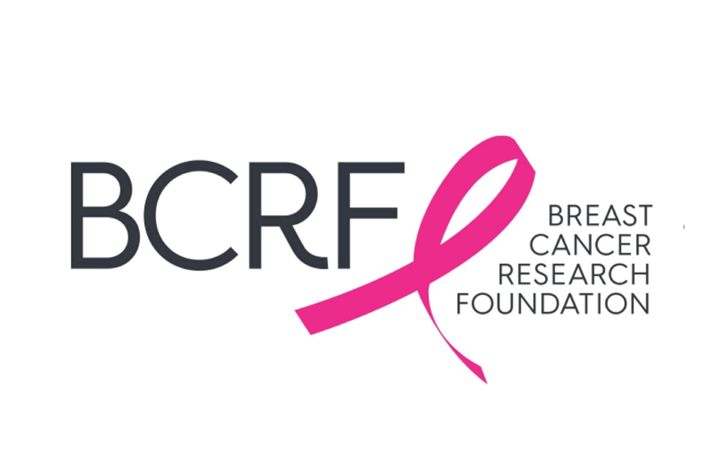
Breast cancer is a disease that affects millions of people around the world, and the fight against it requires awareness, research and support. And at the forefront of this struggle is the Foundation for Breast Cancer Research, whose mission is to advance the world's most promising research on eradicating breast cancer. At the heart of the organisation's identity is its iconic logo.
The Breast Cancer Research Foundation logo was designed internally and intertwined into a ribbon shape against a bright pink background. The design is simple, elegant and eye-catching, which makes it immediately recognisable to supporters of the foundation.
Since its inception, the Foundation for Breast Cancer Research logo has symbolised hope and support for those affected by breast cancer. The brand has used the colour pink in its marketing and advertising for promotional materials, fundraisers and social media channels. The bright and cheerful colour highlights the brand and creates a feeling of positivity and support among its supporters.
In addition to its visual appeal, the Foundation for Breast Cancer Research logo also represents the organisation's commitment to finding a cure for breast cancer. With millions of dollars invested in the most promising research, the foundation is dedicated to improving the lives of those affected by the disease. And the pink colour is a nod to the brand's focus on breast cancer awareness and support.
9 – The Supre Logo: A Symbol of Bold and Fashion-Forward Style

Supre is a well-known Australian fashion retailer that offers a range of trendy and affordable clothing and accessories. The brand is known for its bold, fashionable style and iconic logo at the heart of its identity.
The Supre logo was designed in-house and featured a stylised “S” against a bright pink background. The design is simple, modern and eye-catching, which makes it immediately recognisable to fans of the brand.
Since its inception, the Supre logo has become a symbol of the bold and fashionable style of the brand. The brand has used the colour pink in its marketing and advertising on its promotional materials, store signage and social media channels. The bright and cheerful colour highlights the brand and creates a feeling of excitement and energy among its customers.
In addition to its visual appeal, the Supre logo represents the brand's commitment to empowering women through fashion. The brand offers a range of clothes and accessories that make women feel confident, stylish and trendy. And the pink colour is a nod to the feminine and playful spirit of the brand.
10 – The T-Mobile Logo: A Symbol of Innovation and Connectivity

T-Mobile is one of the largest telecommunications companies in the world and offers a range of services, including mobile phones, the Internet and television. The brand is known for its commitment to innovation and connectivity, and at the heart of its identity is its iconic logo.
The branding agency House Industries designed the T-Mobile logo and showed a stylised letter “T” against a bright pink background. The design is simple, modern and eye-catching, which makes it immediately recognisable to fans of the brand.
Since its inception, the T-Mobile logo has become a symbol of the brand's commitment to innovation and connectivity. The brand has used the colour pink in its marketing and advertising on its promotional materials, store signage and social media channels. The bright and cheerful colour highlights the brand and creates a feeling of energy and excitement among its customers.
In addition to its visual appeal, the T-Mobile logo also represents the brand's focus on offering its customers the best possible experiences. Whether you're looking for a new smartphone or want to stay connected on the go, T-Mobile has the products and services you need to stay connected. And the pink colour is a nod to the brand's focus on providing a fun and engaging experience for its customers.
Wrapping Up
In conclusion, pink is a bold and eye-catching colour that has become integral to branding and marketing for many of the world's leading brands. From cosmetics to fashion to technology, pink has created a sense of energy, excitement and femininity. Whether you are a fan of pink or appreciate good branding, these top 10 pink logos are a testament to the power of colour in creating a solid and recognisable brand identity.
Whether you are looking for inspiration for your brand or want to admire some of the best brands in the world, these logos are a must-have. So take a closer look at these pink logos and get inspired to create your iconic brand identity.
