Serif vs Sans-Serif: Unveiling the Typography Battle
Typography, the art and technique of arranging type, is a fundamental aspect of design that holds immense power in shaping visual communication. From printed materials to digital interfaces, the choice of fonts plays a pivotal role in conveying messages, establishing brand identities, and influencing user experiences.
Among the many font options available, the battle between serif and sans-serif fonts has been a long-standing debate in the design community. So, let's delve into the world of typography and explore the characteristics, strengths, and best applications of serif and sans-serif fonts.
Table of Contents
The Basics of Typography
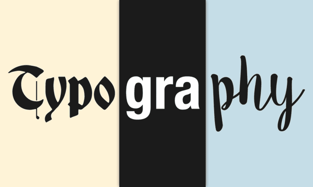
Typography, derived from the Greek words τύπος “typos” (meaning “form”) and γράφειν “graphein” (meaning “to write”), refers to the art and technique of arranging type. It involves selecting, organising, and presenting letterforms to create visually appealing and effective communication. To understand the serif vs sans-serif debate, we need to familiarise ourselves with the anatomy of letterforms.
The critical distinction between serif and sans-serif lies in the presence or absence of serifs. Serifs are tiny strokes or decorative features that extend from the ends of characters in serif fonts, giving them a more traditional and elegant appearance. On the other hand, Sans-serif fonts lack these serifs, resulting in a more modern and simplistic aesthetic.
Serif Fonts: Elegance and Tradition

Serif fonts have a rich history dating back to ancient Rome, where the first serifs were incorporated into stone carvings to aid readability. With their delicate curves and tapering strokes, these serifs became synonymous with elegance, tradition, and authority. Serif fonts evoke a sense of timelessness and sophistication, making them a popular choice for various applications, including print materials, formal documents, and prestigious branding.
Popular serif typefaces include Times New Roman, Georgia, and Garamond. Times New Roman, known for its legibility and classic appeal, is widely used in newspapers and academic publications. Georgia, designed specifically for screen readability, balances tradition and modernity. With its refined letterforms, Garamond exudes a sense of craftsmanship and is often favoured in high-end print designs.
Serif fonts excel in printed materials due to their inherent readability advantages. The serifs guide the eye along the letterforms, enhancing legibility and reducing eye strain. In longer texts, such as books or articles, serif fonts provide a comfortable reading experience.
Sans-Serif Fonts: Modern Simplicity and Clarity

The emergence of sans-serif fonts can be traced back to the Industrial Revolution when clarity and simplicity became paramount in typography. Sans-serif fonts, devoid of serifs, offer a clean and streamlined appearance, aligning with the modern aesthetic sensibilities of the time. They are often associated with forward-thinking, minimalism, and clarity, making them popular for digital interfaces, branding, and current design projects.
Common examples of sans-serif typefaces include Arial, Helvetica, and Futura. Arial, widely used in digital environments, provides a clean, unobtrusive look. With its balanced proportions and extensive variations, Helvetica has become an iconic typeface in modern design. Futura, known for its geometric forms, exudes a sense of futurism and is frequently employed in branding and advertising campaigns.
Sans-serif fonts excel in digital environments and small sizes. Their simplicity and clarity make them highly legible on screens and at lower resolutions. Moreover, sans-serif fonts are often preferred for interfaces and headings where a bold and impactful statement is desired.
Factors Influencing Font Selection
Regarding font selection, it's essential to consider various factors influencing the choice between serif and sans-serif fonts. While personal preference plays a role, purpose, audience, and medium are critical determinants in the decision-making process.
The purpose of the design project heavily influences font selection. For formal documents, such as resumes or legal contracts, serif fonts may be preferred due to their association with tradition and authority. On the other hand, a modern and minimalistic brand identity might call for sans-serif fonts to convey simplicity and a contemporary vibe.
Considering the target audience is crucial as well. Different demographic groups may have varying expectations and preferences regarding typography. For instance, a more mature audience may find serifs more appealing and familiar, while a younger audience might resonate with the clean lines of sans-serif fonts.
The medium in which the typography will be presented also impacts font selection. Printed materials often benefit from the added legibility and aesthetic appeal of serif fonts, while digital platforms, where screen resolutions and rendering can affect clarity, lean towards sans-serif fonts.
Research findings on readability and legibility have contributed valuable insights to the serif vs sans-serif debate. While early studies suggested that serifs enhanced legibility in print, later research has shown that the differences in readability between the two font categories are minimal. Context, rather than the presence or absence of serifs, plays a more significant role in determining legibility.
Advancements in technology, such as high-resolution displays and improved rendering, have also impacted font preferences. With the rise of digital platforms and screen-based reading, sans-serif fonts have gained prominence due to their legibility on screens, especially at smaller sizes. However, it is essential to note that readability is subjective and can vary depending on individual preferences and visual acuity.
Best Practices for Font Pairing
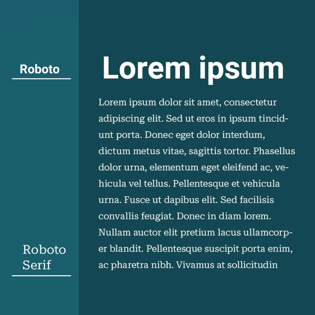
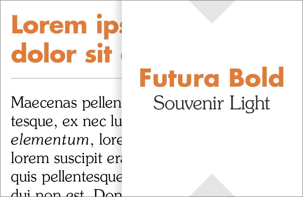
Font pairing, combining two or more harmoniously, is crucial for designers to create visually cohesive and engaging compositions. When it comes to serif and sans-serif fonts, pairing them effectively can enhance the design's hierarchy, readability, and overall aesthetic appeal.
To achieve successful font pairings, several guidelines can be followed:
- Contrast: Aim for a balance of difference between the serif and sans-serif fonts. Contrasting styles, weights, or proportions can create visual interest and differentiation between various elements.
- Similarity: Look for subtle similarities between the fonts, such as similar x-heights or overall proportions, to establish a visual connection and harmony.
- Complementary Qualities: Consider the design's overall mood, personality, and message. Choose serif and sans-serif fonts that complement each other in style and evoke the desired emotional response.
Practical examples of successful font pairings include using a serif font for headlines or titles while employing a complementary sans-serif font for body text to ensure readability. Alternatively, a bold sans-serif font can be paired with a delicate serif font to create a sense of contrast and visual intrigue.
Experimentation is vital when it comes to font pairing. Trying out different combinations, considering the design context and objectives, and trusting one's creative instincts can lead to unique and impactful typographic compositions.
The Rise of Hybrid Fonts
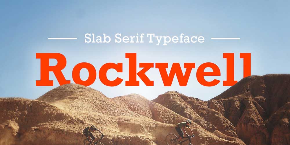
A new trend has emerged in typography in recent years, blurring the boundaries between serif and sans-serif fonts. Hybrid fonts, also known as “slab serif” or “semi-serif” fonts, incorporate serifs and sans-serifs in their letterforms. This blending of characteristics has given rise to typefaces that offer a unique and versatile aesthetic.
Hybrid fonts combine the elegance and tradition of serifs with the modern simplicity of sans-serifs. They allow designers to experiment and bridge the gap between the two font categories. Hybrid fonts can be an excellent choice when designing for brands or projects that seek a balance between tradition and modernity or when aiming for a distinct and memorable typographic style.
Notable examples of hybrid fonts include Rockwell, Archer, and Museo Slab. Rockwell embodies a strong and impactful visual presence with its robust letterforms and prominent serifs. Archer, on the other hand, exhibits a softer and more playful aesthetic while retaining some traditional serifs. Museo Slab balances classic elegance and contemporary simplicity, making it suitable for various applications.
While hybrid fonts offer a unique visual appeal, they come with their own set of challenges. Combining serif and sans-serif elements requires careful execution to ensure harmonious letterforms and legibility. Designers need to consider the context and purpose of their projects to determine whether hybrid fonts align with their objectives.
Case Studies and Examples
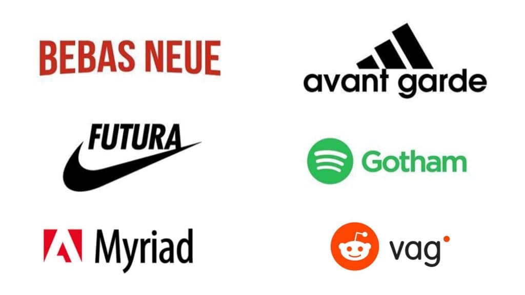
Let's examine some real-world case studies and examples to understand better the impact of serif and sans-serif fonts in design.
Branding: High-end luxury brands often employ serif fonts to convey a sense of heritage, sophistication, and exclusivity. Brands like Chanel and Louis Vuitton utilise serif typefaces in their logos and visual identities to evoke a timeless and refined aesthetic. Conversely, modern and tech-oriented companies like Google and Airbnb opt for sans-serif fonts to project a sleek and contemporary image.
Editorial Design: Magazines and newspapers often rely on serif fonts for their articles and body text, as the serifs guide the reader's eye along the lines of text. On the other hand, Sans-serif fonts are frequently used for headlines and captions to create visual contrast and hierarchy.
Digital Interfaces: User experience (UX) design heavily relies on typography to ensure clear and effective communication. Sans-serif fonts are favoured in digital interfaces due to their legibility on screens and smaller sizes. Companies like Apple and Microsoft utilise sans-serif typefaces, such as San Francisco and Segoe UI, respectively, to maintain consistency and readability across their digital products.
These case studies highlight how the choice between serif and sans-serif fonts can significantly impact the perception of brands, the readability of content, and the overall user experience.
Font Trends and Future Directions
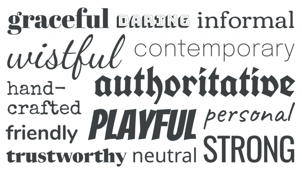
Typography is subject to trends and evolving preferences like any other design discipline. As technology advances and cultural shifts occur, font choices reflect current aesthetics and communication needs.
Currently, some prevailing typography trends include:
- Minimalism: Clean and straightforward sans-serif fonts continue to dominate digital platforms, emphasising a focus on content and readability.
- Geometric Forms: Typefaces with geometric forms, both serif and sans-serif, have gained popularity, exuding a modern and futuristic aesthetic.
- Handwritten and Script Fonts: Custom hand-drawn and script fonts have increased usage, adding a personal touch and a sense of authenticity to designs.
Advancements in technology will likely shape the future of typography, the influence of new design movements, and the constant quest for innovation. As the digital landscape expands, designers must consider fonts' legibility and visual impact across various devices and screen sizes. Additionally, the increasing demand for inclusive design may drive the development of typefaces that prioritise readability for individuals with visual impairments.
In conclusion, the serif vs sans-serif debate has yet to yield a definitive answer. The choice between the two font categories depends on numerous factors, including the design project's purpose, audience, and medium. Both serif and sans-serif fonts have strengths and can effectively communicate messages in different contexts. The key is to understand the characteristics of each and apply them strategically to achieve optimal readability, visual harmony, and communication impact.
Designers are encouraged to experiment, consider the target audience and objectives, and explore font pairing techniques to create compelling typographic compositions. By embracing the versatility of both serif and sans-serif fonts, designers can unlock endless possibilities and deliver captivating visual experiences in the dynamic world of typography.
