How to Create Your Own Company Logo Design
The world is changing, and due to a surge in entrepreneurship and e-commerce, it is now more important than ever to have a distinct, noticeable company logo design. Your potential clients will likely see your logo image first, so strive to make that initial impression count. Though creating an image for your company may appear overwhelming, it can be an exciting and beneficial process with the appropriate tools and direction.
This blog post will guide you through creating a company logo design that reflects your brand. Selecting the right colours, fonts, and icons to communicate your intended message to the target audience will also be tackled here. Whether you are a small business owner seeking rebranding or starting as an entrepreneur from scratch, this guide should help you design a logo that stands out from others.
We will take you through practical tips and resources to make your vision alive, from brainstorming ideas to putting the final touches on the design. Designing your own company’s logotype doesn’t only save money but also enables you to maintain total control of its identity. Thus, roll up your sleeves and get ready to unleash one’s inner self-designer while we delve into logo design.
Summary
- Know your brand: Familiarize yourself with what a brand means before designing its emblem by clearly stating its values and whom it targets.
- Keep it straightforward: Sometimes, complex designs may seem too much or complicated to remember compared with simple, clean ones.
- Colours matter: Choose wisely when selecting colours because they have different meanings within them, thereby evoking emotions in people based on degrees of personality traits represented by specific brands.
- Font matters: Use legible fonts that match your brand's style rather than decorative or overly complicated ones.
- Make it scalable: Ensure your emblem looks excellent and is easy to read at any size, from business cards to billboards.
- Be different: A unique logo will distinguish your brand from others.
- Get feedback: Don’t hesitate to ask for feedback from colleagues, friends, and target customers to ensure your emblem resonates with them.
Table of Contents
Understanding Brand Identity

Identity is everything when you’re making a company logo design. Your brand should reflect what your business stands for, and to communicate that effectively, you need to define your core values. These fundamental beliefs guide your actions and decisions within your company. When you get them down in writing, they’ll be the foundation of your brand identity.
When defining these values, think about what sets you apart from competitors. What principles do you have that customers agree with? Make sure they’re authentic and something people can connect with easily. That way, they’ll trust you and stick around.
As a bonus, getting yourself a set of core values will also help shape your branding strategy. You’ll be able to create marketing campaigns and develop new products more quickly because you already know who you're talking to.
Target Audience Analysis
Knowing who’s watching is crucial to creating an effective company logo design. You can’t tailor your image to appeal to someone if you don’t know who they are in the first place! Analysing who wants your products or services will help ensure customers know how much value there is.
Think through their demographics (age, location), online behaviours (interests) and purchasing habits (preferences). Once you understand all this data, try using it as a way of connecting on a deeper level with them through design elements like colour palettes or fonts – something that says, “Hey, I’m one of you!”
Establishing Brand Personality
Personality goes beyond what employees bring into work daily — it's everywhere at your business! Something unique is critical to stand out against competitors in any market. Focusing on creating that distinct personality customers love so much will build good relationships and guarantee success in challenging times!
Tone, style & values are just some things worth considering when establishing this personality. Also, ensure your brand experience is consistent through every touchpoint customers may encounter – it’s all about trust! By doing this, you should see a boost in recognition and loyalty.
Keep this personality in mind when creating your company's logo. Whether you're aiming for sleek & modern or fun & playful, find a way to show what makes your brand unique. This visual representation could be the deciding factor that'd help potential customers finally pick up the phone and call you!
Setting the Foundations
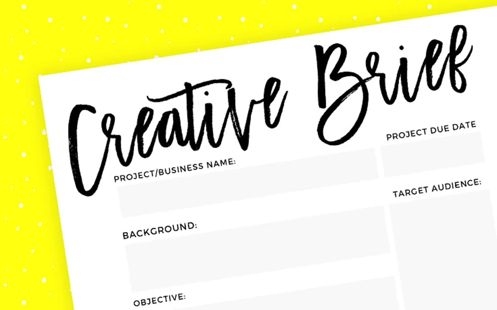
Before getting started on your logo, you’ll need a design brief. This document will outline your logo design's objectives, goals, and vision. It covers all the details that make up an effective logo, such as incorporating specific imagery or setting colour schemes.
By establishing these parameters in the design brief, you set clear directions for what you want your designer to do. This way, everyone will work towards a final product they can agree on. You also get something to review throughout the process to ensure it always aligns with your branding goals.
Research and Inspiration
When designing your logo, there are many places to find inspiration. But before doing so, you should start with research to see what’s already been done in the industry. Look at other logos from competitors or peers — this will help you know what works well and how others have differentiated their brands through design.
It’s also good to look at non-industry sources too! Take inspiration from nature, art, and fashion — draw on diverse influences so that when it comes time to put pen to paper (or mousepad), you can create something unique and memorable that represents your brand.
When designing your logo, there are many places to find inspiration. But before doing so, you should start with research to see what’s already been done in the industry. Look at other logos from competitors or peers — this will help you know what works well and how others have differentiated their brands through design.
Competitor Analysis
A pretty picture isn’t enough for a successful logo design; conducting a thorough competitor analysis is essential. Doing so lets us understand how well your brand matches up against others in the market.
By studying competitor logos, we can identify which elements resonate most with your target audience and integrate them into our strategy while staying true to uniqueness. This step will ensure that our design is positioned strategically against the competition.
Remember that your design team will use this analysis to create a logo strategy and ensure your brand is well-positioned for success.
The Creative Process

Remember, the creative design process of logo-making always begins with brainstorming and sketching. This is when you should let your imagination run wild and write down all the ideas that come to your mind. Take a pen and paper, then draw various concepts, shapes, and symbols representing your brand’s identity. Don’t worry about perfecting everything at this stage because you might just be sitting atop a gold mine.
Once you have a collection of rough sketches, take some time to review them one by one. Find elements that are unique yet resonate deeply with your brand values. Think about how you want people to perceive your business and what feelings your logo evokes in potential customers. Remember that at this point, even if it’s not perfect — as long as it brings out the message clearly — it can be developed further in the future.
Speaking about sharing ideas, don’t hesitate to ask for opinions during this stage, too! Share those doodles with people who can give valuable input, like colleagues, friends, or even potential customers! Constructive criticism will help you narrow down options and refine your concept.
Concept Development
Now, let’s dive deeper into concept development, shall we? Choose two or three designs from the previous step, then refine them digitally. Try different layouts, proportions, colour schemes, and anything else that comes to mind. The goal here is to translate what’s in front of you into a more realistic digital format while also keeping scalability in mind; remember that logos must look good no matter how big or small they get.
As mentioned previously, coherence is critical here too! Ensure the final product matches brand values, target audience expectations, and industry standards seamlessly. A nice logo is excellent, but recognition without proper representation won’t last long.
Take many iterations before settling into something solid. Don’t rush, and don’t hesitate to ask for more feedback, either. Spend enough time here to create something that will look good on a shirt, website, or billboard and resonate with people.
Choosing the Right Design Elements
Many elements are involved in creating a fantastic logo, but the most important thing is to ensure everything matches up! This includes symbols, fonts, colours, and anything else that reflects your brand’s personality and message. Once you’re satisfied with each part, bring them together in harmony.
Most people know that specific colours invoke certain emotions, but many don’t know how they also have their associations. So, it's essential to consider both things when choosing your colour palette. Alongside this, select fonts that’ll be easy for others to read because if they can’t recognise your business name, all hope is lost.
The last thing worth noting is: Remember to pay attention to detail! Each element should be purposeful and meaningful towards the overall message you want to convey. Take some extra time looking at typography, spacing, and proportions and ensure there’s a balance throughout it all.
Typography in Logo Design
The typography used within your logo should align heavily with what kind of personality you want your brand to display — whether you want it to seem professional, creative, trustworthy… etc. Experimenting with different typefaces and then customising them until you end up with something unique and memorable might not be a bad idea either!
The typeface you select for your logo should align with the other design elements. Consider the font’s legibility and scalability—your logo must be recognisable on a billboard or a business card. Whether you go for a classic serif or a modern sans-serif, ensure it elevates the overall design and solidifies your brand message.
Combine several fonts to create contrast and hierarchy within your logo to bring it all together. Experiment with sizes, weights, and styles to highlight important details and establish visual interest. Typography is a potent tool in logo design—it can convey everything about your brand in just one look.
Colour Theory + Palette Selection
The colours you decide for your logo can affect how people perceive your brand. Different hues provoke different feelings and associations, so it’s crucial to select a palette that embodies your brand's personality while resonating with your target audience. Remember colour psychology when making decisions—this will ensure that your logo leaves the right impression on viewers.
The combination of colours in your logo should come together harmoniously while staying visually exciting. Test out different schemes until you find one that represents your values best while distinguishing yourself from competitors. It doesn’t matter if you end up going monochromatic or contrasting—the goal is for this palette to reinforce who you are as a brand.
Remember: colour is a potent tool in logo design because it can influence consumer perception while playing into brand recognition. Consider where your logo will be displayed and how these colours appear across different mediums. A well-selected colour palette can make your logo instantly recognisable—and memorable—for years.
Software and Tools
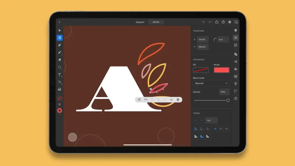
Graphics are everything when it comes to making a logo. The two main types of graphics to think about are vector and raster. Vectors are formed from points, lines, and curves that come together from equations. This allows the image to be made bigger or smaller without losing quality. Raster graphics, on the other hand, are formed from pixels, which makes them dependent on resolution. So, if you try scaling them up, they will lose quality. In general, it’s suggested that you use vector graphics for logo design due to their scalability and flexibility.
Overview of Graphic Design Software
To make a professional logo design, you need graphic design software. These tools offer all sorts of features for any creative vision you have in mind. Adobe Illustrator, CorelDRAW, and Inkscape are three examples of industry-standard software for creating vector designs. They have powerful tools that allow you to shape text with colours and effects so that your logo looks sleek and friendly.
Graphic design software also has advanced features such as layering, transparency, and typography control that let designers fine-tune every detail in their work. Whether inexperienced or a veteran designer, mastering these tools is necessary when crafting a logo that embodies your brand identity.
Practice makes perfect when learning graphic design software, so don’t be afraid to get familiarised with how they work! Try different things with various software elements like shapes and tutorials to enhance your skill set.
Online Logo-Makers And Their Limitations
Software online for logos has grown in popularity lately because people want quick solutions at low prices. But while they may sound great, there are quite a few limitations behind these platforms regarding originality and customisation options. Due to its being used by millions, there’s always the possibility that someone else has already made the same thing as you using the same tool.
Designing a logo requires careful thought into brand identity, target audiences, and industry trends. These are things that software like this cannot emulate and may be difficult to achieve with them. They can, however, serve as a good starting point for designing a simple logo. But remember that working with professional graphic design software will give you more creative freedom and ensure a unique and impactful logo design for your company.
Crafting the Visual Identity

Simplicity and uniqueness are the two sides of a successful logo’s coin. It should strike a balance that allows it to be simple but not so simple as forgettable. A complex design may leave your audience with more questions than answers. Simplicity is essential because it allows for easy recognition and memorability. Uniqueness is what will set you apart in an over-saturated market.
Scalability and Adaptability
When designing your logo, you must consider how it will look across different sizes and formats. Scaling down to fit social media icons shouldn’t make the design illegible or inefficient. Similarly, scaling up to fit on billboards shouldn’t leave the design looking misplaced or disproportionate. Both scalability and adaptability allow you to future-proof your brand by ensuring that it can be easily applied across different mediums, such as merchandise, packaging, digital platforms, etc.
Create Something Memorable
Ultimately, what matters most is whether people remember your logo when they see it. A memorable one can take shape in many ways – as long as they're visually appealing and meaningful. Consider incorporating elements that reflect your company values or services so that potential customers can establish an immediate connection with your business.
There are a few different strategies you could try when aiming for memorability. Emotion-evoking logos might work best if you have something personal to offer consumers… Or maybe something that piques their curiosity will get stuck in their heads instead! Regardless of your chosen path, just make sure that whatever logo you land on is impactful enough to resonate with people on a deeper level! Remember — a great logo communicates values and identity without words – use it wisely!
Feedback and Revisions
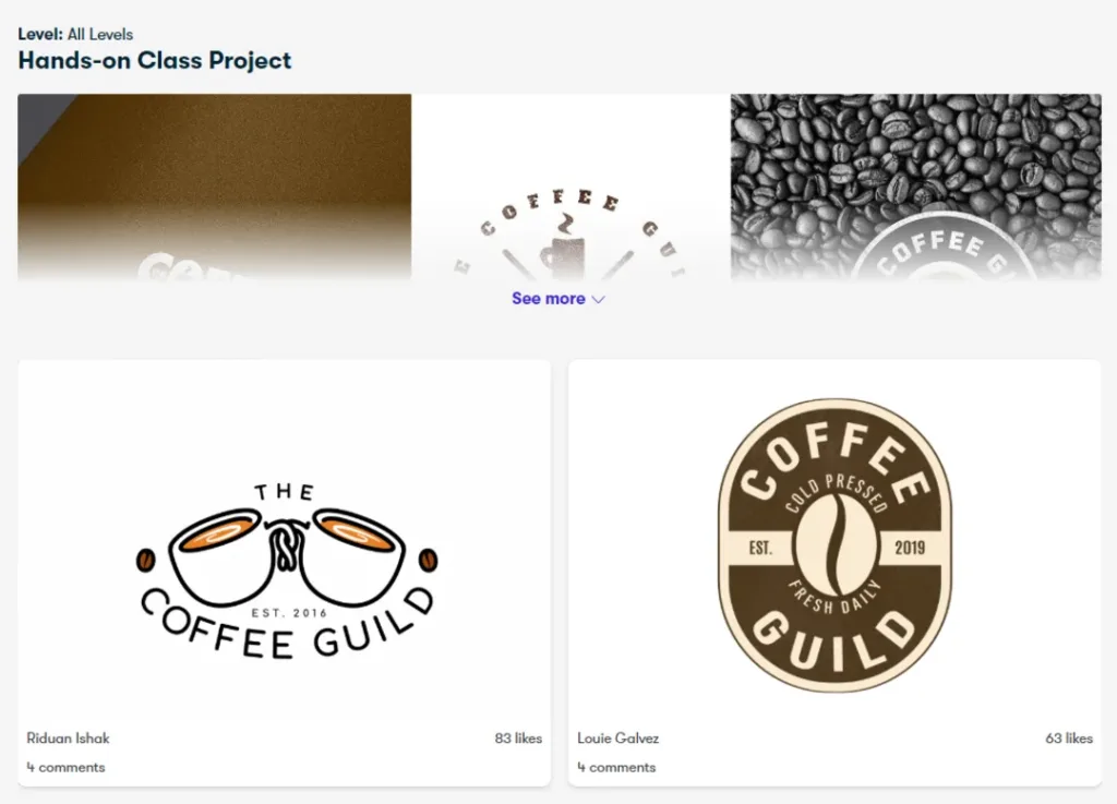
Get as many opinions as possible. Your logo is a big part of your brand, so it’s only fitting that you get as many perspectives as possible (don’t go overboard, though; this isn’t an obsession).
To start, get together with a group that would be considered your target audience and see what they think about the design. They might say some negative things, but constructive criticism can be helpful. If things aren’t coming together, or they don’t like it, it may inspire you to try something different.
Afterwards, reach out to others in the industry and ask their thoughts. Given their experience, they may have different advice on how to make the design pop more. Or if they are very knowledgeable on this subject, maybe you’re even asking for validation.
Lastly, take it online! Social media platforms can be one of the most significant feedback tools, so use them! See what other people think about your logo, especially those outside your focus group demographic. The point here is diversity. You want a handful of different opinions to find similarities between them all and improve upon those areas of the design.
Iterating
Most importantly, you’ve gathered enough information from these individuals to TURN IT UP A NOTCH! Adjust colours and shapes if necessary, but don’t go too overboard; remember to stay true to what you initially tried to accomplish. The goal isn’t to make everyone fall in love with what you put together but to have a logo that shows off your core values yet speaks loudly enough for your target audience to hear.
Be open-minded throughout this process, starting from square one until now, with various revisions (probably plenty more). Don't forget that designing isn't linear, just like life (crazy, huh?).
Knowing When to Stop
You will never reach perfection. We’re all after it, but it’s also unattainable. There will always be changes you could make to any design— but at some point, it starts to do more harm than good. Trust the process you’ve been going through and the people you’ve been speaking with. You can’t keep listening to everyone forever because you’ll go in circles.
When your gut tells you which way is up and feedback starts to make sense, wrap things up! Nothing is worse than putting a cap on a project (it doesn't have to be art-related) when there are still glaring issues with it…but if everything’s starting to check out, confidently declare your logo complete.
Finalising the Company Logo Design
We’ve designed the logo, so we’re almost there! The final touch is just as important as everything else, in any case. Add some detailing here and there to make the logo look lovely and cohesive. Make sure everything’s adequately aligned to look easy on the eyes. If you want to get fancy, add more or less space between each element.
We’ll also need to refine the colour palette and typography we use in our logo. This is because colours play a big part in how people perceive brands; for example, you wouldn’t use a dark red if it was for a happy-go-lucky brand, would you? Ensure your text is readable; this refers to the font you use and how big they are.
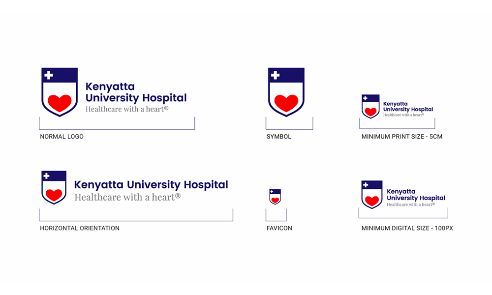
Now, don’t think I’m being picky, but can you scale it up and down in size for different applications? On top of that, test it out on various platforms, like social media apps. The last thing we want is for our creation not to be clear when looking at it elsewhere other than where we’re working from.
Different Files For Different Uses
Not every file format works well with everything. That’s why scaling your design differently can be beneficial! A good thing to remember is that vector files (such as .ai or .eps) work great with printing materials such as business cards or banners. In contrast, raster files (such as .jpg or .png) are more suitable for digital purposes like websites or social media platforms.
Don't Be Inconsistent!
Sorry about this, but I will have to force something upon you again… However, this time around, it’s helping us stay consistent! A guideline will outline colour codes, size requirements, spacing around the logo, etc. By doing this, everybody involved with your brand will know exactly what goes where and how — including employees, designers, vendors, etc. Not only does this keep everything organised, but it ensures that your logo is used correctly and consistently.
In addition to that, when everyone uses the same logo at all times, it helps with brand recognition and credibility. We can even show the guidelines to all our stakeholders so they better understand what we’re trying to do here. It doesn't hurt to review and update these guidelines now and then, either, as long as it sticks to our brand’s identity.
Legal Considerations and Trademarking
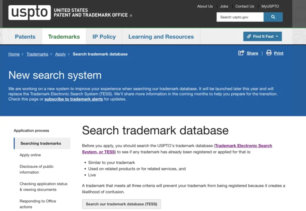
On your path to creating a company logo design, ensuring you are not trespassing on other’s trademarks is vital. Before completing your design, carry out an extensive search to find if any similar logos already have trademark protection. If your logo is too similar, you might face lawsuits for infringing copyright laws of the said firm whose brand you would have copied without permission. This could lead to legal action that may cost you heavily and end up rebranding your company, which will take a long time.
To check whether a trademark has been infringed through online databases provided by organisations such as USPTO and other international databases. Through these databases, you can search for existing trademarks, including logos that resemble yours. However, It is recommended that you consult with a trademark attorney to conduct a more comprehensive search and understand any possible risks before moving ahead with logo designing.
Generally speaking, using someone’s registered trade dress– in this case, logo—may bring a bad name to your business, negatively affecting its financial performance. Thus, taking the time needed for thorough research on trademark infringement goes a long way towards avoiding future potential legal problems and ensuring a smooth branding process for the success of your business over time.
Registering Your Logo
Checking if your logo can be registered as a trademark is essential in protecting intellectual property rights. Registering your logo enables you to enjoy exclusive rights about its utilisation within the context of commercial activities conducted by our enterprise legally only. Following this approach will protect your brand identity and allow you to claim anybody who uses it unlawfully.
A registered trademark adds value and credibility to a business since it distinguishes its products from those of its competitors by preventing them from adopting identical marks that are likely to cause consumer confusion. Besides, registration enhances customer loyalty by enabling them to identify and associate such logos with your brand quickly.
Getting a registered trademark for your logo requires adhering to specific procedures and submitting the required documents. Engaging a trademark attorney makes the registration process more accessible and assures you have proper protection for your logo under the law. Registering your logo means investing in your brand's future prosperity and recognition.
Protecting Your Logo Design
Checking the legal aspects of protecting a logo design is essential when safeguarding its identity against counterfeit use by others. Besides going for trademark registration, other methods exist to protect your logo design, such as applying for copyright protection. Copyright protects any artistic works used uniquely in design, including originality and arrangement on a given mark.
Therefore, having stringent legal provisions concerning one’s logo design can help prevent possible infringers from removing what makes your brand unique in the marketplace. Constantly monitor how your mark is being used so that you will be able to promptly respond through the initiation of legal action whenever unauthorised use occurs, thus preserving the identity of one’s business in this way. Hence, taking proactive steps towards safeguarding your company’s symbol will set it apart from the competition, reducing litigation threats moving forward.
You can, therefore, show your logo as a sign of the identity and worth of your brand with an adequate legal framework. This approach will enable you to understand legal issues and use them as a basis for protecting such assets. A strong foundation will be set up through diligent steps towards safeguarding the design against unauthorised reproductions. As a result, firms can create easily noticeable brands in highly competitive markets.
Implementing Your Company Logo
You may have a stylish and thoroughly thought-out logo, but more must be done. It has to be versatile enough to look good on everything from business cards to your website and social profiles. In other words, it must work well on merchandise and marketing materials.
What does this mean? You’ll need to consider factors like size, colour, and placement. This way, when you slap your logo onto any medium, its visual appeal will remain intact. The trick is that it must look good, no matter how small or large it has been printed. Additionally, try out different backgrounds—it should be recognisable no matter what.
Using your logo across media platforms can consistently hammer in brand recognition. But don’t just take my word for it; consistent visual content will resonate with your target audience much better than an inconsistent one. Trust me.
Consistent Branding Across Platforms
Congrats! You’ve come far by incorporating the same logo across various media channels. Now we’re onto the next step: keeping the rest of your brand consistent, too.
By maintaining consistency in branding across all platforms—colour palette, fonts, tone of voice—you are creating a stronger relationship between your logo and overall identity with consumers who are constantly exposed to them together through your communications and marketing materials.
This uniformity helps customers with recall because they now create cohesive links between the things that make up our brand experience based on what they already know about us—which is quite intelligent if I say so myself!
It doesn’t stop at awareness, either: Consistent branding also makes us appear more professional and reliable. By doing so, we show that our company takes pride in its image—thus reflecting positively on products or services—and demonstrates that we’re willing to go above and beyond competitors’ efforts to outshine them in every way.
Launching Your Logo to the Public
Although it may not feel like it, launching your logo is a huge step in establishing your brand identity. It’s also the start of broader recognition and consumer curiosity! This excitement can attract attention from potential customers and even media outlets.
To get you started on the right foot, make your logo rollout strategic using social media, press releases, events, and collaborations. In doing so, you can create buzz around your new logo and build a presence for yourself wherever possible.
Maintaining Your Brand Identity
Your brand identity is a crucial part of your business’s success. But sometimes, changes must be made to keep up with the fast-paced market. Current market trends, consumer preferences, and technological advancements should all be reflected in your brand. So, if your current brand isn’t resonating with people any more, or you’ve expanded your product line dramatically, it might be time for a rebranding.
To stay ahead of competitors and have a modern image and feel, brands must evolve with the constantly changing landscape. Market research and customer feedback will help determine when it’s time for you to rebrand.
What does the Logo Evolution Process look like?
Over time, your logo should change subtly to remain relevant and appealing to your audience without losing its original essence and recognition. This strategic approach involves working alongside experienced designers and marketers who can ensure that your logo changes are consistent with what you’re trying to achieve.
You don’t want to make drastic changes that may alienate existing customers; instead, you should update the colour palette or font style. By continuously evaluating whether each change aligns with your core company values and goals, you can guarantee that the result will be memorable.
How do I Keep my Logo Relevant Over Time?
Changing something as vital as a logo shouldn’t be taken lightly. It plays a massive role in how people perceive your business, so it’s essential to update it strategically to reflect growth and new adaptations.
The critical thing here is ensuring that whatever changes are made allow for versatility across different marketing channels while maintaining consistency and recognition. Collecting customer feedback on how they view the logo could also bring more insight into improvement areas.
Refreshing every few years to incorporate new design trends or technology advancements should always be part of the plan so that you never fall behind the competition.
Conclusion
Operating your own business is often an opportunity to show off the logo design skills you've accumulated. This creative ability can be developed into a well-representative design by following these steps. The most important thing to remember is that you want people passing by quickly on their daily commute to remember and recognise your brand.
Starting with, it's always good to have reference material from the competition, and knowing what makes you unique from them could save you much time in the long run by narrowing down your options. Afterwards, throwing all the spaghetti at the wall will help spark some ideas for you in that brainstorming phase. Putting those thoughts on paper will ensure they don't slip away when it comes time for finalisation.
Once everything’s set in place, utilise online tools and resources to visualise your thoughts about how it should look. Going through an overly complex design may seem like a great idea at first, but those details will be lost once scaled up or down, and its versatility will also be lost.
Remember that it is better to stick around for years without becoming stale. Finishing your company’s face-off can diminish entrepreneurs' doubt about their venture. Take your time tweaking until satisfaction is met for yourself and your audience. In conclusion, treat this step as one of many crucial ones because, as mentioned before, most people won’t give it a second glance unless given a reason. After all, everybody loves seeing passion put into something they’ll eventually find helpful!
FAQs
What is the importance of a company logo design?
A firm’s identity is essential in its establishment as the brand’s face, which also helps customers associate with it, thus enhancing customer loyalty.
What are some characteristics of good logo design for a company?
A good logo design should be simple, unforgettable, flexible, and meaningful for your company. It should represent your brand values and appeal to your target audience.
What should be included in a corporate logo?
Commonly, text (company name or initials) and imagery (icon or symbol) that mirror what you want your business to stand for are incorporated into this business representation. These constituents must also create visual weight, which makes them appealing.
How do I make my business emblem?
There are several ways to develop your company logo design, such as employing online logo makers, creating graphic design programmes, or hiring an expert. Start brainstorming what will bring out that perfect representation of the brand image, then sketch concepts before narrowing down on options until you find one that perfectly represents you.
What are common mistakes made when designing a company symbol?
Some common errors include placing too many features on it, using contemporary characters or graphic signs that could become outdated soon, and not considering how well the sign scales across different media platforms.
How can I make sure my company symbol is unique?
You can guarantee uniqueness by searching through competitor logos first, avoiding stock images/templates while emphasising originality towards reflecting specific industry/brand values.
Can I copyright my business emblem?
Yes, copyrighting protects against imitation attempts regarding this particular symbol adopted by an enterprise. Seek legal help on trademark procedures to qualify yours.
