Guide to Image Optimisation for Web Performance
Images play a crucial role in web design. They allow you to convey information visually, making content more engaging and memorable for visitors. However, unoptimised images can drastically slow down your website. With page load time being a critical ranking factor and user engagement metric, optimising images for the web is essential.
This comprehensive guide will teach you everything you need about image optimisation. You’ll learn image formats, compression techniques, tools to automate optimisation, CDN hosting, responsive images, and more. By the end, you’ll have the skills to significantly boost the performance of your website through improved image optimisation.
Table of Contents
The Importance of Image Optimisation

Before diving into the specifics, let’s discuss why image optimisation matters in the first place.
Slower Page Load Times
Unoptimised images that are too large can drastically increase page load times. Studies show:
- Images make up 65% of the average page weight (HttpArchive)
- 53% of people abandon a web page that takes longer than 3 seconds to load (Google)
With the average web page exceeding 3MB in size, images play a significant role in site speed and user experience.
Poor User Experience
In addition to slower load times, unoptimised images can:
- Increase bandwidth costs for visitors, especially on mobile networks with data caps
- Cause layout shifts as large images slowly load in
- Display blurry images initially until the entire image loads (“blurry image effect”)
This all adds up to a poor user experience that hurts engagement metrics.
Lower Organic Rankings
Since 2010, page speed has been a ranking factor in Google search results. Unoptimised images that slow down sites can hurt organic rankings and traffic levels.
Reduced Ad Revenue
For publishers monetising sites through display advertising, heavy pages with many images mean fewer ad impressions and lower revenue.
Failure to optimise images comes with tangible business costs across organic rankings, user engagement, and ad monetisation.
Technical Image Attributes to Optimise
Now that you understand why image optimisation matters, let’s explore the key technical attributes of images that impact web performance.
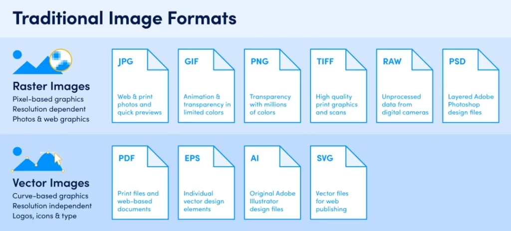
Image Formats
Two primary image formats are used for the web – JPEG and PNG. The correct format depends on the image type and contents.
JPEG
Best for photographic images like photos. It uses lossy compression, slightly reducing quality to achieve smaller file sizes. Quality can be reduced significantly before it becomes perceptible to the human eye.
Use for: photos, gradients, logos with photography
PNG
PNG compression is lossless, meaning no data is lost during compression. Achieves more significant compression than lossless formats like BMP or GIF. Supports transparency, unlike JPEG.
Use for logos, illustrations, diagrams, and text.
File Size
Heavier image files take longer to download, hurting site speed. Aim for the smallest file size possible without noticeably reducing visual quality.
Compression Level
Image formats like JPEG and PNG use compression algorithms to reduce file size. Higher compression levels yield smaller files but can reduce quality if taken too far. Finding the optimal level is critical.
Image Dimensions
Width and height in pixels. Larger dimensions increase file size but allow images to be viewed at higher resolutions/zoomed-in without losing quality. It is important to balance with page speed.
So, in summary, aim for the smallest file size possible through:
- Choosing the optimal format (JPEG vs PNG)
- Finding the maximal compression level before quality degradation
- Using optimal dimensions for the image location (hero banner vs thumbnail)
Manual Image Optimisation Techniques

Before diving into automation tools, understanding core manual optimisation techniques helps get the best results.
Choosing the Right Format
JPG works best for photographic images like photos. The key is choosing the lowest quality setting that still appears crisp and sharp when zoomed in. Start at quality 80 and tweak from there.
PNG is better for logos, illustrations, diagrams and images with solid blocks of colour. It allows transparency, which JPG does not. Use PNG8 format whenever possible over PNG24.
Adjusting Compression
Both JPEG and PNG use compression algorithms to reduce file size. The more compression, the smaller the file and the lower the quality. The key is finding the optimal balance point before quality degradation becomes noticeable.
For JPG, adjust the quality setting in your imaging software when exporting. Typical optimal values range from 60-85.
For PNG, use a PNG optimisation tool (covered next) to set the compression level efficiently on a scale from 0 to 9.
Setting Appropriate Dimensions
Aim to resize images to the exact dimensions they will display on the page. For example:
- Hero banner: 1920x600px
- Thumbnail image: 320x240px
- Article body image: 690x460px
Avoid “oversize” images that get shrunk via HTML/CSS. This unnecessarily increases the file size. The optimal pixel density depends on the impact area on the page.
Enabling Chroma Subsampling
Chroma subsampling is a JPEG-specific technique that takes advantage of the human eye being less sensitive to colour and luminance resolution changes.
It stores brightness/luminance detail at full resolution but less colour data, typically at half the horizontal and vertical resolution. This allows another ~30% reduction in file size without perceptible quality loss.
The downside is that chroma subsampling can cause fringing artefacts around high-contrast edges. But for most images, it’s an easy way to boost compression.
Automating Image Optimisation
Manually running the various optimisation techniques covered above can be extremely tedious and time-consuming. Fortunately, a wide variety of excellent tools are available for automating optimisation.
Desktop Applications
Desktop apps like Photoshop and GIMP provide batch processing capabilities for resizing, format conversion and compression. While quick and easy for one-off tasks, they lack integration with your image library and website workflow.
Standalone Tools
Dedicated optimisation tools like ImageOptim (Mac) and FileOptimizer (Windows) hook into your file explorer shell for context menu and drag-and-drop optimisation. This makes them faster and easier to use than open/save dialogues in editing apps.
The downside is optimisation parameters aren’t customisable on a per-image basis. And there’s still no integration with content management systems and deployment workflows.
Plugin Optimisers
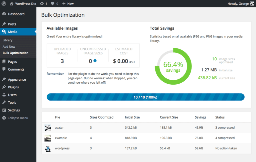
CMS plugins like ShortPixel (WordPress) and ImageKit (Shopify) provide deep platform integration directly within your content workflow. This makes it trivial to optimise images during uploads automatically.
Plugin optimisers strike the best balance between automation and control:
✓ One-click automated optimisation
✓ Custom parameters per image
✓ Integration with DAM/CMS platforms
CDN Image Processing
Services like ImagesX and Cloudinary provide content delivery network (CDN) hosting with integrated image processing and optimisation. This pushes optimisation into the cloud rather than relying on your server hardware.
The advantage here is effectively unlimited and automatic scaling. But it can get quite expensive at mid-high volumes.
Build Process Integration
For more advanced implementations, image optimisation can be directly integrated into front-end build workflows via tools like Grunt and Gulp. This allows baking optimisation right into your deployment pipelines.
The downside is complexity. This approach is overkill for many WordPress sites and templated platforms like Shopify.
| Optimiser Type | Platform Integration | Automation | Control | Scaling | Learning Curve |
| Desktop Apps | None | Batch Processing | Full | Limited | Low |
| Standalone | File Explorer | Drag & Drop | Minimal | Manual | Low |
| Plugin | CMS/DAM | Full | High | Scales with Platform | Low |
| CDN | None | Full | Medium | Unlimited | Medium |
| Build Tools | CI/CD Pipeline | Full | High | Unlimited | High |
Responsive Images

In recent years, websites have shifted towards “mobile first” and responsive design to accommodate the explosive growth of mobile browsing (now over 60% of web traffic).
Responsive design tailors image dimensions and resolutions to best fit differing screen sizes across devices. This technique is known as delivering responsive images.
Importance of Responsive Images
Responsive images provide:
- Faster page speeds – right-sized images load faster
- Lower data costs – smaller images use less visitor data
- No blurry scaling – crisp quality on high DPI devices
Approaches to Responsive Images
There are two main techniques for delivering responsive images:
1. Resolution Switching
With resolution switching, you deliver higher or lower-resolution images to visitors based on device display capabilities.
For example, it serves a 100KB mobile image vs a 500KB desktop image for the same content area. This requires detecting the visitor device type to choose the matching image size.
Resolution switching can be implemented by:
- Manually creating separate mobile/desktop image sizes
- Automatically generating multiple sizes with a responsive image plugin
- Using a CDN’s built-in resolution mapping
2. Size Attribute
The HTML size attribute dynamically scales image dimensions to match the available viewport area. No device detection is needed since the browser handles scaling.
<img src=”image.jpg” sizes=”50vw” />
This tells the browser to set the image width equal to 50% of the viewport width. As the viewport resizes, the image seamlessly scales up/down.
The downside is that the size attribute alone provides no resolution switching. So, low-res images can appear blurry or pixelated on high-DPI mobile screens.
Srcset + Sizes Combo
For optimal responsive images, combine the srcset and sizes attributes:
<img
srcset=”image-200.jpg 200w,
image-400.jpg 400w,
image-800.jpg 800w”
sizes=”50vw”
src=”image-400.jpg” />
This provides the best of both worlds:
- Multiple resolutions switching via srcset
- Viewport-based scaling via sizes
Browsers can dynamically select image resolutions AND scale sizes based on visitors' devices and connection speeds.
Responsive Image Generation
To simplify implementing responsive images, use tools that auto-generate multiple resolutions and write the srcset/sizes markup for you.
This can be handled by CMS plugins, CDNs, or build scripts. The key benefit is automation – uploading one image and getting all the required sizes/markup.
Responsive images come with a file size/page speed trade-off of serving multiple versions of each image. But with the above methods, gains from right-sized images outweigh the marginally larger total payload.
Image CDN Hosting

In addition to providing responsive imaging capabilities covered above, content delivery networks are highly beneficial for optimising site performance.
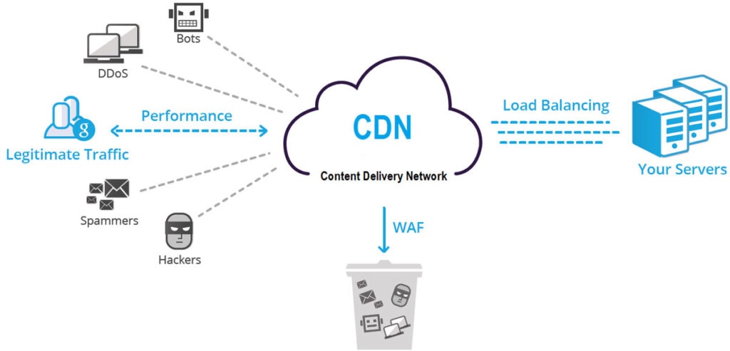
What is a CDN?
A content delivery network (CDN) is a globally distributed network of proxy servers. The goal is to speed up content delivery by reducing the distance between visitors and your image servers.
How Image CDNs Speed Up Sites
CDNs speed up image loading through:
1. Geographic Distribution
CDN servers are spread worldwide, so visitors connect to the closest endpoint. Much faster than centralised image servers.
2. Caching
Images are cached at the CDN edge for low-latency repetitive access. It is essential for frequently accessed images.
3. Hardware Acceleration
CDNs use high-performance networks and servers tailored for static file delivery. Takes the load off the origin infrastructure.
4. Parallelisation
Concurrent multi-CDN image requests speed up cumulative page load time.
Top Image CDN Providers
Here are some of the most popular dedicated image CDNs:
- Cloudinary
- Akamai Image Manager
- Fastly Image Optimizer
- Rackspace Cloud Files
- Amazon CloudFront
Many general CDN providers also offer image-specific features:
- Cloudflare
- Azure CDN
- KeyCDN
Note: Shopify, WordPress.com and other hosted platforms include proprietary CDNs powered by the above providers.
When assessing options, look for:
✓ Image-specific features: optimisation, responsive imaging, transformations
✓ Developer-friendly APIs and web app integrations
✓ Global edge network footprint
✓ Generous free tier
Improving Time to First Byte

In addition to the overall page load speed discussed thus far, a metric called time to first byte (TTFB) precisely measures server response latency – how long it takes for the browser to receive the first chunk of data after a request is made.
Why TTFB Matters
While not directly noticeable to users like total load speed, high TTFB hurts user experience by:
- Delaying visual progress indicators
- Triggering connection timeouts leading to failures
- Extending real page load time
According to Cloudflare, doubling TTFB reduces page views by nearly 20% on mobile. So, optimising TTFB improves user engagement.
For SEO, high TTFB directly correlates with lower Google rankings based on real-world crawler data analysis.
So, TTFB optimisations provide both user experience and SEO benefits.
Optimising Server Response Times
For dynamic sites and apps, follow general best practices like using a performant tech stack (PHP vs Ruby vs Node, etc), server-side caching, and CDNs to accelerate TTFB.
But for static files like images hosted on bare metal or object storage servers, TTFB optimisation boils down to choosing the correct region and instance type.
Steps for Optimising Static File TTFB:
1. Identify visitor geographic distribution
Analytics tools like Google Analytics provide geographic breakdowns. This allows picking cloud regions to match the majority of traffic.
2. Choose the closest region
Deploy servers in the lowest latency region(s) relative to your visitors. Avoid unnecessary roundtrips.
3. Use performant instance types
Prioritise fast processors and solid-state drives for sub-second response times.
4. Load test with real-world conditions
Simulate multiple concurrent users across regions to confirm low consistent TTFB.
With the proper infrastructure configurations, TTFB for static files can be reduced to virtually unnoticeable levels from a user perspective – commonly under 100-200ms.
Image Performance Monitoring
Now that we’ve explored various optimisation techniques let’s discuss monitoring image performance post-deployment.
Why Monitoring Matters
Images likely represent the majority of bytes downloaded on your site pages. As such, they largely determine overall site speed and TTFB.
It’s essential to track image metrics over time to detect:
- Regressions from code changes
- New unoptimised images added
- Increased TTFB indicating infra capacity issues
What to Monitor
Page Weight: Overall bytes contributing to page bloat
Images Bytes: % of page weight and absolute size totals
Image Requests: Count of images delaying TTI/TBT
TTFB: Any spikes indicating insufficient CDN capacity
Compression Savings: Identifies unoptimised photos slipped through the cracks
User Visits: Correlate speed KPIs with user engagement
Tools
- WebPageTest: Provides waterfall charts
- Sitespeed.io Open source with Docker images
- Calibre Promising newer freemium option
- Chrome DevTools Quick checks from browser UI
- GTmetrix Longtime standard for waterfalls
Set performance budgets around image bytes, TTFB, and compression savings. Get alerts when actuals degrade from targets.
Continually monitoring image impact on site speed allows for catching regressions before visitors notice.
Image Optimisation Checklist

Let’s summarise the critical image optimisation techniques covered in this guide:
✓ Pick optimal formats – JPEG vs PNG
✓ Set maximal compression – 80 quality JPG, level 6 PNG
✓ Downsize dimensions – no oversized images
✓ Subsample chroma – 4:2:0 JPEG compression
✓ Automate workflows – CMS plugins, CDNs, build scripts
✓ Implement responsive – srcset, sizes attributes
✓ Offload to CDNs – distributed caching and acceleration
✓ Minify TTFB – optimal regions, instance types
✓ Monitor continuously – actionable speed & quality KPIs
Following this comprehensive checklist will help you:
- Load pages faster by reducing image bytes
- Reduce infrastructure costs through optimised dimensions
- Improve user experience across all devices
- Boost organic rankings by trimming page bloat
The result is faster, cheaper and more engaging websites through adequately optimised images.
Image Optimisation FAQs
Below are answers to frequently asked questions related to image optimisation:
What is the best image format for website use?
Use JPEG for photographic images like photos. PNG is better for logos, illustrations and images with transparency. Animated GIFs can also be suitable for short repeating sequences.
Does image optimisation affect SEO?
Yes. Smaller image file sizes directly speed up page load times, which has been a Google ranking factor since 2010. Faster sites improve visitor experience, leading to better engagement and conversion metrics that boost rankings.
What is the best tool for compressing images?
ShortPixel and EWWW Image Optimizer are two of the most popular plugins for WordPress sites. They provide one-click image compression on upload along with responsive imaging capabilities.
How can I calculate the file size needed for website images?
A general guideline is to aim for image file sizes under 100KB for page speed. Beyond that, it provides diminishing returns.
For precise calculations, determine the maximum display dimensions needed, then multiply by 4x screen pixel density for appropriate resolution. This ensures images render sharply on high DPI devices without unnecessary bloat.
Should I optimise images for the web or let my web developer handle it?
Basic image resizing and format conversion can be handled independently. But for best results, coordinate with developers to implement automated compression, responsive imaging, and CDN delivery in tandem.
The collective expertise of creatives and coders is needed to put all the optimisation pieces together in a sustainable workflow.
What are the most important things I can do to optimise my images?
✓ Pick optimal formats – JPEG vs PNG
✓ Set maximal compression without visible quality loss
✓ Resize dimensions to exact display needs
✓ Implement responsive sizes with srcset + sizes
✓ Serve images from a CDN instead of your origin server
✓ Continuously monitor image metrics post-deployment
Conclusion
Optimising images for the web requires balancing visual quality, site speed and infrastructure costs.
By following the comprehensive techniques covered in this guide – responsive delivery, CDNs, compression, build automation and performance monitoring – you can strike that optimal balance, resulting in beautiful, fast-loading, and affordable website imagery that delights visitors.
