The Golden Ratio in Graphic Design: Mathematical Magic
Since ancient times, mathematicians and artists alike have been fascinated by the Golden Ratio, an irrational number approximately equal to 1.618 that holds the secrets of beauty and visual harmony. This unique mathematical relationship dubbed the “divine proportion” by the ancient Greeks, describes a ratio that appears with uncanny frequency throughout the natural world – from the spirals of seashells to the arrangement of seeds and petals.
In graphic design, the Golden Ratio has proven to be a compositional guide par excellence, prized for its ability to bring aesthetic order and natural balance to artwork and layouts. By employing Golden Ratio principles to dimensions, text sizing, image arrangements, and more, designers tap into this geometric formula to give their work an inherent sense of visual rhythm. The Golden Ratio even dictates classic paper sizes – for example, the dimensions of A4 paper roughly approximate the Golden Rectangle.
When skillfully applied in graphic design, the Golden Ratio creates compositions that seem to “click” on a subconscious level. The natural flow and spatial harmony draw the eye in. From logos to brochures, posters to signage, some of history's most iconic graphic design subtly uses the Golden Ratio, even if the designers were unaware of its influence.
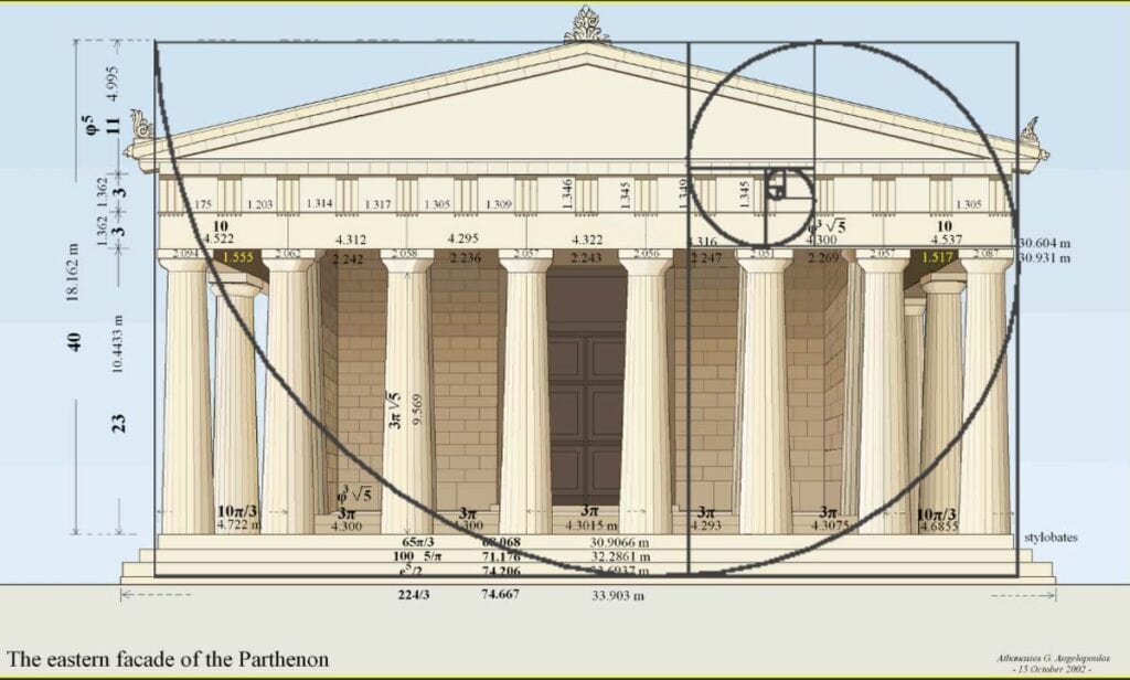
In this exploration of the Golden Ratio's role in graphic design, we will uncover its mathematical and historical underpinnings, study classic examples of its usage, learn practical techniques for applying it, and ultimately see why this “sacred geometry” remains as relevant today as when the Parthenon was built. Mathematical beauty meets visual creativity.
Table of Contents
What is the Golden Ratio?

The Golden Ratio, also known as the Divine Proportion, is an intriguing mathematical concept that has fascinated mathematicians, artists, architects, and scientists for thousands of years. This extraordinary ratio between two numbers appears frequently in geometry, nature, and many man-made creations.
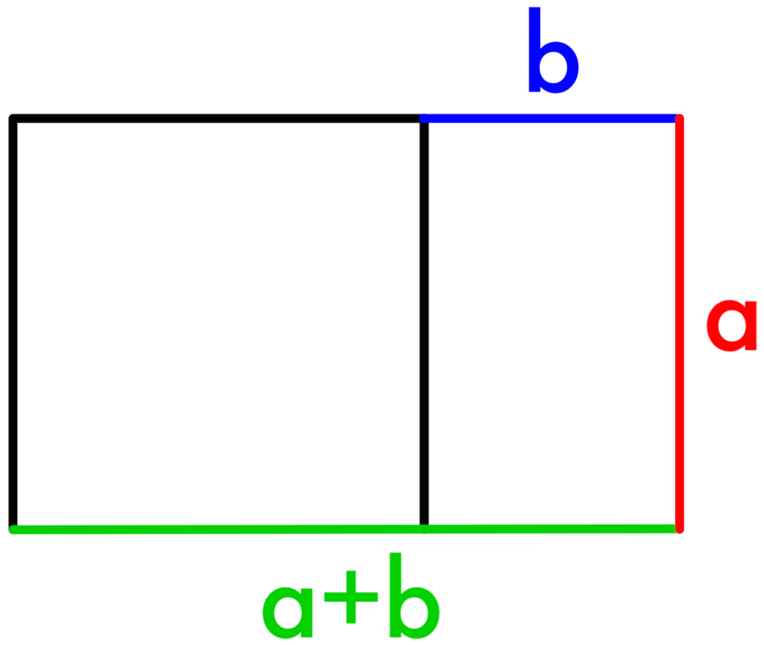
The Golden Ratio is typically represented by the Greek letter Phi (Φ). It is defined as follows: two quantities, a and b, are said to be in the Golden Ratio if the ratio of the sum of a and b to a is equal to the ratio of a to b. Expressed mathematically:
(a + b) / a = a / b = Φ
Where Φ is approximately equal to 1.61803398875, this number has unique mathematical properties and is sometimes called the “golden number.”
What is so special about the Golden Ratio? When two quantities are in the Golden Ratio, the ratio of the larger quantity to the smaller one equals the ratio of the whole to the larger amount. Visually, dividing a line segment by the Golden Ratio creates a smaller component in the same proportion to the original segment as the original is to the whole. This self-similarity at different scales lends the Golden Ratio its visual harmony and aesthetic appeal.
The Golden Ratio appears frequently in geometry, especially in pentagons, pentagrams, and Fibonacci spirals. It governs the arrangement of florets in flower heads and the branching of leaves around a stem. Remarkably, the Golden Ratio even manifests itself in the proportions and dimensions of the human body.
The Golden Ratio also has practical applications in fields like architecture, which has been used to design famous buildings like the Taj Mahal. The Golden Ratio composition can be seen in works by artists like Leonardo Da Vinci. The unique proportions of the Golden Ratio create aesthetically pleasing results that are balanced and appeal to the eye.
In short, the Golden Ratio is an elegant mathematical concept with far-reaching applications. Its visual harmony and frequent appearance in nature reveal a deep connection between mathematics and the natural world. The Golden Ratio's ubiquity and aesthetic qualities have inspired humanity across cultures and disciplines for centuries.
The History of the Golden Ratio

To truly appreciate the significance of the Golden Ratio in graphic design, we must first delve into its rich history. This ratio has captivated the minds of mathematicians, artists, and architects for centuries, dating back to ancient civilisations.
The Golden Ratio can trace its roots to ancient Egypt, where it was used to construct the Great Pyramids. Egyptians believed that the proportion of the Golden Ratio was inherently pleasing to the eye and incorporated it into their architectural marvels.
The concept gained further prominence in ancient Greece, particularly with the work of mathematician Euclid. He documented the properties of the Golden Rectangle, a shape embodying the Golden Ratio, in his masterpiece “Elements.” Greek philosophers and artists recognised the aesthetic appeal of this ratio and applied it in their art and architecture.
The Mathematics Behind the Golden Ratio
Though simple in definition, the mathematics underlying the Golden Ratio reveals an elegant relationship that has profound implications for geometry, nature, and aesthetics.
At its core, the Golden Ratio describes a specific proportion: approximately 1:1.618. Put simply, if we divide a line into two segments so that the length divided by the longer part equals the longer part divided by the shorter part, we get the Golden Ratio. The exact value is:
(A+B)/A = A/B = 1.61803398875…
Where A is the longer segment, and B is the shorter.
The Fibonacci Sequence
This unique proportion is intrinsically linked to the Fibonacci sequence, a mathematical pattern where each number is the sum of the two preceding ones (1, 1, 2, 3, 5, 8, 13, 21, etc.). As we calculate higher Fibonacci numbers, the ratio between consecutive terms approaches the Golden Ratio. After the first several numbers, if we take any two successive Fibonacci numbers, their ratio is close to 1.618.
Mathematically, this can be expressed as:
lim n→∞ (Fn/Fn-1) = φ = 1.618…
Fn is the nth Fibonacci number, which illustrates the deep connection between the Fibonacci sequence and the Golden Ratio.
Golden Rectangles

Another way to derive the Golden Ratio is with Golden Rectangles. A rectangle can be divided into a square and a smaller rectangle. If the ratio between the original rectangle and the square is equal to the ratio between the square and the smaller rectangle, it forms a Golden Rectangle.
Therefore, the dimensions of a Golden Rectangle have widths and lengths related by the Golden Ratio. When we divide a Golden Rectangle into a square and a smaller Golden Rectangle, we can repeat this process indefinitely – the ratios between the widths and lengths remain consistent.
Golden Spiral
Connecting the corners of the squares formed by dividing Golden Rectangles creates an elegant spiral shape known as the Golden Spiral. It exhibits logarithmic growth, spreading outward with the Golden Ratio governing the distances between its turns.
The spiral curve smoothly gets wider while maintaining the same centre point. The Golden Spiral demonstrates a beautiful geometric unfolding closely related to the Fibonacci Sequence and the Golden Ratio.
This quick overview shows the rich mathematical depth behind the Golden Ratio. Its connections to geometry, nature, and aesthetics arise from fundamental mathematical relationships. Understanding these foundations allows designers to employ the Golden Ratio and harness its harmonious power intentionally.
Applying the Golden Ratio in Graphic Design
Now that we've laid the foundation, it's time to delve into how the Golden Ratio can be practically applied in graphic design. From layouts to typography, understanding these applications can elevate your design projects to new heights.
Layout Composition

One of the most common and practical applications of the Golden Rectangle is in page layouts and grids. Graphic designers often divide a page or screen into Golden Rectangles or squares to create a flexible framework for positioning visual elements. The sequencing of the squares naturally guides the viewer's eye through the composition in a fluid, organic way. This avoids a rigid or monotonous layout. The Golden Ratio brings an underlying unity and sense of ordered progression to the structure.
Grids based on the Golden Ratio allow designers great flexibility in positioning images, text boxes, headers, sidebars, and other elements. For example, a web page layout may have a central content column over two Golden Rectangles, with a sidebar occupying a square. This creates visual balance and interest. The Golden Ratio can further guide element sizing and spacing within the columns and content areas.
The Golden Rectangle has an inherent visual stability, harmony, and rhythm that resonates with users. By basing the underlying structure of a design on this rectangle, designers leverage these aesthetic qualities to craft interfaces that are aesthetically pleasing and intuitive for viewers to navigate and comprehend. The Golden Ratio thus remains a powerful tool for graphic designers seeking orderly, organic layouts that stand the test of time.
Typography and Text Layout

Typography is one of the most essential elements of visual communication. The selection of fonts, sizes, leading, and layout profoundly impact how text is perceived and interpreted. Utilising typographic design principles, like the Golden Ratio, allows designers to optimise the reading experience and make content more engaging.
In typography, the ratio can guide the sizing of text elements to create pleasing hierarchies and rhythms. For example, to find an appropriate size for a font, designers may take a base text size and multiply it by 1.618 to get the size for headings. Doing this establishes a harmonious scale between font sizes.
The Golden Ratio also applies to line heights, which affect readability. Leading set to around 1.618 times the font size improves legibility by loosening line spacing. Similarly, using the ratio to text block proportions—setting the width to approximately 1.618 times the height—creates comfortable measures for the eye to scan across.
Implementing the Golden Ratio for font sizing, leading, and layout establishes visual balance and consistency. It brings an aesthetic harmony to the reading experience. Readers can seamlessly focus on the words rather than the typographic composition. Effective use of the Golden Ratio develops texts that communicate with clarity, engagement, and impact.
Logo Design

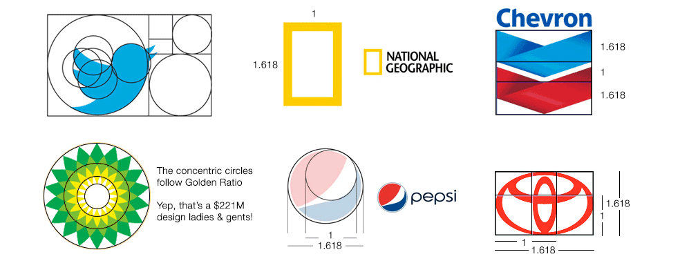
Over the past few decades, iconic and memorable logos have incorporated the Golden Ratio into their compositions. Apple's iconic bitten apple logo is one prominent example. The placement of the bite in the apple is precisely at the Golden Ratio point, dividing the apple into aesthetically pleasing segments that reflect the divine proportion. This simple use of the Golden Ratio creates a logo that feels innately balanced and visually arresting.
Famous logos like Pepsi, BP, CNN, Twitter and National Geographic have also employed the Golden Ratio in their designs. The ratios of elements like the height and width of the Pepsi logo, the size of circles in the BP logo, or the position and size of the CNN text block concerning the logo image align with the divine proportion. This lends these logos a natural harmony in their shapes and sizes that appeal to the human eye.
The Golden Ratio's frequent appearance in iconic logos is no coincidence. Studies show people find compositions incorporating Phi to be most visually appealing and aesthetically beautiful. Using the Golden Ratio to guide the proportion, scale, and position of elements in a logo design ensures it will embody balance, symmetry and intuitive beauty. This subconsciously resonates with consumers and makes logos more captivating and memorable.
Creating a great logo requires tapping into timeless design principles in an oversaturated media landscape. Employing the Golden Ratio is one fundamental way iconic brands like Apple, Pepsi and National Geographic have created logos that feel compositionally balanced, aesthetically pleasing, and intuitively appealing. The divine proportion lives on as a guiding light for crafting symbols that perfectly resonate with audiences.
Image and Photo Composition
When this ratio is applied to the dimensions of a photograph, it can help guide the placement of compositional elements harmoniously. Photographers may position important subjects or leading lines at points corresponding to the Golden Ratio to draw the viewer's eye into the frame.
For example, the subject could be placed at the intersection of two Golden Ratio lines, bisecting the image vertically and horizontally. The four points created by these intersecting lines form powerful focal points. Placing compositional elements along the dividing Golden Ratio lines can create a balanced, proportional look.
The Golden Ratio gives photographs a natural equilibrium that is intrinsically pleasing to the human eye. Our eyes are drawn to compositions that follow its proportions. Using the Golden Ratio can create images with a sense of order while maintaining visual interest through strategically placing elements.
In portrait photography, the Golden Ratio helps position the model's eyes, head and body at appealing points in the frame. It can also guide the placement of secondary elements like props or scenery. Even the direction the subject is looking can be determined using the Golden Ratio for optimal impact.
Understanding and implementing the Golden Ratio takes practice. However, it remains an invaluable tool for photographers seeking to improve their compositional skills and ability to direct the viewer's gaze. Consciously arranging elements based on these naturally harmonious proportions produces aesthetically stronger images.
The Golden Ratio in the Digital Age

As technology advances, so does the integration of the Golden Ratio in the digital realm. From website design to user interface (UI) design, this timeless principle continues to shape the aesthetics of the digital world.
Web Design
Web designers frequently apply the Golden Ratio when planning website layouts and positioning critical elements on a page. The ratio helps guide the size, spacing, and alignment of images, text, buttons, and more. When used correctly, it creates a natural flow and sense of visual harmony, improving site navigation and keeping users engaged.
For example, web designers may split a page into sections using Golden Ratio-approved dimensions. This looks proportionate to the eye and allows for efficient information hierarchy. Applying the Golden Ratio to typography and component sizes also helps increase readability and draw attention to important content. Overall, leveraging the ratio results in responsive and aesthetically pleasing website compositions.
User Interface (UI) Design
In UI design for apps and software, the Golden Ratio provides guidance on-screen layouts, spacing between buttons and icons, font sizes, and more. It helps designers make intuitive, usable, and visually appealing interfaces.
When UI elements are sized and spaced according to the Golden Ratio, it signals users where to focus their attention and how to interact with the interface. Icons and buttons with Golden Ratio-approved shapes and locations will feel right to users. Even tiny details like properly sized white space and margins can improve aesthetics and usability.
Overall, thoughtfully incorporating the Golden Ratio into UI design ensures an elegant balance between form and function. It shortcuts the design process while enhancing visual harmony and user enjoyment. That's why many top technology and software companies expressly leverage the Golden Ratio when designing iconic interfaces.
Frequently Asked Questions (FAQs)
What is the significance of the Golden Ratio in graphic design?
The Golden Ratio is significant in graphic design because it is a mathematical concept that represents a visually pleasing and harmonious proportion. Designers use it to create balanced and aesthetically appealing compositions in various design elements, from layouts to typography.
How can I calculate the Golden Ratio in my design projects?
To calculate the Golden Ratio, you can use the formula (a + b) / a = a / b = Φ, where Φ is approximately 1.61803398875. Simply plug in the appropriate values for ‘a' and ‘b' based on your design requirements to achieve the desired proportion.
Are there tools and software that assist in implementing the Golden Ratio in design?
Several design software and tools offer Golden Ratio grids and overlays, making it easier for designers to incorporate this ratio into their projects. Some popular design software, like Adobe Illustrator, even provide built-in tools.
Can the Golden Ratio be used in digital marketing and branding?
Absolutely! The Golden Ratio can be applied in digital marketing and branding to create visually appealing logos, website layouts, and social media graphics. It helps in establishing a consistent and attractive visual identity for a brand.
Is the Golden Ratio a universal principle in design, or does it vary by culture?
While the Golden Ratio is widely recognised as a universal design principle, its application may vary slightly based on cultural preferences and aesthetics. However, its inherent appeal transcends cultural boundaries, making it a versatile tool for designers worldwide.
Conclusion
The Golden Ratio has cemented its place as one of the most remarkable mathematical discoveries in the history of graphic design. With origins dating back millennia to artists and thinkers of Ancient Greece, this ratio of approximately 1.618 has proven to possess an almost mystical capacity to create aesthetically pleasing compositions.
Through the centuries, mathematicians and designers alike have been entranced by the visual harmony generated by the Golden Ratio. The Renaissance geniuses like Da Vinci explored its properties through geometry and nature. In more recent times, modernist pioneers like Le Corbusier and Dalí consciously integrated this ratio into their iconic works, creating designs that feel intrinsically balanced.
Even in today's digital age, the Golden Ratio continues prominently in graphic design principles and software. Its proportions are applied to everything from website layouts to logo dimensions, demonstrating its timeless versatility. No matter how far technology progresses, the synergy between mathematical precision and artistic expression embodied in the Golden Ratio remains a source of inspiration.
While fashions and styles may change, the human attraction to beauty and order is constant. The Golden Ratio's capacity to crystallise these universal desires into mathematically-defined forms has cemented its legacy. Its story is one of cross-disciplinary brilliance, reminding us that the worlds of logic and creativity are inseparably intertwined. In graphic design and beyond, the Golden Ratio's mystique and visual power will continue to shape our conception of beauty.
