10 Beautiful Font Combinations For All Your Design Needs
Font combinations are as fun to look at as they are to use. You can create endless stunning design combinations with a few different fonts.
I’m a colossal font fan—the more beautiful and well-designed, the better. But what happens when you get a project with two or three fonts that need to be used? You end up spending so much time looking for fonts and fiddling with them that you wish you’d made one good decision in the first place.
I’ve compiled this list of my favourite font combinations—that you can use to create a truly stunning design in less than 30 seconds.
When you design, your fonts must be easy to read so your target audience can quickly understand what you’re trying to say. These beautiful font combinations will help you get started.
Table of Contents
1 – Complement or contrast
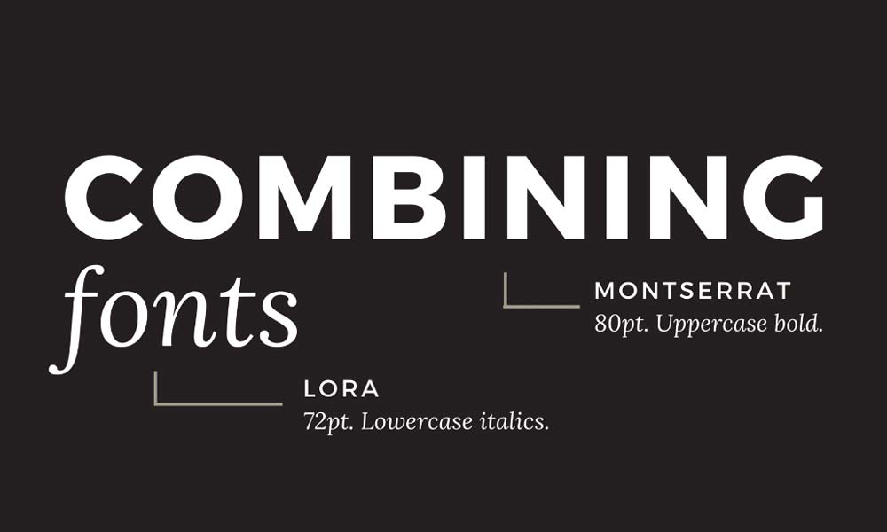
For starters, always look for font pairings that complement one another.
The last thing you want is for both fonts to fight for the viewer's attention.
The ideal combination should harmonise without risking being too similar.
The idea of using multiple fonts is to create visual diversity, so there's no point in choosing broadly identical two.
The more similar they are, the more likely they will clash.
Equally, two very different fonts could be in danger of pulling your design in opposite directions.
If you get the combo right, the viewer can almost not notice what you have done.
Then you know you have found a pairing that rolls off the eye.
So when it comes to font combinations, the golden rule is complement or contrast, but never conflict.
2 – Keep it in the family
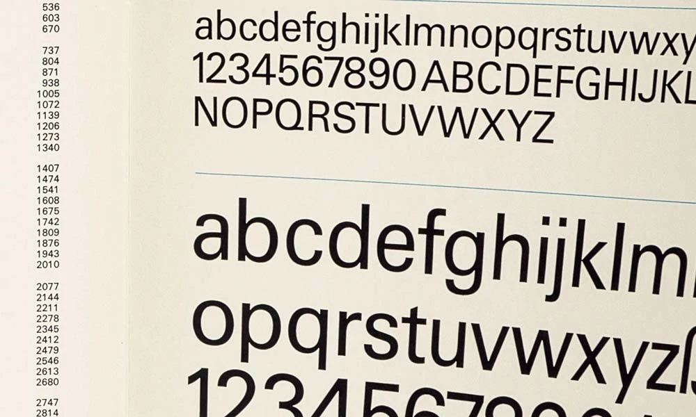
The most straightforward way of guaranteeing that a font pairing works perfectly is by using different fonts within the same typeface family.
Some fonts are members of ‘superfamilies', meaning they come with different weights, styles and classifications specially designed to work together.
For example, the Avenir superfamily includes the following sub-fonts: Avenir Heavy, Avenir Medium, Avenir Light, Avenir Next, Avenir Bold, Avenir Condensed, Avenir Roman, and Avenir Oblique, all of which come in italic, bold and regular font pairs.
Any font combinations will work well together, so you cannot go wrong by keeping it in the family.
3 – Opposites attract
As with colours, typefaces will often conflict if they are too similar (imagine pairing hot pink with dark red).
Two ever-so-slightly different fonts will rarely work together.
When done right, contrast is finding surprising and bold oppositions in a style that brings out the best in each other.
Combining serif with sans serif is a classic move for good font combos.
It is the salt and pepper of the font world.
Serif fonts are slightly more old-fashioned and traditional (examples include Times New Roman and Garamond) and always have strokes at the edges of letters.
By contrast, sans-serif fonts are sleek and modern (examples include Futura and Helvetica) and never have strokes, opting instead for clean lines.
A robust superfamily will include serif and sans serif variations of the same typeface, as with Lucida and Lucida Sans.
If you find a superfamily that includes serif and sans serif, you have a ready-made contrast package for font combinations.
4 – Who's the boss?
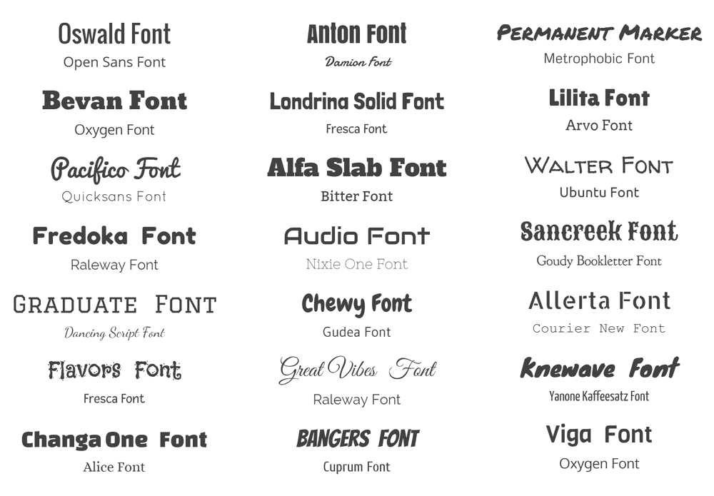
Establishing a clear hierarchy is crucial when combining two very different fonts.
One should ideally be more prominent than the other.
This can be achieved by varying the size and weight of each typeface or even incorporating colour into the mix.
Try an eye-catching, 30pt title in white sans-serif Futura, with a subtle, neutral grey, 12pt subtitle in serif Garamond.
This will undoubtedly present Futura as your primary font and Garamond as your go-to alternative for detail, extra information and support.
So now you are clued in on our hot tips.
These four simple rules will provide you with visual harmony in most situations.
However, with such a diverse world of professional typefaces (and a growing range of free fonts), how can you choose just two complimentary fonts?
Let alone two that work together!
We bring you ten perfect font pairings to suit all your design needs.
10 Beautiful Font Combinations For All Your Design Needs
1 – Futura Bold & Souvenir
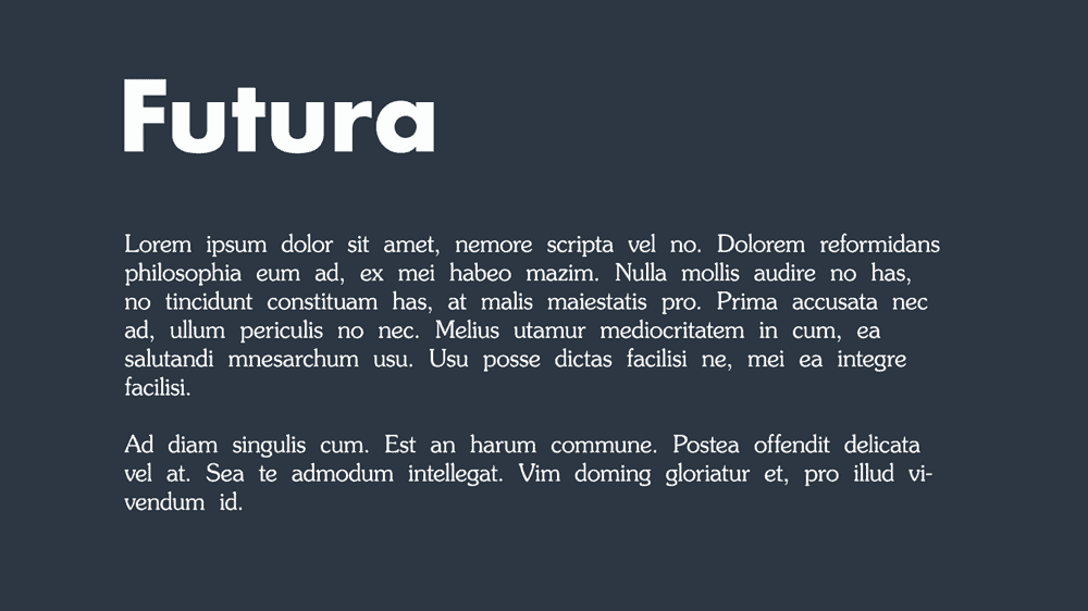
Mixing two such strong typographic personalities is a risk that rarely pays off as they fight it out.
However, somehow, this pairing works.
Allan Haley described Souvenir as being “like Times Roman dipped in chocolate” – playful, goofy and light.
It was created in 1914 and envisaged as a throwback to earlier Art Nouveau models.
In contrast, Futura is bold, optimistic, and serious, concerned with modernism and forwardness.
Following Bauhaus's principles of futurism, Paul Renner created Futura in 1927, emphasising geometric forms; hence, we find near-perfect circles, triangles and squares within each letter.
So here we have two very different typefaces from two distinct periods, created for almost different purposes, that somehow bring out the best in each other.
The slightly innocent smile of Souvenir plays into the strident personality of Futura in a way that lightens the mood of both.
The font combination makes for a clean, quirky, instantly pleasing pairing.
Best Alternatives to Futura and Souvenir:
Powered by Creative Market Powered by Creative Market2 – Rockwell Bold & Bembo
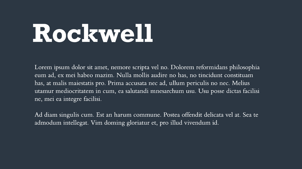
One of the classic slab serifs, Rockwell, was designed by the Monotype Corporation in 1934 and had a tremendous personality and attention-grabbing potential when used in bold.
It has a very geometric quality, too – think of it almost like the serif Futura.
Bembo is a neutral yet versatile serif; sleek, light and conservative.
It is thin yet elegant, as though it is made of bamboo.
Try using Rockwell Bold for your headlines, titles, and website buttons.
Bembo will slot perfectly beneath as a subtitle, body text or detail for one of the best font combinations.
Best alternatives to Rockwell and Bembo:
Powered by Creative Market Powered by Creative Market3 – Helvetica Neue & Garamond
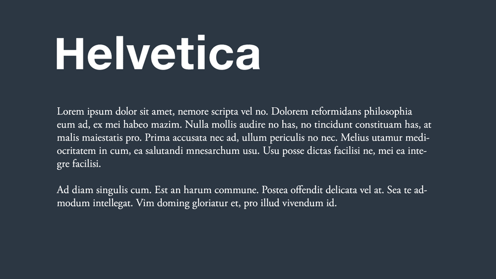
This is a notoriously compatible duo.
Using the timeless favourite Helvetica Neue for headlines and the classic Garamond for text, you invite the reader into a world of elegance, tradition and classiness.
Font combinations of a neo-grotesque sans-serif and an old serif are safe to bet and work exceptionally well in corporate contexts.
Opting for different weights and sizes can establish a social hierarchy between the two neutral families.
It is clear, crisp and traditional.
The best alternative to Helvetica Neue and Garamond:
Powered by Creative Market Powered by Creative Market4 – Super Grotesk & Minion Pro
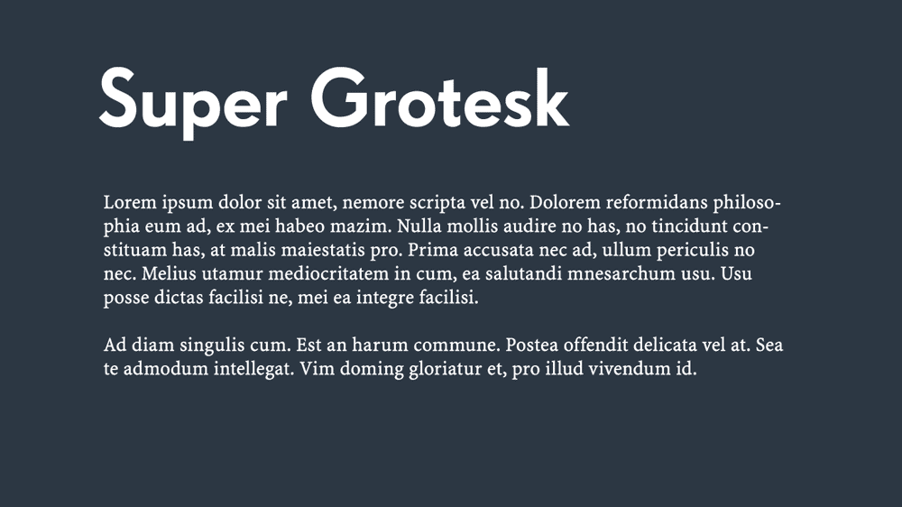
The increasingly ubiquitous serifed Minion Pro does impeccable work as a headlining font in this delicious pairing.
Designed in 1990 for use in the Adobe suite and inspired by late Renaissance-era type, this font is the child of two parents: the pinnacle of modern creative design (Adobe) and the most critical artistic era in human history (the Renaissance).
Coupled with the elegant sans-serif Super Grotesk, these two fonts carry a modern sense of classical beauty with minimal effort.
This is a classy combination, indeed.
Best alternative to Super Grotesk and Minion:
Powered by Creative Market Powered by Creative Market5 – Montserrat & Courier New
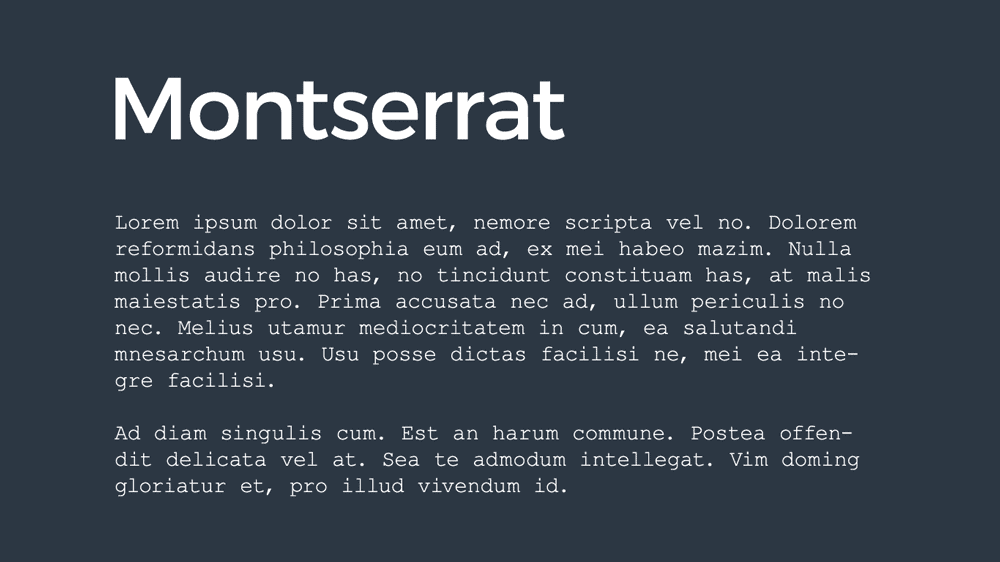
Montserrat is a Google font created recently, specifically for online use.
Since its creation, it has become trendy and widespread.
You will see it all across the internet, on stylish websites, blogs, and Instagram posts.
Its astronomical success is simple: it is an elegant, sleek, sans-serif typeface that is perfect in almost any context.
How exciting then, as one of the top font combinations for Montserrat – the poster child of online typefaces – with the instantly recognisable font of the classic typewriter, Courier New.
This pairing is quite literally the best of the old and the new.
The thick inkiness of the 20th-century type brings a natural weight to the sleek, almost intangible lightness of 21st-century online lettering.
This is a perfect font combination if your brand or product also straddles past and present, and you want to signal that you are keeping ahead of the curve without cutting ties to the past.
Best alternatives to Montserrat and Courier:
Powered by Creative Market Powered by Creative Market6 – Playfair Display & Source Sans Pro
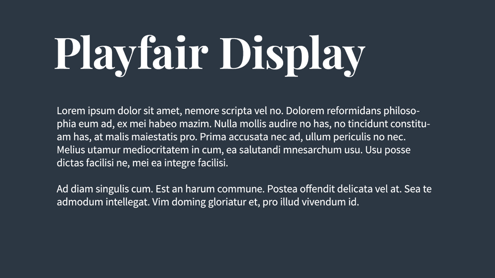
There's a clue in the name of “Playfair Display” – any typeface with the word display in its title is usually designed for more extensive uses, such as headlines.
Playfair Display is a great option when you want to go more significant, and it retains an effortlessly modern look for a Serif-style font.
According to its designer, Playfair Display was inspired by 18th-century letterforms that emerged during the transition from feather-based quills to steel-tipped pens.
With this in mind, it is hardly surprising that the font evokes such old-world charms but with a hint of modernism.
Add into the mix Source Sans Pro, and we start to push things further into the present, creating an enticing, discrete combination while still being very functional.
Playfair Display is a great way to add that personal touch to a tagline, slogan or product description.
Its ampersand and currency symbols are unrivalled, so it is ideal if your product or service is built upon luxury and classiness.
You can ask an AI presentation maker tool to infuse your content with Source Sans Pro, ensuring your text remains grounded in a modern, clean, inviting, and easy-to-read presentation.
Best alternatives to Playfair Display and Source Sans.
Powered by Creative Market Powered by Creative Market7 – Amatic SC & Josefin Sans

This is one of the great font combinations, albeit one that's more on the light-hearted side of chic.
With that in mind, this pairing may not work in every context, but if you are going for gentle whimsy, the mixture of Amatic SC and Josefin Sans will stand out.
While this is not necessarily the proper selection for a corporate context, it does work well if you are an artist, musician or entertainer looking to convey a unique personality.
It is free-spirited, fun-loving and easy-going.
Depending on the style and tone (as well as the subject matter), this combination could work well for a blog.
In any case, don't use Amatic SC as your main body text (your readers will go mad).
Amatic SC is for the titles and headlines, while Josefin sans is for use as body text, be it short taglines, longer paragraphs, or prose.
Best alternatives to Amatic and Josefin Sans:
Powered by Creative Market Powered by Creative Market8 – Century Gothic & PT Serif

As you can see by now, we were not lying when we said that sans serif plus serif is a classic font combination.
It is the best way to achieve contrast without conflict.
Another excellent example of this tried and tested move Century Gothic and PT Serif.
Century Gothic owes a lot to Futura.
The classic Art Deco font knowingly inspires it, but with subtle differences.
Luckily, these differences are enough to set Century Gothic apart from Futura, which (enormous thanks to Wes Anderson) has become incredibly common.
PT Serif is an excellent serif typeface and never fails to work well as paragraph text.
These two fonts have natural chemistry; they are a smart choice if you want a classic pairing that isn't overused.
Best alternatives to Century Gothic and PT Serif:
Powered by Creative Market Powered by Creative Market9 – Raleway & Lusitana
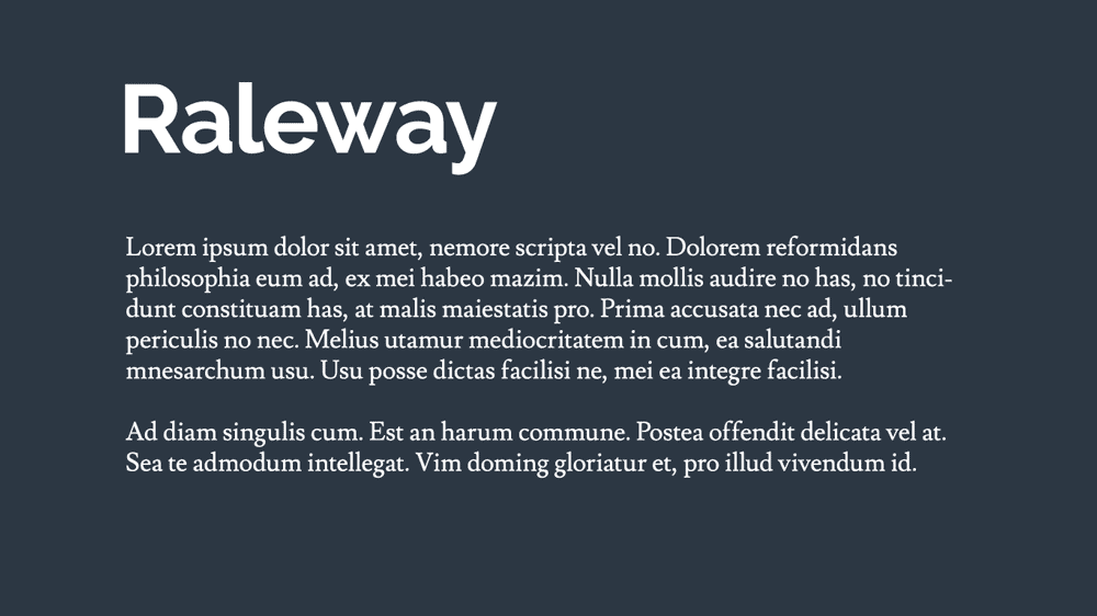
Here are some beautiful free fonts from Google in Raleway and Lusitana.
Raleway puts the funk into function as an elegant font with many practical applications.
Lusitana is warm, welcoming and down-to-earth.
Combine the two, and you have a dynamic that always works.
Remember that using two Google fonts means straying into contemporary online aesthetics.
The reader can often tell that these are new because we subconsciously recognise older fonts, even if we cannot identify them by name.
There's something about these fonts, which have never been made into an actual foundry type, which makes them feel like digital newcomers.
This is perfect if you want to look sleek and modern, such as for a digital magazine, but not so good if you are branding as long-standing and authentic.
Best alternatives to Raleway and Lusitana:
Powered by Creative Market Powered by Creative Market10 – Source Sans Pro & Times New Roman
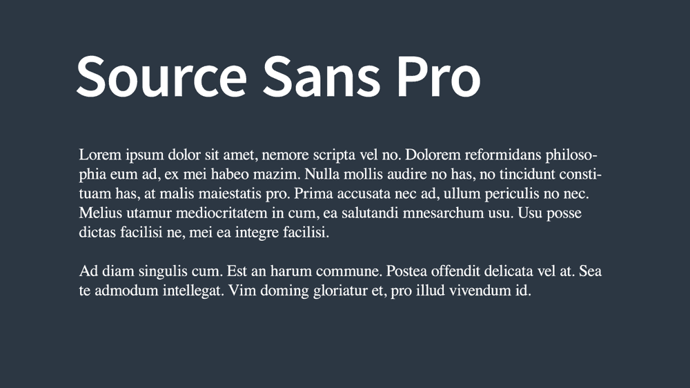
Times New Roman is so widely used (a standard font on Microsoft Word) that it is rarely found in web designs.
Primarily because most graphic designers go for newer (and free-er) typefaces in their plans.
That said, it is essential not to forget about Times New Roman or throw it to one side like an old toy that has been overplayed.
It is still a great typeface; it is a highly readable, classic serif that will bring a sense of familiarity and tradition to your design.
Source Sans Pro is a slightly more modern typeface that works nicely alongside Times New Roman, primarily if you are marketing a timeless, familiar, conventional brand.
Best alternatives to Source Sans and Times New Roman:
Powered by Creative Market Powered by Creative Market11 – Euclid Circular: Simple lines, a clear message
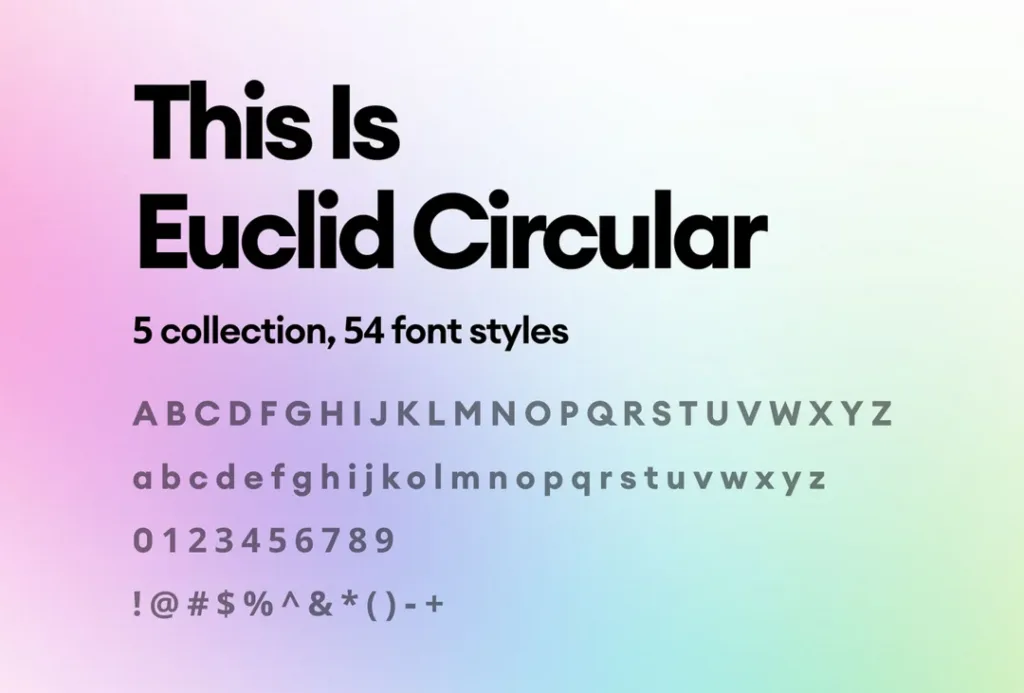
Euclid Circular’s design is already highly preferred in digital and printed media due to its simple formation of characters and its open feel. The rounded characters' minimal shapes and the angular ones' simple strokes make a soft impression on the reader and, in most cases, go unnoticed.
Since the formatting is simple and non-imposing, many digital spaces use it, like news sites, announcement forums, or specific informational hubs. The spacing and shapes make it easy to read and, in typical Internet fashion, get the details you need in one glance.
The same goes for websites that review and break down products or services. With the right frontend design of the entire page, soft colours and Euclid Circular as the preferred font, sites can deliver the message quickly without hassle. For example, the UK casino bonus review resource Kingcasinobonus chose this route: their site is well-adjusted on all screen sizes, and users can navigate quickly from section to section with just a few swipes.
Conclusion
Combining fonts is a risky business, but one that can pay off with tremendous rewards.
Here, we have ten beautiful, ready-made font combinations that will delight in various contexts.
We have the duo, whether you are going for old-fashioned or contemporary, friendly or professional.
Also, remember that beautiful fonts make for beautiful brands.
If you feel bold and want to create your font combination, follow our guidelines: complement or contrast; never conflict.
Look for bold oppositions in the font pairing chart (the more variety, the better) because minor differences clash.
Establish a hierarchy using weight, size or colour – and when in doubt, you can always fall back on a trusty superfamily.
Bear these rules in mind, or use one of our favourite font combinations as inspiration, and you will be well on your way to typeface mastery.

Once you have chosen a font, you should be able to find a similar font in the same family on most sites. Alternatively, you can also search for a font that is similar to your favorite font, or you can check out free font sites like Font Squirrel where you can download a large number of free fonts.