The Ultimate Guide to Resolution in Logo Design
When discussing logo design, most guides focus on the aesthetic aspects of creating a brand logo. And, because a great logo can make or break the success of a business, this is entirely understandable.
Unfortunately, one aspect of logo design often gets overlooked: resolution.
As a technical factor contributing to how a company logo is perceived, the resolution is crucial in ensuring that your logo does what it should.
But, you may wonder: what is resolution in the first place? And how does it differ when designing logos for online and offline usage?
In this guide, you will learn everything you need to understand about resolution in logo design, how it is affected by aesthetic choices on your website or your brand’s visual identity on social media, and the challenges of creating logotypes for responsive websites on modern-day device screens.
So, without further ado, let’s get into it.
Table of Contents
What is Resolution?
Before discussing the role resolution plays in logo design, we must first understand the term's meaning.
According to Adobe, resolution (quite simply) represents “the amount of detail in an image.”
The resolution represents the number of dots printed in a linear inch (DPI). However, on computers and electronic devices, the resolution is measured by the number of pixels per inch (PPI).
In other words, the term resolution (or pixel count) practically represents the number of pixels on the horizontal axis by the number on the vertical axis, resulting in the calculation of pixels per inch.
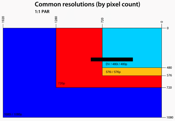
How sharp the image appears on the screen depends on the size of the screen and the number of pixels.
The exact pixel resolution will be sharper on a smaller screen and become less sharp the more extensive the screen becomes.
This makes sense because, in essence, the same number of pixels are spread out over a larger area.
Simple right?
The output will depend on the actual device and the display. So, your image may appear differently on different devices and screens, depending on the device's technical specifications.
What are Pixels?
To have the knowledge required to get the resolution right in all of your logo designs, you will first have to learn a bit about pixels.
By definition, pixels represent the individual squares that make up an image when stacked on top of each other in rows.
Let’s think, for a moment, about what happens when you zoom in close to an image. You’ll find that the closer you get, the blurrier that image becomes.
Essentially, this blurriness means you’ve gotten so close that you can see the individual pixels (or fuzzy squares) that make up the photo you’re viewing.
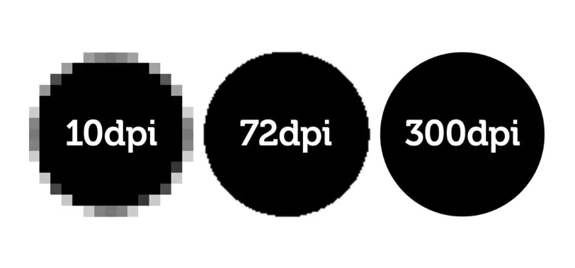
The best way to avoid this blurriness is to focus on DPI (dots per inch) and PPI (pixels per inch).
DPI is usually used when discussing printed output, and PPI is used for displays and digital images. However, many people (even experts) use the two terms interchangeably, often leading to mix-ups and confusion when discussing the concept of resolution.
But how does the number of pixels in a visual file affect appearance?
The higher the DPI or PPI, the more information within an image, which means you can see more detail, and the picture looks crisper.
However, you might have believed that the higher the DPI or PPI, the higher the image quality. After all, what better way to ensure a great viewing experience than to condense the details in a file?
Unfortunately, it’s not just pixel density that affects image quality. Pixel size plays an equally important role in the result.
For example, a low DPI and lower pixel dimensions will cause a blurry image when the size increases.
Similarly, higher pixel dimensions and higher DPI can cause a picture to become blurred when resized.
What DPI should your logo be?
Most resources will tell you that 72 DPI is the best.
However, note that the DPI does not always make a difference when looking at images on a screen, as the resolution of the actual screen may make the image appear differently. (This can be the same for colours and focus too.)
So, while the concept of 72 DPI worked perfectly in print (where one inch was displayed as one inch), digital screens are becoming slightly more complicated.
To avoid confusion, measure images intended for online use in absolute pixels.
What format should your logo be?
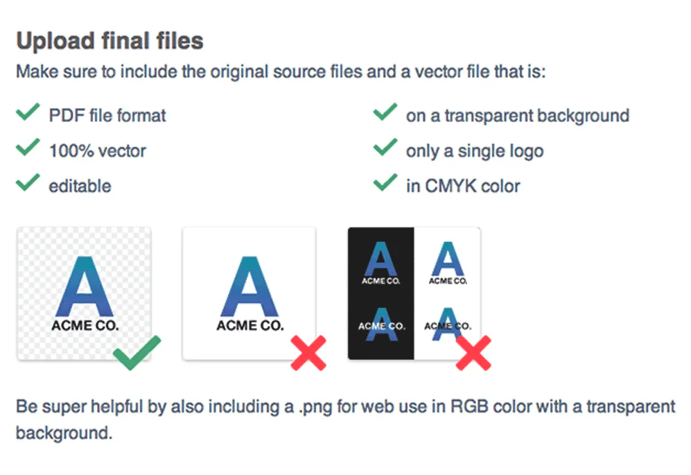
Generally, you will want to opt for vector formats when designing your logo because of its scalability.
While raster files are beginner-friendly, they can pose problems if you need to blow up your logo for print or size it down for your favicon.

It would be best to keep in mind that, when displaying your logo online, the best file format you can use is PNG. As these tend to be smaller, they won’t increase load times (therefore avoiding hurting your conversion rates), yet they’ll remain detailed and sharp.
Moreover, note that PNGs allow you to add your logo to a transparent background, ensuring it looks great no matter where it is displayed.
How to determine the logo size for your needs?
You can (easily) calculate the space size for your logo using a calculator tool. By determining the area you need to fill, this tool will help you understand what size and resolution image you need for the space your logo will take up.
Note that the best sizes for your logo will differ based on whether you intend to use it on your website, social media, or print.
This means that you may need to prepare multiple sizes for different platforms. Alternatively, you must choose a logo format that allows easy resizing.
To ensure the best results regarding how your logo is displayed on various distribution channels, it’s best to become familiar with (and keep up to date with) industry recommendations regarding logo size and resolution.
Recommended website logo sizes
Website design (and appeal) plays a massive role in the success of a business.
Research has shown that a site's aesthetic and functional features determine whether consumers will trust a brand, impact how they perceive that brand, whether they will remember it, and even determine their purchase intent.
So, it’s only natural to aim to make your brand’s site as well-designed as possible.
And it turns out that where you place your logo (along with its size) can positively or negatively affect the overall impression your site leaves.
So, what are the recommended website logo sizes depending on intended use?
Website header
The most traditional area to display your company logo will be in the left corner of your website, referred to as the website header or the navigation bar.
Research shows that this location is ideal for placing visual branding elements simply because it’s where web visitors look first when landing on a page.
To ensure that your logo stands out, sizing will be critical. Too small and will go unnoticed, making you miss a valuable branding opportunity. Too big, however, will overshadow your site's conversion-driving elements, such as the unique value proposition or the primary CTA.
So, what are the recommended dimensions for website header logos?
One good rule of thumb when going with a flat icon is to keep the logo height below 100px and determine the width based on the number of words in your brand name.
For example, if you check out the Sola Wood Flowers homepage, you’ll see that the header logo is 30px tall (a widely accepted standard), which ensures that the text is easy to read but doesn’t overshadow the hero section of the site.
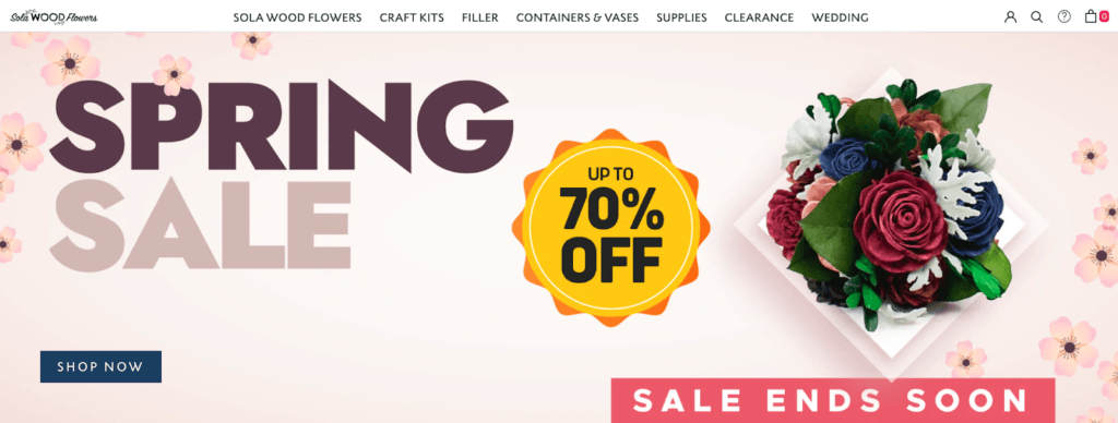
Source: solawoodflowers.com
On the other hand, the brand Anderson & Sheppard goes with a slightly less traditional logo position on its homepage, which is why it chooses a larger size of 985×60 pixels.
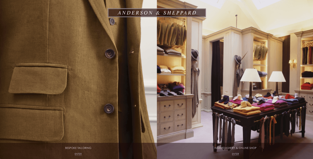
Source: anderson-sheppard.co.uk
Alternative size recommendations include:
- 250 x 150 pixels
- 350 x 75 pixels
- 400 x 100 pixels
Website footer
Although often overlooked when discussing website logo size and resolution, a site’s footer is another commonly utilised location for displaying brand logos.
In this area, the size recommendations discussed above apply. However, note that it allows some leeway in terms of exact dimensions.
For example, this is a space where you might choose to go with a square or vertical icon. If that’s the case, you can choose a dimension of up to 160 x 160 pixels, which will look natural with most design directions.
However, note that going smaller is also all right.
Pretest Plus, for example, chose to go with a smaller 70 x 70 px size for a clean square look.
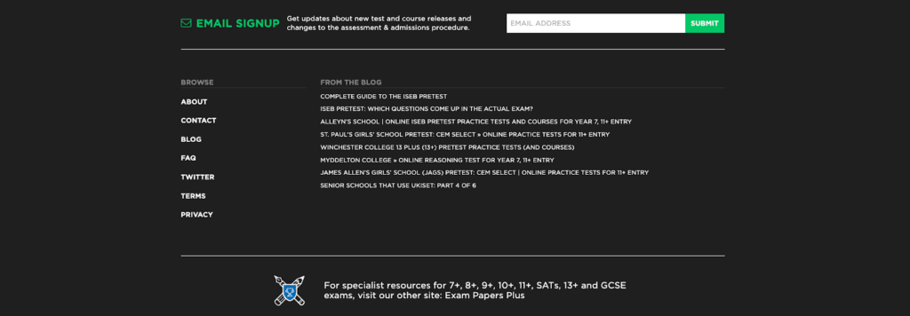
Source: pretestplus.co.uk
If your logo is text-heavy, make sure you don’t make the mistake of displaying it in a size that’s too small (like American Express did). This will make it more difficult for web visitors to recognise your brand and hurt your company’s public image.
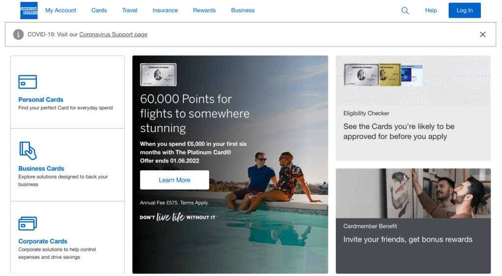
Source: americanexpress.com
Favicon
Lastly, when it comes to choosing sizes for your website logo, don’t forget about the favicon, which is the small icon that appears in people’s browsers, right next to the title of the page they’re browsing, in their favourites and bookmarks bars, and in the search bar.
Generally, you’ll do well with a favicon as small as 16 x 16 pixels. Check out how that looks in the example from Unscramblex below.
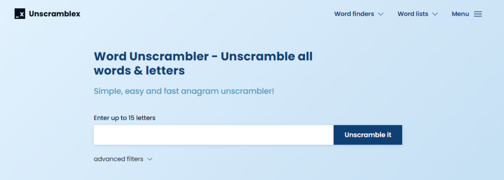
Source: unscramblex.com
Recommendations for social media logos
As you’re probably aware, a professionally put-together social media presence is key to achieving success for your brand.
A well-developed social media marketing strategy allows you to reach your audience and can be a critical factor in achieving high conversion rates. It could even be the secret ingredient to building a loyal customer base.
However, if you want your social media branding to be on point, you must adapt your logo. And, seeing that there are dozens of social media platforms you may want to publish, you’ll probably have to create logo versions for each one (including different sizes for different use cases).
So, let’s cover the most popular platforms and the logo size recommendations to ensure your brand’s visual calling card looks crisp and pristine.
Logo sizes for Facebook
- Page profile picture: Displays at 170 x 170 pixels on computers, 128 x 128 pixels on smartphones, 36 x 36 pixels on most feature phones
- Page cover photo: Displays 820 x 312 pixels on computers and 640 x 360 pixels on smartphones. Minimum dimensions: 400 x 150 pixels.
Of course, remember these are the minimum recommendations for image sizes on the platform.
To aid with load times, Facebook recommends using PNG files. Moreover, note that the platform crops logo images to a circular shape, so make sure you account for that change in advance.
To see how an organisation did this successfully, check out how the Star Wars franchise created black padding around its logo to ensure a visually pleasing result on its Facebook page.

Source: facebook.com
Logo sizes for Instagram
Unlike Facebook, Instagram doesn’t provide clear instructions on the ideal logo sizes for its platform.
Nonetheless, there is one dimension you should stick to with this platform.
Since Instagram displays all profile pictures at a maximum of 180 x 180 pixels on desktop computers, this should be the minimum you upload to the platform.
However, to ensure your followers' best viewing experience, go with the (much larger) 1080 x 1080 pixels size. This is what KURU Footwear did with its profile picture. The adequately sized image prevents the logo from being distorted (or pixelated), even when viewed on a desktop screen or zooming in.
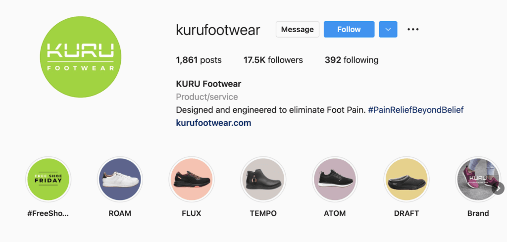
Source: instagram.com
Recommendations for Twitter
Like Facebook, Twitter also has a set of recommended dimensions for uploading images and logos:
- For profile pictures: 400 x 400 pixels, cropped to a circle shape.
- For header images: 1500 x 500 pixels.
When adapting your logo and other visuals for Twitter, you should remember that you may crop the header images due to the resolution used by different screens. This means up to 60 pixels at the top and bottom of the file may not be visible on specific devices.
For an excellent example of a brand adapting its branded visuals for Twitter, check out Trupanion. This pet insurance service chose only to show the pictorial part of its brand logo, ensuring no visibility issues with the brand name but that its identity remained consistent throughout all its communication channels.

Source: twitter.com
Logo sizes for Pinterest
If your audience is active on Pinterest, you may want to create a visually compelling presence on this social network. But, to do that, you must ensure your logo is beautifully presented.
- Profile picture: Like Facebook and Twitter, Pinterest also displays profile pictures in a circular shape, meaning you will have to make some adaptations to your logo. As for dimensions, the minimum you should go with is 280 x 280 pixels.
- Profile cover: While the platform’s help centre recommends a minimum dimension of 800 x 450 pixels, note that the better way to ensure your cover is displayed correctly is to use an aspect ratio of 16:9.
Fire Pit Surplus did an excellent job of adapting its visuals for Pinterest. This brand changed its horizontal logo to a square shape. It cropped its website hero image to a 16:9 aspect ratio, ensuring that its profile on the social network looked put-together and professional.

Source: pinterest.com
YouTube logo sizes
Based on guidelines from Google, these are the dimensions for adapting your visual branding elements to ensure the best aesthetic impression on YouTube:
- Profile picture: 800 x 800 pixels in JPG, GIF, BMP, or PNG format (will be shown as a round image).
- Banner image: Minimum upload dimensions should be 2048 x 1152 pixels (16:9 aspect ratio). If you wish to add text or a logo, the safe area is 1235 x 338 in size.
- Video watermarks: Maximum dimension should be 150 x 150 pixels and less than 1 MB in size.
Check out the PlayStation YouTube channel for a better idea of what this will look like in real life.

Source: youtube.com
Other social media & distribution channel logos
- TikTok: 200 x 200 pixels.
- LinkedIn: 268 x 268 pixels for profile photos & 1128 x 191 for cover images.
- Discord: 128 x 128 pixels
What to look for in a logo design?
Ideally, your perfect logo will enable customers to identify your brand immediately, make it stand out, and evoke plenty of customer interest.
You should go for a simple logo design which is easy to recognise and memorable.
Think about logos you know well and what makes them stick in your memory. You want these things for your logo, which will stay with your customers for the duration and grow your business.
Logo design mistakes to avoid
Avoiding issues with the resolution and quality of your logo is not always possible. However, there are some mistakes you can actively avoid.
- When hiring someone to create your logo, you do not want to scrimp on whom you employ. Sure, reasonable offers may seem significant. Remember that the quality and reality of the results you will receive won’t compare to more established professional designers.
- Avoid the use of generic artwork. You want your logo to stand out, be unique, and present your brand in a positive light. So, you don’t want the basis of your brand’s visual identity to be a carbon copy of something already existing. Especially not if it’s similar to one of your competitors, as this will hurt your chances of standing out. You want individual, unique designs that suit your business and look professional.
- Don’t follow changeable trends. You want a logo design that will be timeless and not something that will date very quickly. As your business grows and expands, your logo should continue to be at the forefront of that growth, showing what your organisation stands for in terms of professionalism and value to customers.
- Avoid a design that is too complex. There can be too much going on in a logo, which draws away attention or convolutes the message you want to send. Make your design simple but adequate for the best results.
Getting size and resolution right in logo design
As you can see, there’s no single rule you can apply to the design of your brand’s logo that will ensure consistent results across the internet.
Instead, when designing the visual branding of your organisation, you should plan for every possible use of your core visuals.
Use scaling software like Photoshop and Illustrator to create your logo and save it in different sizes depending on your needs. Take the dimensions we’ve listed as guidelines, and ensure you’ve saved your main images in vector format to adapt them as your needs evolve.
If you feel this is too much work, you can leave it to the professionals and get a quote from a top Creative Branding Agency for your logo design.
