Kinetic Typography. Sounds fancy, right? At its core, kinetic typography is just moving text. Think of your favorite movie intros or that super cool ad you can’t get out of your head. That’s typography animation at play. Why’s it so important, though? Well, it turns a boring static message into something alive, something that dances on the screen, and captures your attention.
The concept of moving text isn’t exactly brand-spanking-new. Remember those retro movie openings with moving titles? Those classics laid the foundation.
But then, the internet came around, and bam! Websites got a makeover, and suddenly we, web designers, started incorporating this magic called typography animation into the digital space. Websites went from static billboards to dynamic stages where text became the star performer.
There’s this unspoken thing about animated text: it’s seductive. No joke. It’s like watching a dance. Your eyes follow the rhythm, the moves, the pace. This isn’t just fancy footwork.
It tells a story, evokes emotion, and gets a message across in ways plain text can’t. Trust me, in the web design world, typography animation isn’t just a trend. It’s a powerhouse tool. When done right, it’s the difference between “meh” and “wow!”
Awesome fonts to use
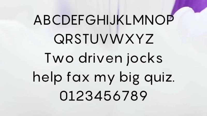
Oh man, this one? Absolute classic. Pangram has this quirky look, like it’s trying to show off each letter of the alphabet. Perfect if you’re aiming for a bit of fun, but still want to stay super elegant. A tightrope walk between fancy and funky.
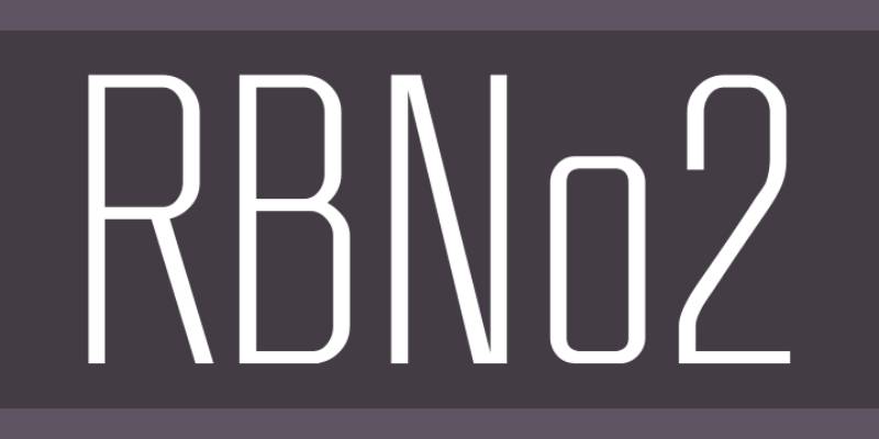
Alright, so if you’re aiming for a modern vibe with a bit of edge, this one’s your go-to. It’s like that sleek car everyone’s eyeing – crisp, smooth, and drop-dead gorgeous.
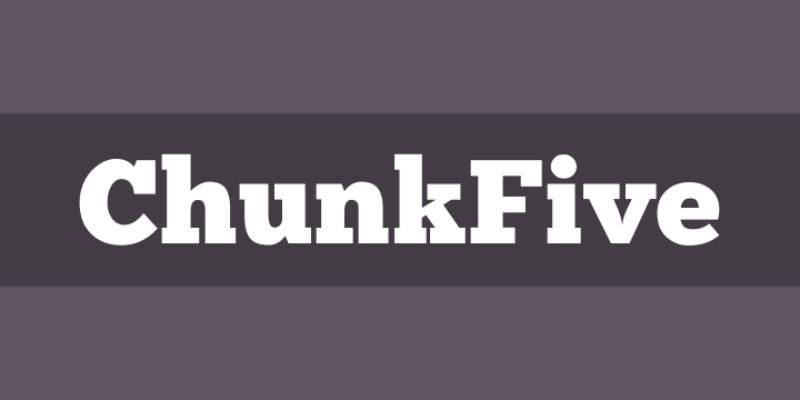
Heavy hitter alert! 🚨
Chunk Five is, well, chunky. It’s that bold statement piece you throw on and everyone’s like, “Whoa.” Great for headers when you wanna scream your message.
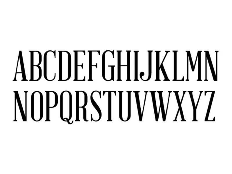
Feeling a bit historical? Abraham Lincoln is tall, slender, and has this vintage charm about it. Perfect if you’re going for a nostalgic look but still want to keep it fresh.
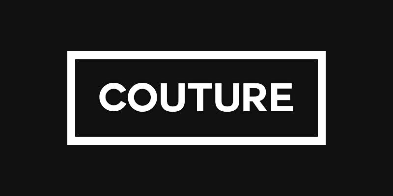
Now this, this is for when you wanna dress your text up. Couture is sharp, chic, and feels like it just walked off a high-end runway. Fashion-forward is its middle name.
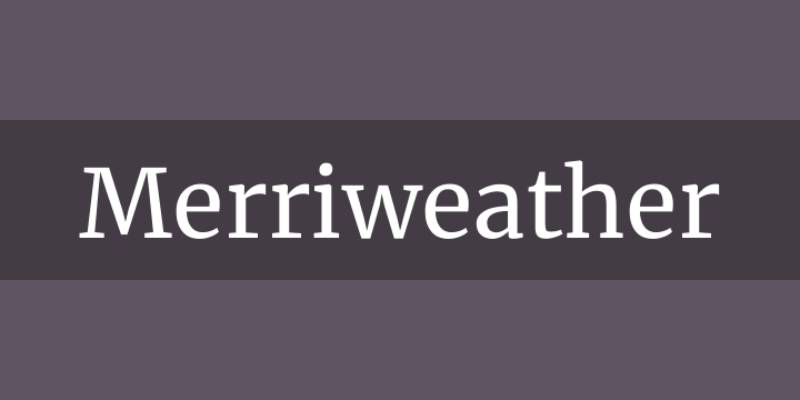
Ah, Merriweather. It’s like that comfy sweater you always reach for. Warm, welcoming, and a perfect fit for longer reads. It just feels… right.
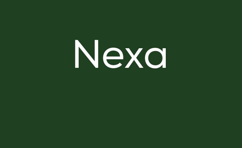
Remember that friend who’s always super put together? Nexa’s kind of like that. Streamlined, versatile, and always on point.
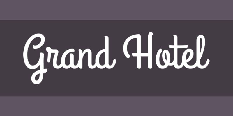
Grand Hotel sweeps you off to a bygone era. It’s curly, it’s fancy, and boy, does it know how to make an entrance.
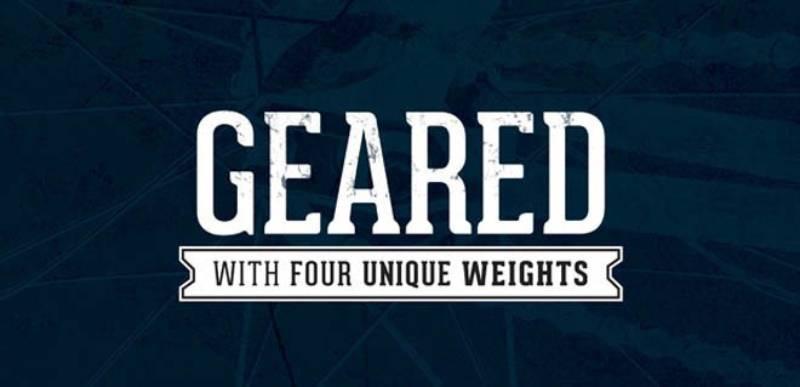
With an industrial touch, Geared is robust and ready to get down to business. But there’s also a hint of playfulness lurking in the background.
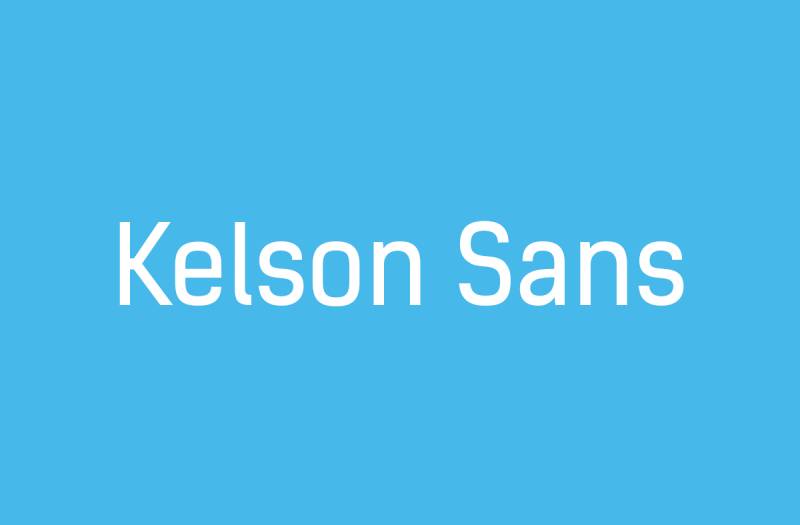
Super chill, yet undeniably professional. Kelson Sans is that dude who manages to look effortlessly cool in a plain white tee. Simple, but oh-so-effective.
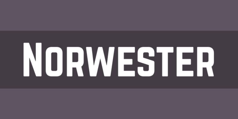
Mountains? Check. Campfires? Check. Norwester brings in those outdoorsy vibes. It’s bold, yet rustic. Makes you wanna plan an adventure.

Hello, future! SciFly feels like it’s from another galaxy. Sleek, smooth, and perfect for when you want to give your designs a futuristic twist.
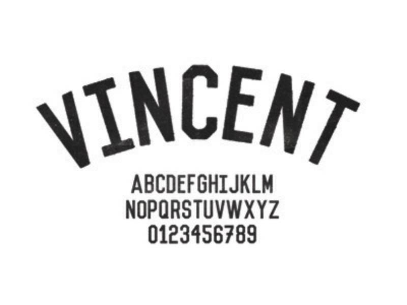
Moody? Mysterious? Enter Vincent. This font plays in the shadows, but when it steps into the light? Showstopper.
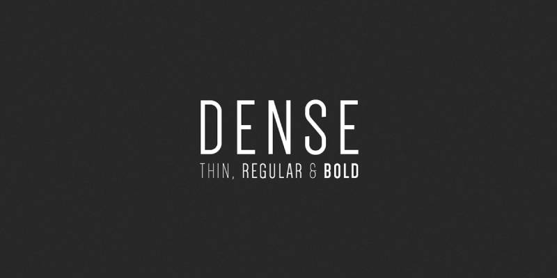
Compact and clean – that’s Dense for you. If you need to pack a punch in a small space, this font’s a no-brainer.
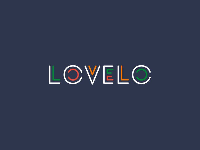
Circles, circles everywhere! Lovelo is bubbly and fun, kind of like that bubbly drink you can’t get enough of on a summer day.
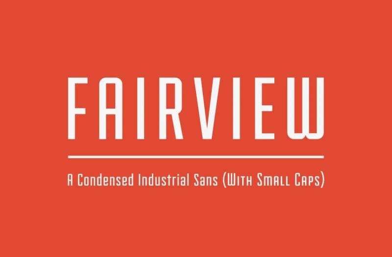
Art Deco vibes, anyone? Fairview takes you back, but not too far back. It’s retro with a modern spin. Slick!
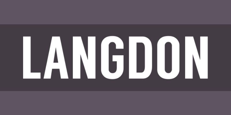
Last, but by no means least, Langdon. Strong, sturdy, and stands tall. A bit of old-school flair without feeling outdated.
The Art and Science Behind Typography Animation
The Aesthetics of Moving Text
Let’s get a tad artsy here. Ever watch those animations and think, “Damn, that’s smooth!”? Well, that smoothness? That’s by design. Every bounce, twist, and turn in typography animation is crafted to be aesthetically pleasing. We pick fonts, colors, and motions that vibe with the overall feel. We’re not just moving text around. We’re choreographing a performance. It’s art, right there on your screen.
Psychological Impact on Viewers
Here’s the science bit: our brains? They love motion. And there’s a reason web designers like me are all over typography animation. When text moves, your brain’s like, “Ooh, shiny!”, and you’re instantly hooked. It’s not manipulation; it’s psychology. The dynamic dance of letters taps into our innate curiosity, making messages stickier and more memorable.
The Role of Typography in Branding and Marketing
Hold up, it’s not all art and games. There’s some real business logic here. Ever notice how some brands have that distinctive style with their moving text? Yup, typography animation isn’t just for show; it’s branding gold. When you see text glide in a certain way or morph into a brand symbol, it’s like a visual signature. Companies know this, and they harness it. They embed their identity into the way their text moves, turning mere words into branded experiences. And as for marketing? An animated message can be the difference between scrolling past and stopping to engage. It’s that potent.
Popular Techniques and Their Applications
Morphing: Creating Motion and Emphasis
Imagine a word, just chilling, then suddenly it stretches, bends, and turns into something entirely new. That’s morphing for you. It’s all about transition and transformation. It’s like your text is putting on a show, changing costumes, and taking on different roles. This technique in typography animation is a real game-changer. It keeps viewers on their toes, anticipating the next shift.
Flickering Text: The Art of Selective Animation
Now, here’s a trick I’ve used more times than I’d like to admit. You want to grab attention? Make your text flicker. But not too much—just a tad. Like a candle in the wind. It’s subtle but oh-so-effective. It’s that eye-catching glitch, the heartbeat of the message, emphasizing certain parts while making others play second fiddle.
Hypnotizing Text: Capturing Viewer Attention
Ever get lost staring at those hypnotic circles? Well, text can do that too. Through loops, spins, and other rhythmic motions, text becomes entrancing. This typography animation technique is less about relaying a message and more about making viewers lose themselves in the visual spectacle.
Moving Text: Directional Emphasis and Meaning
Text can walk, run, jump, or even slide. Upward movement? Optimism. Downward? Maybe a touch of sadness. Sideways? A shift or change. It’s storytelling, minus the storyteller.
Drawing Text: The Artistry of Lettering
Drawing text is all about the reveal. Imagine watching a painter sketching, and as the strokes connect, words form. This technique celebrates the beauty of each letter, each curve, each line. Typography animation becomes a canvas, and every letter is a masterpiece being born.
Geometric Constructions: Modern and Techy Vibes
Shapes and text. Who knew they’d be BFFs? From circles to squares to hexagons, geometric designs paired with text scream modern and cutting-edge. It’s like the future, but now. And trust me, the tech vibe it brings? Next level.
Fluid Geometry: Urban Dynamism in Typography
Now, imagine those geometric shapes but make them liquid. Sounds wild, right? Fluid geometry merges structure with flow, bringing dynamism and spontaneity to typography animation. It’s urban, it’s fresh, it’s unpredictably mesmerizing.
Texture Constructions: Layered Artistic Effects
You can literally feel this one. It’s text with depth, layers, and textures. Think of it like text with a fabric—maybe denim, silk, or even rough stone. It’s tactile, even if you can’t touch it. Such techniques add a touch of reality to the digital realm.
Complex Morphing: Storytelling Through Symbols
Words turning into symbols and vice versa. It’s storytelling on steroids. It bridges the gap between abstract and concrete, turning typography animation into a visual narrative that’s complex yet so darn intriguing.
Graphic Animations: Integrating Illustrations and Text
When words meet art, magic happens. Text melds into illustrations, and suddenly, they’re one. It’s not just about reading; it’s about experiencing a world where words are alive, taking forms we recognize and resonate with.
Dynamic Montage: Creating a Storyline with Text
You’ve got a bunch of text snippets, right? Now, imagine them coming together, creating a storyline—a montage, if you will. It’s like watching snippets of a movie, but it’s all text, building up to a climactic message.
Neon Flickering: The Nightlife Appeal
Bring the nightlife to text. Neon lights, buzzing, and flickering. It’s the city vibes, the allure of the late hours, all captured in typography animation.
Dash Typography: Elegance in Simplicity
Dashes, breaks, pauses. They’re so simple yet add elegance. It’s text, but make it fashion. Minimalistic, sophisticated, and oh-so-chic.
Creative Letters: Surprising and Engaging Viewers
Each letter, a unique design, a creative burst. Forget the norm; this is about breaking the mold, letter by letter. It’s unpredictable, it’s fresh, it keeps viewers guessing.
Illustrated Letters: Visual Storytelling
Why just read when you can see? Letters morphing into mini illustrations, adding a visual dimension to the narrative. Typography animation meets visual storytelling, and it’s a match made in design heaven.
Scrabble Effect: Dynamic Message Creation
Words, building up like a game of Scrabble. Each letter finding its place, coming together to form words, sentences, messages. It’s playful; it’s dynamic. It makes viewers lean in, wanting to see the final message take shape.
Morphing Geometric Shapes: Enhancing Narratives
Shapes telling stories, transforming and evolving. Circles morphing into squares, triangles blending into hexagons. It’s geometry but with a narrative twist, enhancing the core message.
Static and Animated Letter Combinations: Focused Messaging
Some letters move; some don’t. It’s like a dance where some dancers freeze while others whirl around them. It focuses attention, creating a contrast that highlights the core message.
Accelerated Typography: Quick Visual Stories
Fast-paced text, zooming in and out, racing against time. It’s about urgency, about capturing moments in split seconds. It’s a visual adrenaline rush.
Emotion-filled Animated Letters: Conveying Feelings
Letters that laugh, cry, shout, or whisper. Emotions captured in the way they move, the way they interact. Typography animation that touches the heart, making viewers feel the message.
DIY: Creating Your Own Kinetic Typography
Tools and Platforms: An Overview
So, before you start dancing with your words, you’re gonna need the right tunes. And by tunes, I mean tools.
- Online Platforms: Sites like Canva or Biteable.
- Dedicated Software: Think of Adobe After Effects or Apple Motion. These bad boys give you more control. A bit of a learning curve, but totally worth it.
- Mobile Apps: On the go? There’s an app for that. Legend and Quik can get your text grooving right from your phone.
The best part? There’s a ton of tutorials out there. Whether you’re a newbie or looking to level up, there’s always a YouTube tutorial or a forum waiting to be your fairy godmother.
Step-by-Step Guide to Creating Typography Animations
Alright, fam. Ready to get your hands dirty? Let’s break it down, step by step.
Choosing the Right Background
It’s all about setting the vibe. Think of it as picking the perfect wallpaper for your room. Whether it’s a static color, a gradient, or even a video clip—your background sets the tone. So, whether you’re going for moody blues or fiery reds, make sure it complements your text.
Adding and Styling Text
Next up, the star of the show: your text. Add it in. Choose that font that speaks to you. Maybe something bold? Or perhaps, something cursive and whimsical. Size it, position it, give it some space to breathe.
Animating Text: From Basic to Advanced Techniques
Now, here’s where the magic happens. You ready?
- Fade-ins and Fade-outs: Basic but effective. Like a ghostly appearance, it’s smooth and classy.
- Swings and Bounces: Give it some energy! Perfect for something upbeat.
- 3D Rotations: Add some depth, literally. It’s like your text is reaching out.
As you get comfortable, experiment with combinations. The sky’s the limit, really.
Previewing and Adjusting Animations
Once you’ve got the moves down, it’s rewind time. Play it back. Does it flow? Is it too fast? Too slow? Adjust the speed, tweak the movements, and make sure it’s just right. You know, like that perfect cup of coffee in the morning.
Exporting and Sharing Your Animated Typography
Done? Nah, we’re just getting started. Save it, export it. MP4, GIF, you name it. And then? Show it off. Social media, your website, maybe even on a big screen downtown. Let the world see your typography animation masterpiece.
FAQ about typography animation
What’s typography animation?
Oh, dude! It’s like when you see those moving, groovy texts in videos and websites. Typography animation is the art of bringing text to life, making it move, bounce, slide, or even morph. It’s like giving words their own dance moves. Super cool, right?
Does it work on all devices?
Oh, good question! Mostly, yes. But like all things web and tech, it’s best to test things out. Some older devices or browsers might struggle a bit, but most modern tech should handle it just fine. Still, always double-check, especially if it’s for a big project.
What’s trending in typography animation?
Oh man, it changes like the wind! But lately, I’ve been seeing a lot of fluid motions, morphing text, and 3D effects. Retro vibes, too. Think 80s neon and all. But you do you. Follow the trend, or set your own!
How do I make it accessible?
Props for thinking of that! Accessibility is key. Make sure to have a readable contrast, avoid super-fast flashes (can trigger seizures), and provide alternative content for those who can’t view animations. It’s about being inclusive, buddy.
Can it slow down my website?
Yeah, it can. Animated typography elements can be heavy, especially if not optimized. CSS only text animation should be light on the loading time. Keep an eye on file sizes and test your site’s speed. Nobody likes a snail-paced website, right?
Conclusion
Alright, let’s bring this beast home. We’ve dug deep into the world of kinetic typography and, honestly, it’s kind of wild how much there is to it. Words moving, dancing, and even telling stories.
I’ve been in the game for a while now, and things evolve faster than a meme on Twitter. But when it comes to typography animation, here’s what’s brewing:
- Virtual Reality & Augmented Reality: Imagine it – you wear those fancy glasses and words fly around you, react to you, maybe even play hide and seek with you. Trippy, right? It’s coming.
- Personalized Animations: Think of ads that are tailor-made for you, with typography animations that use your name and react based on your preferences. It’s like they know you. Well, they kinda do.
- 3D is the New 2D: Flat is cool. But three-dimensional typography animations? They’re the next level. Expect more depth, shadows, and maybe even words you feel like you can touch.
- Interactive Typography: Interactive websites are already here. But get ready for typography that responds to your mouse, voice, or even emotions. In my view, the websites that would work great with animated typography would be film maker websites. If you combine the website interactivity with a good video montage, the site will be a killer.
- Sustainability & Typography: Sounds odd, right? But with digital art becoming more physical (like NFTs), expect some typography animations to have eco-friendliness baked in. Maybe a digital artwork that plants a tree?
Typography animation isn’t just for websites or ads. Its magic is seeping into other domains too.
- Education: Kids these days, right? Hand them a static book and they’re bored. But what about interactive typography animations that teach as they move? Schools are catching on.
- Entertainment: Ever noticed those movie titles that kinda move? Or that music video with the crazy text effects? It’s more than a trend; it’s the norm now.
- E-commerce: Online shopping is cool. But imagine reading a product description that’s not just static text but a typography animation that shows you, in real-time, what you’re about to buy. Hook, line, and sinker.
- Public Spaces: Digital billboards, train stations, even the local coffee shop might have some typography animation going on. It grabs attention. It’s memorable. And it’s everywhere.
About the Author

Bogdan Sandu
Bogdan is a designer and editor at DesignYourWay. He's reading design books the same way a hamster eats carrots, and talks all the time about trends, best practices and design principles.