![]()
Founded in 1948, the National Youth Orchestra is an institution in the UK with generations of musicians who have learned to practice their craft there. Currently, there are 160 teenagers in the orchestra and many more in the NYO Open program.
In order to keep the flame alive and attract new talent, the Orchestra reached out to SomeOne, an international design agency based in London and Sydney. Beyond a simple logo design and visual identity creation, the organization and the agency went for a full rebranding that goes with a new strategy for communication. As part of the strategy, the slogan “Play your part” becomes the new motto.
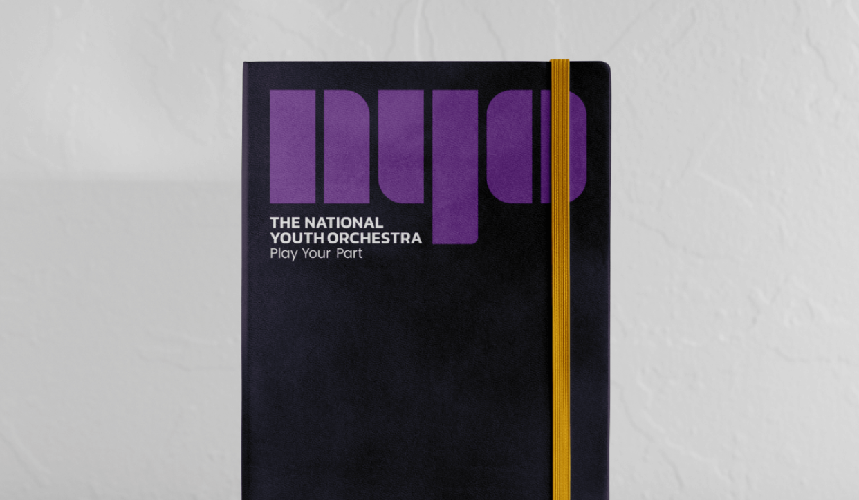
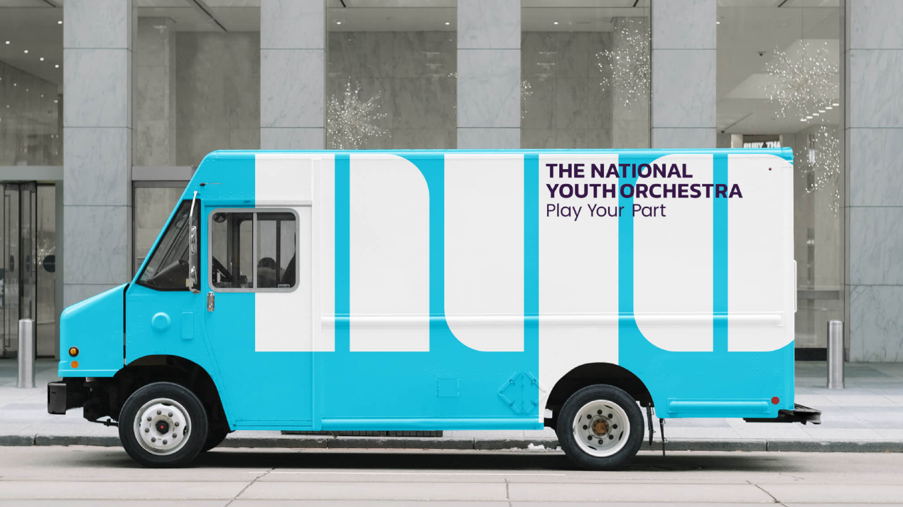
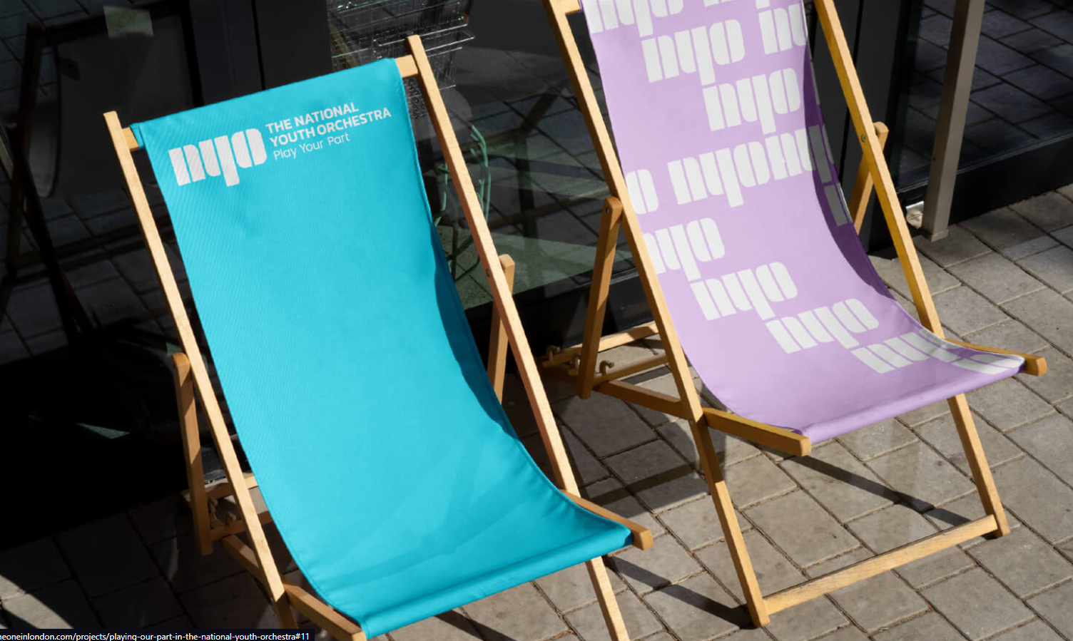
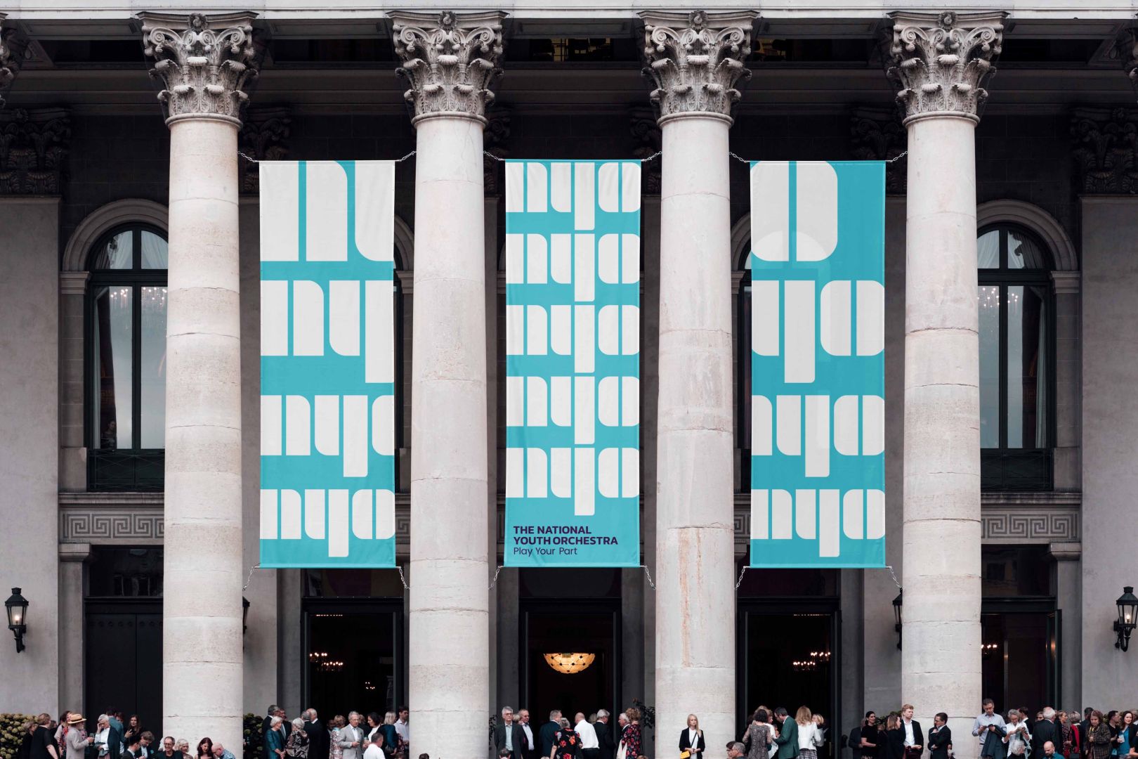
Design-wise, the logo spells out NYO with a custom font that’s difficult to read, but most of the time goes along with the full text “The National Youth Orchestra”. Instead of a more boring color scheme, the agency opted for a color system that goes with photographic guides and typographic palettes. One of the self-confessed goals was to avoid clichés of branding aimed at youth audiences, which was achieved with success. The branding works particularly well when repeated or animated, as it give a very musical vibe with the rhythm it creates.
About the Author

Mirko Humbert
Mirko Humbert is the editor-in-chief and main author of Designer Daily and Typography Daily. He is also a graphic designer and the founder of WP Expert.