Imagine an art gallery. The paintings, the sculptures, the installations – everything tells a story, right? But what if all the art pieces were placed haphazardly without any order or sense of importance?
You’d get confused, wouldn’t you?
This is where the concept of hierarchy swoops in, establishing order and guiding our eyes.
Now, let’s take this concept and apply it to typography. We enter the realm of font hierarchy.
The Role of Fonts in Communication
Fonts. They’re not just pretty faces. They’re the unsung heroes of communication, adding depth, emotion, and clarity to our messages. It’s like they have their own secret language. A curly, elegant script font might whisper elegance and sophistication, while a bold, all-caps sans-serif font could shout strength and modernity.
Let’s dive a little deeper and explore the psychology of fonts. Every font carries a certain mood, a vibe. You wouldn’t use Comic Sans for a legal document, right? Or Papyrus for a tech startup‘s logo? That’s because we’ve all (consciously or subconsciously) agreed on what these fonts represent in our collective minds.
Elements of Typography
Alright, so before we delve into font hierarchy, let’s get our basics straight. First up, typeface vs. font.
Typeface refers to the overall design of the letter shapes, the artistic expression. Think of it as a song. On the other hand, font is the digital file that allows you to use that typeface. It’s like an MP3 file of that song.
Let’s also quickly touch upon the anatomy of a font. Here are some terms you should know:
- Baseline: The line where the letters sit.
- Cap-height and x-height: The heights of the capital letters and lowercase letters, respectively.
- Kerning: The space between individual letters.
Got it? Great! Now let’s move on to the juicy stuff.
The Concept of Hierarchy in Design
Hierarchy. It’s a big deal in design. It’s like a visual guide, showing your eyes where to go and in what order. It tells you what’s most important, what’s secondary, and what’s just extra info. Without it, you’d be lost in a sea of text.
In comes font hierarchy, the typography equivalent of your friendly neighborhood tour guide.
Introduction to Font Hierarchy
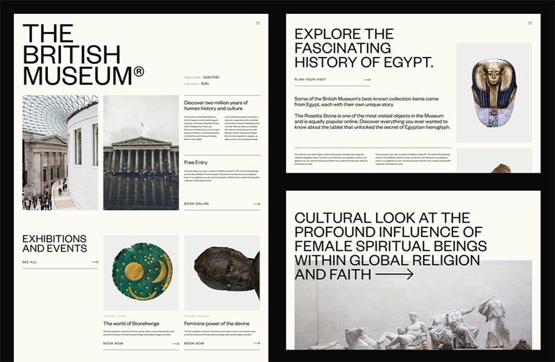
Font hierarchy, in simple terms, is the use of different fonts, sizes, and styles to create order and visual interest. It’s like a map for your content, guiding your reader’s eye from point A to point B and so on.
Levels of Font Hierarchy
There are typically three levels of font hierarchy: primary, secondary, and tertiary.
- Primary: This is the big stuff, the main headline or title. It’s the largest and most noticeable text.
- Secondary: A bit smaller, but still pretty important. Subheadings and quotes usually fall into this category.
- Tertiary: The smallest level, usually body text or captions.
Think of it as a family reunion. The primary text is your loud Aunt Linda who commands everyone’s attention, the secondary text is your cool cousin who always has interesting stories, and the tertiary text is the rest of your family members who fill in the rest of the conversation.
Creating Font Hierarchy: Size
Size is a straightforward and effective way to create font hierarchy.
The bigger the text, the more attention it garners, right?
But here’s the catch – don’t just randomly increase font sizes. It needs a strategy, a pattern.
For instance, your headlines (primary) should be the largest, followed by sub-headings (secondary), and then the body text (tertiary).
Creating Font Hierarchy: Weight
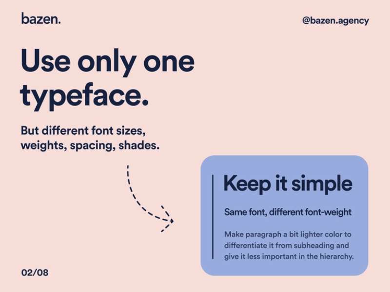
Weight is all about how thick or thin your font is. Bold fonts demand attention, while lighter fonts recede into the background.
So, use bold weights for your primary or secondary text and lighter weights for your tertiary text. This contrast in weight can create a clear and visually appealing hierarchy.
Creating Font Hierarchy: Color
Ever noticed how your eyes are drawn to bright colors? That’s because color is a powerful tool in creating hierarchy.
Darker colors or contrasting colors can make certain texts stand out, while lighter or similar colors can make other texts blend in more. But remember, it’s crucial to maintain good color contrast for readability.
Creating Font Hierarchy: Spacing

Spacing is like the invisible hand that subtly guides your reader’s eye. More space around a text can make it stand out, while less space can make it blend in.
So, increase the spacing around your primary and secondary text, and keep the spacing tighter for your tertiary text.
Creating Font Hierarchy: Typefaces
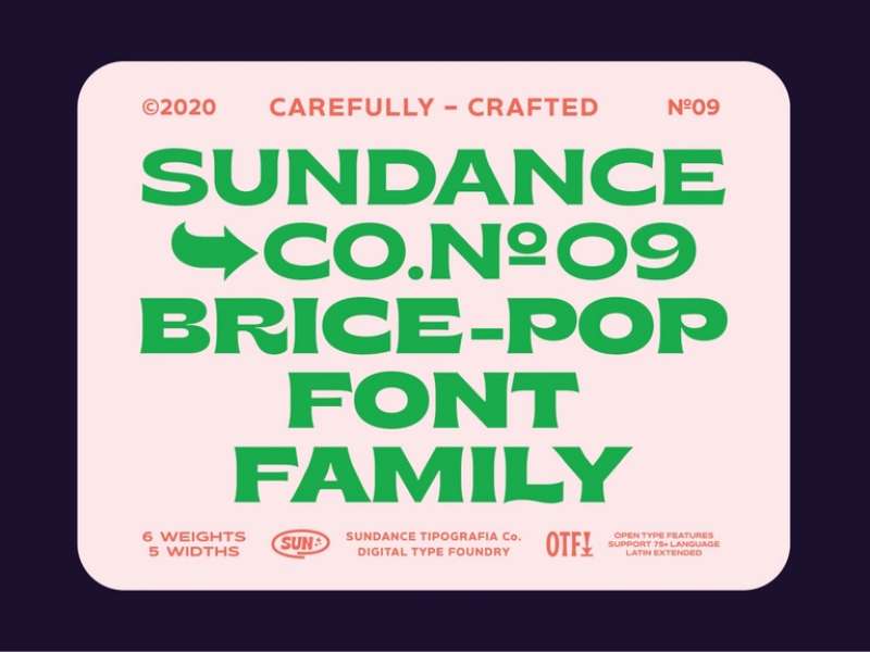
Using different typefaces can also create hierarchy.
For instance, you could use a bold, eye-catching typeface for your headlines, a less dramatic but still interesting typeface for your subheadings, and a simple, easy-to-read typeface for your body text. That would be a serious font combination, but you could just stick to two fonts, if you’d like to keep things basic.
Common Mistakes in Font Hierarchy
Okay, let’s talk about some common pitfalls in font hierarchy.
One big no-no is overcomplicating the hierarchy. Too many different fonts, sizes, and styles can make your design look chaotic and confusing. Stick to a few key variations and apply them consistently.
Another mistake is inconsistent use of fonts. If you use a certain font for all your subheadings, stick to it. Changing fonts randomly can break the flow and confuse your reader.
Lastly, always consider the context in your font selection. A fun, quirky font might work great for a children’s book, but not so much for a corporate report.
Font Hierarchy in Different Design Contexts
Font hierarchy isn’t a one-size-fits-all deal. It needs to be adapted based on the design context.
For instance, in print design, you have to consider factors like the size of the page, the quality of the paper, and how the colors will appear when printed.
In digital design, on the other hand, you have to consider screen size, resolution, and how the design will look on different devices.
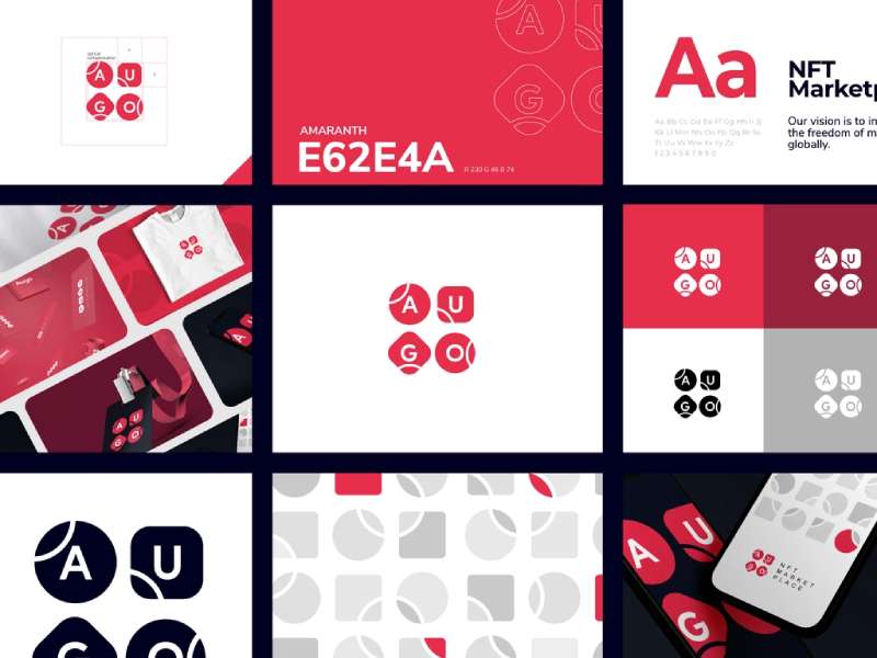
And when it comes to logo design, you need to create a hierarchy that works well in a compact space and can be easily recognized even at smaller sizes.
Case Studies of Effective Font Hierarchy
Let’s look at some real-world examples to see font hierarchy in action.
Take The New York Times, for instance. The newspaper uses a large, bold serif font for its main headlines, a smaller but still bold sans-serif font for its subheadings, and a smaller, regular serif font for its body text. This clear hierarchy guides the reader’s eye and makes the content easy to digest.
Apple Inc., on the other hand, uses a minimalist approach. It often uses a large, bold sans-serif font for its headings and a smaller, regular sans-serif font for its body text, creating a clean and modern look.
Tools and Resources for Creating Font Hierarchy
There are plenty of tools and resources out there to help you master font hierarchy.
Help you master font hierarchy, huh? There are typography tools like Adobe Fonts or Google Fonts, where you can explore and experiment with thousands of different fonts.
Want to learn more about the ins and outs of typography? Websites like Typewolf or Canva Design School offer plenty of guides and tutorials.
The Relationship Between Font Hierarchy and Accessibility
Font hierarchy isn’t just about looking pretty – it’s also about being accessible. A clear hierarchy makes your content easier to read and understand, which is especially important for people with visual impairments or reading difficulties.
Moreover, there are accessibility guidelines and laws (like the ADA or WCAG) that require certain standards of readability, and a good font hierarchy can help meet these standards.
The Importance of Testing in Font Hierarchy
You’ve created a great font hierarchy. But how do you know it’s really working? Test it!
A/B testing, where you present two different versions to see which one performs better, can be a great way to refine your hierarchy.
Also, don’t forget to gather feedback. Ask others what they think, and be open to making changes based on their input.
The Role of Font Hierarchy in Branding
Font hierarchy plays a critical role in branding. It can help make your brand more recognizable and memorable.
Take Google, for example. Its use of a simple, bold sans-serif font for its logo and a smaller, regular sans-serif font for its search results creates a clean and consistent look that’s instantly recognizable.
Coca-Cola, on the other hand, uses a unique, script font for its logo and a simple, regular sans-serif font for its other text, creating a distinct and memorable brand identity.
The Impact of Cultural and Regional Factors on Font Hierarchy
Font hierarchy isn’t just about the design – it’s also about the audience. Different cultures and regions have different typographic traditions and preferences.
Arabic typography, for instance, has a rich history of calligraphy and tends to favor more ornate and flowing fonts. East Asian typography, on the other hand, often uses square, grid-based characters and has a different set of principles for creating hierarchy.
So, always consider your audience’s cultural and regional context when creating your font hierarchy.
Conclusion: Mastering the Art of Font Hierarchy
And there you have it – a deep dive into the world of font hierarchy. From the psychology of fonts to the intricacies of size, weight, color, spacing, and typefaces, it’s a fascinating and complex world.
But the most important takeaway? Font hierarchy is more than just a design technique – it’s a way of guiding your reader, telling a story, and creating an experience.
So, keep exploring, keep experimenting, and keep pushing the boundaries of what’s possible with font hierarchy. The future of design is exciting, and font hierarchy is a big part of it.
Remember, as with any art form, mastering font hierarchy takes time and practice. So don’t be afraid to make mistakes and learn from them. That’s how you grow as a designer.
And finally, always keep your audience in mind. After all, design is about communication, and your font hierarchy is a key part of that conversation.
About the Author

Mirko Humbert
Mirko Humbert is the editor-in-chief and main author of Designer Daily and Typography Daily. He is also a graphic designer and the founder of WP Expert.