10 eCommerce Website Design Mistakes You Should Avoid
One can’t afford to have anything less than an impeccable online presence in the digital age. Business success depends on it, as customers expect it – especially from the competitive industry of eCommerce.
Many factors make up an effective website; Search Engine Optimisation (SEO), a robust content strategy, web design, etc. Many such factors also overlap; poor web design can hamper SEO.
Each one would require its own series of articles to cover thoroughly. So would their overlapping and the wealth of ways they can go wrong.
So, here we may start with web design, a fundamental element that eCommerce increasingly relies on. First, we’ll cover what web design should achieve, and then we’ll explore ten eCommerce website design mistakes you should avoid.
Without further ado, then, let’s begin.
Table of Contents
Website design’s benefits across the customer journey
As an introduction, we should highlight the benefits of web design throughout the customer journey. Statistics find that eCommerce is thriving post-pandemic, and web design plays a crucial role.
To explore this role, we may first use SEMrush’s visualisation of the customer journey:

With this breakdown of its phases in mind, we may consolidate them down to the following three.
#1 Lead generation and acquisition
First, every journey begins with lead generation and acquisition, the discovery and consideration phases, respectively. Here, website design informs first impressions and either convinces customers to stay or drives them away.
A well-designed landing page will capture a lead, while a poor one will not. Poor website design will drive away potential leads, failing to nudge them along your sales funnel.
Moreover, SEO minds those user engagement signals. The fewer customers you satisfy immediately, the worse your website will rank in search engine results pages (SERPs). In turn, fewer new customers will discover you organically.
#2 Conversion
Then, if you entice new customers, great eCommerce website design mistakes can cause poor conversion rates. Of course, this will directly impact your bottom line – which is why Conversion Rate Optimisation (CRO) offers such immense value.
In brief, fluid and functional web design will directly enhance your conversion rates. SEO benefits aside, it will capture the eye, inspire trust, and ease navigation toward those coveted conversions.
All conversion rate improvements also ease the strain on your customer acquisition efforts. The more of your existing leads you can successfully convert, the fewer brand new ones you will need to acquire.
#3 Retention and advocacy
Finally, engaged customers generate more revenue than new ones on average and cost less to retain. Shopify quantifies both as follows:
- “It can cost five times more to acquire a new customer than retain an existing customer”.
- “[You] have about a 60%–70% chance of selling to an existing customer, while you have about a 20% chance of selling to a new user”.
Here, too, web design plays a crucial role. Trust, customer support, and personalisation offer just three examples of its facilitating retention-minded user experience (UX) elements.
The goals of excellent eCommerce website design
With those factors in mind, let us next outline which goals web design should aspire to meet. To do so, let us cite GoodFirms on which factors drive visitors away:

You may already extrapolate eCommerce website design mistakes from this – but wait. To pinpoint what it shouldn’t do, first, we must outline what it should do.
#1 A fast and responsive experience
First, initial impressions truly matter. 2006 research found you have only 50 milliseconds to impress with your content, and customers have only become more demanding since.
But even before reaching that stage comes loading; online audiences truly hate waiting.
As we’ll cover next, slow and sluggish websites drive customers away as few other factors do.
So before all else, excellent web design should ensure a fast and responsive experience. All other optimisations must rely on this one, or your customers won’t even get to see them.
#2 Visual appeal and hierarchy
Then, once your visitors stay, your design should entice them to enter the consideration phase.
Here, a sleek, modern, and professional-looking design will catch the eye and inspire trust. As it does, design consistency and a clear hierarchy across your content will let your website facilitate customer journeys.
Notably, eCommerce websites require deeper navigation than typical websites do – so these two elements boast even more value for them.
#3 Clarity and ease of use
Finally, customers will have to spend quite some time on your website on navigation. Filling up a shopping cart does take time.
However, they do value their time, so your design should offer an excellent UX for them to invest in it.
Indeed, ease of navigation ranks 3rd among the reasons visitors leave. Thus, your design should facilitate quick, frictionless shopping experiences to avoid bounces and cart abandonments.
The greatest eCommerce website design mistakes you should avoid
With all that said, how wrong can eCommerce web design go?
Very wrong.
Here are the ten most common mistakes you should steer clear of, in no particular order.
#1 Slow loading speeds
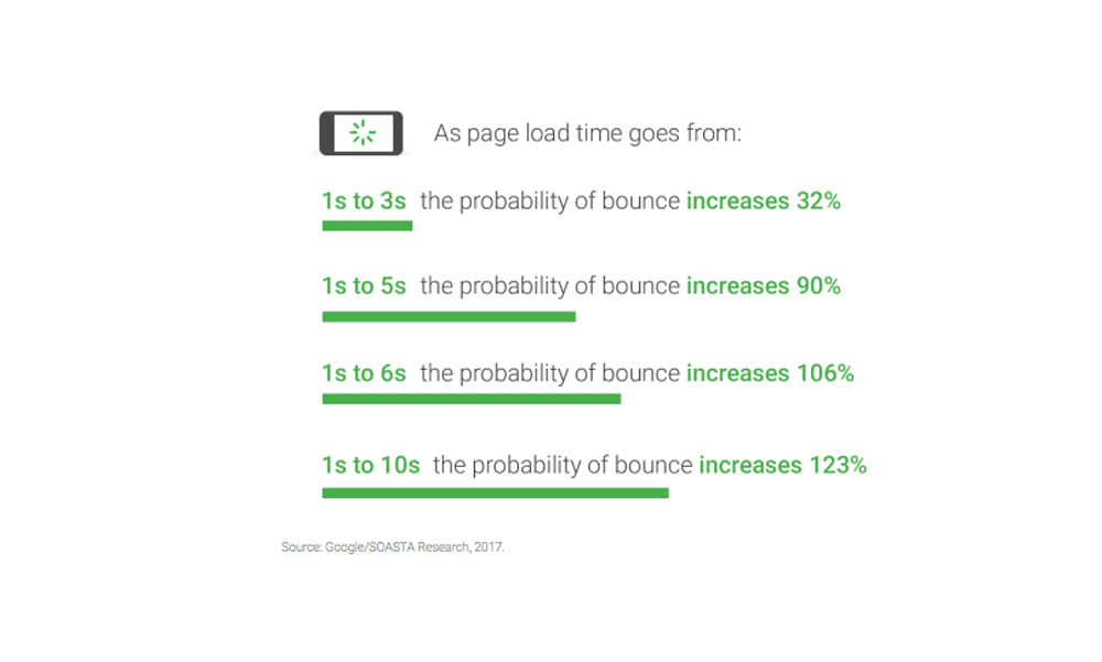
First and foremost, customers hate waiting. If GoodFirms’s survey above didn’t convince you, Google itself corroborates this:

Here, insistence on style and visual appeal over function typically causes this mistake. In pursuit of the former, web admins may forget the latter – and drive away more customers than they attract.
To address this mistake early, you may consider the following fundamental practices:
- Optimise images. Keep your image file sizes at 100kB or less with as few quality compromises as possible.
- Cull needlessly heavy themes and plugins. Weigh the benefits of any assets that slow your website down against their performance impact; function over style.
- Clean up your code. Minimising requests will help tremendously with loading speeds, as might JavaScript minifications where possible.
If these don’t suffice, you may also examine your hosting provider options. Alternatively, if your customer base requires it, you may also consider investing in a Content Delivery Network (CDN).
#2 A confusing site structure
Next, confusing site structures are among the most serious eCommerce website design mistakes one can make. As we’ve covered above, a labyrinthine website rarely inspires customers to stick around.
On the other hand, a logical site structure lets visitors navigate the content more efficiently, increasing the likelihood of a conversion. At the same time, it enhances SEO by allowing Google to index all pages and distribute authority among them.
Writing on the subject of eCommerce SEO, Backlinko offers the following illustration of a proper eCommerce site structure:

Of course, that’s only the foundation. You may then please your potential customers further by:
- Offering breadcrumbs. Customers may change their minds, and offering them breadcrumbs will assist their navigation whenever they do. Path-based ones typically work best, but you may also consider location-based or attribute-based ones.
- Having your URLs reflect your site structure. Similarly, your URLs should at all times reflect your internal structure. Doing so will give your customers more clarity and make shared links to specific pages more readable.
- Refining your search filters. Finally, search filters are pivotal to easy navigation. With enough polish, they may even obscure structure shortcomings.
It would help if you naturally strived to avoid structural shortcomings, but one can’t overstate the value of search filters.
#3 A desktop-only design
Still, we may cover desktop-only designs on fundamental eCommerce website design mistakes. When more and more customers shop on mobile devices and mobile traffic consistently surpasses desktop traffic, it’s fundamental.
What’s more, eCommerce traditionally struggles with cart abandonment rates – as we’ll cover below. In this regard, too, mobile users need your attention, as Baymard Institute finds:

Finally, SEO values mobile-friendliness highly too, and so does Google’s Page Experience evaluation. In brief, you can’t afford to neglect it.
To ensure mobile-friendliness, you may:
- Prioritise loading speeds. It is a precious practice; mobile users mind loading speeds even more than desktop users.
- Account for less screen real estate. Mobile screens are more restricted, so your design should account for that – from drop-down menus and filters to images and buttons.
- Adopt a mobile-first design philosophy. Designing for mobile devices first typically benefits desktop users, as it mandates simplicity and clarity.
Remember to review your website on a mobile device in all cases. If you have a hard time with it, so will your customers.
#4 Unclear costs
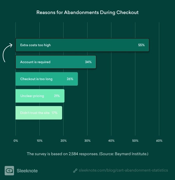
Having mentioned cart abandonments, we may briefly focus on that ever-present eCommerce challenge. Which elements cause customers to abandon their carts?
Visualising Baymard Institute’s findings, Sleeknote explains – “extra costs” rank first by far:

Of course, extra costs don’t just cause cart abandonments; they also diminish customer trust and hamper retention. And yes, eCommerce website design mistakes can bring this issue about more often.
To address this, you may:
- Highlight any additional costs as clearly as possible. The earlier during the checkout process you can do so, the better.
- Use a shipping rates widget. Such widgets on your cart page can warn your customers early and save them some frustration.
- Update shipping costs in real-time. Within the cart page will also help with transparency, and many eCommerce platforms offer this functionality.
Of course, offering free shipping or reducing your free shipping threshold will also help immensely with this issue. However, you will have to decide if this makes business sense.
#5 A lengthy checkout process
Curiously, “checkout is too long” ranked 3rd in the above survey on cart abandonment reasons. But perhaps this will make more sense if you consider that requiring an account, which ranked 2nd, describes the same problem.
Indeed, Shopify places them under the same umbrella; they both prevent a “friction-free checkout experience”.
So, to shorten your checkout process in the eyes of customers, you may first add a visual progress bar:

This, of course, only addresses their perception, not actual eCommerce website design mistakes. So then you may:
- Allow for product purchases without an account. You may prompt customers to sign up for future convenience, acquiring great leads.
- Limit input fields. Ask only for vital customer information; you may acquire more through different means post-checkout.
- Limit pages. As you do, trim the number of pages from the first click to check out down to the bare essentials.
Exact execution will depend on your business and audiences, but the principle should always be to reduce friction from the product to sale.
#6 A lack of trust signals
Finally, as regards Sleeknote’s above illustration, trustworthiness ranked 5th. But trust signals still offer plenty of value, and your design can facilitate them in many ways.
To illustrate this, consider the following types of trust signals:
- Your “About Us” page. The page introduces your business to new customers, from history and mission to contact information. Your homepage design should promote this page clearly and other appropriate pages.
- Security and accreditations. From your BBB accreditation to security seals, customers value secure shopping experiences highly. Consider where you place such signals and how your design frames them.
- Social proof. Finally, product reviews play a fundamental role in inspiring customer trust. Nine out of ten customers read reviews, and 79% trust reviews as much as personal recommendations.
For a great visual example of leveraging reviews effectively, eCommerce juggernauts like eBay and Amazon aside, we may cite Fabletics:

#7 Lacking customer support
Similarly, not presenting clear customer support offerings is common among eCommerce website design mistakes. After all, customer trust often hinges on immediately visible customer support options – and your willingness to provide them.
Customers often have numerous questions, and answering them swiftly can prevent changes of heart while solidifying trust. In this sense, support must extend beyond the product post-purchase phase and across the entire journey.
To do so, you may leverage chatbots and offer live chat options across valuable pages. They did use to be much less effective in years past, but statistics today paint a much more promising picture:

Return on Investment (ROI) will naturally vary, but eCommerce does leverage chatbots quite effectively – as the numbers show.
#8 Misplaced or inadequate Calls to Action
Next, underused, misused, and ineffective Calls to Action (CTAs) are a prevalent issue for many websites, eCommerce or otherwise. They are a central part of CRO and serve as the most crucial conversion factor.
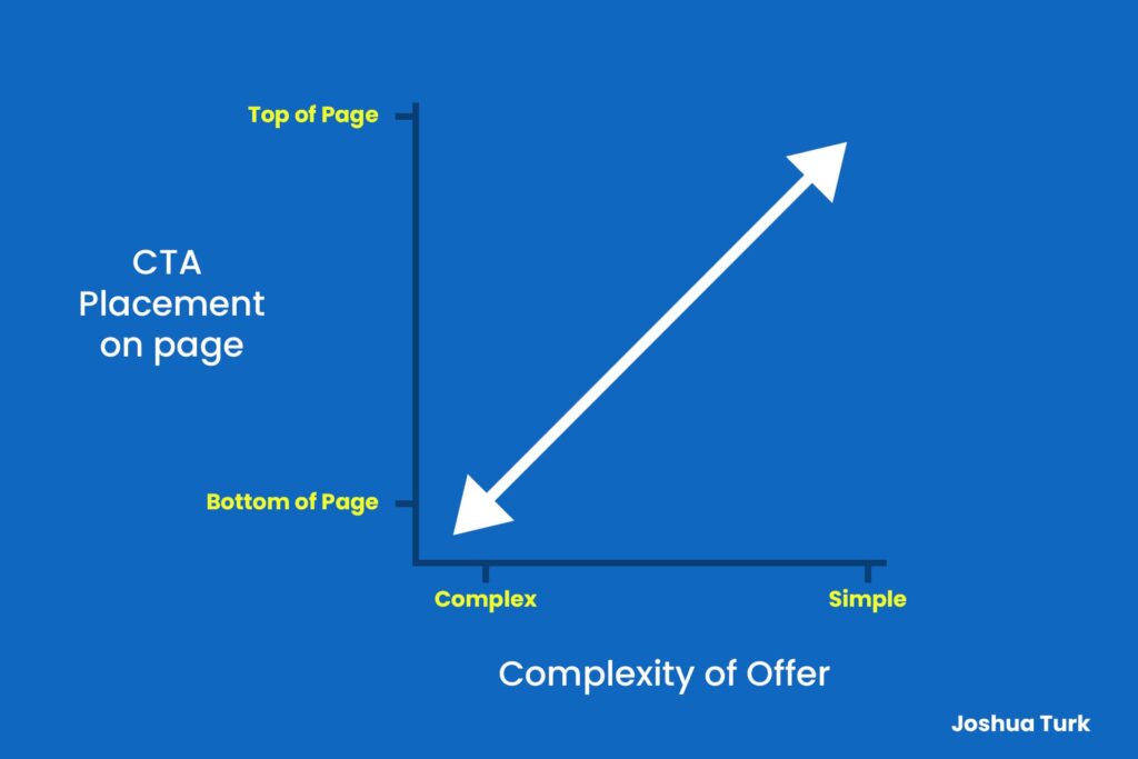
Here, we may initially outline the common placement factor regarding page height.
Most CTAs do belong as close to the top of pages as possible, but Joshua Turn rightly argues that placement should correlate with offer complexity:

But that aside, consider the following CTA-related eCommerce website design mistakes:
- Too many CTAs. An abundance of CTAs on a given page will often confuse visitors and distract them from your intended path. Limit them to the bare essentials, if not down to one per page.
- Obscured CTAs. Similarly, placing CTAs next to other visual elements will often obscure them. Make sure yours contrast with background colours, look clickable, and catch the eye quickly.
- Unclear CTAs. Finally, copy-wise, make sure your CTAs represent your offer’s value as clearly as possible. Visitors won’t click them if they don’t immediately understand what they can expect or how much value they will get.
CTAs should also have the full attention of all A/B tests you do over time.
#9 Too many irrelevant popups, too soon
Despite your best efforts, quite a few customers will slip through. You may attempt to court those with popups correctly, but one can easily overdo it.
Despite their reputation, popups do offer demonstrable value. Sumo’s extensive research confirms this and warns about using them correctly.
The first advice they give, which many marketers of all industries get wrong, is time. Popups must emerge at least 8 seconds in, if not precisely when the user intends to leave.
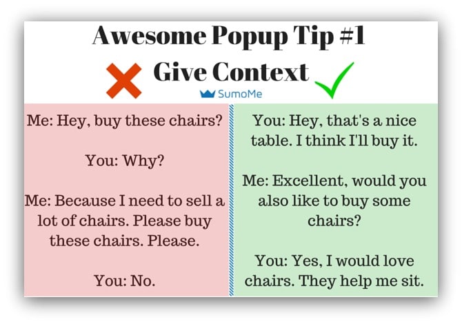
They illustrate this factor brilliantly as follows:

The second among eCommerce website design mistakes is simply abundance. Continuing on the topic above, who would remain eager to shop at a store that constantly annoys them?
Arguably, very few people would.
Third, popup copy and timing matter immensely. The difference between a helpful popup and an annoying one often lies in contextual value, as Sumo explains:

So, remember quality over quantity. Present your customers with relevant, helpful, well-timed popups; if ever, bombarding them with “salesy” ones will rarely work.
#10 Not enough focus on retention and referrals
Finally, if you convert a visitor successfully, you should strive to retain them. One can’t overstress the value of customer retention, as Shopify’s statistics on point #3 illustrated.
To briefly recap, retaining existing customers costs much less than acquiring new ones. Existing customers place larger product orders and are more likely to make purchases, to begin with.
As for referrals, referred customers are more engaged – as personal recommendations are excellent trust signals.
You may typically implement loyalty programs and offer discounts and other perks for referrals to focus on them.
These strategies do work very well but need a proper design to shine.
Ideally, your outreach should look like FriendBuy’s:

Don’t copy them to the letter, of course, but do try to avoid common eCommerce website design mistakes by:
- Keep your offer clear. You’re asking for loyalty or advocacy, so keep your copy as straightforward as possible to inspire trust. Highlight your offer’s value, with no jargon and long-winded explanations in the way.
- Framing it with bright visuals. Tap into your insights to see what resonates with your audiences, and use visuals to attract their attention. If you can use direct taglines like “be a good friend”.
- Remaining brief. Simplicity in copy is always crucial, and such outreach is no exception. Make your audiences have to read as little as possible to decipher what you’re asking of them.
Finally, remember to adjust your tone and design choices to your audiences. There is no one-size-fits-all in such matters, and your insights always know best.
Conclusion
To summarise, there are ample ways in which website design can help your business thrive. A successful website can inspire trust, achieve more conversions, reduce cart abandonment rates, and more if done correctly.
In contrast, poor web design can genuinely hamper your website. From bouncing right away to leaving in frustration, poor performance may lie one design mistake away.
Of course, we couldn’t cover all eCommerce website design mistakes to avoid here; there are too many of them. But hopefully, this overview of the most substantive ones will help you avoid the worst offenders.
