The Ultimate Guide to Font Pairing: Everything You Need to Know
As a designer, you are undoubtedly familiar with the importance of fonts and why one should be cautious while using them in the content.
There was a time when we had limited options to choose from, but today, the font choices have become vast, so we can easily find the required option. Choosing the best font for your site is one thing but making an ideal font pairing is another.
Designing a website takes much consideration so that the results are up to the mark. Among all the elements, the most crucial part is choosing the font pairing wisely, so you don't disappoint the reader. You might have seen websites with poor font selections that instantly turned you off. Hence, never take this factor for granted.
If you are about to develop a website and are confused about how to pair fonts or what is the key to making perfect font pairing, this article is the ultimate help for you. We will discuss a few best font pairings that will give you a clear idea of how you can do it in a better way. Let's get started.
Table of Contents
Importance of Font Pairing
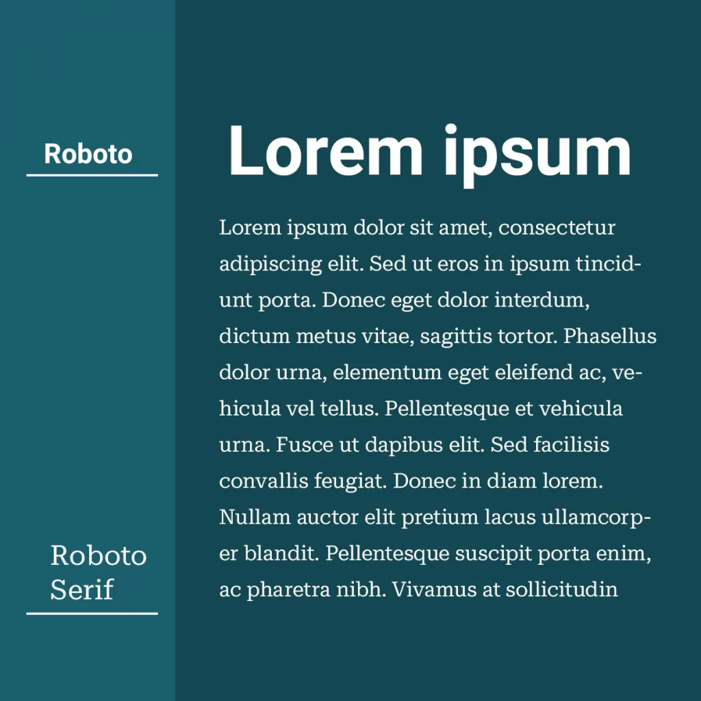
It's a common saying that font selection plays the same role in the design that the right kind of dress does to your personality. As you are concerned about being dressed up for a particular event, you should pay the same consideration during font selection and the pairing. It will be a continuous headache as a beginner, but with time, you will know why it is essential and how to avoid the wrong font selection.
Have you ever thought about why you need to pair different fonts on the website or why you cannot stick to a single typeface? The most straightforward answer to this question is that using the right kind of font pairing not only makes the content aesthetic and enhances the readability score. Sticking to a single font not only looks less attractive but also makes the users bored.
Let's look at a few points about fonts' importance. They include:
Good for Brand Recognition
Do you know that the correct type of typeface helps you establish good brand recognition? Yes, you heard it right. It not only boosts the performance, but it will likely connect the users with you in a better way. To convey the right mood and message to the users through your brand, it is crucial to never take the font selection for granted.
Gain User Attention
The better the font choices, the more attention you will get from the users. It is essential to gain as much attention as you can for the success of your website and brand. For acknowledgement, it is crucial to make your site eye-catchy so that the user doesn't stop themselves from visiting there again and again. Fonts play a huge role in this manner.
It boosts Readability
There would be no use of the site if the content mentioned is not readable or understandable. Hence, try to make your content easy to read so the reader won't face any difficulty. A poor readability score makes you lose more than half of your followers. The better the readability score, the more followers you will get on your site.
Conveys the Right Message
If you are trying to promote a particular brand through your website, the readers must get the right kind of message you want to give. How you convey the right message and tone highly depends on the font selection. For instance, if you have designed an art website using handwritten fonts, it will spoil the overall image, and you will regret it later. Consider those specially designed fonts for such websites instead of randomly picking them.
These are a few crucial points that might give you an idea about why to focus on the right font and its pairing.
But to gain this advantage, one must know how to make the ideal pairing. Only then can you make your website stand out. There are a few essential points that you have to opt for to achieve this success.
Top 10 Tips for Font Pairing
1 – Combine Serif and Sans-Serif Fonts
The two most important and highly used fonts are serif and sans-serif, which are further divided into different variants. Sans-serif has a simple look, but serif is quite the opposite and gives decorative vibes. San-serif and serif have several fonts, but the most popular is Avenir Next font, which contains some special characters for designers. One of the best combinations you can make is merging the body typeface of serif with the header typeface of sans-serif.
This combination will mesmerise the content, and you can never go wrong with it. You can also choose two different fonts of the same sans-serif family, including Trade Gothic Bold and Bell Gothic. They might belong to the same family but have opposite personalities.
Another point to keep in mind is, better to avoid using fonts that might belong to different families but give you the same feel. It will become hard for the reader to differentiate. You can achieve this sense of pairing with practice. Keep practising to get your hands on the right kind of pairing.
2 – Do Not Use the Same Classifications
Combining two different fonts that might be from 2 different font families but belong to the same classification will also create problems. For instance, you can choose Clarendon bold font with Officina serif font because they both belong to slab serif, so using two fonts that belong to the same classification won't be correct.
On the other hand, you can easily pair the New Baskerville font with heavy-set Clarendon, as both belong to different typeface families. These little details make a huge difference, so always choose wisely because they depend on the success and failure of your site. Always make a combination of fonts that fit perfectly to the content, making the reader curious to know more about your brand.
Moreover, please keep this point in mind from the start so that you do not need to face any tension in the middle.
3 – Do Not Overuse Fonts
Apart from using the right combination, it is also essential to know how many fonts you can use in the design so that they look eye-catchy. Never use more than three fonts; otherwise, the reader will become confused after seeing too much variation in a single design. Keep one font for the title, one font for the headings, and the third font that is optional should be left for the body.
Have you ever seen content with too many different fonts instantly turning you off? It is one of the common mistakes people often make that you should avoid if you want to make your site alluring. Ensure the font you have selected for the header text must be able to grab everyone's attention because it will play a massive role in bringing more readers.
4 – Contrast Font Weight and Sizes
Paying particular attention to the size and weight of the selected font is also crucial. How you can effectively contrast will enhance the Readability of your content. Ensure the size difference between the two fonts is enough so that the reader doesn't get confused. If you keep only 8 pts difference, it is not ideal.
The more significant the difference, the more effectively the user can read and get the message. People usually read the content on the website in a go, so make sure they do not need to stop over any line or word. You can also keep the size of each font different. Make sure the line that needs more user attention should be written large. Balancing the font's weight is another way to keep the interest balanced and the content eye-catchy.
You can use bold and heavy fonts for titles because they need more observation. For body text, you better stick to light fonts. It is how you can create a perfect combination of fonts as well.
5 – Similar Fonts for Consistency
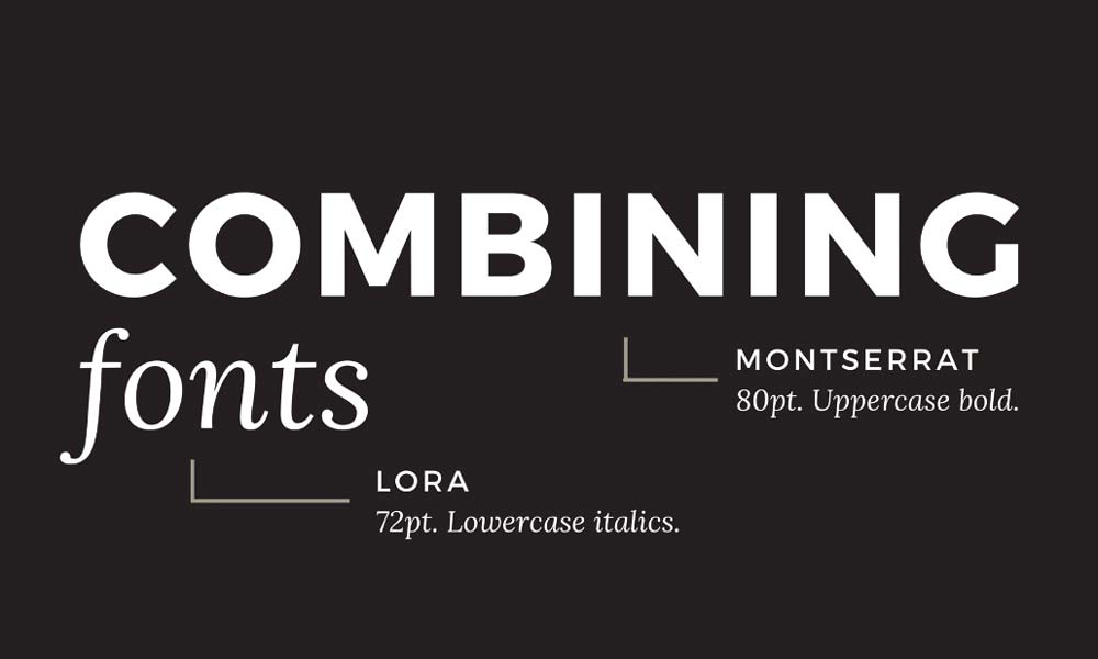
Consistency is essential and should be practised in every content. Repeatedly changing fonts for titles or body texts will decrease users' interest, and they will no longer be able to focus or concentrate. What if you use one font for the heading throughout the content and one font for the body text? It is how you can achieve a great sense of consistency.
It will also keep users interested and likely focus on the message you want to convey through your content. Moreover, you can also perfectly adjust two fonts or a combination of fonts in the design.
6 – Combine Neutral Fonts with Personality Fonts
Each font serves a different purpose, and each comprises its traits. Some are said to be personality fonts because they contain human-like personalities.
They depict a specific mood and contain a warm personality. A few examples include Handwritten fonts and calligraphy fonts. If you are using a personality font, then never combine it with another personality font in a single design.
You can pair such fonts with neutral ones entirely opposed to personality typefaces. It is how you can create warm and welcoming vibes through your font selection, and the user will be more likely to read your content with interest. Using two similar fonts for the heading and body text will look odd and decrease the user's interest.
7 – Stay Away from Conflict
Even if you use two different types of fonts belonging to a different families, it doesn't mean no conflict is involved. If you pick one font from a serif typeface and one from sans-serif, if they are different from each other, it will create a problem in design, and you won't be able to deliver the right mood. For instance, if one font you selected has well-spaced letters while the other has less space, it will ruin the entire structure of your design.
If you are an expert designer, you will surely be familiar with these little details, but as a beginner, you need to practice and figure out how to make an ideal combination of fonts. Only then can you make your site stand out.
8 – Complimentary fonts are the Best
Each font differs in personality and trait, as already mentioned above. A few depict serious moods, while some have angry personalities, and as a designer, it is essential to know which font depicts what kind of emotion. Only then can you make font pairing successful. If you use fonts in wedding cards for your clients, you can go for calligraphy typeface or script fonts.
However, you can not use the same fonts for business websites or brand sites. When it comes to pairing, if you have used one strong font in a design and now you are trying to find the best pair, go for neutral and soft ones because using two strong fonts in a single design will have a destructive impact and will ruin the overall content image.
It is like a guessing game whenever you decide to pair two fonts. You might have to rely on your gut feeling entirely, but with time, you will start doing it in a better way. The best thing you can do is to get your facts clear about a particular font, why it is used and the traits of that font so that the decision becomes easy for you.
9 – Visual hierarchy of fonts
You can check magazines and newspapers to get the best visual hierarchy. Similarly, if you focus on such visuals for your website content, it will give another level of picture to your website. Before doing this, you must know how to apply visuals to your fonts so that nothing goes wrong. They consolidate textual styles by separating text-based components, including headings, captions, sub-headings, etc.
In Visual hierarchy, many other elements also play a huge role, including spacing between two words, font size, weight, etc. If you keep an eye on all these attributes correctly, nothing will stop your site from shining. You do not have to make this hierarchy only for headings or titles. Consider that part that is more important for the reader to read so that they get instant attention.
10 – Practice Makes Perfect
You have often heard this proverb in the past and surely be familiar with the meaning. The more you practice, the more knowledge you will get; the same goes for font selection and pairing. Practice as much as you can so that you come to the point where you will no longer make wrong choices. This friendly suggestion will polish your skills and make you a typeface professional.
No formula can be applied to find the best font pairing. The only way possible is to practice. You have to take risks and do different experiments at the start that might turn out disasters, but it will let you gain more knowledge. Once you know a particular font pairing doesn't work, you won't do it again.
Beautiful Font Combinations
Now that you know all the points you must consider before making any pairing, let's look at a few best pairings you should try on your website.
1 – Futura Bold & Souvenir
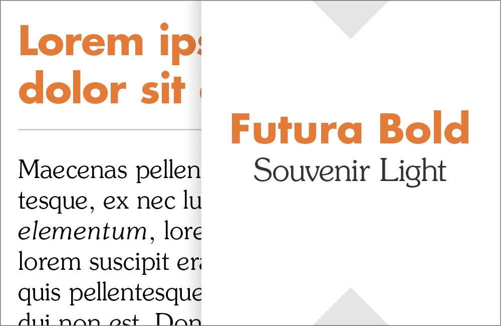
Futura bold can quickly get the user's attention and enhance the Readability of the content, so pairing up with an equally bold Souvenir font would be great. You might wonder why using two strong fonts in a single design won't be great, but sometimes it also works, so go ahead with this pairing. Both fonts have entirely different personalities, as Souvenir is light and goofy font while Futura is a bold and serious typeface.
Both also came into being in different periods, so their traits are entirely different. Both are used to depict different emotions, so why not give this pairing a try?
2 – Helvetica Neue & Garamond
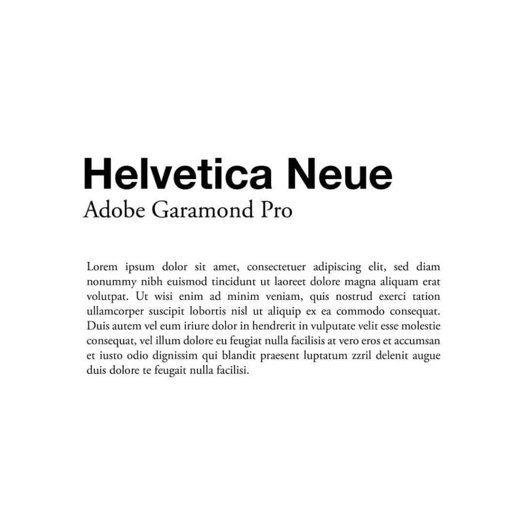
The second option is Helvetica Neue and Garamond font which equally makes a great pairing. Using Helvetica for headings and Garamond for text will depict a considerable level of compatibility. It will help you get maximum attention, and your follower will stick to your site no matter what. It is also a perfect combination of sans-serif and non-serif, so why not go for it?
3 – Bembo and Rockwell Bold

Another pairing coming your way is Bembo with Rockwell, which has spice and the ability to grasp attention. Rockwell font is a slab serif that came into being in 1934 and is enough to get the required attention if you use it in bold. On the other hand, Bembo is a versatile serif typeface that is conservative and light. So combining a bold and light typeface will be a big hit.
Use Rockwell bold for your headlines or titles, and stick to Bembo for the body text. It is how you will make the right and worth appreciating balance.
4 – Courier New and Montserrat

Monserrat is a recently released font that is mainly used for online content. With time, this font's colossal popularity is seen for all the right reasons. You have seen this font many times on the internet or different sites. It is a sans-serif typeface that fits anywhere, which is acknowledged.
On the other hand, Courier new is an old font that came into existence many years ago. So pairing an old font with a new one would be a great combination. For headings, you can use Montserrat and for the body, use Courier new.
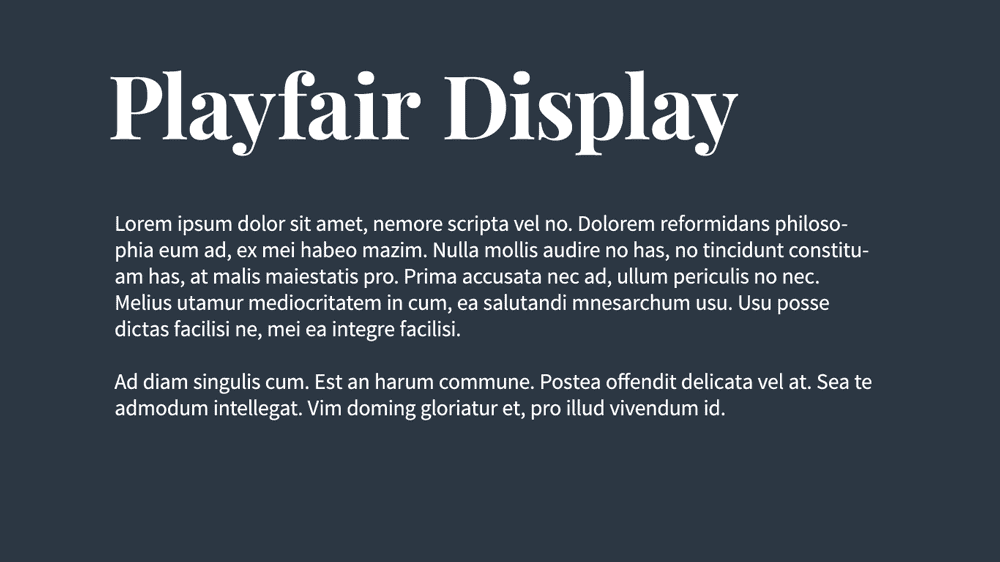
5 – Source Sans Pro and Playfair Display Typeface

Playfair display is a typeface used in places that need to be prominent, including Titles and headings. It is commonly used in modern websites because it has a sleek personality. Yes, it reflects old-world charm in a modern way because it came into being after being inspired by 18th-century letterforms.
Regarding source sans pro, it is a simple font that you should mix with a modern design typeface for better results. If you want your content to be presented decently with a bit of modernism, go ahead with this combination.
6 – Century Gothic & PT Serif
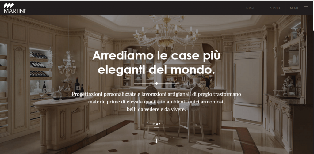
Another perfect example shows why sans-serif and serif is an ideal font combinations. Century Gothic is a classic font and is quite commonly used everywhere. On the other hand, PT serif is a neat serif typeface often used in different paragraphs.
Hence, you can save Century gothic for headings, while for body text, you can choose PT serif. Both will make a perfect combination and look eye-catchy when combined.
7 – Lusitana and Raleway Typeface
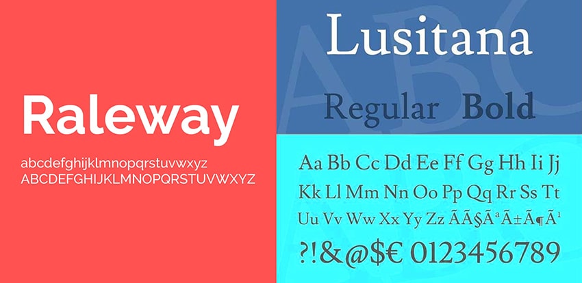
The last combination we have for you is Lusitana and Raleway, which have been practically applied to various prominent platforms in the past. Lusitana is a warm font that is welcoming and can get attention. Raleway font is quite popular and somewhat opposite to Lusitana, so both will work when used in a single design. Both are google fonts and are easily recognisable, so the reader will instantly tell that two new fonts are used in a design.
Conclusion
Typefaces play a crucial role in making the website at the top. However, before choosing the right font for your design, you must keenly observe many factors to make the right choice. One of the most critical tasks in choosing the font is to select the right combination that perfectly goes hand in hand so that the user can comfortably read what you want to convey.
A well-designed website without a suitable typeface is nothing, so your site's success hugely relies on font selection and pairing. If you have just entered the market and are learning ways to select the right font, it will take time, so do not panic and go with the flow. In the start, you will keep guessing and only depend on your instincts, but with time you will start seeing the clear image.
If you have been trying to know how to find the exact and best font pairing, this article will fully assist you in this manner. This guide has discussed how you can get your hands on the right font and make an ideal pairing to flourish your website. You have to think out of the box to be different from your competitors.
Take notes and follow the tips for productive font pairing.
