Logo Design and Branding: Build an Identity
A company's logo is often the first impression people get of a brand. It's an iconic representation meant to communicate the essence of what a company stands for in a simple, memorable way. However, creating an effective logo involves more than just drawing an image. Psychology, emotion, and strategic thinking go into making logo design and branding that genuinely resonates with target audiences.
Table of Contents
The Importance of Making a Good First Impression
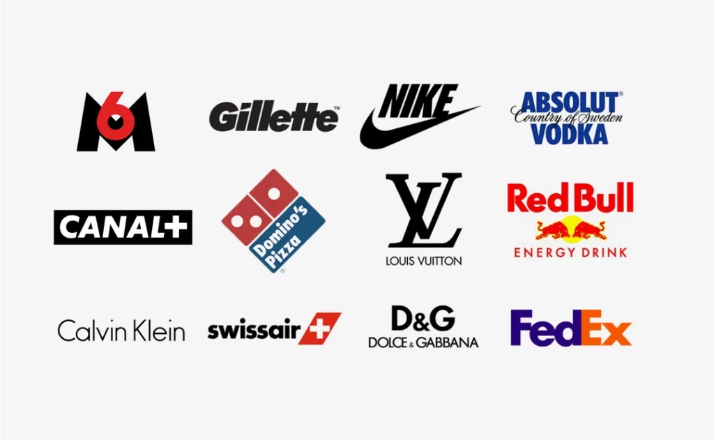
They say you never get a second chance to make a first impression. When it comes to a business, its logo is likely the first impression a potential customer will get. According to a study by van Hamburg, only 20 people out of the 250 surveyed could remember the actual company names represented by the logos they were shown. However, over 190 could identify the company by looking at the logo.
This shows the power of a logo, to sum up an entire brand image that sticks in people's minds. A logo gives customers a mental shortcut so that just a glance triggers an association with the nature and values of a company.
But it has to be executed thoughtfully to make the desired impression. The success of a business can hinge on the effectiveness of its logo. Consider iconic logos like McDonald's golden arches, the Nike Swoosh, or Apple's half-bitten fruit. The logo has to work hard from day one.
The Goals and Purpose Behind Logo Design and Branding

So, what makes an effective logo in the first place? There are a few key goals good logo design should achieve:
- Memorable – It should be recognisable enough to stick in customers' minds
- Versatile – The logo should work across different mediums like print, digital, merchandising, etc.
- Timeless – An effective logo stands the test of time for decades
- Appropriate – It should match the company's brand identity and values
- Simple – Icons are more memorable, so simplicity is key
- Evocative – The style and imagery should evoke the emotions a brand wants customers to feel
Accomplishing this combination of objectives with a single design is no easy feat. However, the purpose behind creating an evocative and versatile logo that makes the right first impression informs every choice made in the design process.
Getting to Know the Company Behind the Logo
Before a logo designer can start sketching icons or choosing colours, they must research to understand the company needing the logo entirely. To resonate, the logo must encapsulate the brand identity, values, mission, visual identity, tone, and customer base.
Some key questions the designer needs to answer:
- What products or services does the company provide?
- What is the personality of the brand? Serious? Whimsical? Cutting-edge? Traditional?
- Who is the target demographic? What feelings and emotions does the brand want to evoke in customers?
- What makes this company unique compared to competitors? What are its values?
- Are there symbolic visuals that could represent the brand? Creatures? Shapes? Letters?
- Does the company have brand guidelines or a style guide that needs to be followed?
- Has the company used past logos or brand imaging needing to evolve?
The more understanding of the branding objectives, the better the logo can strategically capture that brand's essence.
Common Elements that Make Logos Impactful

Once the purpose and emotional impact of the desired logo are determined, what visual elements can designers use to bring that to life? Some options that make logos stand out include:
Typography
Fonts inherently convey certain feelings. So, typography choices in logos need to match the brand identity. Sans serif fonts feel clean and modern, while serif fonts have an elegant, traditional vibe. Handwritten and display fonts can come across as creative. Bold, straight lines feel professional and direct, while curved, thinner lines seem more approachable and casual. Colours, spacing, and capitalisation all factor into typography's impact.
Symbols
Having an iconic symbol as part of the logo increases memorability. It acts as a visual trigger reinforcing what people associate with the brand. Symbols can represent values, heritage, categories, locations, personalities or other brand components. Familiar logo symbols include:
- Objects or tools related to the industry
- Creatures like animals or people
- Shapes like circles, squares, swooshes
- Letters merged creatively into new icons
- Abstractions of ideas into visual form
Colour
Colour psychology plays a vital role in logo design. Specific colours evoke predictable feelings and attributes that brands want to be aligned with:
- Red – Energy, passion, aggression, intensity
- Orange – Cheerfulness, enthusiasm, vibrancy
- Yellow – Happiness, optimism, clarity
- Green – Growth, harmony, health, stability
- Blue – Trust, loyalty, wisdom, confidence
- Purple – Luxury, ambition, creativity
- Black – Power, sophistication, exclusivity
Relevance
Clever logos take imagery relevant to a company’s category or location and evolve it creatively into an evocative logo. Visual associations established in customers’ minds help cement what a company does—for example, Apple’s apple or Twitter’s bird profiles.
First Impression Impact in Action

So what happens when all these strategic design elements culminate into globally recognised logos influencing first impressions? Customers instantly associate those qualities with the brand whenever they encounter the emblem.
For example, the Mercedes Benz three-pointed star cap instantly triggers perceptions of quality engineering, luxury and status. The Coca-Cola script font communicates classic, iconic Americana. The Visa colours and angled stripes feel like part of an exclusive, customer-focused credit card brand. The Target bullseye symbolises retail accuracy. Looking at each logo sets off psychological sparks tied to positive brand experiences.
The logos become mnemonic devices for those associations through thoughtfully crafted designs that engineer specific first impressions.
Evaluating Logo Designs
Of course, a logo rarely gets it exactly right on the very first iteration. Designers usually go through an extensive creative process to imagine various options, then narrow selections by evaluating what works well and what doesn’t based on strategic branding objectives.
Some key considerations in logo evaluations include:
- Visual Impact – How well does it stand out in a sea of logos and feel aligned stylistically with the company’s personality and values?
- Meaning and Concept – Does the style, imagery and symbolism communicate the desired brand associations?
- Flexibility – How well does the logo translate onto different backgrounds? What about if viewed very small, like on mobile? Can it be used in black and white and still be effective?
- Distinctiveness – Could this logo represent any generic company, or is it unique enough to signal this specific brand?
- Fittingness – Do choices like typography, colour palette, and visuals feel cohesive with the company’s identity?
Through iterative rounds of design and evaluation, logo options get refined until there is confidence in the final logo nails that coveted first impression.
Giving Logos Room to Shine
So, an organisation went through a lengthy strategic process to develop a unique and memorable logo. They need to implement it in branding materials and advertisements to start triggering the positive customer associations they want it to evoke.
But even the best logo can get visually lost if it’s not treated as the superstar of the branding design. The logo should have prominent placement and plenty of breathing room so it doesn’t feel cluttered or compete with other elements on the page.
Website headers, shopping bags, trade show banners, commercials, packaging and more all need ample space around the logo to keep it the visual anchor. The logo can then work magic to spark instant recognition and goodwill that redirect back to the company behind it.
Consistent Brand Messaging
In addition to a well-designed logo getting room to shine, it needs to be part of consistent messaging about the brand across channels. Using coordinated colours, fonts, imagery, and tone of voice reinforces what the logo kicks off. It primes customers to care about the brand and perceive it the desired way when the look, language and emotions align with the logo’s first impression.
For example, a company with an elegant serif font in its logo signals a refined, upscale identity. But if customers then visit their website and see a bold, wacky font over fun cartoons, it sends mixed messages compared to the logo’s first impression. The branding has to ladder up clearly.
Balancing Timelessness with Modern Relevance

So when is it strategic for logos to update compared to when icons achieve that timeless status where change would feel off-brand?
Typically, the more established a logo becomes, the more inadvisable it is to overhaul it entirely. Visual brand recognition becomes baked into the audience’s minds. However, elements can still modernise around the logo to prevent perceptions that a company feels outdated.
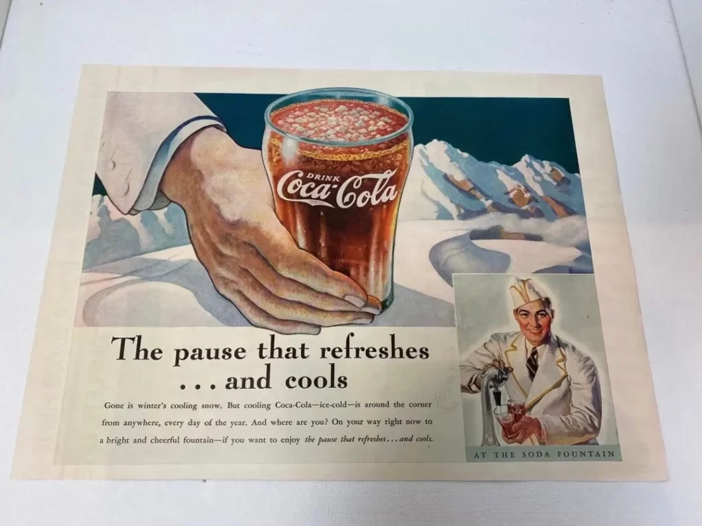
Think about Coca-Cola – their script logo epitomises classic Americana and likely will never change. But they modernise marketing around it with contemporary music, ethnically diverse casting and topics like sustainability.
Whereas newer brands still solidifying their identity often evolve logos every 5-10 years as they grow. Changes refresh the personality more dramatically when existing brand equity allows room to keep experimenting.
So when done right, logo redesigns strike an artful balance between building on heritage vs keeping up with the times when needed.
Simplification
One big trend in recent years involves companies simplifying logos. Removing complexity aims to evoke minimalism associated with sophistication. For example, brands like AT&T, Mastercard, Microsoft and Google moved towards flatter, scaled-back designs.
Lettermark Logos
Many brands opt for logos focused just on stylised initials of company names rather than icons plus words locked together. Examples of lettermark logos include IBM, CNN, HBO, and LG. This allows more flexibility with complementing taglines that can be updated while the lettermark stays consistent.
3D Effects
With modern tools like Photoshop, logo renders have become more dimensional representations with highlights, shadows, and gradient tones than flat single-colour logos. It adds light-catching qualities associated with depth and substance when done with a sense of realism.
Bright Rainbow Colours
Vibrant neon palettes popped into a logo design for brands wanting to get attention and appear youthful vs more muted traditional colours. It is particularly popular with media, fashion and tech brands like Snapchat, Taco Bell, and Squarespace.
Hand-Crafted Imperfection
Another trend aims to feel more human vs digitally perfected thanks to elements like faux brush strokes, uneven lines, and custom illustrations. It communicates approachability, individuality and whimsy.
Maintaining Consistency Across Brand Touchpoints

As important as the logo itself is to making desired first impressions, customers engage with brands across many touchpoints. So, that same identity and messaging promoted visually by the logo must carry through websites, ads, locations, products, employees and beyond.
When done right, recognisable continuity signals professionalism and trustworthiness. For example, the colours, fonts, imagery, and terminology are all cohesively on-brand when walking into a Target. Customers quickly correlate information to impressions first sparked by the Target logo and bullseye iconography.
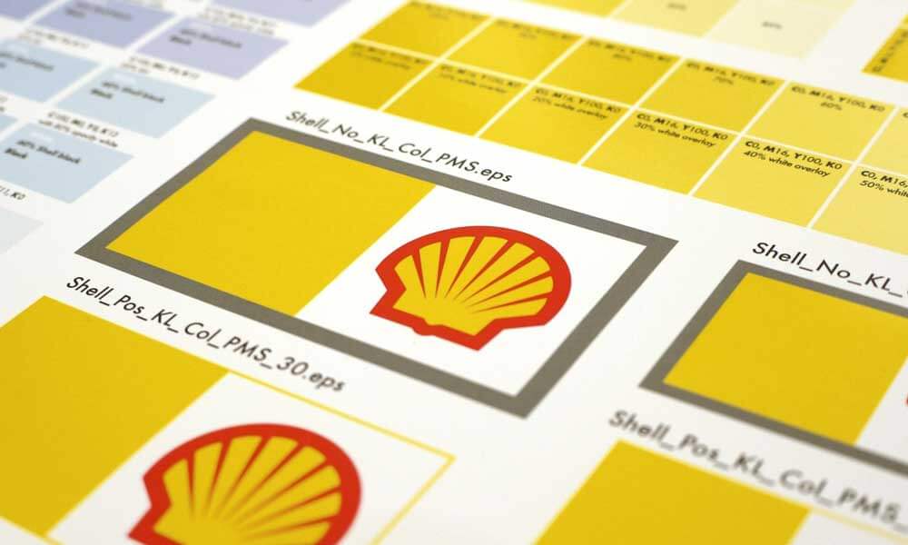
Brand style guides document how visual identity and essential messages grow consistently wherever customers experience the company. It is a blueprint for legally protecting logos from misuse while aligning perceptions.
Conclusion
A company's logo may seem like a simple design that lives in the background. Concentrated psychology, emotion and strategy create the visual shortcut for how a business wants to be perceived. When done effectively, a great logo makes a stellar first impression that sticks in the audience's minds sparks familiarity instantly and communicates values they associate with the brand through that iconography.
It becomes an invaluable asset that helps forge ongoing relationships between companies and customers. It reminds us just how robust good design can be.
Frequently Asked Questions
What are the critical elements of an effective logo?
Some key elements include being memorable and recognisable, having visual simplicity, communicating desired brand attributes through typography, symbols and colour choices, and being flexible enough to work across contexts.
How long does the logo design process typically take?
It's an in-depth strategic endeavour, not just artistic creation. Most logo design processes take 2-6 weeks to develop robust options, from research to initial concept sketches to refinement and testing.
What's the difference between a logo and a brand?
A brand refers to people's cumulative perception of a company based on experiences beyond just seeing their logo. The logo acts as a visual trigger that kickstarts branding associations.
Should my company spend time redesigning our outdated logo?
If your logo feels disconnected from modern brand messaging or you've grown considerably since first launching it, a refresh might help perceptions. However, frequent logo redesigns can diminish brand recognition.
Who owns the rights to my company's logo?
Unless specified otherwise in contracts, the designer you hired to create the logo typically maintains intellectual property ownership. Contracts should transfer rights over to your company.
