The Evolution of the Mercedes Logo: A Look at its History
Mercedes, the pride of Germany's automobile industry, has been synonymous with luxury and engineering excellence for nearly a century. The brand was founded in 1926 by two legendary automotive engineers, Karl Benz and Gottlieb Daimler. And boy, did they know how to make cars!
Today, Mercedes-Benz is a household name that's loved by millions of car enthusiasts around the world. With manufacturing facilities in multiple countries across the globe, the brand has established its presence on all continents. And let's be honest, who wouldn't want to own a Mercedes? Driving a Benz is like driving a piece of history that's been fine-tuned with the latest technology.
From the sleek and sporty C-Class to the ultra-luxurious S-Class, Mercedes-Benz has a car for every type of driver. And let's not forget about their legendary AMG line that turns even the tamest models into roaring beasts. The brand's iconic three-pointed star logo is instantly recognizable and symbolizes the brand's commitment to excellence, innovation, and prestige.
So, whether you're cruising down the Autobahn, exploring winding mountain roads, or running errands around town, a Mercedes-Benz is the perfect car for anyone who appreciates performance, style, and luxury. It's no wonder that the brand has become a symbol of success and sophistication.
Table of Contents
The Original Mercedes Logo: 1902-1909

Regarding logos, Mercedes-Benz certainly didn't start with a bang. Their first logo was about as exciting as a German accounting textbook. The oval-shaped badge sat there like a stoic teacher, sternly grading your homework. And don't get us started on that wordmark. It was like a font designer had too many beers and decided to get crazy.
The letters were all different sizes, like a family portrait where the kids were all trying to outdo each other. And the enlarging and then shrinking thing? Was that supposed to be a subliminal message about the brand's fluctuating stock prices?
But let's give credit where credit is due. The double outline was a nice touch. It was like a frame that said, “Hey, this logo may be boring, but at least it's well put together.”
And while the monochrome version was as exciting as watching paint dry, the dark blue and silver emblem added a touch of class. It was like a top hat and tails for a car logo. It said, “Sure, we may not be flashy, but we've got style.”
All in all, the first Mercedes logo was a bit of a snooze fest. But hey, we all have to start somewhere. And just like a nerdy kid who grows up to be a successful entrepreneur, Mercedes-Benz has come a long way since that first awkward logo. Now, if you'll excuse us, we'll take a spin in our sleek, stylish Benz and forget all about that oval badge from the past.
Benz: 1909-1916

It was like the Mona Lisa of car logos – elegant, ornate, and beautiful. The circular badge had a thick double outline like a frame around a work of art. And that stylized wreath? It was like a fancy necklace that said, “I'm expensive but worth it.”
The wordmark was just as impressive. The eddy custom sans-serif font was like a fancy wine – rich, complex, and perfect for impressing your friends at dinner parties. And the black-on-white background? It was like a tuxedo that had been tailored to perfection.
But let's remember the most important thing – the logo represents the power and energy of the brand. It was like a lion roaring in the jungle, ready to take on any challenger. It said, “We may be elegant, but we're also fierce.”
Looking back, it's easy to see why the 1909 Benz logo was so iconic. It was like a classic piece of art you couldn't take your eyes off. It was like the perfect outfit that made you feel confident and assertive.
So, here's to you, the 1909 Benz logo. You may be a thing of the past, but you'll always be a timeless classic. And who knows? One day we'll all be driving cars with just as beautiful and impressive logos. But until then, we'll have to settle for admiring you from afar.
The First Mercedes Star: 1916-1926

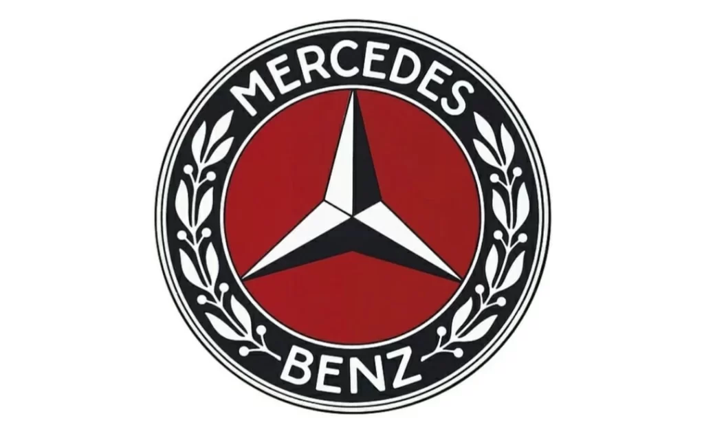
Ah, the good old logo was designed back in 1916! It was a natural beauty, with a blue and white star shining bright on a burgundy-red background. And if that wasn't enough to catch your eye, it was all wrapped up in a thick circular frame, like a fancy piece of jewellery.
But that's not all! The logo had a wordmark and some leaves drawn in white, adding a touch of nature to all that sophistication. It was like a fancy garden party in visual form.
And remember the colour palette – it was all about style, sophistication, and power. You could practically feel your power levels rising just by looking at it. Move over, Superman – this logo is the new symbol of strength.
Overall, the logo perfectly represented the brand – elegant, powerful, and classy. It's a shame they didn't throw in a little sparkle or glitter. What's the point of being classy if you can't have a little fun?
Mercedes-Benz Logo: 1926-1933

Designed back in 1926, it's an absolute blast from the past. Featuring a blue and white star nestled snugly on a burgundy-red background, it's like the logo equivalent of a cosy winter sweater.
And if that's not enough to warm your heart, it's all wrapped up in a thick circular frame that's so thick; you could use it as a frisbee in a pinch. But wait, there's more! The wordmark and leaves ornament are drawn in white, adding a touch of whimsy to all that elegance.
The colour palette is all about style, sophistication, and power, which makes sense because if you're going to be sophisticated, you might as well be powerful, too, right? It's like the visual equivalent of wearing a top hat and monocle while riding a unicorn. Classy and powerful all at once.
All in all, this logo is a true work of art. If the brand were a person, it would be the kind of person who wears a smoking jacket and sips brandy by the fireplace. And who doesn't love that kind of person? Don't spill your brandy on the logo, or you'll be in trouble!
The Iconic Mercedes Logo: 1933-1989

They created this badge later in the same year; it is super minimalist and futuristic for its time. It's like the Marie Kondo of badges – if it doesn't spark joy, it's not on there.
The badge is executed in black, which is a bold move. It's like saying, “I don't need colour to be cool.” And it works! Inside the white circle, there's a stylized, thin and sharp three-pointed star, which is so pointy it could probably cut through butter. And let's not forget about the medium-thick black outline – it's like the badge equivalent of a lovely frame.
Overall, this badge is like the cool kid in school who wears all black and listens to experimental jazz. It's edgy, it's different, and it's not afraid to take risks. It's the kind of badge that would start a band with its friends and play in dive bars until they get discovered by a record label.
And who knows? Maybe this badge will be just as iconic as the first one someday. But until then, it'll keep doing its thing, slicing through butter and looking super cool.
3D Silver: 1989-2009

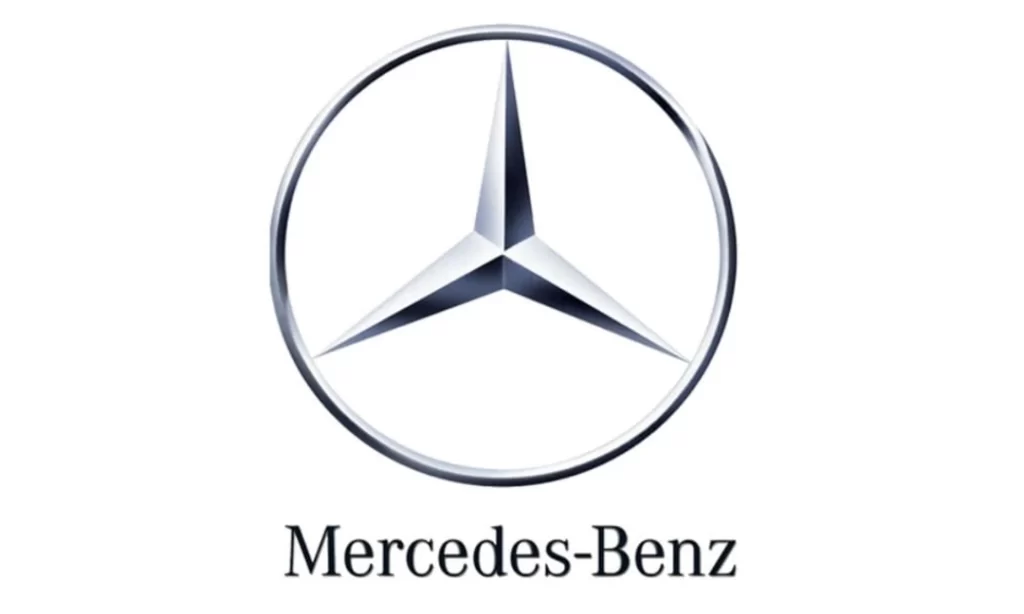
In 1989, the logo got a little more…three-dimensional. It's like the brand decided it wanted to be a cool kid in the '90s and started experimenting with holograms.
They switched the colour palette of the badge to gradient grey, which is like the visual equivalent of a smooth jazz album cover. And now the symbol was executed in a glossy metallic texture – like the badge equivalent of a shiny sports car. But wait, there's more! The enlarged serif lettering in black was placed under it, like a little brother trying to keep up with his cool older sibling.
But don't let that fool you – the inscription is still classy and neat, boasting a slightly visible shadow that adds volume and style to the whole image. It's like the badge went to the gym and got swole but still knows how to dress up for a fancy dinner.
Refining: 2009-2011

Ah, the flat design – the Marie Kondo of logo designs. In 2009, it was all about keeping things simple and minimalist. The brand embraced the “less is more” philosophy and threw out all the extra bells and whistles.
Gone were the glossy metallic textures and gradient greys – now they redrew everything in plain grey without any accents or additions. It's like the badge decided to become a monk and simplify life. The typeface of the lettering remained the same, but the lines started looking thinner due to the absence of the shadow. It's like the badge went on a diet and lost a few pounds.
But you know what? Sometimes simplicity is the key to greatness. It's like the plain cheeseburger of logo designs – it may not have all the fancy toppings, but it's still delicious.
Mercedes Logo Design: 2011-Today

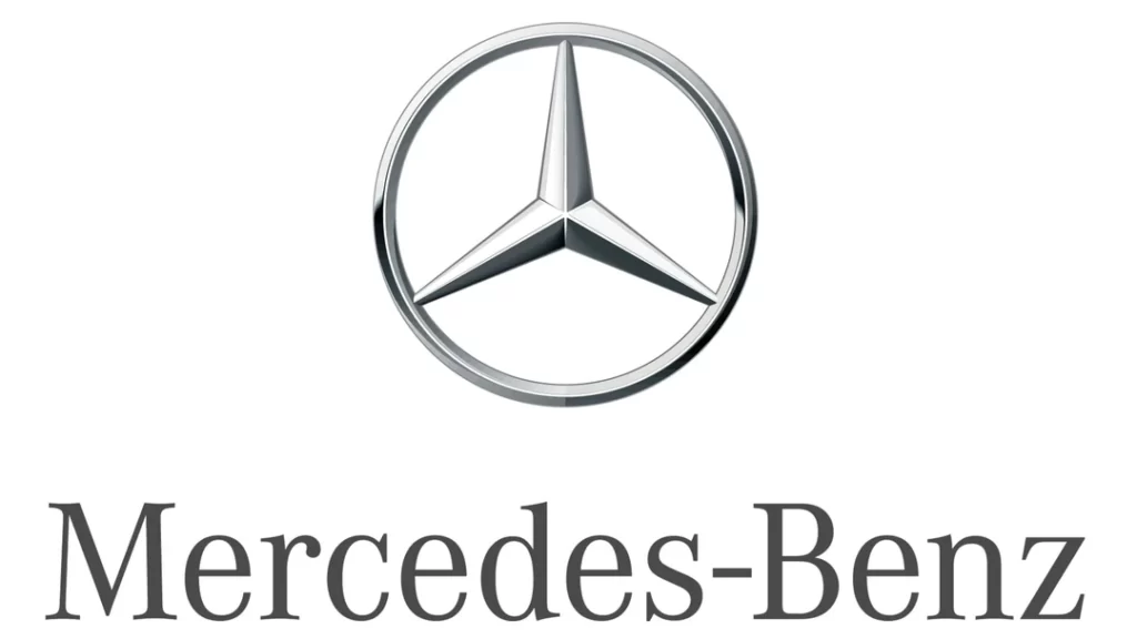
Look who's back with another logo redesign – it's like the brand can't decide. In 2011, the logo got a makeover that was a subtle nod to its past but with a few upgrades.
The new logo looks similar to the one introduced in 1989, like when your mom tells you you looked like your grandpa when he was young. But hey, if it ain't broke, don't fix it – give it a little sprucing up. The circular framing of the emblem became thicker like it had been hitting the gym and doing some serious bench presses.
And the lines of the wordmark got thinner like it had gone on a juice cleanse and lost a few pounds. The badge decided to go for a more streamlined look, keeping things classy. The lettering typeface resembles the Corporate A font family, an example of timeless elegance – like Audrey Hepburn in a little black dress.
Wrapping Up
In conclusion, the evolution of the Mercedes logo over the years has been a fascinating journey. From its early beginnings in 1902 to the latest redesign in 2011, the brand has continuously reinvented itself while maintaining its signature style and sophistication.
Each iteration of the logo tells a unique story, reflecting the cultural and design trends of the time. From the ornate and intricate badges of the early 20th century to the minimalist and sleek designs of the 21st century, the Mercedes logo has been an ever-evolving symbol of innovation and excellence.
What's clear is that the Mercedes brand is always looking to the future while still cherishing its rich history. And with each logo redesign, the brand captures the essence of the times and creates something timeless.
As we look back at the history of the Mercedes logo, we can see the evolution of the brand and its culture. And as the brand continues to innovate and push boundaries, we can't wait to see what the future holds for this iconic emblem.
