Classifying Typography Styles: Definitive Guide
Typography refers to the style and appearance of printed text. It encompasses fonts, sizes, alignment, spacing, colour, and other elements that affect how we perceive and read written language. Correct typography is crucial for effective communication, readability, aesthetics, and tone.
From elegant serifs to playful scripts, typography has an incredible diversity of styles. This article will provide an in-depth examination of crucial typography styles, tracing their origins and evolution. We'll also showcase famous examples of each style and provide design tips and best practices to enhance your typography.
Table of Contents
A Brief History of Typography
Before delving into specific styles, it helps to understand the history of shaping typography conventions. The origins of typography stretch back to scribal writing in 3500 BCE Mesopotamia. Early typographers include Gutenberg, whose printing press (c.1439 CE) revolutionised mass communication. Type founding was developed in the 15th century, allowing printers to cast reusable, movable type.
As technology progressed, typography rapidly expanded. Typographers like Baskerville and Bodoni pioneered stylish, refined fonts in the 1700s. The Victorian era saw a “fight for beauty and imagination.” The Arts & Crafts movement advocated handmade, medieval-inspired types. Sans serif, geometric, and other modernist styles emerged in the early 1900s. Electronic typesetting and digital fonts arrived in the 1960s-80s.
Today's typographers have an enormous array of types for every need. Understanding core styles provides a solid base to utilise typography effectively.
Serif Fonts
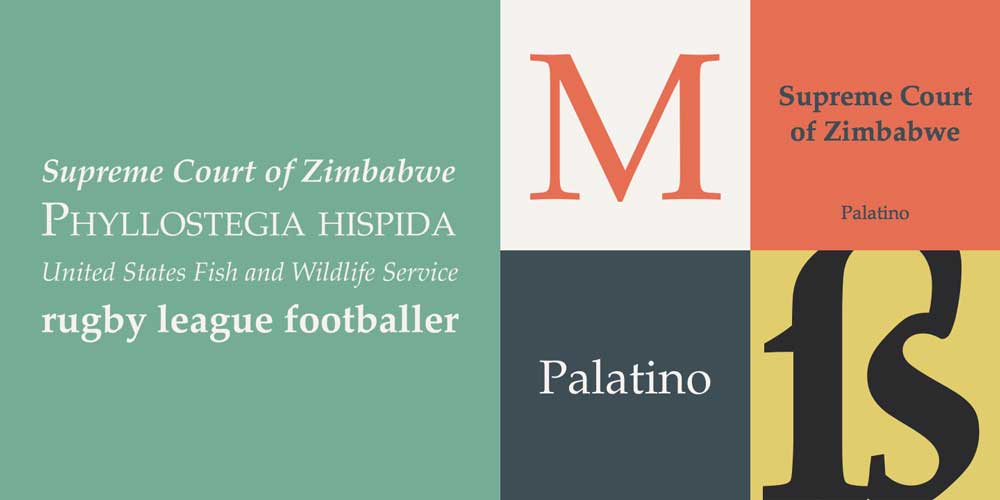
Defining Serifs
Serifs comprise extending strokes at the ends of letters. Also called “feet,” serifs emerged in Latin writing and early Roman inscribed lettering. As one of the oldest styles, serifs bring elegance, readability, and tradition. The serifs guide horizontal flow in dense text settings.
Serifs come in different shapes and sizes. Thick slab serifs provide a bold distinction, while hairline serifs lend refinement. Bracketed serifs feature curved connections to letters. Unbracketed serifs have sharper transitions. These structural variations distinguish serif sub-categories.
Serif Sub-Categories
Various serif forms of typography developed over centuries. Some key serif font types include:
- Old Style: Inspired by late-Renaissance writing, old-style serifs like Bembo feature diagonal stress, subtle bracketing, moderate ratios between thick and thin strokes, and excellent readability.
- Transitional: Slightly more horizontal stress and sharper brackets than the old style; transitional serifs like Times New Roman add polish while maintaining legibility.
- Modern: With dramatic contrast between thick and thin lines and minimal brackets, modern serifs like Bodoni convey stylish elegance.
- Slab: Bold and eye-catching, slab serifs like Rockwell have thick block lines with slight line variation.
- Newspaper: Pragmatic and space-efficient, these workhorse serifs optimise the economy of space.
Best Practices for Using Serifs
Serifs work well for:
- Books, articles, reports (enhances readability)
- Luxury goods branding (connotes heritage/tradition)
- Law, finance, higher education (communicates trust and authority)
Consider serif readability–some extremely thin or condensed serifs fatigue the eyes in longer text. When using serifs:
- Vary font weights and sizes for the hierarchy
- Allow ample whitespace between lines and paragraphs
- Use slab or old-style serifs for hard-copy documents
Sans Serif Fonts

Defining Sans Serifs
The name “sans serif” literally means “without serifs in French. First appearing in the early 19th century, these sleek, stripped-down fonts dispense with extraneous details. Sans serifs' clean lines and minimalist aesthetic resonated with modernist “form follows function” ideals in the 1900s.
Sans serifs come in a spectrum from geometric to humanist styles. Geometric sans serifs have circular or square letterforms with rigid, constructed lines. Humanist styles feature organic, calligraphic lines with elliptical letter shapes.
Sans Serif Sub-Categories
Some common sans serif font varieties include:
- Grotesque: Early sans serifs feature a unified intensity of weight and monolinear strokes. Helvetica is a classic grotesque.
- Geometric: Based on simple shapes like circles and squares, these have a constructed, machine-like appearance. Futura exemplifies geometric sans serifs.
- Humanist: With flowing, handwritten-inspired letterforms, humanist sans serifs add warmth and approachability. Gill Sans fits this model.
- Realist: Blending humanist flowing lines with grotesque monolinear regularity, these straddle styles. Meta is a realist sans serif.
Best Practices for Using Sans Serifs
Sans serifs allow words to be quickly recognised in short copy. They work well for:
- Websites and apps (clarity on screens)
- Posters and signage (legible at a distance)
- Minimalist designs (clean, uncluttered aesthetic)
When using sans serifs:
- Maintain a solid visual hierarchy
- Increase letter and word spacing
- Avoid extremely condensed or thin fonts
Display Typefaces
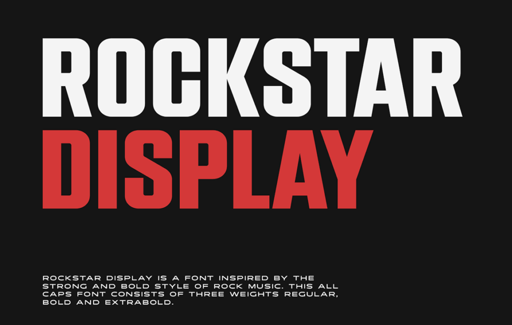
Defining Display Type
While text fonts optimise readability via clarity and flow, display type prioritises aesthetics for graphic impact. More expressive and artistically exploratory than text fonts, display types are tailored for large sizes, posters, and titles.
Display fonts come in a hugely diverse array of styles united by artistic flair over pragmatic functionality. From elegant scripts to punk-inspired grunge, display fonts break typographic conventions.
Categories of Display Type
Display type is divided into numerous eclectic categories, including:
- Script: Elegant and event-appropriate fonts mimicking formal cursive handwriting.
- Novelty: Humorous, ironic or cartoonish display fonts, often tying into cultural memes or trends.
- Retro and Vintage: Nostalgic display types referencing specific past eras, like art deco, psychedelia and grunge styles.
- Grunge: Rugged, chaotic, gritty display fonts that give an urban, rebellious impression.
- Artistic: Highly stylised display types incorporate intricate illustrations and design elements in the font artwork.
Best Practices for Display Fonts
Display fonts shine when used thoughtfully as emphatic visual accent elements. Best practices include:
- Use sparingly: Too many display fonts create a chaotic appearance.
- Watch legibility: Intricate display fonts work better in large. Don't put a script font in 12-point text!
- Match style: Pair display fonts with complimentary text that fits the desired tone.
- Consider meaning: Display fonts carry cultural connotations; choose wisely depending on audience/context.
Creative and Experimental Typography
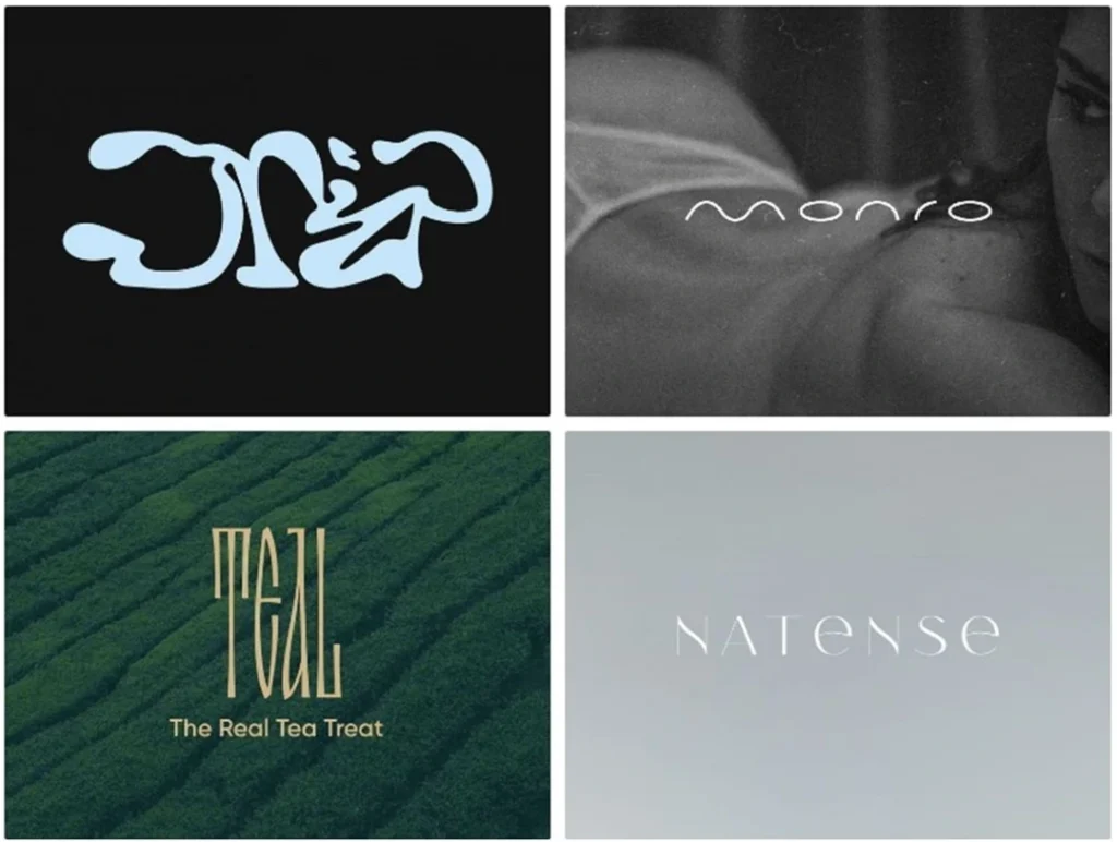
Defining Novel Typography
Typographic innovation pushes the envelope beyond conventional fonts. Adventurous designers utilise unique formats, custom modifications, found objects, unpredictable materials, digital glitches, generative code and more to create new typographic specimens (or “specimens” for short).
This highly creative typography lives primarily in the context of visual fine art, graphic design portfolios, event promotion graphics and the like. Novel typography bucks readability and aesthetics to focus purely on innovation.
Unconventional Typography Techniques
Some essential experimental techniques include:
- 3D printing: Sculpts three-dimensional letters out of unusual materials.
- Kinetic: Letterforms change shape spontaneously or in response to stimuli.
- Generative: Algorithmically controlled fluid, folding, blooming effects.
- Glitch: Distorts digital fonts with satellite interference patterns, pixel sorting, etc.
- Deconstructed/transformed: Alters font outlines or forms via effects like fragmentation and stitching.
Best Practices for Novel Typography
As a radically creative form, guidelines for unconventional typography mainly centre on context:
- It promotes cutting-edge cultural events (fashion shows, music events, gallery exhibits, etc.).
- Ensure style aligns with branding goals – i.e. an edgy, experimental font for urban streetwear.
- Recognising legibility and readability are not priorities with novel typography.
Global Typography Styles
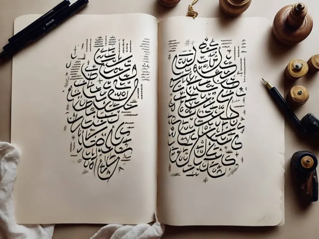
Diverse Cultural Traditions of Typography
Beyond Western typography conventions, writing systems worldwide evolved unique letterforms, materials, and aesthetic traditions. For instance, the Chinese moveable type predates Gutenberg yet has never been standardised around a single-type family. Chinese character forms gesturally mimic writing with brush and ink. These ideographs foreground visual impact and flow over strict consistency.
Likewise, Arabic calligraphy integrates fine artistry into the very act of writing. Elegant curves, precision spacing and ornamental flourishing turn script into breathtaking graphic compositions. Other non-Latin alphabets like Devanagari or Cryllic similarly harmonise symbol functionality with cultural aesthetics.
Indigenous and folk art typography also showcases global diversity. Mexican sign painters incorporate vibrant colours, folk motifs and hand-drawn letters to turn store signage into artistic pride—Gond tribal artists from India relay myths and nature symbols via exuberantly patterned typographic posters.
Integrating Global Style Elements
This diversity inspires typographers worldwide. Modern designs integrate global elements like:
- Chinese seal script for branding elegance and exoticism
- Lush Arabic floral motifs intertwining with letters
- Colourful Mexican sign painting fills and borders
- Gond tribe patterns and textures for visual intrigue
When adapting global styles:
- Research cultural context to avoid appropriation
- Use as respectful inspiration rather than direct copying
- Credit/collaborate with artisans from these traditions
- Note if visual elements carry religious meanings
Typography and Identity
Typography as Brand Building
Beyond functionality and aesthetics, typography plays a profound role in emotional connection and identification. Fonts subconsciously trigger complex social judgments about voices and values. Unique, identifiable typography crucially shapes brand identity.
For instance, Coca-Cola's flowing script connotes all-American nostalgia and authenticity. The Swiss modernist typography of their “Taste the Feeling” campaign evokes sleek, youthful dynamism. These distinct but complementary typographies strategically correspond to specific branding facets.
Matching Typography to Brand Traits
Some key ways typography aligns with brand identity include:
- Tone: Serif/script for heritage; Sans serif for reliable/progressive
- Colour: Vibrant colour embodies fun; Subdued colour seems trustworthy
- Language: Multilingual type can indicate cultural diversity goals
- Customisation: Modified lettering like ligatures signifies uniqueness
- Consistency: Visual uniformity across touchpoints boosts recognizability
Typographic Brand Strategy Tips
To leverage typography for branding:
- Identify target audience values, needs and desires
- Map specific fonts to personality traits you wish to convey
- Keep branding implementation consistent across touchpoints
- Create original signatures, monograms, etc., for custom identification
- Ensure typography aligns ability with the logo and other visual identity elements
Typography and Readability
Defining Readability
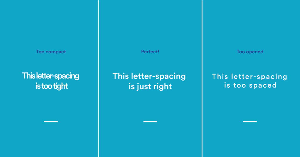
Readability represents how easily and comfortably a block of text can be read. High readability reduces cognitive effort, boosting engagement, comprehension and reader experience. Readability depends on typographical factors like fonts, sizes, line spacing, alignments, etc. Optimising these elements makes texts inviting and enjoyable to read.
Generally, serif fonts enhance long text readability by guiding the horizontal flow. Simple, open shapes also help–ornamental display fonts fatigue the eyes in paragraphs. Classically readable serifs include Bembo, Times, and Georgia. Quality sans serifs like Myriad Pro also offer excellent on-screen and print readability.
Quantifying Readability
Readability analysis tools like the Flesch-Kincaid or Dale-Chall methods score texts using metrics such as:
- Word length: Long words and sentences indicate complexity
- Syllable count: More syllables increase cognitive load
- Sentence syntax: Complex grammar strains working memory
- Concept familiarity: Common words are more legible
These quantify the comprehension difficulty level to guide drafting appropriate texts.
Best Practices for Readable Typography
To maximise readability:
- Font choice: Use simple, clean, moderately sized fonts optimised for paragraphs
- Spacing: Increase leading and paragraph separation
- Alignment: Left align body text; centre headings
- Sizes: Have a clear, consistent hierarchy of sizes from headers to footnotes
- Columns: Constrain line lengths for comfortable horizontal eye movement
- Contrast: Ensure adequate difference between text and background colours
Typography Legibility
Defining Legibility
Legibility indicates how easily letters and words can be distinguished from each other. It enables quickly discerning symbols without ambiguity. Factors impacting legibility include typeface designs, sizes, stroke thicknesses and weights.
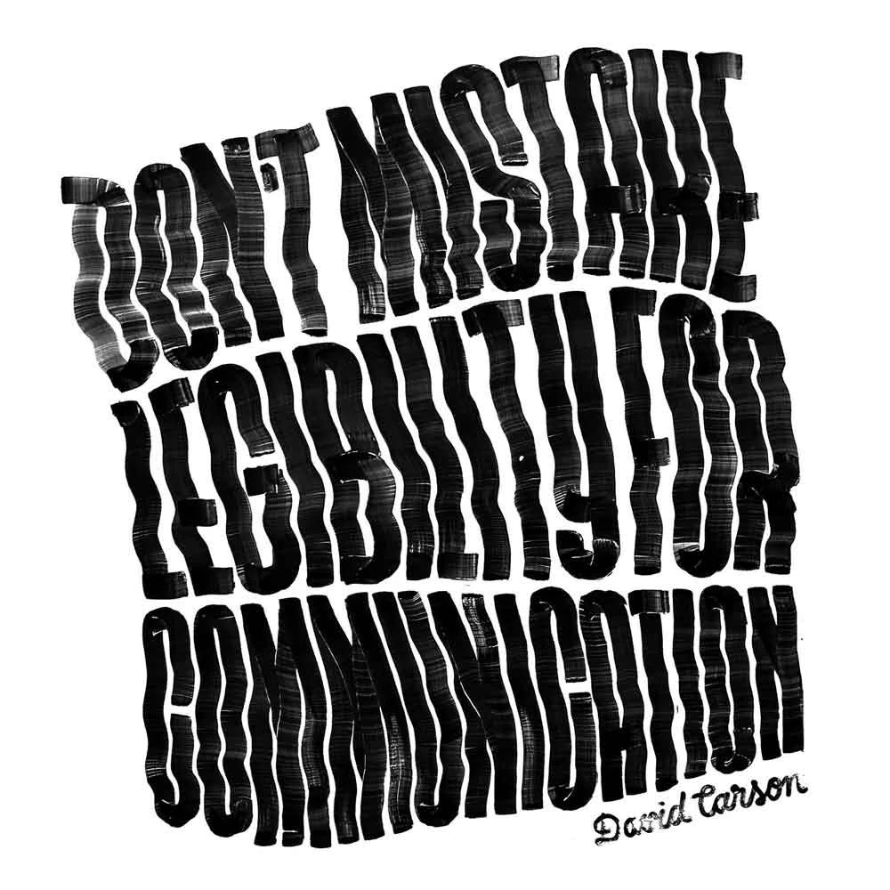
Closely related to readability, legibility focuses on clarity and recognising individual letters rather than comprehension across sentences. Extremely ornate display fonts sacrifice legibility for style. Meanwhile, wayfinding signage demands absolute legibility even from a distance, achieved through simple sans serifs.
Quantifying Legibility
Legibility analysis assesses visual perception factors like:
- Size: Letter height; x-height relative to cap height
- Stroke width: Thicker strokes are more identifiable
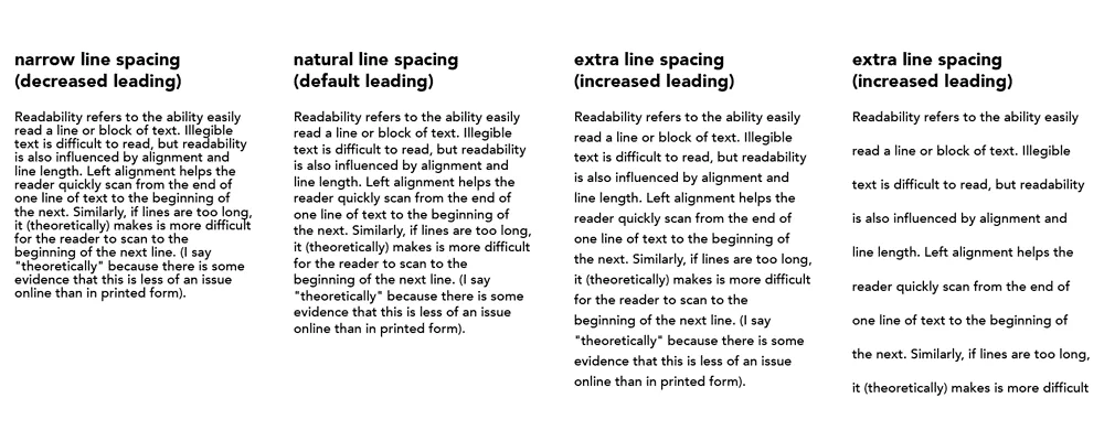
- Tracking: Letter spacing preventing ambiguous letter pairs
- Weight: Bold enhances clarity. Hairlines lose edge distinction
- Width: Condensed letters blur together
Metrics identify fonts struggling with legibility before finalising usage.
Best Practices for Legible Typography
For maximum legibility:
- Enlarge small text (12 pt font minimum)
- Increase tracking for a more precise definition
- Maintain stroke width/weight differentiation
- Choose fonts with unambiguous letter shapes
- Use wider, proportional fonts for paragraphs
- Reserve condensed fonts for headlines
- Avoid thin strokes and hairlines in the body copy
Choosing and Combining Typefaces
Principles for Harmonious Font Pairing
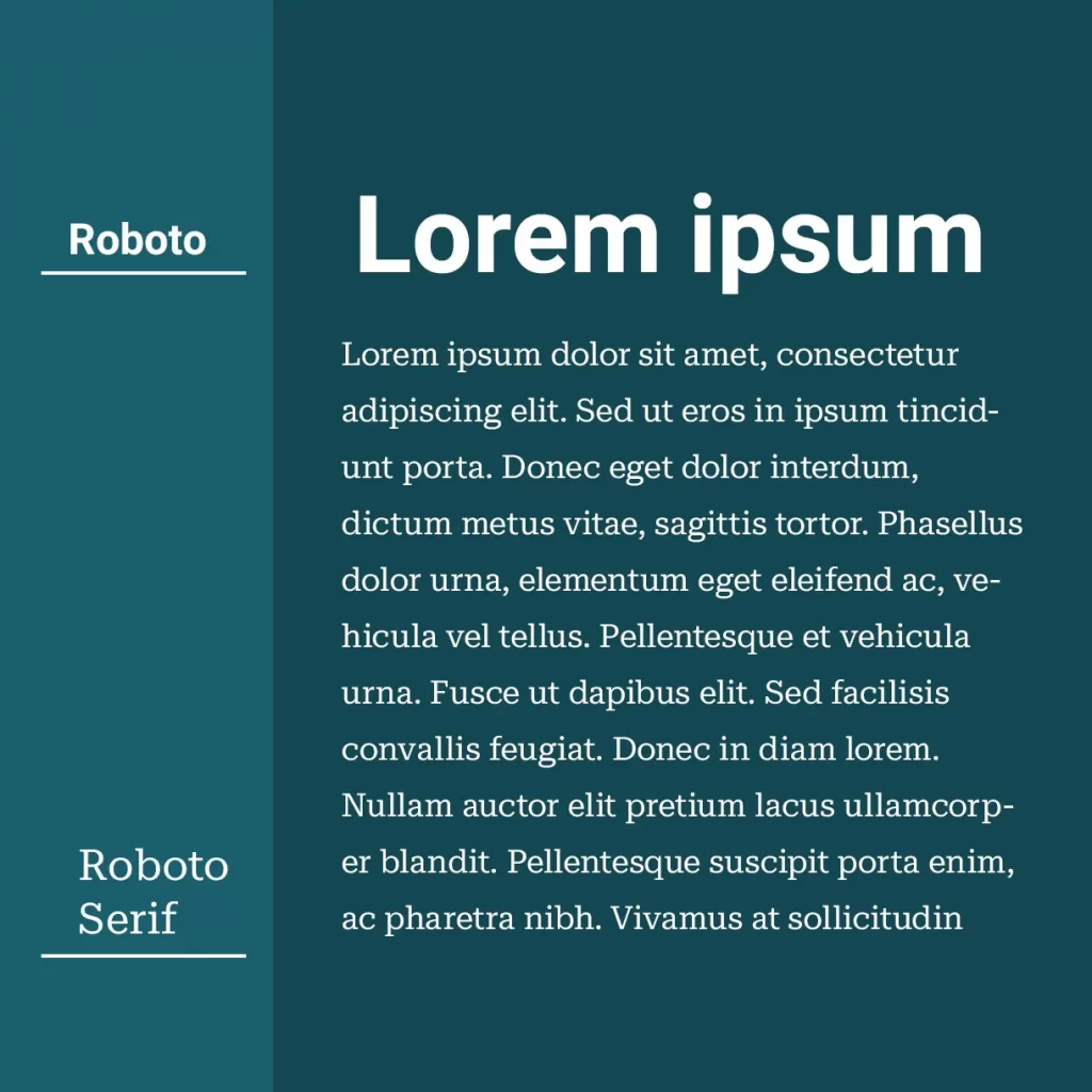
Font pairing mixes styles strategically to communicate tone while enhancing content hierarchy and aesthetics. Pairings might contrast weights and structures while agreeing on mood. Specific genres like sans/serif combinations achieved archetypal status through style harmony.
Best practice principles include:
- Match sizes and weights so neither overpowers
- Ensure sufficient contrast for hierarchy
- Complement personalities to achieve tone goals
- Consider historical links between original font genres
- Sample actual paragraph settings to test harmonisation
Mismatched fonts shriek rather than sing in harmony!
Common Winning Typography Combinations
Classic pairings to try:
- Serif + sans serif: Provides contrast and visual hierarchy
- Slab serif header + transitional serif text: Adds bold flair
- Sans serif header + serif body: Strongly defines levels
- Display + text: Aligns decorative style with readability
Mixing multiple fonts risks clashing. Limit pairings or recurrently use the same set for cohesion.
Typographic Hierarchy Best Practices
Further refine hierarchies via:
- Strategic sizing (significant size gaps between levels)
- Weight contrasts (light body text; bold titles)
- Colour variations (colour headers dominate B&W paragraphs)
- Italicising secondary text like captions
- Capitalising keywords, names, titles
- List numbering/bullet styles to formatting parts
Typography Classification Systems

Why Classify Typography?
As covered, typography encompasses diverse font styles, genres, formats and cultural traditions. Classification systems aim to organise this vast range into navigable structures based on shared traits like period, aesthetic, intended use case, etc.
Effective organisation through classification empowers typography analysis and searching/exploring available options. Historical chronology and stylistic attributes provide two critical classification approaches.
Chronological Classifications
Classifying by historical evolution includes schemas like:
- Old style > transitional > modern > slab: Serifs
- Humanist > grotesque > geometric: Sans serifs
- Blackletter > Roman > display > digital: General
Such systems reveal stylistic influences and cultural turning points across eras.
Appearance/Use Classifications
Alternatively, visually-oriented and use case schemes may have categories like:
- Serif, sans serif, display, script
- Text, decorative, handwritten, symbolic
- Neoclassical, gothic, tech, retro, comics, eroded
These aid browsing, comparison and selection use through grouping aesthetically unified families.
Customised Combination Systems
Hybrid systems combine chronology, style and usage factors across levels of hierarchy. For example:
Serifs
- Old Style
- Text
- Display
- Transitional
- Text
- Display
This multi-dimensional approach powerfully facets a multifaceted domain!
Typography Composition Tips
Principles of Excellent Typographic Composition
Beyond individual font usage, arranging textual elements artfully as a composition elevates a design: sensitive spacing, alignment, visual weight distribution and directional flow control reader journey and absorption.
As in photography, compositional fundamentals like the rule of thirds, negative space, centrality and asymmetry guide layout choices. However, typography additionally considers reading gravity, order, and optics. Refined letter and text framing directs attention, signifying meaning.
Using Space for Emphasis
Strategic spatial allocation spotlights distinct content hierarchies. For example:
- Generous margins: Frame text bodies, preventing a crowded feel
- Isolated headings: Allow prominent display fonts to command focus
- Paragraph indents: Shape textual “paragraphs” visually on the page
- Comprehensive tracking: Important short texts expand through spacing
- Space around logos: Isolates and magnifies identifying marks
Achieving Visual Balance
Balancing visual weight evenly across page sections lets viewers enter compositions without bias:
- Centre spread: Grounding effect for elegant title pages
- Left/right mirroring: Symmetrical margin widths
- Top/bottom: Match compositional densities above and below the page equator
- Radial symmetry: Circularly repeating motifs self-balance
Asymmetrical breaking of symmetry can also be highlighted with intent!
Guiding Viewer Journey
Strategic layout directs eyes smoothly across vital touchpoints:
- Z-path: Default top L to R reading movement
- Entry points: Ornamentation catches initial looks
- Scale and colour: Establish visual hierarchy navigation
- Grouping: Related elements clustered, unrelated, separated
- Flow lines: Arrows gradients lead vision through sequence
With mindful composition, journeys through typographic landscapes become richly rewarding!
Conclusion
We've explored incredible typography diversity spanning form and function–from august serifs consecrating tradition to renegade display types breaking all rules. Classifications structure this ocean of options, and strategic font pairings channel its possibilities.
The composition then shapes reader engagement on micro and macro levels. So, encoding meaning through mindful typographic choices, our textual communications sing–or they shout unintelligible cacophony!
But now, understanding core styles, best practices, and guiding principles equips us to leverage typography confidently. Whether branding businesses or beautifying book covers, typography crafts emotional connections through artistry, readability and technique.
So, let your inner designer flourish; bring your voice to a page with skill and style. May your compositions harmonise as sweet symphonies across our visual soundscapes!
Frequently Asked Questions
What are the best fonts for reading on screens?
Quality humanist sans serifs like Calibri and Myriad Pro offer excellent digital reading. Slab serifs also hold up, but very light/condensed serifs strain eyes.
What does leading refer to in typography?
Leading describes vertical line spacing, measured from baseline to baseline. More comprehensive leading enhances paragraph readability through less density.
How are typography classification systems functional?
Classification organises the enormous range of fonts for more accessible analysis, search and selection. It reveals histories, influences and stylistic connections.
How does typography influence emotions and branding?
Strategic fonts evoke identities aligning with the target audience's values and desired tone. Custom fonts boost recognition and authenticity.
What makes a good font pairing?
Effective pairings feature sufficient contrast without clashing. Complementary sizes/weights, similar personalities/periods and paragraph test drives ensure harmony!
