Evolution of 1970s Logos: From Groovy to Timeless
The 1970s was a pivotal era in graphic design, characterised by bold colours, geometric shapes, and artistic experimentation. As the revolutionary spirit of the 1960s gave way to a new decade, logo designers embraced creative freedom and innovative techniques. Branding experienced a transformation, moving away from the muted, corporate aesthetic of the 1950s and 60s and towards more expressive and unconventional visual identities.
This was particularly evident in logos, as designers pushed creative boundaries and leveraged new styles. Psychedelic influences, retro-futurism, kitsch elements, and artsy configurations dominated the symbols of the 1970s. Music festivals like Woodstock, fashion trends like disco, and films like Star Wars provided cultural inspiration. Meanwhile, the rise of brands like Apple and Nike highlighted the power of visual symbols in an increasingly commercial landscape.
In this article, we'll travel back to the 1970s and explore the history behind ten iconic logos of the era. We'll examine their aesthetic qualities, from colour palettes to typography, and analyse how they captured the free-spirited, experimental zeitgeist of the decade. We'll also consider the designers behind these logos and the innovative techniques they utilised. From simple geometric forms to vivid gradients, these logos demonstrate the diversity and dynamism of 1970s design. By examining these influential emblems closely, we can better understand the interplay between culture, branding, and graphic design in the 1970s. Their legacy continues to shape visual culture today.
Table of Contents
The Cultural Canvas
The Social Climate
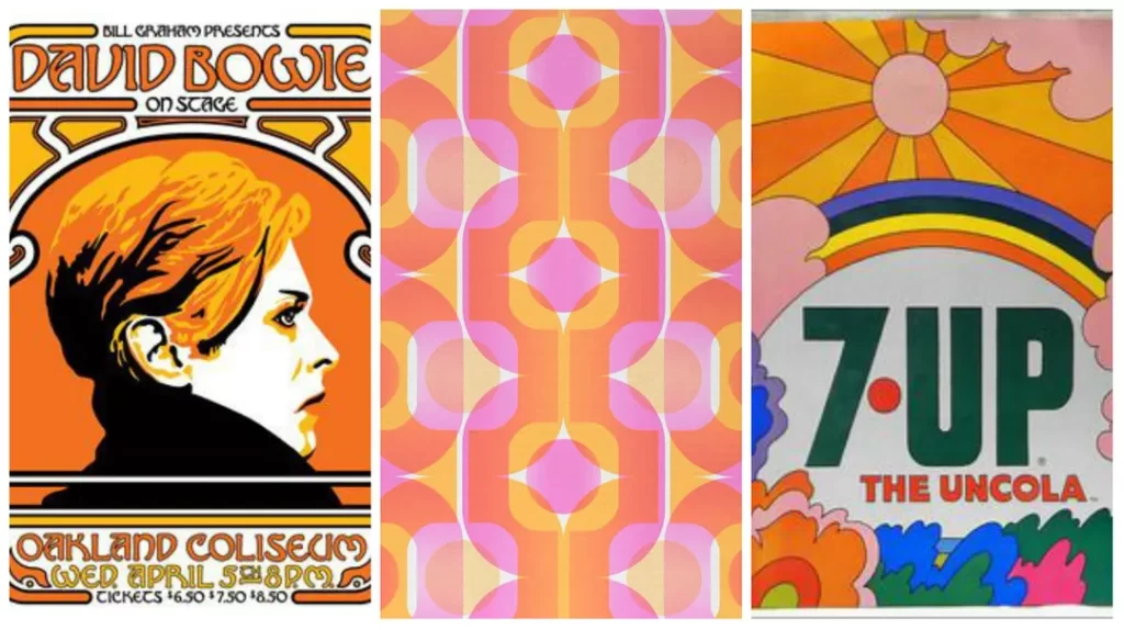
The 1970s were a turbulent time of profound social change and upheaval. Coming on the heels of the radical 1960s, the decade saw the repercussions of the counterculture and civil rights movements continue to shape society. This unique cultural backdrop significantly influenced logo design trends during this era.
With the Vietnam War raging on, anti-war sentiment was strong. The peace symbol became an iconic emblem, reflecting the values of the anti-war, anti-establishment generation. Environmentalism also rose to prominence, raising awareness of ecological issues. Brands and corporations sought to align themselves with these ideals of freedom, rebellion, and social progress to connect with the younger, more socially conscious consumer. As a result, logos from the 1970s often embraced themes of nature, individuality, and social justice.
The rise of the women's liberation movement also catalysed a shift in culture and attitudes. As more women challenged traditional gender roles, female empowerment became a pressing social issue. Many logos began targeting women as an emerging consumer group with increased economic power and independence. Beauty and fashion brands, in particular, adopted bold, assertive designs to speak to the modern, liberated woman.
The counterculture movement continued to influence design with its unconventional styles rooted in psychedelia and youthful opposition to the establishment. Overall, logos in the 1970s mirrored the subversive energy and activism of the era.
Pop Culture Phenomena
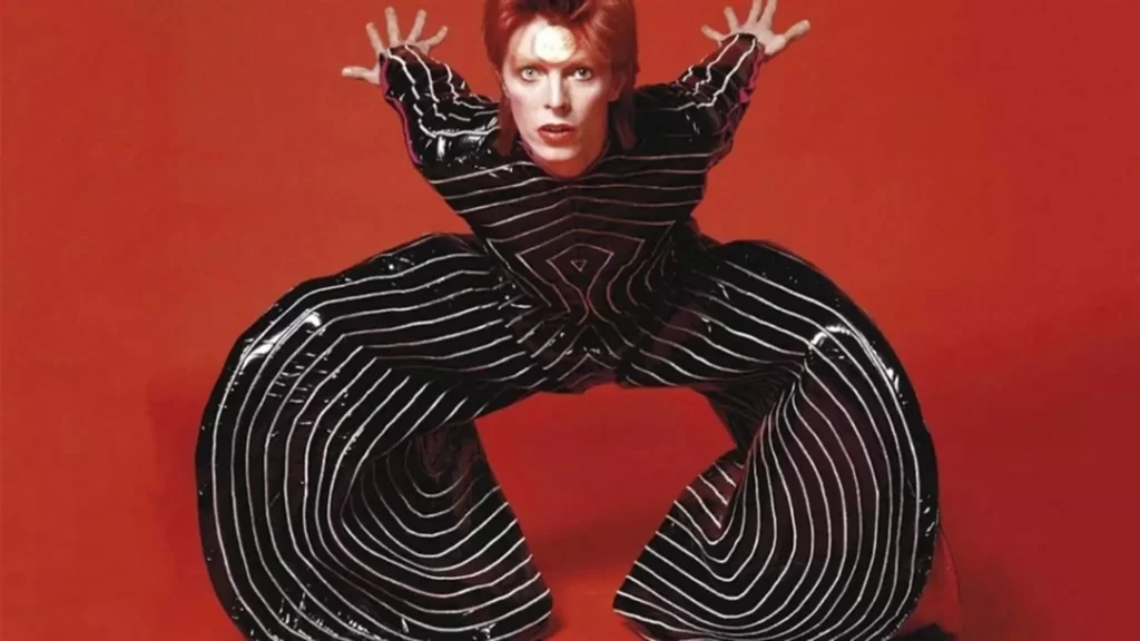
The 1970s witnessed the rise of significant pop culture crazes that became etched into the public consciousness. These era phenomena also left a sizable imprint on logo design, from disco to blockbuster movies.
The frenetic disco scene was at its peak, dominating mainstream music and youth culture. Disco-inspired logos that were brightly coloured, vibrant, and dynamic, mirroring the high-energy late-night dance floors. Shiny metallics, glittering disco balls, and pulsing typography all captured the movement and excitement of this style.
Film and television also saw massive growth, marked by the success of high-concept blockbusters like Star Wars and shows like Charlie's Angels. Logos incorporated imagery and themes inspired by science fiction, fantasy, and escapism in these famous works. Sleek, futuristic elements like stars, rockets, and metallic finishes filtered into logo designs, tapping into the wonder and adventure of movies and television.
From fashion to advertising, pop culture dictated many design choices. Eye-catching, bold logos tried to align brands with current and relevant trends. The phenomena of the 1970s ushered in an era of innovation that delivered memorable and stylistically distinct symbols.
Design Elements

Colour Palettes
The colour palettes used in logos during the 1970s were eclectic and vibrant, mirroring the bold stylistic trends of the era. Earthy, natural tones like rich oranges, harvest golds, and avocados were prevalent. These warm hues evoked a sense of nostalgia and comfort, reminiscent of the peace movement and back-to-nature attitudes popular at the time.
Brights and bold primaries also came into vogue, with logos featuring crisp, saturated red, blue, and yellow versions. These loud, attention-grabbing colours aligned with the bold, psychedelic aesthetic of the decade. Many logos also utilised striking colour combinations, with complementary hues placed side-by-side to create visual vibrancy. The contrast between colours like purple and yellow or orange and blue made logos stand out. Overall, the experimental use of colour in the 1970s pushed logo design in new creative directions.
Typography
Typography evolved dramatically throughout the 1970s. Early in the decade, elaborate, decorative fonts were widely used in logos. Serif fonts with delicate flourishes and ornate styling reflected the last vestiges of 1960s psychedelia. However, as the decade progressed, simple and streamlined sans-serif fonts emerged.

The shift towards minimalist, sans-serif lettering aligned with the move towards modernism and functionality in design. Clean fonts like Helvetica, with their legible lines and lack of ornamentation, embodied the pared-down aesthetic that would dominate in the ensuing decades. By rejecting embellishment and embracing simplicity, typography in the 1970s bridged the transition between the elaborate 1960s and the reserved minimalism of later eras.
Visual Styles
Logo design in the 1970s encompassed a spectrum of visual styles. At one end, minimalist logos like the Nike Swoosh gained popularity through their simple, graceful lines and lack of embellishment. The stripped-down aesthetic and easily recognisable silhouette embodied a sleek, refined modernism.
In contrast, psychedelic styles persisted, with logos featuring wild, expressive illustrations, dizzying optical illusions, and bursts of clashing colours. The hypnotic patterning and kaleidoscopic effects aimed to dazzle the eye. Pop art influences, with bright colours, bold outlines, and dimensional forms or shadows, were also apparent. Overall, 1970s logo design was defined by minimalist and maximalist approaches, united by experimental creativity—the decade's innovations significantly advanced logo design, setting the stage for bolder aesthetic explorations.
Iconic 1970s Logos
The Coca-Cola Logo: Evolution of a Classic
The Coca-Cola logo is one of the world's most iconic and recognisable symbols. In 1971, the company introduced a pivotal redesign that featured the dynamic ribbon – a flowing, bold script that captured the enthusiasm and excitement of the Coca-Cola brand. This marked a significant shift from the previous cursive logo to a more contemporary and versatile design.
The new dynamic ribbon logo was debuted in conjunction with the launch of the contour bottle, Coca-Cola's signature bottle shape. The contour bottle's unique silhouette became integral to the brand's identity. The ribbon logo and contour bottle created an unmistakable brand image that could be adapted for advertising across various media.
The 1971 rebrand proved tremendously successful at increasing recognition and enhancing Coca-Cola's global presence. Studies conducted in the mid-1970s revealed that the Coca-Cola symbol was recognised by more people worldwide than even major religious symbols. The ribbon logo surpassed the Christian cross in international brand awareness.
This impressive brand recognition was a testament to the power of the redesigned logo and bottle. Coca-Cola cemented its status as a cultural icon by capturing the brand's spirit in a distinctive, memorable visual identity. The ribbon and bottle design became representations of refreshment, joy, and Americana worldwide. More than just a soft drink, Coca-Cola branded itself as an experience and lifestyle with its 1971 logo redesign. The dynamic ribbon retains its popularity and influence as one of history's most brilliant examples of effective logo design.
IBM: The Birth of the Blocky Logo
IBM, founded in 1911 as the Computing-Tabulating-Recording Company, has undergone multiple logo changes throughout its long history. The company's original logo featured an ornate, almost Victorian-style design with flowing script lettering surrounded by floral embellishments.
In the 1970s, as IBM established itself as a leading technology innovator, it adopted the iconic striped logo design it is now famous for. This was a dramatic departure from its traditional ornate logo, reflecting the sleek, bold aesthetic of modernism and IBM's forward-thinking approach.
The new logo consisted of bold, solid blue letters with prominent horizontal stripes. According to logo design principles, the bars represent speed and dynamism, suitable for a technology pioneer like IBM—the solid, blocked letters project stability, reliability and efficiency.
This minimalist, abstract logo perfectly captured the essence of IBM's business strategy in the digital age. The stripped-down aesthetic symbolised innovation, while the bold lettering conveyed market dominance. The lack of serifs and sleek, geometric design echoed IBM's technologies' precision and cutting-edge nature.
In general, this shift from traditional to modern in the 1970s logo change also mirrored the transition from old tech to new tech in the computer industry. The simplified, bold design has stood the test of time as one of the most recognisable tech logos worldwide.
Nike Swoosh: The Birth of an Athletic Empire
The Nike Swoosh has become one of the world's most iconic and recognisable logos, but its origins stem from humble beginnings in 1971. That year, Phil Knight, founder of Blue Ribbon Sports – the company that would later become Nike, Inc. – was seeking a design for a new brand logo. He reached out to Carolyn Davidson, then a graphic design student at Portland State University.
At the time, Knight was preparing to launch a new line of athletic shoes and apparel under the name Nike, named after the Greek winged goddess of victory. He wanted a logo that would capture the spirit of motion and speed. Davidson came back with several designs, but a straightforward checkmark stood out. Knight chose it and paid Davidson just $35 for the job.
In the decades since the Swoosh has come to represent the global powerhouse that is Nike. Its graceful curved lines evoke a sense of movement and flow that perfectly embodies athleticism. The minimalist, fluid shape allows it to stand out clearly, whether large or small in scale. It's also highly versatile – the Swoosh enhances any product it adorns, from t-shirts and sneakers to golf clubs and basketballs.
Yet, while it has grown ubiquitous today, the Swoosh faced scepticism early on. Some mocked its simplicity. But Knight saw the power in the unconventional design. It broke through the clutter of the time's busy, crowded logo design. The Swoosh was easy to recreate faithfully in any medium, which is critical for branding coherence. Knight's intuition proved prescient.
Now, the Swoosh is valued at over $26 billion, making it one of the most valuable trademarks in the world. It is a premier example of how thoughtful minimalist design can create an icon that stands the test of time. The logo that once cost $35 has fueled the rise of one of the most successful companies ever. Not bad for a checkmark.
Apple: The Birth of a Tech Giant
When Apple Computer was founded in 1976 by Steve Jobs, Steve Wozniak, and Ronald Wayne, the pioneering tech startup needed a logo that embodied its vision. The founding trio commissioned an ornate, woodcut-style logo depicting Sir Isaac Newton sitting beneath a tree with an apple dangling precipitously above his head. Newton was a fitting symbol, as the famous apocryphal story of his discovery of gravity via a fallen apple illustrated the power of innovative thinking. While artistically intricate, the detailed logo proved challenging to reproduce clearly on the company's products.
The Rainbow Apple
In 1977, Apple Computer unveiled the now iconic rainbow apple logo. Designed by Rob Janoff with a bite mark added for scale, the logo paid homage to Apple's original name, Apple Computers. Its vibrant rainbow stripes represented the company's dedication to bringing colour graphics capabilities to what was then a black-and-white computing world dominated by IBM. The colourful stripes and friendly bite made Apple stand out from its competitors and signified its mission of making computing accessible and inviting for all.
Symbols of Simplicity and Innovation
Over the decades, Apple continued to refine its logo while preserving the original rainbow apple motif. The colours were later incorporated into monochrome designs used on products like the iPhone and retail bags. In the 2000s, Apple began utilising a minimalist solid white apple in advertising and packaging.
The evolution of Apple's logo traces the company's trajectory from a scrappy startup to an innovative leader. As products like the iPod and iPhone revolutionised consumer technology, the logo came to embody the company's commitment to sleek, intuitive design. Today, the stylised apple symbolises the brand's visionary thinking and never-ending quest to push the boundaries of what technology can achieve. Apple's deceptively simple logo reflects the sophistication and imagination at the heart of its efforts to put pioneering technology in people's hands.
Design Trends and Techniques
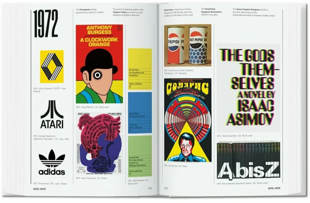
The 1970s was a transformative decade for logo design. During this period, several key trends emerged that shaped the visual identity of major brands.
One of the most prominent trends was the use of geometric shapes. Triangles, circles, squares and variations are featured heavily in logos across all industries. These elemental forms conveyed a sense of balance, symmetry and mathematical precision. For instance, the iconic Adidas logo with its three parallel stripes embodied the sleek, structured aesthetic of the era. The geometric stripes evoked motion and speed, an ideal representation of an athletic apparel company.
Beyond functionality, the prevalence of geometric logos also aligned with the cultural ethos of the 1970s. During a turbulent social and political change, simple yet bold geometric logos provided a sense of order, stability and confidence. Major corporations sought symbols representing solidity and reliability in a decade of uncertainty.
In tandem with the grounding influence of geometry was an obsession with the future – a visionary spirit known as retro-futurism. Logos in the 1970s often incorporated forward-thinking fonts and designs that blended nostalgia with romantic visions of the future. The 1972 Munich Olympics logo exemplified this aesthetic with its sleek, futuristic typography that embodied a celebratory spirit and cutting-edge modernism.
Lastly, the 1970s saw the rise of logo storytelling. Logos evolved beyond merely representing names into narratives communicating a brand's values, personality and aspirations. The classic Shell logo encapsulated this trend with its iconic seashell that implicitly suggested the company's connection to nature, the environment and ocean resources. Simple but symbolic, these logos became visual metaphors for the brand's ethos.
In these diverse ways, logo design in the 1970s fused functionality and aesthetics to capture both the pragmatic spirit and aspirational visions of the times. The logos of the era demonstrated how graphic symbols could communicate on levels beyond the literal to become signifiers of corporate and cultural identity.
The Legacy of 1970s Logos
The influence of 1970s logos continues in contemporary branding and design. Many modern companies draw direct inspiration from the visual style, design elements, and principles that defined the 1970s era.
For example, the resurgence of retro and vintage design aesthetics in recent years mirrors aspects of 1970s graphic design. Brands looking to tap into nostalgia often utilise the distinctive colour palettes, typography, shapes, and textures that were hallmarks of the 1970s.
The retro-futuristic visual language of the 70s, characterised by chrome/metal textures, vibrant neon colours, and Space Age motifs, has profoundly impacted contemporary logo and branding work. Designers today integrate and reinterpret these elements into fresh, innovative identities that feel both modern and retro.
Similarly, the simple, pared-down minimalism featured heavily in the 1970s remains a core principle in logo design. Contemporary brands aim to emulate the minimalism and artistic simplicity of legendary 70s logos like Nike's Swoosh and Apple's Bitten Apple.
At their core, the most enduring 70s logos remain relevant not just because of style but because of their emphasis on visual storytelling and cultural resonance. They embody timeless principles like simplicity, memorability, and conceptual depth, allowing them to persist across eras.
In short, the 1970s retains its position as a wellspring of inspiration for designers. By studying and thoughtfully reimagining the most iconic branding of that period, creatives continue producing work that feels fresh and nostalgic, contemporary and retro. When skillfully executed, this fusion creates compelling, forward-looking identities that still feel rooted in the visual ingenuity of the 70s.
Frequently Asked Questions (FAQs)
What defined the colour palette of 1970s logos?
The colour palette of 1970s logos was characterised by earthy tones such as browns and oranges. These colours reflected the era's fashion trends, conveying warmth and nostalgia. Additionally, there was a bold experimentation with contrasting hues, pushing the boundaries of visual appeal.
How did pop culture influence logo design in the 1970s?
Pop culture had a profound impact on 1970s logo design. Logos often incorporated elements from iconic phenomena like disco, movies, and television. These logos mirrored the energy and themes of these cultural movements, making them highly engaging and relatable.
What role did typography play in 1970s logo design?
Typography in the 1970s transformed. Early in the decade, ornate and decorative fonts were standard. However, a shift towards minimalism brought clean, sans-serif fonts into prominence. This shift reflected the broader cultural move towards simplicity and functionality.
How have 1970s logos influenced modern branding?
1970s logos have had a lasting impact on modern branding. Contemporary brands often draw inspiration from that era's design elements and principles. From colour palettes to typography, the 1970s continue to shape how brands present themselves, bridging the past and the present.
Conclusion
As we conclude our journey through the vibrant and innovative world of 1970s logos, it becomes evident that this era left an indelible mark on branding. The interplay of culture, design elements, and storytelling has continued to shape how we perceive and interact with logos in the modern age.
Through this exploration, we've gained an appreciation for the design prowess of the 1970s and a deeper understanding of how logos are more than just symbols – they are reflections of their time, culture, and the human spirit.
