10 Website Design Principles for Creating an Engaging User Experience
Robust website design is essential for achieving your business goals and providing a good user experience. This means creating an interface that's easy on the eye, engaging for visitors and effectively communicates information. You can create a site that impacts your audience by understanding fundamental design principles.
To get to grips with this subject, let's explore the critical website design principles in more detail – and how they help deliver online success.
Table of Contents
Critical Website Design Principles

Usability and utility are fundamental principles of effective website design. When designing a website, it is vital to keep the user in mind. A good website should be easy to navigate and provide relevant information, fulfilling users' needs.
Users tend to scan for information rather than read every word. Making content scannable with headings, bullet points, and concise paragraphs is essential. For example, if someone wants to find specific information on a web page, they are more likely to scan through the headings and bullet points than read all the words.
Users hate waiting for things because they expect instant gratification. If your site takes ages to load, it can lead them to leave it and have a negative experience of interacting with your company or brand. For example, say you have an e-commerce site, and someone goes there specifically wanting to buy something; if it takes so long for the site pages to load that they get annoyed and abandon their shopping cart without purchasing anything, you've lost them as a customer.
Users make snap decisions based on intuition about whether or not something will be easy to use or not so easy to use, so designing sites which are intuitive is crucial – especially when people can click away from your site at any time. Your website should be self-explanatory (i.e. minimising how much people have to think/how much stuff they have to ‘figure out'). By keeping user requirements minimal, websites encourage exploration/engagement with the online content being shown off.
For example, An online clothes shop where users can apply filters (such as colour) helps users quickly find what they want without trawling through many irrelevant products/pages.
Visual cues play a big part in guiding user attention towards elements that matter on a page: using visual clues like colour/and size/contrast helps visitors know where we stand/and navigate our sites better.
Well-written/concise/scannable/objective content is vital for effective communication too – i.e. making sure what we're saying is clear, concise and scan-able – so users can quickly understand the purpose of a website/page and find any necessary information.
Simplicity in design reduces cognitive load for visitors, making it easier for them to think/interact with our web page. Complex/cluttered designs can overwhelm people and make it harder for them to navigate around a site.
For example, keeping things simple/intuitive means that users can quickly locate whatever they want on the page because there's less stuff on there overall, i.e. you've removed all unnecessary clutter.
Finally, testing early and often helps identify usability issues so your website meets user expectations. Conducting user testing/gathering customer feedback throughout the design process allows us to improve/refine our website based on real-life preferences/behaviour.
Importance of User Experience in Website Design

To succeed, a website must be usable and valuable. If it isn't, then the user experience (UX) will suffer.
But UX goes beyond just usability and usefulness. A good website is also one that users find easy to use and valuable enough to meet their needs. To create sites like this, you need to understand what makes people behave as they do and when they know they want something right now.
You also need to design for intuition and provide control over navigation. This helps ensure your site is easy to use – which means it will be more likely that visiting people will stay longer.
Reducing cognitive load through good design and a well-written copy is vital if you want your UX efforts to succeed.
Users may feel overwhelmed if a page appears cluttered or complex, so ensure everything on display has earned its place.
You can guide attention by using whitespace effectively: put plenty of space around essential elements in the layout so they stand out; meanwhile, reduce the prominence of less-important features.
Remember: if something doesn't help with overall comprehension or ease of understanding, lose it.
Finally, an attractive interface that's simple rather than confusing encourages engagement and repeat visits – which could mean more conversions, not forgetting positive word-of-mouth recommendations.
Responsive Design and Mobile Optimisation
Responsive design has become essential to website development as mobile devices are used more frequently. Responsive design enables websites to adjust to various screen sizes and devices, ensuring a consistent and optimal user experience. Mobile optimisation is crucial for both user experience and search engine optimisation (SEO) since sites that need to be optimised for mobile may have higher bounce rates and lower search rankings.
To ensure their site is accessible and user-friendly across devices, businesses must adhere to best practices when designing mobile-friendly websites. This includes working with a responsive design framework, optimising images and media for mobiles, and streamlining navigation on smaller screens.
Companies can improve the overall user experience by focusing on mobile optimisation while attracting more potential customers or clients.
Take this example: someone using their smartphone browses a website. If it has yet to be optimised for mobiles, the content might be distorted, navigating could be difficult, or they may need to zoom in or out just to read text. A responsive design will ensure the website adapts seamlessly to their device so they can view and navigate easily – making all the difference!
Incorporating Whitespace and Visual Hierarchy

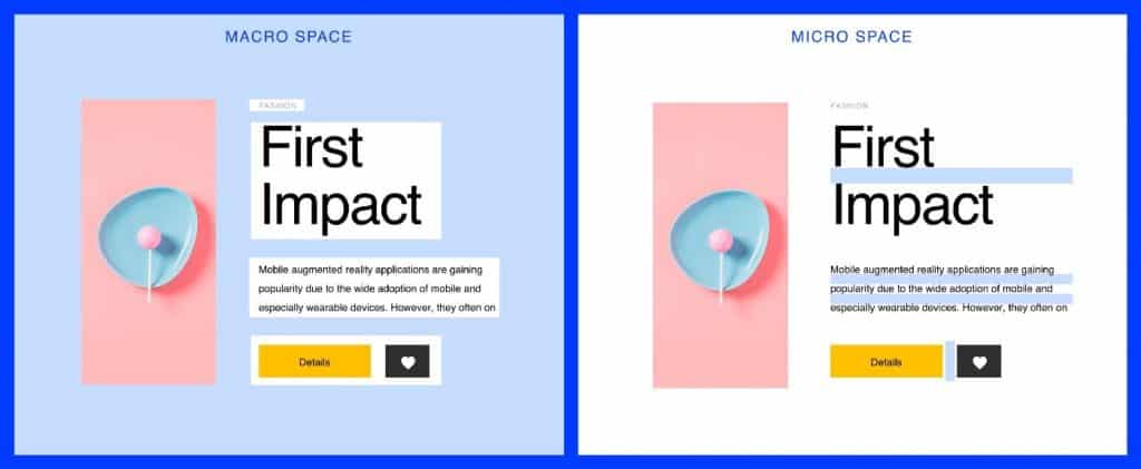
Whitespace, or negative space, is the space between web page elements. This essential design element helps to make the text more readable and content more legible by organising it into visual “chunks” that help the reader's eye distinguish one piece of information from another. By using whitespace strategically, designers can create a clean and uncluttered layout that makes it easy for users to focus on what's important.
A critical principle in web design is visual hierarchy – how elements are arranged on a page to suggest their order of importance and guide attention. Designers can establish this with size, focus (or blur), colour contrast, typeface choice, location/movement, and use or absence of whitespace.
For instance, more significant or more heavily styled elements naturally attract attention; contrasting colours create emphasis; placing one item apart from others draws viewers toward it; giving an element room to breathe imparts significance; abruptly cutting off—using no padding at all at once side—a borderline suggests its contents continue beyond the cut-off point.
Having a clear visual hierarchy makes it easier for users to navigate sites because they know where to look first (the most prominent thing), then second … etc.); they can easily find what they're interested in without exploring every part of a website first.
Think about news websites without much whitespace and no obvious visual cue as to what stories are the main ones – different-sized headlines don't always help if there isn't enough separation between them.
Users could struggle to determine which headline was most important… get frustrated… and leave.
But add some extra whitespace around each story group (to separate them visually), increase the font size for head stories only (and maybe bold those as well… may be using a different colour, too)… now you have something that's scannable/easy-to-skim and user-friendly.
Consistency in Design Elements
Focusing on the finer details is essential to create a professional and consistent website. A unified user experience can be achieved using the same branding, colours, fonts, and layout across all pages.
Not only does this approach make your website more distinctive and reinforce your brand's identity, but it also improves usability for visitors. If they see familiar design elements as they explore different parts of your site, they'll quickly learn how it works and feel comfortable interacting with its features.
A well-structured website with consistent colours, fonts, navigation menus, etc., throughout (including subpages) will consistently deliver an enjoyable user experience. The site will be easy to use because people are used to interacting with sites that look like yours.
Ultimately, consistency in design choices helps visitors navigate around the rest of your site without needing instructions – because most websites work precisely how we expect them to. It's one less thing for them to learn while attempting to get what they want from you.
That's why we recommend following our design guidelines: creating a solid digital presence relies on consistency in more minor elements coming together into one bigger picture.
Navigation and Usability Considerations

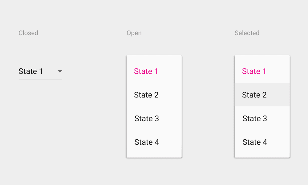
Website design demands the consideration of navigation and usability. Indeed, creating an intuitive menu is integral to enabling users' discovery of information. Fundamentally, a clear and logical structure is critical if a website is to make sense for users. By sticking to best practices for website navigation, including descriptive labels, hierarchical menus and aids that guide navigation clearly throughout the site – such as breadcrumbs or an active state on links – businesses can create a better user experience and reduce cognitive load.
Usability also means making important information obvious: putting it front-and-centre (in web-design parlance above the fold) so visitors don't have to scroll down or include search functionality so they can find exactly what they want. For example, placing the search box on the top right has become a convention because people are used to looking there. Make sure your search returns accurate results, too.
By baking in usability from the get-go, you'll ensure your visitors can reach their goal more efficiently, resulting in happy customers returning.
Accessibility and Inclusivity in Website Design
Website design must take into account the principles of accessibility and inclusivity. Developing accessible websites guarantees that users with disabilities can access and navigate their content, necessitating incorporating alternative text for images, video captions, and keyboard accessibility. Observing Web Content Accessibility Guidelines (WCAG) assists in making sure that a broader range of users can interact with these sites.
Inclusive design goes beyond mere accessibility by aiming to create sites suitable for a diverse audience. Companies may create a more inclusive and user-friendly site by considering the needs and preferences of different user groups. This might entail options such as font size adjustment, language translation services or customisation functions. Being mindful of including both accessibility and inclusivity in website design allows businesses to reach out to a larger audience while simultaneously providing all users with a better experience.
For example, envision someone visually challenged visiting a site without any substitute text on its pictures; this would imply losing significant visual details crucial for comprehending the material. Incorporating features like alternative texts results in greater inclusivity while assuring individuals with disabilities have full access to it all.
Importance of Fast Loading Speed

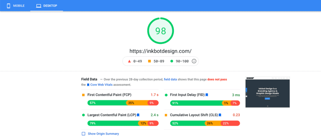
The success of a website often hinges on how quickly it loads. People expect websites to load rapidly; when they don't, it can lead to higher bounce rates and a poor user experience.
Improving website performance is crucial to reduce loading times and quickly give users what they want.
Ways to enhance the speed at which your website loads include minimising HTTP requests, caching, optimising code and scripts and compressing images.
Businesses can significantly boost their sites' performance by taking these steps and leveraging browser caching so repeat visitors get faster load times. And having fast-loading webpages doesn't just make people more likely to convert or enjoy their experience on-site. It also improves where search engines rank your pages.
Imagine someone visiting an online shop only for pages that take a while to load, meaning they become frustrated and decide not to bother waiting for the content they were expecting. If this happens often enough, lost sales will be inevitable. Conversely, if all that person's searches return pages that load quickly, it provides a great user experience that might help increase conversion rates.
Use of Colour, Typography, and Imagery
Website design utilises colour, typography, and imagery to create a visually appealing experience. Colour can be used to evoke certain emotions or convey branding. Designers choose a colour palette that matches the brand personality or desired user experience.
Typography affects how users read content on your website. The font you choose should be readable and accessible to most users. This means choosing a legible font across different devices and screen sizes.
Images are a potent tool in web design. They can make your site more visually engaging, convey messages faster than words, and create an emotional connection with your visitors. The right images help reinforce your brand identity and entice visitors to want more.
For example, consider what travel websites might look like If they use beautiful photos of exotic destinations with bright colours popping off the page and easy-to-read fonts – all of this combines for a stunning experience!
Incorporating Call-to-Action Elements

When it comes to getting users to do what you want them to, adding a call-to-action (CTA) button is critical. CTAs come in many shapes and sizes – they can be tiny text links or big, bright buttons – but the bottom line is that their design and prominence on a page are crucial.
The position of your CTA, the way it looks, and the language you use on it should all be considered when thinking about how best to incentivise users' clicks.
Placing your CTAs in prime positions will improve the chances of someone clicking on them; designing them to contrast with other elements on the page can also make them stand out more; using persuasive language that communicates something valuable will also increase their allure.
For instance, a website offering a free trial of its software could have a prominent CTA button at the top of its homepage with “Start Your Free Trial Today!” written inside. It's been placed prominently and uses colour contrast and power words such as “start” and “free”, making users more likely to convert.
Testing and Optimising Website Design
Optimising website design is a never-ending process. It ensures that the site keeps working better for people using it, whoever they are.
Designers have many ways to help them determine what improvements will work well. They can test the site's ease and ask people for their opinions.
One popular way of testing designs is called “A/B testing”. This means trying different techniques simultaneously and seeing which one works best. For example, if you designed a button asking people to sign up for an email newsletter, you could try two different colours or words on that button. One version might get more clicks than another—so you would know which change would likely be most helpful.
These tests help designers build a detailed picture of what users want and expect from websites like yours—and figure out any “pain points” where things aren't working well.
Testing is always going on because users' needs can change quickly, depending on various factors such as their physical surroundings or moods.
Conclusion
Effective website design is essential for shaping user experience and achieving business goals. Businesses can make user-friendly, visually pleasing, and engaging sites by following fundamental website design principles such as usability, simplicity, and visual hierarchy. Responsive design and mobile optimisation ensure websites work well on any device.
Adding enough whitespace, staying consistent with branding elements like logos or colours throughout the site, and keeping navigation clear all improve a user's overall site experience. Accessibility is also crucial to making sites usable by as many people as possible. Making sure a page loads quickly helps, too.
Design choices like colour scheme or typography can impact how visitors perceive your brand and imagery choice (think quality photography versus clipart), so it's worth considering whether your preferences fit with what you're trying to convey.
A good website will have vital call-to-action elements encouraging visitors to complete tasks like signing up for emails or buying something. If there's no point of conversion, the site becomes an empty shell.
Remember: it's always worth regularly testing your site's performance – speed testing tools such as WebPageTest.org can help measure this – but remember these results might not be accurate if someone else on your server happens to be doing some high-demand tasks when you run them.
