Minimalist Logo Design: Why Less is More
In today's fast-paced and visually saturated world, minimalist logo design has emerged as a powerful branding strategy, embodying the mantra “less is more.” This approach to logo design focuses on simplicity, clarity, and the power of visual elements to evoke strong emotions and create lasting impressions.
In this article, we'll explore the principles and benefits of minimalist design and why it has become an increasingly popular choice for businesses and organisations worldwide.
Minimalist logo design is rooted in the belief that simplicity can convey meaning just as effectively, if not more so, than complex designs. By stripping away extraneous elements and focusing on the essence of a brand, these logos become instantly recognisable and memorable. They are designed to communicate a clear message with an economy of form, using basic shapes, clean lines, and a limited colour palette.
As a branding expert, I will share my insights into the factors that make minimalist logos successful and why adopting this design philosophy could be a game-changer for your brand.
We'll begin by discussing the origins of minimalist design and how it has evolved. We'll then dive into the key elements and principles that define minimalist logo design, such as balance, proportion, and contrast. We'll also touch on the psychological underpinnings of this approach and how it can create an emotional connection with your target audience.
Next, we'll explore case studies of some iconic minimalist logos, analysing the design choices and their impact on the respective brands. We'll also examine common mistakes and pitfalls to avoid when creating a minimalist logo, ensuring you're well-equipped to craft a design that stands the test of time.
Finally, we'll provide practical tips on applying minimalist design principles to your brand, including typography, colour, and imagery considerations. Whether you're a seasoned designer or a business owner looking to refresh your branding, this article will serve as a comprehensive guide to understanding and harnessing the power of minimalist logo design.
By the end of this article, you'll deeply understand the minimalist logo design philosophy and its benefits for your brand. You'll be well-equipped to create a compelling logo that embodies the essence of your business while making a lasting impression on your target audience. So, let's delve into the world of minimalist logo design and discover why less truly is more.
Table of Contents
The Benefits of Minimalist Logo Design

Why do minimalist logos work so well? Here are some of the key benefits of using a minimalist approach in logo design:
1 – Memorable
Minimalist logos have become increasingly popular due to their simplicity and effectiveness. The reason why they are so effective is that customers can easily remember them. Unlike complex designs, which can be challenging to understand and recall, a minimalist logo typically consists of a simple, clean mark that the human brain can easily recognise and acknowledge.
Our brains are wired to process and remember simple shapes and patterns more efficiently. When we see a minimalist logo, our brains can quickly recognise its unique shape and associate it with the brand it represents. In contrast, a cluttered, intricate logo can be challenging to comprehend, and customers may not remember it as quickly.
2 – Versatile
Minimalist logos are the epitome of versatility in the world of branding. They are highly adaptable and can be used in various contexts without losing impact. One of the main advantages of minimalist logos is their ease of reproduction and scalability. Due to their straightforward design, they can be easily reproduced across different media types, from small business cards to giant billboards, without losing their visual appeal or legibility.
Moreover, minimalist logos tend to be more adaptable to different colour schemes, which makes them easier to integrate into various branding materials. They can be used with a single colour or multiple colours depending on context and brand identity. This flexibility allows businesses to use their minimalist logos in various settings without worrying about colour consistency or compatibility.
Another benefit of minimalist logos is that they can be easily combined with other design elements to create a unique brand identity. For instance, a minimalist logo can be paired with a distinctive font or a specific colour palette to create a cohesive visual identity that reflects the brand's personality and values.
- Amazon Kindle Edition
- Airey, David (Author)
- English (Publication Language)
- 319 Pages – 08/18/2014 (Publication Date) – Peachpit Press (Publisher)
3 – Timeless
Minimalist logos have a timeless quality that differentiates them from other logo designs. While design trends come and go, minimalist logos have proven enduring and consistently influential in representing a brand's identity. By eliminating any unnecessary elements, a minimalist logo can focus on the essence of a brand, which is likely to stay the same over time. This means that a well-designed minimalist logo can remain effective for years if not decades.
One of the critical reasons why minimalist logos have a timeless quality is that they embody a sense of simplicity and clarity. These qualities are universally appealing and broad, regardless of changes in design trends or cultural shifts. A minimalist logo conveys a sense of elegance and sophistication that can resonate with customers for years.
4 – Attention-Grabbing
In branding, a minimalist logo can be an attention-grabbing choice that sets a brand apart from its competitors. While complex logos can be visually stunning, a minimalist logo's simplicity can significantly impact the viewer's attention.
A minimalist logo can stand out in a crowded marketplace, especially if it is visually striking or incorporates a unique design element. The lack of clutter in a minimalist logo allows the viewer to focus on the essential aspects of the design, creating a strong and memorable visual impact.
Best Practices for Minimalist Logo Design
Now that we've explored the benefits of minimalist logo design, let's look at some best practices for creating a successful minimal logo.
1 – Keep it Simple
Minimalist logo design is an art form that emphasises simplicity, elegance, and clarity. The key to creating an effective minimalist logo is to strip away all unnecessary elements and focus on the brand's essential qualities. This means using clean, uncluttered lines and shapes to create a mark that is easy to recognise and remember.
One of the fundamental principles of minimalist logo design is to use as few design elements as possible. The goal is to create a visually striking and memorable logo while conveying the brand's essence. A minimalist design can make a powerful visual impact that stands out in a crowded marketplace by reducing a symbol to its most essential elements.
Moreover, minimalist logos often utilise negative space to create a sense of balance and harmony in the design. A designer can make a more visually appealing and memorable mark by strategically placing blank space around the logo's design elements. Negative space can also create hidden meanings or visual puns, adding depth and sophistication to the design.
2 – Choose the Right Typeface
The typeface you choose for your minimalist logo is a crucial element that can significantly impact its effectiveness. While the design of a minimalist logo is focused on simplicity, the typeface choice can add personality and style. Therefore, it is crucial to stick to simple, sans-serif fonts that are easy to read and modern.
Simple sans-serif fonts work well with minimalist logos because they are easily read, discreet, and modern. They can also add a sense of clarity and sophistication to the logo design. Choosing a simple, legible font can help the logo to be recognised and remembered easily. Moreover, sans-serif fonts are timeless and do not go out of style quickly. This means they are ideal for minimalist logos that must remain effective and relevant over the long term.
On the other hand, overly decorative or ornate fonts can detract from the minimalist aesthetic of the logo. These types of fonts are often challenging to read, which can make the logo less effective. They may also have a dated or old-fashioned appearance, quickly making a minimalist logo appear out of touch. Therefore, it is best to avoid decorative or ornate fonts and stick to simple, clean typefaces that align with the minimalist aesthetic.
- Hardcover Book
- Remington, R. Roger (Author)
- Multilingual (Publication Language)
- 432 Pages – 11/08/2015 (Publication Date) – Taschen America Llc (Publisher)
3 – Use Colour Strategically
Colour is an essential element in logo design and is crucial in communicating a brand's identity and message. This is the same for minimalist logos, where colour can be particularly impactful. However, in the case of minimalist logos, less is often more. Sticking to a simple colour palette that complements the overall design and reinforces the brand's message is crucial.
One of the advantages of a minimalist logo is that it allows for a clean and straightforward use of colour. The fewer design elements in the logo, the more impactful each colour can be. A minimalist logo typically features only one or two colours, making integrating it into various branding materials easier.
Choosing a colour palette for a minimalist logo requires careful consideration. Choosing colours that complement each other and align with the brand's identity and message is essential. For example, a brand focusing on natural and organic products may choose a colour palette with earthy tones, such as green, brown, and beige. In contrast, a technology company may select a colour palette featuring blue, which is often associated with trust, stability, and innovation.
Another consideration when choosing colours for a minimalist logo is their emotional impact. Different colours can evoke emotions and associations, such as calmness, excitement, or trustworthiness. Understanding each colour's emotional impact can help brands choose a colour palette that reinforces their message and identity.
4 – Be Consistent
Consistency is essential in branding, and this is particularly true for minimalist logos. A minimalist logo serves as a visual representation of a brand's identity, values, and personality. Therefore, it is crucial to maintain consistency in design elements, typography, and colour palette across all branding materials.
Maintaining consistency in design elements means using the same or similar design elements in all branding materials. For instance, a minimalist logo may feature a simple, uncluttered shape repeated in other design elements, such as packaging or business cards. This repetition reinforces the brand's visual identity and creates a cohesive, recognisable brand image.
Typography consistency involves using the same typeface and font across all branding materials. This means that the font used in the minimalist logo should also be used in other design elements, such as product packaging, website design, and social media profiles. Consistent typography reinforces the brand's visual identity and adds to the overall coherence of the brand.
Maintaining consistency in the colour palette means using the same colours or similar shades of colours in all branding materials. This creates a cohesive brand image and reinforces the brand's identity. A consistent colour palette can help customers identify the brand quickly and support the emotional associations that colours evoke.
Famous Examples of Minimalist Logo Design
Some of the world's most iconic brands have embraced minimalist logo design. Here are just a few examples:
1 – Apple
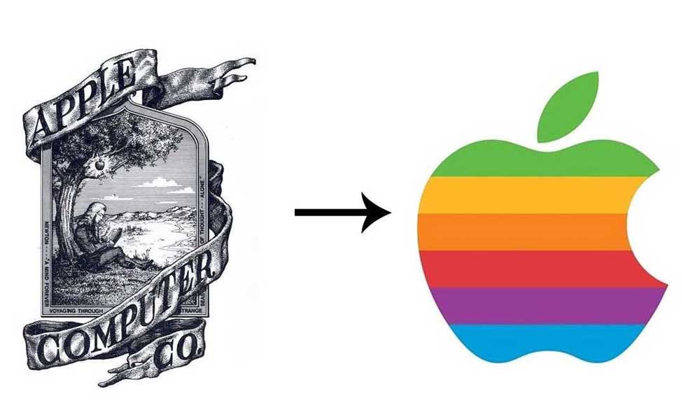
The Apple logo, featuring an apple with a bite taken from it, is one of the most recognisable minimalist logos globally. Designed by Rob Janoff in 1977, this logo has undergone minor changes over the years, but its core design remains the same. The Apple logo's simplicity and elegance represent the company's commitment to innovation and user-friendly technology, making it easily memorable and distinguishable from competitors.
2 – Nike
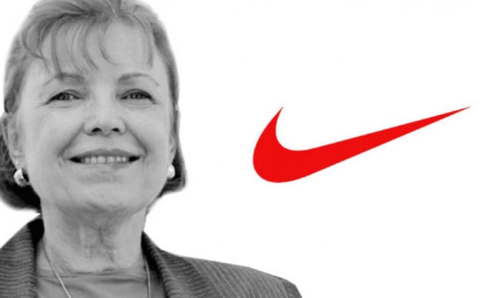
The Nike “Swoosh” logo, designed by Carolyn Davidson in 1971, is another iconic minimalist logo. The swoosh, resembling a checkmark, conveys motion and speed, perfectly capturing the essence of a brand synonymous with athletic performance and achievement. This simple yet powerful symbol has become a cultural icon, as it is easily identifiable and represents the brand's values and aspirations.
3 – McDonald's
The McDonald's “Golden Arches” logo, designed by Jim Schindler in 1962, is a classic example of minimalism in logo design. Consisting of two golden arches forming the letter ‘M,' this simple logo has become synonymous with fast food and McDonald's. Its minimalistic design makes it easily recognisable, while its colour (yellow/gold) conveys warmth and quality, which are integral to the company's brand values.
4 – FedEx
The FedEx logo, designed by Lindon Leader in 1994, showcases the clever use of negative space in minimalist logo design. At first glance, the logo appears to be a simple wordmark with the company's name in bold letters. However, a closer look reveals an arrow formed between the letters ‘E' and ‘x,' symbolising forward movement, speed, and efficiency – attributes synonymous with the FedEx brand.
5 – IBM
The IBM logo, designed by legendary graphic designer Paul Rand in 1972, features a distinctive striped pattern forming the company's initials. This simple yet impactful design creates a sense of motion, stability, and technological advancement – characteristics vital to IBM's brand identity. The minimalistic design recognises the logo and reflects the company's commitment to innovation and progress.
The Potential Problems of Minimal Logos
Creating a custom logo design is a crucial step in establishing a brand's identity, and it's essential to achieve three key objectives:
- The logo should ideally align with the brand's purpose, products, and services.
- It should be easily understood and memorable by the target audience.
- It should have a distinct look that sets the company apart from competitors and gives it a unique identity.
To illustrate this point, imagine you are a potential customer for a new business just starting. The market is already saturated with many competitors, and the company needs to stand out to attract your attention. The logo is often the first point of contact between a customer and a brand, so it must make a positive first impression.
However, the logo is overly simplistic and lacks any descriptive elements. In that case, it can be difficult for customers to understand what the brand stands for and what products or services it offers. This can lead to poor visibility, poor conveyance, and a weakened brand image. If the logo doesn't capture customers' attention, it will be difficult for the business to thrive and be successful.
This is why creating a unique, memorable logo that accurately reflects the brand's identity is essential. A well-designed logo can significantly impact a brand's visibility and customer relations. It's worth investing time and effort into creating a logo that accurately represents your brand, as it can affect your business's success.
What Research Says
Business Insider published a report on September 14, 2019, based on research conducted by professors from Canada, England, and France. The study involved 2000 students who were shown 597 different logos, mainly minimalistic and descriptive, intending to determine the most appealing ones.
During the research, participants were informed about the products and services of different companies. After that, they were shown their descriptive and minimalist logos to see if they were consistent with the products and services offered. The researchers found that the participants preferred descriptive symbols, which gave them a better idea of what the brand stood for, and therefore provided them with a sense of authenticity.
Moreover, after analysing the business performance of the included brands, the research suggested a strong correlation between descriptiveness and gross profits. This finding indicates that companies with descriptive logos perform better financially than those with minimalist logos.
The study also found that about 40% of major brands still use descriptive logos, compared to 70% that use minimalist logos. This finding suggests that many brands still use illustrative logos because they effectively communicate their message to consumers.
A great example of this is the logos of Burger King and McDonald's, both equally reputable brands with different approaches to their logos. The Burger King logo has a more descriptive system, with the name of the brand being the main focus of the logo. On the other hand, the McDonald's logo is minimalist, with a simple design that has become iconic over the years.
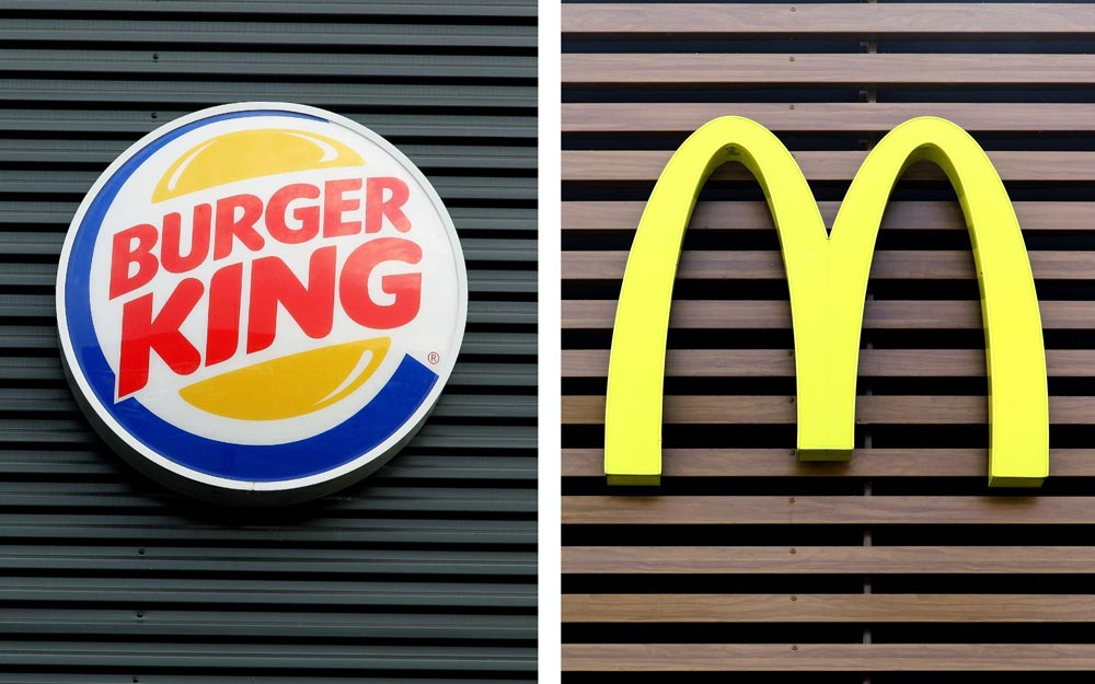
The Burger King logo is an excellent example of a descriptive logo. It features a full brand name, with buns covering it, making it a hamburger. This design fully reflects what the brand is about and what the logo represents. Even someone completely unfamiliar with the brand can tell what it stands for. It's the perfect example of a descriptive logo that accurately portrays the brand's identity and products.
On the other hand, we have the McDonald's logo, perhaps the uncrowned king of the burger world, with a logo that doesn't explain its products or the brand in general. The golden arches have become iconic but don't necessarily convey what the brand is about or what products it offers. If it weren't for the already established brand image, there would be a slight chance of anyone even knowing what those golden arches are about.
The story's moral is that descriptive logos are more profound, likeable, authentic, and convincing from a sales point of view. A logo should accurately represent a brand's identity and products, making it easier for consumers to understand what it stands for. Descriptive logos are more memorable, allowing consumers to associate them with the brand and its products more efficiently.
Are Minimalist Logos Authentic?

If you're a beginner in the world of logo design, you may be inclined to shift towards a minimalist logo design because of its perceived benefits. However, minimalist logos are less authentic than you might have thought, according to the research we mentioned earlier.
Despite briefly describing the company's services and products to the research participants, the study found that minimalist logo designs were perceived as less authentic and trustworthy because of their non-descriptive nature. However, this was not the case with familiar and already famous brands.
Researchers found that descriptive logos can increase the sense of authenticity and trust among customers, ultimately leading them to enter the sales funnel. This conclusion was reached after closely studying and comparing companies' profits with minimalist and descriptive logos. Companies with descriptive logos had higher earnings than those with minimalist logos.
This is because descriptive logos accurately reflect the brand's identity and products, making it easier for customers to understand and trust the brand. Descriptive symbols give customers a clear idea of what the brand represents, making customers more likely to do business with the company.
Additionally, descriptive logos can help differentiate a brand from its competitors, making it stand out in a crowded market. A well-designed illustrative logo can enhance a brand's visibility and make it more memorable, increasing brand recognition and customer loyalty.
In conclusion, while minimalist logos may be popular, they are not always the best choice for businesses looking to establish a strong brand identity and increase profits. Descriptive logos are more likely to be perceived as authentic and trustworthy, and they can help companies stand out in a crowded market.
- Hardcover Book
- Bokhua, George (Author)
- English (Publication Language)
- 224 Pages – 08/02/2022 (Publication Date) – Rockport Publishers (Publisher)
Is It a Good Time for You to Move Towards Minimalism?
Before deciding to adopt a minimalist logo design for your business, it's essential to consider several factors. Rebranding your corporate image by introducing a new logo is a significant step that requires careful consideration.
One question is, what is your company's position in the market? If your company is well established and has a strong presence in the market, then a minimalist logo design may be suitable. However, a descriptive logo may be more effective if your company still builds its brand identity and awareness.
Another factor to consider is whether your current logo is attractive and appealing, generating good profits. If this is the case, there may be no need to change to a minimalist logo design.
It's important to remember that adopting a minimalist logo design can turn your company into just another player in the “go with the flow” league. This can be risky for a startup, as it's crucial to stand out and differentiate your brand from competitors.
As a starter, building a solid brand identity through a descriptive logo that accurately reflects your company's values and products is advisable. This approach helps establish your brand and build a loyal customer base.
Remember, building a solid brand identity is a step-by-step process that takes time. Rushing into a risky decision like adopting a minimalist logo design can have far worse consequences. As the saying goes, one step at a time!
The Future of Minimalist Logo Design
As the world becomes increasingly digital, minimalist logo design will likely continue to grow in popularity. With more and more brands competing for consumers' attention, a simple, clean, and memorable logo can help a brand stand out in a crowded marketplace.
However, minimalist design is not a one-size-fits-all approach. While it can be effective for many brands, it may not be the best choice for others. When choosing a design approach, businesses must consider their unique values, target audience, and marketing goals.
The Continued Rise of Minimalism
Minimalism as a design philosophy is here to stay. The current digital landscape, characterised by abundant visual stimuli and short attention spans, demands logos that are simple, easily recognisable, and can stand out among competitors. As a result, we can expect minimalist logo design to continue gaining popularity among new and established brands as they seek to make a lasting impression on consumers.
Adaptive Logos and Flexibility
As technology advances and new platforms emerge, logos must adapt to various formats and sizes while maintaining uniqueness. Minimalist logo designs are inherently adaptable, as their simplicity allows them to be scaled and modified easily. We can expect minimalist logos to become more flexible and versatile, catering to different devices, platforms, and applications.
Focus on Sustainability and Eco-Friendliness
In an increasingly eco-conscious world, brands are becoming more aware of the importance of sustainability and environmental responsibility. Minimalist logo designs can embody these values by using clean lines, simple shapes, and a limited colour palette, which convey a sense of eco-friendliness and responsibility. This trend will likely continue to gain momentum as more brands align themselves with sustainable practices and environmental stewardship.
Integration of Augmented Reality (AR) and Virtual Reality (VR)
As AR and VR technologies become more sophisticated and integrated into everyday life, we can expect to see minimalist logos evolve to take advantage of these platforms. Minimalist logos may incorporate elements that can be enhanced or animated using AR or VR, offering unique and interactive experiences for users. This will likely increase demand for logo designs seamlessly blending with the digital environment while retaining simplicity and impact.
Emphasis on Storytelling and Emotional Connection
While minimalist logo designs are inherently simple, they can still convey a brand's story and evoke an emotional response from consumers. As branding becomes more focused on storytelling and creating meaningful connections, minimalist logos must balance simplicity and emotional resonance. This might result in minimalist logos that incorporate subtle elements or visual cues which allude to the brand's backstory or values without compromising the overall simplicity of the design.
The future of minimalist logo design is bright as it continues to adapt and evolve with emerging trends and technologies. As the digital landscape becomes more saturated and consumers seek meaningful connections with brands, minimalist logos will continue to be an effective tool for brand communication and identity. By remaining adaptable, sustainable, and emotionally resonant, minimalist logos will maintain their relevance and impact in the ever-changing world of branding.
- Slade-Brooking, Catharine (Author)
- English (Publication Language)
- 160 Pages – 01/26/2016 (Publication Date) – Laurence King Publishing (Publisher)
Conclusion
Minimalist logo design is a powerful tool for creating a memorable, versatile, and timeless brand identity. By focusing on simplicity and removing unnecessary elements, brands can create logos that are easy to recognise, recall, and adapt to different contexts. Whether it's the iconic Apple logo or the simple but effective Nike “Swoosh” symbol, minimalist logos have become some of the most recognisable in the world.
When designing a logo, it's essential to consider the unique needs and goals of the business. The minimalist design may not be the best fit for every brand but it can be a powerful tool when used strategically. By working with a skilled designer and following best practices for minimalist logo design, businesses can create logos that effectively communicate their values and stand the test of time.
Last update on 2024-05-11 / Affiliate links / Images from Amazon Product Advertising API


Thank you for sharing! Your minimalist logo designs exude elegance and simplicity, capturing the essence of brands effortlessly. Truly inspiring work that speaks volumes in its subtlety! Well done!