


EdTutor, an upcoming AI-assisted tutoring app, embarked on an exciting journey to carve out its unique brand identity in the competitive Educational Technology (EdTech) landscape. I was brought on board to develop a brand identity that resonates with college students – quirky, friendly, and trustworthy – and to introduce a brand that’s both innovative and approachable.
Announcement: Our practical course 'How to Build a Successful Brand' is launching soon. Join the Priority List now for a $150 Discount and be notified when we go live!
Table of Contents
About the Brand
EdTutor, a US-based startup, aims to appeal to the American college student market for their product launch in 2024. The founder approached me to create a brand identity that resonates with this demographic. Designed to function like a personal tutor, the app harnesses cutting-edge AI technology to transform how college students learn, by providing a hip, friendly, and easy-to-navigate solution.
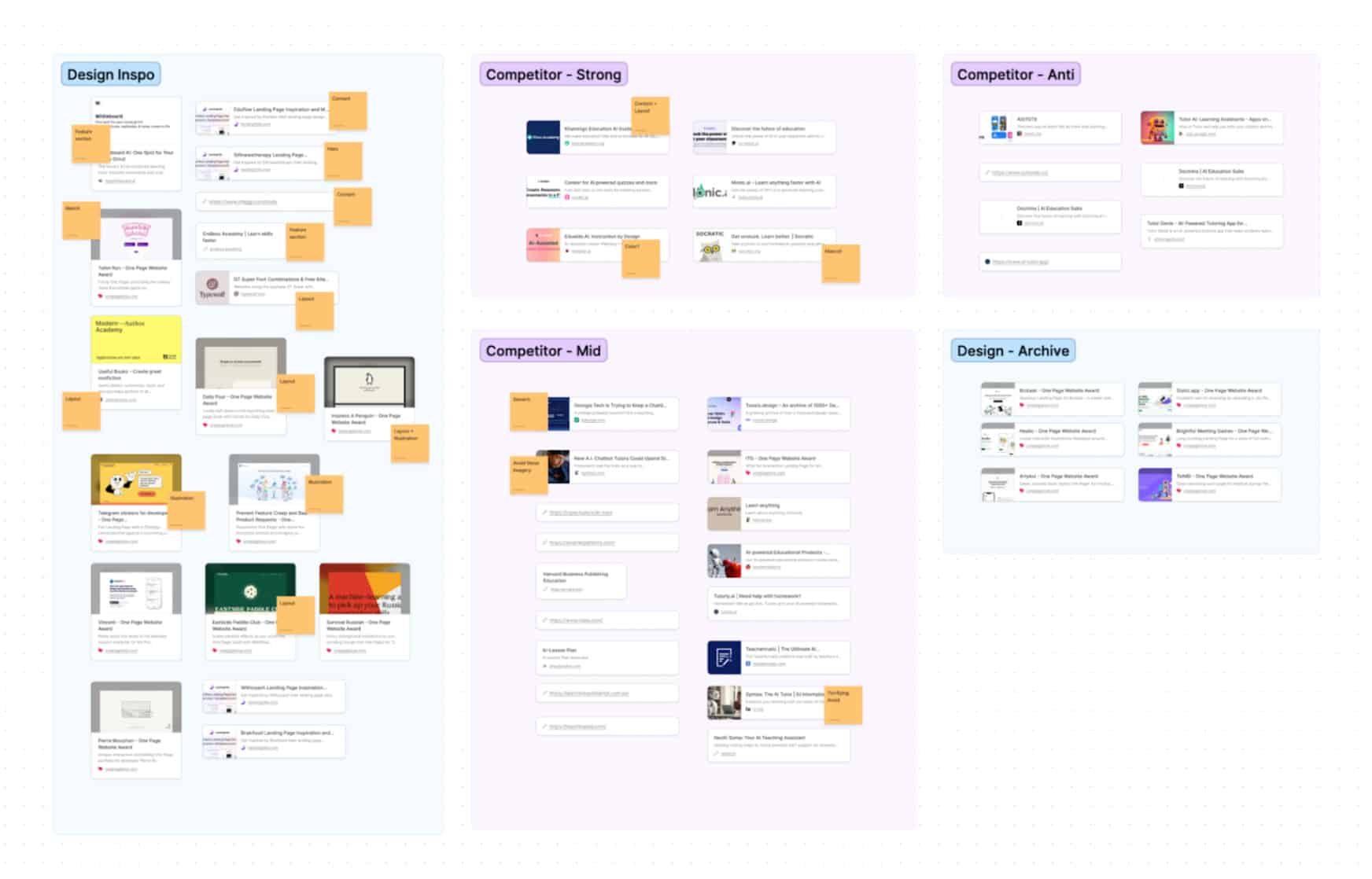
In the rapidly evolving market of AI-assisted educational tools, we saw an opportunity for EdTutor to really stand out. The field is still emerging, with few established products, giving us a chance to be a frontrunner. Our first task was to thoroughly research our competitors to understand the landscape we were entering. The creative challenge was to visually encapsulate AI technology in forms that are appealing and accessible to a tech-savvy, younger audience, steering clear of the common tech-centric imagery in the industry.
Research and Strategy
In analyzing over 30 AI-assisted products and EdTech apps alongside the client, we identified a significant gap in the market: a lack of visually compelling representations of AI technology. Most competitors opted for generic, tech-oriented visuals, leaving the field open for us to establish a strong, engaging brand identity for EdTutor.
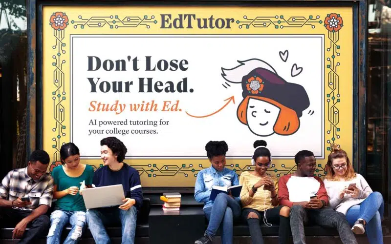
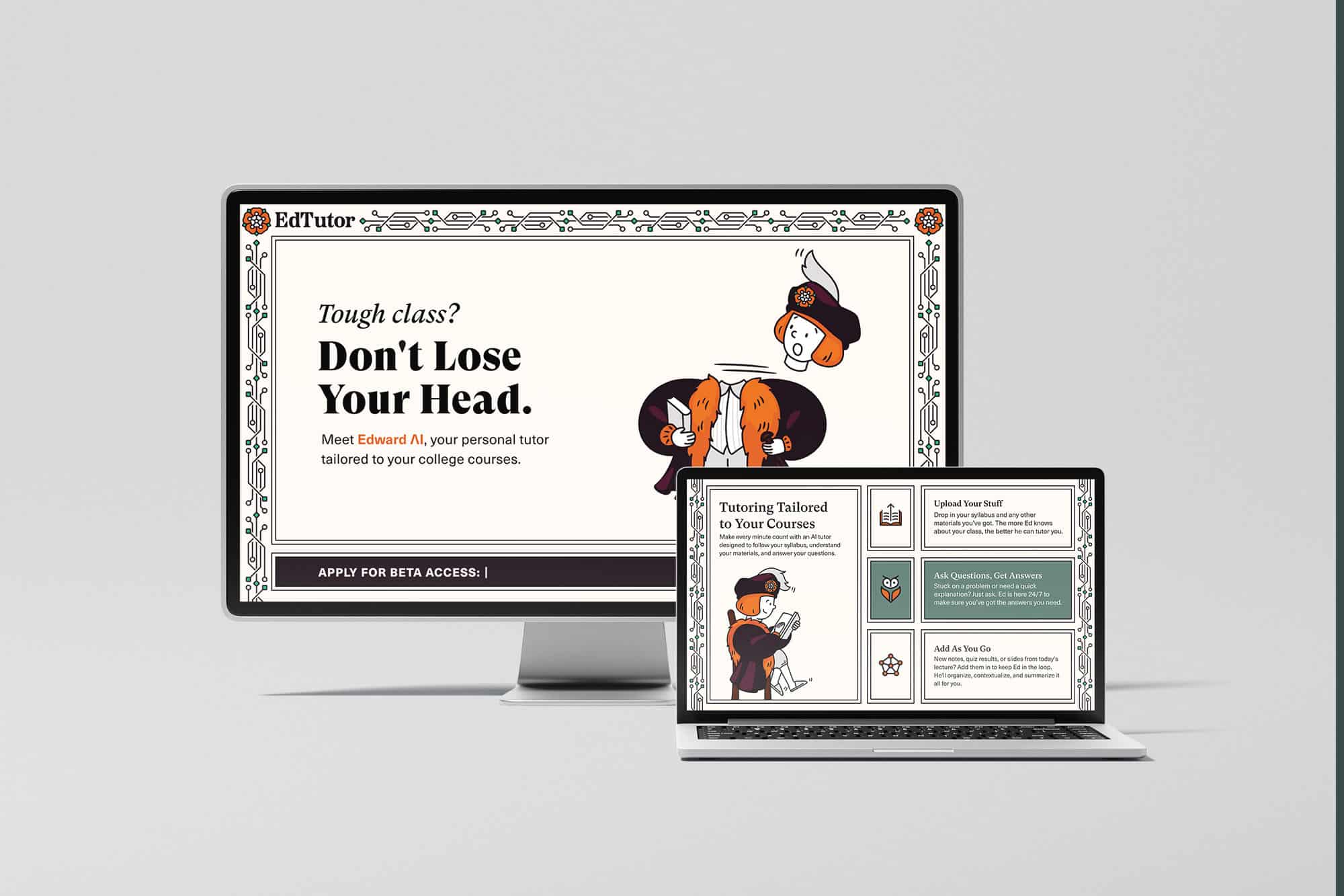
Developing ‘Edward Tudor’ as our mascot became a pivotal strategy. Inspired by the wordplay “EdTutor” to “Ed the Tudor,” we aimed to set EdTutor apart from its competitors and add a relatable aspect to the AI-driven solutions. Edward Tudor, envisioned as a blend of historical charm and modern appeal, was designed to embody curiosity, knowledge, and friendliness, making the AI app more personable.
This led to our decision to embrace Tudor-era aesthetics, diverging from typical tech-centric designs in favor of something more approachable and unique. Drawing inspiration from Tudor-era art – portraits, tapestry, and tiling – we crafted a distinct brand identity, symbolized by Edward Tudor, a character that melds historical visuals with modern tech motifs.
Design and Implementation
The design process was deeply iterative, with constant revisits to earlier stages to ensure brand coherence. Starting with the mascot design, I drew inspiration from Edward VI, blending traditional Tudor-era scholar attire with modern sensibilities. The mascot’s silhouette was crucial, so I chose a fur-lined scholar’s coat and a feathered hat to add to Ed’s character.
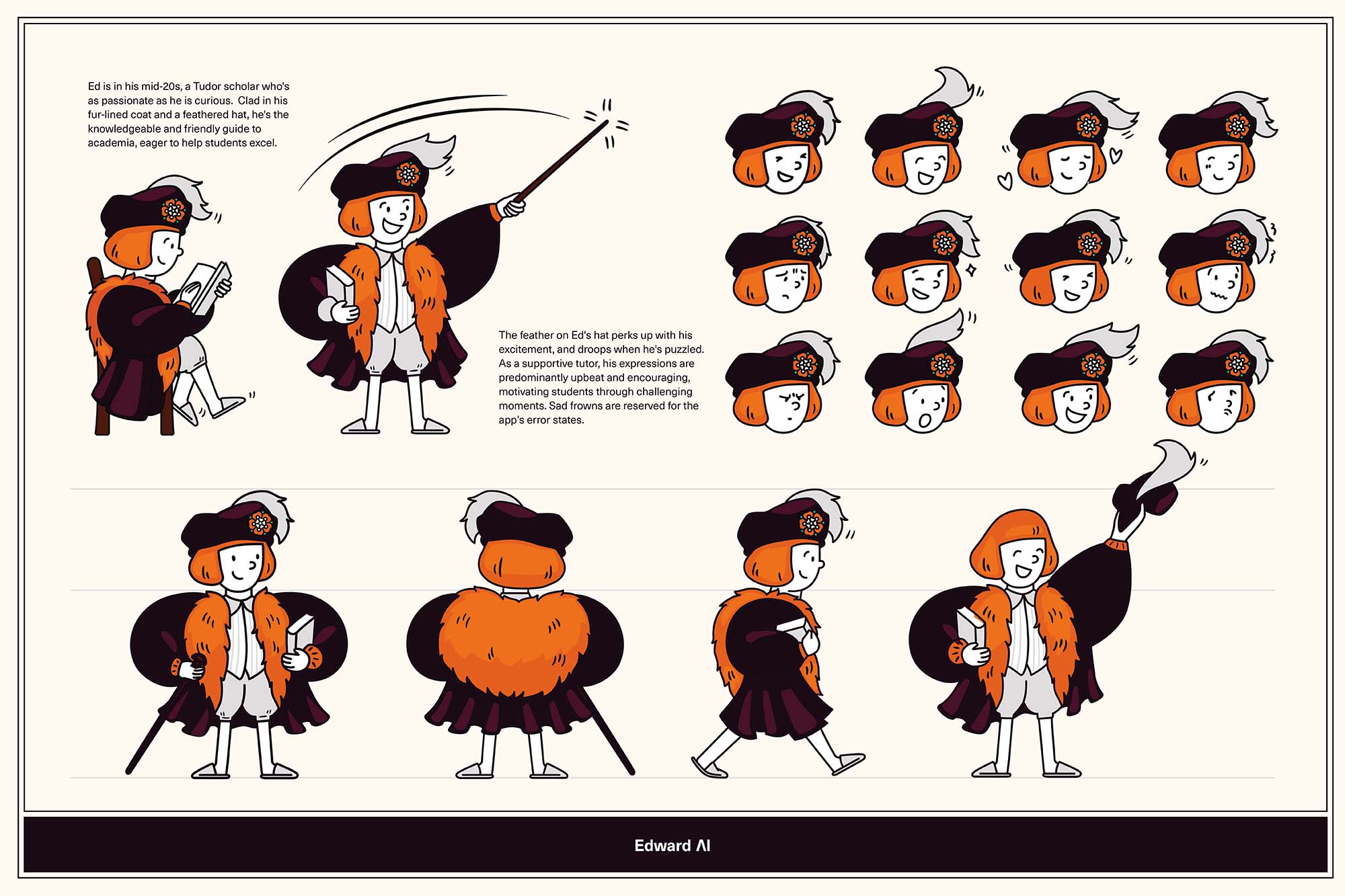
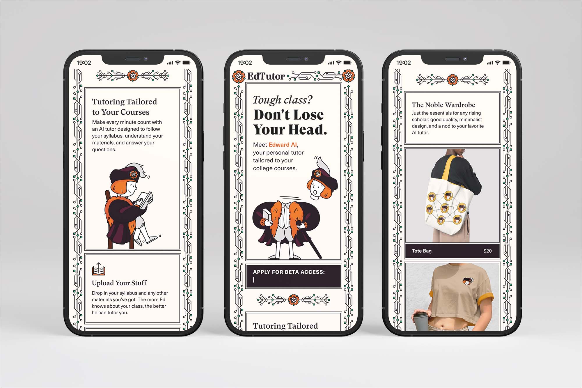
Having a mascot opens doors to a variety of brand assets. For example, Ed’s feathered hat became a dynamic element, changing with his moods and adapting to different usages in the app, like celebrating successes or indicating error states. Ed’s accessories, like his canes and books, evolved into custom emojis, demonstrating the mascot’s versatility in enhancing the brand identity.
When it came to the logo, the initial thought was to use Ed’s face. However, given the strong Tudor influence, I found it important to emphasize the tech and AI aspects more prominently in the brand elements. After exploring various options, I settled on a Tudor rose logomark intertwined with a node graph representing AI technology. This logomark also became a prominent emblem on Ed’s hat.
The biggest challenge was to constantly balance the historical reference with the technology signifier and aesthetics. In every facet of EdTutor’s brand identity, I was mindful to subtly incorporate symbols of technology or AI. When designing textural and decorative elements, I created a series of vine borders comprising nodes and cords, symbolizing the merger of historical elegance with modern digital motifs. The font pairing of GT Super and Neue Haas Unica blended classical elegance with a digital flair. The color palette, inspired by Tudor-era art, aimed to combine traditional warmth with modern vibrancy.

Results
Although there are no tangible results to present at this stage, the visual identity for EdTutor holds promising prospects.
With a clear differentiation strategy in the competitive EdTech landscape, the brand aims to carve its own unique identity and stand out in the market.
“Seeing the quality of the brand has genuinely shifted the direction of the ‘EdTutor’ marketing strategy, and opened us up to a whole new world of opportunities.”
– EdTutor’s Team
What’s Next
Our competitor research informed our approach, enabling EdTutor to establish a unique market presence. The branding efforts resulted in a visually compelling and cohesive identity that clearly differentiated EdTutor from generic, tech-focused competitors.
Moving forward, I am developing a comprehensive suite of icons and animations for the EdTutor app, centered around the character of Ed. These elements are key to bringing the brand’s personality to life within the app. Ed’s animations are designed to be positive and supportive, reflecting his role as an encouraging tutor. We’re keeping his expressions upbeat, with sad faces used sparingly, just for error states in the app. These thoughtful design details are what make the brand’s strategy and positioning come alive visually.
Conclusion
Branding EdTutor was a dynamic and iterative process, underscoring the significance of research and innovation in design. This experience reinforced several key aspects: the power of a brand’s story, the practical benefits of a versatile mascot, the crucial role of aligning market research with storytelling, and the unique impact of blending historical elements with modern technology. As EdTutor gears up for its launch, its robust and unique brand identity is well-positioned to make a substantial impact in the EdTech industry.
A key challenge I encountered was identifying a suitable visual representation for AI, which is becoming more abstract as technology progresses beyond conventional physical forms. Many brands currently gravitate towards either overly abstract imagery or resort to clichéd representations of futuristic robots. Such approaches can alienate users from a concept that’s already intangible. I believe that depicting AI in an accessible way is important for sustaining users’ connection with this evolving technology, and that is a significant and ongoing challenge for the design community.


Can’t believe there are no comments on this. This is brilliant.
The way AI technology was blended to what people can relate to just shows how important branding is.
I love it