The 15 Greatest Print Advertisements Ever Created
Print advertisements have a rich history dating back hundreds of years. From striking imagery to clever taglines, iconic print ads have left an indelible mark on our culture. This article will count down the 15 best print advertisements of all time, exploring what made them so groundbreaking and memorable. From subtle plays on emotion to bold creative risks, these ads changed the game and set new standards in creativity and innovation. Read on for the story behind the best print advertisements ever made.
Table of Contents
#15: De Beers, “A Diamond is Forever” (1948)
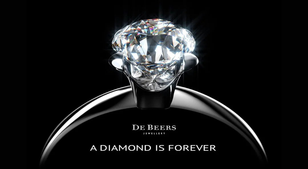
The Campaign That Started It All
In 1938, De Beers hired the N.W. Ayer advertising agency to boost weak diamond sales in the United States. The result was the 1948 “A Diamond is Forever” campaign, considered one of the most successful and recognisable ad campaigns of the 20th century.
Critical Reasons For Its Success:
- Associated diamonds with romance and love
- Established the tradition of giving diamond engagement rings
- Persuasive copy portraying diamonds as rare, unique treasures
- Simple yet striking imagery of glamorous couples
This seminal campaign single-handedly connected diamonds with commitment and forever love in the minds of consumers. By 1979, diamond sales in the U.S. had increased 55% from 1938. The “A Diamond is Forever” slogan endures over 70 years later as one of the most famous taglines ever written. This campaign changed diamonds from luxury items to necessary symbols of relationships, making it one of the most influential print ads in history.
#14: Volkswagen, “Think Small” (1960)
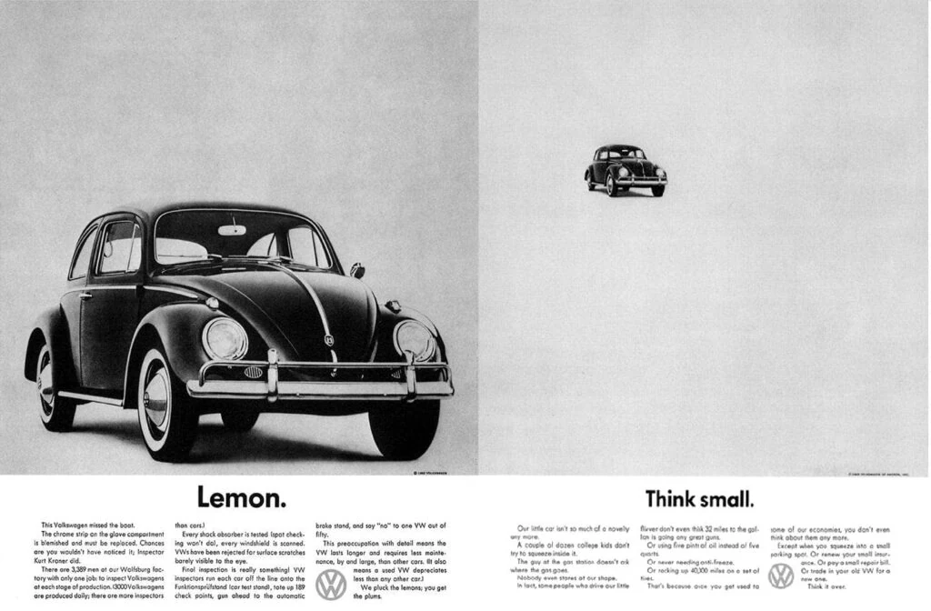
Punching Above Its Weight With Wit and Simplicity
Volkswagen entered the American market 1949 but struggled to gain traction against Detroit’s big auto manufacturers. In 1960, Volkswagen contracted Doyle Dane Bernbach (DDB) to design an awareness campaign—the result was this counterintuitive “Think Small” ad.
What Made This Ad Clever:
- Played against consumer expectations about cars and ads
- Tongue-in-cheek headline mocks Detroit’s bigger-is-better mentality
- Minimalist design with abundant white space
- Emphasised affordability
The self-deprecating humour and spare aesthetic were antithetical to the overblown auto ads of the 1950s. This bold approach worked magic—VW’s US sales shot up 307% from 1959 to 1968. The “Think Small” ad set new creative benchmarks and became a standard example for the less-is-more design ethic. Its witty, subtle persuasion also demonstrated that not all blockbuster ads need to shout.
#13 M&Ms, “Melts in Your Mouth, Not in Your Hand” (1954)
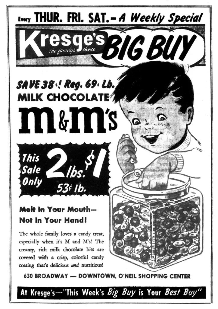
Playing Off A Key Product Benefit
Before 1954, M&Ms were sold as irregular pieces in cardboard tubes, limiting portability and marketability. Mars introduced bite-size M&Ms in 1954, along with a campaign playing up the benefit of their melt-resistant shell.
Why This Benefit Resonated:
- Highlighted the most significant improvement over other chocolate
- Linked directly to the desire for portable, mess-free candy
- Presented with appealing chocolate visuals
- Rhyming slogan hardwired itself into memory
The M&M campaign leveraged its unique selling proposition into blockbuster growth for decades. It also illustrated that print ads don’t require complex copy—spotlighting the proper product advantage is enough when done creatively. Short and sweet (literally, in this case!) resonates.
#12: ABSOLUT Vodka, “ABSOLUT _____” Campaign (1980s-2000s)
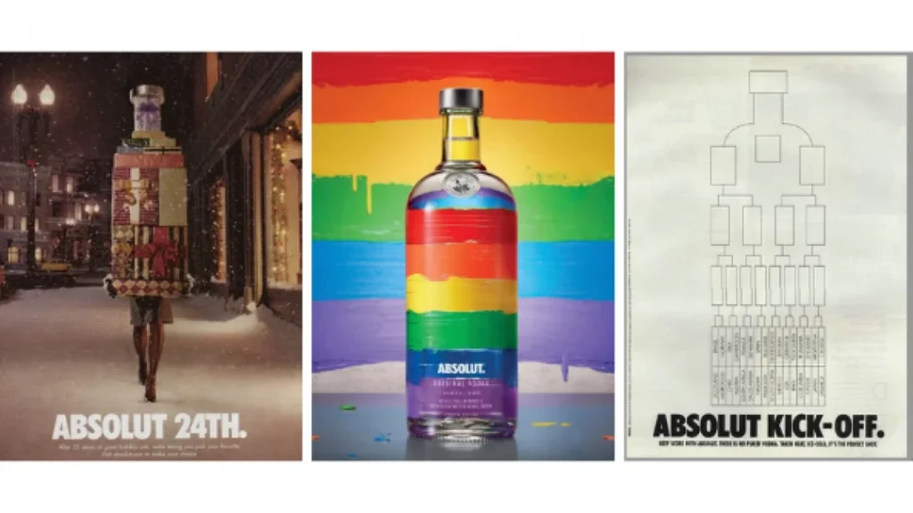
Paving the Way for Flexible Brand Contextualisation
In 1979, ABSOLUT was an unknown vodka brand when it hired TBWA to dramatise its Swedish origins. The agency responded with a brilliant, flexible campaign visually associating ABSOLUT’S bottle silhouette with different cultural icons across hundreds of ads.
Key Attributes of a Legendary Campaign:
- Simple visual device facilitating boundless cultural contextualisation
- Consistent branding while keeping imagery fresh and topical
- Lasted over 25 years and 2000+ ads spanning food, fashion, travel and beyond
- Became ingrained as a cultural icon, blending alcohol with art
The “ABSOLUT _____” campaign was monumentally influential in its minimalist ingenuity. It epitomised how a brand could integrate within diverse cultural contexts through a flexible, creative platform. This campaign set the stage for contextual fluidity in branding and advertising.
#11: Energizer Bunny, “It Keeps Going…” (1989)
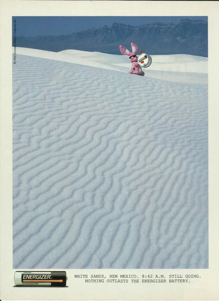
Charging Forward on Charm and Quirk Alone
In the 1980s, Energizer and Duracell were locked in a battle to demonstrate longer-lasting batteries. Energizer’s ad agency had an “ah-ha” moment, realising their battery outlasted the toy bunny beating the drum. Thus, the legendary Energizer Bunny campaign was born.
Behind the Magic Formula:
- Personified distinguishing product advantage through the unique character
- Built engaging continuity between ads via bunny inserts
- Forced rivals to change claims to avoid association with inferior bunny
- Won hearts and minds on sheer eccentric delight
Differing battery life claims had low captivation potential…until a quirky, adorable drum-playing rabbit entered the picture. The Energizer Bunny campaign proved that product differentiation claims paired with charm, whimsy and surprise could be wildly effective. The bunny incarnated Energizer’s proposition and leapfrogged (or hopped) into pop culture fame.
#10: Nike, “Just Do It” (1988)
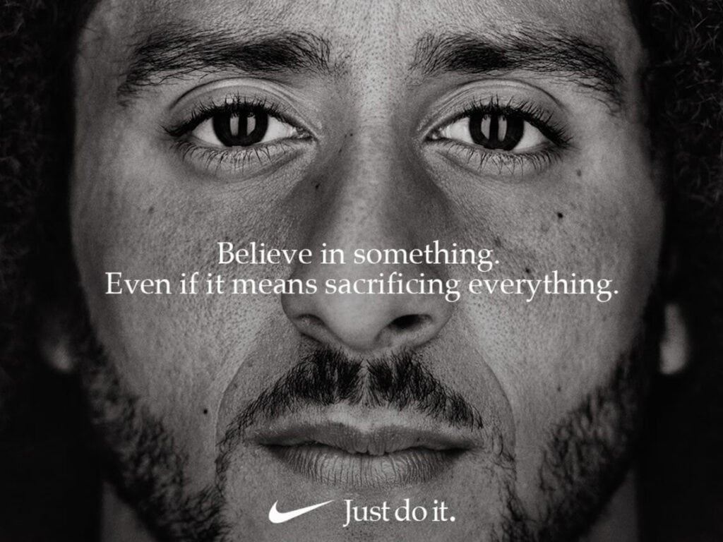
Turning Branding Upside Down, Literally Overnight
In 1988, Nike needed help to expand running shoe sales beyond hardcore athletes. They hired ad agency Wieden+Kennedy, who crafted the revolutionary 3-word tagline “Just Do It” overnight.
Why This Tagline Was Game-Changing:
- Upended branding conventions with abstract minimalism
- Gleaned aspirational intensity rare for consumer goods
- Captured universal human drama to transcend product
- Catapulted Nike from a niche player to an iconic global brand
The “Just Do It” concept, equating Nike with realising one’s full potential, was a quantum leap in sports branding. It spearheaded the association of athletics with pursuing life passions. Like the top ads in this list, “Just Do It” eschewed product functional claims for emotional branding flair. Doing so kickstarted Nike's trajectory to world domination built on abstract ideals.
#9: Coca-Cola, “Hilltop / I’d Like to Buy the World a Coke” (1971)
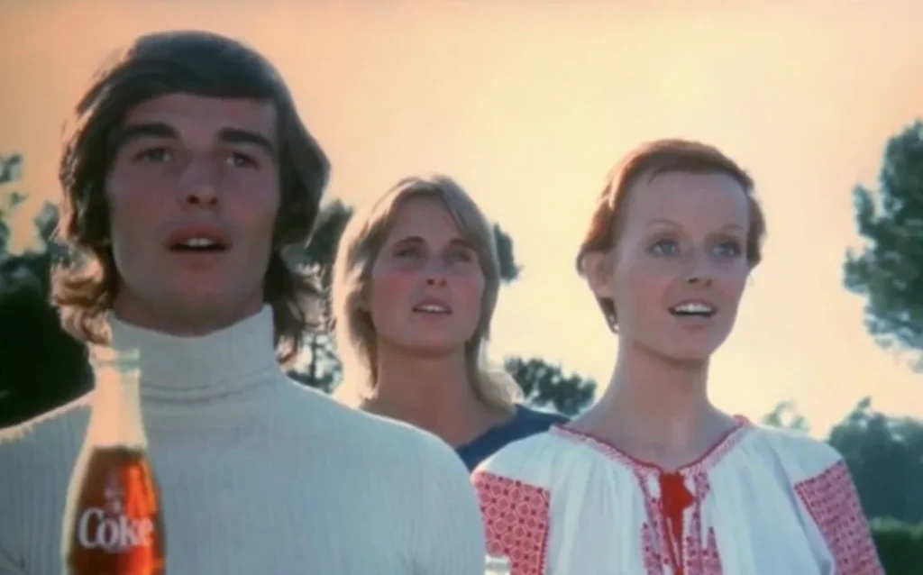
Selling Harmony and Optimism When We Needed It Most
In 1971, Coca-Cola wanted an ad capturing youth counterculture sentiment. The result was “Hilltop,” better known for its jingle lyrics “I’d Like to Buy the World a Coke.”
Why This Ad Struck Cultural Gold:
- Released when Vietnam War/cultural tensions peaked
- Portrayed vision of hope, harmony and togetherness
- Iconic jingle channelled hippie optimism musically
- Featured natural casting diversity pushing social boundaries
The ad forged an emotional connection with anti-war young people by rooting itself in 1960s values like inclusion and world peace. It also demonstrated advertising’s potential for positive social influence when executed conscientiously. “Hilltop” became a cultural phenomenon still regarded as one of the best ads ever – Coca-Cola’s brand embodiment of unity and hope.
#8: Benetton, “All Colors United” (1989-1990)
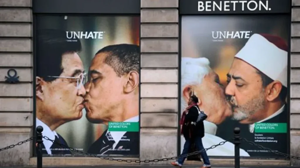
Stirring Social Change Through Controversial Imagery
Italian clothing brand Benetton distinguished itself in the 1980s-90s via provocative print ads confronting war, racism, disease, capital punishment and more. Their most famous campaign featured unlikely multicultural pairings of people embracing the slogan “All Colors United.”
Why This Campaign Had Global Impact:
- Boldly spotlighted social issues brands steered clear of
- Cutting-edge visual embrace of racial/cultural diversity
- Generated immense controversy, critical acclaim and imitators
- Established Benetton’s brand ID as socially progressive
Benetton’s hard-hitting social awareness ads were unprecedentedly influential, forcing society to confront uncomfortable realities. Compelling authentic imagery drove intense emotional engagement. While triggering boycotts and condemnation, “All Colors United” also set landmarks showcasing advertising’s power to spark social dialogue.
#7: Calvin Klein, “Nothing Gets Between Me And My Calvins” (1980)

Pushing Envelopes Through Teenage Rebellion
Calvin Klein escalated the use of sexual imagery in jeans advertising with 15-year-old model Brooke Shields proclaiming, “Nothing gets between me and my Calvins.” This scandalous 1980 campaign sparked outrage but cemented Calvin Klein’s brand association with youthful sexuality and pushing boundaries, for better or worse.
Components of an Unforgettable Cultural Flashpoint:
- Featured sexually suggestive teen to amplify controversy/buzz
- Established brand bond with independence and rule-breaking
- Set benchmarks for advertising standards and moral outcry
- Calvin Klein thrived on perpetual envelope-pushing after that
While ethically questionable, the Brooke Shields ad illustrated print advertising’s power to ignite cultural firestorms through envelope-pushing. Calvin Klein built its identity on audacious ads questioning taste levels, forging lifelong customer relationships with rebellious youth. This campaign announced the brand as a disruptive cultural force.
#6: Wonderbra, “Hello Boys” campaign (1994)
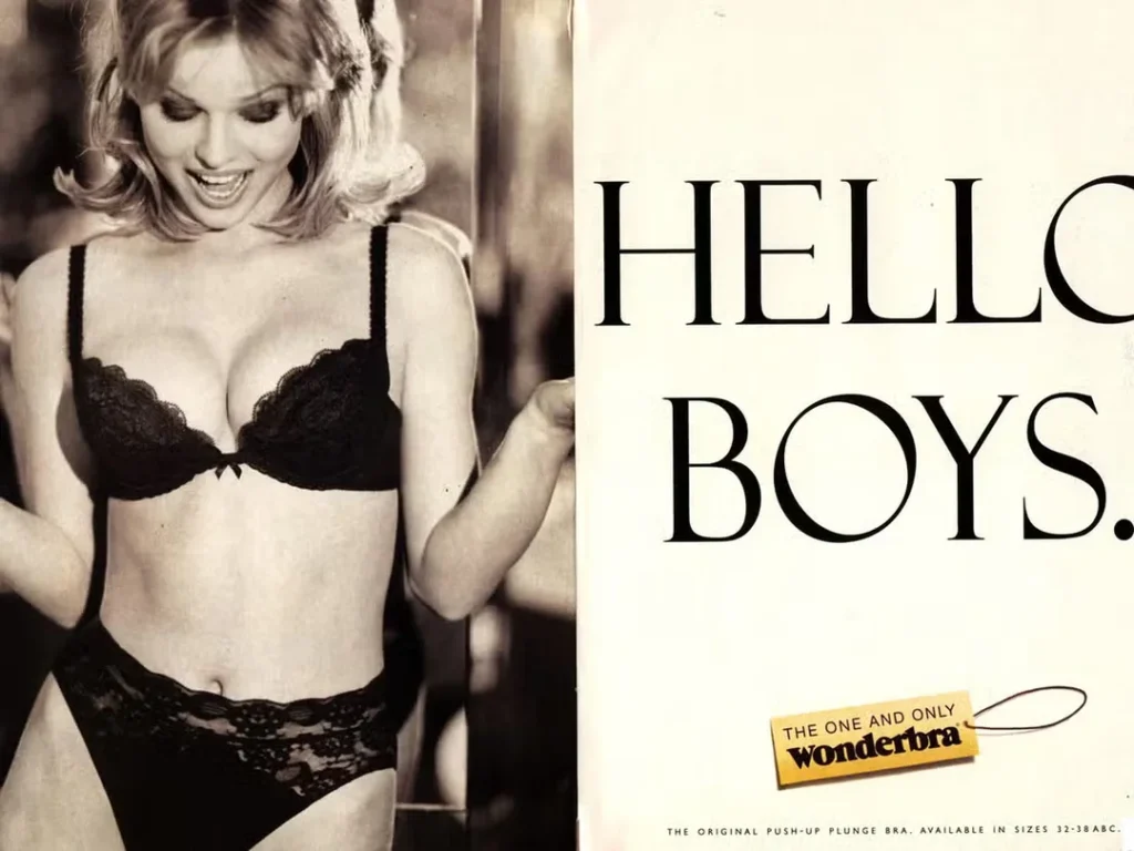
Redefining Sex Appeal Advertising With Empowerment Spin
The 1994 launch of Wonderbra’s push-up bra was accompanied by this unconventionally straightforward “Hello Boys” campaign exuding playful confidence. While racy, its creator said the ads were meant to make women the subject, not the object.
Notable Paradigm Shifts:
- Female sexual desire is portrayed affirmatively, not to appease men
- Sensuality is embraced through the female gaze rather than exploiting it
- “Hello Boys” flipped gender-based ad dynamics on their head
- Wonderbra became the #1 lingerie brand by making women feel alluring
By embracing female self-assurance in desire, “Hello Boys” redefined sex appeal advertising for the 1990s. While still brazen, its whimsical flavour communicated empowerment over objectification. Wonderbra discovered that for brands playing in racy territory, female confidence beats pure sex any day.
#5: Apple, “1984” Super Bowl Ad (1984)

Ambushing the Super Bowl to Position a Brand as Revolutionary
When Apple launched the Macintosh in 1984, they knew they needed a blockbuster ad conveying user-friendliness eclipsing complex IBM PCs. The result was the screen-smashing “1984” mini-film aired nationally during Super Bowl XVIII – an advertising moonshot.
Landmark Strategic Risks Underpinning Success:
- First-ever cinema-quality Super Bowl ad standing out from beer/car ads
- Framing Apple’s underdog persona via dystopian filmic allegory
- Establishing Apple’s enduring brand aura: creativity, independence, rebellion
- Fundamentally, Mac vs. IBM is heart vs. head; simplistic but effective
Even failing, “1984” would have succeeded with a $2 million impact from mere controversy. As history shows, the gamble paid off, with “1984” being crowned the most iconic Super Bowl ad ever. More importantly, it positioned Apple for perpetual market domination via branding magic.
#4: McDonald’s, “You Deserve a Break Today” (1971)
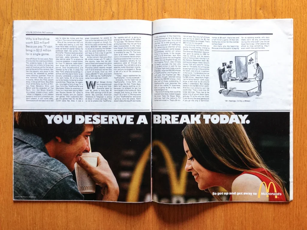
Inventing Fast Food as Self-Care with Psychedelic Flair
In the early 1970s, McDonald’s wanted to grow beyond families to young adults. Marketing VP Dick Brams developed the radical branding notion of McDonald’s as a personal respite from daily stresses.
Components of a Watershed Multi-Platform Campaign:
- Ad copy and visuals framing burgers as a mental health break
- Launched first-ever brand jingle reinforcing campaign message
- Psychedelic bell-bottoms aesthetic reflecting 1970s culture
- Skyrocketed McDonald's from $700M to $4B+ revenues by 1976
With empathy, quirky visuals and earworm musicality, “You Deserve a Break” transcended function to form emotional connections. Foreshadowing 21st-century self-care culture, McDonald’s nailed aspirational brand building via multi-platform sensory appeal and cultural contextualisation. The aftershocks still define McDonald’s identity today.
#3: Marlboro Man “You Decide” Campaign (1955)
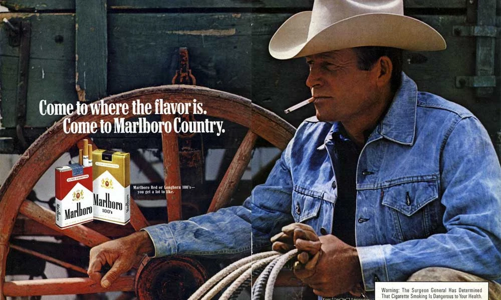
Transforming a Feminine Brand into the Ultimate Masculine Status
In the 1950s, filtered cigarettes were considered feminine. For Philip Morris’ new Marlboro Reds, ad agency Leo
Burnett rebranded them to appeal to men through rugged cowboy imagery in “You Decide” ads.
Core Pillars of Outsized Success:
- Iconic Marlboro Man visual embodiment of masculinity
- Romanticised cowboy individuality and rebellion
- Sales leapt 4000%+ from 1953-1957
- Feelings-based lifestyle branding precursor
Leo Burnett’s realisation that smoking signified rebelling against social pressures was ahead of its time. The firm forged Marlboro’s phenomenally successful male identity around lone cowboy ruggedness. In doing so, they crafted perhaps the first major emotional lifestyle branding campaign, which still predominates tobacco marketing today.
#2: Silk Cut, “Silk Cut Purple” (1984)

Paving the Way in Cryptic Minimalist Cool-Hunting
In 1983, cigarette advertising was banned from UK television. Silk Cut Cigarettes wanted to retain market share while adhering to tobacco-promoting constraints. The ingenious result was the “Silk Cut Purple” campaign, which contained no logical messaging – just creative purple visuals facilitating abstract brand impressions.
Groundbreaking Communication Without Really Communicating:
- Confounding imagery where only brand name-connected ads
- piqued curiosity through beautifully staged visual riddles
- Established brand persona for artistic sophistication
- Set blueprint for cryptic branding chestnuts like “Got Milk?”
Through wispy purple enigmas, Silk Cut forged untapped emotional mindshare. This campaign illustrated the potency of curiosity, abstraction and visual poetry in making brands irresistibly alluring over rational comprehensibility. The Silk Cut campaign demonstrated that ambiguity could be vital in carving out distinctive brand identities.
#1: Gillette, “The Best a Man Can Get” (1989)

Launching a Mantra That Redefined Masculinity for Generations
In 1989, Gillette wanted to increase razor sales by linking daily grooming rituals to aspirational male confidence. They hired ad agency BBDO, who delivered the landmark “The Best a Man Can Get” campaign.
Attributes of the Greatest Slogan Ever Written:
- Perfected masculine emotional lifestyle branding
- In three words, framed shaving as a self-maximisation vehicle
- Resonated across demographics with inspirational intensity
- Propelled Gillette from safety razor maker to icon-shaping masculinity standards
The landmark Gillette campaign sparked exponential growth that was unheard of for mature CPG companies. It illustrated advertising’s immense latent power in creating cultural role model ideals when tapping the proper consumer insight. “The Best a Man Can Get” did more than shift product; it redefined male identity chasing perpetual glory through personal grooming. The world's most fantastic slogan remains its most macho Mantra for the ages.
Conclusion
The most incredible print advertisements have leveraged creative bravery, emotional insight and cultural attunement to become pop culture titans. They have forged profound consumer relationships through inspired photography and killer copy and zagged when others zigged. These campaigns illustrate how when print ads fire on all cylinders, they can revolutionise branding, business and society in lasting ways.
From Silk Cut’s velvety violet stylishness to Nike’s soul-stirring mantra, these ads show how powerful print remains when combining artistry with smarts. They dialled into unmet consumer needs and addressed them through spectacular creative visions aligning with their eras.
The top 15 print advertisements have proven risk-taking originality wins over the following templates. Several faced initial outrage but still rewired cultural perspectives over time. Above all, the most significant print ads unlocked mystique, blending logic with magic across medium conventions and constraints.
For these reasons, these brilliantly eccentric and boundary-breaking print ads will never fade away. Their indelible impacts on consumers and culture cement them as landmarks demonstrating the pen and lens’ mightiest potential.
FAQs about these Print Advertisements
What made De Beers’ “A Diamond is Forever” campaign successful?
By linking diamonds with romance and aspirations of forever love, De Beers’ mid-century campaign dramatically increased U.S. diamond sales. Its memorable copy and imagery cemented the tradition of diamond engagement rings.
How did Volkswagen’s “Think Small” ad help its growth in the U.S.?
This clever ad played against consumer expectations about cars and advertising in the 1950s. Its simplicity, self-deprecating humour and spare aesthetic contrasted with overblown American auto ads of the era and resonated widely. VW’s sales skyrocketed over 300% in the nine years following Think Small’s launch.
What was unique and practical about the ABSOLUT Vodka “ABSOLUT _____” ad campaign?
The consistent use of ABSOLUT’s bottle silhouette visually blended with different cultural images provided endless contextual flexibility for 25+ years of ads. This creative platform broke convention by facilitating cultural fluidity in an ad campaign.
How did the Energizer Bunny help differentiate Energizer batteries from the competition?
The Energizer Bunny charmingly embodied the brand's key advantage of longer battery life. By associating their distinguishing proposition with a cute animated mascot, Energizer forged positive emotional connections that drove growth and ownership of the superiority claim in consumer minds.
What made Nike’s “Just Do It” slogan unconventional yet effective?
In just three abstract words, “Just Do It” upended branding conventions by eschewing functional product claims. Instead, it equated Nike with the universal human drama of realising one’s full potential. This stratospheric concept transformed Nike from a niche running shoe company to an iconic global brand.

Great showcase of print advertisements! Your blog highlights the creativity and impact of print media in advertising