The 15 Best Logo Design Fonts To Check Out
Selecting the right font is one of the most important decisions when designing a logo. The perfect font can make your logo look professional, trustworthy, and memorable. But with thousands to choose from, where do you start? This comprehensive guide covers the 15 best logo design fonts and typefaces. We'll explore what makes each one a strong choice, along with examples, use cases, pairing suggestions, and design tips. Let's dive in!
Table of Contents
What Makes a Good Logo Font?
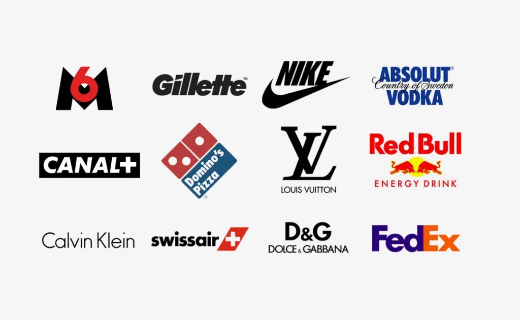
Before highlighting the best of the best, let's review what qualities make a font well-suited for logo design:
Readability
Logos often appear very small, so your font must remain clear and legible at tiny sizes. Avoid thin lines or intricate details that may get lost when scaled down.
Visual Impact
You want your logo to grab people's attention—Prioritise fonts with distinguishing traits that are still readable (more on this below!).
Flexibility
Consider how your logo may get used—on business cards, websites, signage, merchandise, etc. Choose a font that’s versatile enough for different contexts and surfaces.
Originality
While using a standard font has familiarity benefits, having a unique typography makes your brand more distinctive and ownable. Custom-drawn or modified typefaces are ideal for logos.
Feature Compatibility
If you want stylistic variants like italics or weights, confirm your chosen font family includes those to expand your logo usage.
With those criteria in mind, let’s count the best logo fonts!
15 Best Logo Design Fonts
1. Futura
Futura was designed in 1927 and has nearly a century of brand recognition. This geometric, sans-serif typeface combines readability with quirky visual flair. Distinctive traits like its pointed ‘A’ and ‘V’ make Futura stand out—even in small sizes. Its tall ascenders allow for ample whitespace to maintain clarity.
Futura delivers a modern, sleek look. Tech companies like PayPal leverage its subtle geometric style. Futura also brings a pop art edge when rendered with uneven baseline alignments. Pair with round fonts like Amatic SC for contrast.
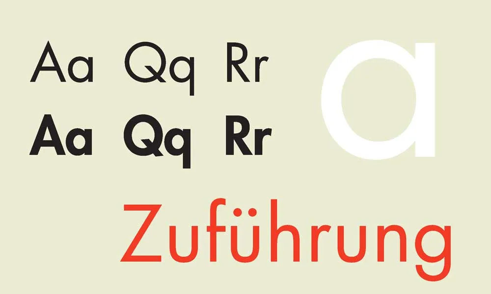
Futura delivers sleek, modern logo designs with geometric flair. Image credits: PayPal, Spring, Urban Outfitters
2. Helvetica
Helvetica needs no introduction as one of the most ubiquitous fonts since its 1957 debut. However, its popularity stems from something other than being adventurous but from its intrinsic legibility and clarity. Helvetica’s tall x-height, open counters, and neutral letterforms allow it to serve any logo cleanly and professionally.
Given Helvetica’s widespread familiarity, it smartly conveys universal concepts—as seen with brands like American Apparel, Panasonic, and Energizer promoting accessibility. Blend Helvetica with a more stylised accent font like Ritaglia to make it feel fresher.
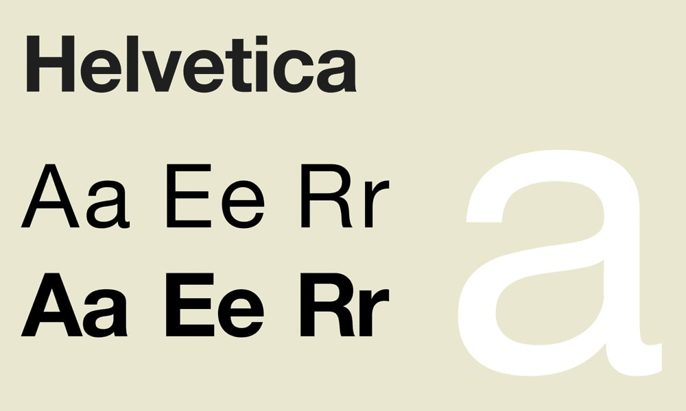
A go-to for straightforward, globally recognised logos. Images: Energizer, American Apparel, Panasonic
3. Bodoni
Bodoni typifies high-contrast fonts with dimensional letterforms featuring ultrathin serifs and strokes with bulbous terminals. First popularised in the 1700s, Bodoni creates a lush, dramatic effect that catches the eye while retaining harmony and class. But beware of display sizes! Bodoni’s spindly thin parts risk getting lost or filling in more minor logo uses.
Bodoni communicates luxury appeal with fashion houses like Vogue and Louis Vuitton, adopting it for logos promoting affluence. Pairing with a bold slab serif like Rockwell balances its delicate slenderness. Adding letterpress texture also boosts Bodoni’s gravitas in logos if size becomes limiting.

Bodoni adds stylish flair with its high contrast thicks and thins. Images: Vogue, Louis Vuitton, Eve
4. Baskerville
This traditional serif face dates back to the 1700s and is named after its designer, John Baskerville. Its timelessness comes from stately Roman letterforms softened by bracketed serifs and rounded terminals, promoting better flow and harmony compared to sharper serif counterparts. These subtleties lend Baskerville a refined, literary air. Small note: the regular weight distorts at tiny sizes.
Baskerville gives logos an elegant European traditionalism—fitting for luxury boutiques like Mulberry or established authorities aiming to signal heritage and trust. Combine with simpler sans serifs like Avenir to create logo contrast.
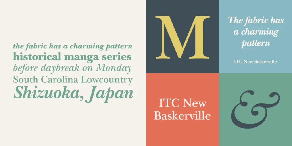
Baskerville adds old-world refinement with its ink-like quality. Images: Mulberry, UCLA Library, Poetry Foundation
5. Caslon
Another serif face traces back to 1700s typography. Caslon imparts readability and legibility with balanced spacing between letters, even stroke weights, and easily decipherable shapes. These traits enable it to endure at any scale while lending a handsome visual texture.
Epitomising effortless reading, Caslon frequently highlights literary organisations like Penguin Books or educational institutions conveying scholarship—but offers enough panache to avoid feeling stuffy. Pair with modern sans serifs like Museo for contrast.

A legible serif can sharpen cultural, academic, or literary logos. Images: Penguin Books, William & Mary, Housing Works Bookstore
6. Gotham
Gotham revitalised geometric sans serifs with its release in 2000. Gotham’s letterforms feature ultra-clean lines and near-perfect circles, invoking steadfast strength and confidence. Lots of rectangular negative space within letters means Gotham can disappear into the background without losing presence—an asset for highly graphical logos.
Modern and brimming with capability, Gotham embodies the straightforwardness of brands like Spotify and LinkedIn. Its neutral quality plays well with more stylised fonts like handwritten DearAnnie to create contrast.
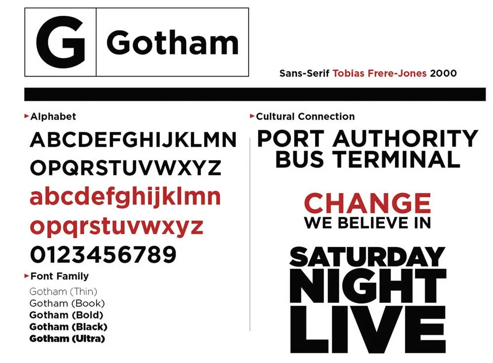
An elegant go-to San serif can promote dependability and intellect. Images: Spotify, LinkedIn, Architecture Firm
7. Trajan
Trajan’s identifiable letterforms originate from Roman capitals carved into stone monuments. Its upper- and lowercase letters feature unique shapes like angular C and S figures. Trajan delivers stature and presence—perfect for short brand names needing distinction. But beware of legibility with extended text!
Trajan embodies imperial power and wisdom. Major film studios leverage Trajan to stir epic emotions and convey cinematic legacy. Blending Trajan with a lighter script or san serif balances its commanding pressure.
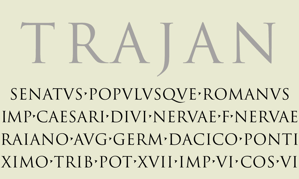
A cinematic font can convey imperial might and storytelling. Images: 20th Century Studios, Gaumont Pictures, Paramount Pictures
8. Garamond
Garamond’s old-style serif pedigree dates back to the 1500s! This history brings a sense of refinement and reliability—but constant re-cutting over centuries grants Garamond variety with many stylistic versions available. Overall, Garamond strikes a readable balance between Transitional and Old-style typefaces for vintage allure.
Garamond adds tasteful sophistication to any logo but avoids stuffiness. Its flourishes and fluidity attract publishers and artisanal brands like Etsy wishing to signal craft and attention to detail. Pairing a display font like Libre Franklin handles prominent text duties alongside Garamond’s fineness.
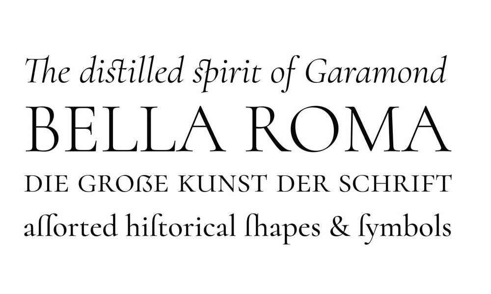
A legacy serif can infuse logos with timeless refinement. Images: Etsy, George Washington University Press, French Paper Co.
9. Brandon Grotesque
Brandon Grotesque modernises the geometric sans serif with subtly rounded edges and flowing curves, making its letterforms more organic and friendly while upholding legibility and technical precision. Released in 2010, this font conveys capability with approachability.
With its blend of dependability and accessibility, Brandon Grotesque suits startups aiming to signal trust and innovation, like Canva or Wix. Pair with script fonts like La Belle Aurore for personality contrast.
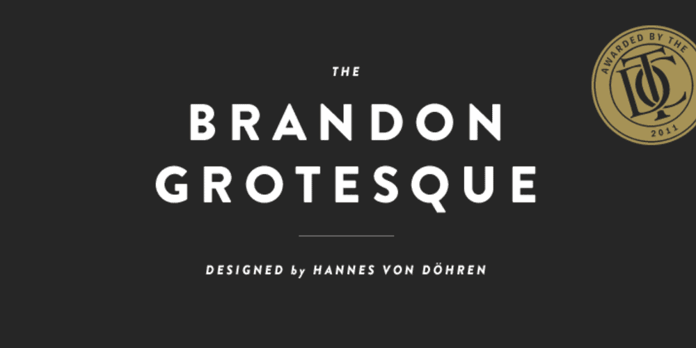
A contemporary geometric able to promote innovation with heart. Images: Canva, Wix, Namu
10. Mrs Eaves
Named after renowned 18th-century typographer Sarah Eaves, this serif mixes calligraphy inspiration with contemporary sensibilities. Mrs Eaves features playful loops on lowercase L, f, and g along with swirling uppercase Q tails with effortless panache along with overall letterform harmony.
Mrs Eaves brings charm and fluidity to any logo, well-suited for lifestyle brands promoting enjoyment like Two Roads Hospitality, seen below. Combine with a more orderly sans serif like DIN or Avenir to spotlight its graceful handwritten quality.
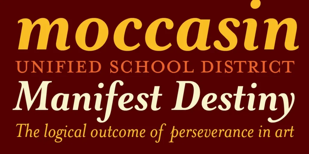
A playful, flowing serif able to inject fun into branding. Images: Two Roads Hospitality, 8 Faces Brewing, Antenna Magazine
11. Neutraface
Neutraface arrived in 2002 to bring back interest in long-forgotten geometric sans serifs mid-century architects favoured. Like those utilitarian letterforms, Neutraface delivers clarity, functionality and progress—but gets updated with obviously modern aesthetic choices like an italic variant.
With its encapsulation of forward-looking design, Neutraface naturally finds itself at home with contemporary architecture and property development firms like those shown below. Pair with softer serif fonts like Elena for intrigue.
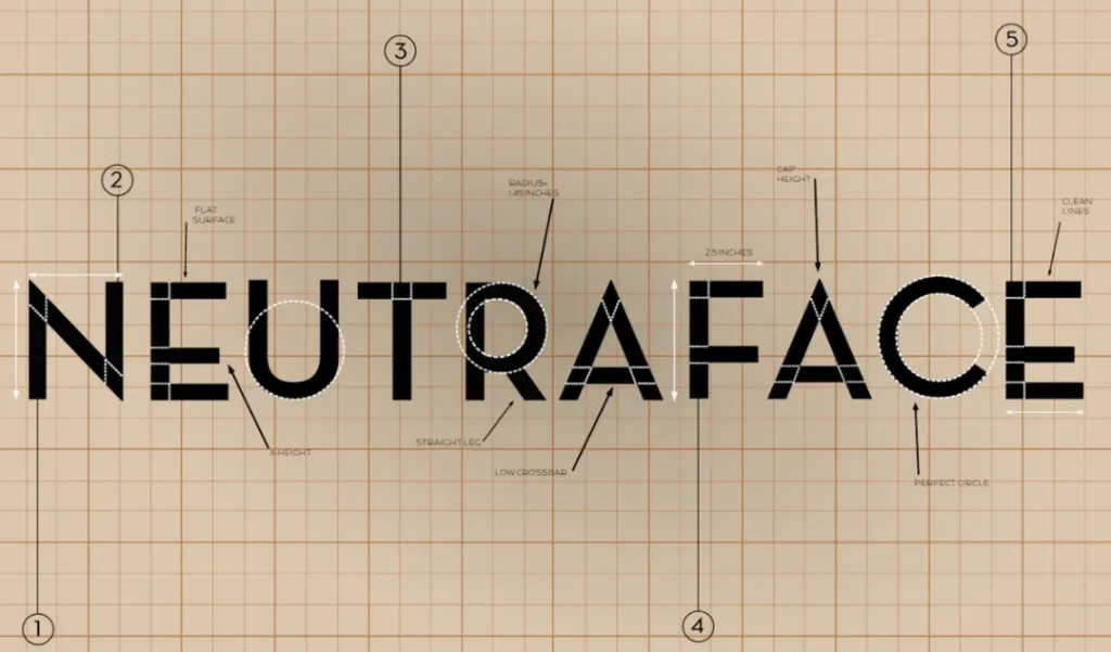
A remixed geometric able to convey sleekness and capability for visual brands. Images: Studio Gang, American Copper Buildings, UrbanVillage
12. Chronicle
Explicitly designed for setting text, this aptly named serif shines with its distinguished italic style for chunks of words. However, Chronicle’s Clarendon-inspired letterforms also give it enough visual expression to serve logos gracefully at display sizes with flowing bracketed serifs and ball terminals promoting harmony.
Chronicle lends warmth and charisma to any identity, well-showcasing bloggers, publishers and causes promoting connectivity like Behance—Complement Chronicle’s friendliness with sturdier constructed san serifs like Graphik.
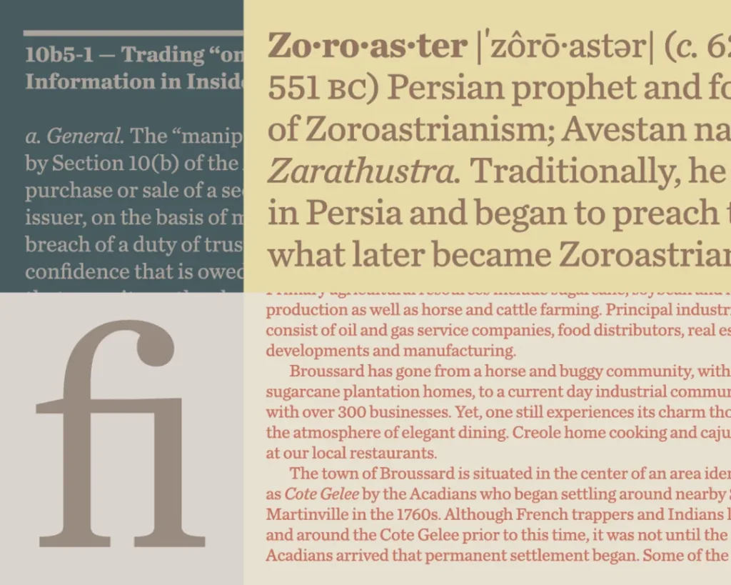
A clarifying serif can boost relatability for textual applications. Images: Behance, Activity Bookstore, Bloglovin'
13. Avenir
Designed in 1988 as a competitor to genre-dominating Helvetica, Avenir echoes the clarity of its forerunner but exhibits rounder, more playful terminals and letter widths—a byproduct of being designed on screen rather than drawn first. The result? Enhanced distinction and affability.
Avenir promotes accessibility and harmony on par with industry leader Helvetica but shows more warmth. Parisian brands leverage Avenir’s elegance, as seen with Givenchy and Sephora below. Pair with striking serifs like Didot for contrast.
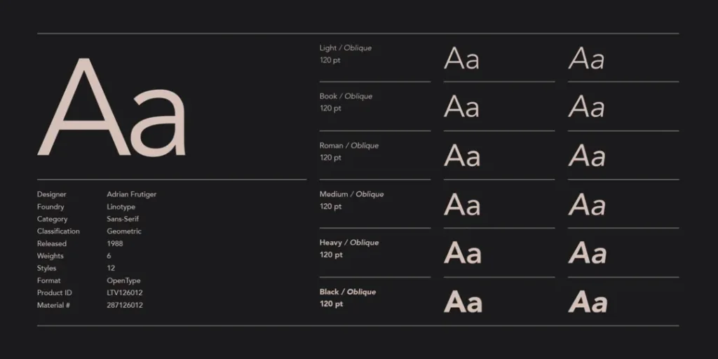
A friendlier Helvetica alternative can convey approachability. Images: Sephora, Givenchy, Laurent-Perrier Champagne
14. FF Meta
FF Meta arrived in 1991 to dominate the humanist sans serif category. With less perfect circular bowls compared to quintessential geometrics, FF Meta better matches the odd shapes and flow of natural handwriting. This makes FF Meta feel more lively plus adds distinguishability. The family offers both proper and display-styled versions to serve multiple needs.
FF Meta’s animated quality injects energy and movement—perfect for active consumer brands like Everlast, Red Bull and Nike wishing to accentuate dynamism and high performance—Pairr Meta’s verve with more grounded serifs like Rockwell.
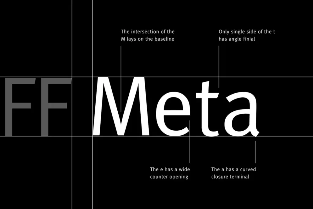
A kinetic yet highly legible san serif can energise active brands. Images: Everlast, Red Bull, Nike
15. Alternate Gothic
Drawn initially for sign painting, Alternate Gothic became one of the 20th century’s most famous industrial sans serifs. Its condensed verticals and near-even stroke widths make it thick yet spaced and legible. These qualities allow Alternate Gothic to grab attention on a large scale.
Alternate Gothics’ emboldened letterforms signal complexes and urban developments wishing to convey lasting dominance and architectural power like factions below. Softening script fonts like Great Vibes temper its angularity.
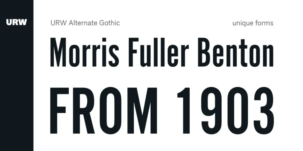
A sturdy San serif can add height and visibility to development brands. Images: Related Group, Barclay Homes, Dubai Holdings
There, you have the 15 top fonts for logo design! Study their traits. Experiment with pairings. Discover which options best represent your company. And most importantly, trust your taste and personality to guide you—that will make your logo stand out most.
Now let's cover some frequently asked questions about selecting logo fonts:
FAQs about Choosing Logo Fonts
What are the three best fonts for a logo?
Helvetica, Futura, and Garamond are the three most versatile fonts for logo design. Helvetica offers neutral clarity that works everywhere. Futura provides quirky yet legible distinctiveness. Garamond balances elegance with readability across contexts.
How do you choose a font for a luxury brand logo?
Luxury brand logos use fancy “didone” serif fonts like Bodoni, Didot, and Walbaum or employ highly stylised custom lettering. These ornamented letterforms reference calligraphy to signal high class. Streamlined San serifs also indicate premium through simplicity.
What font style is best for logos?
Sans serif fonts generally work best for logos meant for digital use. Serif fonts promote heritage for traditions-focused companies. Handwriting/script fonts inject personality and warmth. Explore font styles reflecting desired attributes.
What fonts do professional graphic designers use?
Graphic designers frequently use Helvetica, Garamond, Futura, Gotham, and Caslon for clear printed communication. More display-driven designs feature Trajan, Bilbao, Neuzeit, and Alternate Gothic. Custom lettering also allows for complete stylistic control.
What makes a font good for logos?
Ideal logo fonts feature legibility, differentiation, versatility, originality, and style options like weights and italics. Custom-drawn letterforms work incredibly well, too, by offering exclusive identifiable traits.
Hopefully, these logo font selections, examples, and pairings provide a helpful starting point for choosing the typography that gives your company an impactful, recognisable identity. Always test fonts at multiple sizes and contexts, and optionally work with a designer to customise letterforms that embody your brand. Best of luck with your logo and brand design journey!
