Rebranding Success Stories: How Companies Reinvented Themselves
The lizard brain loves the familiar. It wants to stick with what it knows, even when what it knows isn't working. That's why rebranding is so tricky. It requires silencing the lizard brain and embracing the unknown.
But the companies that manage to pull off a successful rebrand unlock new levels of growth. When done right, rebranding jolts stagnant brands back to life. It reframes the narrative and reshapes perceptions. A firm rebrand rejuvenates from the inside out.
In this article, we'll examine companies that dared to reimagine themselves. We'll learn how they overcame inertia and fear to reinvent themselves. From revamped logos to overhauled messaging, we'll explore the rebranding secrets that transformed these organisations.
Rebranding can be challenging. But the success stories ahead prove it's possible. With courage, creativity, and commitment, tired brands can trigger game-changing momentum. Are you ready to reintroduce yourself?
Table of Contents
Old Logo Gets a Facelift
The most visible part of any rebrand is often the logo change. An outdated logo design can make your entire brand feel stale, like that pair of sneakers you've held onto for far too long. Conversely, a logo redesign presents a ripe opportunity to signal change and bring your image into the 21st century.
Take Mastercard's recent subtle yet highly effective logo redesign, for example. The two iconic overlapping red and yellow circles we know by heart are still there, but now they're nestled inside a simplified, rounded rectangle. The overlapping circles represent Mastercard's universal connections and partnerships—, keeping them aligned with the brand's core identity.
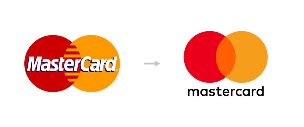
However, the flattened, minimalist execution matches our modern, digital-first world. And cleverly, the incomplete corners of the rectangles act as frames, symbolising how Mastercard sees itself as an integral part of the larger digital payments ecosystem. This brilliant logo redesign helped Mastercard appear more contemporary without losing its core visual identity.
The key takeaway here is that a logo redesign has the power to modernise your brand seamlessly, as long as you retain those core visual elements that make your brand recognisable in the first place. It's like getting a stylish new haircut—you look fresh, but you're still undeniably you. A nip here and a tuck there can work wonders.
If your logo feels about as current as a VCR, it may be time for a redesign. Use Mastercard's subtle yet highly effective approach as inspiration. Keep the visual essence of your brand intact while updating the aesthetic to be less, well, stale. You don't have to overhaul everything. Just modernise it. Give your brand identity a boost in the digital age. Those outdated sneakers may be your favourites, but it's time to get some new kicks.
Reinventing Through Acquisition
Rebranding is fertile ground after a merger or acquisition. It's a chance to plant the seeds of change and cultivate new growth. The expanded capabilities create space for evolution. The synergies allow the cross-pollination of ideas. It's the perfect time to prune away outdated branches and nurture innovation.
Consider Accor and their impressive rebrand after acquiring Fairmont, Raffles and Swissôtel. These luxury brands were grafted into Accor's portfolio, elevating their premium offerings beyond the mid-scale. Accor blossomed into a luxury experience, no longer confined by its thrifty image.
The tagline “Live Limitless” evoked this renewed spirit of hospitality. It was an invitation to indulge the senses, to savour and relax at the moment. This emotional resonance was vital. A brand must transcend the functional and transport people with each interaction.
The new ALL loyalty program expanded Accor's ecosystem, enriching the soil beyond hotel stays. Now, members can earn and redeem through bars, spas, clubs and more. Accor flourished into a lifestyle brand, branching out with abundance and ease.
A rebrand requires cultivation over time, nourished by strategy. But mergers and acquisitions are landmark moments to plant the seeds of change. They allow brands to blossom into something bold and beautiful. The old roots support new growth, reaching ever skyward. A rebrand did well, honours heritage, yet transforms for the future.
The key is to till the soil when it's fertile – that's when real change can take root. For Accor, the acquisitions created space for metamorphosis. Their rebrand grew organically from this foundation. And other brands can replicate this by nurturing their milestones into fresh growth. The opportunity is ripe. The time is now. Reach boldly for the sun.
Back to Roots
The siren song of change often lures brands to abandon their heritage to pursue ‘new recklessly’. But the most resonant rebrands artfully blend past and future.
Consider Burberry, a venerable British luxury house worn by Arctic explorers and wartime heroes. But late 20th century popularity led to overexposure. The once covetable check pattern and knight logo became ubiquitous and commoditised.
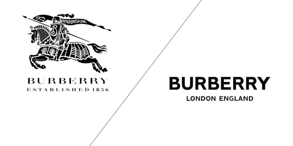
By the early 2000s, Burberry teetered on the brink. How could this heritage brand rediscover its soul?
Burberry wisely understood that the classic is still relevant. They dusted off founder Thomas Burberry’s innovative Victorian spirit. His interlocking initials were repurposed into a fresh monogram-based visual identity. The iconic check was revived as a proprietary brand code.
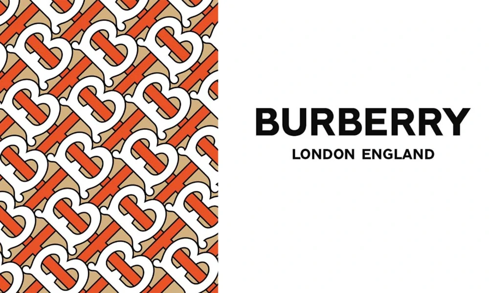
Most importantly, Burberry re-centred around values of fearlessness, independence and ingenuity. They reminded consumers that pioneering new frontiers of style has always been Burberry’s legacy.
This masterful rebranding fused the old and new. By honouring its heritage, Burberry made history once again. They proved, as great brands do that looking back can propel you forward.
The past contains powerful seeds. Plant them artfully to grow a rebrand that resonates.
Key Takeaway: Brands seeking relevance can rediscover their essence by modernising and abandoning their origins and heritage.
Rethinking Target Audience
The tribes have changed. The old maps are obsolete. It's time to redraw the boundaries.
Who is your brand serving in this day and age? The demographics you aimed for five or ten years ago may have moved on. Your loyal customers‘ needs and worldviews are likely shifting. You need to periodically re-evaluate who your real audience is to avoid a disconnect. Like a faded polaroid, your brand's image can become unrecognisable to the people it wishes to connect with.
A brand is a promise. But promises must be periodically renewed and refreshed.
Take Mattel's Barbie, an iconic brand that has reinvented itself to remain relevant decade after decade. In 2016, Barbie unveiled a bold makeover featuring diverse skin tones, body types, hairstyles and fashions. This reflected the various world girls grow up in today.
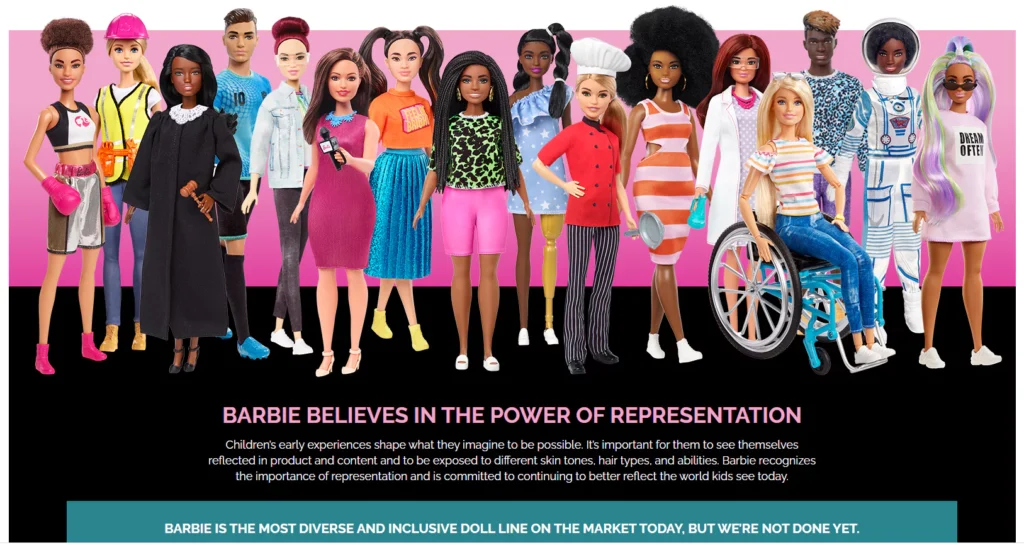
Beyond the physical dolls, even Barbie's brand communications changed to depict her in more progressive roles—everything from a presidential candidate to a robotics engineer. This successful rebrand established Barbie as an inclusive friend celebrating girls' limitless potential.
The tribes had changed, so Mattel changed the brand promise. They realigned Barbie to resonate with a redefined audience.
Brands that connect create a movement that cultivates actual tribes – they must periodically re-examine who they serve and why. They must regularly recreate their promise to align with their audience's evolving ethos.
This is not pandering. It is honouring the community that sustains you.
Let the old maps fade. Draw new boundaries. Find your new tribe.
Brand Name Change
Sometimes, everything from the logo to the tagline needs a complete makeover for rebranding success. Dropping a tarnished brand name can feel like a liberation, an empowering fresh start. Rebranding represents a defining moment to usher in a new era and narrative for a company.
This path is fraught with risk, no doubt. But the rewards can be prosperous for those bold enough to take the plunge.
Consider Fukushima Prefecture post-2011. The nuclear disaster dealt a catastrophic blow to its agricultural reputation. Fear of contamination meant consumers shunned the region's produce.
- Kenney, Bill (Author)
- English (Publication Language)
- 240 Pages – 07/05/2023 (Publication Date) – Lioncrest Publishing (Publisher)
To regain trust, Fukushima's peaches were reintroduced in 2020 under the new name Akanami. This symbolic rebranding helped rebuild confidence in the fruit's safety.
Similarly, Fukushima's rice was rebranded as Aizu no Akihime in 2021, severing ties with the past. And it worked—sales recovered following these strategic rebrands, conveying a fresh start. The new names powerfully communicated that Fukushima's produce was safe again.
The lesson is clear: a brand name change can help overcome past reputation damage and allow a business to redefine itself. It signals a line in the sand, an opportunity to reinvent the narrative.
But only with courage and intelligent messaging. Cosmetic changes won't cut it. The public today craves authenticity and facts, not just shiny new logos.
Rebranding represents a chance for businesses to make a fresh beginning. To hit reset with their core audience. But it takes more than a name change. Companies must back it up with transparency, quality products and a story worth believing in again. Get this right, and brands can triumph over the most damaging pasts.
Brand Purpose
Today's consumers are longing for brands that stand for more than just profits. They want brands that make a difference beyond just selling products. This presents a massive opportunity for brands to reframe their purpose and connect with consumers on a deeper level.
Brands that take a stand and align around a meaningful cause give people a reason to care. It's no longer enough just to make good products – consumers expect brands to use their power and influence for good.
Just look at what Unilever has done with its “Brands with Purpose” strategy. They realised that their extensive brand portfolio, with household names like Dove, Vaseline, Hellmann's, and Knorr, could have much more impact if unified around a joint mission.

So, they rebranded and realigned all their brands around “making sustainable living commonplace.” Now, each brand channels its unique products and messaging through this socially conscious lens.
This shared sense of purpose has created a halo effect for Unilever's brands. When you buy Dove soap or Hellmann's mayo, you're not just buying a product – you're supporting a company trying to make the world a little better. You're consuming more consciously and promoting sustainability.
Unilever's brands are now seen as enabling mindful consumption, not just peddling goods. The entire company is more relevant and meaningful in consumers' minds.
The takeaway is clear: finding a socially relevant purpose bigger than profits alone can uplift your entire brand portfolio. When your brand stands for a cause, consumers stand with you. That's the power of rebranding around a purpose that matters.
Rebrand for Renewal
We all know those venerable old brands, the ones that have been around forever and feel as comfortable as an old pair of shoes. Brands like Coca-Cola, Levi's, Campbell's Soup – they're woven into the fabric of our culture.
But longevity has a downside. After a few decades, even beloved brands can start to feel stale. The classic label that once seemed iconic now looks dated. The familiar tagline starts to sound tired and trite. Even after realising it, customers begin to tune out. Sales slow. Brand love starts to fade.
This is the quiet crisis of brand fatigue.
How can heritage brands fight back against this inevitable drift into obsolescence? As Patek Philippe demonstrates, the answer lies in informed, thoughtful updating balanced with a deep respect for brand history.
Patek Philippe is a perfect example. This luxury Swiss watch company has been around since 1839. That's 184 years…older than Italy as a unified country! Talk about heritage. But Patek Philippe isn't coasting on history alone.
In 2021, they unveiled a subtle but significant refresh of their iconic Calatrava Cross logo. This prestigious cross shape has appeared on Patek Philippe watch dials since 1887 as a symbol of the brand's uncompromising quality and precision. The new version is bolder and has more of a 3D look, but it's immediately recognisable as an evolution of the classic cross. The essence remains, but the logo now looks fresher and more contemporary.

Accompanying advertising highlights Patek Philippe's continuing leadership in innovative watchmaking while respecting the brand's long tradition of craftsmanship. The message is clear: this may be a heritage brand, but it's not stuck in the past. Patek Philippe is moving into the future without abandoning the core identity that customers love.
This delicate balance of old and new, change and continuity, is what enduring brands need to stay relevant. Thoughtful revitalisation reminds customers why they fell in love with the brand in the first place while also signalling that new chapters are still to be written.
So take heart, legacy brands. With sensitivity and imagination, you can trigger renewal without losing hard-won brand equity. Your next golden era may be just a subtle rebrand away.
Boldly Breakaway
Friends, sometimes you've just got to make a clean break. When the baggage of the past is so heavy that it’s dragging you down into the mud, that’s when a total rebrand isn’t just an option—it’s the only way forward.
Take JC Penney. One hundred years of history, but sometimes the legacy holds you back more than it lifts you. So when Ron Johnson took over as CEO, he knew that timid little tweaks here and there wouldn’t cut it. Nope, the department store needed radical surgery. Out with the old, in with the new.
So Johnson launched “Fair and Square,” saying adios to the constant sales and markdowns that had made JC Penney feel more like a clearance outlet than an actual store. No more games, just fair and square pricing day after day. Minimalist new logo, hip in-store vibe, brands that appealed to a younger crowd rather than the blue-hair bingo set. This was a balls-to-the-wall, no-half-measures, scorched-earth rebranding effort.
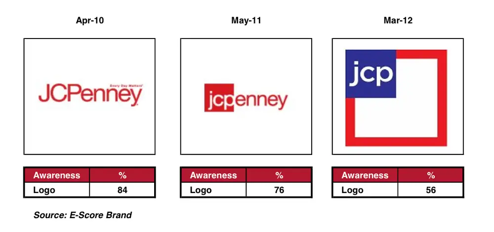
Now, ultimately, it backfired, as loyal customers fled and revenues tanked. So it’s a cautionary tale for sure. But you've got to respect the courage and conviction. Johnson looked at a sinking ship and said dammit, if we’re going down, at least let’s go down with our flag flying high. Let’s make one last epic run at this thing before we hit the iceberg.
So, if you find yourself at that same point of desperation, where a total rebrand is the only thing that can save you, go for it. Rip off the rearview mirror. Torch the old brand and rise like a phoenix from the ashes. Will it work? No guarantees. You might crash and burn like JC Penney. But fortune favours the bold. And sometimes, the only way out is through. Just be ready for one wild ride.
Key Takeaways from Rebranding Success Stories
The examples above showcase diverse and bold approaches to rebranding. Some key learnings for your rebrand are:
- Keep your core DNA: Retain some visual identity or name elements representing your brand heritage. This aids continuity.
- Acquire change: Mergers or acquisitions allow you to expand into new segments and reposition your brand.
- Back to roots: Leverage your brand origin story and history in a modernised form to reclaim authority.
- Know your real audience: Re-evaluating your audience profile is crucial to create relevance. Customers evolve.
- Change for a cause: Rebrand around a social purpose to connect better with consumer beliefs and values.
- Refresh gently: For legacy brands, small changes using nostalgia and original charm can renew appeal.
- Shock tactics: In extreme situations, drastic actions may be the only way to reboot the brand fundamentally.
Conclusion
Rebranding is not for the faint of heart. It requires gobs of courage, boatloads of clarity, and an endless reservoir of creativity. This is not just a cosmetic facelift—a fresh coat of paint on faded siding. A successful rebrand is a top-to-bottom reimagining of your business strategy and ethos.
While the prospect may seem daunting, the potential rewards make it all worthwhile. When built upon genuine consumer insights and animated by a compelling purpose, a brand overhaul contains the seeds of transformation. It can fundamentally reshape a business and its trajectory.
The rebranding stories we've explored reveal some of the critical ingredients and strategies:
- Embrace your heritage – Don't throw away your history and hard-earned equity. Instead, rediscover and reinterpret it for a new era.
- Acquire game-changing abilities – Add capabilities and skills to meet emerging consumer needs and desires.
- Modernise your purpose – Refresh and restate your reason for being to make it timely and resonant.
- Re-evaluate your audience – Understand who you serve and what they expect now, not who you served decades ago.
- Take small but significant steps – Don't rush drastic actions that may alienate your base. Careful, incremental changes can have an outsized impact.
- Lead with vision and restraint – Have a clear destination, but get there gradually, with nuance.
With this kind of prudent, thoughtful approach, a brand refresh can also mark a positive turning point – from failure to success, from decline to growth, from stale to fresh. Rebranding is always an adventure but a rewarding one for those willing to embark on the journey.
FAQs About Rebranding
Here are some common questions about rebranding answered for you:
How much does it cost to rebrand?
The costs vary based on the scale and complexity of the rebranding effort. Factors like research, strategy, new visual identity, branding documentation and launch promotion together can cost from $50,000 to over $200,000 on average for a complete rebrand.
When is the right time to rebrand?
Rebranding is advised when your brand loses relevance with evolving consumer demographics and preferences, after mergers to integrate new capabilities, or when recovering from reputational damage. Periodic refresh every 5 to 7 years is also recommended.
Can rebranding alienate existing customers?
Yes, dramatic rebranding actions like name changes or radical logo redesigns bear the risk of losing existing brand equity and loyal customers. Rebrand evolution should outweigh revolution.
How is rebranding different from repositioning?
Rebranding requires an overall change in brand identity through elements like name, logo, messaging and visuals. Repositioning involves changing just the market positioning and customer perception of the brand without identity changes.
What are some rebranding best practices?
Keep core brand equity intact, stay true to brand origins, evaluate if your audience has changed, and ensure visual updates are evolutionary. Also, rebrand around a larger purpose and not just aesthetics. Incorporate employees to own the rebrand internally, too.
Rebranding allows businesses to reinvent themselves and realign with the market and consumers. The examples and lessons in this article will guide you in planning a successful brand revitalisation. With strategic thinking and creativity, you, too, can craft a brand makeover that will accelerate your business growth and connect better with your audience.
Last update on 2024-05-14 / Affiliate links / Images from Amazon Product Advertising API

