How to Learn the Basics of Design
Design is the lifeblood of visual communication, a harmonious marriage of creativity and functionality that breathes life into ideas and crafts compelling experiences.
As a universal language transcending boundaries, design has become an essential skill in our increasingly digital world. Whether you're a budding artist or a creative enthusiast seeking to enhance your skills, learning design basics is a transformative journey that can open doors to limitless possibilities.
In this article, “How to Learn the Basics of Design,” we will walk you through the fundamental principles, tools, and techniques to lay the foundation for your growth as a design virtuoso. Fasten your seatbelts and prepare to embark on an odyssey of inspiration, innovation, and self-discovery.
Table of Contents
Learning the Fundamental Basics of Design
Congratulations on embarking on the exciting journey of mastering the fundamentals of design! This comprehensive guide will delve into the core principles of design, providing you with a solid foundation to build your creative prowess. To ensure a smooth progression, we will thoroughly discuss each principle, offering valuable insights and tips on incorporating them into your work.
Remember, developing a deep understanding of these fundamental concepts is crucial before venturing into more complex and intricate design challenges. Mastering these basics will refine your design skills and empower you to harness your creativity in crafting innovative and captivating designs in the future.
- Balance: Achieving visual equilibrium is essential to creating harmonious compositions. By carefully distributing elements and their visual weight, you can establish a sense of stability and order in your designs.
- Contrast: Contrasting elements, such as colours, shapes, and textures, can create a striking visual impact that directs attention and adds dynamism to your work. Use contrast to emphasise essential elements and create a visual hierarchy.
- Proximity: Grouping related elements together helps convey meaning and establish relationships within your design—Utilise proximity to create cohesive and organised compositions that guide your audience's attention.
- Alignment: Aligning elements within your design can establish a visual connection and create a sense of unity. Proper alignment contributes to a polished, professional appearance, strengthening your design's effectiveness.
- Repetition: Repeating elements such as colours, shapes, or patterns can reinforce a visual theme and create a sense of consistency. Repetition can also highlight important aspects or create visual rhythm in your designs.
- White Space: Also known as negative space, white space is the unoccupied area around your design elements. Skillfully incorporating white space can enhance readability, create balance, and highlight the focal points of your design.
- Typography: The art of arranging text within your design plays a crucial role in conveying your message. Understanding typography basics, such as font selection, size, and spacing, is vital to creating practical and visually appealing designs.
You can confidently tackle more advanced design challenges by diligently studying and applying these fundamental design principles. As you continue to hone your skills, you will discover new ways to creatively blend these principles, giving birth to unique and unforgettable designs that leave a lasting impression on your audience.
Applying Colour to Design

Colour is pivotal in shaping a design's emotional tone and atmosphere. Incorporating various colours in your work can evoke moods and impressions, ultimately influencing how your audience perceives and connects with your design.
For example, a design dominated by red hues will likely conjure intense emotions, as red is often associated with passion, anger, and love. This powerful colour can be used to underscore a message's urgency or convey a sense of excitement and energy.
Conversely, utilising blue tones in your design work can create a sense of tranquillity, calm, and relaxation. The cooling effect of blue is reminiscent of the sky and the ocean, making it a popular choice for projects that aim to evoke feelings of serenity and trustworthiness.
Understanding the psychological impact of various colours is essential for emphasising critical information and guiding the viewer's eye throughout your design. By harnessing the emotive power of colour, you can create visually engaging compositions that resonate with your audience on a deeper level.
Here are some additional colour attributes to consider when crafting your designs:
- Green: Often associated with nature and growth, green can instil a sense of renewal, balance, and harmony in your designs.
- Yellow: This bright and cheerful colour can evoke optimism, happiness, and energy, making it an excellent choice for drawing attention to specific elements.
- Purple: With its royal and mystical connotations, purple can impart a sense of luxury, creativity, and spirituality in your design work.
- Orange: Blending the warmth of red and the cheerfulness of yellow, orange can convey enthusiasm, excitement, and motivation.
- Grey: While sometimes perceived as neutral or dull, grey can add sophistication, elegance, and modernity to your designs when used thoughtfully.
- Black: Often linked to power, elegance, and formality, black can create a dramatic contrast, highlight essential elements, or convey a sense of authority.
- White: Symbolising purity, cleanliness, and simplicity, white can create a sense of spaciousness, minimalism, and clarity in your designs.
By mastering the art of colour selection and understanding the emotions they evoke, you can craft designs that effectively communicate your message and leave a lasting impression on your audience.
Use of Lines

Lines, as fundamental basics of design, possess many characteristics that can significantly influence your work's mood and overall impression. Whether they are slim, straight, squiggly, or thick, the quality of lines in your design speaks volumes about the atmosphere you intend to create.
For instance, thick or hand-drawn lines often evoke a sense of playfulness and informality, making them well-suited for juvenile or whimsical themes. These types of lines can add a touch of charm and personality to your designs, evoking a handcrafted and organic aesthetic.
In contrast, thin and straight lines are associated with refinement and sophistication, making them ideal for conveying professional, corporate, or minimalist themes. These clean and precise lines help establish a sense of order and structure in your designs, promoting clarity and focus.
The way lines interact is also crucial to the basics of design. For example, slim, straight lines intersecting at various angles can create a sense of chaos or tension, generating visual excitement and dynamism in your work. This technique can be particularly effective in capturing the essence of high-energy, fast-paced situations or conveying a sense of urgency.
Alternatively, hand-drawn lines that maintain a degree of orderliness and straightness can lend a personal, intimate touch to your designs. This approach can evoke warmth, authenticity, and relatability, fostering a deeper connection between your audience and your work.
As you continue to explore and experiment with lines in your designs, consider the following attributes:
- Curved lines: Graceful and fluid, curved lines can bring a sense of elegance, movement, and harmony to your compositions.
- Zigzag lines: These lines can introduce a sense of action, energy, and unpredictability, making them perfect for creating visual interest and adding texture.
- Parallel lines: Utilising parallel lines can convey a sense of stability, continuity, and rhythm in your designs, helping to guide the viewer's eye and establish visual hierarchy.
- Diagonal lines: Often used to imply movement or direction, diagonal lines can add dynamism and depth to your designs, creating a more engaging and immersive experience for your audience.
By understanding the various design characteristics and applications of lines, you can skillfully manipulate them to evoke different moods and styles, ultimately crafting visually compelling compositions that resonate with your intended message and audience.
Designing with Shapes

Incorporating shapes in your designs can significantly impact the overall mood, tone, and message you aim to convey. Different forms carry distinct associations and emotional responses, making them powerful tools for evoking specific themes and impressions in your work.
For instance, angular shapes like triangles and squares tend to project a sense of strength and masculinity. These bold and structured forms can communicate stability, power, and assertiveness, making them ideal for designs that target a more professional or assertive context.
Conversely, curving and smooth shapes such as circles and ovals often elicit a more feminine and gentle response. These fluid forms can evoke feelings of warmth, harmony, and grace, making them well-suited for designs that aim to create a softer, more nurturing atmosphere.
To gain a deeper understanding of how shapes can influence your designs, consider the following examples:
- Squares: As familiar and ubiquitous shapes, squares are often associated with stability, security, and trustworthiness. Consider everyday objects like TV screens or pieces of paper – their square or rectangular forms convey a sense of order and dependability. In your designs, squares can create structure, balance, and a sense of reliability.
- Circles: With smooth, unbroken lines, circles naturally appeal to the eye. They evoke feelings of wholeness, unity, and organic harmony, making them excellent design choices that convey peace, inclusivity, or balance. Circles can also soften a design's overall appearance, lending it a more approachable and friendly character.
- Triangles: Triangles, with their sharp angles and pointed vertices, can communicate a sense of dynamism, energy, and direction. Depending on their orientation, triangles can signify stability (when the base is at the bottom) or instability (when the base is at the top). Use triangles in your designs to create a sense of movement, tension, or purpose.
- Organic shapes: Freeform, irregular shapes inspired by nature can add a sense of spontaneity and life to your designs. Organic shapes can evoke feelings of growth, adaptability, and creativity, making them perfect for projects that emphasise natural elements or require a more fluid, less rigid visual language.
By carefully selecting and incorporating shapes in your designs, you can effectively manipulate the mood and message of your work, crafting visually engaging compositions that resonate with your audience and convey your intended narrative.
Scale and Size in Design

Scaling and sizing are essential design concepts that contribute to creating balance, contrast, and proportion in a composition. These principles help to establish visual hierarchy, guide the viewer's eye, and evoke specific emotions in your audience.
Size refers to the dimensions of individual elements within a design. At the same time, scale pertains to the relationship between the size of a component and its perceived appearance in the context of the overall composition. For example, featuring a person on a billboard will create a larger-than-life impression compared to their appearance in a typical, everyday setting.
Proportion, on the other hand, describes the relative size of an element concerning other elements within the design. Proportion considers both scale and size, helping to define the visual balance and harmony of the composition.
Scale and proportion are often employed to convey the accurate size of an object or to emphasise the size difference between two elements in a design. A typical example of this is comparing a child's hand to that of their mother, which highlights the contrast in size and evokes emotions associated with growth, nurturing, and protection.
To further illustrate the importance of scale and proportion in design, consider the following applications:
- Visual Hierarchy: By manipulating the size and scale of elements within a design, you can create a visual hierarchy that directs the viewer's eye to the most critical aspects of your composition, ensuring your message is effectively communicated.
- Emphasis and Contrast: Adjusting the scale and size of elements can emphasise specific aspects of your design, creating contrast and adding visual interest. This can draw attention to crucial information or evoke particular emotions in your audience.
- Realism and Illusion: Playing with scale and proportion can create illusions or convey a sense of realism in your designs, depending on your intended effect. For example, manipulating the scale of objects can create the impression of depth or perspective, adding dimension to your work.
- Harmony and Balance: By carefully considering the proportion of elements within your design, you can create a sense of unity and balance, ensuring that all components work together cohesively and contribute to the overall effectiveness of your composition.
By mastering the concepts of scaling, sizing, and proportion, you can skillfully manipulate the visual dynamics of your designs, crafting engaging and impactful compositions that resonate with your audience and effectively convey your intended message.
Use of Space

As a designer, mastering space in your work is crucial for creating visually appealing and compelling compositions. Often referred to as “white space” or “negative space,” this unoccupied area surrounding design elements serves a vital purpose in providing room for both the design and the viewer's eye to breathe and rest.
When used appropriately, white space can prevent your design from appearing crowded or claustrophobic, ensuring the composition feels balanced and inviting. On the other hand, neglecting white space can result in a format that feels overwhelming or difficult to comprehend, diminishing its overall impact.
Conversely, using too much white space can make a design appear incomplete or disjointed, giving the impression that something is missing or unfinished. Striking the right balance between occupied and unoccupied space is essential for creating harmonious and visually engaging compositions.
To effectively incorporate white space into your designs, consider the following strategies:
- Balance: Experiment with the distribution of design elements and white space to achieve a sense of equilibrium, ensuring that the composition feels neither too sparse nor too cluttered.
- Hierarchy: Utilise white space to establish a visual hierarchy, helping to guide the viewer's eye toward the most critical aspects of your design and ensuring your message is effectively communicated.
- Legibility: Incorporate ample white space around text and other design elements to enhance readability, making it easier for your audience to process and understand the information presented.
- Focus: Use white space to draw attention to critical elements within your design, creating contrast and emphasising the most important aspects of your composition.
- Aesthetic appeal: Thoughtfully employing white space can contribute to a clean, modern, and minimalist aesthetic, particularly appealing to certain audiences or in specific design contexts.
By learning to blend and balance these elements, you can create compositions that elicit a robust emotional response and resonate with your audience. Continually experimenting with and breaking down the principles of white space will empower you to refine your design skills, ultimately leading to more compelling and impactful work.
Texture in Design

The texture is an engaging and versatile design element that can be experimented with to create visually intriguing compositions. Often employed to evoke a sense of realism and depth, the thoughtful application of texture can add a unique visual and tactile dimension to your work, enhancing its overall appeal and impact.
Incorporating texture into your designs enriches the visual experience and gives the composition a distinctive feel and character. This can help your designs stand out from the competition, drawing the viewer's attention and fostering a deeper connection between your audience and your work.
While digital textures can be applied to your designs using computer software, it's essential to pay attention to the role of physical materials in the final printed output. The choice of paper, fabric, or other substrates can significantly influence your finished piece's texture and overall aesthetic, so it's crucial to consider how these materials will interact with your design elements.
To effectively incorporate texture into your designs, consider the following approaches:
- Realistic textures: Use photographic or hand-drawn textures to simulate real-world materials, such as wood, metal, or fabric, adding depth and authenticity to your designs.
- Abstract textures: Experiment with abstract or stylised textures to create unique visual effects that evoke your audience's moods, themes, or emotions.
- Layering: Combine multiple textures or patterns to create complex and visually rich compositions, adding depth and interest to your designs.
- Tactile textures: Consider how the physical materials used in your final printed work will impact your designs' overall feel and appearance. This may include selecting papers with unique textures, incorporating embossing or debossing techniques, or using speciality inks to create tactile effects.
- Subtlety: Use texture subtly to enhance specific design elements or create visual interest without overpowering the composition. This can be achieved by carefully adjusting your textures' opacity, scale, or colour to ensure they complement rather than dominate your design.
By thoughtfully experimenting with texture in your designs, you can craft visually compelling compositions that captivate your audience and leave a lasting impression. Additionally, considering the physical materials in your final printed work can enhance the overall sensory experience, resulting in genuinely memorable designs.
The Value Dimension

The value of design plays a crucial role in establishing unity and cohesion within your work. Often overlooked, value is the connecting thread that combines all aspects of your design, creating a harmonious and visually appealing composition.
Effective use of value can generate a focal point and guide the viewer's eye throughout your design, helping to establish a clear visual hierarchy and ensuring that your intended message is communicated effectively. In essence, value is a balancing tool that allows you to create a harmonious relationship among the various elements in your design.
Incorporating values of high intensity, which lean towards the lighter end of the spectrum, can create a subdued and gentle tone within your composition. Depending on your design's context and other elements, this approach can evoke feelings of tranquillity, purity, or elegance. In contrast, employing values with low intensity, or darker ones, can create a more foreboding and ominous atmosphere. This technique conveys a sense of mystery, power, or drama.
Utilising values at either extreme of the spectrum can produce a theatrical effect, capturing the viewer's attention and evoking strong emotional responses. However, balancing these extremes is essential to ensure your design remains visually engaging without becoming overly dramatic or distracting.
To effectively incorporate value into your designs, consider the following strategies:
- Contrast: Use contrasting values to create visual interest, emphasise specific design elements, and guide the viewer's eye through your composition.
- Gradation: Employ gradation or smooth transitions between values to create a sense of depth, dimension, or movement within your design.
- Harmony: Ensure that the values used within your design complement one another and contribute to the overall balance and unity of the composition.
- Mood: Consider how the value choices in your design can evoke specific emotions or feelings in your audience and adjust accordingly to convey your intended message effectively.
- Consistency: Maintain consistency in your value choices across different design elements to create a cohesive and harmonious visual language.
By thoughtfully applying the concept of value in your designs, you can skillfully craft visually captivating compositions that resonate with your audience and effectively convey your intended narrative.
Why Learn the Basics of Design?
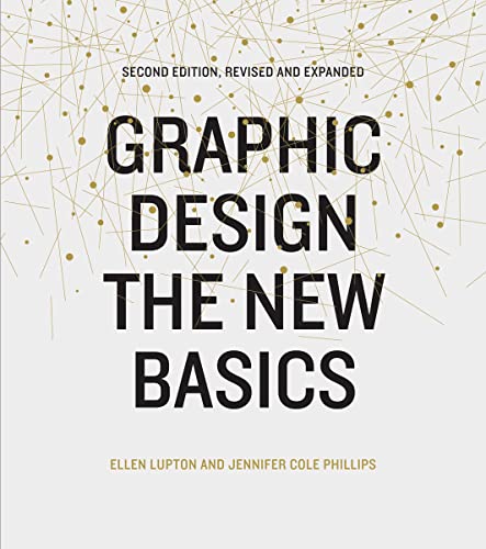
- Lupton, Ellen (Author)
- English (Publication Language)
- 264 Pages – 07/14/2015 (Publication Date) – Princeton Architectural Press (Publisher)
Graphic design is a powerful tool for communication, enabling the effective transmission of ideas, concepts, and messages through visually compelling compositions. As you progress through various stages of the design process, it's crucial to recognise that each design element plays a pivotal role in conveying the intended message of your work.
The impression your audience derives from your design directly results from how you've skillfully integrated these elements into a cohesive and engaging composition. Consequently, it's essential to tailor your strategy to resonate effectively with your target audience, ensuring the message is relevant and impactful.
Getting Started with Your Design
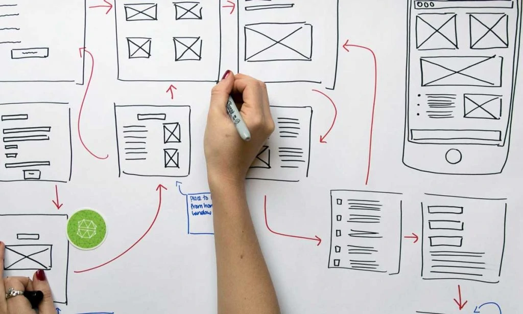
To become a successful designer, two main options are enrolling in a design school or starting out independently. While enrolling in a design school may involve taking a 4-year course at an elite college, it can provide a structured and comprehensive approach to learning the necessary skills and knowledge to succeed in the industry. However, it all depends on what you want and your goals in the field.
Regardless of your chosen path, the most important thing is to be good enough to handle any assignment. Design is a broad field encompassing visual and interaction work of web, print, and mobile app design. Even after completing a formal education, you must be able to apply what you've learned practically.
To achieve this, it's essential to adopt a simple approach that combines the necessary skills to succeed in design. First and foremost, learn to see and conceptualise. The most significant mistake you can make is to jump into software programs like Photoshop without being able to visualise the final product. Therefore, getting the basics of design right before getting started is crucial.
Additionally, learning how to draw can be beneficial for designers. While being a great artist isn't necessary, having the basics of drawing can give you an advantage in your work. Make sure you are comfortable sketching using a pen, and try out your drawings for about 30 days using a book. Practice for about 30 minutes each of the 30 days to improve your skills.
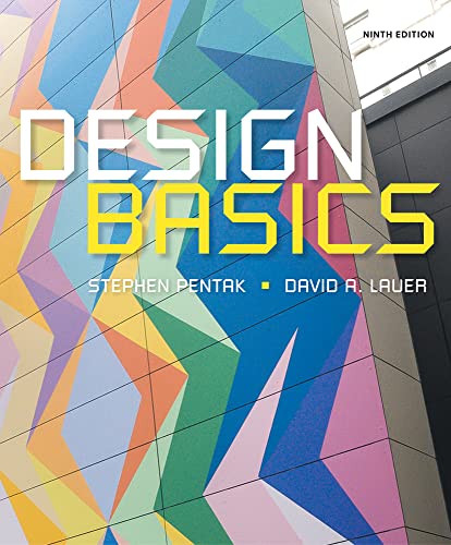
- Pentak, Stephen (Author)
- English (Publication Language)
- 320 Pages – 01/01/2015 (Publication Date) – Cengage Learning (Publisher)
One of the critical factors that can make you successful in graphic design is having a solid understanding of graphic design theory.
The basics of design serve as the skeleton that supports your design work. Therefore, learning all aspects of colour, value, texture, space, and other essential elements is important. You can learn this theory through books, online courses, or by connecting with graphic design professionals. Networking with professionals can allow you to learn from them and help them in different ways.
In addition to understanding graphic design theory, knowing user experience is essential. Your work as a graphic designer will be available to your target audience, so it's necessary to understand their experience and preferences. Reading about user experiences and researching industry trends can help you design with your audience in mind, ultimately creating better outcomes for your clients.
Another essential skill to develop as a graphic designer is writing. A lousy designer may fill their mock-up with placeholder text, but a skilled designer will have practical communication skills and carefully choose their words to ensure a cohesive message. Ensure your writing is geared towards humans, not overly academic or technical. Writing in an approachable tone will make your work more relatable and engaging for your target audience.
Basic Design Principles for a Web or Graphic Designer
Here, we have prepared the basic design principles for a web or graphic designer and developer, which can help create high-quality design products.
Demands First

When we talk about “demands” in the context of design, we are not referring to the needs of a government or company. Instead, we are talking about the wants and conditions of the end-users of a particular service or product. Understanding these demands is critical to the design process, enabling designers to create functional and meaningful products for their target audience.
Whether designing for the web or print, designers must consider the problems and tasks of their target users. This involves researching to gain insights into their behaviours, needs, and preferences. By doing so, designers can create products that meet the demands of their users while also being functional, aesthetically pleasing, and user-friendly.
Not all users may be able to determine what they need. In such cases, designers may need to collaborate with developers to create a solution that addresses the user's problem. This underscores the importance of effective communication and teamwork in the design process.
To create successful designs, a design team must understand the essential needs of their users.
Users come to specific websites or products to solve particular problems, and designers must ensure their solutions are tailored to those needs. This requires a deep understanding of user behaviour, preferences, and pain points. By focusing on meeting the demands of their users, designers can create practical and impactful products.
Build Your Design on Data
Generally, the services available on the Web do not appear anywhere – people somehow use them before they transfer online. This allows developers to study user behaviour in the real world.
Due to this behaviour, you must develop your prototypes, which you later offer to users. The system should adapt to people’s behaviour and respond to it, not force users to change their habits. To understand what solutions work best, use A/B testing.
Do Less
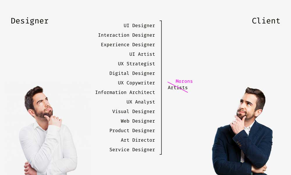
Designers and developers may be skilled and knowledgeable in their respective fields, but they could be more omnipotent. They cannot solve all the issues raised by their users, and it's important to recognise this limitation. Sometimes, other companies may be better equipped to solve a particular problem, and there's nothing wrong with providing users with a link to the desired service. By doing so, designers can provide their users with a comprehensive and seamless experience.
In the development process, responsible design is critical to creating effective solutions. One approach to responsible development is using Application Programming Interfaces (APIs). APIs allow third-party developers to create products and services that can solve people's problems without additional effort on the part of the project's basic design. This approach saves resources and directs them to essential tasks, leading to a more effective and efficient design.
APIs offer several benefits in the design process:
- They allow designers to focus on core design tasks and avoid spending valuable time on non-essential functions.
- They provide an opportunity for collaboration and integration with other companies and developers, ultimately leading to a more comprehensive and cohesive design.
- They allow designers to leverage existing solutions to provide their users with the best possible experience.
Do not Think That it’s Easy to Do Something Simple.
Designing a product that looks simple is easy, but simplifying its actual use can be more challenging, mainly when dealing with complex internal systems hidden from the visible part of the interface. However, it is essential to simplify product use to ensure users have a positive experience.
At the core of responsible and respectful design lies the principle that developers should strive to simplify the use of their products. This is particularly important when users have no alternative but to work with a service or program, which can be frustrating if it's challenging to use.
To simplify the use of products, developers can start by analysing user feedback to identify common pain points and challenges. This can help them identify improvement areas and prioritise these changes. Developers can also use design principles such as simplicity, consistency, and user-centeredness to create intuitive, user-friendly products.
Additionally, developers can consider providing users access to training materials and resources to help them understand how to use the product effectively. This can include documentation, video tutorials, and online support forums.
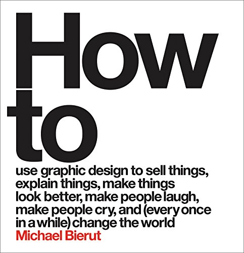
- Hardcover Book
- Bierut, Michael (Author)
- English (Publication Language)
- 320 Pages – 11/03/2015 (Publication Date) – Harper Design (Publisher)
Systematic Process
The best way to build an efficient service is through incremental improvement. Starting with a working product that can be tested on real people is essential. This iterative approach allows continuous improvements based on user feedback, reducing the risk of critical mistakes and improving the overall user experience.
To ensure that a product is efficient, it should undergo alpha and beta testing stages. The development team typically performs alpha testing to identify and fix any issues before releasing the product to a small group of external users for beta testing. During beta testing, users can provide feedback on the product, identifying any bugs, errors, or usability issues that need to be addressed. This feedback can then inform the development team on improving the product and adding new features to enhance the user experience.
Iterative development reduces the risk of critical mistakes and ensures that the product meets the users' needs. This approach allows developers to focus on minor, manageable improvements that can be implemented quickly and efficiently. This reduces the likelihood of significant issues arising and enables developers to fix minor problems that may occur along the way, ensuring that the project continues without delay.
The digital world offers significant advantages over traditional construction projects, such as building bridges, where mistakes can be costly and difficult to fix. In contrast, digital products can be easily updated and modified, allowing developers to quickly correct any errors or issues that arise during the iterative development process. This means that developers can take risks and experiment with new features and functionality without fear of causing significant damage to the project.
Contextual Understanding

Design is created for people, not robots. This means that the contextual usage of a product or service is critical to its success. The context in which the product is being used can significantly impact a user's interaction with the interface. For example, a user in a library or on a phone call may have different needs and limitations to consider in the design.
Similarly, a person's previous experience with similar products or their level of technological literacy can significantly affect their interaction with your product. Considering these factors when designing a new product or service is essential to ensure that it solves the target audience's problem effectively.
Developers must clearly understand their target audience's potential and the products' context to create successful designs. This understanding enables them to create interfaces that meet real-life demands rather than just creating a beautiful interface that may not be effective.
Designers can use many cool tricks and techniques to create effective and engaging interfaces, such as colour, typography, and user-centred design principles. However, it's important to remember that these tricks and techniques should be used with the user's needs and context in mind.
The Bottom Line
In conclusion, mastering the basics of design is an enthralling and transformative experience. By nurturing your creativity, embracing design principles, experimenting with various tools, and consistently seeking feedback, you lay a solid foundation that can take you from novice to expert.
Remember, design is more than just aesthetics; it is a powerful way to communicate ideas, evoke emotions, and influence decision-making.
As you embark on this creative odyssey, never underestimate the value of patience, persistence, and curiosity. Keep pushing the boundaries of your skills, network with like-minded individuals, and remain open to new concepts and methods. The world of design is ever-evolving, and so should you. Ultimately, by harnessing your potential, you can leave an indelible mark on the visual landscape, enriching the lives of those who encounter your creations.
Last update on 2024-05-16 / Affiliate links / Images from Amazon Product Advertising API

