10 Tips for Creating YouTube Thumbnails That Get Clicks
YouTube thumbnails are the first thing viewers see when browsing videos. A good thumbnail grabs attention and compels viewers to click. With over 500 hours of video uploaded to YouTube every minute, standing out is vital. This article provides tips for creating clickable YouTube thumbnails. From understanding thumbnail dimensions to using colours effectively, optimising text and borders, employing contrast and alignment principles, and testing different options—we cover everything you need to make thumbnails that convert.
Table of Contents
Know the Ideal Thumbnail Dimensions
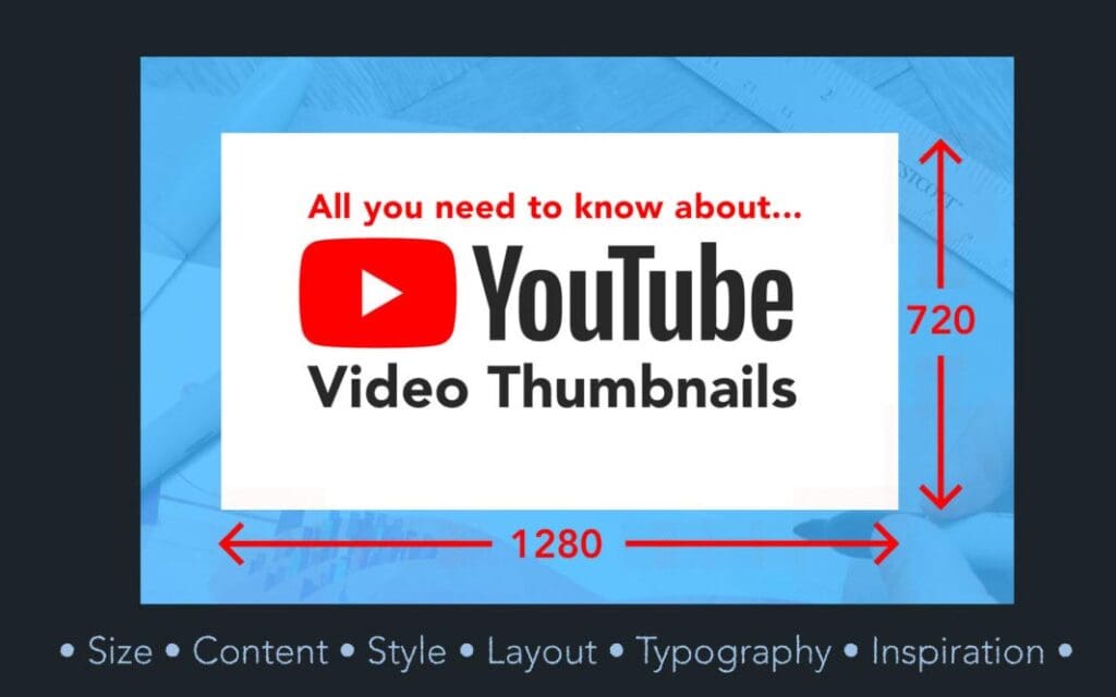
The ideal dimensions for a YouTube thumbnail in 2024 are:
- Width: 1280 pixels
- Height: 720 pixels
These are the exact dimensions of the video player on the desktop. Ensuring your thumbnail matches this size means the entire image will be shown. Anything smaller may get stretched or cropped by YouTube.
Many video editing tools default to these dimensions when exporting thumbnails. But it's worth double-checking so you utilise the whole space.
Use High-Contrast Colours That Stand Out
Colour hugely impacts whether a thumbnail grabs attention. With so much content competing for clicks, high-contrast, vibrant colours are essential.
Aim for a dominant colour that contrasts nicely with the background. For example, a bright red overlay on a dark grey background. Or a neon green text heading over a black backdrop.
Avoid muted or dull shades—these will fade into the background. Testing different colour combos using the YouTube thumbnail previewer is worthwhile.
Some top-performing thumbnail colours include:
- Reds
- Oranges
- Yellows
- Greens
- Purples
- Blues
Optimise Text to Be Bold and Legible
Text plays a pivotal role in conveying a thumbnail's key message. Ensuring text pops yet remains easy to read takes finesse. Here are text optimisation tips:
Use High-Contrast Font Colours
Match text colours to the contrasting backdrop for maximum legibility. Dark font colours like black or blue over bright backgrounds work well. On the other hand, white or yellow text over darker shades stands out.
Avoid similar shade combinations—light grey on white or navy on black. There won't be enough differentiation for the text to pop.
Prioritise Key Text
Not all text holds equal weight. Prioritise key messaging like video titles using larger, bolder fonts up top. Supporting details in smaller fonts can trail below.
Limit Text Quantity
Too many text blocks risk overcrowding thumbnails and decreasing legibility. Stick to critical headings, subheadings and selective details only. Remove excess verbiage.
Check Mobile Appearance
Given high mobile viewership, check font legibility on smaller screens. Headers staying crisp when minimised? Are subtitles still easy to read? Fine-tune as needed.
Use Borders Strategically to Draw Focus
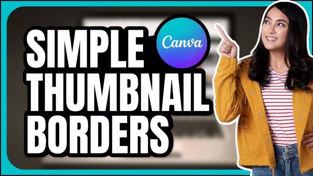
Borders direct attention, enclosing elements you want viewers to focus on. Used intentionally, they powerfully highlight vital areas.
Border Thumbnail Subjects
Placing borders around central subjects—a person, product or text block—focuses attention where you want it. Enclosed shapes also add definitions from busy backgrounds.
Emphasise Text with Borders
Text in borders leaps off thumbnails by separating from backgrounds. Outline the title text, key statistics or other headers you want highlighted.
Vary Border Weights
Thicker borders add greater emphasis around enclosed objects. But mix up weights to not overpower. Balancing thin outlines with selective heavy edges works best.
Employ Contrast and Alignment Principles
Leveraging contrast and alignment amplifies what you want viewers to notice in thumbnails.
Use Contrasting Elements
Containing contrasting components—like a glowing product against a black backdrop or white subtitle text in coloured boxes—creates differentiation that pops.
Align Text Consistently
Keep text alignment consistent across a thumbnail. Flush left, centred or right-aligned text looks uniform and intentional. Mixing alignments risks a disjointed appearance.
Optimise Image Subject Details
Images often feature centrally in YouTube thumbnails. Dialing in optimal subject appearance drives clicks.
Adjust Image Lighting
Properly lit subjects stand out against backgrounds. Images looking overly dark or bright diminish subject focus. Adjust lighting so central focus areas are visible.
Enhance Colour Saturation
Boosting colour saturation makes images vibrant yet natural. Over-saturating can make things unrealistic. Find the sweet spot between lively and lifelike.
Sharpen Critical Focus Areas
Sharpen tools bring key areas into focus. For example, selectively sharpening a product image against a blurrier background establishes evident prominence.
Test Different Options to See What Performed Best

There’s no one-size-fits-all best thumbnail. Testing alternatives to see what viewers responded to most provides data to refine.
Try Different Layouts
Does centred text over an image perform better than text overlaying an image? See what garners more clicks.
Swap Image Location
Product on the left versus right—what draws more eyes? Asset positioning impacts results.
Test Colour Schemes
Green on black beating red on white? Finding the right colour combo through testing pays off.
Keep iterating based on view performance data, moving closer to your most clickable thumbnail.
Tools to Design Standout Thumbnails
Having the right design tools speeds up creating awesome thumbnails. Here are the top options:
- Canva is a user-friendly design platform with templates to customise. Great for beginners.
- Adobe Photoshop: The industry standard for photo editing with robust features. Some learning curve.
- Adobe Lightroom: Streamlined photo editor with handy presets and filters. More accessible than Photoshop.
- PicMonkey: A browser-based editor with templates, graphics, and effects for quick creation. Intuitive interface.
- Snapseed: Mobile photo editing app with pro-level features. Convenient for on-the-go creation.
- InVideo: AI-powered automated creation with templates. Just add assets and text—fast thumbnail builder requiring minimal design skills.
Try selecting 2-3 tools meeting your skill levels and thumbnail needs—for example, Canva for templates paired with PicMonkey or Snapseed for image editing. Or fully leverage Photoshop capabilities for advanced bespoke designs. Mix and match what fits best.
Level Up Thumbnails with Motion and Effects
Still, images now compete with motion and effects. Take thumbnails to the next level by adding:
Animation
Subtle animated effects—like sliding, scaling or rotating graphics—grab viewer attention versus static images. Just don’t overdo it.
Colour Transitions
Fading or shifting thumbnail colours make them less flat and dull. Again, use judiciously for the most significant impact.
Video Inserts
Looping key video moments gives motion preview without playback. It entices viewers to click for the full video.
Dynamic Text
Blinking or perspective text creates a 3D, modern thumbnail appearance that performs well.
Balancing lively motion with clear messaging amplifies viewer enticement.
YouTube Thumbnail Examples From Top Creators
Analysing thumbnails from top YouTubers provides benchmark inspiration:
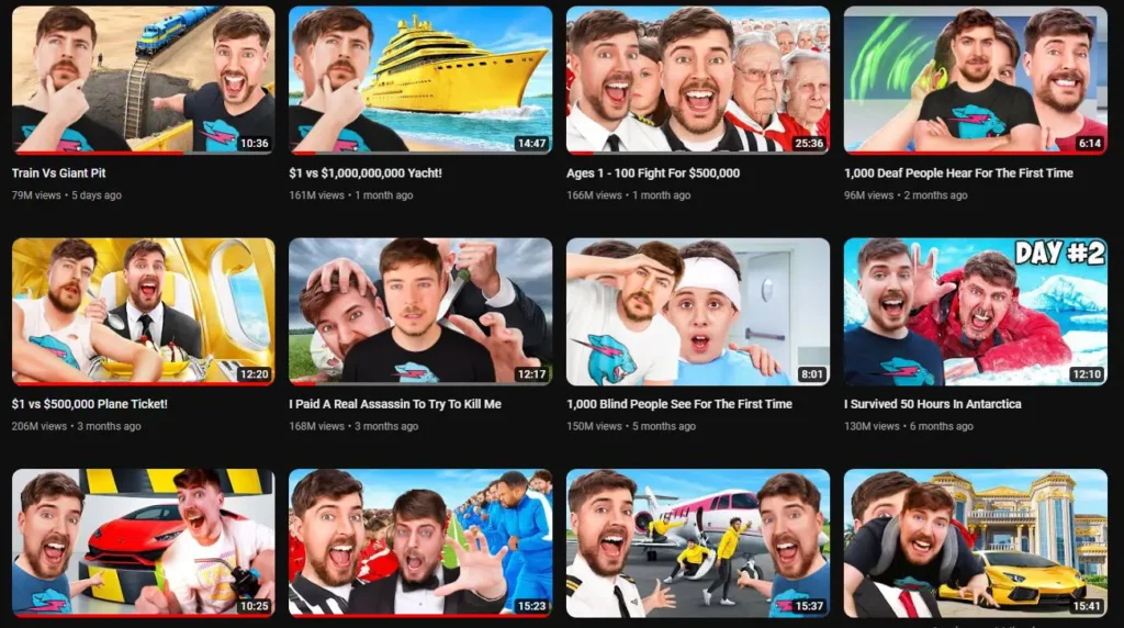
MrBeast generates insane viewership through outrageous stunt videos. His wacky facial expressions in thumbnails alongside bright text on contrasting backgrounds perform phenomenally.
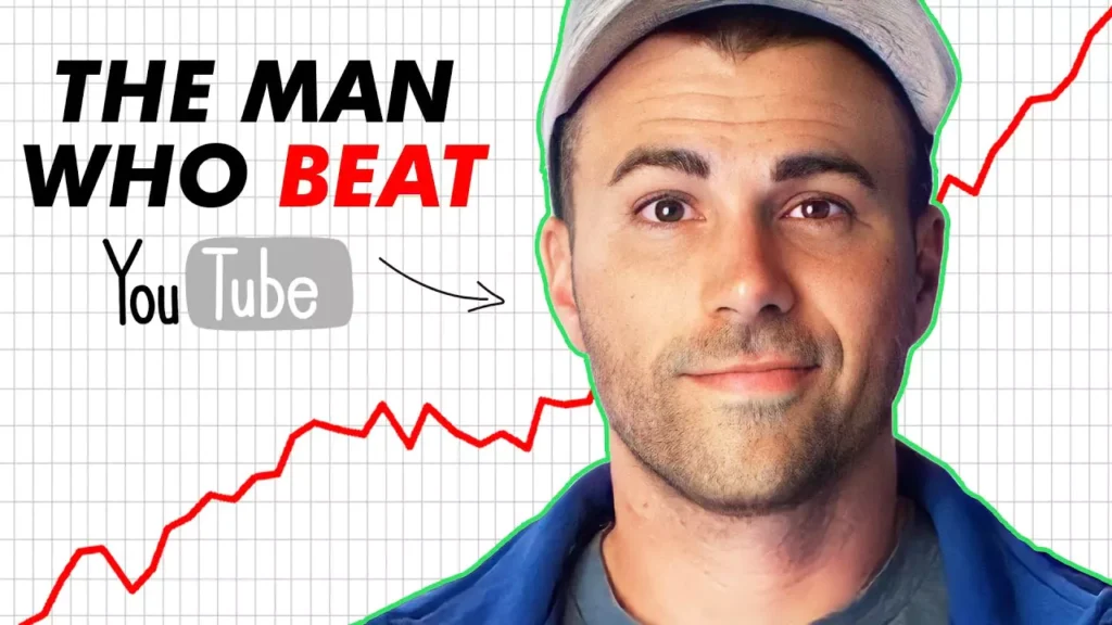
Mark Rober, master of fascinating science videos, uses proportional text styling with legible layouts. Clean, focused and balanced.

Matt D’Avella structures simple lifestyle video thumbnails effectively. Tight composition, selective colour and clean fonts with plenty of white space.
Study thumbnails from creators resonating in your niche. What elements could you incorporate to enhance clickability? Iterate creatively while staying on-brand.
Continuously Test and Optimise
With YouTube’s algorithm favouring higher click-through rates, regularly testing thumbnails pays long-term dividends.
Monitor metrics to guide iterative improvement:
- Click-through-rate
- Impressions
- Audience retention
- Traffic sources
- Audience demographics
Fine-tune thumbnails to elevate performance over time. What imagery, text or layout tweaks move metrics upward? Let data guide design decisions. Test, analyse results and optimise based on empirical evidence.
Conclusion
YouTube thumbnails must grab fleeting attention and spark immediate interest, convincing viewers to click. This requires balancing visual intrigue with clear messaging matched to audience expectations. Follow the tips covered—from size guidelines to colour and text use, contrast and effects—to create thumbs-up-worthy thumbnails that convert viewers to video watchers. Consistently analyse performance and fine-tune based on hard metrics to level up over time incrementally. Keep testing elements to unlock your channel’s highest click-through thumbnail potential.
YouTube Thumbnails FAQs
What are the ideal dimensions for a YouTube thumbnail?
The recommended dimensions are 1280 x 720 pixels to fill YouTube's video player size on a desktop.
How many images or text blocks should a thumbnail contain?
Aim for 1-2 central images and 2-3 text elements only—too many risks of overcrowding. Prioritise the most critical asset and messaging.
What tools are best for creating YouTube thumbnails?
Why test different thumbnails instead of just choosing one?
Testing alternatives and tracking metrics reveal empirical data on which thumbnails perform best with actual audiences. This hard evidence guides optimisation.
What metrics indicate how well a thumbnail is converting viewers?
Key indicators are click-through rate, impressions, audience retention, traffic sources, and demographics. Continuously monitor these over time.
