How to Enhance Your Website User Experience
Imagine walking into your favourite restaurant only to be received by a rude host, waiting for the food you ordered for ages and asking for basic things like napkins or water refills. You would never go back there, right? Like those intolerable experiences that ruin eating out, an ill-conceived website can mess up someone’s user experience (UX) with your brand online.
But what is UX exactly? It is just an experience someone has when using a product or service, whether a physical item, a website or an app. UX covers everything from visual design to website navigation and page loading speed. If any part of this experience annoys or perplexes users, you must deliver better UX, which can repel people in large numbers.
Table of Contents
Why Does UX Matter So Much?

Think about the last time you got increasingly irritated trying to buy something online because the checkout process was complicated. You may have ended up abandoning your cart altogether out of pure frustration. That lost sale stems from the website having a crummy UX!
When user experience is an afterthought rather than a priority, businesses suffer real consequences like:
- High bounce/abandonment rates
- Fewer conversions/sales
- Negative brand perception
- Lack of customer loyalty
Alternatively, investing in excellent UX reaps huge rewards by creating happy, engaged users who keep returning. And in our increasingly digital world, that's more vital for success than ever.
According to Forrester, even just a 1% annual improvement in the digital experience can drive hundreds of millions in revenue for top companies. That means prioritising UX should be a no-brainer!
Start With User Research
You can't just guess what people want from your website. That's why researching your target audience is crucial in optimising UX.
User research methods like surveys, interviews, analytics data, and user testing help you truly understand your users:
- Needs, goals, and motivations
- Pain points and common frustrations
- Preferred devices and environments
- Browsing behaviours and patterns
- Accessibility requirements
For example, your website user testing uncovers seniors need help with tiny font sizes while mobile users get annoyed by desktop-oriented navigation. Working parents frequently visit between 8-9 pm, so fast load times are crucial.
Invaluable user insights allow you to design intuitive experiences tailored to your audience rather than making misguided assumptions.
Common User Research Methods
- User interviews
- Surveys & questionnaires
- Usability testing
- Analytics tracking
- Session recordings
- Card sorting activities
- Focus groups
Focus On Core UX Principles
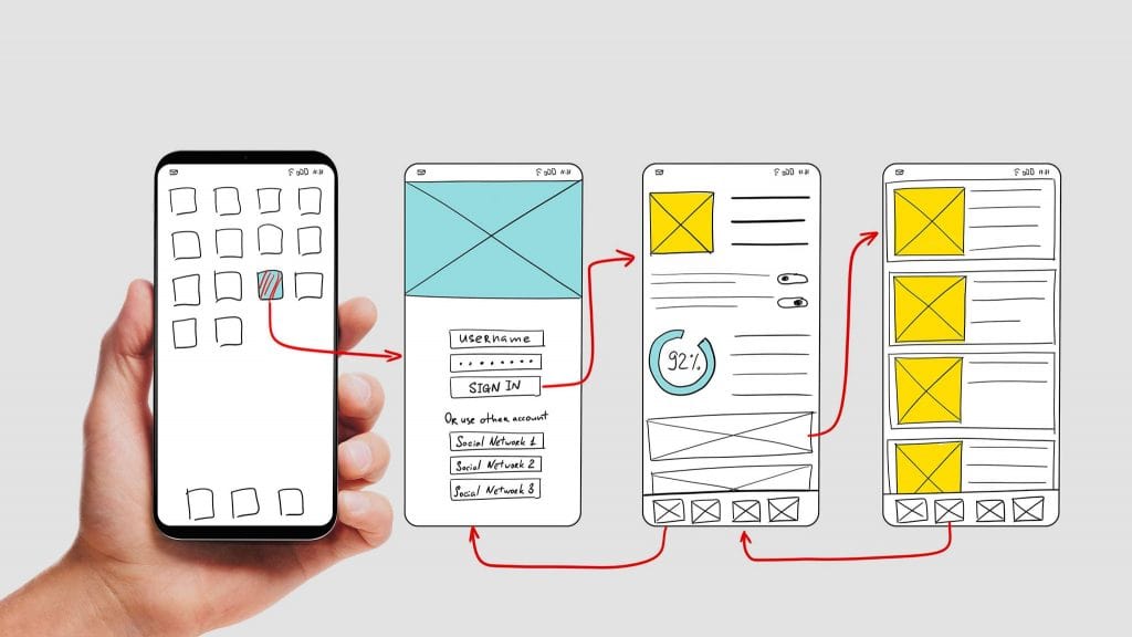
With solid user research, you can start incorporating fundamental UX principles that create seamless browsing experiences for your audience. While approaches vary, some core tenets hold for virtually all websites:
1. Usability
Can people easily accomplish everyday tasks on your site without getting confused or frustrated? Usability centres on creating intuitive, frictionless user flows.
For example, having a search bar “above the fold” (before scrolling) with smart autocomplete allows users to find what they need instantly. Clear calls-to-action, like contrasting “Buy Now” buttons, guide the user journey efficiently.
2. Accessibility
Is your website easily usable by people with disabilities like visual, auditory, or motor impairments? Prioritising accessibility helps maximise your potential audience.
Standard accessibility practices include:
- Optimising for keyboard navigation
- Using high-contrast color schemes
- Ensuring text can be resized without issue
- Providing text alternatives for images/multimedia
- Enabling operating system accessibility tools
3. Findability
How easily can users discover and navigate to the most relevant content? Intuitive menus, intelligent search, and strategic content structure all enhance findability.
For example, prominently featuring your top products/categories in the navigation makes browsing smoother. “Breadcrumb” links showing their path through the site also prevent users from getting lost.
4. Credibility
Does your website inspire trust and confidence? Credible sites minimise user anxieties about security/privacy by using https encryption, displaying credentials/ratings, and having a professional, polished look.
5. Visual Appeal
While aesthetics alone don't make a great user experience, thoughtful design enhances it. Factors like colour schemes, typography, whitespace and quality imagery/video contribute to a website's overall visual appeal and emotional resonance.
Map the User's Journey
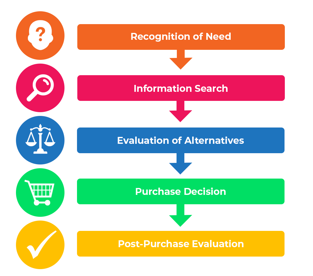
Speaking of user flows, explicitly mapping out every step of the core user journeys on your website is a game-changing UX practice. These detailed journey maps visualise:
- How users navigate key processes (e.g.vitalrchasing, getting support, etc.)
- Every potential touchpoint, channel, and interaction involved
- User needs, emotional states, and potential pain points at each stage
With a clear journey map, you can identify and eliminate usability hiccups, streamline processes, and optimise the entire experience. For instance, you might realise that requiring account creation before checkout is an unnecessary roadblock, losing your sales.
Need an example? Let's look at a typical ecommerce journey:
- Awareness: The user lands on the website via organic search, ad, email, etc.
- Research: They browse product pages, filters, read reviews, etc., to narrow options.
- Decision: Users add items to their shopping cart and proceed to checkout.
- Purchase: They enter shipping/payment details and complete the transaction.
- Follow-Up: Order/shipping confirmations are sent, with opportunities for feedback.
Even seemingly minor friction at any stage, like a confusing returns policy or sluggish loading times, can disrupt the journey and cost you a conversion. That's why scrutinising each touchpoint is so valuable!
Design Intuitive Navigation
Think of your website's navigation as the GPS, helping users find their way around. Even reaching their destination becomes an ordeal if the navigation needs to be more transparent and logical.
Well-designed navigation empowers users to browse and access any information or functionality they need seamlessly. Some top nav UX tips include:
- Structure menus logically based on user expectations and priorities rather than your organisation's internal vocabulary or structure.
- Use clear, recognisable menu labels that immediately communicate where each option leads (e.g. “Shop All Products” over “Offerings”).
- Limit main menu items to around 7 for easy scanning and processing (with dropdowns or mega-menus for more options if needed).
- Prioritise most-visited pages by putting them in the top/left nav spots that get seen first.
- Maintain navigation consistency throughout the site so users don't have to learn new UI patterns on different pages.
- Provide multiple navigation paths like related links, sitewide search, and breadcrumb trails in addition to the main menus.
Above all, remember that intuitive navigation is about orienting users and guiding them seamlessly based on their needs, not yours! Getting it right dramatically reduces “where am I?” and “how do I…?” moments of confusion.
Optimise for Mobile
Let's face it – we're a society surgically attached to our smartphones. Mobile devices drive a staggering 58% of all website traffic worldwide. That figure underscores how vital mobile-friendly UX has become.
To delight your mobile users, focus on:
- Quick loading times aided by compressed images, minified scripts, caching strategies, and performance optimisations
- Simplified layouts that are easy to scan/tap on small screens through intelligent use of white space, menus, text sizing, etc.
- Prioritising essentials by cutting distractions and centring the core user tasks mobile visitors want to accomplish
- Smart touch targets sized appropriately for fingers rather than cursors, with ample spacing between tap zones
- Streamlined processes for entering information, checking out, or other vital actions prone to frustration on mobile
For example, PayPal found adding mobile-optimised guest checkout increased their conversion rate significantly by eliminating the arcane “new account” creation process on smartphones.
Mobile can no longer be an afterthought if you want to deliver great UX across devices!
Write for Scanning, Not Reading
Use clear, descriptive headings and subheads
Users should be able to skim your headings and quickly grasp the core topics to decide what's relevant to them. Vague or cryptic headers just get ignored.
Break up text with shorter paragraphs and sections.
Vast walls of text are immediately off-putting to scanners. Shorter paragraphs and visual separators like horizontal lines make content far more approachable.
Incorporate crisp, bulleted lists.
Our brains unconsciously gravitate toward bulleted lists, allowing us to process information in concise, straightforward chunks rapidly. Use them to your advantage!
Highlight critical terms in bold or italics.
While too much formatting gets distracting, selectively bolding or italicising phrases you want to jump off the page gives them more stopping power.
Use plain language and an active voice.
Skip the corporate jargon or overly complex terms. Straightforward, conversational writing in an active voice enhances scannability by getting right to the point.
Support text with relevant visuals
Graphics, charts, screenshots and other multimedia summarise text while concisely conveying additional context. But don't overdo it!
By optimising your writing for how users read on the web – quickly and with impatience – you make consuming your content a smoother, less frustrating experience.
Design for Cognitive Load

Ever feel utterly drained or overwhelmed after struggling through a confusing website, app, or software? That's the ugly reality of excessive cognitive load – overtaxing someone's working memory by forcing them to process too much at once.
Conversely, properly managing cognitive load through brilliant UX/UI enhances focus, reduces mistakes, and generally turbo-charges user performance. So, what are some proven tactics?
Be Scannable
Many load-reducing techniques tie directly into optimising scannability, like breaking up text walls using descriptive headings, visuals, and bulleted lists—these ease information processing for time-crunched users.
Limit Choices
While endless options intuitively seem appealing, too many choices can paralyse users into indecision and regret. “Choice overload” is a natural phenomenon! Master the art of curation and limit choices to what's most relevant and valuable.
Use Progressive Disclosure
Rather than bombarding users with every possible option or detail upfront, progressively disclose more advanced or tangential features/information on an as-needed basis through things like:
- Hamburger menus
- Expandable sections
- Smart defaults
- Dynamic filtering
Minimise Distractions
Minimise any elements, notifications, prompts, or other UI “noise” that might divert attention from the core user tasks or goals for that particular page or workflow. Decluttering reduces visual fatigue and cognitive strain.
Be Consistent
Creating uniform patterns that users only have to learn once vastly reduces their mental workload compared to facing new, unfamiliar UI/UX conventions across different pages and systems. Establish a solid design system and stick to it.
Essentially, the best UX minimises “brain burning” by carefully managing the limited cognitive resources users must divide between perceiving, retrieving memories, decision-making, and other processes. The less mental strain your design demands, the smoother the overall experience!
Speed Up Load Times
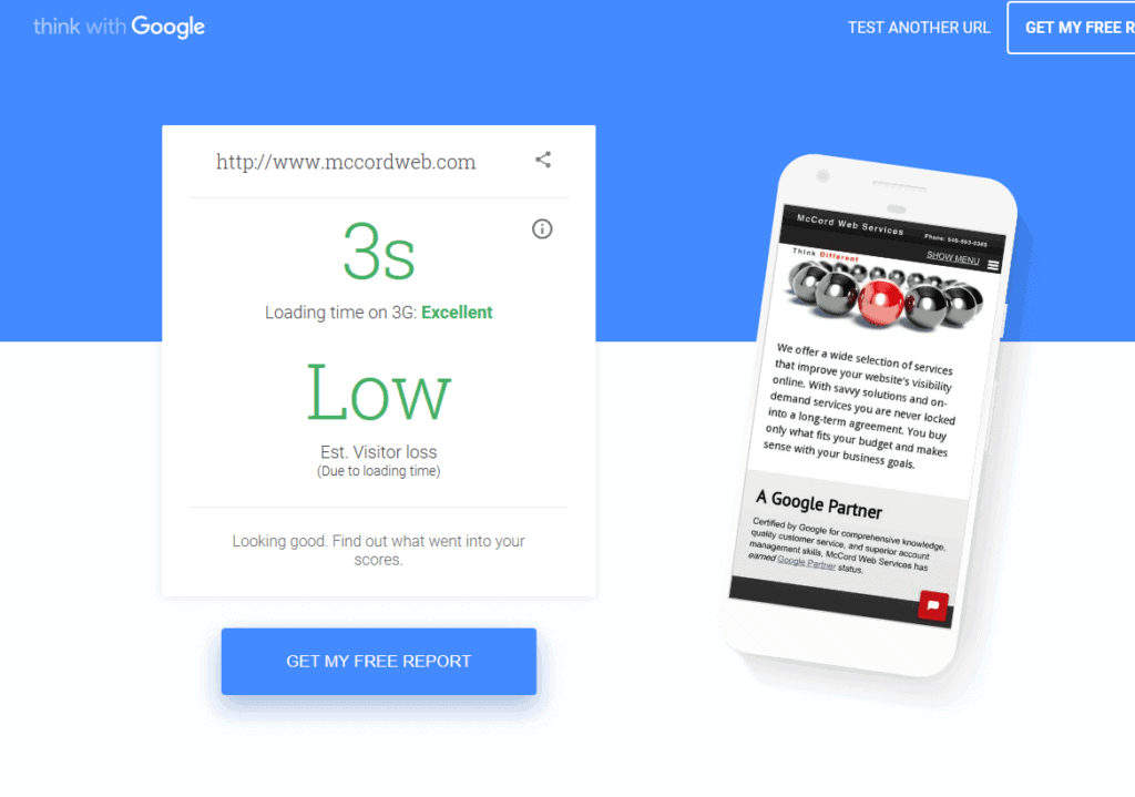
Today's nanosecond-paced world has utterly obliterated our collective patience thresholds. Even a 1-second delay in page load times can ratchet up bounces by a whopping 7%! Worse, a sluggish 10-second load time means you've potentially lost over 30% of your visitors before they even see your content.
In our need-it-this-second era of instant gratification, loading performance isn't just a “nice to have” – it's make-or-break for delivering quality user experiences. Tactics to prioritise include:
- Optimising media files like compressing images/videos without tanking quality
- Leveraging browser caching to load repeat components rapidly
- Minimising HTTP requests by combining and compressing files
- Enabling compression like Gzip to shrink file transfer volumes
- Using a Content Delivery Network (CDN) for faster file distribution
- Implementing code splitting only to load the minimum code needed initially
- Prioritising above-the-fold content using techniques like the Facebook JSONLD approach
- Adopting a “performance budget” and load time goals to optimise toward
Load time is such a critical factor that web bodies like Google recommend using metrics like Largest Contentful Paint in addition to traditional page speed scores. After all, ultra-fast server response times don't matter if that gargantuan image carousel still takes ages to load!
Bottom line: In our culture of instant gratification, where “fast” is the norm, even tiny delays can completely derail the user experience before it begins. No aspect of UX is more vital to flawless execution!
Form Follows Function (Mostly)
We've all encountered captivating, gorgeous websites that ultimately fail as usable tools because the form was prized over function in their design. While visuals play a significant role in emotional resonance and perceived quality, attractive aesthetics should come at something other than the cost of core functionality and ease of use.
The best websites strike a harmonious balance – yes, they're visually appealing and stick to consistent branding/theming. But even more importantly, the whole interface is painfully apparent and intuitive. Buttons and inputs are sized appropriately and unambiguously labelled. Layouts make sense and put the most vital elements front and centre based on predicted user priorities. All interactions follow familiar patterns rather than requiring learning curve after learning curve.
As Donald Norman's seminal book extolls, “The Design of Everyday Things” should centre on discoverability (figuring out what actions are possible), understanding (knowing what action to take), and proper feedback/mapping between your intentions and the effects.
- Donald A. Norman (Author)
- English (Publication Language)
- 288 Pages – 09/19/2002 (Publication Date) – Basic Books (Publisher)
For example, look at mega-giants like Amazon, Google, and Facebook. Their sites could be more cutting-edge and visually stunning by today's modern standards. However, they closely adhere to that functional core of predictable UI patterns, clear signifiers and prompts, and ultra-lean interfaces that fulfil everyday user needs with minimal friction.
Rather than chasing empty “pretty for the sake of being pretty,” focus first on usability and truly understanding your users' mental models, goals, and expectations. If you solidify that foundation, the superficial aesthetics can amplify rather than detract from the experience.
Sweat the Small Stuff
The make-or-break moments of user experience frequently stem from tiny, seemingly inconsequential details that often get overlooked amid loftier design goals and conversations.
Does clicking something produce immediate, intuitive feedback signalling the action was registered in addition to your eventual server response? Does your loading animation indicate directional progress, or just mindlessly spin ad infinitum? Did you account for plural/singular cases in your field labels and error messages? Are you 100% clear and upfront about costs, requirements, data usage policies, and other fine print before users invest time and effort into a process?
These subtle interaction details and micro-moments turn good UX into great UX. Far too many websites need to improve in these areas by leaving users confused, ripped off, or just wasting their time. Keep your stellar overall experience from derailing at the last mile!
Obsessing these finer usability nuances demonstrates empathy and meticulous care that nurtures an emotional bond and elevates your UX into beloved brand territory.
Let Data Drive Design
For UX as a discipline, gathering reliable data insights and rigorously integrating them into the design process isn't some nice-to-have perk. It's an absolute imperative!
After all, the whole purpose of user experience is solving how actual users think and behave rather than just assuming based on faulty hunches or preconceived notions. Potential sources of invaluable UX data include:
- Web analytics tools reveal traffic sources/flows, popular content, conversion stats, device usage, etc.
- Heatmaps and session recordings that replay actual user clicks, movements, hesitations and engagement signals.
- User testing and feedback loops like surveys, controlled tests, or soliciting open-ended input about frustrations.
- AB and multivariate experiments that quantify the impact of tweaking specific UX variables.
Don't just commit to being “data-driven” as some vague platitude – scrutinise those datasets rigorously and course-correct your UX designs as needed to align with the evidence.
If only 5% of users watch your splashy animated product intro, shelving it becomes a no-brainer in preserving focus.
If cart abandonment rates skyrocket after implementing a new multi-step checkout process, revert to the prior streamlined version stat. Let the cold, complex numbers guide you rather than personal whims or assumptions about what's “best.”
Test Early and Often

Adopting a culture of constant user testing and iteration throughout your design process is closely tied to being data-driven rather than just evaluating at the end.
Many high-profile UX disasters and sunken costs could've been easily averted by regularly testing prototypes and getting frequent user feedback before investing too heavily in one direction.
Different forms of testing to incorporate include:
Usability Studies Observe people directly attempting to complete core tasks and workflows using your interface. Identify friction points where they get stuck or confused.
A/B Testing
Expose variations on UX elements like CTAs, form designs, navigation, etc., to live user traffic and let performance metrics decide winners.
Heuristic Analysis: Have UX experts evaluate your product against established principles and identify potential issues.
Guerilla / Hallway Testing: Get rapid, lightweight input from strangers by briefly intercepting them with prompts (e.g. “Can you show me how you'd perform X on this prototype?”)—a quick way to check concepts.
Focus Groups / Interviews Collect qualitative feedback through moderated discussions with your target audience members about their needs, frustrations, etc.
Taking a “lean” approach of repeatedly testing and revising designs provides the flexibility to correct course early before too many resources are sunk into the wrong path. And it helps avoid disastrous launches met with lukewarm-at-best user reception.
Be Accessible For All
In our increasingly diverse, inclusive digital world, factoring in accessibility from the ground up isn't just good practice – it's an ethical responsibility to maximise usability for every potential user regardless of their physical or cognitive capabilities.
Some key accessibility priorities include:
- Ensuring keyboard navigability without reliance on a mouse/trackpad
- Supporting assistive technologies like screen readers for the visually impaired
- Providing text alternatives for multimedia content
- Allowing for text resizing and zoom without layout issues
- Designing for colourblindness through smart contrast choices
- Minimising reliance on skill, such as drag-and-drop or hover functionality
Upholding accessibility best practices often benefits everyone's user experience by optimising focus, clarity, and functionality across different contexts. Most accessibility improvements ultimately just uphold good design fundamentals!
However, achieving robust accessibility does require ongoing commitment, auditing, and testing to identify barriers. Automated tools like the WAVE chrome extension can help catch apparent violations but won't spot more nuanced issues requiring manual testing and feedback from people with disabilities. Performing formal audits against leading guidelines like WCAG 2.2 is also wise.
The bottom line? In an increasingly digital-first world, accessibility must be a UX priority. At the bare minimum, it's ethically imperative. But beyond that, designing for the broadest swathe of potential users makes good business sense to maximise audience reach and avoid isolating portions of your market.
Deliver Tailored Experiences

Ever notice how major sites like Netflix or Amazon greet users in seemingly personalised ways, recommending content or products tailored to their particular interests and behaviours?
Welcome to the world of tailored, individualised user experiences enabled through intelligent UI customisation and dynamic content delivery.
Some examples of website personalisation and tailoring functionality could include:
- Highlighting different features or layouts on the homepage for new vs. return visitors
- Varying the CTAs showcased based on what someone previously browsed
- Displaying related articles or product suggestions tailored to their interests
- Serving different sitewide navigation optimised for their industries and customer segments
- Dynamically customising onboarding sequences based on user goals or use cases
Basic tailoring approaches use explicit rules or segmentation like:
“If this visitor came from [referrer source], show X.”
“If from this [geo/industry], serve Y content variation.”
More advanced approaches leverage machine learning to build automated predictive models for identifying the precise content and experiences someone will best respond to based on their behaviour data.
By creating experiences dynamically tailored to each visitor's unique attributes and preferences, brands enhance relevance while reducing friction. Visitors don't waste time wading through noise, increasing engagement and satisfaction.
Build Trust and Credibility
What differentiates a successful and unsuccessful business in the overcrowded digital market? Among many other things, one of these ingredients is a website that seems reliable and proficient enough to allay user fears such as privacy concerns, security issues, quality variations, and doubts about authenticity.
Why should one give sensitive information or hard-earned money to a doubtful website?
How to demonstrate credibility and foster customer trust:
- Use validation markers such as awards, testimonials for customers’ feedback, recognitions logos/badges/credentials/awards/reviews/testimonials
- Include trust signals like a secure badge indicating SSL certificate encryption data, seals from reputable authorities, guarantees/warranties, and worded policies, particularly on refunding.
- A content strategy that positions you as an expert for your niche to highlight your unique value proposition
- Make sure your design just looks good – not outdated or chaotic amateurism
- The tone should maintain professionalism even in spelling, style and grammar.
Nailing the essential functional experience is not enough because elements necessary for enhancing trust and making users feel safe before they start paying are also critical.
Suppose there are any hints of suspicion around your site’s appearance or feeling. In that case, you will lose huge numbers immediately, irrespective of how strong the underlying service, product or content offering may be.
Don't Annoy Users

How often have you bounced from a site due to frustrations with autoplaying video, intrusive newsletter signups, barrages of notification requests, or other intrusive site elements? Probably more often than you realise!
While using techniques like CTAs, animations, and prompts to drive conversions seems bright, injecting too many disruptive commercial gimmicks tends to backfire by delivering obnoxious user experiences. It's easy to cross that fine line into annoying people.
Instead, strive always to respect the user's time and intent. Make it easy for them to consume content or find helpful information without constant roadblocks, interruptions, and unwanted confrontations.
For example, is autoplaying product videos indispensable for users evaluating your offering? Or is it primarily an unfocused distraction from the accurate decision-influencing details like thorough descriptions, high-quality imagery, reviews, tech specs, etc? Cut anything superfluous that detracts from the core experience.
When unavoidable elements like permission requests or newsletter prompts need to be present, use passive and unintrusive approaches like slide-ins that allow self-dismissal rather than full-window modals that block all interaction. Or better yet, delay such interruptions until events in the user journey where they might be more contextually receptive to the prompt.
Think about what makes site experiences enjoyable for you as a human being, and then design around preserving those positive vibes for your visitors and customers.
Create Delight via Microinteractions
In the grand scheme of website priorities, you could argue that “whimsical delight” ranks relatively low compared to basics like usability, utility, and core functionality. Yet those often-overlooked micro-interactions and delightful little flourishes are precisely what separates best-in-class user experiences from ones that are just generically serviceable.
After all, nailing the expected fundamentals might keep users satisfied or content. But adding strategic splashes of delight creates enthusiastic fans and brand evangelists willing to go out of their way to tell others.
Simple ways to weave in little moments of surprise and joy include:
- Celebratory Feedback: Sprinkle in playfulness and humour when acknowledging user actions like form submissions or level completions. Think animated confetti, progress celebrations, silly bot responses, etc.
- Nuanced Animations: Bring products to life through polished animations that are purposeful rather than gimmicky. Use motion, colour, and texture to make interactions feel almost magical.
- Friendly Illustrations: Swap out staid iconography or flat visuals with personable illustrated characters that lend personality and warmth to otherwise cold UI.
- Strategic Unboxing: Even for digital-only experiences, progressively revealing new content or functionality with fun transition effects creates a sense of excitement and discovery.
- Easter Eggs: Hide harmless inside jokes or delightful extras for passionate users to stumble upon, rewarding their curiosity and strengthening their bond with your brand.
The key is layering these delighters on top of an already-optimised foundation rather than prioritising whimsy over utility. Used tastefully, they upgrade good UX into genuinely memorable brand experiences.
For example, Stripe's checkout uses snappy animations to enliven what would otherwise be a mundane process. Duolingo's mascot owl interjects with playful copy and rewards as you progress through language lessons. Even major brands like Google's Santa Village integrate surprising interactive flourishes amid utilitarian apps.
These microinteractions don't just delight momentarily – they reinforce your brand personality in positive ways that foster long-term loyalty and engagement by humanising your digital presence.
Let Content Breathe

From an aesthetic standpoint, one recurring misstep that often plagues websites is coming across as overwhelming or cluttered due to not balancing negative/white space appropriately.
Content gets crammed into every nook and cranny until the overall effect is chaos and visual fatigue. That doesn't make for a relaxing, enjoyable user experience! Our brains crave sufficient breathing room to parse and absorb information properly.
Thoughtful use of clean, open space throughout your layout and content sections allows:
- Creating apparent visual hierarchies of which elements are most important
- Guiding eyes effortlessly through a deliberate content flow
- Strategically highlighting priority calls-to-action or messaging
- Fashioning an overall lighter, more premium and polished aesthetic
Rather than stuffing absolutely everything “above the fold” for fear of missing something, embrace clean and open designs that elegantly showcase the most relevant core content upfront. Tasteful use of spacing, padding, and proximity allows for establishing transparent relationships between disparate elements while avoiding overwhelming feelings of claustrophobia.
Of course, this doesn't mean leaving excessive vacant stretches or unintentionally wasting excess real estate. Finding that perfectly balanced sweet spot between maximising the use of space and avoiding overcrowding is the proper UX art form!
But when you nail that visual breathing room, you not only provide a more luxurious and inviting browsing experience – you inherently uplevel perceptions around your website's authority, sophistication, and credibility.
FAQs to Enhance Your Website UX
What abilities do I need to have in UX design?
The fundamental skills of UX design revolve around user research, prototyping/wireframing, visual design, interaction design and usability testing. A blend of creative and analytical faculties is priceless. Additionally, familiarise yourself with UI tools like Figma, Adobe XD, and InVision.
How much can one earn as a UX designer?
On average, according to Glassdoor, the basic salary for a UX designer in the United States is about $90K per annum. Nonetheless, salaries can range from $60K-$130K+ based on location, experience level and whether you work in-house or at an agency.
Do you need a degree to work in UX?
While degrees like Human-Computer Interaction (HCI) or UI/UX are relevant and helpful, many successful UX designers today are self-taught or hold unrelated degrees besides starting by building a solid portfolio demonstrating their skills and processes.
What is the process of UX design?
Usability testing is used during the designing stage, which involves user research, persona/journey mapping, ideation wireframing, prototyping, user testing iterating, and ultimately implementing final designs, just to mention a few. Phases vary across organisations and product domains.
Where can I find some good resources on UX Design?
Top-notch blogs include NNGroup, UXBooth, UXMatters, Smashing Magazine, and InVisionApp’s resource hub. These books are also must-reads: Don’t Make Me Think by Steve Krug.
How do I transfer into UX from another career?
Among other things are online courses/boot camps, lots of reading, side projects, and mentorship; start building up a UX portfolio case study demonstrating your skills before you fully transition roles.
What does it mean when someone says “UI designer” compared to “UX”?
Specifically, User Interface (UI) designers concentrate more on visual and interactive design aspects, including layout, iconography, graphics, typography and branding. UX is a broader area encompassing overall usability and user experience.
Where do UX designers usually work?
This position is common in web development agencies, software development companies, startups and tech companies. Advertising agencies have them as well.
What are the most used tools for UX designers?
Standard UX tools include those for wireframing/prototyping, such as Figma, InVision, and Adobe XD; those for user testing, like UserTesting.com, Hotjar, and FullStory; and those for design feedback/collab, including Zeplin, Marvel, etc., in addition to standard graphic editors too.
Is a career in UX design good?
Given the increasing demand for skilled UX designers with high-paying power, numerous lucrative opportunities exist within this field. However, it would be best to keep learning and evolving as trends change.
Which are the biggest trends in UX design to watch out for?
Some key trends include mobile-first design, voice user interfaces (VUI), AR/VR experiences & increased personalisation via AI/machine learning and an emphasis on ethics/privacy considerations like “calm” design principles.
Last update on 2024-05-20 / Affiliate links / Images from Amazon Product Advertising API

