
Let's take a trip down memory lane with these 1990s logo designs. We'll touch on 90s cartoon logos and all the amazing fonts!
The 1990s logo designs were influenced by pop culture and underground music. Organic and handwritten fonts boomed, bright colors reigned, and patterns were everywhere you looked. Let's take a look at the 1990s logo design aesthetic, along with some awesome examples and inspiration.
If you're short on time, Envato Elements is a great resource for high-quality assets. You can find anything from 90s candy logos to 90s cartoon logos. For a small monthly fee, you can have access to thousands of assets like 1990s print templates and 1990s Instagram graphics to elevate your projects.
1990s Logo Designs


The underground music scene and pop culture were big influences for 1990s logo design. As with many decades, overlapping trends were common. We saw a departure from what was considered classic design. The New Wave music from the seventies and eighties led to rave culture, and hip hop led to graffiti. Popular TV shows like Friends and the Rugrats influenced the use of handwriting anywhere from professional newsletters to logos.
The aesthetic of the 90s logo featured vibrant colors, abstract shapes, sometimes fun patterns where applicable, and many gradients. Comic Sans was used in many retro 90s logos, as well as condensed sans serif and handwritten styles. Hip hop and the skateboarding culture launched graffiti-style 90s logos, while others opted for the grunge style.
Microsoft Windows
The Windows 90s tech logo is a very straightforward concept. This was the first multicolored 90s logo design that appeared to look wavy. The logo featured trailing pixels to give the illusion of movement. The new colors added vibrancy to the design.
Nickelodeon
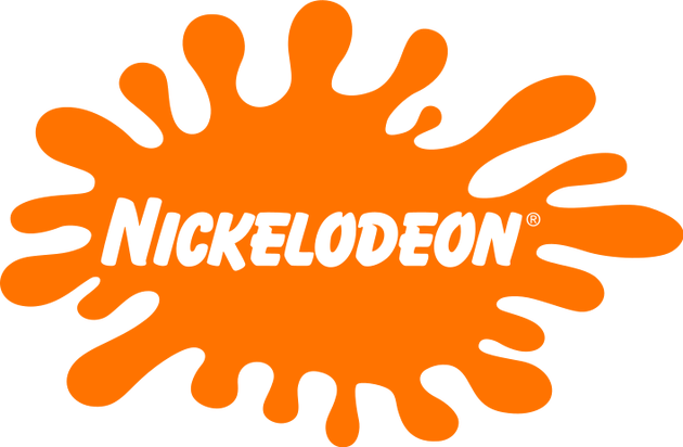
Nickelodeon is an iconic 1990s company logo that used the distinctive blot in different shapes throughout this decade. While the main white logo was already designed in the 80s, Nickelodeon embraced the 90s cartoon logo style. This meant the use of organic shapes—they had many and used them whenever possible.
Cartoon Network
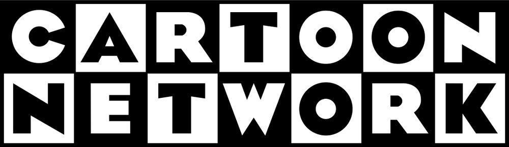
Cartoon Network's iconic 90s cartoon logo hasn't changed much. These days, the brand uses the initials CN, but still in the same style. This logo is one of the most recognizable—each letter of the two words is placed in a white or black square to form a seven by two table. The typeface used for the 90s cartoon logo is a bold sans serif with sharp angles. This typeface resembles many of the late 1920s Art Deco fonts.
Friends
This type of trendy and sleek 90s logo design was popular amongst all the sitcom shows. The wordmark uses a handwritten typeface in all caps. It's simple, versatile, and memorable. Each letter is separated by a colored dot that signifies each main character of the show. The colors are simple and are very iconic of the 90s: simple red, yellow, and blue.
The Fresh Prince of Bel-Air
The Fresh Prince of Bel-Air is an aesthetic 90s logo that features all the elements that made the 90s so trendy. The mix of vibrant colors that are punchy on screen with the use of a grunge, graffiti-style typeface and a serif italic font works really well.
Saved by the Bell
Saved by the Bell is a 90s logo design that also possesses the main characteristics of the decade. The uneven sans serif font that looks handmade, mixed with another font with sharp corners, and the use of bright colors—these are all key elements of the decade. The wordmark is placed over a simple shape that adds more prominence.
MasterCard

The modernization of the MasterCard 90s company logo was a big step forward for the brand. The new logo featured a new sans serif italic typeface that was more elegant, with a shadow behind it. The wordmark was placed over two intersecting circles with lines, and these were bright red and yellow. The combination made the new logo stand out everywhere.
1990s Logo Design Inspiration From Envato Elements
The Moonlight (OTF, TTF)


The Moonlight is a handwritten font that resembles the famous 90s font Comic Sans. The 90s were big for handwritten fonts, even in professional settings. This style of font would have been used in a 90s candy logo design, a newsletter, or even a 90s cartoon logo. The Moonlight is a font that's more organic and natural compared to Comic Sans.
Record Scratch Retro (OTF, TTF, WOFF, WOFF2)


Record Scratch is a retro 90s logo font that is also close to Comic Sans. It isn't as organic as The Moonlight, but it's based on a classic sans serif font and features rounded corners and soft shapes. This whimsical 90s cartoon logo font is best suited for kids' content.
Axon (OTF, TTF)


If you're looking for something more classic, Axon is a great font that represents everything a 90s logo should be. This minimalist sans serif is inspired by Art Deco; the low waistline gives that hint. Highly legible and perfect for any occasion, Axon is one of the fonts that would be considered timeless for a 90s tech logo.
De Solidia (OTF, TTF, WOFF)


De Solidia falls in the handwritten category, a more legible Comic Sans. While Comic Sans had structure to its characters, De Solidia embraces curves and non-straight lines. This font would be great for a 90s company logo that wants to portray itself with a fun but professional font.
Smiley Face Retro (OTF, TTF, WOFF)


This font and image embody everything from the aesthetic of 90s logos. There are so many bright colors, with geometric elements and the Comic Sans looking font. Smiley Face is an outline font that has the same elements as Comic Sans, with soft and round edges and a bubbly personality.
Gumzilla (OTF, TTF)


Handwritten fonts were big for 1990s logos, mainly because they were trying to appeal to a younger generation, especially with 90s cartoon logos. Gumzilla is a highly legible font that you could see in 90s TV shows. The era of sitcoms didn't shy away from handwriting-inspired logos. Using handwritten retro 90s logos allowed for viewers to relate to the show better—it was a way to humanize the characters and make them believable.
Warxer (OTF, TTF)


Warxer is a handwritten font in a graffiti style. You'd see this type of font in a 90s candy logo design or 90s cartoon logo. Graffiti started emerging in the 60s and became more and more popular since then. By the 90s, many fonts were in the graffiti style and were ready to be used digitally.
Luser (OTF, TTF, WOFF, WOFF2)


Luser is another graffiti style font that became popular with the popularization of hip hop. The 90s were full of subcultures that influenced how everything looked and shaped many graphic styles from this decade. This graffiti font is very similar to the Fresh Prince of Bel-Air's logo. The font is very organic, based on how graffiti would be drawn, and even has the highlights and shadows added.
Grunge! (OTF, TTF, WOFF)


Underground raves launched the grunge style. Many rave logos were chaotic and included blurred or textured characters. Posters included scratched-out words, many inspired by the Ray Gun magazines.
Rectoverso (OTF, TTF, WOFF)


Rectoverso is a more legible grunge font suitable for a rave logo. Much of the grunge aesthetic was fueled by emotion. Design was freshly evolving from modernist ideals, and grunge was anti-design, something that hadn't been seen or accepted amongst designers.
90s Text Effects (PSD)


The 90s were full of contradicting styles due to the multiple subcultures that emerged in previous decades and became widely popular. Many of these 90s trends had a specific look to them, like the text effects above: graffiti style from the hip hop culture, grunge from the rave culture, and the Memphis Style from popular culture. You'd see these styles anywhere from 90s candy logos to 90s company logos.
90s Style Text Effects (PSD)


Kids' 90s cartoon logos were full of fun elements. Like this 90s style text effect, key 90s elements included lollipops, cassettes, sprinkles, popsicles, and headsets. Bright, fun colors were part of any retro 90s logos.
That's It!
In this article, you learned all about the aesthetic of 90s logos. This was a decade with multiple subcultures that shaped music, culture, and graphics. The underground raves and hip hop music launched graphic styles so uniquely from the 90s: bright colors, organic font styles, and extra graphic elements. Which one is your favorite 90s style?
If you're short on time, Envato Elements is a great resource for high-quality assets. You can find anything from 90s company logos to 90s tech logos. You can also find other assets like 1990s graphic templates and 1990s add-ons that can elevate your projects.

 How to Create a Retro 90s Grunge Photo Effect in Adobe Photoshop


 What Is the Memphis Style?


 How to Create a 90s Abstract Rave Poster in Adobe Photoshop


 How to Create a Trendy Neon and Oil Spill Rainbow Poster

 Aesthetic Design: From Vaporwave Design to the Grunge Aesthetic

 90s Graphic Design Trends: From Aesthetic Fonts to Grunge Patterns and Rave Flyers

 Retro Design Trend: Create the 80s Style With Fonts, Text Effects, and More!

 A Look at Graphic Trends That Define the 70s (Retro Fonts, Text Effects, and More!)


