
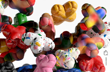


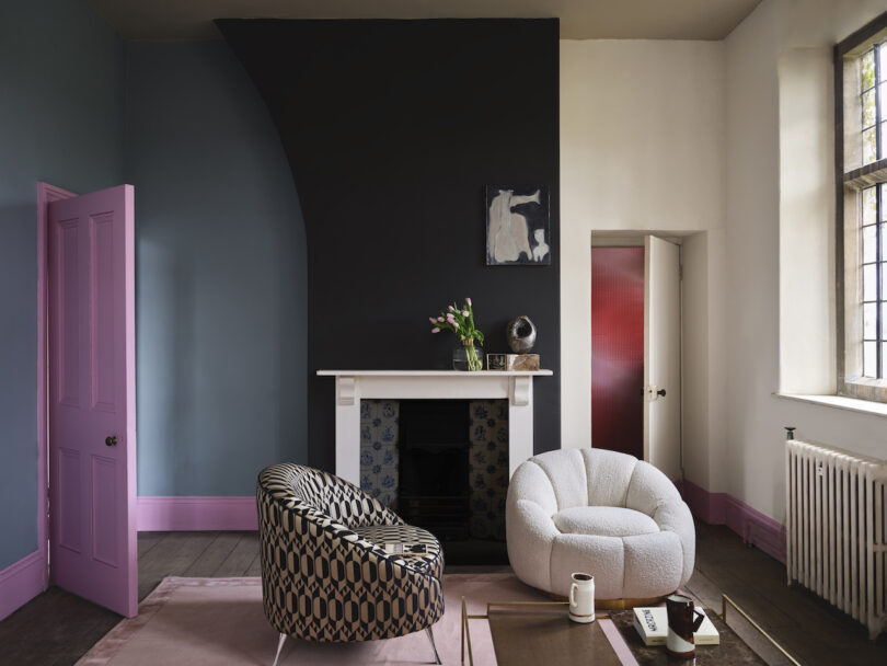
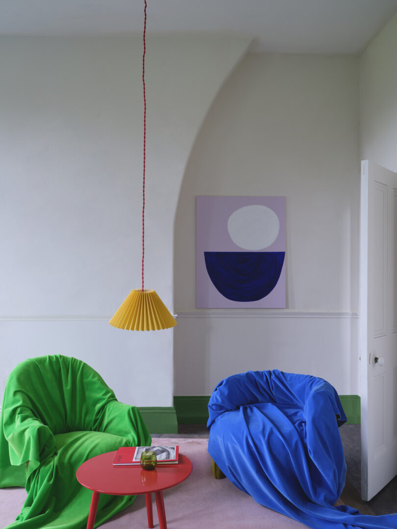
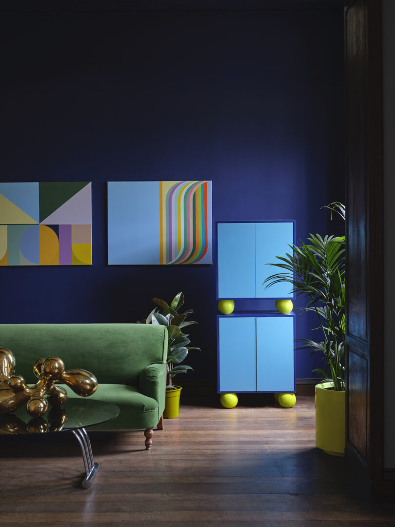
When a designer known for having a specific panache with color and pattern collaborates with a design house known for creating mass-loved paint colors and wallpapers, you know the results are going to be exceptional. Such is the case with Carte Blanche, a new collection by designer Christopher John Rogers in collaboration with Farrow & Ball. The collaboration consists of four foundational neutrals, eight vibrant shades, and three statement-making wallpaper prints, each of them beautiful in their own way.
Even if you’ve seen hundreds of paint swatches before, we have a hunch these new hues will excite your eyes. Rogers, who is inspired by a wide range of creative sources, from artist Ellsworth Kelly to airport decor, turned to his childhood memories of food and family to create the 12 shades.
Every designer, creative, and design enthusiast knows that finding just the right color for a space can be painstakingly hard. With Carte Blanche, the search is now much easier. Below, the shades are described by the designer and design house themselves:
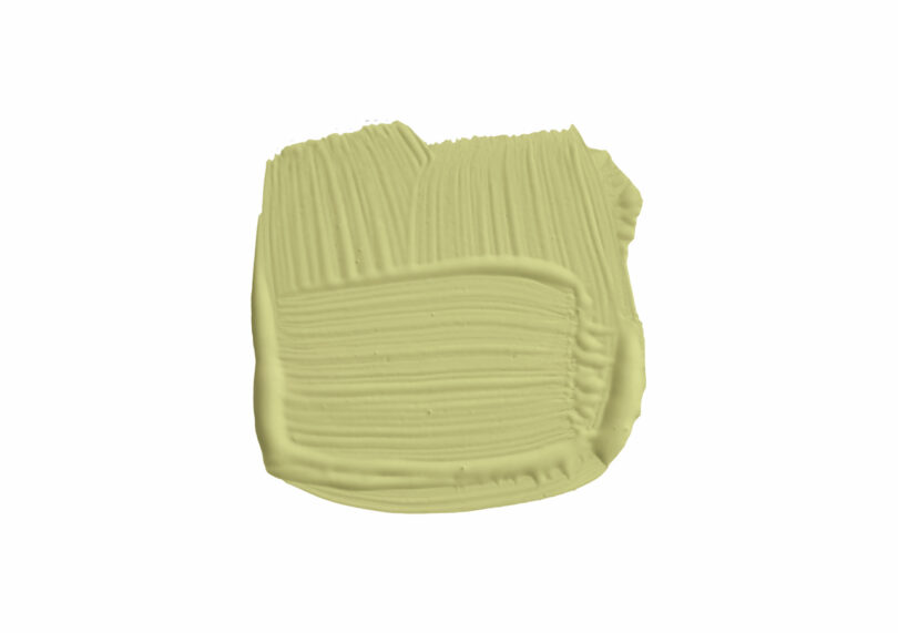
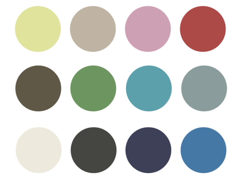
Hog Plum: A muddy yellow reminiscent of the sweet and sour fruit found across Central America and the Southern States.
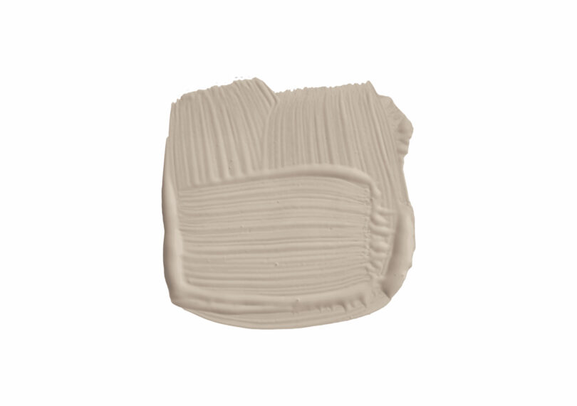
Roasted Macadamia: favorite among The Squirrels, this soft neutral is named after the nut of a similar shade.
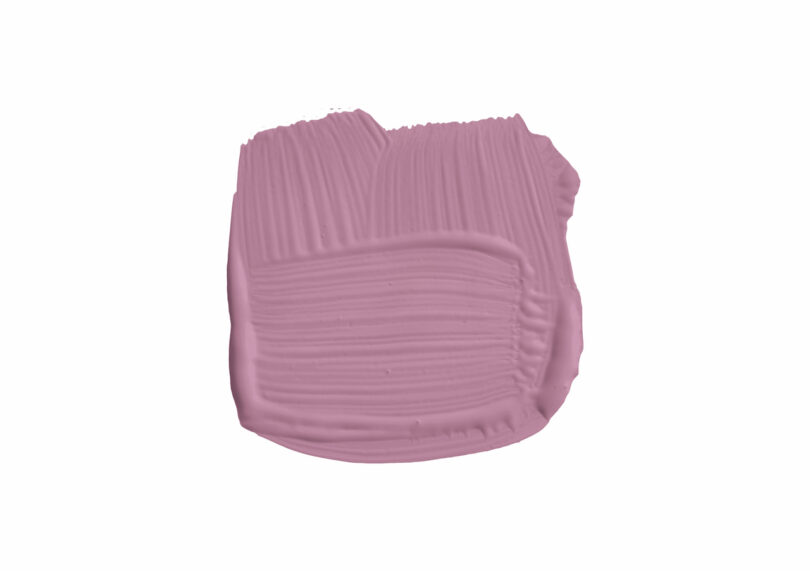
Shallot: A cheerful pink that takes its name from a sweeter member of the allium family widely used in Cajun cuisine.
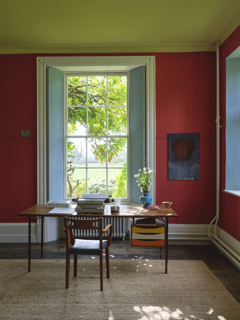
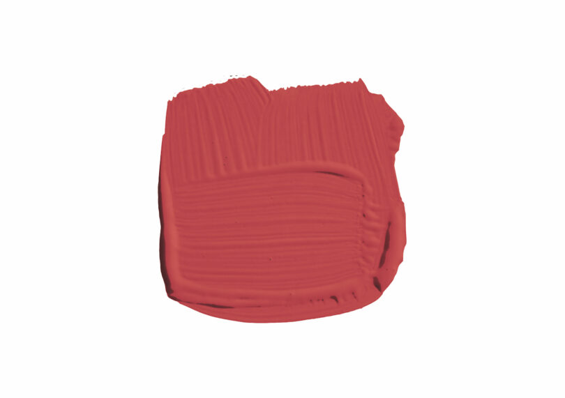
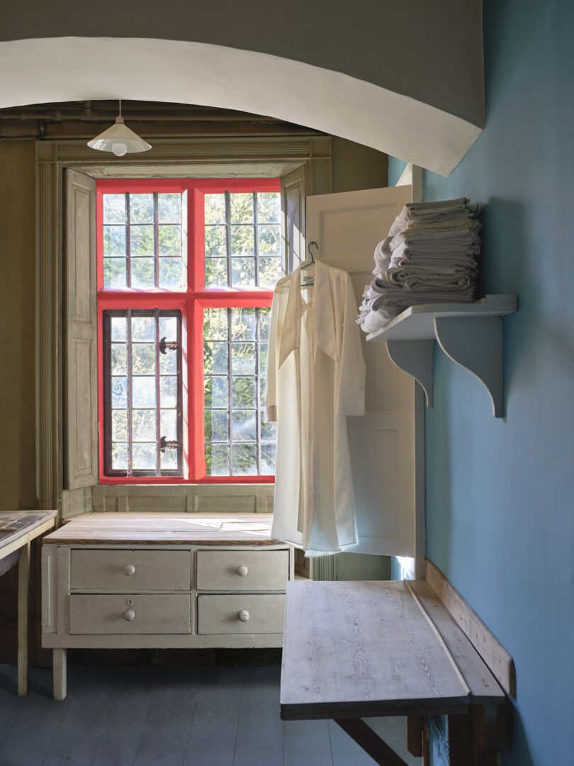
Romesco: A rich, brilliant red evocative of the classic Spanish sauce, which also doubles as a favorite makeup shade.
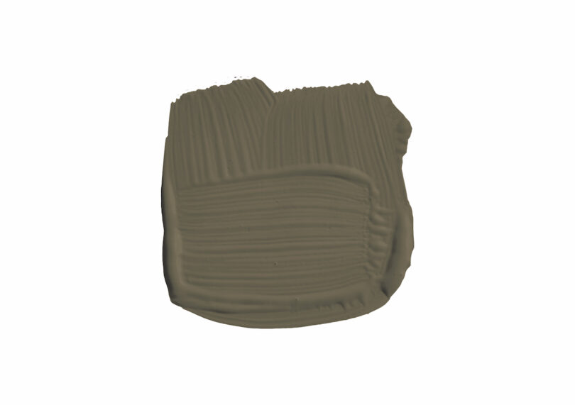
Cardamom: A rich brown inspired by the warming, versatile spice used in dishes around the world.
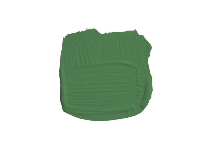
Raw Tomatillo: This joyful and verdant green is inspired by the fried green tomatoes made by a beloved grandmother.
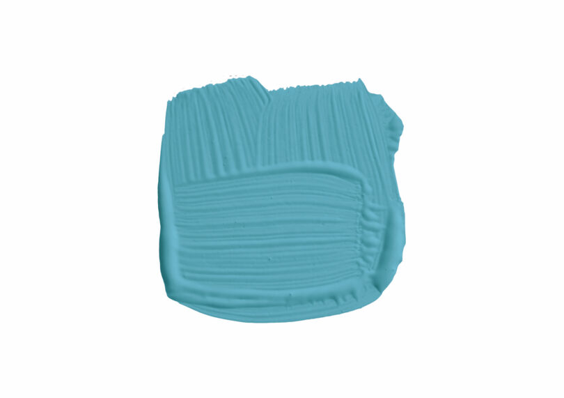
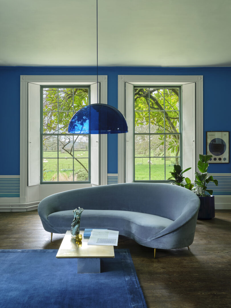
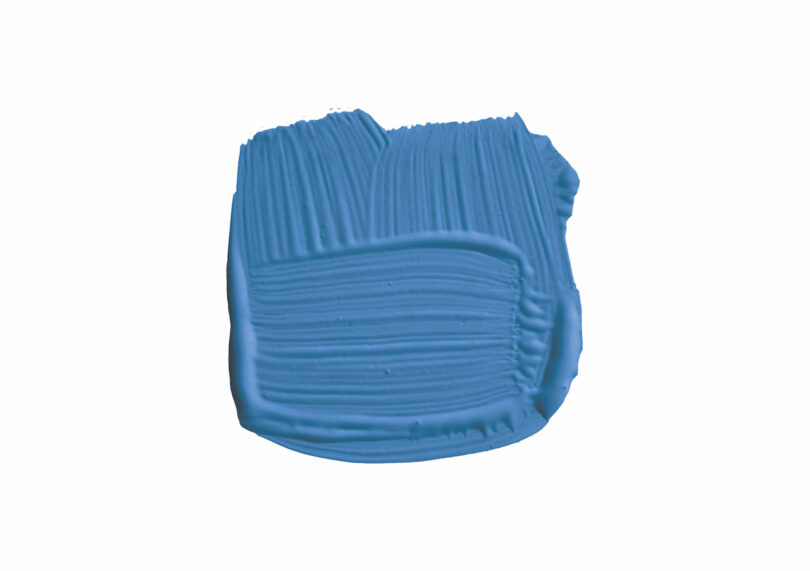
Lobster: A vibrant, lively blue that takes its name from the popular Louisiana catch.
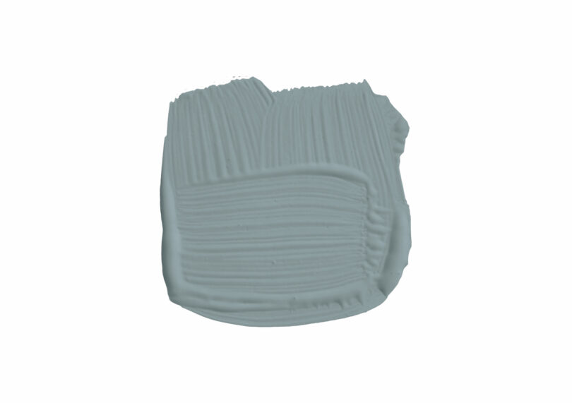
Sardine: This silver blue takes its name from a favorite afternoon snack of a much loved grandfather.
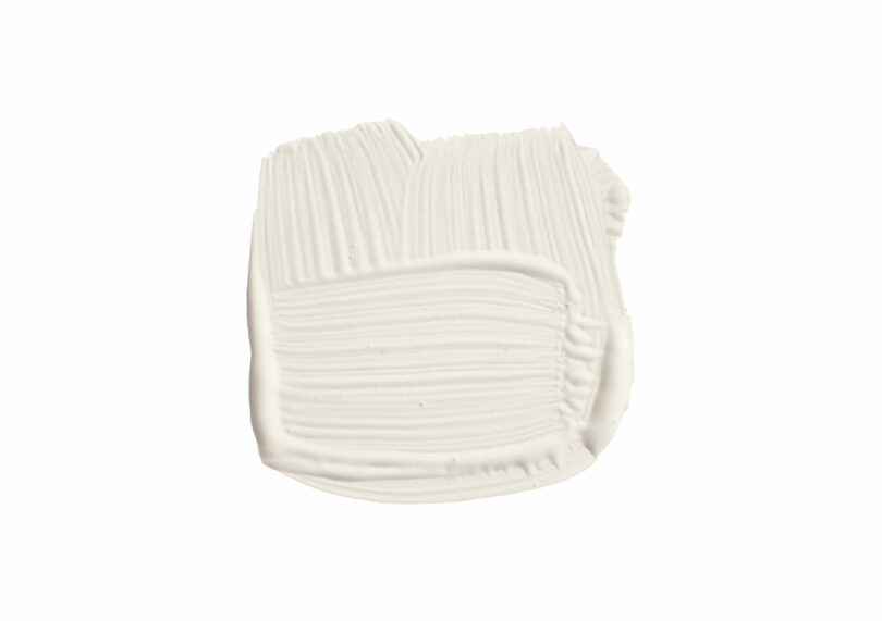
Au Lait: This soft white is inspired by the chicory coffee popular in New Orleans, often served with steamed milk.
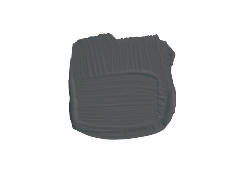
Licorice: This deep black is that of the classic sweet created using the root of the plant from which it takes its name.
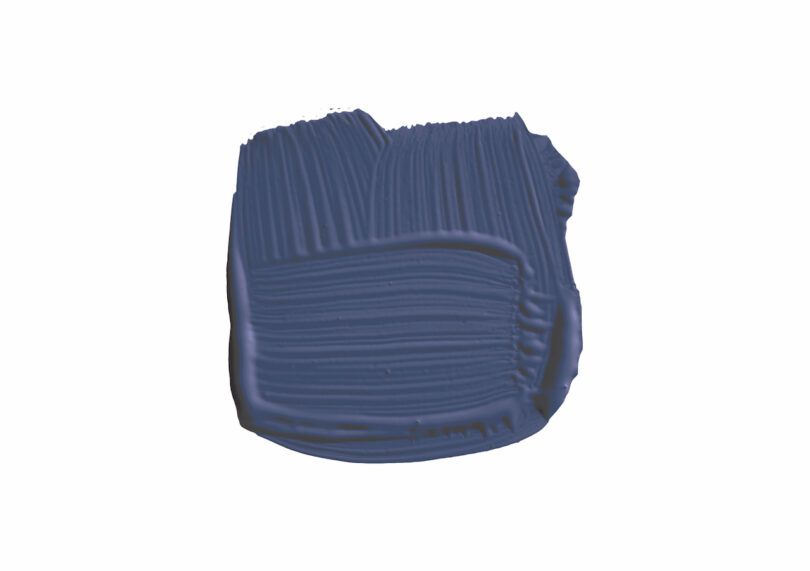
Blue Maize: This deep blue is inspired by the unique hue of corn popular in Mexico and the Southern States.
Pea Flower Tea: A vivid blue, this shade is named after the brightly colored drink created by infusing petals from butterfly pea flowers.
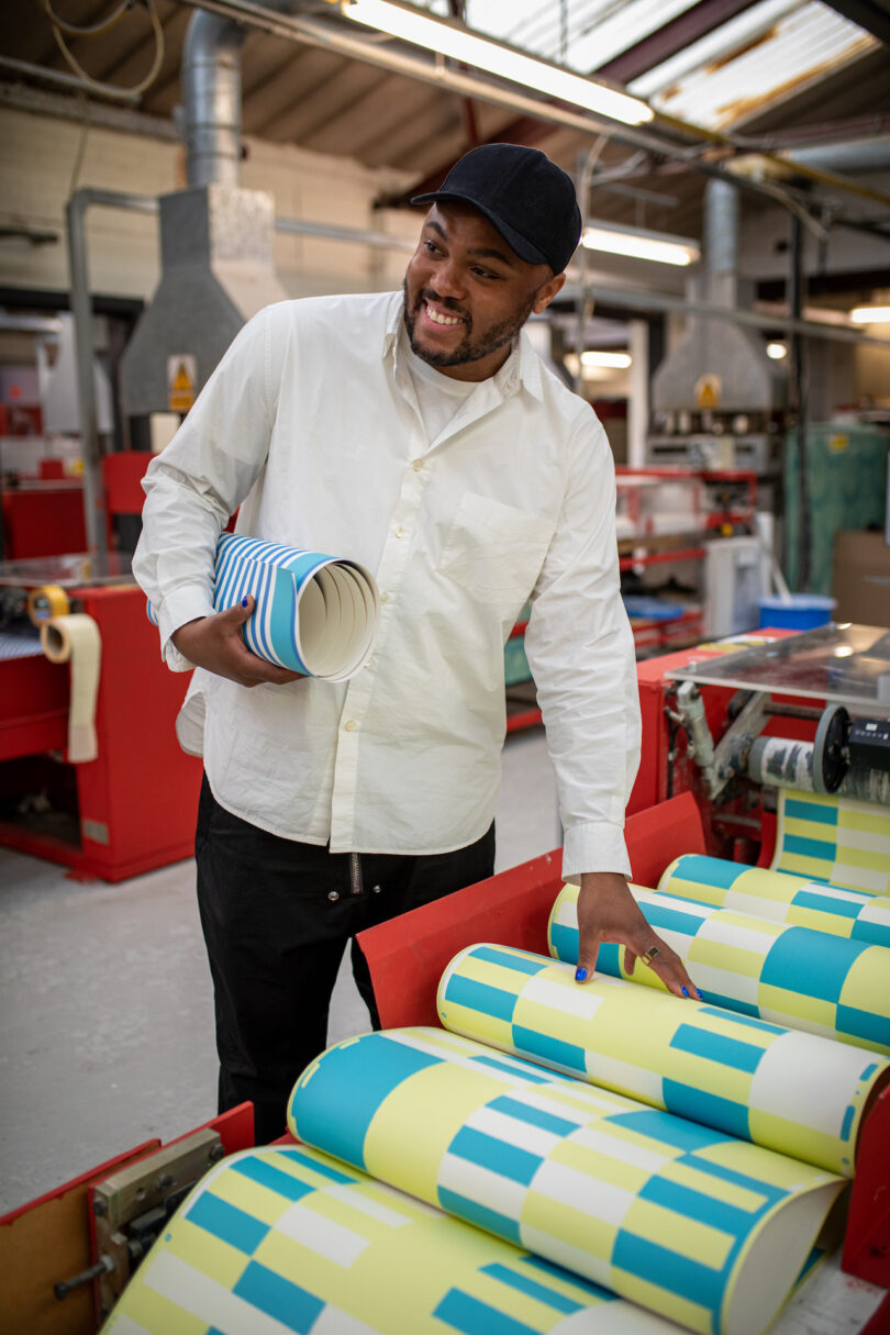
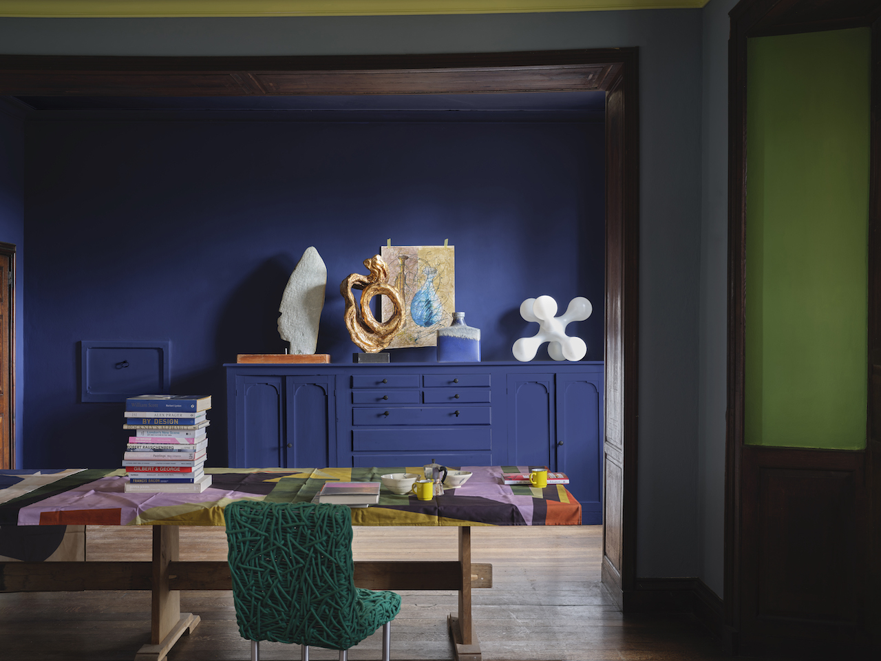
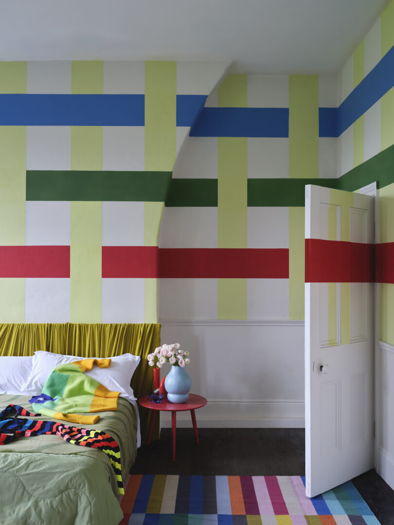
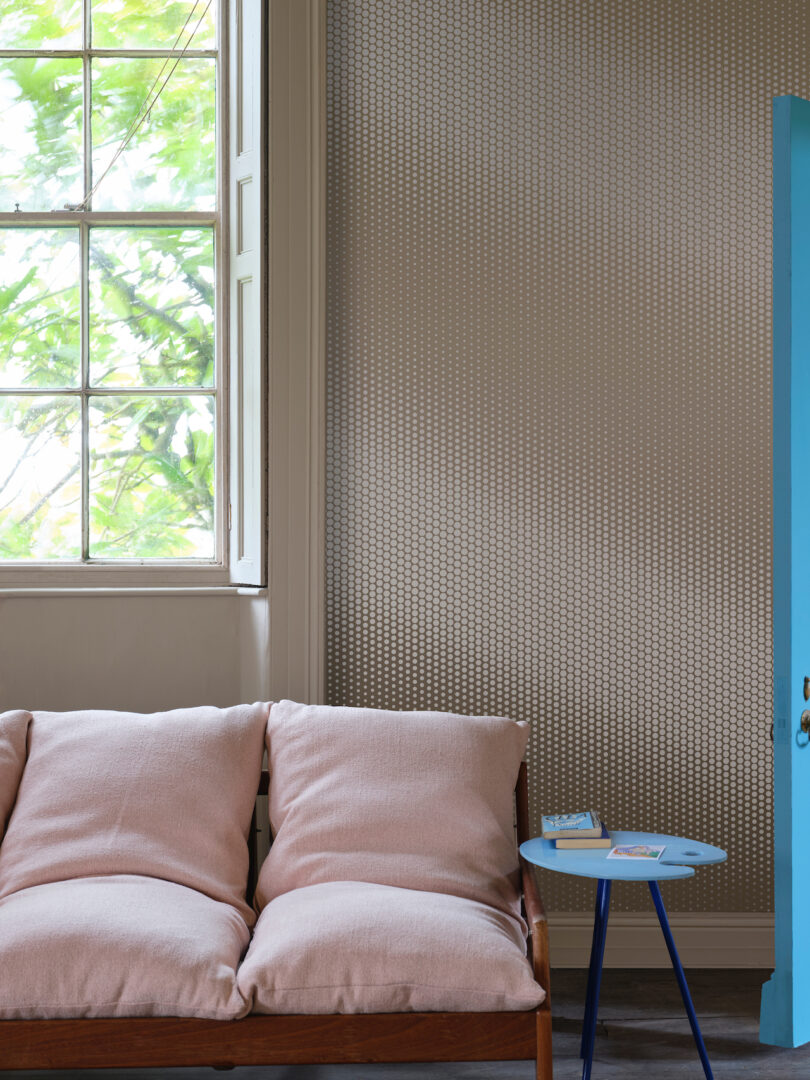
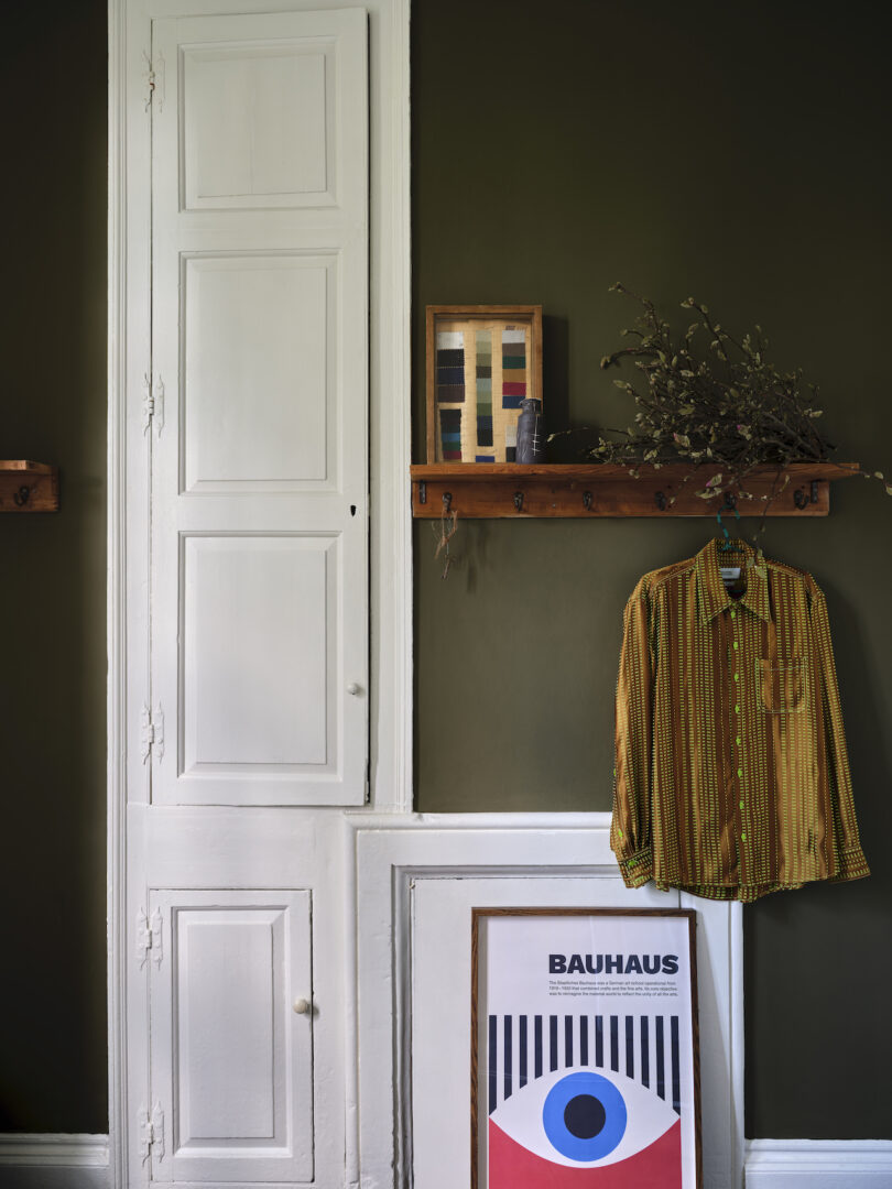
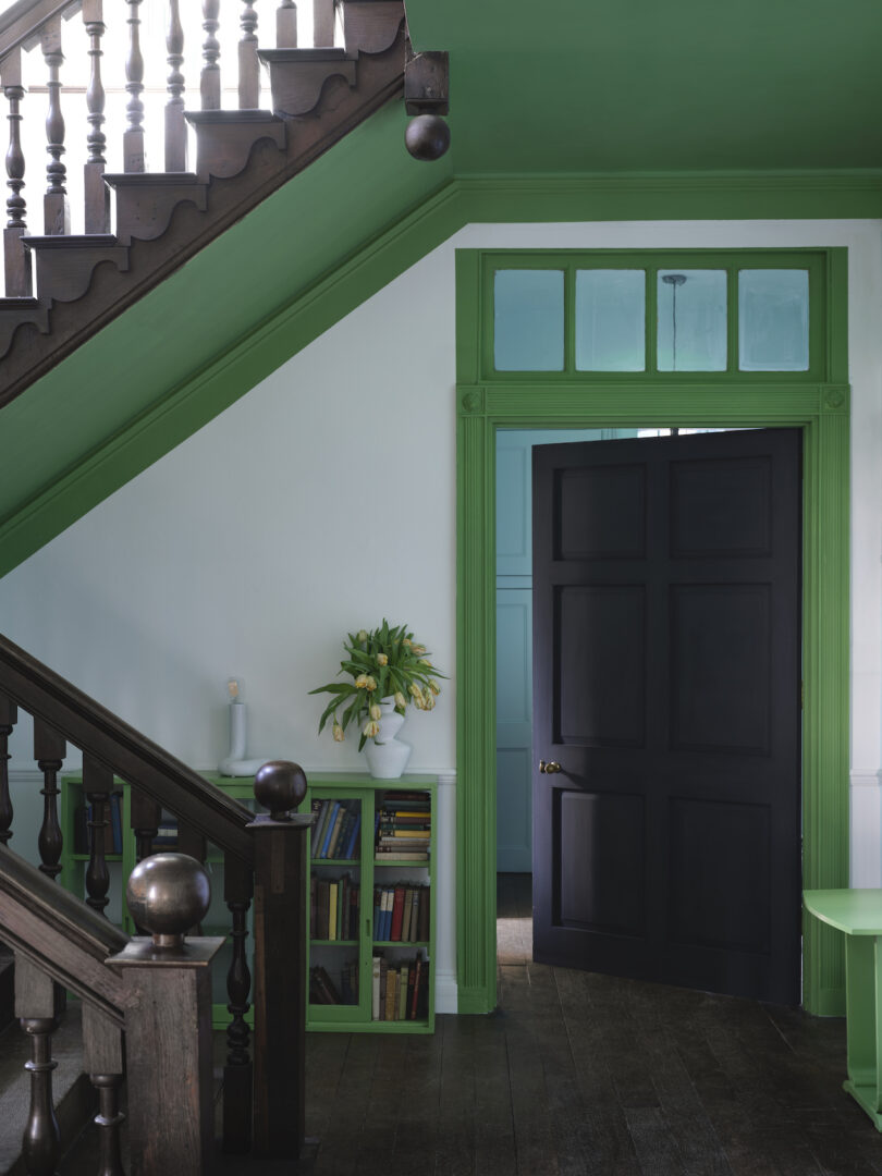
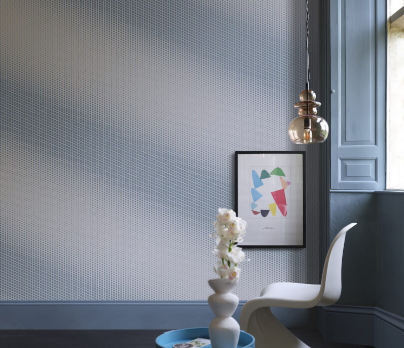
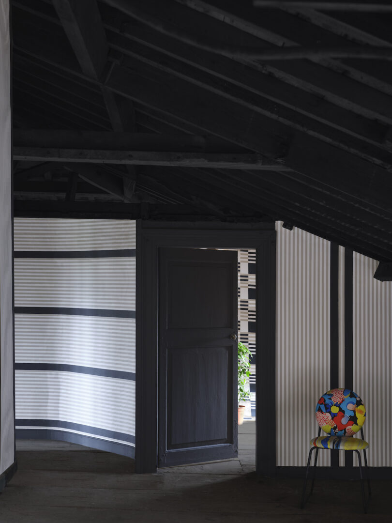
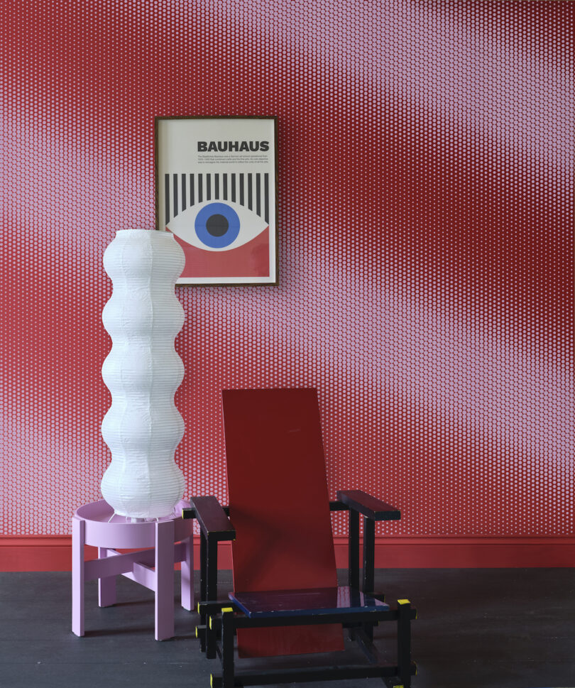
For the graphic wallpapers, he was inspired by shapes from his own work, Bauhaus textiles, and one of Farrow & Ball’s timeless stripe designs. Each of the three wallpaper designs come in four different colorways using the colors from the Carte Blanche palette, creating a seamless collection that will translate effortlessly on blank walls.
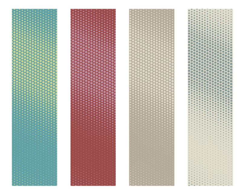
Dot
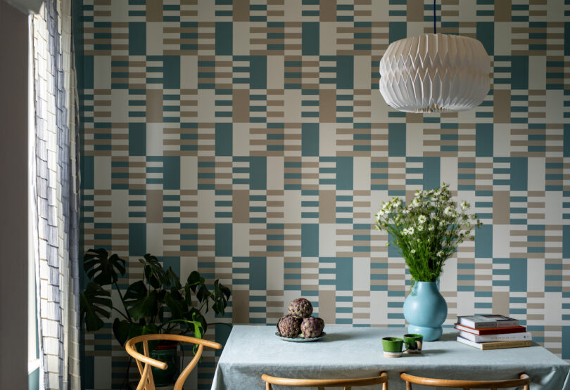

Check
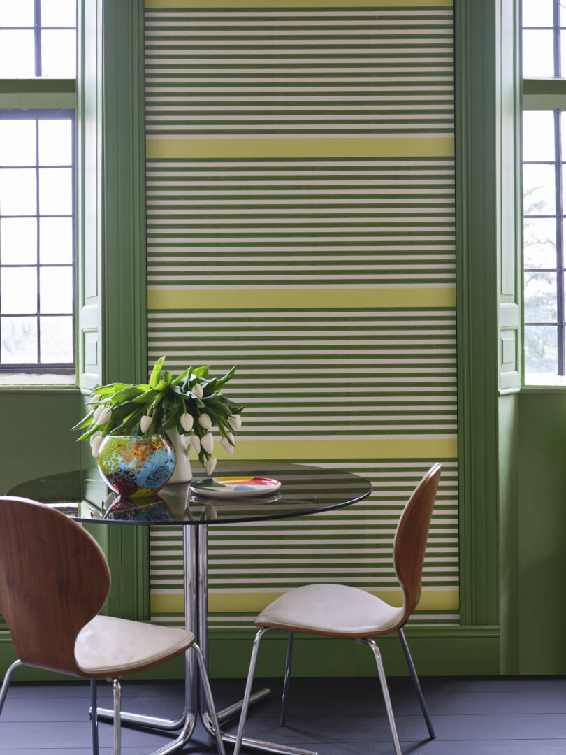
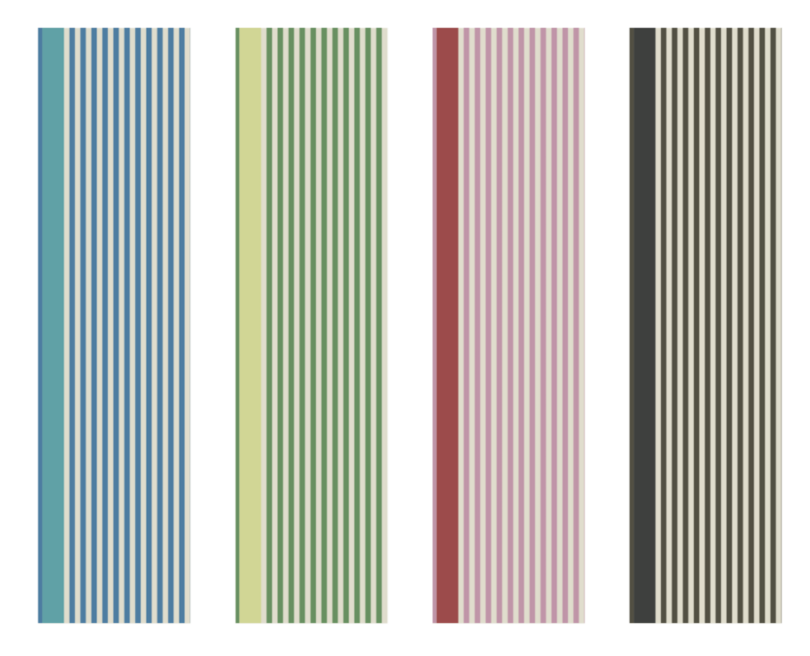
Stripe
For more information on the Carte Blanche collection, visit farrow-balk.com.