Logo Design Psychology: Fonts, Colours & Shapes
Logo design shapes a brand's identity and influences consumer perception. It can make a long-lasting impression and allow the brand to establish a strong visual presence. In today's competitive business landscape, understanding logo design psychology is vital in creating logos that resonate with your target audience.
This article will delve into various areas of logo design psychology, including colour psychology, symbolism, how it influences consumer perception and decision-making, and the impact of fonts and shapes on people's psychology. Additionally, we'll look at composition techniques and how logo design psychology has evolved.
The importance of logo design in branding cannot be overstated. The first thing consumers might notice about your brand could be its visual representation; this makes the face of your brand critical, given that it appears across marketing materials, products and digital channels.
On the one hand, a great logo can help create trust and credibility for your brand while differentiating it from the competition, resulting in a strong brand identity; on the other hand, an awful one could leave your potential customers confused or inconsistent about what you're trying to represent leaving them with negative perceptions about you or what you stand for.
Logo Design Psychology refers to studying how different elements of design, such as colours used in logos, symbols, fonts used, or even composition chosen, influence human behaviour, emotions, and perceptions. By understanding these psychological impacts, businesses may create logos that effectively communicate their brand's values whilst evoking desired emotional responses and resonating with target audiences.
This article hopes to provide readers with an extensive exploration of Logo Design Psychology whilst examining the relevance behind creating compelling logos. We'll cover each aspect at length so that readers walk away with good knowledge of psychological principles underpinning great Logo Design whilst being able to leverage this work so that next time they are looking for a new company logo, they do it right!
Table of Contents
The Psychological Impact of Colours in Logo Design
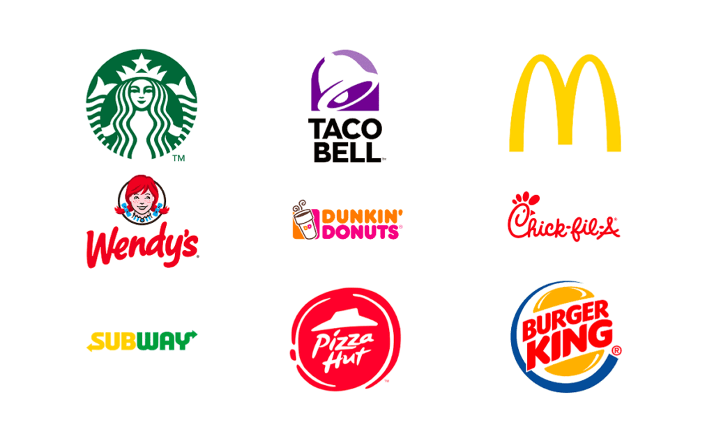
The impact of colours on emotions, perceptions, and behaviours is profound. Each colour triggers a different feeling and diverse cultural and psychological associations. For example, blue tends to be associated with trust, security, and reliability, while red can evoke excitement, passion or power. By choosing the right colours in logo design, businesses can influence how they want people to feel about their brand.
To illustrate this point, consider one of the most well-known social media platforms – Facebook. The logo combines blue and white, which conveys trustworthiness, dependability and professionalism. Blue is often associated with calmness and stability, creating a haven for users concerned about their personal information being shared online.
Not only do individual colours impact logo design, but combinations do, too.
For instance, complementary colours (opposites like red/green or blue/orange) create contrast, making logos stand out.
Analogous colours (those beside each other, like blue/green or orange/yellow) create harmony instead.
Understanding the principles behind colour theory and colour psychology means designers can also send out specific messages when creating logos through clever colour combinations.
Symbolism and Meaning in Logo Design
Logo design utilises symbols as they can communicate ideas, trigger associations, and generate emotions. Symbols, which can be abstract or figurative, often possess significant cultural and historical value. When choosing symbols for a given logo, it is essential that they are aligned with the brand's identity, resonate with its target audience, and successfully convey the desired message.
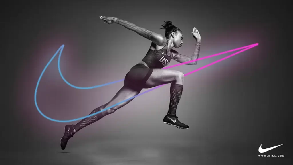
The Nike “Swoosh” is an excellent example of symbolism in logo design. This uncomplicated yet forceful symbol denotes speed, agility and victory. The Swoosh has become synonymous with the Nike brand—it may be considered one of the best-known logos worldwide—and by deploying this form in its visual communications, Nike effectively conveys core values such as athleticism, high performance and achievement. The symbol also carries aspirational weight—Nike encourages consumers to pursue their goals.
In addition to using symbols when creating logos, designers can employ techniques including visual metaphor or hidden meaning—including subtler elements within a logo's design—to add depth or intrigue. Such practices create a part of discovery for audiences engaging with a given mark. Striking a balance between simplicity and complexity is crucial here—ensure decipherment remains easy without diluting messaging.
The Influence of Logo Design on Consumer Perception

The design of a logo is an essential factor in how people perceive a brand. A well-designed logo can influence people's buying decisions, help establish a brand's personality and create positive associations. People often make assumptions and judgments about brands based on their logos, so a logo must be designed to represent what the brand stands for and resonate with its target audience.
An example of how much influence a logo can have on people's perceptions is Apple. Its simple, minimalistic apple with one bite taken out of it is instantly recognisable worldwide – even if you didn't know what the company did or anything about its reputation, you'd still recognise its branding.
The design reflects Apple's core values: simplicity, innovation and elegance. The fact that it looks sleek and modern conveys high quality, which helps shape consumers' perceptions – that this premium brand produces exceptional products.
As well as shaping consumer perception, good logo design can also play a role in whether someone decides to buy something or not. Suppose someone sees your logo somewhere before seeing your marketing materials or website or speaks to anyone working at your business. In that case, they'll be more likely to trust you because they've seen you, even if only subconsciously.
They're also more likely to think you're credible (because “someone” went through the trouble of designing some decent branding) and feel familiar towards your business (even though they don't know why). This could be enough for them to choose to buy from you rather than your competition, another reason why getting proper branding done from day one makes sense.
The Psychological Impact of Fonts in Logo Design
Psychology says that fonts in logo design are necessary because they can convey emotions, personalities and a range of feelings to consumers. Variables such as lowercase versus uppercase, serif versus sans-serif and italicised versus straight affect how your logo is perceived.
Choose the right font for your brand.
Fonts should match the overall style of your brand. They can affect mood and impact, including elegance, tradition, friendliness or professionalism. They must also be legible on any scale. “Many clients want something unique,” says Palatino author Hermann Zapf's son Christian, who runs digital type foundry Hermann Zapf & Appenzeller (HZ+T). However, he warns against being too unusual with the decision.
Zapf points out that brands often overlook typography when designing logos: “It is not only about good drawing – it is about creating a harmony between letters.”
Typographer Matthew Carter agrees: “It's true for almost all successful marks like Coca-Cola or IBM.”
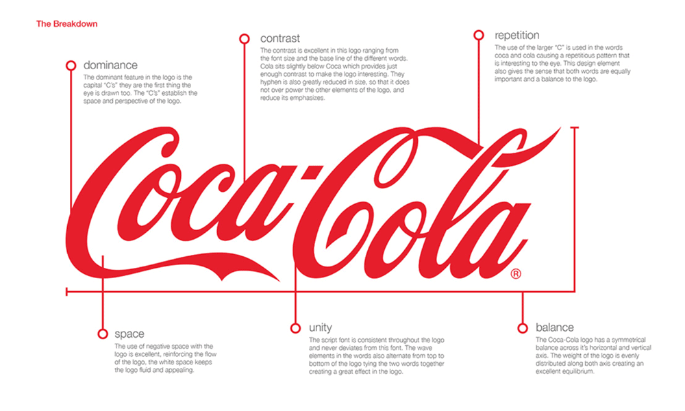
Coca-Cola has used Spencerian script since 1885
According to The Guardian newspaper, The Coca-Cola Company uses this lettering developed by American designer Frank Robinson over 130 years ago.
The phrase' logo design' appears nowhere on the company website. Still, Coca-Cola describes its logotype as Spencerian script – an elegant typeface inspired by steel nibs used around 1850 by American signwriters.
Spencerian script is thought to have originated in England and became popular across America after Platt Rogers Spencer published his book Spencerian Key To Practical Penmanship in 1866.
It became one of America's most popular handwriting styles until typewriters overtook pens around 1890.
- Hardcover Book
- Bokhua, George (Author)
- English (Publication Language)
- 224 Pages – 08/02/2022 (Publication Date) – Rockport Publishers (Publisher)
Today, very few people write formally with pen and ink, but scripts remain widely used when formality or tradition are called for.
For example, wedding invitations often use script fonts because of their decorative and ornate appearance.
This is often the case in advertising, too – especially when brands try to project a sense of authority.
A familiar example
Coca-Cola's logo is an example of Spencerian script. “My great-grandfather developed it,” says Christian Zapf.
“This typeface has many characters and has been used for so long that people associate it with Coke.”
He adds: “There are many scripts out there, but very few have survived as long as this one or stayed relevant.”
Spencerian, which he describes as having “a lot more movement” than many other scripts, is also known for its elegance.
Coke should be thought of in similar terms.
The correct choice can lead to success.
Good luck finding another brand that uses Spencerian script extensively: you probably won't. That uniqueness helped Coke become the world's most valuable brand.
Hermann Zapf agrees that Coca-Cola has used typography well over the years. He believes the decision-makers chose wisely: “They wanted something special.”
Hermann Zapf & Appenzeller sells digital versions of both Palatino and Optima, two famous font families created by his father, Hermann Anton Zapf (1918-2015).
The Role of Geometric Shapes in Logo Design
Using geometric shapes in logo design can communicate messages to customers by evoking specific psychological associations. Different shapes can create other emotional and perceptual effects. For example, squares and rectangles represent stability, reliability and order, whereas circles symbolise harmony, unity or wholeness.
A good quality logo will effectively utilise the power of these shapes to deliver a desired message or value. The choice of shape should depend on the brand's values, target audience and the emotional response sought from that audience.
One example is Mastercard's logo. It features two overlapping circles that create a sense of unity, connectivity, or harmony: an idea not dissimilar to its business proposition as an aggregator for individual payment cards.
Using circles gives a subliminal suggestion of inclusiveness, collaboration or global reach – all things that might be attractive to someone deciding whether or not it is worth committing valuable real estate in their wallet (or digital wallet) over to this particular card scheme.
- Airey, David (Author)
- English (Publication Language)
- 240 Pages – 08/20/2014 (Publication Date) – Peachpit Press (Publisher)
Also note the choice of colours: red suggests energy, while yellow conveys vibrancy or excitement.
Combining both colours within intersecting circles creates an immediate visual effect rich in meaning: connectivity, convenience, and acceptance.
Geometric shapes are not the only type available for designers when creating logos – abstract and organic forms have their uses, too.
Abstract shapes include stars (for modernity), hearts (for distinctiveness) and arrows (for uniqueness).
Organic forms come from nature – think about anything with rounded corners, like clouds.
They can suggest creativity but offer other properties depending on their contextual use: they could be soothing with lighter shades at low resolution, playful if so designed for childrenswear, etc.
By choosing appropriate shape(s), designers avoid appearing trite, unoriginal – even confusing.
The Impact of Lines in Logo Design

Lines in logo design possess the ability to communicate a variety of emotions, messages, and characteristics. The psychological associations that lines express – thickness, straightness, position, and smoothness – reveal specific moods. For instance, thin lines might convey delicacy, elegance or fragility; thick ones could suggest strength or power. Skilful deployment of lines within a logo can express desired qualities or emotions with consistency and coherence.
One famous example of a company successfully using lines within its logo is Adidas. Its symbol consists of three diagonal parallel lines that represent a mountain. This presentation conveys movement, speed and progress – even challenge – all fundamental tenets underpinning the brand's values of athleticism and performance. Exploiting how different line types can affect viewer perception in this way creates extra visual dynamism for the Adidas logo: it feels lively and energetic at first glance because we associate diagonal angles with objects moving swiftly upward.
However, you use them aesthetically (lines are one graphic element that designers sometimes manipulate into unusual shapes); they also can create visual illusions/effects: curved ones generate flow/rhythm/grace; jagged/irregular ones provide chaos/excitement, etc.). How natural/enviro-friendly your brand is will influence your choice too: curvy/wavy line types are typically seen by Westerners as softer/gentler than straighter/more complex versions.
Their position/direction on the page (horizontal/vertical/diagonal) affects how they're emotionally perceived (e.g. verticals feel more powerful; diagonals feel energetic), so thinking carefully about these line characteristics matters if you want everything about your new design to make perfect sense from an aesthetic standpoint but also elicit an exactly right emotional response from target audience/etc.
Composition Techniques in Logo Design
Creating a powerful, unforgettable logo relies heavily on thoughtful composition. Composition refers to how design elements are arranged and organised within a symbol, as well as their placement. Factors like size, spacing, hierarchy, layering and standing can all play a role in creating a practical and visually appealing logo. The most successful logos use these techniques to ensure the design is memorable, communicates clearly and looks excellent.
One of the best examples of clever use of composition in a modern logo is FedEx's famous arrow symbol hidden between the ‘E' and ‘x. This not only creates some lovely negative space (the space around or between the subject/s), but it ties into what FedEx does – transporting things quickly from A to B. It's simple yet clever.
Understanding factors such as size (and scale), placement (and position), and spacing (or kerning) is essential for any designer looking to create a strong logo; so are other areas of composition, such as layering and hierarchy.
Layering different design elements within your logo can add depth to the overall look – helping make it more eye-catching or complex if required – while establishing an order via hierarchy will help ensure that certain elements stand out above others, making them instantly recognisable.”
If you're unfamiliar with either term: “Hierarchy is about establishing which parts of your logo should be given visual prominence,” adds Alex Griendling at the online magazine website Envato Tuts+, “so people concerned with visuals don't have any trouble understanding what they're supposed to see when they take their first glance at your mark.”
Case Studies of Successful Logo Designs
The psychological elements of logos and what makes them work can be determined by analysing case studies. These case studies provide examples of how the brand identity is communicated, how consumer behaviour and perception are affected, and insight into brand success. Designers seeking inspiration and guidance on creating a powerful logo may find lessons in these specific psychology principles.
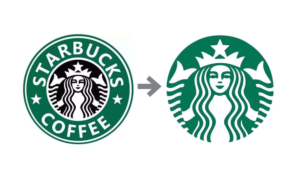
A prime example of this is the Starbucks logo redesign. The original design was a complex drawing containing a mermaid. Still, in 2011, it was streamlined to feature just the iconic Siren with no outer ring – creating a more straightforward, modern image that could better appeal to younger or more diverse audiences. Lessons here include staying relevant, adapting to changing consumer preferences and using psychological methods to create strong identification.
Similarly valuable is the Nike logo story: its simple tick symbol represents athletic performance/success globally, targeting athletes/sports fans anywhere. This demonstrates symbolism's potency, the importance of designing something that transcends language/culture barriers, and why an emotional connection with the target audience matters.
So overall, examining such case studies offers insights into thinking behind successful logo designs – giving lessons in thought processes involved when selecting creative strategies capable of making lasting impressions/driving brand successes.
The Influence of Logo Design on Brand Perception

The role of logo design in shaping brand perception and recognition is crucial. A well-designed logo contributes to brand recall, memorability, and association. When consumers repeatedly see a logo, it becomes associated with the brand's products, services, and values. Logo design is integral to overall brand psychology and affects a brand's personality, authority, and market value.
McDonald's provides one example of how effectively logo design can shape consumer perceptions about a particular brand. The fast food giant's golden arches are instantly recognisable and have become synonymous with the company. They are simple yet memorable in their design, evoking feelings of happiness or joy along with reminders from childhood.
Using such a strategy helped McDonald's reinforce its positioning as a family-friendly fast-food chain because anyone who sees such branding will recognise it and associate it with other messages previously encountered elsewhere – thereby creating greater awareness using repetition.
Logo design also has potential implications for influencing buyer psychology; this concept relates to logical and emotional motivations when people make purchasing decisions. Using an effective logo could evoke positive emotions while nurturing familiarity that ultimately helps create connections between brands and consumers.
When making purchase-related decisions, emotion counts.
Emotional factors such as self-identification (‘I am the kind of person who buys these kinds of products') along with loyalty towards certain brands count for quite a lot when making purchases happen: logos should, therefore, ideally reflect values that mean something to shoppers themselves – especially if those values align closely enough with those held by businesses selling items they may want or need at some point in future.
Consistent use across different marketing channels and touchpoints reinforces customer identity – meaning logos must remain true to form.
When individuals encounter logos that are consistent in terms of their message plus design choices/colours utilised, etc., there is increased opportunity for enhanced recognition, which, in turn, strengthens the link between logo and brand. Companies must ensure that their logos are used consistently across various marketing materials, packaging, websites and social media channels; this helps them build a cohesive brand image.
The Evolution of Logo Design Psychology
Logo design psychology has evolved with time, impacted by historical, cultural, and technological developments. To stay relevant, adapt to changing consumer behaviours and expectations, and create logos that resonate with the target audience, logo designers must comprehend the evolution of logo design psychology. Logo design psychology has been significantly influenced by technological advancements such as digital platforms and social media in recent times.
Logos were often intricate and detailed throughout history, reflecting their time's craftsmanship and artistic values. However, as technology advanced further, so did logos; they became more adaptable to different mediums/platforms, streamlined/simplified as we entered into a digital era where everything was viewed on mobile phones or tablets (smaller screens), minimalism/clean lines/scalability became crucial while maintaining visual impact/legibility.
The rise of social media platforms has affected how we should perceive/focus on designing a logo. We now view most things via these digital channels/smaller screens/cluttered spaces – so having a recognisable/striking, visually appealing logo is essential now more than ever before! So before designing your brand image, ask yourself: will my bright orange be lost next to someone else's? Will people notice my little ‘camera' symbol alongside other people's photos?
How well does your current branding work when viewed on social media? Or perhaps just seen through small windows on websites, etc.… Can you still see what is being said/described when it's just an inch big/thumbnail size?
Looking Forward…..
Expect continued evolution in this field as consumer behaviours shift/change over time: take wearable tech, for example – this could explode over the next decade….
As technology advances, there'll always be new ways/tools/trends shaping how we create our logos, too!
Each year, millions are spent learning about which colours/styles/fonts appeal most to the audience they are targeting, and this will be around for a while! So be sure to keep up with the latest research/insights in this area -if you want to stay at the top of your game.
Logo design psychology is increasingly vital to brand identity and marketing strategies. A logo is more than just an image – it's often the first impression people have of a company, and it can influence whether potential customers feel compelled to learn more.
The psychology behind what makes a logo work – from its shape, colour, and font to how it's used (or abused) on various mediums can help designers create something that genuinely resonates with consumers and leaves a lasting impression.
- Hardcover Book
- Remington, R. Roger (Author)
- Multilingual (Publication Language)
- 432 Pages – 11/08/2015 (Publication Date) – Taschen America Llc (Publisher)
Conclusion
Understanding the psychology behind logo design is essential for creating successful logos that effectively convey brand identity, influence consumer perception and foster brand success. By understanding how colours, symbols, fonts, shapes, lines and composition techniques can psychologically impact an audience and staying up to date with the latest research and insights, designers can create logos that make a lasting impression on consumers.
Carefully considering the colours, symbols, fonts, shapes, lines and composition techniques used in a logo so that they align with a brand's identity while also being appropriate for its target audience and designed to evoke specific emotional responses are vital steps to take when trying to create a visually appealing memorable logo that will have an impact. Creating such a logo requires having strong design skills and deep knowledge of what makes for compelling logos from a psychological perspective. Hence, they resonate with audiences and can leverage various psychological principles to create logos that perform well at driving brand recognition.
Last update on 2024-05-11 / Affiliate links / Images from Amazon Product Advertising API


