Top 10 MLB Logos That Strike a Home Run
When one's thoughts turn to Major League Baseball (MLB), a tapestry of vivid imagery is woven together:
- The electrifying tension of closely fought games.
- The larger-than-life exploits of legendary players.
- The unmistakable MLB logos stand proudly for each team.
Yet, a team's logo is far more than a mere visual emblem; it is a potent embodiment of identity, a repository of history, and a source of boundless pride. In the captivating sports arena, the prowess of a well-crafted logo can ascend to the same echelons of renown as the very athletes who don it.
Embarking on this journey through the landscape of MLB logos, we find ourselves at the crossroads of nostalgia and innovation, where colours and shapes interlace to narrate stories of triumph, unity, and legacy. Within the confines of this article, we shall embark on an odyssey to uncover the pinnacle of MLB logo design, unwrapping the essence of the top ten logos that have etched an indelible legacy across the canvas of both the sport and the broader tapestry of popular culture.
As we traverse the annals of history and witness the evolution of these visual insignias, we'll come to understand that these logos are more than icons; they are living testaments to the passion and dedication of a team's fanbase, a conduit for the shared experiences of victory and defeat, and a timeless bridge connecting generations of enthusiasts. So, with the crack of the bat and the roar of the crowd echoing in the background, let's embark on this expedition to celebrate the soul-stirring emblems that have transcended their humble designs to become iconic symbols of an everlasting love affair between a sport and its admirers.
Table of Contents
The Criteria for a Winning Logo
Before we jump into the countdown of the top 10 MLB logos, it's essential to understand the criteria that separate the memorable from the forgettable. A great MLB logo must achieve the following:
- Distinctiveness: A logo should be easily recognisable even from a distance. It should stand out in a crowd and be instantly associated with the team it represents.
- Simplicity: Complexity can muddle a logo's impact. The best logos are often simple in design, making them easier to remember and reproduce.
- Relevance: A logo should reflect the team's name, location, or mascot meaningfully, connecting the visuals with the team's identity.
- Timelessness: A well-designed logo transcends trends and maintains its relevance for years.
- Versatility: Logos must look great on various mediums, from billboards to tiny smartphone screens.
- Memorability: A logo should create an impression that lingers in the minds of those who see it.
With these criteria in mind, let's journey through the top 10 MLB logos that have hit it out of the park regarding design and impact.
Top 10 MLB Logos
1 – New York Yankees

The New York Yankees logo is an enduring classic that has stood the test of time. Featuring the iconic interlocking “NY” lettering, this logo was first introduced in 1909 and has remained unchanged over the past century. Its longevity and consistency are a testament to the logo's simple elegance and ability to capture the heritage of baseball's most storied franchise.
The interlocking “NY” lettering is executed in a dignified, straightforward serif font with a visual balance between the two letters. The upright, confident stance of the logo evokes the might and dominance of the Yankees, winners of 27 World Series championships. Yet the emblem also carries an air of refined style, fitting for a franchise synonymous with excellence.
While other teams have changed logos over the years, the Yankees' visual identity has stayed constant, representing an unwavering link to the past. The logo connects today's stars like Aaron Judge and Gerrit Cole to Yankee greats from Babe Ruth and Lou Gehrig to Derek Jeter and Mariano Rivera. The logo has been proudly displayed on uniforms for over a century and represents championships.
The Yankees logo symbolises the team's aura of history and tradition. The old Yankee Stadium, with its iconic frieze featuring the interlocking “NY” logo, enhanced the sense of heritage for generations of fans. Though the venue is new, Yankee Stadium retains many architectural flourishes echoing the past. The logo remains the same, a visual reminder of the legends and lore that make the Yankees one of baseball's most storied franchises.
Simple yet bold, understated yet regal, the Yankees logo is truly iconic. The interlocking “NY” lettering is inextricably linked to the team's identity and exemplifies the long-running success and prestige associated with baseball's most famed franchise.
2 – Chicago Cubs
The iconic Chicago Cubs logo features a cheerful bear cub that perfectly encapsulates the spirit of the storied baseball franchise. Known affectionately by fans as “Clark,” this illustrated cub has been the centrepiece of the team's branding for decades. Clark proudly represents the Cubs ‘ colours with his blue hat and red, white, and blue uniform.
The logo debuted in 1937 but gained widespread popularity in the 1960s. The illustration by Otis Shepard depicts a bear cub smiling widely with a baseball bat hoisted over his shoulder. The friendly facial expression and energetic pose give off a youthful, enthusiastic vibe – fitting for a team all about having fun.
Over the years, Clark has gone through periodic updates and stylisations, but his spirited essence has remained consistent. The vibrant crimson, royal blue, and white complement each other beautifully, creating an eye-catching pop of colour. The Cubs logo is instantly recognisable even from a distance, thanks to the bear's distinct outline and posture.
The classic emblem is a celebration of both sports and art. Clark's endearing personality and vivid hues perfectly encapsulate what the Chicago Cubs franchise is all about – loyalty, passion, and determination. For the players and fans, Clark represents the youthful energy and undying devotion that fuels Cubs baseball. No matter your allegiance, this logo is sure to spark a smile.
3 – San Francisco Giants
The San Francisco Giants logo exemplifies effective sports branding and design. It evokes the team's history, home city, and competitive spirit with simple elements.
The distinctive orange and black colour scheme is at the heart of the logo. The warm, vibrant orange pops against the bold black background. This creates a solid visual contrast that grabs attention. Orange and black have been the Giants' colours since the franchise moved west to San Francisco in 1958. The colours symbolise the city's sunset over the Pacific Ocean and the burning fires that ravaged San Francisco after the 1906 earthquake.
The other central component of the logo is the silhouette of the Golden Gate Bridge. The bridge's iconic suspension towers and cables are rendered in a minimalist style that preserves their recognisable shapes. Placing this San Francisco landmark front and centre forges an immediate connection between the team and its home city. It signals that even though the Giants originated in New York, they now fully embrace their West Coast identity.
The Giants logo makes a memorable impact by combining just the bridge silhouette, the orange and black palette, and the custom script of the team name. The simplicity of the design allows the core symbolic elements to shine. The logo works any size, whether a small social media icon or a giant outfield wall display. For over 60 years, it has helped build an unmistakable visual brand that resonates with fans in the Bay Area and beyond. The Giants logo proves that sports branding can be simple to be powerful. Its brilliance lies in communicating so much through so little.
4 – Los Angeles Dodgers

The iconic Los Angeles Dodgers logo has become a symbol of both athletic excellence and classic style. Featuring simple yet striking royal blue interlocking letters “LA,” this timeless logo encapsulates the spirit of a storied Major League Baseball franchise.
First introduced in 1958 when the team relocated from Brooklyn to Los Angeles, the logo's clean lines and bold colours reflected the glamour and optimism of the city at the dawn of the Space Age. The flowing script font evoked the autographs of movie stars. Paired with the Dodgers' classic white and grey uniforms, the logo exemplified midcentury modern cool.
Over the decades, as fashions have changed, the Dodgers logo has remained consistent and sophisticated. The royal blue gracefully complements the team's crisp white home jerseys while perfectly offsetting the classic grey road uniforms. Young and old fans continue wearing caps, shirts and jackets emblazoned with this iconic emblem.
Beyond its aesthetic appeal, the logo also symbolises the Dodgers' winning tradition. Since arriving in Los Angeles 65 years ago, the team has won six World Series championships, cementing its status as one of baseball's most successful franchises. Stars like Sandy Koufax, Fernando Valenzuela and Clayton Kershaw have all sported this iconic logo during their Dodgers careers.
In today's sports world of flashy graphics and constant rebrands, the Dodgers logo stands out for its timeless simplicity. It is a visual representation of a team honouring its history while striving for future glory. This beloved symbol will likely inspire Dodger fans for generations to come.
5 – St. Louis Cardinals

The iconic St. Louis Cardinals logo artfully combines tradition, symbolism, and movement. A vivid red cardinal in flight is at the centre of the logo; its wings outstretched as if soaring over the baseball diamond. Perched atop a yellow baseball bat, the cardinal represents the team's name while incorporating an essential element of the sport.
The bat adds a sense of forward motion to the logo, with the bird angled slightly forward as if moving to meet the pitch. This creates a feeling of energy and anticipation. The red cardinal is a long-standing team symbol, featured on Cardinals uniforms since 1922. Red is the distinctive colour of the Cardinals franchise, connecting today's players to the storied franchise history.
Beyond representing the team name, the cardinal also symbolises the critical values of the organisation. Known for its bright red plumage and melodious song, the northern cardinal embodies passion, joy, and celebration. Cardinals are territorial birds fiercely defending their homes, much like the storied Cardinals teams of the past century. This symbolism captures the team's competitive spirit and commitment to excellent performance.
The cardinal and bat logo integrates history, identity, competition, and sportsmanship. Over decades of play, the logo has come to represent the Cardinals organisation and its proud baseball legacy. Each time the birds-on-bat appears on a uniform, baseball cap, or piece of memorabilia, it reconnects fans to the enduring traditions of Cardinals baseball.
6 – Toronto Blue Jays

The Toronto Blue Jays logo is most recognisable in Major League Baseball. At the heart of the logo is a detailed depiction of a blue jay in mid-flight, wings outstretched and claws at the ready. The blue jay is native to North America and known for its intelligence, adaptability and social nature – qualities that resonate with the team and its fans.
The predominantly blue colour palette is a nod to the bird and the “blue” in the team's name. It creates an excellent, calming effect while symbolising power, dignity and professionalism. Splashes of red add vibrancy and evoke the colours of the Canadian flag.
Incorporating the maple leaf into the logo is a meaningful patriotic touch. As Canada's national symbol, it cements the Blue Jays as Canada's sole MLB team. The maple leaf's red colour contrasts beautifully with the blue backdrop. Its five points represent the unity of the five eastern provinces that initially formed the Dominion of Canada.
In-flight above, the maple leaf reads “Blue Jays” in a commanding block font exuding strength and confidence. The logo, as a whole, neatly encapsulates the majesty of the blue jay while incorporating iconic Canadian imagery. It is a skilful representation that resonates with fans as a symbol of national pride. Nearly 50 years after its creation, the timeless Toronto Blue Jays logo remains a crowning achievement of sports branding.
7 – Boston Red Sox
The iconic logo of the Boston Red Sox is a shining example of effective sports branding through simplicity. At first glance, the focal point is the bold, red letter “B” that stands proudly as the identifying mark of the team. This solitary letter encapsulates the spirit and legacy of the Red Sox franchise that dates back to 1901.
While some logos opt for more intricate illustrations, the Red Sox logo emphasises typography. The thick, block lettering of the “B” evokes a sense of strength and resilience. The unembellished design reflects the no-nonsense, hard-working attitude associated with Boston sports teams. Just by looking at the upright, uncompromising letter, you get a feel for the grit and determination of the team behind it.
In addition to representing the Red Sox name, the lone “B” also acts as a symbolic ambassador for Boston. The red colouring is a nod to the rich colonial history of Boston, hearkening back to the red coats of the British during the American Revolution. It connects the team visually with the very birth of the nation. The boldness of the lettering aligns with Boston's reputation for toughness and tenacity. Despite its simple construction, the logo encompasses significant aspects of the team's background and regional pride.
The longevity of the Red Sox logo further evidences its success. While numerous other teams have undergone logo redesigns and updates, the essential elements of the Red Sox mark have stayed consistent. For over 100 years, the iconic red “B” has stood as a beacon, representing the storied franchise and its home. Over generations of fans, the logo has maintained its relevance and resonance. As new chapters of the team's history continue to be written, the strength and simplicity of that lone letter will endure.
8 – New York Mets
The New York Mets logo is a classic example of how modern design can incorporate nostalgic elements. At first glance, the symbol appears simple – the team's name in bold blue letters overlays a bright orange baseball. But a closer look reveals that the blue letters depicting the word “Mets” form a symbolic skyline, representing the famous New York City skyscrapers.
This ingenious design immediately conveys the Mets' deep connection to New York City. Though artistically rendered, the skyline is still recognisable as the distinctive Manhattan cityscape. The integration of the skyline with the team name demonstrates how inextricably linked the Mets are with the identity and spirit of New York.
Yet while the skyline represents New York's rich history and heritage, the bold colours and clean, streamlined design give the logo a modern, forward-thinking aesthetic. This blend of nostalgia and progressivism reflects the very ethos of the team itself. Much like New York, the Mets aim to honour their past while continuously reinventing themselves in pursuit of future glory.
The skyline itself encapsulates this dual outlook. It depicts the iconic Empire State Building, New York's enduring early 20th-century legacy, and the late 20th-century Citigroup Center building. This juxtaposition hints at how the Mets hope to build upon the foundation of their storied 1962 origins to create new success in the contemporary era.
Finally, incorporating the brightly coloured baseball nestled within the skyline is a nod to the actual sport and the ultimate aspirations of the team. While proudly embracing their New York heritage, the Mets remain focused on excellence on the field above all else. This clever detail reminds fans that no matter what, the priority is winning baseball games.
These layers of meaning and connection are captured in just a simple logo, making it a brilliant representation of the New York Mets franchise precisely and the passion for baseball more broadly. Like New York City, the design balances multiple eras and identities, giving the Mets a timeless and iconic visual emblem.
9 – Detroit Tigers
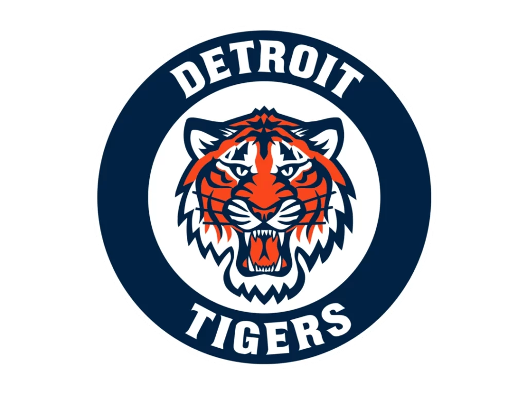
The Detroit Tigers logo is an iconic symbol of strength, ferocity, and competitive spirit. This distinctive logo powerfully captures the essence of the storied baseball franchise, featuring a snarling tiger head in vibrant orange, black, and white hues.
The logo's focal point is the tiger's head depicted in profile, mouth open to reveal sharp teeth in a fierce snarl. Its eyes convey a piercing, predatory glare that makes it clear this is an animal not to be trifled with. The tiger's orange and black striped fur provides vivid contrast, ensuring the logo makes a bold visual impact.
The choice of a tiger for the logo connects to the team's home city of Detroit. As a mighty, stealthy hunter, the tiger represents the prowess and tenacity of the team on the field. The logo's dramatic snarling expression reflects the Tigers' uncompromising competitiveness and burning desire to win. Like the stealthy tiger on the hunt, the team relentlessly pursues victory with speed, strategy and strength.
With origins tracing back to the late 19th century, the Detroit Tigers logo has undergone refinements over the decades, with the current version introduced in 2018. The consistent presence of the tiger visually links today's Tigers with previous roster greats from Ty Cobb to Miguel Cabrera. For fans, the logo symbolises the team's fighting spirit and is an emblem of Detroit pride. In its bold graphic style, the Tigers logo broadcasts the promise of an exciting matchup whenever Detroit takes the field. After over a century, this enduring logo continues to exemplify Motor City baseball's intensity, skill and passion.
10 – Oakland Athletics
The Oakland Athletics have one of the most iconic and recognisable logos in baseball, featuring an elephant set against a white background encircled by the team name in green lettering. This logo emerged in the early 1900s and paid homage to the franchise's historical roots and long-standing “white elephant” nickname.
In the early days in Philadelphia in the late 19th century, the Athletics were not a good squad and were mocked by other teams as a “white elephant,” an expensive but useless possession. Rival clubs suggested that Athletics owner Connie Mack bought himself a white elephant by assembling a subpar club in Philadelphia. When the team moved to Kansas City in 1955, they officially adopted the white elephant as their mascot, placing a cartoon elephant on their sleeve patch.
The elephant logo, as it appears today, debuted in 1968 when the Athletics relocated to Oakland. The green and gold colour scheme was also established, representing the team's deep connection to its new Bay Area home. The green hues reflect the lush landscapes of Oakland and the East Bay region, while the gold represents the California sun and optimism of the Golden State. The green and gold create a vivid, eye-catching palette that has defined the Athletics' visual identity for over 50 years.
This classic elephant logo bridges the team's past in Philadelphia and Kansas City and its Oakland roots. As one of baseball's most historic franchises, the Athletics' logo honours its legacy as a charter American League club while celebrating its Bay Area home. The iconic elephant wearing a white jersey will forever represent the story, history, and identity of the Oakland Athletics.
Conclusion: A Design Home Run
In MLB logos, creating a design that resonates requires a delicate balance of tradition and innovation, simplicity and complexity, nostalgia and modernity. The top 10 MLB logos highlighted in this article have accomplished just that, leaving an indelible and memorable mark on the sport and its devoted followers.
From the instantly recognisable and iconic interlocking “NY” of the New York Yankees, a logo that has proudly adorned pinstripes since 1909, to the vibrant energy and symbolic meaning of the Chicago Cubs' playful cub bear, each logo tells a unique story that resonates deeply with fans. These logos have become more than just symbols of athletic teams – they are cultural icons ingrained in Americana.
The Yankees' dignified navy and white caps, bearing a few perfectly angled letters, reflect the franchise's historic prestige and success. The Cubs' logo evokes a sense of joyful youth and quirky personality. The sleek, stylised depictions of birds in flight in the Cardinals, Blue Jays, and Orioles symbols capture an essence of speed and grace. The Rockies' dramatic high-altitude mountainscape encapsulates the majesty of the Colorado landscape. Each logo in MLB has been carefully crafted to represent the spirit, legacy, and ethos of that franchise and its loyal fanbase.
These cherished emblems remind us that baseball is more than just a pastime – it is a phenomenon that touches hearts, unites communities across generations, and roots zealous fans to their beloved teams. So, the next time you don your favourite squad's cap or jersey, take a moment to appreciate the thought, creativity, and cultural history embedded in their MLB logos. It's more than just an emblem – it's a visual portal into America's pastime.
