Top 10 Most Iconic and Recognisable Game Logos
Game logos are more than just a brand – they become ingrained in our minds as gamers. The style, design, and emotion behind these logos allow us to connect deeply with the gaming experiences they represent. After countless hours immersed in these virtual worlds, we form nostalgic bonds to the logos.
In this article, we analyse what makes some game logos so iconic and widely recognised compared to others. We'll explore the origins, meaning, and psychology behind the top 10 iconic video game logos. Get ready for a fun trip down memory lane!
Table of Contents
10. The Sims Diamond
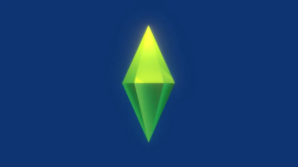
The Sims franchise debuted in 2000 with the iconic green diamond logo featuring a house inside. This clean, minimalist design nicely represented the premise of customising homes and characters.
Origins
Graphic designer Rex Crowle created this now-classic logo. Interestingly, earlier concepts included more realistic house drawings. The team eventually chose the diamond shape for its simplicity and ability to contain new illustrations for future sequels.
Psychology
The white space around the central green shape creates a welcoming, open feel. This reflects the creative freedom in The Sim's core gameplay. The vibrant green evokes life, energy, and endless possibilities.
Fun Facts
Over 200 million copies of The Sims games have sold to date. The Sims 4 was the best-selling PC game of 2022 by units. The engaging gameplay and iconic branding left a significant impact!
9. The Final Fantasy Logo
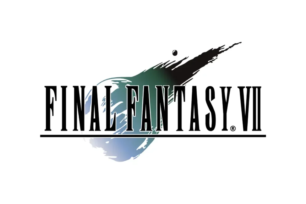
You can't think of iconic Japanese RPGs without the striking Final Fantasy logo. The stylised font and simple background make it instantly recognisable to enthusiasts.
Origins
Designer Yoshitaka Amano created the original Final Fantasy logo in 1987. While each new entry features updated art, the strong typography remains constant. Many elements come from Japanese calligraphy, hinting at FF’s roots.
Psychology
Slanted letters like ’Y’ convey a sense of speed and dynamism. This matches the epic, cinematic feel of Final Fantasy games. The two lines also resemble an opening book, alluding to an adventure waiting inside.
By the Numbers
As of 2024, there have been 16 main Final Fantasy games and dozens of spin-offs. Combined unit sales exceed 183 million – no wonder this logo holds legendary status!
8. The Street Fighter II Logo
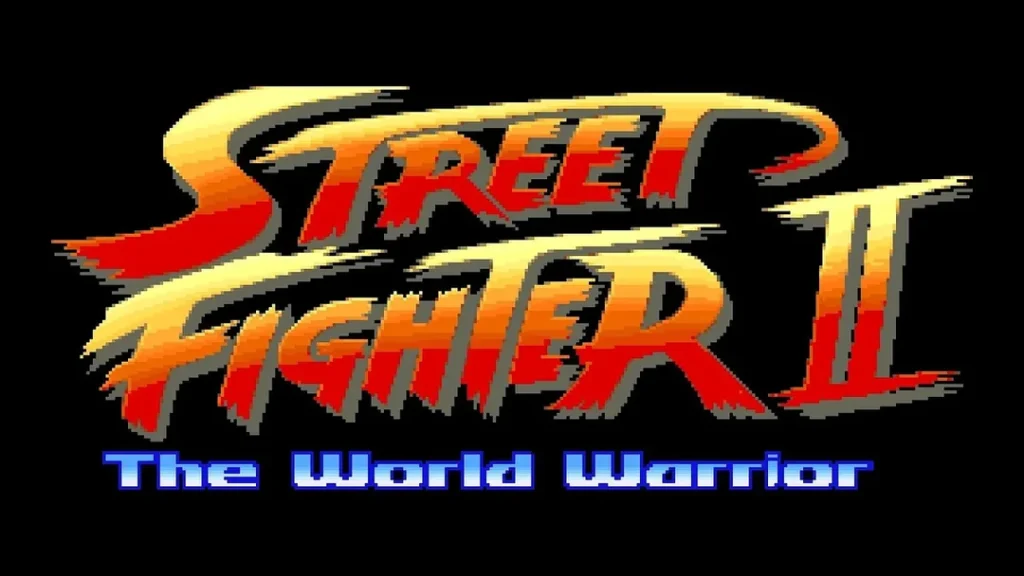
Street Fighter II remains one of the most influential and well-known fighting games ever. Its fiery dragon logo perfectly captured the intense competition within.
Origins
Capcom commissioned Japanese illustrator Mick, which meant “honourable gate dragon”. Combined with the round text bubbles, this conveyed ancient wisdom and spiritual mastery – perfect for a martial arts title!
The English letters were added later for worldwide appeal. This fusion of Eastern and Western motifs helped the game become a global phenomenon.
Psychology
The dragon's fierce stare, open fangs, and coiled body represent explosive power barely contained – like the world warriors themselves! The surrounding fire boosts feelings of excitement and passion.
Legacy
With over 6.3 million copies sold, Street Fighter II still ranks among the best-selling games ever. Fans widely recognise its dragon logo decades later as a symbol of 2D fighter excellence!
7. The Fallout Vault Boy
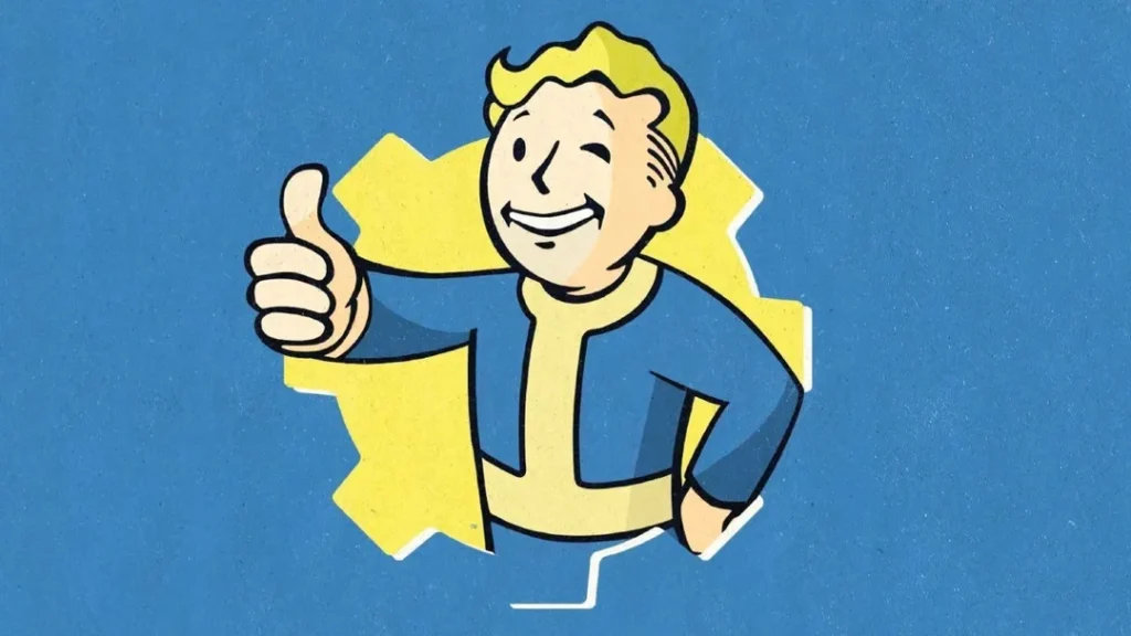
The Fallout series takes place in post-nuclear war wastelands brimming with dark humour – qualities perfectly encapsulated by its iconic Vault Boy mascot. His cheery smile against this grim backdrop strikes an ironic, cynical tone that Fallout is known for.
Origins
The first Fallout game in 1997 featured Vault Boy on its cover and loading screens. Interplay’s art director designed him to lighten the mood and help players visualise gameplay mechanics like radiation levels or stealth skills.
Psychology
Despite his cartoon style, Vault Boy’s proportions match a 1950s propaganda poster. This transports us back to an idealised post-war America. Seeing him thrive amid nuclear devastation highlights Fallout’s absurdist, retro-futuristic nature.
By the Numbers
The Fallout franchise has sold over 46 million copies worldwide. Vault Boy achieved pop culture fame – you can even buy Vault Boy bobbleheads and costumes! His cheeky resilience won fans' hearts.
6. The Need for Speed Game Logos
The Need for Speed logo captures street racing culture impeccably with a graffiti-style font, checkered flags, and a speeding car outline. First launched in 1994, NFS helped define arcade racing and still feels flashy, rebellious, and full throttle, thanks to its unforgettable emblem.
Origins
Graphic artist Barry Jackson designed the original logo and box art for 1994's The Need for Speed. The team asked for something conveying speed and street racing illegalities – setting the tone for the long-running franchise!
Psychology
The bold red against black conjures feelings of danger, excitement, and the chaotic urban racing environment. Meanwhile, the flattened perspective of the distorted car increases perceived velocity. This intense sensory design gets hearts pumping!
By the Numbers
With over 170 million total sales, Need for Speed stands among the top ten highest-grossing video game franchises. Fans adore its high-speed fantasy – memorably signified by this graffiti-style logo bound to give authorities nightmares!
5. The Pac-Man Shape
The immediately recognisable Pac-Man logo and character design have driven brand awareness over 40 years since its launch. The friendly yellow circle, open mouth, and missing wedge ingeniously portray a literal “pac man” in ghost-chomping action!
Origins
Namco designer Tohru Iwatani created Pac-Man’s iconic imagery in 1980 based on the Japanese phrase “pakupaku, ” meaning opening and closing one’s mouth. The pie shape represents a missing meal – fueling his motivation to munch power pellets and ghosts!
By the Numbers
With over 70 officially licensed Pac-Man games and well over a billion quarters gobbled in arcades, Pac-Man still enjoys broad appeal after all this time. Talk about evergreen branding!
Pop Culture Status
Pac-Man’s unmistakable form graced merchandise, cartoons, music, and even the number-one hit song “Pac-Man Fever” in 1981. Now a retro icon, you’ll find homages across media and fashion. Waka waka indeed!
4. The Super Mario Logo
The quintessential platformer series, Super Mario features one of gaming’s most ubiquitous icons. Mario’s red cap, overalls, impressive moustache, cheerful face, and hand gestures leap to mind. The logo succeeded in making Mario “larger than life”!
Origins
Shigeru Miyamoto sketched the original Mario Sprite for 1981’s Donkey Kong. Graphic artist Yōichi Kotabe later refined Mario’s look into the beloved mascot we know. Signature elements like his moustache, potbelly, and vibrant colours set him apart.
Psychology
Mario’s cheerful confidence inspires us to leap headfirst at challenges! The letters’ forward lean angle and Mario’s stride capture Mario’s trademark plucky, boundless momentum. Just looking at it can motivate you to seize the day!
By the Numbers
Mario remains the best-selling gaming franchise, with over 740 million games sold worldwide. Moreover, Mario appeared in over 200 games himself! It’s-a-me legend!
3. The Pokémon Logo
With its playful, bubbly font framed by an iconic Pokéball design, the Pokémon logo taps directly into a youthful adventure. One glance at this colourful emblem filled 90s kids’ heads with dreams of trainer glory!
Origins
Japanese graphic designer Ken Sugimori created the Pokémon logo in 1995, incorporating the iconic Monster Ball capsule device holding pocket monsters. The Japanized “Monster” font helps convey fun fantasy.
Psychology
The round, inviting shapes and bright primary colour palette trigger jubilant emotions – perfect for kids embarking on grand monster-taming journeys! The action lines behind Pokémon add dynamism, while the scratched texture resembles a trainer card for personalisation.
By the Numbers
At over 380 million total games sold, Pokémon is the highest-grossing media franchise ever. Moreover, it’s capturing new generations 25 years later thanks to the branding’s youthful, adventurous spirit!
2. The Nintendo Seal
Brought to life in 1989, the prestigious Nintendo Seal of Quality logo certifies games extensively playtested for reliable family fun. Its presence told gamers to expect memorable worlds and polished entertainment ahead!
Origins
Graphic designer Yusuke Nakano created the Nintendo Seal in 1989 to build trust after the '83 game crash. The approach worked wonders, adorning classic NES titles like Super Mario Bros. 3 and establishing Nintendo’s unmatched reputation for quality.
Psychology
The round seal shape and “honour-bound” calligraphy convey reliability and excellence. The striking red wax colour pops against black backgrounds, similar to an official decree. Its mere presence sets expectations high!
By the Numbers
As of 2021, over 5.4 billion Nintendo platform games and 4.9 billion playing cards/toys shipped worldwide. No wonder the sight of this logo still stirs excitement and high hopes after 100+ years of bringing smiles worldwide!
1. The PlayStation Shapes

Sony sparked a gaming transformation with PlayStation's launch and dynamic abstract logo. Its meaning evolved to represent immersive new experiences, only cutting-edge consoles provided in 1995 – making it an enduring emblem of progress.
Origins
Original PlayStation logo designer Manabu Sakamoto explained its creation: “It consists of geometric figures because I wanted something more abstract to resonate with a wider global market.” The flowing ribbon shape certainly achieved global appeal!
Psychology
The logo shapes resemble an opening passageway, alluding to the cinematic journeys ahead. The lime green brings a modern, high-tech feel reflecting PlayStation’s advanced capabilities. Altogether, Sony enticed gamers to “step inside” this portal!
Impact
PlayStation exploded console popularity beyond specialised gamers with mainstream hits like Tomb Raider or Metal Gear Solid. Follow-up generations continued this trend thanks to branding updates retaining the iconic flowing shapes. Overall, PlayStation sold over 5 billion consoles and counting!
Conclusion
We explored the stories, design choices, and statistics demonstrating why these ten logos left indelible marks across pop culture. Each tapped deeply into target audiences’ motivations through intelligent graphic design.
Their origins revealed they often arose from simple ideas fused with creative flair rather than overthought marketing strategies. Abstract shapes and mascot characters also allowed gamers’ imaginations to flesh out the worlds inside.
Game creators should note how these logos convey core appeals of fun, adventure, challenge, competition, or high-tech experiences. Ideally, logo designs capture emotional essences true to their franchise versus following temporary trends.
As games mature into interactive art, iconic branding and logos will only grow more crucial to templating player expectations and attachment. These ten industry-defining emblems provide studies and inspiration to inform future efforts to craft similarly stirring icons. Just don’t copy them outright unless you want lawsuits, that is!
Now, before signing off, let’s answer some burning questions surrounding famous gaming symbols:
FAQs About Game Logos
Why do game companies change logos between sequels?
Graphic design updates help sequel logos feel fresh yet familiar. Modified backgrounds, new taglines, or modern styles suit updated narratives or tech while retaining identity.
How do you create iconic game logos?
Study enduring logos to see how shapes, fonts, spacing, colours, and character poses capture target emotions. Fuse creative ideas with purposeful design choices matching gameplay and world themes.
What game has the most advanced logo?
Polyphony Digital’s Gran Turismo logo stands out for its ultra-reflective car shell shape with a coloured racing environment inside. This slick look captures their leaderboard-topping racing simulations’ cutting-edge graphics pushing PlayStation hardware limits!
Do game publishers force specific logo designs?
While publishers provide input and branding guidance for broader business initiatives, original developers generally propose and iterate logo ideas. However, compromises balancing creative visions and commercial interests happen.
Why don’t some old games get logo redesigns?
Period logos containing retro stylistic flourishes or faded colours boost nostalgic charm for rereleases! Modern polish ironically dampens authentic retro appeal, so original graphics better nurture fan connections to bygone eras.
