


Company logos are an essential part of any brand’s visual identity, representing the company’s values, products, and services. While some logos may seem straightforward and simple, many are crafted with hidden meanings and subtle nuances designed to convey a deeper message.
While colors or shapes may give an idea of what the logo represents, many companies choose more thought-out designs that leave people trying to decipher them.
Announcement: Our practical course 'How to Build a Successful Brand' is launching soon. Join the Priority List now for a $150 Discount and be notified when we go live!
Table of Contents
Why Are There Hidden Messages in Logos?
Logos are often designed to communicate a message or an idea to the audience.
Sometimes, designers use hidden messages in logos to convey a deeper meaning. These hidden messages, or Easter eggs, can be anything from subtle imagery to the clever wordplay that can be easily missed at first glance.
Using hidden messages in logos can help create a deeper connection between the brand and its audience, making the logo stand out in a crowded marketplace. Moreover, these Easter eggs also help to develop a sense of intrigue and curiosity in the audience, increasing their engagement with the brand.
The Best Logos with Hidden Meanings
Let’s dive deeper and discover the hidden meanings of the following 40 logos. Perhaps you even know some!
Toblerone
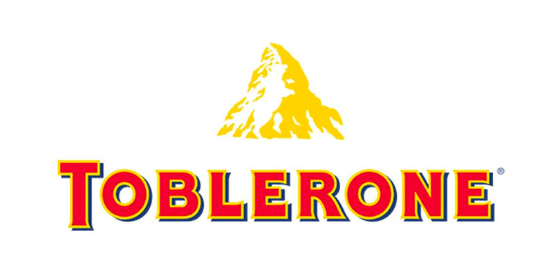
Toblerone and its mountain are widely recognizable, but there is something many people miss at first glance. Have you noticed the bear inside the mountain? It represents the city of Bern, where Toblerone originated.
FedEx
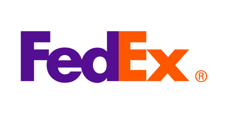
Shipping company FedEx has always been hiding an arrow between the letters ‘E’ and ‘X’. This shape is meant to represent how fast FedEx ships to its clients.
Carrefour
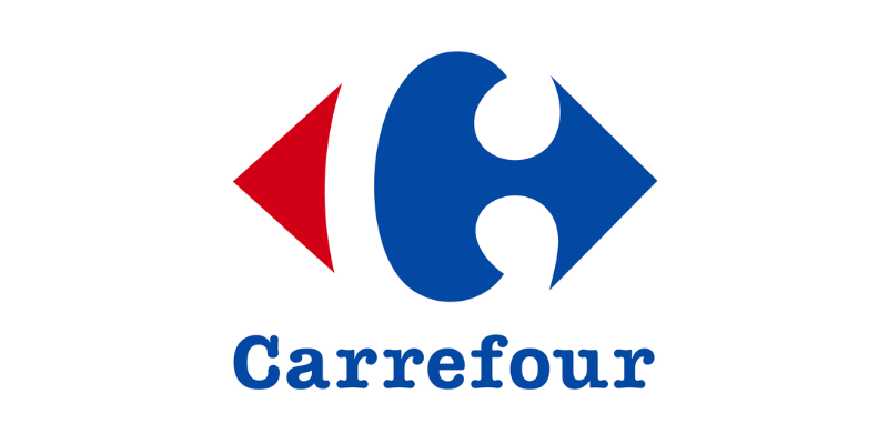
In French, ‘Carrefour’ means intersection, which is shown on the logo at first glance; you can see two arrows pointing at a right or left turn. However, hidden in between is the shape of the letter C. You just have to focus on the negative space to see it!
Amazon
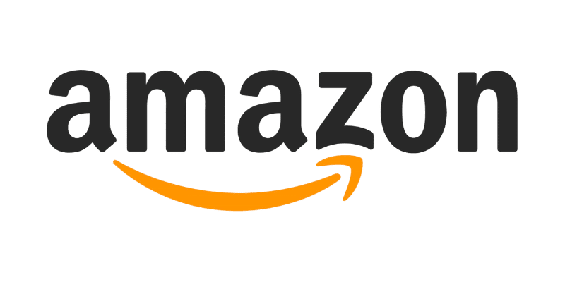
The arrow on Amazon’s logo not only represents a smile, conveying customer satisfaction; it also connects the ‘A’ to the ‘Z’, meaning that they sell everything from A to Z!
New Man
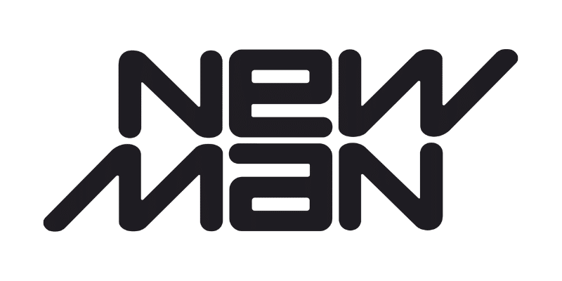
New Man has a logo that can be read upside down! In addition, if you step away from it, you can see a bow tie shape with the letters ‘N’ and ‘M’ on each line.
Tour de France
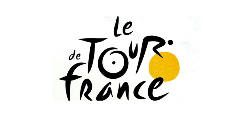
The Tour de France design conveys a clever way of using letters to create an image. If you look closely, you will notice that the ‘O’ in ‘Tour’ with the yellow circle forms the shape of a bike, and the ‘R’ is meant to look like a bike rider!
Eight
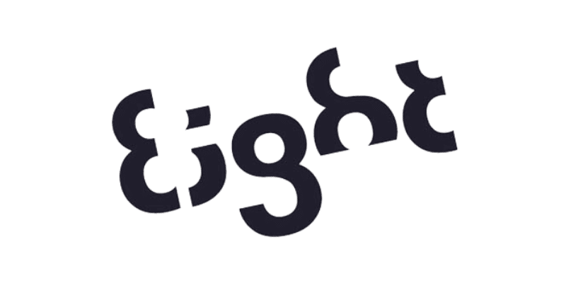
This design company conveys its creativity through the logo. Each letter is formed by a section of the number eight.
Roxy
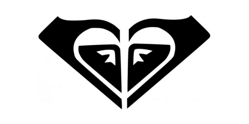
Roxy is a sports brand born from the Quicksilver group that targets a female audience. A very clever way to portray this is through its design; they took Quicksilver’s logo and mirrored it, creating a heart shape.
NBC
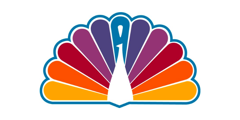
NBC’s classic logo is formed by the six colors of the rainbow, symbolizing the rise of color TV. However, inside, you can also see the shape of a peacock that is spreading its feathers.
Hope for African Children Initiative
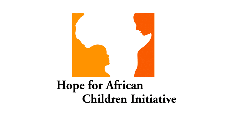
At first glance, this logo shows the shape of the African continent. But if you look closer, you will see the outline of a child and their mother, whom the foundation is trying to help bring together.
Sony Vaio
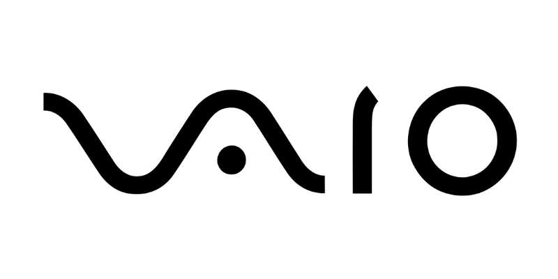
Sony Vaio combines the ideas of analog and digital technology into one. It utilizes the ‘V’ and ‘A’ to represent an analog wave and the ‘I’ and ‘O’ to represent binary from the digital world.
Tostitos
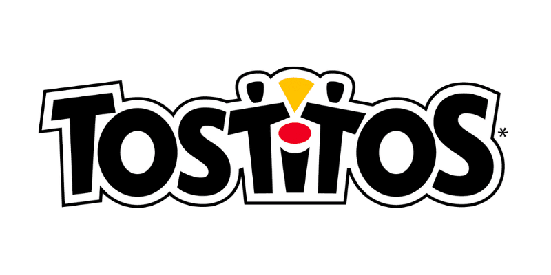
Tostitos portrays a clever and fun design on its logo. You will see the two ‘T’s in the middle as two people dipping a tortilla chip inside a bowl on top of the ‘I’.
Beats
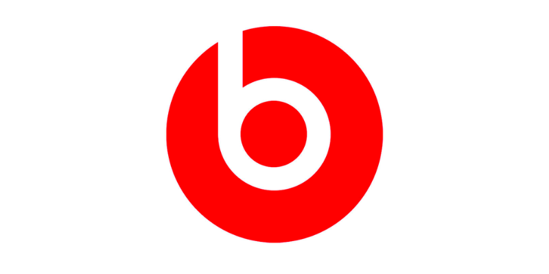
Many people rave about their products, but have you ever noticed that the ‘b’ inside their logo represents the profile of someone wearing headphones?
Cisco
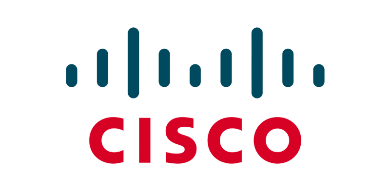
Born in San Franciso, this sound company portrays the two towers of the Golden Bridge on its logo as a homage to their hometown! In addition, the outline of this figure is also meant to look like sound waves.
Baskin Robbins
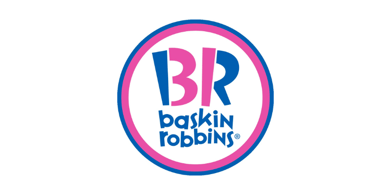
Baskin Robbins is an ice-cream chain company that has utilized colors very cleverly. On their logo, you can read out the number ‘31’ out of the ‘B’ and ‘R’, representing their 31 flavors.
London Symphony Orchestra
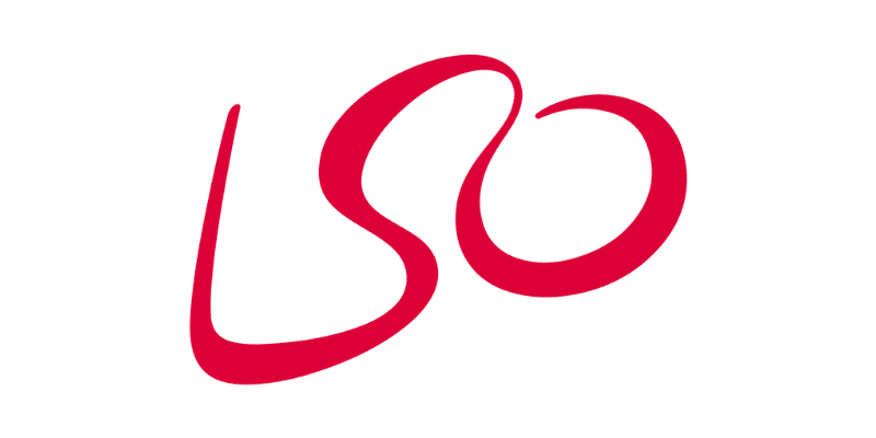
Some may think that this abbreviation is just written in a flashy font. However, it is an abstract outline of an orchestra conductor; the ‘L’ and the ‘O’ form the arms.
GameCube
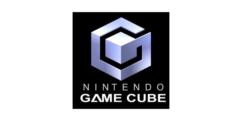
Nintendo GameCube shows a very interesting logo. Not only is it a cube inside another, but it also forms a ‘G’ in black and a ‘C’ in the negative (white) space.
Unilever
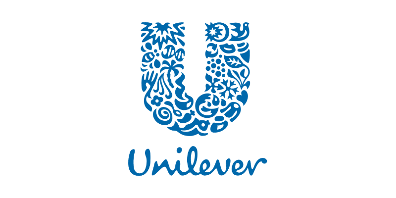
Unilever is a father company that involves many different products. The ‘U’ on its logo is formed by all the types of goods sold by Unilever, which makes it entertaining to figure out!
Audi
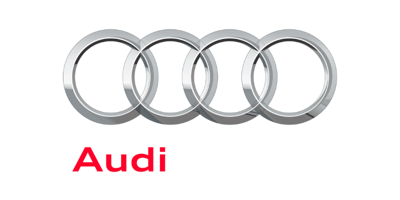
Audi’s logo is formed by four interlocking rings, representing the merger of four automobile manufacturers that joined to create the Audi brand.
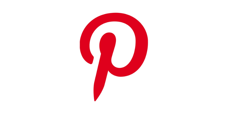
The Pinterest logo is pretty straightforward. A ‘P’ inside a red circle, right? However, the ‘P’ is actually meant to represent a pin.
Gillette
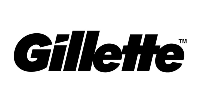
Gillette’s logo features a simple but striking design that incorporates the company name in blue lettering with a sharp razor cut on the dot of the ‘I’’s, symbolizing the high precision of their blades.
Wendy’s
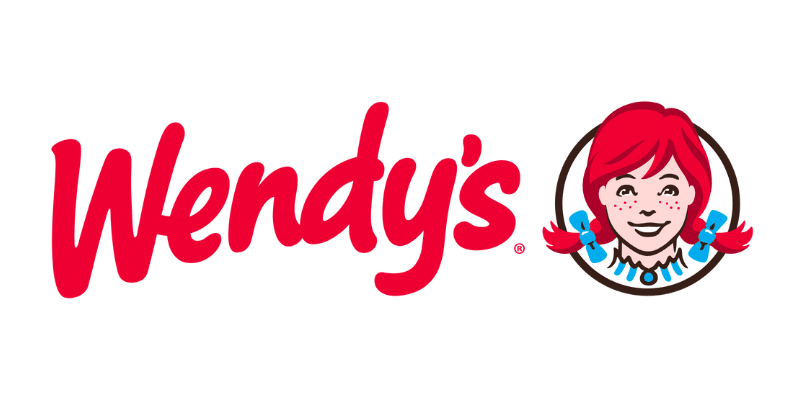
Wendy’s is portrayed by a distinctive red-headed girl with pigtails. On the collar of her dress, you can read the word ‘mom’, which evokes the homey feeling of Wendy’s food.
My Fonts
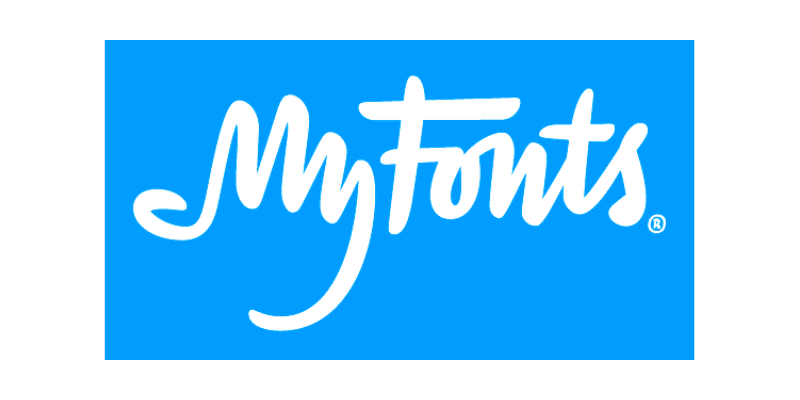
This one is a bit harder to see the first time. My Fonts is a website where one can access different fonts. The ‘My’ in My Fonts has been designed to look like a hand, showing the ease of ‘grabbing’ any font you want.
Picasa
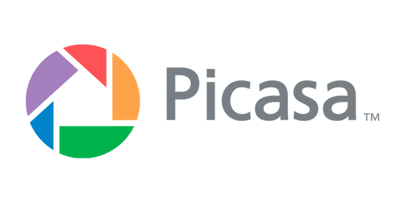
Picasa’s logo features a colorful geometric shape that resembles a shutter or camera lens. The logo represents the software’s focus on organizing and enhancing digital photos.
Galeries Lafayette
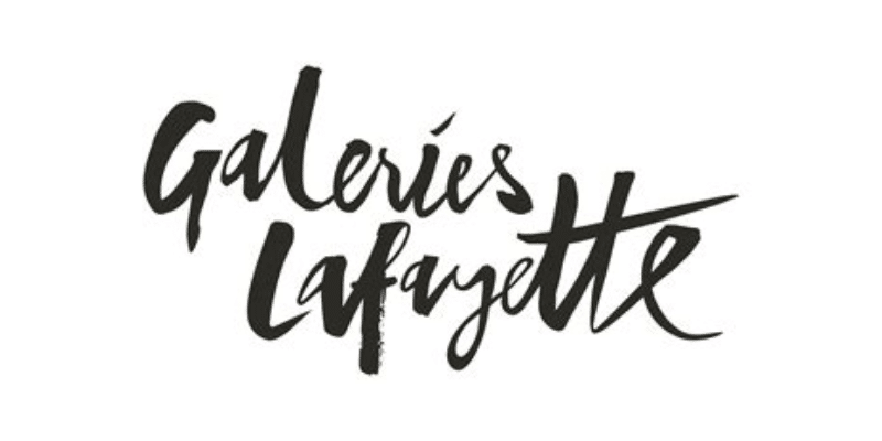
This emblematic French department store holds a hidden element in its logo. In between its fancy writing lies the Eiffel Tower in the letter ‘f’.
BMW
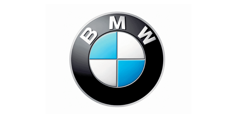
Many people say that the two-colored squares on BMW’s circle represent a propeller, as BMW began making airplane engines. However, the two colors represent Bevier’s flag, where the company originates.
LG
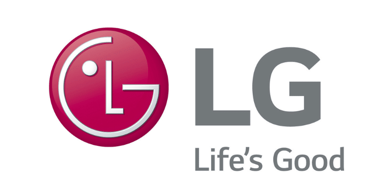
When observing LG’s design, there’s one obvious takeaway: the ‘L’ and the ‘G’ can be found inside the circle. Not everyone notices the face they make, though! The ‘L’ becomes the nose, and the ‘G’ forms the rest of the face.
Adidas
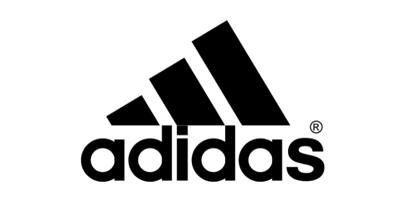
Adidas’ logo is one of the most famous in the sports world. But did you know that the three lines on top of the words are meant to represent a mountain? It symbolizes the hardships and obstacles athletes face and overcome.
Nike
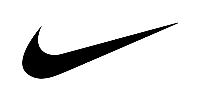
Speaking of the sports world, Nike is another dominant brand. Its symbol represents the wing of the Greek goddess of victory, ‘Nike’.
Yoga Australia
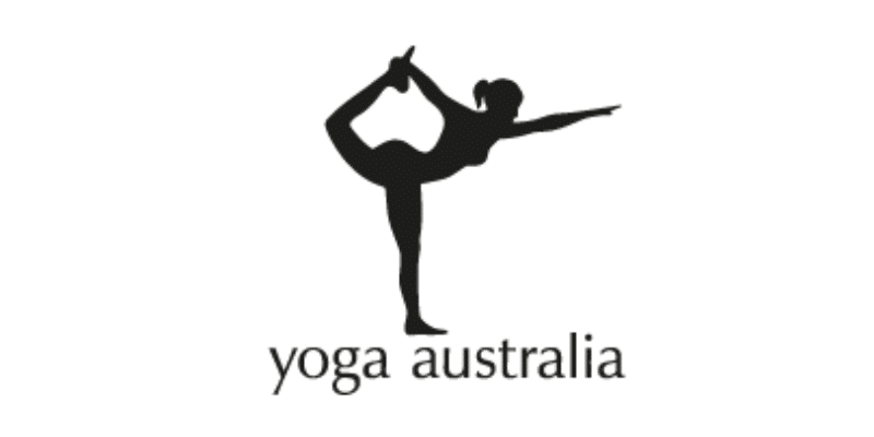
The initial logo from Yoga Australia hides a gem in the middle. The space created between the girl’s arm and leg forms the country of Australia.
Hyundai
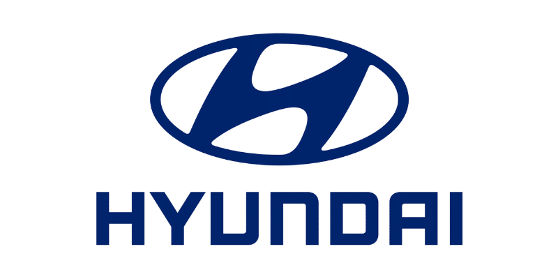
Hyundai’s logo appears very fancy and stylized with a slanted ‘H’ as the protagonist. However, that ‘H’ is also meant to represent two people giving a handshake: a salesperson and a customer.
Museum of London
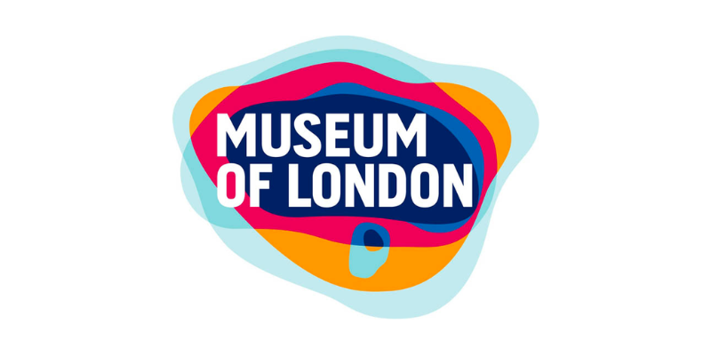
The Museum of London has an interesting look. The colorful, organic shapes have some meaning behind them, though. Each element shows the shape of London throughout history.
Pittsburgh Zoo
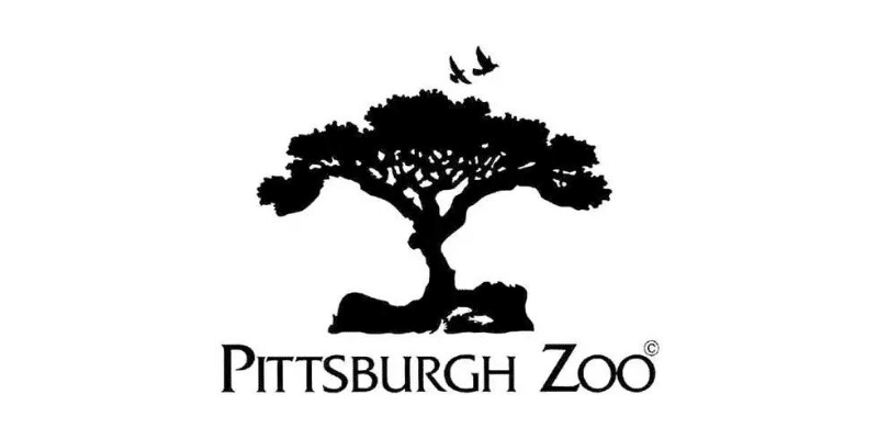
When looking at the Pittsburgh Zoo logo, you can see one of two things (or maybe both!): either a tree or the figures of a gorilla and a cheetah looking at each other.
Levi’s
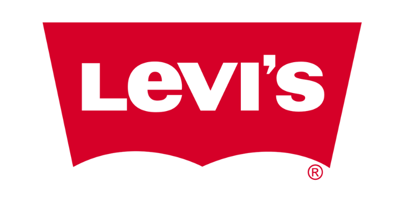
Everyone knows Levi’s and their product: jeans. However, only a few people pay attention to their logo. On the bottom of the red shape, you can clearly see the cut-out of the classic Levi’s pockets.
Sony Ericsson
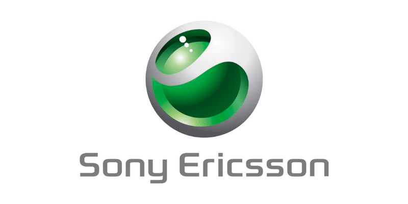
With a futuristic design, Sony Ericsson’s logo contains the initials of their name; the ‘s’ and the ‘e’ can be seen together inside the ball.
Chick-Fil-A
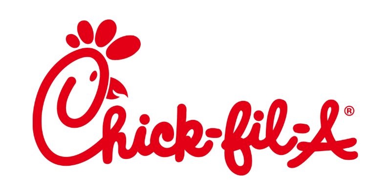
Chick-Fil-A’s design is more literal about their main product. On the ‘C’, you can see a chicken with its crest!
Continental
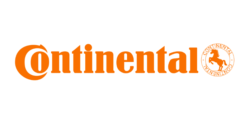
The first two letters in Continental’s logo give the biggest clue as to what they sell. If you pay attention, the ‘c’ and the ‘o’ form a tire together.
Goodwill
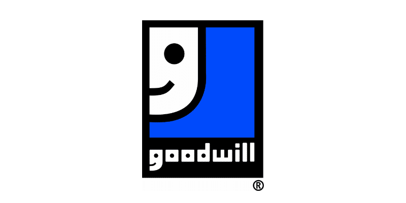
At first glance, you might think that Goodwill’s logo is a smiley face, representing how good it feels to recycle and reuse. But this face is actually a larger size of the letter ‘g’.
Hershey’s Kisses
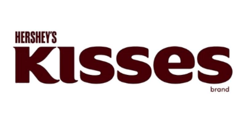
Hershey’s Kisses has a very distinctive shape for its small chocolate bites. But have you seen that the space between the ‘K’ and the ‘I’ in ‘kisses’ forms the shape of one of their chocolates?
Kölner Zoo
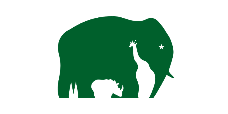
One last example of great use of negative space is Kölner Zoo’s logo. You will find a giraffe and a rhino as negative space inside the elephant figure.
Conclusion
And that makes it 40 logos in total. The next time you encounter a logo, pay closer attention to all the details because most tell an additional story!


What an eye-opening blog post! Exploring the hidden meanings behind these iconic company logos is both insightful and engaging. It’s amazing how design can convey so much about a brand’s values and mission. Kudos to the author for shedding light on this often-overlooked aspect of branding!