Minimal Logo Design: An Effective Approach to Simple Logos
Minimal logos are the most effective in achieving brand recall, which makes them a key element in any branding campaign. They are the simplest and most direct way to communicate a message about your product or services.
A logo is one of the most important things a business can get wrong in the design. Not only does a lousy logo look cheap and unprofessional, but it's also usually the first thing potential clients see when they visit a website. You must create a simple, minimalist logo design to make your website look more professional.
Logos are essential for any business, whether a small one-person operation or a large corporation. A strong logo is one of the most powerful tools to gain your audience's attention.
But while logos can be pretty straightforward, they are also vital. They should communicate your company's personality and help to distinguish you from your competitors. So it's essential to choose the right logo design for your business.
In this guide, I'll teach you the best way to create a simple, effective logo design using a combination of minimalism, simplicity, and typography.
Table of Contents
Why Is Minimal Logo Design Important?
A minimal logo design is a powerful tool for establishing an instant connection with potential customers or employees. Minimalism is a style or approach to design that seeks to eliminate extraneous visual elements in favour of basic shapes, lines, or colours, often using fewer colours. Minimalism is a philosophy or principle that strives to simplify, organise, and refine the design for maximum impact and effectiveness.
Minimalism is often associated with simplicity and a clean, straightforward design that draws the eye and leaves the viewer wanting more. While there is undoubtedly value in minimalism, the minimalist approach should not be applied blindly to a logo.
A well-designed minimalist logo carefully integrates simplicity and directness into the design. When you choose a minimalist logo design, you create a design with less visual noise yet still conveys the desired message.
A minimal logo design is an ideal solution for many businesses. Here are some reasons why it works for you.
It creates a more effective visual brand identity for your business.
Your company will stand out from competitors without being overly busy or flashy.
You'll be able to attract more visitors to your website.
Your minimal logo design is memorable and is the first thing visitors see.
The minimalist logo design is more than just a logo design; it's a way of thinking about your business.
Minimalism is a powerful branding tool that's becoming increasingly popular with consumers. Many minimalist designs are bold, simple, and striking.
A minimal logo design is a powerful branding tool becoming increasingly popular with consumers. Many minimalist designs are bold, simple, and striking.
Principles of Minimalism

Minimalist means “to remove from something” or “to limit to the essential.”
Minimalism is about simplicity and balance; you should apply it to everything from a logo to a website. Minimalism is often associated with a particular aesthetic—an impression of simplicity, order, and function—but it's really about the underlying principles that shape and inform everything we do.
Here are some common elements that define minimalism in logo design:
Balance
Balance in the logo means that weight distribution between the logo and its surrounding space must be adequately distributed. A minimal logo design shouldn't stick out like a sore thumb and shouldn't have space around it like a black hole.
Simplicity
Simplicity means the logo should have only one or two elements and be simple shapes and symbols. Simplicity means that the logo is easy to understand and remember and doesn't overwhelm the viewer.
Organisation
A minimal logo is straightforward and orderly. It doesn't force the viewer to make unnecessary mental associations with its elements or the surrounding space. A minimal logo is organised into a hierarchy of forms, shapes, and colours.
Space
The logo must communicate the message and the experience it's intended to create without overwhelming the viewer. A minimal logo design leaves space for a viewer's mind to fill in with visual details and meaning.
Using the Three Basic Principles
Use Colors That Complement Each Other
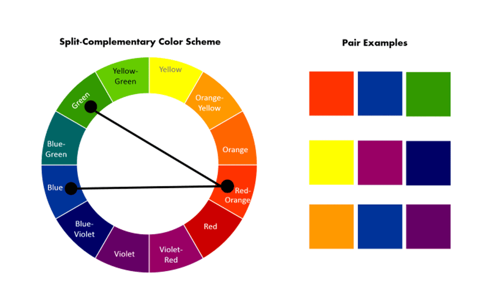
In general, you should stick with a complementary colour scheme. When you think of complementary colours, you think of two colours that are opposite on the colour wheel or two that complement each other in a colour scheme.
Complementary colours are best for matching patterns and textures, such as patterns on a wall or fabrics on a table. They also tend to work well together because they appear to contrast with each other and emphasise certain qualities of the objects they are applied to. For instance, yellow and blue work together to create a bold, eye-catching statement on a piece of clothing or a wall.
How to Use Colors That Complement Each Other for a minimal logo design?
It's important to know that using complementary colours doesn't mean you have to match colours exactly. Sometimes a slight variation is a good thing. If you want to play around with a few colour schemes, here are some guidelines to get you started.
- Yellow + Green = Warm + Cool
- Orange + Blue = Soft + Strong
- Pink + Blue = Sweet + Powerful
- Red + Green = Warm + Soft
- Purple + Green = Calm + Active
- Purple + Pink = Soft + Vibrant
The above list is just a start. As you start to use different colour combinations to develop a logo, you'll discover more and more possibilities. Experimenting with the colour wheel can help you find the best colour combinations to complement each other.
An excellent way to test the colour combinations you are coming up with is to try them on paper.
Colour Combinations
What do you think of the colour combinations above? Do any of them look familiar?
You might be surprised to learn that not all colour combinations are created equal. Understanding the difference between hues, saturation, and value is essential.
Hue
Colours close together on the colour wheel are said to be closely related. Hue refers to the lightness or darkness of a colour, and it is a primary factor in creating colour schemes. You can see how colours close to each other on the colour wheel are similar in terms of their hue.
Saturation
Closely related colours also share a similar level of saturation. Saturation refers to the intensity of a colour. A colour that is saturated is darker than a less saturated colour.
Value
Finally, colours close to each other on the colour wheel can have different values. Value refers to the brightness or darkness of a colour. On a black-and-white version of the colour wheel, you can see how colours that are close to each other have a similar value.
As you can see, each colour has three crucial aspects: hue, saturation, and value. You can mix and match these three factors to create endless colour combinations, but keeping your eye on the big picture is essential. Too dark may overwhelm the background, so you should avoid using a saturated colour. In contrast, a colour that needs more light may give your brand the impact you want.
Use Simple Shapes That Make Sense For Your Branding
Minimal logos often feature simple shapes and colour schemes. It's easy to understand why — it keeps your brand clean, elegant, and memorable. But it's equally important to remember that every element you add to your design needs to serve a purpose.
Here are seven ways to use simple shapes for a minimalist design:
1. Add Space
In the world of minimalism, space is the only thing you need. You can design a minimalist logo with a rectangle, triangle, circle, or other basic shapes without words. When using a minimalist design, remember to add white space around your design to help it stand out from your background.
2. Balance
If you want to use a basic shape in your design, keep in mind that you should balance it. Try to evenly distribute your design so that each element is weighted equally. You might divide your logo into two equally spaced, equal-sized rectangles or place one-half of your design in the upper-right quadrant of your page.
3. Keep It Simple
You can use only a few colours or elements in a minimalist design. Stick with a limited palette of just a few colours. Designing a simple design is more manageable than creating something complicated and intricate.
4. Limit the Design
It's essential to keep your minimalist design simple. Think about your target audience — if they are familiar with your brand and would recognise your logo, then you shouldn't complicate it with too many details.
5. Choose the Right Shape
You may be tempted to use a rounded or oval shape, but there are better shapes for your brand than these. A square is a classic shape, but choosing a shape that makes sense for your brand is better.
6. Focus on the Elements
Use a minimalist design to highlight the elements essential to your brand and communicate what you do.
7. Consider the Environment
Minimalism is best used in logos for websites and print materials. A minimalist approach can be challenging to convey in logos for physical items, such as T-shirts, business cards, and posters.
Don't Overdo the Functionality
A strong brand is vital if you want your business to stand out from the crowd. That means that your logo must convey the personality of your business and set it apart from others in the industry. At the same time, you don't want to make your brand too flashy.
In other words, it's essential to strike a balance between uniqueness and accessibility.
The logo should represent who you are, but not in a way that makes it impossible for customers to recognise your products. In this video, we'll show you how to get there.
How Can I Make My Logo Stand Out Without Being Too Unique?
Designers often fall into one of two camps when working on a logo.
One camp believes a business needs to be distinctive if it has a strong logo. This approach emphasises the uniqueness of the brand and strives for more originality.
The second camp believes that branding isn't about creating something unique—it's about being relatable and easy to remember. This camp believes that a unique design is essential, but they also understand that people may not be familiar with it, so they tend to lean toward simplicity and familiarity.
Which camp do you belong to?
A successful business needs to be unique and memorable. But it also needs to be approachable and straightforward enough for customers to remember. Here are some guidelines that can help you balance uniqueness and accessibility.
How Do I Find the Right Balance?
The first thing you need to do is decide what you value. If you're in the first camp, you're probably drawn to something that stands out and looks different. If you're in the second camp, you're more likely to look for something clean and straightforward.
After deciding what you're looking for, the next step is to create a mood board that includes designs that you like and look like they'll translate well to the product you sell.
You may be drawn to an unusual pattern or illustration style, but that's only part of your decision. It would help if you also thought about whether it's appropriate for your target audience and whether it conveys your message.
Can these styles be combined? Maybe. If you like the idea of something simple and graphic but want it to be manageable, try making a logo that combines a bold, geometric pattern with a symbol or illustration.
What Makes a Good Minimalist Logo?
Many people prefer colourful logos. They are fun and creative, which makes them attractive to customers. However, a minimalist logo can still have character, style, and personality. It's just a little less visually flashy.
Coloured logos can be fun and attention-grabbing. But, as with any design, a minimalist logo can become dull and stale over time.
Consider that the colour orange is associated with creativity and happiness. A minimalist logo featuring this bright colour might seem refreshing and energising to potential customers.
Are All Minimalist Logos the Same?
Minimalist logos are not only easy to recognise and remember, but they are also easy to replicate. They are clean, simple, and elegant. Many companies use a minimalist logo because it reflects their brand identity. A few examples of minimalist logos are Coca-Cola, Nike, McDonald's, Google, Amazon, and Facebook.
Minimalism is a trend that is growing in popularity. The minimalist look is more prevalent in fashion, design, advertising, architecture, and software industries. But it's also catching on in traditional businesses like finance, insurance, real estate, and technology.
Can a Minimalist Logo Be Too Minimalist?
It's essential to avoid creating a minimalist logo that is too simplistic and sterile. That's why it's best to include a subtle element, such as a line drawing, to add personality and life to the design.
You can use the following tips to create a unique, memorable logo that fits your brand personality.
Use a Sharp Focus
The easiest way to make your minimalist logo stand out is to use a sharp, clear focus. An example is the Nike swoosh logo. The logo is so well designed that it doesn't need to feature the word “Nike” to convey the company's brand personality.
Use the Proper Font for Your Logo
Minimalist logos are often created in a typeface that is simple and clear. Arial, Helvetica, and other sans-serif fonts are all excellent choices.
However, choosing a font that suits your brand personality is essential. Choose a font that is lively and inviting. For example, the “Nike” logo features a simple, straight, and unadorned font. The font conveys the company's brand personality and is easy to read and recognise.
Use a Symbol
Another effective way to make your minimalist logo stand out is to use a symbol. For example, the Amazon logo is a triangle. A symbol adds character, energy, and intrigue.
Avoid Using Images
Images can distract from your minimalist logo and distract your customers from the product or service that you offer. They can also be time-consuming and expensive to create. If you must use an image, it should be a simple, clear one. Avoid using text or graphics that may detract from the logo's simplicity.
Wrapping Up
Minimal logo design is a growing trend in the branding industry. It's a simple, clean approach to logo design. In this article, I explained why minimalist logos are so compelling and showed you how to create one yourself.
If you're a designer or someone with a background in graphic design, you may be interested in working more with minimalism in logo design.
Learn more about minimal logo design by subscribing to the free newsletter!
