Toundra by LG2
Opinion by Emily Gosling Posted 7 May 2024

There’s always something intriguing about niche, singular companies, stores and brands. When I was growing up, I distinctly remember a shop that sold only various things made out of wicker, for instance. It both intrigued and baffled me then, before I understood the concept of a ‘front’, a la (or so rumour has it) the numerous shops that once lined Hackney Road selling unfeasibly garish shoes and handbags displayed in their polythene wraps.
But where brands are niche – and not thinly veiled money laundering schemes – they’re rarely not absolutely charming. Serres Toundra, or just Toundra for short, is no exception; specialising in nothing but cucumbers and now bearing some gorgeous new branding thanks to LG2, a creative studio with outposts in Toronto, Montreal and Quebec City.


LG2, which claims to be the largest independent creative agency in Canada, was tasked with creating a new brand identity for ‘one of Quebec’s leading cucumber producers’, Toundra, that was as fresh as its produce. The brand’s full name, Les Serres Toundra, literally translates from French to English as ‘The Tundra Greenhouses,’ firmly placing the production sites of its famed cucumbers – ‘state of the art greenhouses inspired by Dutch technology,’ in Saint-Félicien, northern Quebec.
‘Thanks to Serres Toundra’s greenhouses, Quebecers can eat fresh, local vegetables all year round,’ LG2 explains. ‘The greenhouses operate rain or shine, winter or summer, in a Nordic climate a stone’s throw from the Canadian tundra. Growing vegetables in a climate that’s usually too cold for such crops is an innovative feat, and we knew we needed to get the word out about the project.’
![]()


Toundra began life in 2016, and its previous wordmark seems to sit in the realm of the purely functional, and rather clinical – despite the very 2000s ‘∆’ symbol as the final ‘A’. The stark white and clip-art fluoro green didn’t exactly scream class, provenance and eco-friendliness; but where the former logo does work wonders is in showing just how superb LG2’s work for Toundra really is.
While it’s become incredibly boring and cliche to hear agencies breathlessly describing how ‘disruptive’ a project is, sometimes ripping things up and starting again is exactly what’s needed – as was clearly the case here.

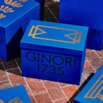
Looking to create a visual platform that’s both appealing and friendly, the agency opted to use a limited but striking and thoroughly fit-for-purpose colour palette of various shades orbiting around various greenish hues ‘inspired by shades in the greenhouses’. The brand’s key colours are Vert Forêt (forest green), Jaune Soleil (sunshine yellow), and Greige Mineral (no translation needed).
But it’s the typography that’s undoubtedly the hardest working, and smartest element of the whole Toundra brand. I absolutely love it – and with its unusual stance of starting in a lowercase ‘t’ followed by all uppercase ‘OUNDRA’ it’s a refreshing break from the sea of all lower-case wordmarks that have abounded in recent months. I’d assumed the letterforms were, in a brilliantly simple take on the project, inspired by cucumbers: all deliciously organic rounded edges, undulating thicknesses and an earthy feel that’s somehow both playful and pragmatic.
According to LG2, however, the ’rounded typeface echoes the greenhouses year-round abundance’ while the clean, straight lines are a nod to Serres Toundra’s rigorous approach to farming. Either way, it’s a fantastic wordmark that’s memorable and fun, and will undoubtedly achieve its goal of on-shelf standout and brand recognition. Elsewhere the brand uses the very pared back sans serif font Manrope, designed by Michael Sharanda.

LG2 also created a suite of minimal but hardworking illustrations that look to further portray Toundra as a friendly brand that produces 365 days a year. While the packing boxes keep things restrained, with just two colours (one being the brown of the cardboard, in a very clever use of the materials at hand) and the wordmark proudly displayed in large lettering; the illustrations come to life on assets like merch (the now-ubiquitous tote bag naturally makes an appearance); social assets and online campaigns; and as a small-scale addition to the packaging designs. In some cases, individual icons are isolated and are used like stickers over the editorial style, overlit brand photography, which works beautifully and keeps anything from feeling too slick or serious.
Where Toundra once looked thoroughly B2B, scientific, and somewhat hastily thrown together as something to put at the top of a pitch deck, the new designs are striking, subtly aspirational and lean into the lifestyle aspects of the brand that will truly appeal to in-store and online shoppers, rather that laboratory/greenhouse/hedge fund folk.