Quality Experience (QX) by &Walsh
Opinion by Emily Gosling Posted 28 March 2024
Even the most fleeting scan through &Walsh’s portfolio makes it wholly unsurprising how Jessica Walsh’s semi-eponymous studio has achieved such a brilliant reputation. While Walsh herself has garnered countless design press column inches – as partner at Sagmeister & Walsh; one half of the 40 Days of Dating project; a creative conference regular; and an advocate for women in design – the work speaks for itself.
Since its founding in 2019, the studio has rapidly fostered a thoroughly distinctive look for its projects – they’re totally, definitely ‘&Walsh’, but without resorting to a uniformly predictable house style.
As such, there’s a fair few similarities between this recent &Walsh project and the one I previously covered on BP&O. Last autumn we discussed &Walsh’s visual identity for ad agency GUT, a beguiling black and white creation based around a shape-shifting logo referencing the undulating tubular forms of actual human guts.
This time round, &Walsh has worked on another ad agency identity – Quality Experience (QX), which is led by former DDB global CCO Ari Weiss alongside Cristina Reina, former global creative director at McCann, and previous Droga5 big-guns Dan Gonda and Colleen Leddy.

According to &Walsh, QX is an ‘independent, full-service advertising agency on a mission to foster purposeful interactions between brands and their audiences by creating quality experiences’ that ‘applies meticulous care to every aspect of their work, creating an environment where bold ideas can flourish’.
Perhaps it’s that idea of flourishing that meant that – as with GUT – &Walsh looked to the natural world to inform its designs. Where GUT’s designs had a specific natural form/organ to mimic, in the case of QX its showstopper brand element, a 3D logomark, takes the shape of a nondescript ‘living organism… embodying the brand’s organic and ever-evolving essence’.
&Walsh then seemingly goes on to refer to the identity as a ‘biosphere’ in which the ‘logomark breaks through the limits of its 2D shape, expanding into a 3D living organism’. I wasn’t quite sure what a biosphere was, but it’s defined by National Geographic as being ‘…made up of the parts of Earth where life exists. The biosphere extends from the deepest root systems of trees, to the dark environment of ocean trenches, to lush rainforests and high mountaintops.’ So in a way, it’s a fitting metaphor for a visual identity or ‘brand world’; if a pretty grandiose one.
![]()

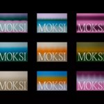
So where do we find the metaphorical lush rainforests, high mountaintops and deepest root systems in the case of the QX ‘biosphere’? In this case, the world is perhaps a little sparse – brand elements are kept simple and stripped back, and largely centring on the use of five different logos.
&Walsh says it opted to create a ‘dynamic range of logo marks’ to reflect the fact that ‘QX is not one size fits all’ and allow the agency to use different logos for different clients. Each logo design, like the rest of the branding, was informed by the idea of duality and tension such as a ‘striking balance between safety and danger’, according to the studio.
Again, as with GUT (and indeed, many &Walsh projects) the identity is striking in its minimalist black and white palette. It works beautifully, feeling slick and allowing other elements such as motion-led logo applications to come to the fore. There are some smart type choices too, Da Vinci Display is used for the main brand font – a gorgeous decorative, but legible typeface by NYC designer Virgile Flores. On the QX website and other branding applications, this is used alongside an equally charming sans serif which balances out Da Vinci’s glorious flourishes, Haffer by by Prague-based foundry Displaay.


While the identity works as a holistic brand world (or indeed, biosphere), I’m not too sure about this ‘suite’ of logomarks. None feel completely ownable or dynamic in their own right: they work together, and are often found in a group for digital applications (in the images we’ve seen of the branding’s application, at least). However, when left to stand on their own two feet as a separate entity, they lose a lot of power and feel sort of shyly decorative.

Another wee snag in the five-logos idea is that they all feel so similar aesthetically that it can be tricky to really tell them apart – especially when they’re in motion, flashing up one after the other. If the rationale behind creating five different logos was, as &Walsh says, to ‘ensure each client sees themselves within QX’s brand universe’, I’m not sure it would really achieve that aim – but hopefully that won’t really matter, since the rest of the identity is so sharp and considered.