Top of the Mornin’ Coffee by Earthling
Opinion by Emily Gosling Posted 25 May 2023
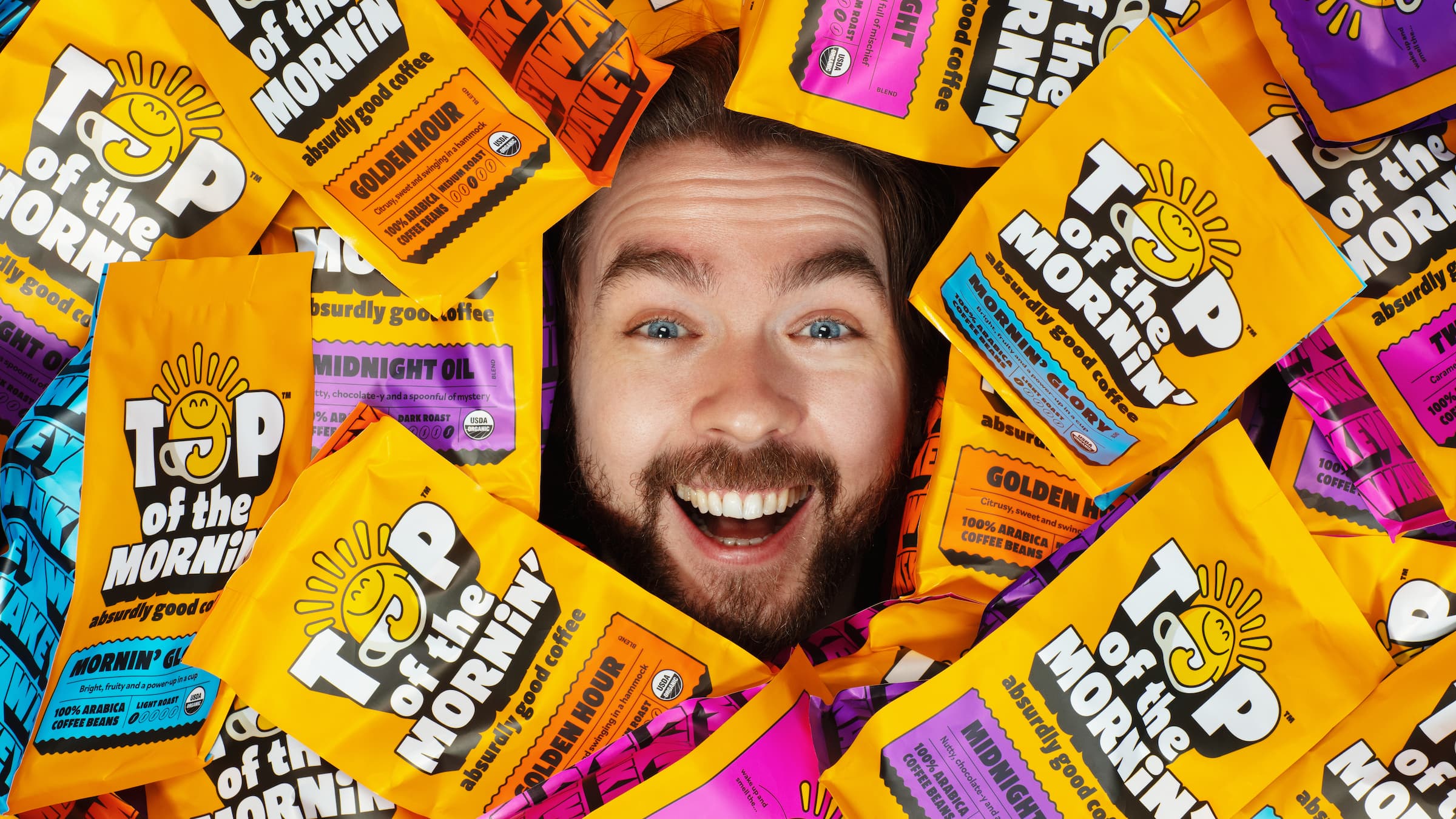
Anyone over about 25 would likely feel that of all people, big-time YouTubers aren’t exactly in need of a coffee fix: high-octane, breathless excitement and endless, pause free chitchat don’t exactly scream ‘3pm slump’.
However, Irish YouTuber Seán McLoughlin, aka Jacksepticeye – who boasts more than 52 million social media followers, and nearly 16 billion views on YouTube alone – reckons otherwise, or at least his decision to launch his own brand of speciality coffee would suggest so.
In 2020, McLoughlin launched Top of the Mornin’ Coffee – so named thanks to the distinctive, archetypally Irish opening phrase used throughout his video content.
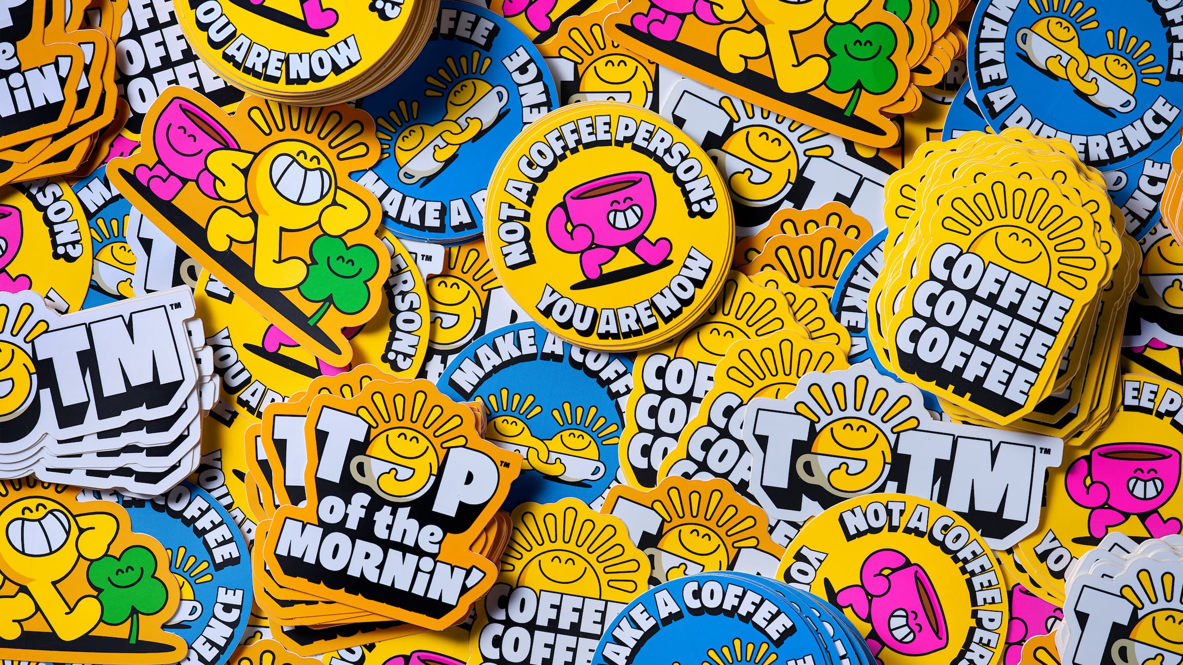
The coffee comes in four different roasts, available as ground coffee or as whole beans (and with a whole range of merch such as mugs, pin badges, stickers, apparel and more to match); and is sold through its own website either as individual products or as part of a subscription service. According to the brand, the coffee is ethically sourced and uses USDA-certified organic beans, with 1% of the money from its sales going to mental health support charity Crisis Text Line.
Despite having only used its former designs for the three years since the brand was founded, the arrival of new Top of the Mornin’ Coffee CEO Hugh Thomas (Ugly Drinks cofounder, and former VitaCoco exec) to help the brand expand led to London-based Earthling Studio being brought in to radically overhaul the visual identity.
According to Earthling, McLoughlin wanted to ‘expand the brand’s appeal to a new generation of drinkers’. The studio worked across Top of the Mornin’ Coffee’s entire brand strategy and identity, including packaging design, illustrations, photography, art direction, motion and the brand guidelines underpinning it all. The aim was to create the ‘definitive gateway coffee brand for adult explorers’ embodying ‘the positivity, humour and generosity of its founder, Jacksepticeye, while having stand alone value in coffee and beyond’.
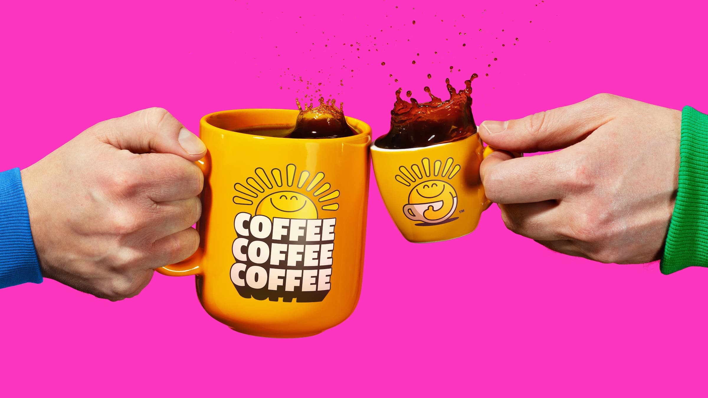
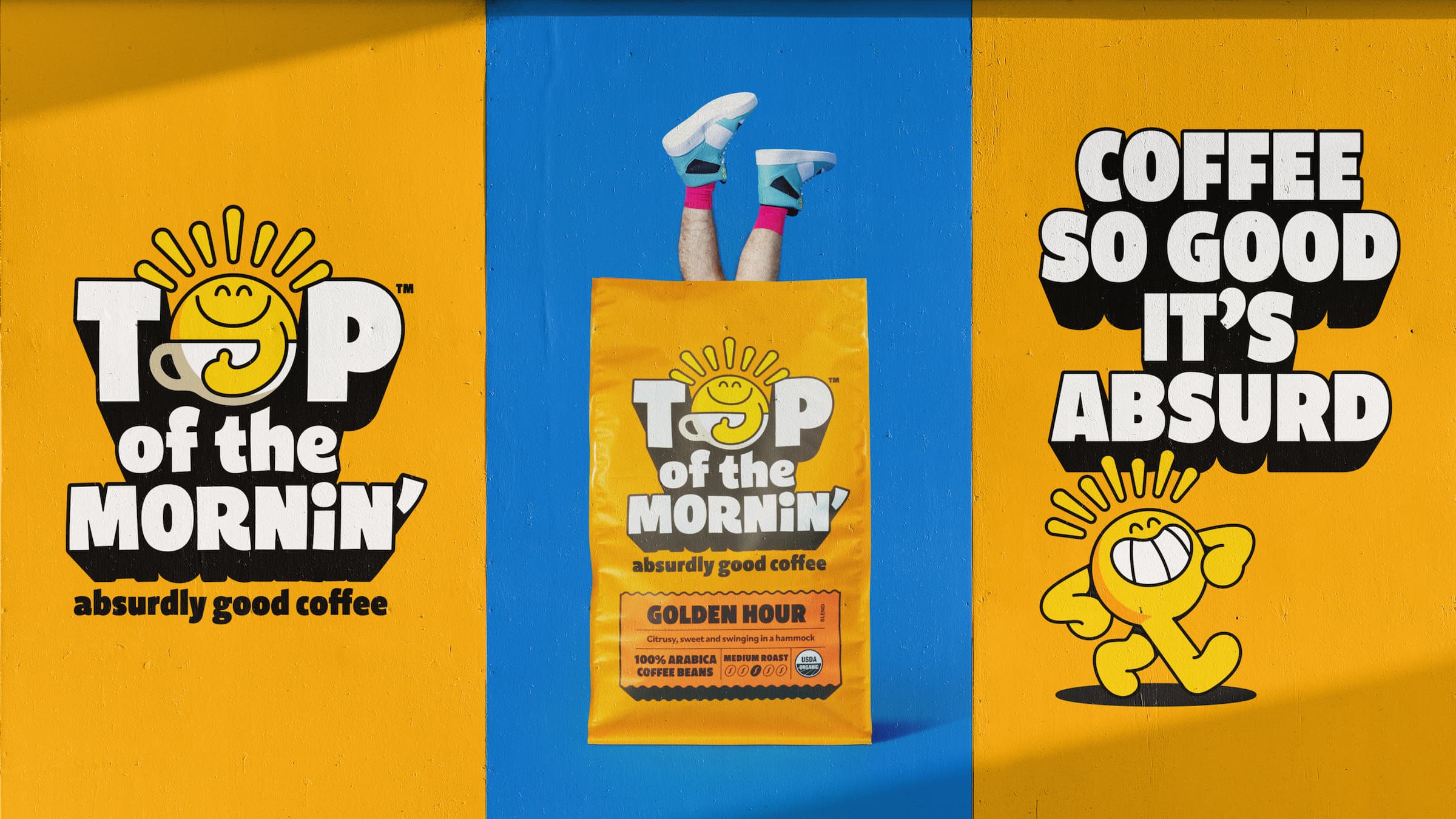
The new branding is underpinned by the idea of ‘absurd positivity’; aiming to radiate a playfulness embodying a positive start to the day in an uncertain world while conveying the brand’s ‘genuine passion to always deliver “absurdly good coffee” experiences’.
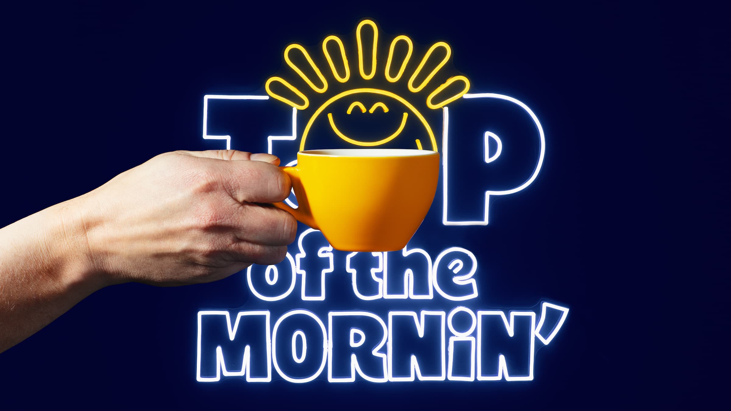
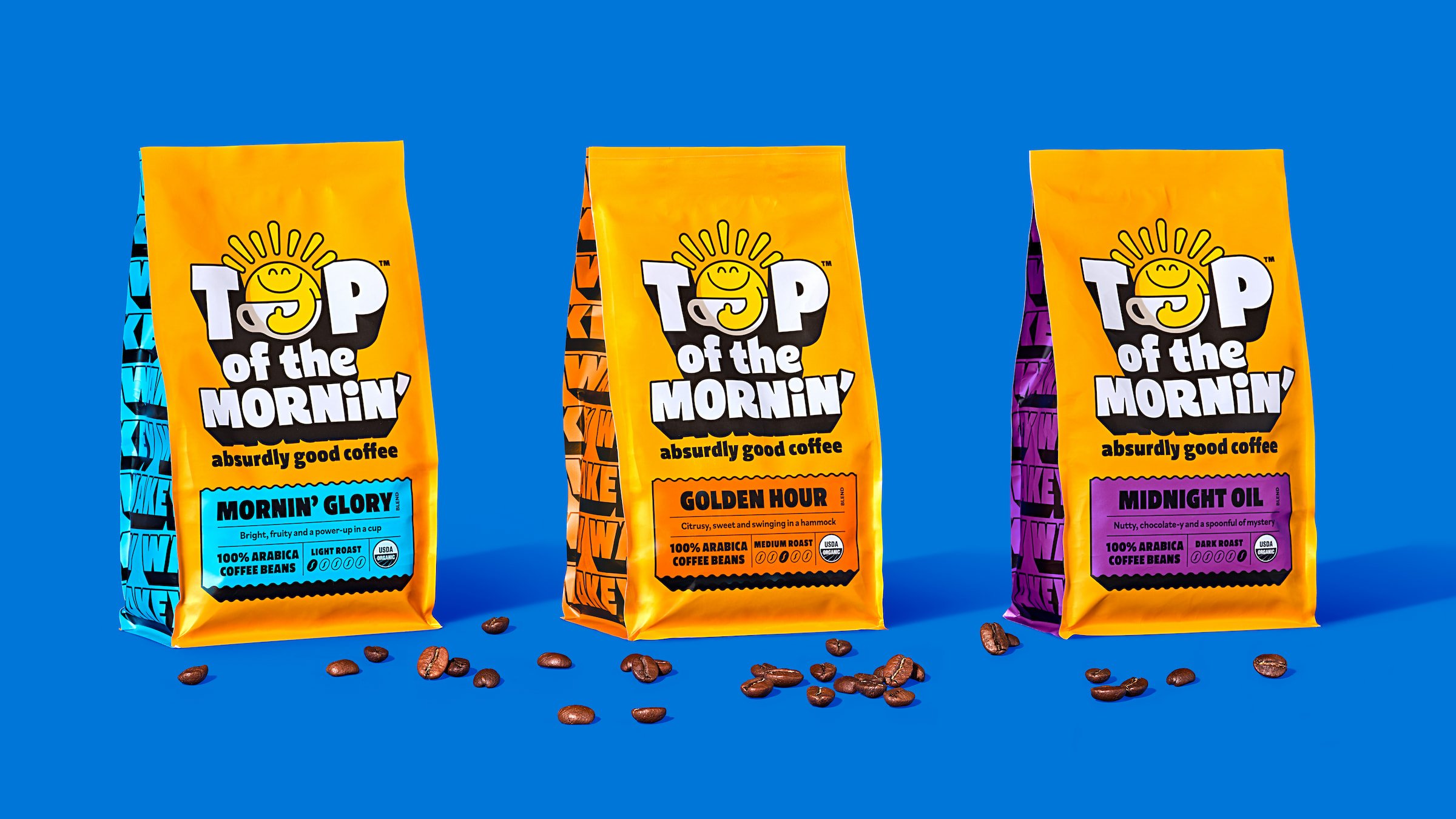
The new Top of the Mornin’ Coffee icon is inspired by the idea that the product tastes ‘like a cup of sunshine’, personified by a cute, beaming sun character named Sonny that doubles up as the ‘o’ in the brand name’s ‘Top’ as part of its wordmark. The logotype is unabashedly extra, using cartoonish 3D lettering that aims to stand out, and very much achieves that.
It’s a pretty original approach to coffee branding, particularly for products that pride themselves on their speciality, organic credentials. It’s refreshing to see a total eschewal of slick, hipsterish minimalism in favour of high-octane highjinks – which is totally befitting of both the brand and the man behind it.
The brand colours are brash, bold and unapologetically retina-singeing; with the pack’s main tone continuing the sunshine-and-positivity theme with a sickly sweet Sunny Delight orange and the variants in the range differentiated by vibrant, highlighter pen shades of blue, pink, and purple.
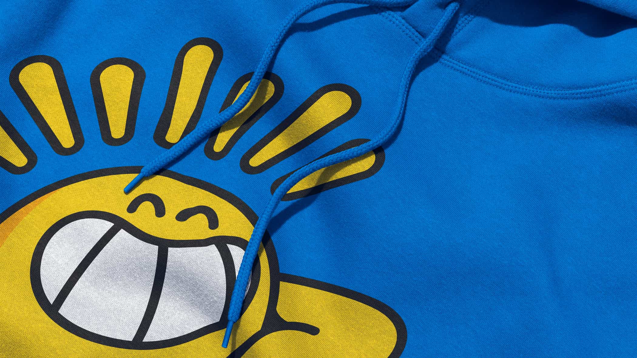
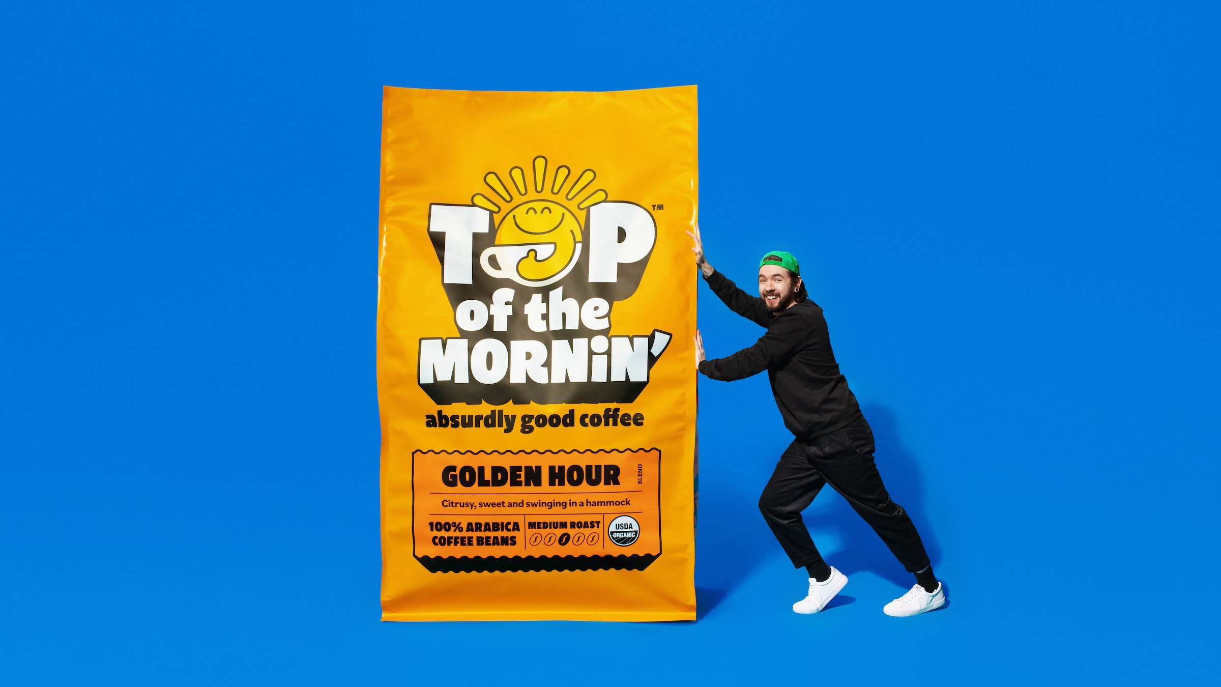
These vivid hues, coupled with the bouncy, rounded lettering make everything seem remarkably kinetic: static applications almost vibrate with the relentlessly good vibes. Quite how Earthling managed to keep this mega-chipper aesthetic from being ‘kids’ TV host’ levels of irritating is anyone’s guess – but very impressive.
Likely it’s because of just how befitting the look and feel is to the intentions of the brand, and the personality of its creator; but there’s also deft touches to the execution that keep things just on the right side of smart over saccharine. Take Sonny’s rays: the curved, bubbly forms feel fresh; and the thick black linework that carries throughout the illustration style and all the brand’s typography gives a subtle professionalism with its consistency and application.
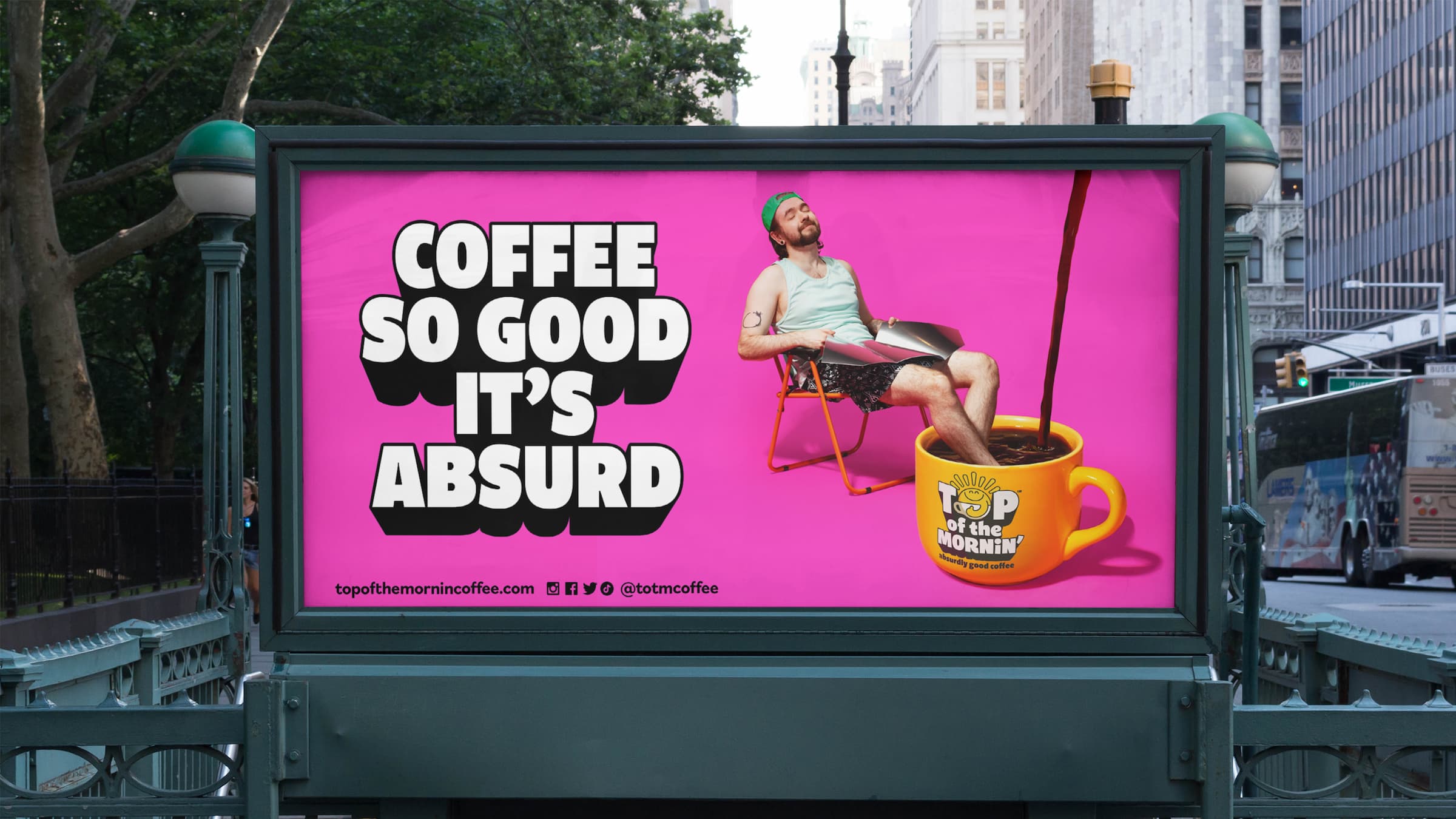
The tone of voice is equally rooted in an absurdity-tinged kind of joyfulness, aiming to ‘pack a punch’ with devices like alliteration and deliberately short sentences. Top of the Mornin’ Coffee’s main strapline, ‘coffee so good it’s absurd’, refers to McLoughlin’s joint passions of creating ‘absurdly good products’ and providing ‘some light relief with his unique playfully positive personality’.
Sonny is accompanied by a secondary cast of character friends, including ‘a shamrock called Lucky inspired by Seán’s Irish roots, a down to earth Cup of Joe and an inclusive rainbow character called Raye,’ as Earthling puts it. ‘A new world, Planet Positivity, has also been developed, where the absurdly positive vibes truly blossom.’
While we often hear agency’s referring to a ‘brand world’, this really is an alternate universe – and a thoroughly joyful one at that.
Fonts: Bilo
