'Not just another fintech brand': a new identity for Apron shirks category norms
Opening Line founder Zosia Swidlicka and Outsiders Creative Partner Tom Rogers explain how their teams collaborated with to create a fintech identity that transforms payments from a painful process to a positive experience without leaning into category clichés.
Credit: Opening Line / Outsiders / Apron
Apron, a fintech product that speedily sorts, pays, and reconciles invoices, launched its rebranding initiative by encouraging binge-watching. One of the first points in the brief that Apron founder Bogdan Uzbekov gave Outsiders and Opening Line was to watch The Bear.
The television series, which swept through the pop culture zenith last year, follows a fine dining chef desperately trying to wade through the brutal realities of running a small business while constantly fighting fires. "This tells you everything you need to know about what our clients go through daily," Uzbekov told Outsiders' Rogers and Swidlicka.
It was a clever, direct way to immerse the designers and strategists at Outsiders and Opening Line, who would partner on the new identity in Apron's world. Rogers told Creative Boom: "The show's passion, grit and energy came through in spades during the interviews we held with Apron team members and core customers. It was clear that they all shared the same hustler mentality; riding on momentum and driven to succeed. Except when they came across barriers to progress – like spending five hours a week paying invoices instead of working towards the bigger picture."
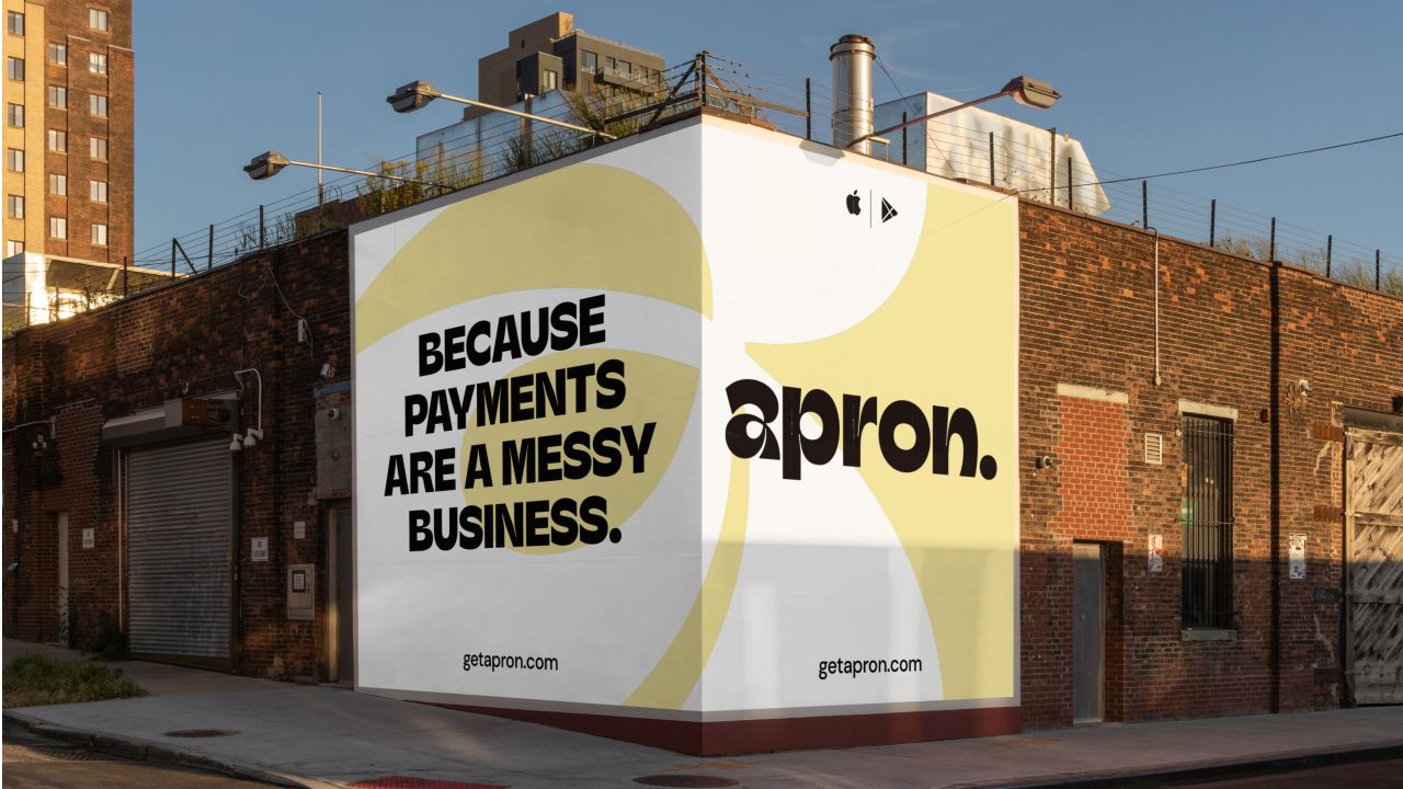
Credit: Opening Line / Outsiders / Apron

Credit: Opening Line / Outsiders / Apron
With The Bear binged and the interviews completed, Opening Line and Outsiders began reimagining Apron's identity in a way that captured that pervasive grit and hustler mentality to cut through the busy payments solutions category. "With a crowded market, competitive category and increasing scepticism towards new technology, we had much to contend with in this project," said Swidlicka, founder of Opening Line. "As great as the product is… we knew it wouldn't break through without a distinctive brand behind it. We needed to tell a story."
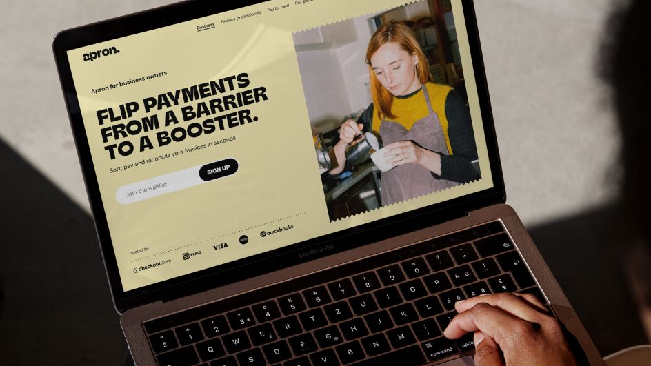
Swidlicka explained: "It would have been really easy to create a positioning around saving business owners and accountants time and money – 'payments are painful' and all that – in fact, that's what everyone else in the market was already doing. We knew that to get through to this audience; we'd have to aim not for their rational brain but their emotional one."
The resulting positioning avoids becoming just another fintech solution with much credit due to the seamless and deep collaboration connecting the visual and the verbal. The rebrand was created in just ten weeks, which adds to the impressive transformation.

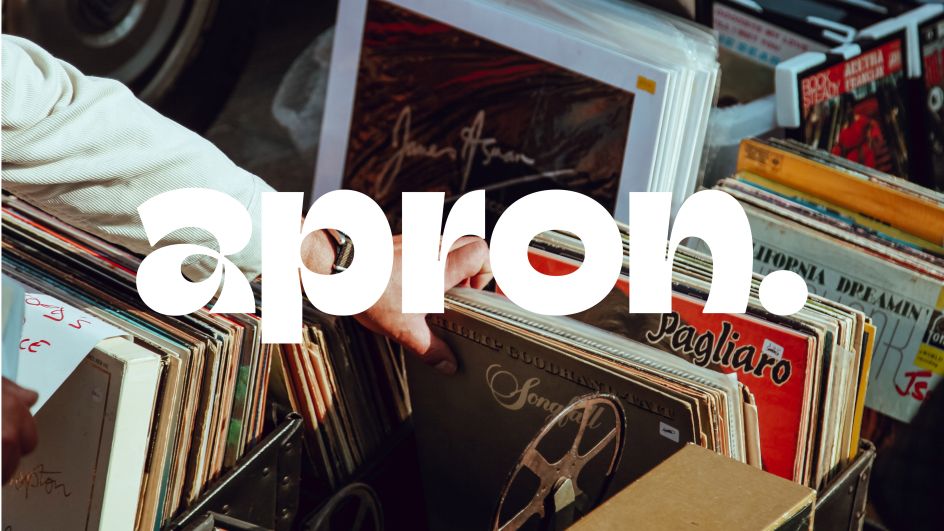
Credit: Opening Line / Outsiders / Apron
Credit: Opening Line / Outsiders / Apron
Credit: Opening Line / Outsiders / Apron
A belief that brand is a seamless link between strategy, verbal and visual disciplines saw Outsiders bring in Opening Line to work alongside them during this project. The teams worked hand in hand throughout the process, collaborating at key stages to ensure maximum cohesion and crossover across all elements. "Working in this way meant that the 'joyfully efficient' personality we'd established together at the beginning was able to really come into its own across all touchpoints," said Swidlicka.
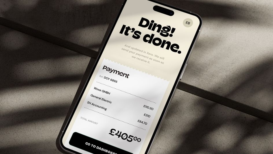
The identity adds tangibility back into the process of cash passing between partners, grounding Apron in the real world through subtle graphic devices such as the serrated receipt edge.
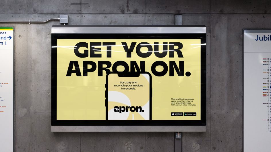
Meanwhile, the tone of voice takes a "show, don't tell" approach that helps the audience visualise their life with (and without) Apron. Using bold, simple typography balances assertiveness with a friendliness that feels punchy but not alienating. The palette is bare bones and joyful, based in reality to represent the "roll your sleeves up" mentality of Apron's already overstretched audience.
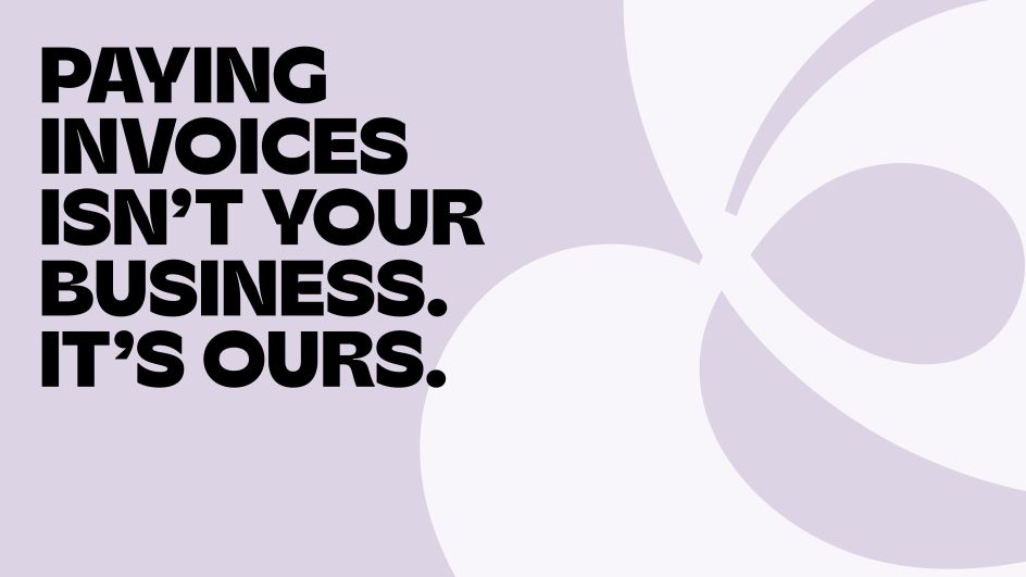
Credit: Opening Line / Outsiders / Apron
Credit: Opening Line / Outsiders / Apron
Credit: Opening Line / Outsiders / Apron
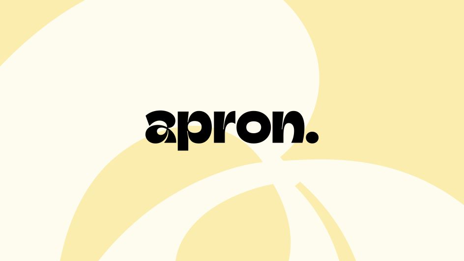
Outsiders' Rogers says "the cherry on top is the logo." Inspired by the brand name, the 'a' represents the tying of the knot while putting on an apron and getting ready to get to work. "It's our little montage moment: get your apron on and get going."
Altogether, the brand evokes action and momentum by communicating the value of what Apron can help people to achieve. Rogers summarised the transformation: "We flipped payments from a pain to a positive, a barrier to a booster, by painting a picture of how they can be harnessed to unlock greater gains. It substantially differentiates the brand from competitors and brings a new narrative to staid fintech messaging." Apron, Swidlicka adds, has been successfully elevated to a "critical cog in the small business machine. Not just one in a million other fintech solutions."
The new Apron identity and position are now live across the company's website and social media profiles, with much more to come.