Be Equitable by For The People
Opinion by Thomas Barnett Posted 8 February 2024
There are many kinds of rebrand. There are rebrands that tread lightly, reverently refining and polishing what is already there, like archaeologists delicately exhuming sunken lucre so that it can once again gleam (National Portrait Gallery). Then there are rebrands that are a little more decisive in their handling of the raw materials—imagine our similetic Time Team creatively re-assembling the fragments of a shattered mosaic, forming a new design that yet remains contiguous with the past. And finally, there are those bold, swaggering rebrands that take a righteous sledgehammer to the dusty, crusty, musty old bits of pottery they find, and instead build something entirely, gloriously new amongst the rubble.
For The People’s rebrand of Be Equitable (formerly Cook Ross) belongs decisively to this latter category. That parenthetic ‘formerly’ is so emphatic that I am tempted to embolden, italicise and underline it whenever it is used in this article, but I would never put my editor through such an ordeal.
For The People (FTP) were brought in at the behest of Michael Leslie Amilcar, Be Equitable’s new Owner and CEO. As an Afro-Latina and former Cook Ross employee of over 16 years, Amilcar’s brief to FTP was “to help evolve the business from a company named after two white practitioners…to one that celebrated a truly diverse and passionate collective of individuals, dedicated to doing the work.”
Because of what I am about to say, I wish to offer this perfunctory, yet sincerely meant, caveat: as an organisation, Cook Ross did some pretty cool things. Over the past thirty years, they’ve developed a reputation as leaders in unconscious bias training; a program developed by their founders. They’ve offered consulting, strategy and training services to clients like NASA, Nintendo, Oracle and Verizon, helping these mega-corporations realise the power of difference and cultivating more equitable workplaces. This is a deeply decent line of work.
However, Cook Ross, in design terms, was a visual dumpster-fire. Unnecessarily italicised typography? Check. Ivan Ooze-approved palette of far-too-many drab purples? You bet. Stock images of men-at-desks? Yes, yes yes. Nightmare-fuel #diverse illustrations? Bingo! It is increasingly rare for design case studies to include ‘before and after’ images (it’s passe, and why would you want other peoples’ gross work icking-up your gorgeous web page?), but in this case I can understand why FTP chose to allow themselves this slightly smug indulgence. The vast gulf between what came before and what came after hammers home that point that the inception of Be Equitable, more than merely a visual rebrand, was a complete and spectacular about-turn in positioning and corporate raison d’etre.
Nowhere is this more apparent than in the name change. This is ‘‘practising what we preach’ done with gleeful zeal, dethroning two white men in favour of an activistic statement of challenge and change; it is a gauntlet thrown down to a complacency everywhere. BE say “we wanted to ensure that the name spoke with meaning and purpose, that without much explanation the name gave clear expression to the work we are deeply committed to. We also wanted the name to be human, personable and inviting”. The name also neatly abbreviates to the same two letters that make up its first word, allowing BE to use a condensed version of their name and logo with great authority and versatility.
![]()

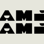
BE’s brand font is Be Martin, designed by Washington-based typographer Tré Seals. This authoritative gothic sans serif is a variation on “Martin” – also developed by Tré. The original Martin was inspired by the ‘I AM A MAN’ posters carried during the Memphis Sanitation Strikes of 1968 and is named after Martin Luther King, who was assassinated the night after delivering a speech in support of the cause. For BE, Seals also developed a set of ‘expressive’ alternate glyphs that ingeniously merge the proportions and profile of Be Martin with the undulating, elastic forms of Edward Ubiera’s illustrations (we’ll get to those shortly).
BE Martin is supported by a Erode, an satisfyingly spiky little serif designed by Nikhil Ranganathan (the name is nothing to do with erosion, but rather is the name of a city in Tamil Nadu, India), and Pretendard, a perfectly nice, multilingual Neo-grotesque from South Korean typographer Hyung-jin Kil. The former has a lovely textural interplay with the tall, sheer blocks of BE Martin in FTP’s case-study, but is strangely absent on BE’s website. With Pretendard carrying the entire supporting role on the website, things run the risk of looking a little too smoothly geometric — the delicate serifs of Erode really do add just the right amount of texture to hook the eye when used for body copy alongside those huge headers set in BE Martin’s monolithic strokes.


Accompanying BE Martin in any number of ingeniously simple layouts are a series of Illustrations derived from sketches by New York based artist, Edward Ubiera. The undeniable artistry of these beautiful, powerful, idiosyncratic forms elevates the BE brand to new heights for the D&I industry . The illustrations are organised into simple categories ‘heads’ and ‘bodies’, allowing a flexible range of applications as backgrounds, containers, layout elements and iconography. Brandon Brown, Be Equitable, creative collaborator comments that the illustration vocabulary “almost feels ancestral. It has this feeling that there is history to what I’m looking at…You’ve tapped into something for a brand that a lot of people don’t dig deep enough for.”
The history and humanity encoded in Ubiera’s eloquent forms is also the perfect counterpoint to the stridency of the typographic approach. FTP acknowledge that they “initially drew upon the history of activism, taking cues from protest posters and grassroots publications”, but they reflect that “whilst these styles matched Be Equitable’s outspoken and courageous attitude, they didn’t reflect the compassion and warmth that made working with them so special….we needed to instil a sense of optimism for what could be”.
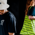
FTP’s “earthy, organic colour palette” provides more of this warmth and humanity. Describing colours as “skin tones” is a vexed issue, but the range of muted pinks, browns, buffs, tans, oranges intuitively captures the beauty of diversity in this complex harmony of colours. The palette is given some piquancy by a trio of vibrant, mossy greens, and given breathing space with two neutral tones and plenty of chalkboard-y ‘Off-Black’. The versatility of the palette is shown off in the endlessly pleasing combinations of colours used across FTPs gorgeous layouts—the muted, pollen yellow is particularly urgent when paired with off-white and off-black.


Reading between the lines of FTP’s case-study, something interesting begins to emerge. FTP helped BE find their own voice with spectacular results, but in the process they were also compelled to reflect on their own language and practices. Before-and-after images may be uncommon in design case-studies, but FTP include something rarer still: the phrase ‘learn from our mistakes’. Mistakes? In a case-study?!
FTP reflect that “this process reminded us of our responsibility as storytellers and required us to pay careful attention to the nuances of our language…we worked closely with Be Equitable to learn from our mistakes and ensure our stories were always a force for good.” It is rare for an agency to so openly embrace such a symbiotic relationship with a client, but it has undoubtedly paid dividends in the resulting work.

BE’s new identity strikes an extremely bold pose amongst a sea of bland D&I consultancies, but its not posturing purely to differentiate. FTP’s work strikes a delicate but potent balance between outspoken social justice activism and constructive professionalism. In FTP’s neat phrasing, it is “an identity shaped by adversity, built on optimism”. It is also evidently one that has arisen from a deep mutual understanding between client and agency, tailored with great precision to communicate a bold new direction.