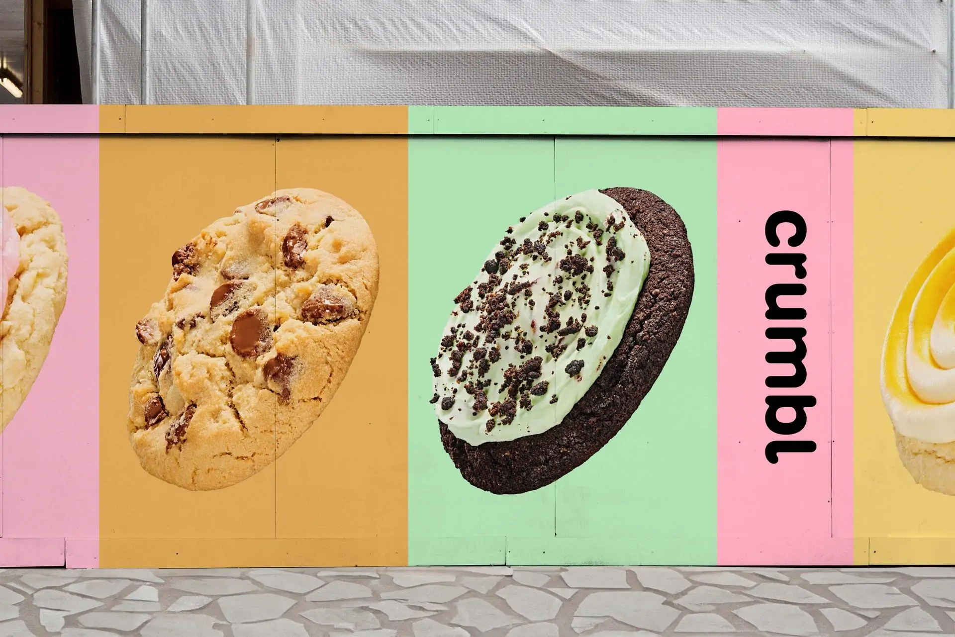
Crumbl by Turner Duckworth
Opinion by Emily Gosling Posted 16 April 2024
While we speak the same language, the cultural differences between us here in the UK and our pals in the US can feel vast. There’s pavement vs sidewalk, fringe vs bangs, ‘flavour’ vs ‘flavor’. There’s also biscuit and cookie – though where we draw the line between the two is another debate for another time. And seemingly at the forefront of the cookie store world across the pond is Crumbl. I’d never heard of it, but since its founding in 2017 the brand has a whopping 918 stores across the US and Canada (as of September 2023). And according to Turner Duckworth, which recently rebranded the company, Crumbl has ‘grown into an international fan favourite’.
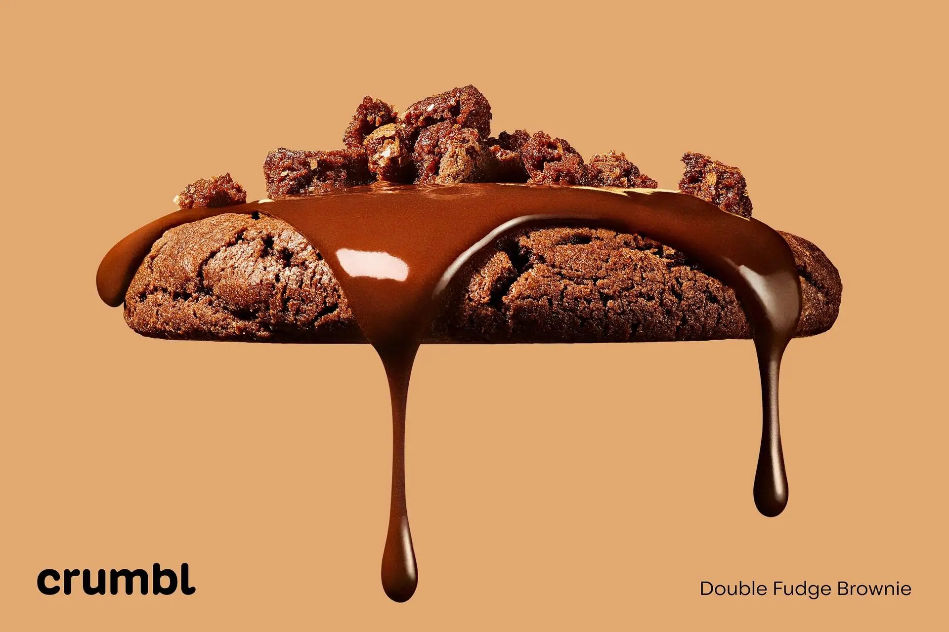
Crumbl was founded by two cousins who, as the brand’s own legend has it, embarked on a ‘perfect cookie quest’, trying out countless recipes to land on the ultimate milk chocolate chip. A year after opening their first store in Utah, Crumbl began to operate a menu that rotates weekly, but always offering that ‘perfect’ choc chip variant. Over the past six or so years, the brand had scaled rapidly, but its identity hadn’t, so Turner Duckworth was brought in to help reinvigorate a brand that had ‘lost touch with its unique personality and delicious product’.
Since much of Crumbl’s success is said to be down to its social media prowess – the brand has more than seven million followers on TikTok and over four million on Instagram – it makes sense that Turner Duckworth maintained the perennially screen friendly brand colour, ‘millennial pink’.
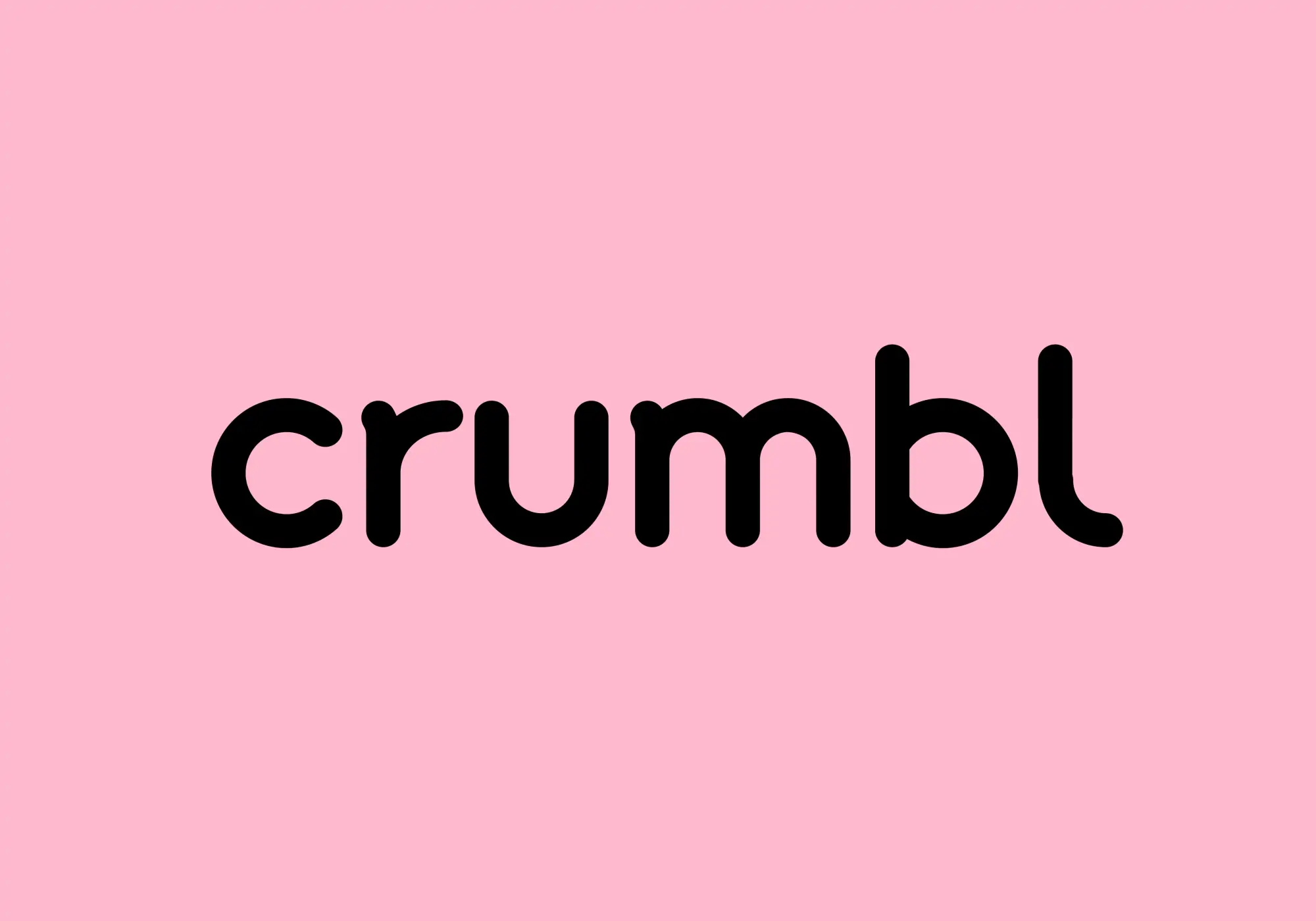
In fact, a fair few elements of the previous branding have been retained; but Turner Duckworth’s revamp certainly makes everything feel a lot more fresh, slick, and modern. Where the former logotype read ‘crumbl cookies’, the agency dropped the ‘cookies’ (and its former, rather terrible ClipArt-ish chef device) but retained the all-lower-case thing. It’s a shame, really: what does everyone suddenly have against proper nouns?
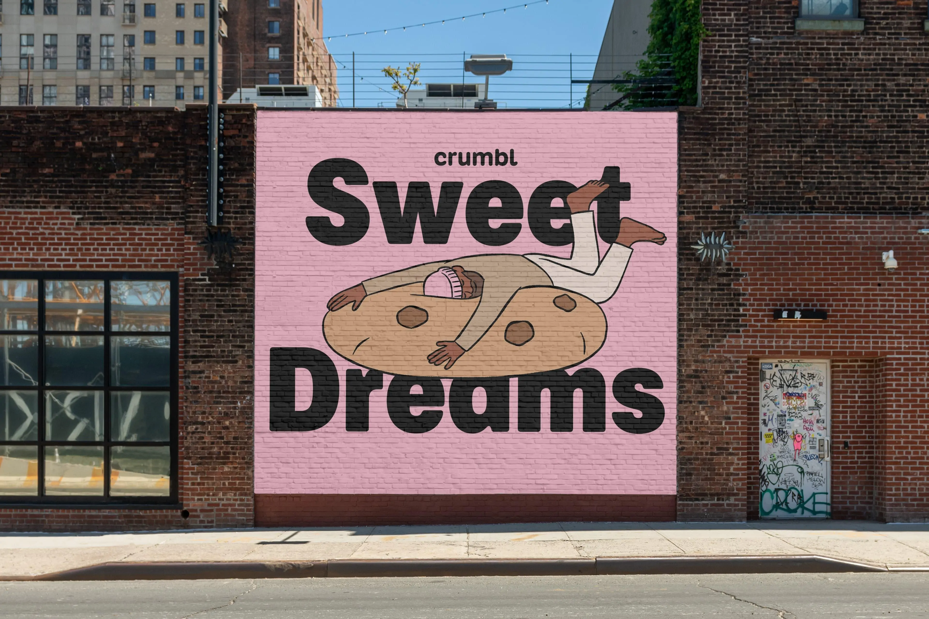
Alec Tear was brought in to help Turner Duckworth redraw the logotype, which takes its softness and curves largely from the former design, but makes everything a lot more bold and punchy through thicker, more ownable letterforms. The logotype has also been extended into a standardised font, Crumbl Sans, a customised variable typeface that ‘effortlessly shifts from delightful to delectable…from pixel-perfect utility to bold sensory sensations’, as Turner Duckworth puts it. German type foundry Kilotype was brought in to work on the font, which spans all brand touchpoints from posters to social.
The fact that Crumbl Swag is a variable font makes it perfect for motion design applications: it’s wonderful to see the letterforms morphing gloopily from straightforwardly legible to powerful display lettering. The type looks just about ready to melt – a very fitting aesthetic for a company that serves freshly baked cookies.
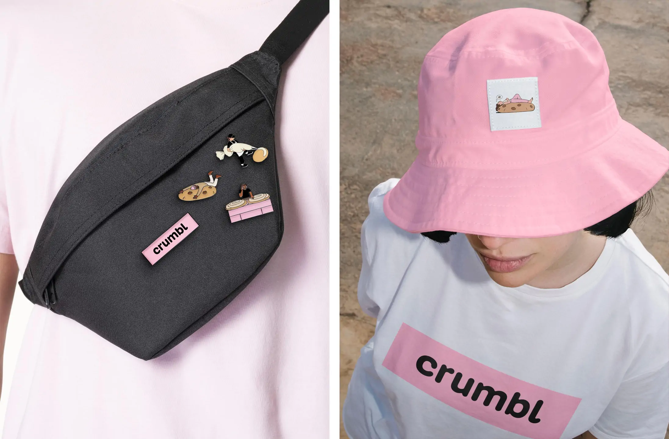

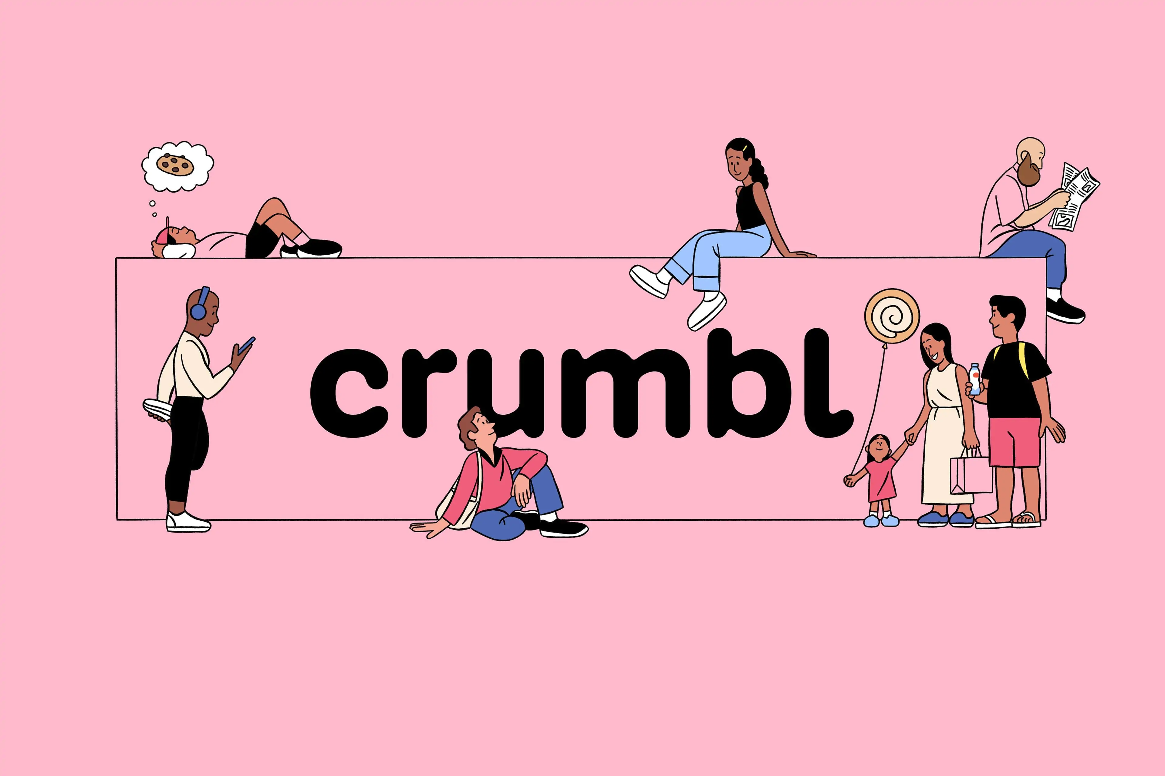
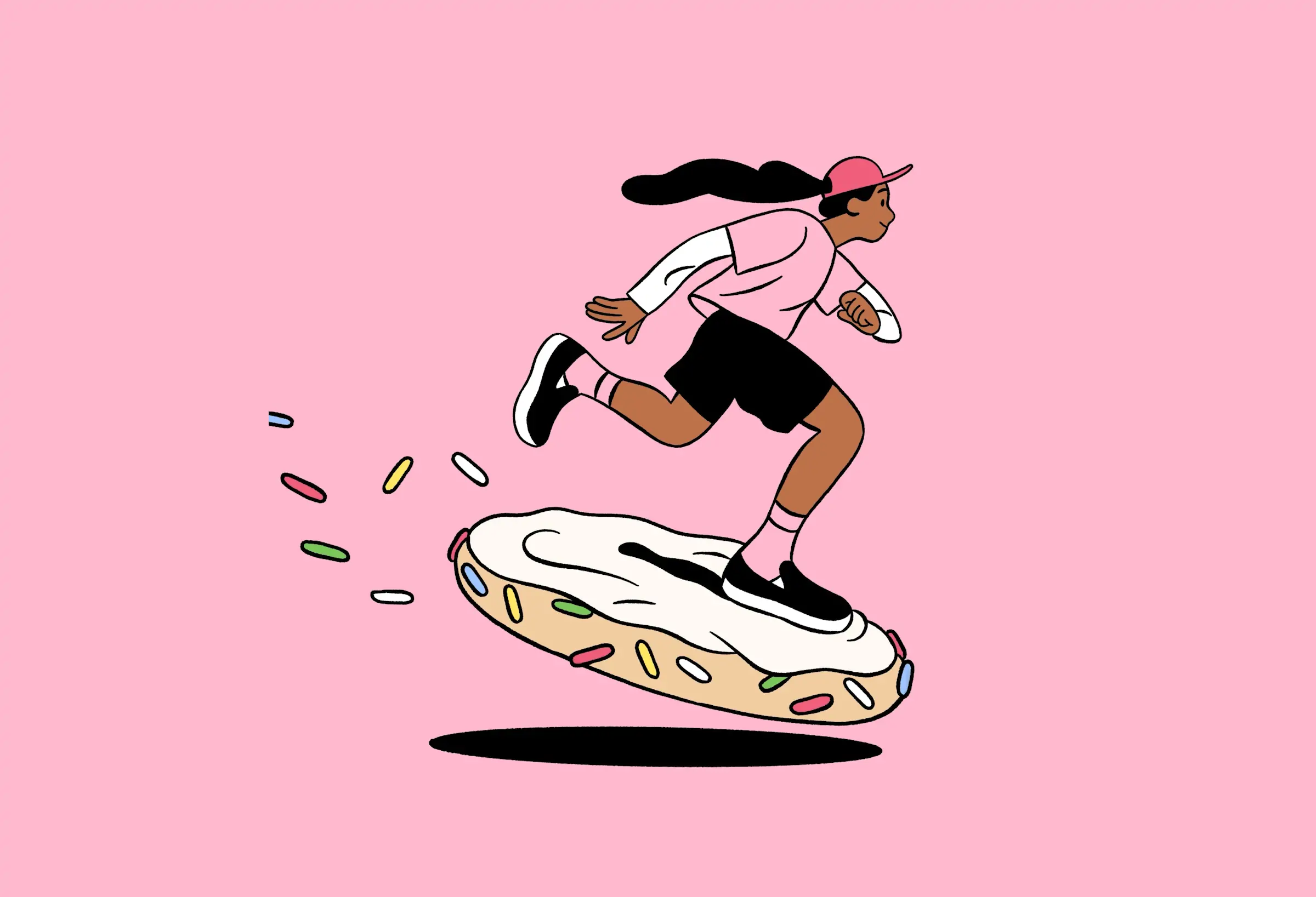
With this being 2024, naturally there’s no shortage of Crumbl merch to show off the new designs, too. There’s the bucket hat that’s so beloved by Gen Z and so baffling to those ‘there the first time round’; t-shirts, and even skateboard decks. But in fairness to Crumbl, its fabulous new suite of illustrations (rather cringeily dubbed ‘the crumblverse’) deserves to be plastered around liberally. Created by BUCK, the thick black linework, stark flat colours and playfulness of the illustrations is great, and really adds to the feeling of a brand that’s coherent, confident, but true to its roots.
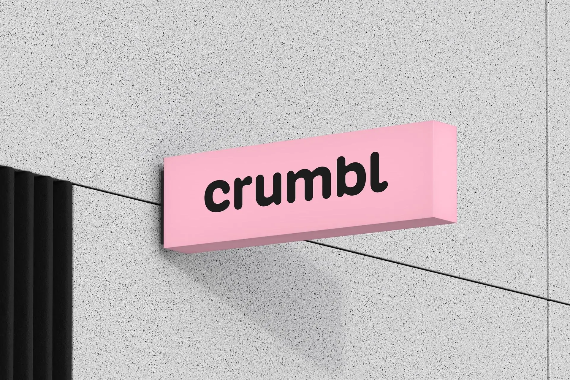
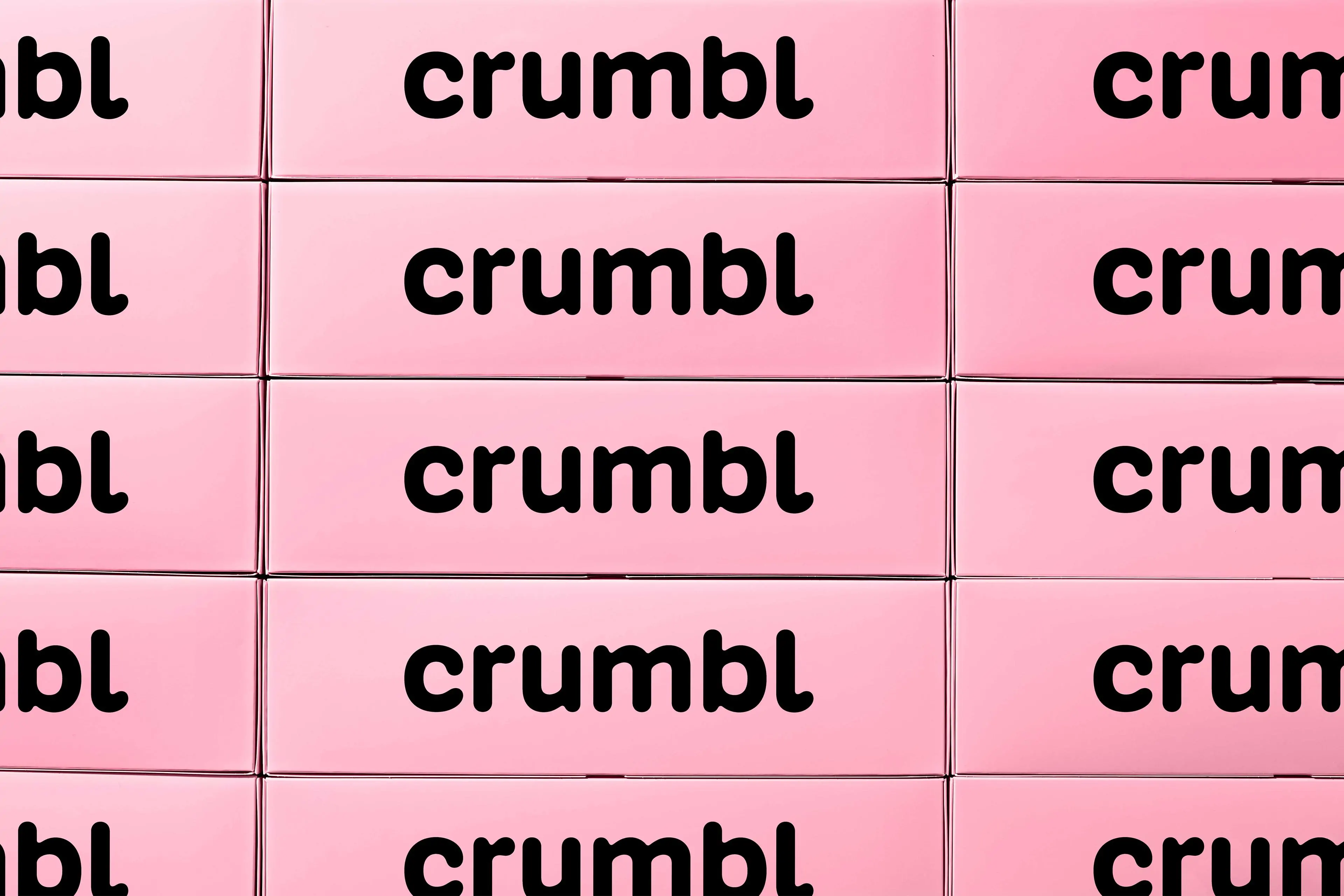
Another key element that Turner Duckworth wisely carried forward is the ‘famous pink box’. The original four-pack (Crumbl now offers six and 12 packs, too) was designed by Crumbl’s cofounder and COO Sawyer Hemsley with his classmates while still at Utah State University, according to Turner Duckworth, the brand’s ‘unique, oblong-shaped box’ was the ‘first of its kind’. That USP combined with the signature Crumbl pink ‘make it recognisable and Instagrammable, perfect for posting that sweet Crumbl review, boomerang, or photo on social media!’.
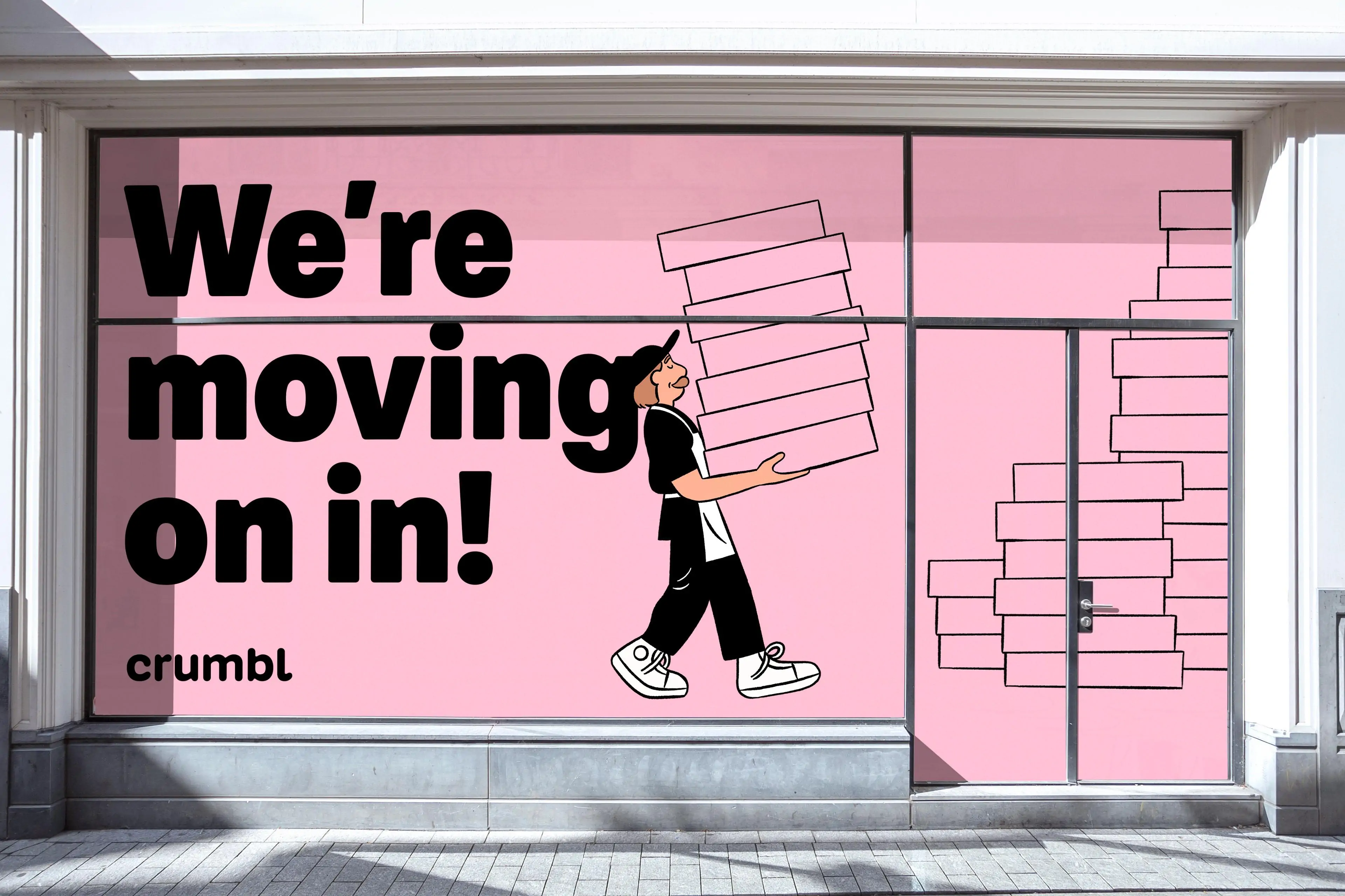
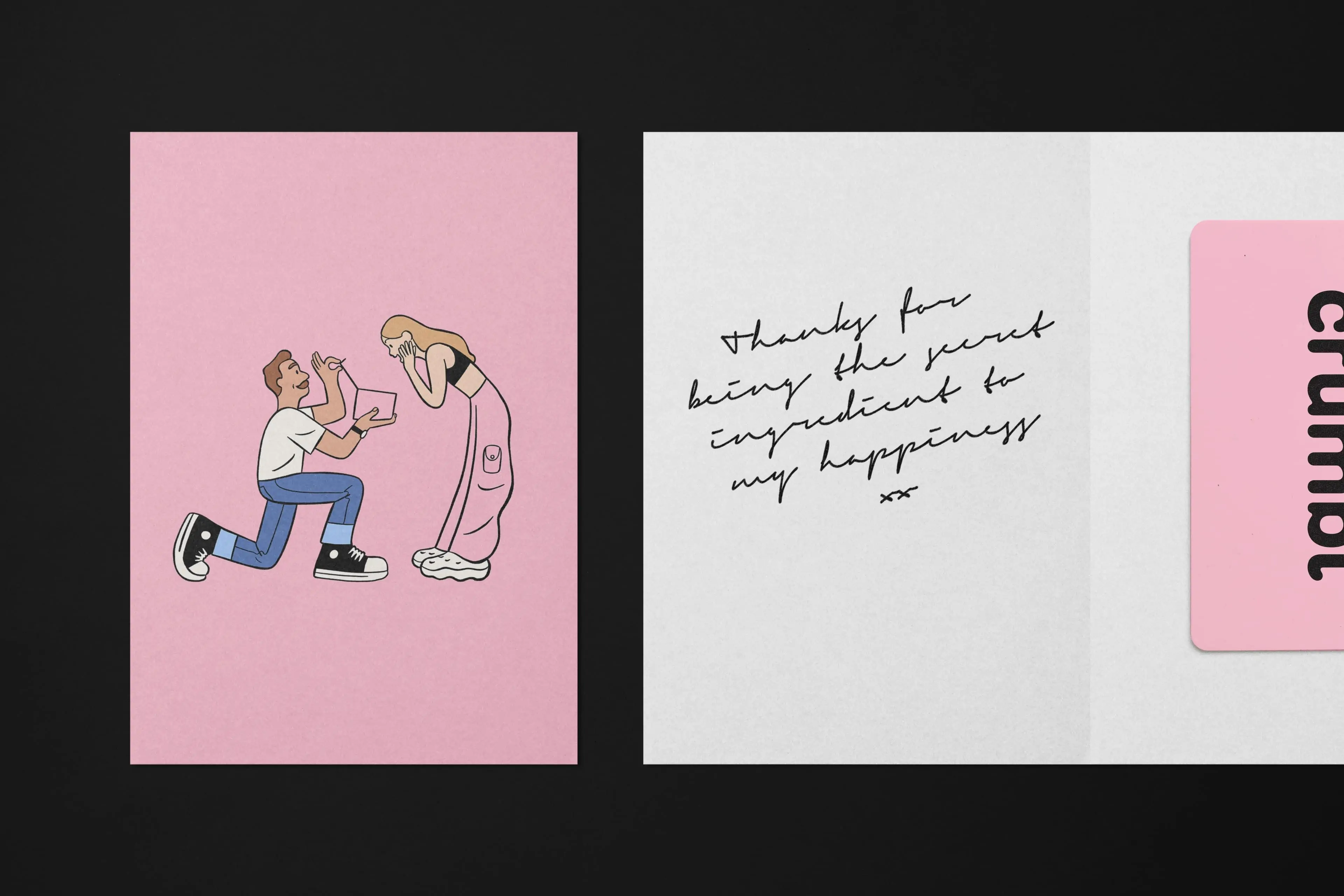
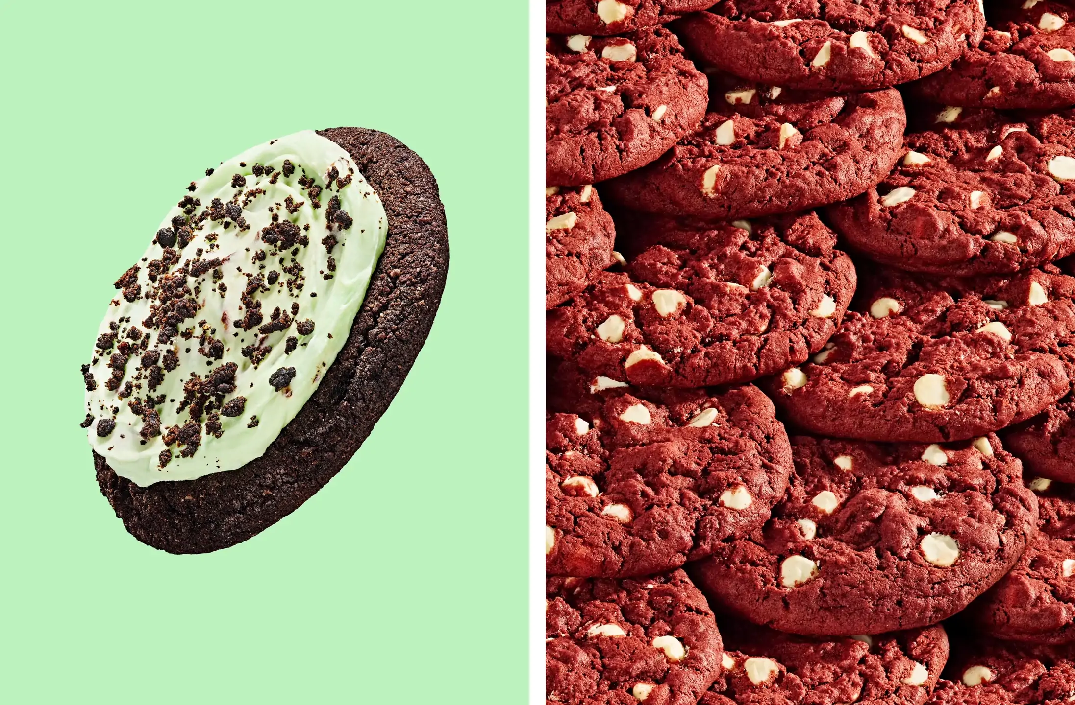
It’s easy to be sniffy about brands that are so obviously designed for the ’gram, but in 2024, that level of snobbery is both unhelpful and misguided. Cadbury has its purple, Tiffany its blue and Crumbl its pink – the tone that just so happens to perennial fly online. If a brand does deliberately court the influencer circle, so what – if the rest of the identity (in this case, things like those illustrations, superb new brand photography, and structural packaging) is well-crafted, client-appropriate and just downright aesthetically pleasing? In cases like that, surely deliberate Insta-worthiness is fine.
With Crumbl, it’s more than fine – this is a gorgeous identity which instantly does exactly what its meant to do: fire up your sweet tooth and instantly make you crave the brand’s delicious-looking doughy wares.
Discover more Crumbl brand assets, plus assets from many more brands at Brand Archive.
