Blue Mountains by For The People
Opinion by Thomas Barnett Posted 5 March 2024

The Blue Mountains of New South Wales, Australia are not technically mountains at all. They are, rather, a complex labyrinth of dissected plateaus, gorges and valleys of sandstone, formed over 50 million years ago. So far, so deceptive. Fortunately, however, the Blue Mountains are most definitely blue. When the atmospheric temperature of the region rises, a superfine mist of fragrant oil gently evaporates from the eucalyptus trees that carpet the valley, dispersing into the air. As sunlight hits this aromatic haze, the visible spectra of light scatters, propagating shorter wavelength colours more than longer ones, enveloping the ‘mountains’ in an illusory lapis gauze.
Yet despite this magical, multisensory allure and generations of popularity with tourists, there remains an under-appreciated aspect of the 3,000km2, UNESCO World Heritage designated park. While the iconic Three Sisters rock formation is world renowned, less well-known is the community of 26 villages scattered across the plateau, and the rich local culture. Which is why Blue Mountains Tourism, in conjunction with Blue Mountains City Council, approached their antipodean compatriots For The People to devise a distinctive new place-making identity for the region.

In its case study, For The People names a third collaborator and commissioning partner: the local community. For The People observes that within the spectacular natural landscape, there is also ‘a creative and inclusive community that doesn’t concern itself with what’s on the surface. From the layers of its landscape, to the spirit of its locals – the Blue Mountains is defined not by its height, but by its depth’.
From this new perspective, the core brand idea is derived: ‘Run Deep’. Through extensive workshops and one-on-one interviews with residents, business owners, local creatives and visitors, For The People developed an identity that brings their stories (and the stories of the land) to the surface.


Throughout this identity, the distinctive beauty of the landscape is balanced with the personality of the people that inhabit it. Perhaps the best example of this is the close unity of copywriting and typography. The joyous, lively copy pulses with life, vividly conjuring that ‘creative and inclusive community’ in a way that makes you deeply envy anyone who can call the Blue Mountains home. To unify landscape and inhabitants, this expressive copy is set in Avara, an ingeniously ‘curveless’ font from French multi-disciplinary artist, sculptor, designer, performer, teacher and software engineer Raphaël Bastide (seriously, if you check out one portfolio today, make it this one). Avara’s angular forms perfectly evoke the jagged edges of the Blue Mountains’ sandstone and basalt escarpments. In this combination of copywriting and typography, we feel the very geology of the landscape animated by a warm human voice.
![]()
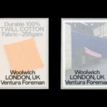
The logotype, while not set in Avara, borrows some of its proportions and wedge serif details to harmonise with the surrounding typography. Cleverly, the ‘B’ and ‘M’ are ninety-degree rotated versions of each other, creating a pleasingly symmetrical lettermark when abbreviated. There are three variants of the logo: the full wordmark, the abbreviated version, and an intermediary ‘Blue Mtns’ that is used in communications primarily aimed at locals, to foster a sense of informality.

Unsurprisingly, the palette revolves around various bright, dark and powder blues, along with shades of dark and pale eucalyptus and fern greens. However, the palette is complicated to gorgeous effect by a bright pollen yellow, a hazy lilac and volcanic reds – the latter is perhaps a nod to the pyroclastic flows that once covered large areas of the mountains in basalt, most of which has now worn away. These contrasting hues are combined with consummate painterly skill, adroitly conjuring the potent and peculiar beauty of a landscape that is somehow simultaneously rugged and delicate. Soft, noise-flecked gradients complete the intensely place-centric approach to colour by conjuring the optical effects of the region’s namesake eucalypt haze – as For The People puts it, ‘revealing a world that appears from out of the Blue’.
The enormous diversity of habitats and landscapes contained within the Blue Mountains is evoked in a series of patterns that can be used to create borders or filled shapes. For The People developed a ‘dynamic patterning system’, a simple tool that allows near-endless customisation, ‘so that each engagement with the brand is as unique and ever-changing as the environment’. These undulating, crenellated borders are used to particular effect in signage, combining with the geologic all-caps of Avara to create a kind of classic outdoorsiness that is hearty, rather than kitsch.


The wobbly, undulating forms of the patterns are picked up in some surprisingly lovely illustrations-slash-iconography. I say ‘surprisingly’ not as a back-handed compliment, but because by this point in this incredibly thorough, thoughtful, cohesive project, one really isn’t expecting any further treats. It is testament to For The People’s indefatigable compulsion to inject charm into every single detail that these sweetly giddy little doodles are self-effacingly ushered in with barely a mention in the case study text. Yet they are lovely, and I suspect they reflect the influence of the illustrations created by Edward Ubiera for For The People’s identity for Be Equitable (reviewed by me for BP&O last month).


Together with the wiggly patterns, the ‘icollustrations’ are deployed with devastatingly charming results to adorn a collection of Blue Mountains knitwear that I fervently hope exists in the real world, and not just in the layers of some fiendishly complex Adobe Photoshop/Dimension mockup file. I’ve used this writing gig to shamelessly beg for brand merch before, and I’ll do it again. For The People, I’ll take one cute woollen beanie, two pairs of boot socks and the green colourway of that Fair-Isle-style jumper (size Men’s Medium). Please ship to [REDACTED BY EDITOR].

If, after such a mortifying display of venality, I may return to more a straight-faced analysis: in its careful acknowledgement and privileging of local voices (and in this case, especially the Ngurra (Country) of the Darkinjung, Darug, Dharawal, Gundungurra, Wanaruah and Wiradjuri aboriginal peoples on whose land the Blue Mountains National Park sits), For The People lives up to not only its aim to craft place brands that are ‘locally grown and locally owned’, but also to the grander historical resonance of its own studio name, ringing as it does with echoes of Lincoln’s invocation of a better, brighter, fairer world just beyond the (blue) horizon.