'We have to bring the audience on the journey with us': How The Guardian approached its biggest redesign in a decade
The newspaper has a brand new homepage and app design.
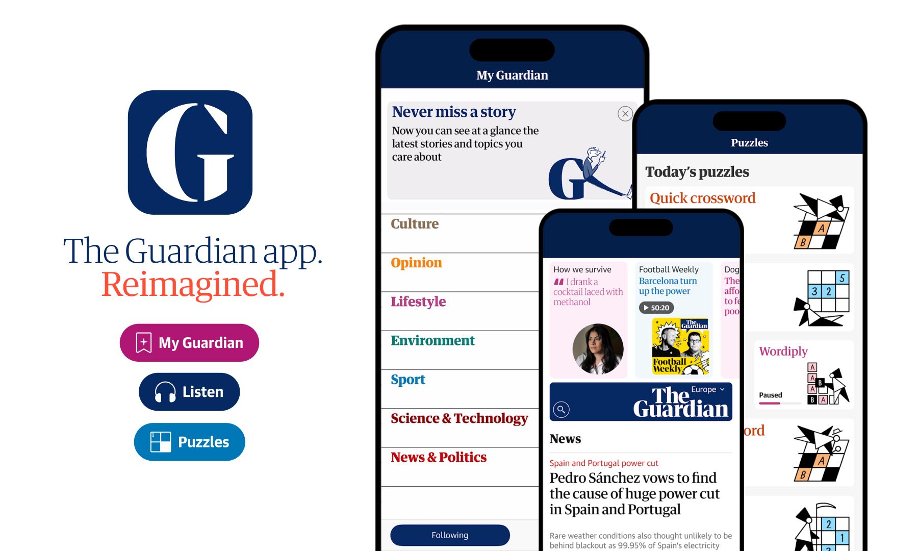
Earlier this month, UK newspaper The Guardian launched a major refresh of its mobile app alongside a redesigned homepage. In order to deliver a more engaging, personalised and seamless digital experience for readers, the team created a new homepage for both the app and website that's designed to be less overwhelming and more curated.
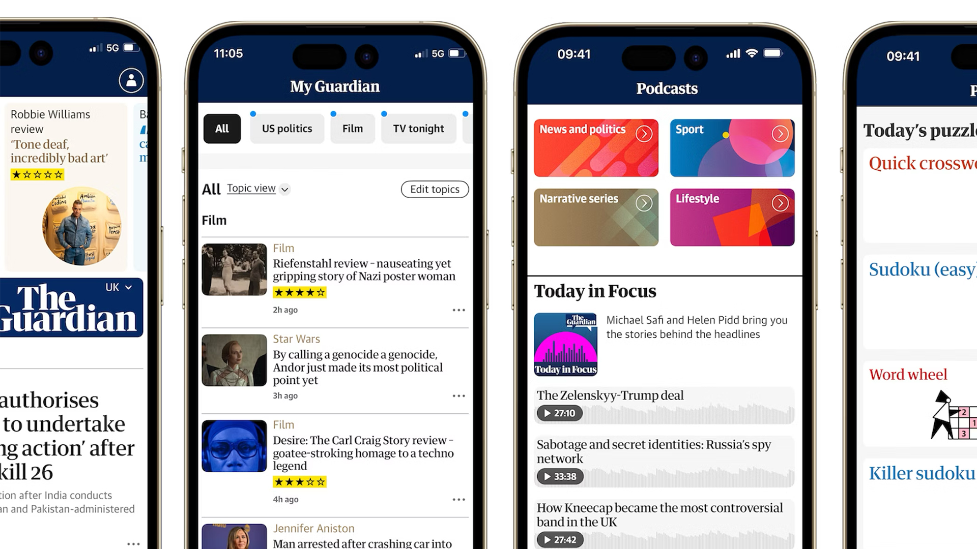
The new Guardian app features a redesigned and streamlined My Guardian tab, a dedicated Audio tab, and more puzzles. Meanwhile, the new website homepage puts mobile first, since The Guardian claims 75% of its digital audience visit via a mobile device. Perhaps the most notable addition here is a new masthead highlights bar designed to showcase more journalism and non-new content.

We caught up with Jonathan Haynes, head of digital (platforms) at The Guardian, to find out more about the design refresh. If you're looking for more web design inspiration, take a look at our roundup of the best web design tools.
What drove the decision to redesign the homepage and app?
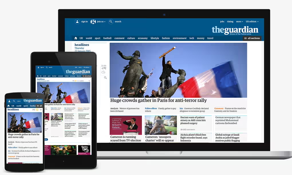
Our last major redesign was in 2015 and since then website design and our understanding of user experience has evolved considerably. Back then our aim was to build a responsive site and our priority was to make things work for both mobile and desktop.
In 2025, we recognise that our audience is in a different place, with 75% of our digital readers visiting us daily using a mobile device. Our mobile app is a premium product and its users are also among our most dedicated audience, with one million people using it daily. That’s why we set out to prioritise the best possible mobile experience. Editorially we also wanted to show the full breadth of the Guardian’s features, opinion, sport, lifestyle and culture journalism, while visually making this more appealing and engaging.

What are the main challenges of redesigning an interface many people visit daily?
The Guardian as a brand has a very loyal audience, who care deeply about our journalism and how we serve it to them. This isn’t a challenge as such, but it means that any time we make a change like this, it’s important to bring the audience on that journey with us. There were lots of challenges with the redesign along the way, we were working with our existing structures - and essentially had to bring two different platforms - web and app - together and unify them. We wanted ‘a big bang moment’ to showcase the improvements we made and new innovations, but also wanted to make sure that the experience still felt familiar for our users. We began making design changes late last summer, to fonts and background colours on the platforms which then let us build the more complicated areas of the new design while still supporting the existing site and app. This allowed us to change the experience in stages so that users could adjust as we went along.

What was the rationale behind placing stories above the title banner in the new design?
The new masthead highlights bar is designed to showcase more of our journalism. The linear structure you usually need for mobile means placing news at the top, but then you are in danger of looking like you’re only about news. On desktop you can solve this in other ways, our pre-2015 desktop site did this with two columns - one news, one not - a design that many publishers use, but that doesn’t work for mobile. So we decided to create a space at the top that showcases more of our journalism, but also doesn’t take attention away from the news. We experimented; putting the bar below the titlepiece and directly above the news didn’t work as it looked and felt really confused. Putting the bar above the titlepiece allowed us to show readers, with a quick glance, that we have real depth and variety of journalism, while still giving the familiar experience of a news splash directly below the titlepiece.
What do you think is the key to holding users’ attention amidst so much competition in 2025?
The simple answer here would be the quality of the journalism, but that’s only half the story. Most of the apps and websites that people use in their daily lives are visual and vibrant and that’s a language people have come to expect. As a media organisation we need to be serving our audiences with experiences they recognise and enjoy. Part of this redesign was about making the homepage more engaging in itself, rather than as simply an index from which to access content.
At the Guardian, we’ve been lucky that we built a destination site early on and have always had a huge proportion of our traffic come to us directly. With the way AI is evolving search, destination homepages and apps become even more important and so we want the homepage experience to be the best it can be.
This redesign is the first part of an evolution that will continue with adding many more ways to consume our journalism directly on the homepage. In the mobile app, other experiences like the personalisation we offer in My Guardian, our puzzles and podcasts give users more reasons to come back and spend time and we will continue to improve those features and offerings.

Did audience feedback influence the design, and if so how?
Yes, very much so. We ran qualitative user research before and during the redesign and ran two beta tests with a small portion of our audience to validate and adapt as we went along. Part of the redesign is to introduce structure with primary and secondary sections, the primary ones offering big display options to show off our very best journalism, and secondary ones offer a higher information density to satisfy reader needs. In early iterations of those we tried to be very dense and very text-heavy to convey a lot of information with a minimal footprint. This is something that one or two readers will always crave, but the overwhelming user feedback was that this was boring and it needed more images and visuals, so we adjusted accordingly. We also tested extensively to understand our own audience of editors. We were building an experience, we wanted to be able to express the journalism and have a design that bridged editor and audience needs.
Will you be continuing to iterate on the design over time?
We will. We’re going to be bringing video loops to homepages in the very near future, we also have plans for evolved slideshows for richly reporting stories directly on our homepage. Video and visual work is always a big technical challenge especially when working across multiple code bases and with the different sets of native interactions, but it’s become a key part of how most people consume media. We also want to be able to better showcase data and graphical information and we’re going to be adding features too to the other parts of the app. We have the ability to listen to articles now and in time we’ll build a playlisting for that. There’s so many exciting ways to improve user experiences and get more of our journalism to more people, this is just the start.
Get the Creative Bloq Newsletter
Daily design news, reviews, how-tos and more, as picked by the editors.

Thank you for reading 5 articles this month* Join now for unlimited access
Enjoy your first month for just £1 / $1 / €1
*Read 5 free articles per month without a subscription

Join now for unlimited access
Try first month for just £1 / $1 / €1

Daniel John is Design Editor at Creative Bloq. He reports on the worlds of design, branding and lifestyle tech, and has covered several industry events including Milan Design Week, OFFF Barcelona and Adobe Max in Los Angeles. He has interviewed leaders and designers at brands including Apple, Microsoft and Adobe. Daniel's debut book of short stories and poems was published in 2018, and his comedy newsletter is a Substack Bestseller.
You must confirm your public display name before commenting
Please logout and then login again, you will then be prompted to enter your display name.
