Kikin by Koto
Opinion by Anna Marar Posted 16 May 2024

When you think about the world of financial investments, an image of woven Scouts’ patches isn’t typically the first thing that springs to mind. Other contemporary brands (like Monzo, Chip, and Plum) aim for visual simplicity over complex personality development or extended world-building. But while a rugged outdoor theme might feel incongruous in the fin-tech space, Koto has skilfully capitalised on this contrast to create an identity for Kikin that feels startling and original.

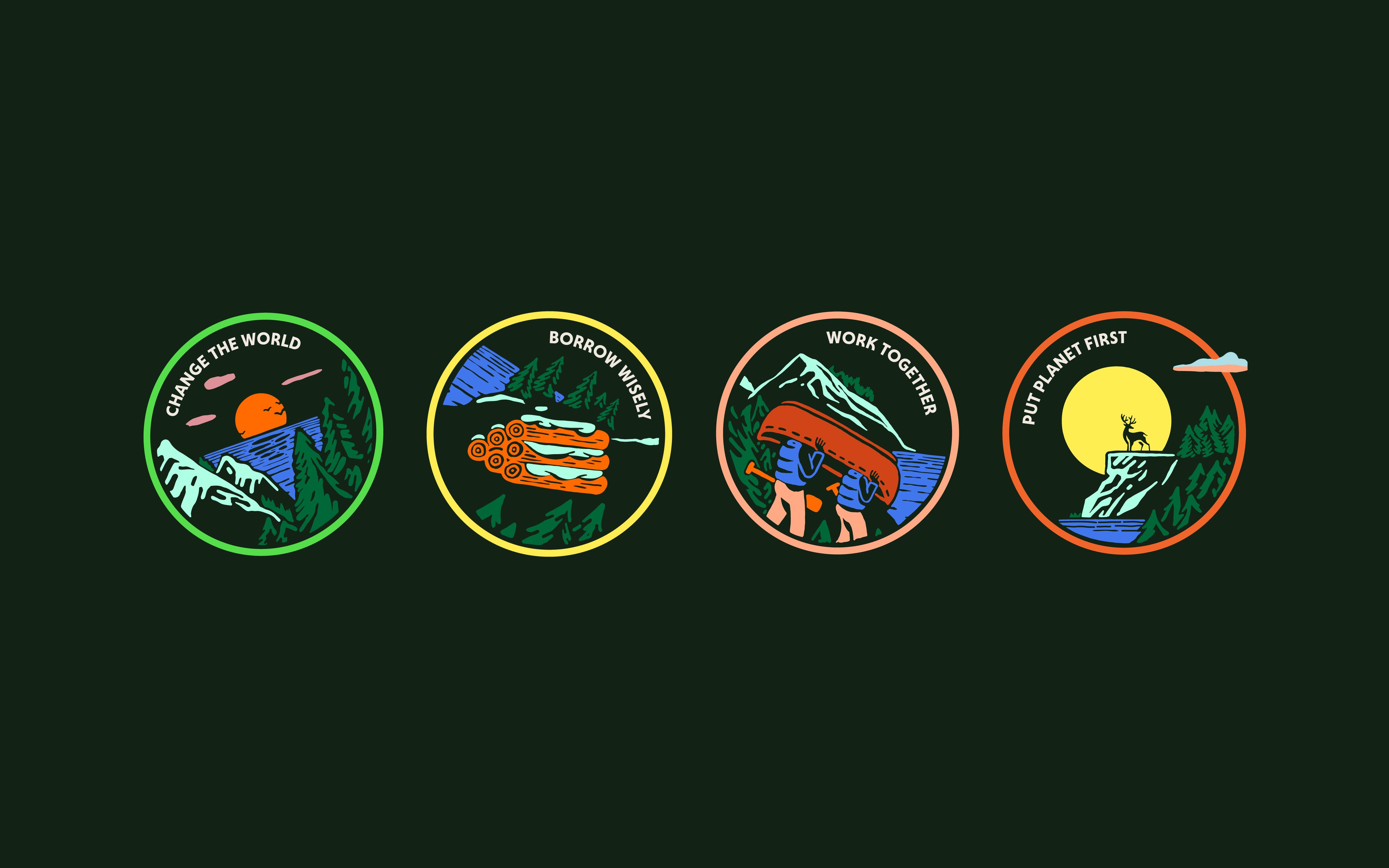
Kikin, a new digital finance platform, helps businesses to make environmentally conscious decisions ‘that are good for people and planet’, and so Koto was inspired to draw inspiration from brands that ‘put the outdoors first and make you want to be a part of the community’. This led the studio to create a set of vibrant illustrations recalling outdoor clothing brands like Patagonia and North Face, which are combined in a system of woven patches echoing the visual language of achievement associated with youth clubs like the Scouts or Brownies.

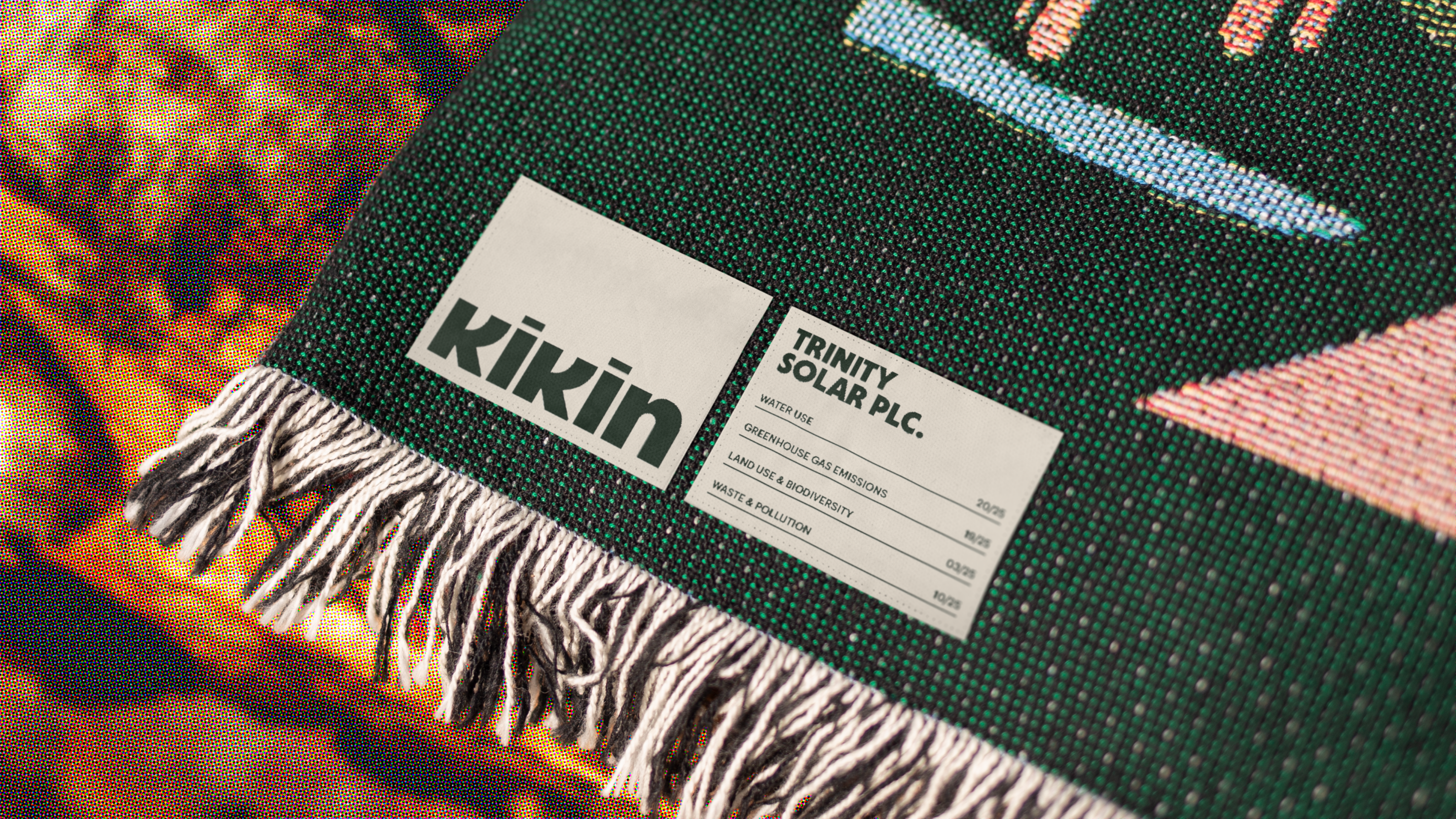
Within this theme, Koto’s use of texture is particularly successful. Incorporating elements of Lo-Fi and retro printing techniques, the stylistic treatment adds gritty warmth to the often polished shine of digital-first branding. In situ, the patches are shown on ties, shirts, blankets and bags where corduroy, fleece and waterproof canvas further emphasise the materiality of Kikin’s brand world. Each fabric, shot in sharp resolution, is cleverly chosen to evoke immediate associations with the outdoors, and the idea of ‘wearing’ brand allegiance through the choices we make. It’s brilliantly concise.

Meanwhile Koto’s approach to image treatment blends an Apple-style layering of grand natural expanses and sans serif text with the texture and intimacy of cheap print. The resulting photos have a risograph naivety to them, again adding the warmth of physical production to a digital space – a ‘humanising’ effect, as Koto calls it. Green is, naturally, the foundation of the brand palette, cleverly connecting the twin themes of nature and fin-tech with a pairing of deep forest green and bright ‘monochrome monitor’ phosphor.

The primary font is Central Type’s Deacon, in both black and bold weights – it’s then adapted to create the lowercase wordmark, and a shorthand icon. Here the letter ‘k’ is flipped, ‘becoming a character to reflect the people behind the businesses Kikin supports’ (according to Koto). I didn’t immediately get this personification, even with the quirky animation. Rather, I assumed an East Asian influence – and, with some digging, there’s actually a striking similarity between the ‘k’ and the Mandarin symbol for ‘tree’ (木). Other critics have noted a resemblance to the Japanese kanji character for ‘person’ (人). But these resemblances are, apparently, unintentional.
Nevertheless, this element isn’t strictly needed to create the approachable human-led vibe that Koto has sought to cultivate, and here the studio has succeeded, hitting the sweet spot between approachable and commercial. There’s much that feels friendly, summoning the warmth of community, but at the same time Koto has struck the right touch of formality, building an essential aura of trustworthiness for a company that deals with people’s money. The typography is sharp and tidy, while graphs and charts bring balance the illustrative scenery with formal design rigour. It’s this slight corporate sheen that allows the somewhat dissonant connection between digital financial advice and Scouts’ camp to make sense.


