How to Choose the Best Fonts for a Website
Fonts are one of web design's most important yet often overlooked elements. The fonts you choose for your website speak volumes about your brand personality and values. Typography can elicit specific emotions and convey key messages to your audience. That's why selecting the right fonts for your website should not be taken lightly.
The typography you select shapes how visitors perceive and interact with your content on a subconscious level. Fonts can convey certain emotions and associations in viewers, impact readability and comprehension, and ultimately support or detract from your brand identity.
In this comprehensive guide, we will explore the critical role of typography in website design. We will uncover the psychology behind how popular fonts influence our impressions and provide data-driven insights into how typographic choices impact user experience and behaviour on the web.
Leveraging research and real-world examples, we will provide a crash course in typography terminology, principles, and best practices to inform your website font selections. We will also recommend versatile, visually appealing font combinations that align with specific brand styles and website objectives – whether you create a fun and casual experience, convey luxury and sophistication, improve readability for long-form content, or optimise for on-site engagement and conversions.
By the end of this guide, you will understand the nuances of web typography that distinguish successful websites. You'll have the knowledge to choose and implement the ideal fonts for your brand, improve site navigation and readability, and allow your website content to make the outstanding first impression that today's users demand. Let's dive into the captivating world of web typography!
Table of Contents
The Power of Typography in Web Design

Typography is more than just picking attractive fonts to display your content. It is a vital visual communication tool that establishes your brand's tone and personality. The fonts you choose will evoke certain emotions in users, guide their eyes across the page, and convey a sense of professionalism or playfulness. Typography sets up a critical visual hierarchy, making key messages stand out while allowing secondary information to recede. It enhances readability and comprehension, with studies showing that the right fonts can boost retention by over 20%.
Conversely, poor typography choices undermine the user experience and damage your brand. Hard-to-read or inconsistent fonts frustrate users, while typographic errors convey unprofessionalism. Overly decorative fonts reduce comprehension, and inaccessible font styles exclude users with visual impairments. With 94% of first impressions based on visual appeal, you cannot afford to treat typography as an afterthought.
Every font has a strategic purpose, from classic serif body text to clean sans-serif headers. Pairing fonts requires thoughtful consideration of personalities and proportions. Leading, tracking, line lengths, styling and weighting allow for further customisation and optimisation. With endless typeface options now available, typography has become a complex craft – but one well worth mastering. Your fonts will make your brand memorable while guiding users smoothly through your content. Typography can feel mystical, but purposeful and strategic selection can elevate your website's look, feel and usability.
The Science Behind Font Choice

Understanding Cognitive Fluency
The ease with which we process information, and cognitive fluency, substantially impact our experiences and perceptions. This concept is critical when considering font choices, as the legibility and familiarity of a font directly contribute to its cognitive fluency. Research has shown that fluent fonts, which our brains can parse quickly and easily, lead to more positive assessments of information. On the other hand, disfluent fonts that are difficult to decipher may frustrate users.
Fluent fonts enhance the user experience by allowing seamless reading comprehension when designing websites and other interfaces. Visitors can extract information from text written in an eloquent font with minimal effort. This will enable them to focus their attention on the actual content rather than struggling to decode words and letters. In contrast, less legible fonts force users to expend cognitive resources on the reading process, diverting their attention from the information.
Beyond legibility, a font's familiarity also impacts fluency. We have built up recognition of standard fonts like Arial or Times New Roman over years of exposure. Because these fonts are so well-known, they allow for nearly automatic processing. Unconventional or decorative fonts, while creative, may decrease fluency due to their novelty. Even if readable, uncommon fonts require more attention to recognise each character.
When conveying complex information on a website, fluent fonts should be favoured. Arial, Verdana, Georgia, and other widespread, simple serif and sans-serif fonts are safe bets for maximising cognitive fluency. Remember that distracted or frustrated readers will likely engage with content less deeply. Ensure that your typography choices promote fluency so users can focus on comprehending the information you provide.
Legibility vs. Readability
Legibility and readability are related concepts in typography that are often used interchangeably, but they refer to different aspects of how text appears and functions on the page. Legibility pertains explicitly to how easily readers can distinguish individual letters or characters from one another. It focuses on the clarity of each glyph and its identifiability, especially at small point sizes or in unusual contexts like extreme boldness or italics. For example, a highly legible font would have differentiated forms for similar letters like “l”, “I”, and “1”, which remain unambiguous even at 8 or 9-point sizes. On the other hand, readability deals with how comfortably and efficiently a block of text can be read and understood. It focuses on features like word and line spacing, line length, and how the typeface style impacts reading flow over multiple sentences or paragraphs. A readable font and layout allow the reader to progress smoothly through the content without stumbling or needing to re-read sections.
Legibility and readability are critical for web design and online content typography choices. Legible fonts ensure that even small text remains clear and decipherable like the tiny copyright notices or footnote links often used at the bottom of website pages. Readable fonts and layouts make longer passages easy to consume, which is vital for presenting informative content to users. The most effective web typography balances both aspects – using legible typefaces and styles so that individual letters are highly distinguishable and optimal line spacing, sizes, and columns to enhance readability for extended reading. Keeping legibility and readability in mind when selecting and setting type will help create a smooth, effortless reading experience for users across short and long textual content.
Factors Influencing Font Selection

Brand Identity and Personality
Your website's fonts should align seamlessly with your brand identity. Consider the personality you want to convey: are you aiming for elegance, playfulness, minimalism, or professionalism? Each font carries its visual cues and associations. Serif fonts, for instance, often evoke a sense of tradition and sophistication, while sans-serif fonts tend to appear more modern and approachable.
Target Audience
Understanding your target audience is essential in font selection. Age, cultural background, and preferences affect how fonts are perceived. Younger audiences might gravitate towards trendy and bold fonts, while older audiences prefer classic and timeless choices. Furthermore, consider your audience's demographics – are they tech-savvy or less familiar with digital interfaces? This information will guide you in choosing fonts that resonate with your users.
Device Compatibility
In today's multi-device landscape, your chosen fonts must be compatible across various screen sizes and resolutions. Fonts that look fantastic on a desktop monitor might appear distorted or illegible on a smartphone. Opt for web-safe fonts or use responsive design techniques to ensure consistent readability and aesthetics across devices.
Categorising the Best Fonts for a Website
Serif Fonts

Serif fonts are characterised by the small lines, or “serifs,” extending from each letter's edges. They are often associated with tradition, authority, and elegance. Serif fonts are excellent choices for websites that want to convey a sense of professionalism and reliability. Some popular serif fonts for web design include:
- Georgia: Designed by Matthew Carter for Microsoft, this font has a traditional, readable serif style. It renders well on screens.
- Times New Roman: A classic serif font designed for The Times newspaper in London. It's very legible and works well for blocks of text.
- Book Antiqua: This serif font has more character than Times New Roman but is still highly readable. It's popular for both print and the web.
- Cambria: Created by Microsoft, Cambria has high legibility and works well for on-screen reading. The serifs are subtler, making them suitable for headings and body copy.
- Bodoni: A sophisticated Didone or modern serif font with high contrast between thick and thin strokes. Used sparingly for titles.
- Garamond: A timeless old-style serif font dating back to the 16th century. Classic and readable with subtle serifs.
- Baskerville: Designed in the 1700s, this transitional serif is stately and elegant. Works well for formal, sophisticated designs.
- Didot: A high-contrast modern serif named after a French printing family. Brilliant for headlines and accent text.
- Palatino: An old-style serif font with elegance and readability. Famous for many decades in print and digital media.
- Droid Serif: A contemporary serif font designed by Steve Matteson as a serif companion to Roboto Sans. Clean and very readable.
Sans-Serif Fonts

Sans-serif fonts are known for their clean, minimalistic appearance. They lack decorative serifs in serif fonts, giving them a modern and straightforward vibe. Sans-serif fonts are often favoured for their versatility and readability, especially in digital environments. Here are a few widely used sans-serif fonts for web design:
- Arial: A simple, easy-to-read font available on all systems. Suitable for body text.
- Helvetica: A clean, classic sans-serif font that has endless uses. Works well for headlines.
- Verdana: Specifically designed for screens, with excellent legibility at small sizes. Great for body text.
- Calibri: The default font for Microsoft Office programs. A nice balance between professional and friendly.
- Open Sans: A versatile open-source font with a neutral, warm appearance. Suitable for a range of uses.
- Lato: Clean, modern look. Used widely across the web. Good for headings.
- Roboto: The default font used in Android. Gives a mechanical, futuristic feel.
- Montserrat: Geometric sans-serif with a modern style. Commonly used for titles and headlines.
- Futura: Elegant, geometric font inspired by Bauhaus. Has a vintage yet modern feel.
- Oxygen: Specifically designed for easy reading and high legibility. Works well at small sizes.
Display Fonts
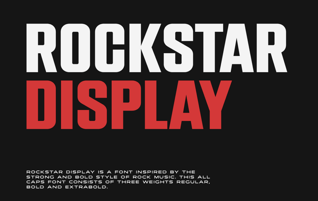
Display fonts are characterised by their unique and attention-grabbing designs. They are typically used sparingly for headlines, logos, or other prominent web page elements. While these fonts can add visual interest, using them sparingly is essential, as they can become difficult to read in longer passages. Some notable display fonts include:
- Futura: A geometric sans-serif font designed in 1927. Clean, efficient, with a modern feel. Suitable for displaying text and headings.
- Bickham Script: A flowing, elegant script font designed in the 18th century. It adds a touch of sophistication and charm. Suitable for display text.
- Bebas Neue: A bold, sans-serif font with a geometric, art deco feel. Eye-catching for headlines. Has multiple weights.
- Oswald: A strong, thick, sans-serif font. It has a bold, high-impact look that is perfect for headlines. Works well at large sizes.
- Lobster: A playful, informal script font with thick and thin strokes. Friendly and fun. Great for display in more casual designs.
- Montserrat: A popular geometric sans-serif font inspired by historical signs. Clean and modern. Multiple weights are available.
- Pacifico: A lively, whimsical script font. Light and breezy. Perfect for a youthful, cheerful look.
- Raleway: An elegant sans-serif font with a smooth, toned-down look. Many weights are available. Great for displaying text.
- Anton: A sleek, contemporary sans-serif font with a geometric appearance. Suitable for a bold, modern look.
- Open Sans: A popular, neutral sans-serif font with a rounded appearance. Clean and readable. Suitable for paragraphs as well as headlines.
Monospaced Fonts
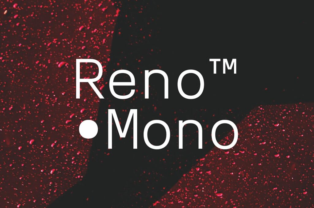
Monospaced fonts, also known as fixed-width fonts, are characterised by their uniform spacing between characters. These fonts are often used in coding environments, as their consistent spacing makes it easier to align code elements. However, monospaced fonts can be creatively incorporated into web design to achieve a unique aesthetic. Examples include:
- Courier New: A standard, default monospaced font installed on most computers. Classic, familiar look.
- Consolas: Clear and highly readable. Works well for both text and code. It is included in Microsoft software.
- Source Code Pro: Optimised for coding with an extensive range of characters, designed by Adobe.
- Monaco: Default monospaced Mac font. Clean, simple, and readable.
- Inconsolata: Modern, elegant monospaced font. Works well for both text and code.
- Fira Mono: Clear, contemporary monospaced font. Open-source with an extensive character set.
- Roboto Mono: The monospaced version of Roboto with a tech and sci-fi vibe.
- Space Mono: Stylish, futuristic monospaced font with rounded edges.
- PT Mono: Simple, clear, and highly legible. Based on monospaced fonts from the 1900s.
- Droid Sans Mono: Created for user interfaces and terminals. Part of the Android project.
The Role of Accessibility
Choosing inclusive, accessible fonts is an essential part of website design. With approximately 15% of people worldwide living with some form of disability, ensuring that your website text is legible and usable for all visitors is an ethical obligation and a legal requirement in many jurisdictions.
When selecting fonts, consider the following factors for accessibility and inclusivity:
- Contrast – Sufficient contrast between text and background colours is vital for legibility. Dark text on a light background provides the best contrast for users with visual impairments or colour blindness. Check that colour combinations pass AAA-level requirements of the Web Content Accessibility Guidelines (WCAG).
- Font size – Text size should be adjustable by the user without losing legibility. Providing relative font sizing like EM units allows visually impaired users to enlarge text comfortably. And set the base font size to 16px or higher.
- Line spacing – Ample line spacing prevents text from appearing cluttered, a critical factor in improving readability for those with dyslexia, visual impairments and cognitive disabilities. A minimum of 1.5 line spacing is recommended.
- Font style – Opt for simple, sans-serif fonts like Arial or Verdana. Avoid thin, cursive, or handwritten fonts, which reduce legibility.
- Letter spacing – Slightly wider letter spacing creates more precise definitions between characters for those with low vision or cognitive disabilities. But avoid excessive spacing, which reduces readability.
- Font weights – Include both regular and bold text weights. Bold highlights headings, titles and key text for those who need clarity. But avoid texts being too aggressive.
With inclusive font choices, you can create accessible, readable text for all your website visitors. Consider accessibility from the start of your design process.
Making the Decision: Font Pairing and Hierarchy
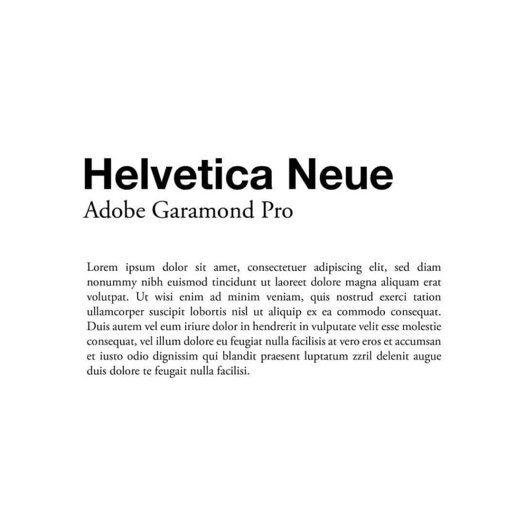
Choosing a single font is only the beginning. Effective typography involves creating a hierarchy that guides users through your content. This hierarchy is achieved through font pairing – harmonising different fonts. A common approach is to use one font for headings and another for body text. The key is to ensure contrast and consistency in your choices.
Font Pairing Tips
Finding the right font combinations for your design projects can seem daunting, but following some basic principles can help you create more visually appealing and cohesive designs.
Contrast the Weights and Styles
When pairing two fonts, look for ones that provide an obvious visual contrast. Combining a bold, heavy font with a light, airy one creates a definition between headlines and body text. For example, pairing a thick sans-serif font like Impact for headlines with a delicate serif font like Garamond for body copy would create a bold headline that stands out from the lighter text.
You can also contrast the styles – a rounded font like Rockwell would pop next to a more geometric font like Futura. Mixing a script or handwritten font with a simple sans serif typeface makes an eye-catching contrast. Just ensure the font styles complement each other and don't clash.
Maintain Consistency Across Design Elements
While the contrast between fonts is essential, you also want to maintain consistency in your design. Use the same font pairing across headings, subheads, body text, and other elements. This creates unity in the design and strengthens your visual brand identity.
You may also want to limit the number of different fonts. Stick to one or two complementary fonts throughout all design pieces. Too many fonts can make the design feel disjointed and confusing.
Choose Fonts that Enhance Readability
Readability should be a top priority when pairing fonts, especially for body text. Elegant serif fonts like Times New Roman and Georgia are highly legible for blocks of text. For headings, stand out from the body copy with thick, bold sans-serif or display fonts.
Also, pay attention to x-height (the height of lowercase letters) – larger x-heights improve readability. And make sure italicised fonts are manageable at smaller sizes.
You can create aesthetically pleasing and easy-to-read designs with mindful font pairing and consistent usage. Experiment with different font combinations to find your project and brand style best.
Real-World Examples
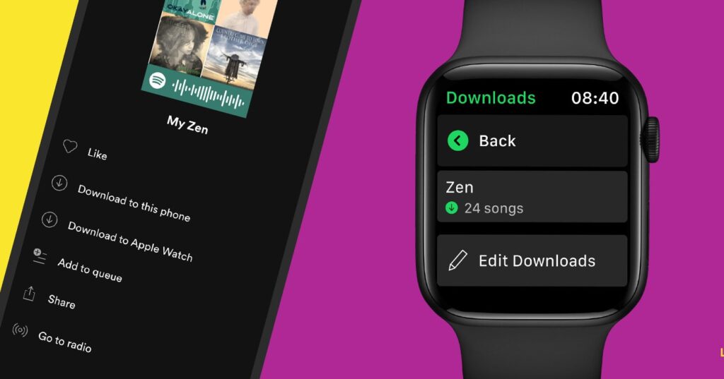
Let's take a look at how some popular websites leverage fonts to create compelling user experiences:
Medium
The online publishing platform Medium uses fonts to support its focus on reading. For headings, it uses Circular, a simple yet lively sans-serif font explicitly designed for Medium. Circular provides a clean, modern style that focuses on the text.
For body content, Medium uses Georgia, a highly readable serif font designed for the screen. Georgia offers a classic, familiar style while its large x-height and open counters aid readability. This combo allows Medium to deliver an optimal reading experience across articles of varying lengths.
Apple
Apple's website prominently features the San Francisco font, custom-designed for its operating systems. San Francisco lends Apple's site a crisp, minimalist aesthetic that aligns with its products' styling. It combines the legibility of a sans serif with the friendly warmth of a rounded neo-grotesque.
This font for headings and body text creates consistency across Apple's site. It also enables excellent readability on Retina displays, underscoring Apple's focus on the technological experience. The consistency with its products' UI also subtly reinforces Apple's brand identity.
Spotify
As a digital music platform, Spotify uses font styles that evoke a sense of fun and creativity. Its logo and headings use Circular, a rounded sans-serif font with a softer, playful feel than standard geometrics.
For its body text, Spotify uses Circular Std, a modified version of Circular with adjusted spacing to improve readability. This combo of youthful heading font and clear body text helps communicate Spotify's brand personality – simple, easy, and engaging.
YouTube
YouTube uses YouTube Sans as its official typeface, customised precisely for the brand. It has a Casual, minimalist feel with rounded edges. For most UI elements and headings, YouTube uses the Bold version for sharp, high-contrast styles that catch the eye.
In body text, YouTube Sans Regular provides a clean, neutral presentation to keep the focus on content. YouTube Sans contributes to a fun, casual brand image while maintaining clarity across the site.
The thoughtful selection of fonts enables these companies to craft website experiences that strengthen their brand identities and engage their audiences. Typefaces set the tone and greatly influence how users perceive and interact with digital content and products.
Conclusion
Typography is an art form that strategically blends aesthetics and functionality to communicate a message effectively. The fonts and text styles you choose for your website, or brand have immense power to engage your audience, convey information clearly, and leave a lasting positive impression that reinforces your core brand identity.
When selecting typography, it's crucial to consider your brand personality and tone, your target demographic, accessibility for all users, and intuitive font pairings. The right typographic choices allow you to tell your unique brand story that resonates with your audience and adds value to their experience.
Thoughtful typography speaks volumes without saying a word. It can elicit emotion, convey attitude and style, establish hierarchy, and guide users seamlessly through experiences. Typography tells a story – your story. It reflects the essence of your brand each time a user interacts with your content.
So take the time to intentionally choose font styles that align with your brand identity and content goals. Experiment with different typeface combinations until you find those that work harmoniously together—Optimise text size, colour, and styling for readability across devices. And, of course, ensure your typographic choices are accessible to everyone.
When you choose the best fonts for a website holistically, with the user experience in mind, it becomes an integral part of an effective digital strategy that gets results. Typography has the power to make lasting impressions and encourage meaningful engagement. Wield this power thoughtfully, creatively, and consistently; your typography will tell your brand's unique story across every platform in the best possible light.
