History of the Nintendo Logo Design
The Nintendo logo design is one of the most iconic and recognisable logos in the video game industry. The distinctive red colour and unique font represent fun, innovation, and quality gaming for generations of fans. But this iconic logo didn't spring up overnight – it has evolved through several redesigns over Nintendo's 100+ year history.
Table of Contents
Early Beginnings
Humble Origins as a Playing Card Company
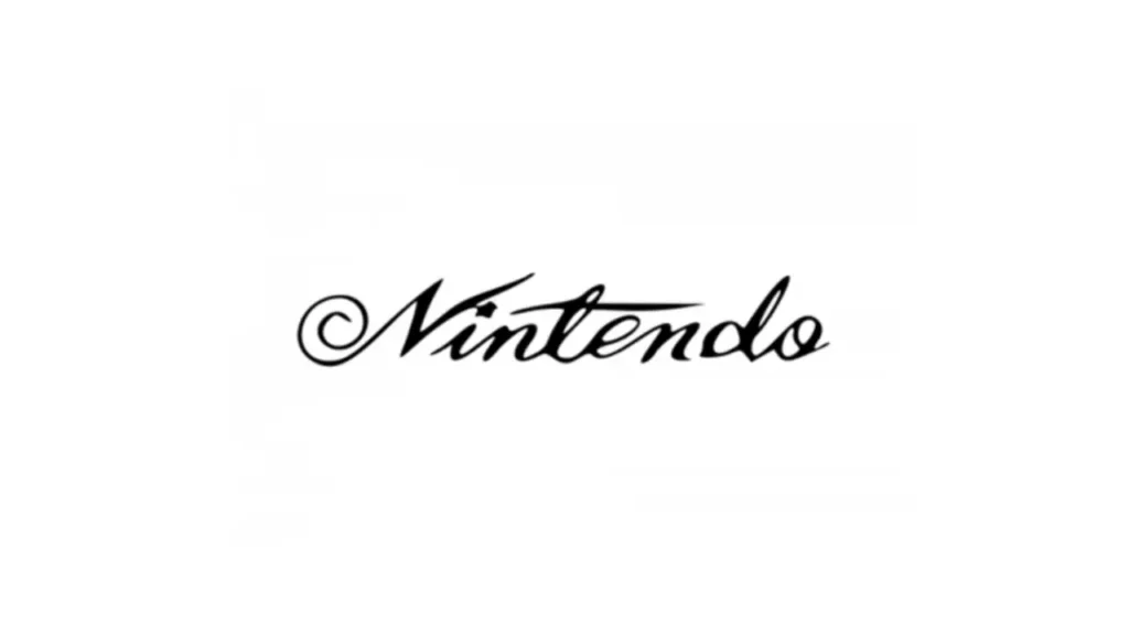
Nintendo started in 1889 as a small playing card company in Kyoto, Japan. Back then, the company was run by Fusajiro Yamauchi and was initially called “Nintendo Koppai“. The logo featured the words “Nintendo Koppai” written in black ink with a traditional Japanese style.
As a playing card company, Nintendo's logo reflected the traditional roots of its product – hanafuda playing cards. These intricately designed cards featured beautiful floral patterns and were used to play various popular Japanese card games. Nintendo's hanafuda cards and early logo were nondescript, aimed primarily at the local Japanese market.

Shifting to Toys and Games
Over the next 60 years, Nintendo shifted its focus towards toys, games, and plastic playing cards as Japan underwent rapid modernisation. The company logo incorporated more stylised calligraphy, taking inspiration from classic woodblock letter printing.
In 1953, with grandson Hiroshi Yamauchi now at the helm, the company name changed to “Nintendo Playing Card Company”. The logo symbolised this transition – maintaining its heritage with calligraphic text but enclosing it in an oval reminiscent of Western graphic design.

This fusion of Eastern and Western aesthetics characterised Nintendo's early logo evolution, bridging its historical past and modernising future.
A Vibrant Facelift
Embracing Colour and Energy
In the 1960s, Nintendo strategically moved into the toy and electronic game industries. Seeking to engage children and highlight the energy of gameplay, their logo underwent a complete facelift.
1968, the text was presented in a vibrant red – a bold departure from its subdued black predecessors. This vivid colour choice visually communicated the excitement and fun of Nintendo's products. Enclosed, it was a geometric but rounded hexagonal form.
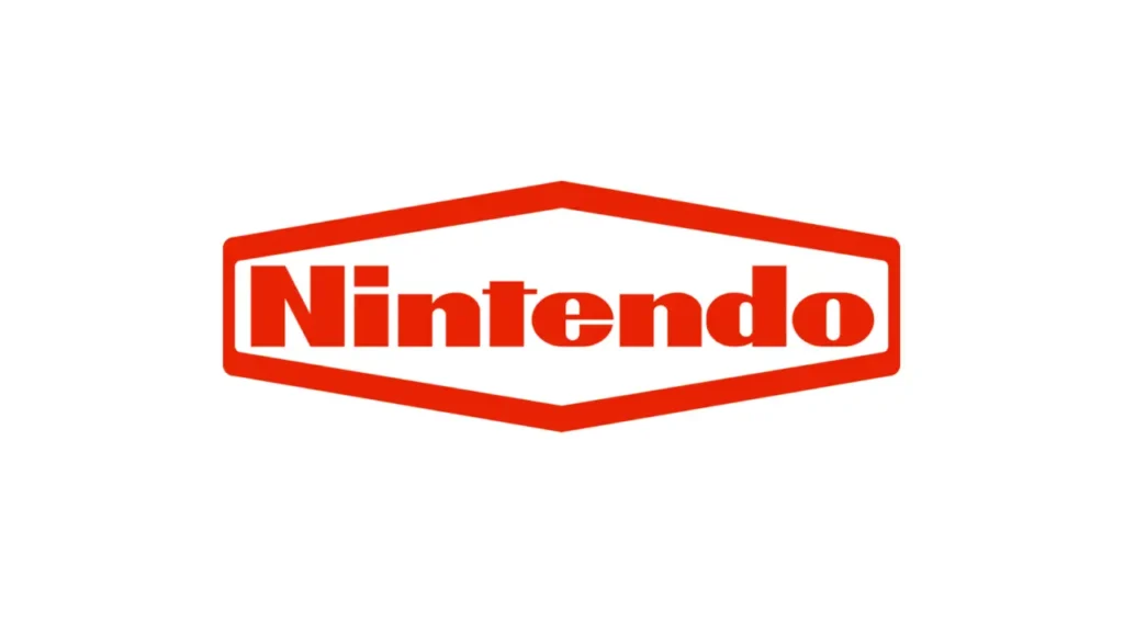
This lively, playful logo captured Nintendo's goal to provide joy and become part of childhood memories. The emphasis on colour and shape over intricate calligraphy marked the company's strategic shift towards international markets and modern manufacturing techniques.
Streamlining in the 70s and 80s
Building on this colourful revamp in the 60s, the logo underwent further streamlining to encapsulate Nintendo's spirit of imagination and play.
In the 1970s, the text was presented in a clean, rounded font without serifs or embellishments. This pared-down look removed the oval shape and conveyed a friendly, welcoming impression.
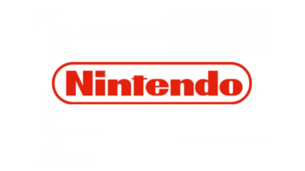
When the Nintendo Entertainment System was released internationally in 1985, the logo text was rotated 22.5 degrees – adding dynamism and movement. This angled font captured the excitement surrounding Nintendo's pioneering home console system.
Via strategic shape and font choices, Nintendo's logo through the late 20th century aligned with its passionate, surprising, playful brand personality.
- Future Publishing Ltd (Author)
- English (Publication Language)
- 133 Pages – 06/22/2023 (Publication Date) – Future Publishing Ltd (Publisher)
Iconic Minimalism and Versatility
Solidifying the Iconic Oval
In the 1990s, building on decades of evolution, Nintendo finalised its iconic ellipse and red font combination.
The 1991 logo maintained the rotation of the angled 80s font but simplified the styling into a standard typeface without elaborations. Enclosed, it was an elongated, flowing red oval. The curves created a sense of motion matching Nintendo's whimsical energy.
This iconic logo distils the brand's essence into two elements – vibrant red symbolising excitement and fun and an oval shape evoking dynamism and play. The simplicity conveys Nintendo's welcoming spirit to gamers of all ages.
Adaptability in the Modern Age
Since reaching its iconic 1991 form, Nintendo's logo has remained remarkably consistent. Only occasional variations in font-weight, spacing, or oval dimensions have graced Nintendo consoles, games, and products over the past 30 years.
The versatility and minimalism of the iconic design allow it to thrive across decades, gaming platforms, and regional markets with only subtle shifts.
This sustained longevity comes from the logo's intangible ability to capture nostalgia while feeling fresh and imaginative. The solidity reflects Nintendo's dedication to its heritage alongside constantly evolving gaming technology and creativity.
Branches and Subsidiaries
Nintendo of America and Europe
For its major subsidiary regions – Nintendo of America and Nintendo Europe – variations of the iconic logo identify each branch.
Nintendo of America's logo utilises flattened corners on the red oval to provide visual distinction. First employed in 1982 alongside the North American launch of the Nintendo Entertainment System, this subtle oval modification creates a dynamic outline befitting the kinetic energy of American pop culture.
For Nintendo Europe, formed in the early 90s, the logo adds visually striking yellow accents along the oval contour lines. This reflects Europe's rich cultural history while contrasting beautifully with the oval's red tones. The flair and excitement of the yellow lines capture Europeans' passion and sophistication.
Pokémon Company Logo
For the subsidiary brand Pokémon founded in 1998, the iconic Nintendo oval shape frames the vivid colour-changing “P” of the Pokémon logo. With the “P” morphing into various elemental colours, the logo beautifully merges Nintendo's oval and Pokémon's dynamism.
This fusion creates an energetic symmetry between parent and child company. The oval neatly contains Pokémon's unpredictable, mutable graphic identity. And the quartet of iconic stars in the nook of the “P” hints at Pokémon's origins within Nintendo's creative galaxy.
Values Through Logo Design
Through its shape, colour palette, typography and adaptable minimalism, Nintendo's logo beautifully captures the enduring values of the brand. The distinctive graphic emblem includes joy, surprise, movement, inclusiveness, and flair.
Childlike Fun, Playful Creativity
The vibrant red font and flowing, dynamic oval speak to play and fun – welcoming gamers of all generations to tap into Nintendo's childlike creativity and imagination.
Energetic Innovation
The angled typography and versatility of the logo design convey the kinetic energy pulsing through Nintendo's history of innovation and reinvention. Nintendo's logo continually realigns with its latest revolutionary technology, from playing cards to electronic toys to home consoles.
Respect for Heritage
Yet the remarkable consistency of the logo and signature elements like the red colour also channel Nintendo's roots over a century's experience crafting fun entertainment products and memories. The logo embodies historic foundations supporting constant modern renewal.
Ultimately, Nintendo's brand identity skillfully traverses universal appeal and local adaptation. The logo's journey through shape, colour and form echoes Nintendo's odyssey towards defining state-of-the-art interactive entertainment.
Frequently Asked Questions About the Nintendo Logo History
After learning about the evolution of Nintendo's iconic logo over the past century, you may still question the brand's visual identity journey. Here are answers to 5 of the most frequently asked questions.
Why is Nintendo's logo red?
The vibrant red colour choice emerged in 1967 as Nintendo expanded into toys and games. Seeking to engage youth and represent the excitement of interactive entertainment, red was selected to communicate fun, passion and warmth visually.
This bold colour contrasted the traditional black logo used during its early playing card business. The red logo accompanied Nintendo's shift towards creativity and innovation.
Does the oval shape have a symbolic meaning?
The oval elegantly frames Nintendo's logo text in a flowing, curved shape reminiscent of hands cradling an object with care. It may represent Nintendo's mission to transport joyful experiences and memories into people's lives through play.
Its round contours also suggest protection, unity and wholeness – just as Nintendo strives to create immersive gaming worlds where entertainment bonds families and friends.
Why is Nintendo abbreviated as “N” in Japan?
In Japan and some other Asian regions, Nintendo Co. Ltd officially operates under the abbreviation “NTDOY”. The single letter “N” represents the company to the public and on stock exchanges.
This abbreviation arose as a convention given the lengthier official name used in Japanese regions – “Nintendo Kabushiki gaisha”. By abbreviating with N, Nintendo conveys its brand recognition and legacy in Asia despite using the non-abbreviated English name globally.
Has the font changed over time?
Nintendo's logo font has evolved from calligraphic ornate stylings to more geometric, rounded designs. The tilt, spacing, weight and small embellishments have shifted across eras, too.
But the font has retained its thick, solid strokes and playful essence. By not adhering to a single typographic style, Nintendo maintains expressiveness – just like its approach to game and character design.
Why don't the sub-logos match the primary logo?
For brands like Nintendo of America, Europe and Pokémon under the Nintendo umbrella, regional variations, target market and product distinctiveness warrant modified logos.
Flattened oval corners, yellow accents and the iconic Pokémon “P” encasing all help these sub-logos achieve visual differentiation and local resonance. Yet they retain the essence of Nintendo's shapes and sensibilities for consumer recognition across branches.
Conclusion
Over 100 years, Nintendo's logo tells a winding, vibrant story paralleling the company's evolutionary history in interactive entertainment. Nintendo has created visual brand consistency across years, platforms and subsidiaries by distilling its values into a minimalist yet versatile icon.
Yet the logo retains flexibility to match Nintendo's ever-changing technology and creativity. By analysing the forms and modifications of these graphic symbols over eras, we trace Nintendo's artistic spirit and its steadfast connection with fans worldwide.
Ultimately, the logo's balance between versatility and consistency reflects Nintendo's cultural role in bridging generations through the enduring power of play. Its shape represents fun memories and emerging surprises spanning age groups and cultural backgrounds.
Just like recognising a familiar friend across years, Nintendo's iconic logo markers – vivid red colour, welcoming oval, energetic typography – transport us back to nostalgic playtimes while promising the thrill of new interactive magic.
Last update on 2024-06-11 / Affiliate links / Images from Amazon Product Advertising API

