Font Psychology and How It Influences Design
What if I told you that your chosen font can influence how people perceive your words? Fonts have psychological effects that can subtly shape how writing is processed and understood. The study of these effects is known as “font psychology.”
Humans make snap judgments about things all the time, usually within a fraction of a second. Fonts are no exception. When we see words printed in a particular style, our brains start whirring with unconscious assessments.
Table of Contents
The Origins of Fonts and Their Psychological Associations

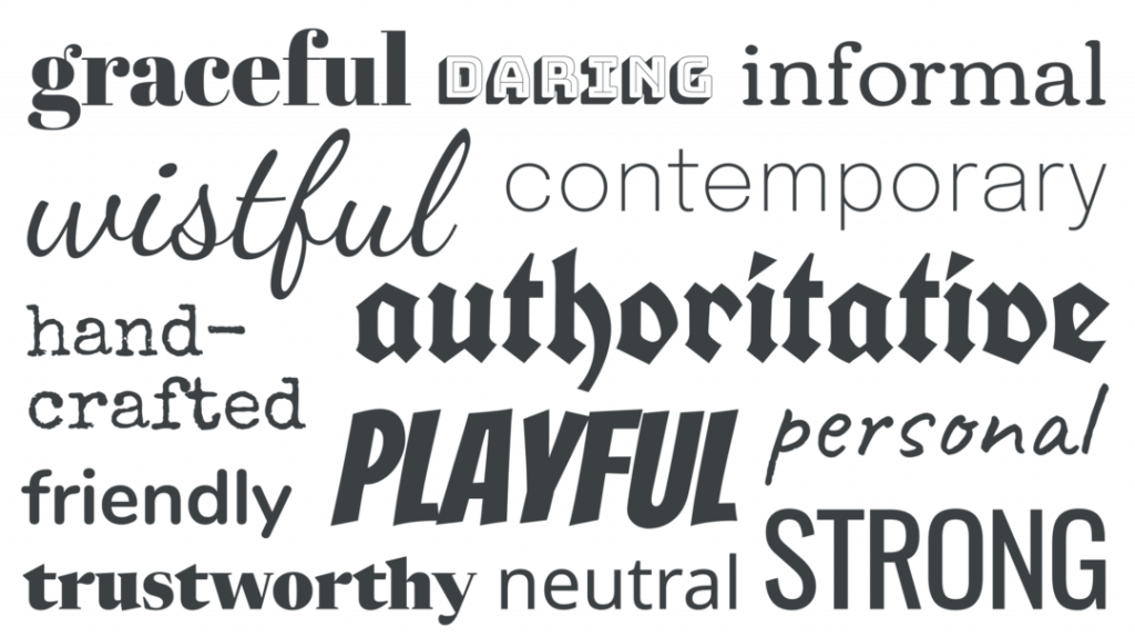
Script and decorative fonts are reminiscent of handwriting.
Movable type was first used in China in the 11th century, but the printing press wasn’t perfected until the 15th century in Europe by Johannes Gutenberg. His early fonts were modelled after the popular Gothic script used by monks for religious texts.
As a result, early typefaces took on religious and spiritual symbolism. The intricate embellishments were meant to honour God and convey moral righteousness. Publishers used Gothic (or Blackletter) fonts for Christian work, establishing an affiliation between ornate decoration and church authority figures.
By the mid-15th century, Romans and italics emerged as alternatives to the Gothic type. These fonts, modelled from works of classical Roman and Italian Renaissance authors, gained traction as staples of early secular publishing. Romans and italics thus inherited their origins' connotations of stability, credibility, and intellectualism.
In the 16th century, bookmakers began distinguishing font styles to denote different parts of texts, establishing two camps of typefaces that remain ubiquitous today:
Serifs vs Sans-Serifs: Associations with Tradition vs Modernity
Serif fonts like Times New Roman have decorative “feet” at the ends of strokes. The serifs echo calligraphy and give the text a traditional, formal feeling.
Sans-serif fonts like Arial lack these feet. Their plain, unadorned style makes them look sleek, simple, and modern by comparison.
So, from their early origins, serif and sans-serif styles gained symbolic ties to ideas like history vs progress, ceremonial vs everyday, fancy vs plain, complex vs simple, and so forth.
How Do Fonts Affect Us Psychologically?

Fonts elicit both emotional and cognitive responses. On an emotional level, they can convey anything from fun and playfulness to seriousness and professionalism. Cognitively, they affect the ease and flow of reading, how credible information seems, and even comprehension and recall.
Emotional Impact
Specific fonts project more positive or negative vibes. For example:
- Playful/casual fonts – Comic Sans, Monotype Corsiva, Brush Script. These evoke childishness and light-heartedness.
- Formal/serious fonts – Times New Roman, Arial, Calibri. These say “professional” and “business-like.”
Meanwhile, fonts like Verdana, Tahoma, and Georgia project neutrality.
Cognitive Effects
Fonts don't just influence moods and feelings. They also interact with our mental processing in subtle ways.
- Readability – Some fonts promote smooth, effortless reading. Others disrupt flow and force slower, more deliberate processing.
- Credibility – Professional, non-ornate fonts boost credibility, while more playful, informal styles have the opposite effect.
- Comprehension & recall – Hard-to-read decorative fonts reduce comprehension, memory and reading speed. They demand more cognitive resources, which hinders understanding.
Now, let's explore some core aspects of font psychology in more detail…
How Readability Impacts Processing
If a font is easy to read, you can glide through the words without effort. But some fonts slow you down, interrupting that seamless flow. How readable a font appears hinges on the following:
Letter & Word Recognition
We have to identify letters and words before extracting meaning. Hard-to-decipher fonts hamper this fast pattern recognition. Our eyes keep stopping and starting instead of moving rhythmically along the text.
Familiarity
Unusual novelty fonts can dazzle, but familiarity breeds readability. The more exposure we've had to a font, the more readable our brains find it.
Familiar fonts confer a readability advantage.
Simplicity & Clarity
Plain, simple, clean fonts without much flourish or embellishment maximise clarity so we grasp words quicker. More intricate decorative fonts make the brain work harder.
Visual complexity slows processing.
This is why most books and documents stick to familiar, plain serif and sans serif fonts like Times and Arial. Readability trumps aesthetic appeal.
Familiarity Breeds… Credibility?
The familiarity principle also plays into credibility assessments. For better or worse, we make quick trustworthiness judgments of unfamiliar, hard-to-read fonts.
Our brains are natural pattern seekers who prefer certainty. The unfamiliar provokes doubt, while the familiar promotes credibility and trust because it mirrors what we recognise and expect. It just “looks right” to our brains.
This effect is so pronounced that switching text to a dense, unconventional font can make statements seem less accurate!
Professional Fonts Mean Business

Even among relatively familiar fonts, stylistic qualities like simplicity and formality govern credibility. “Professional-looking” fonts convey authority and seriousness more than playful ones.
Let’s compare Arial and Comic Sans:
Arial
- Simple, familiar, neutral
- Used in office settings
- Says “professional”
- Boosts credibility
Comic Sans
- Childish, quirky, casual
- Used informally
- Says “silly”
- Undermines credibility
This professional/unprofessional dichotomy stems from associations and past exposure. Arial belongs to the sans serif camp of fonts used in business contexts for reports, emails, presentations and more.
Comic Sans also screams informal contexts like children’s projects, amateur productions, and personal communication.
How Font Personality Primes Our Brains
Beyond cognitive impacts, fonts seem imbued with personality traits that subtly prime our psychology:
Fun vs Serious
Some fonts like Brush Script and Monotype Corsiva conjure artistic creativity, emotion, and even escapism with their fluid, looping curves. Others like Impact and Eurostile see severity in their bold lines and imposing staunchness.
Warmth vs Coolness
Does a font offer friendly, inviting vibes or more clinical, aloof ones? Script and serif fonts often rate warmer, while solid and geometric sans serifs seem cooler and more detached.
Feminine vs Masculine
Softer, thinner script fonts strike many as stereotypically feminine, while imposing, angular fonts feel more masculine. Perceived gender can activate related stereotypes.
Youthful vs Mature
Similarly, specific fonts cultivate perceptions of appropriate age/demographic. Comic Sans implicitly targets kids, while Constantia suggests wisdom.
Matching Font to Audience & Purpose

These psychological dimensions allow strategic font pairing with target readers. Below are some examples:
Youth Fonts
Target audience – young people
Purpose – engage, entertain, educate
Best font matches – Comic Sans, Cookie, Papyrus
Professional Fonts
Target audience – workplace colleagues
Purpose – inform, advise, instruct
Best font fits – Arial, Calibri, Georgia
Academic Fonts
Target audience – students, professors
Purpose – lecture, study, publish findings
Best font fits – Times, Cambria, Constantia
Marketing & Sales Fonts
Target audience – potential customers
Purpose – advertise, promote, upsell
Best font matches – Bebas Neue, Lato, Open Sans
Warning Signs: When Fonts Hinder Processing
While some fonts seamlessly aid reading comprehension, retention and flow, others actively hinder cognitive processing. Watch out for:
Overly Decorative Fonts
Too many swirls, embellishments and stylisation demand more visual processing, so understanding suffers. Stick to plain fonts for optimal cognition.
Dense, Complex Fonts
When individual letters and words get trickier, cognitive resources drain from meaning into essential visual pattern recognition.
Unusual, Rare Fonts
On average, rare fonts slow reading by 10-15%. Familiarity speeds word recognition so readers grasp meaning quicker.
ALL CAPS
Uppercase accelerates visual fatigue. We’re used to lowercase as the brain recognises word shapes more easily. Use caps sparingly.
Overly Compressed or Stretched Fonts
Condensing or vertically stretching fonts hampers that all-important word shape recognition, especially if tightened unevenly.
Underlined Text
It might highlight the importance, but that extra line through words disrupts character shapes, which exacts a readability cost. Use bold or italics instead.
Overly Long Line Length
Keep lines between 50-75 characters. Anything longer forces awkward eye-sweeping motions that bury readers.
Cognitive Impacts of Poor Font Choice

It's not just theoretical. One study had students memorise instructions printed in easy or hard font. The problematic font group suffered impaired understanding compared to those who got the reader-friendly version.
Another found that presenting health pamphlets in unreadable fonts like Brush Script or Italicised Times New Roman curbed how much readers remembered later. Recognition and recall both took a hit.
So, if you want your audience focused on content rather than decoding text, avoid ornate display fonts and obscure stylised options. Stick to simple, clean choices like Arial, Calibri or Verdana, optimised for scannability.
Font Psychology in Practice
Once you know these psychological dynamics, you can wield fonts for rhetorical advantage. Some examples:
Grabbing Attention
Use an unconventional font to make words stand out. Novelty captures focus fast. But swap back to plain for the meat of the message so readability doesn’t suffer.
Increasing Trust & Credibility
Stick to non-ornate, familiar fonts like Times New Roman. Avoid anything too casual or funky unless it deliberately matches your brand identity.
Being Persuasive
Harder-to-read fonts increase systematic processing, where readers scrutinise arguments more rationally. Simple fonts promote intuitive responses based on gut reactions. Choose wisely!
Optimising Retention
To help audiences remember content, use highly legible fonts without visual clutter. Decorative fonts overtax mental resources, so memory suffers—Prioritise processing ease.
Appealing to Certain Demographics
Match font personality to target market. Feminine scripts for women's products, playful Comic Sans for kids' campaigns, imposing squares for high finance firms. But don't rely on limiting stereotypes.
Being On-Brand
Reinforce company image through typography. Law firms project confidence with bold sans serifs like Avenir. Non-profits demonstrate compassion using softer, serifed Italics.
Ethical Considerations
While font psychology opens opportunities for influence, persuasion can quickly become manipulation. Respect reader autonomy. Don't sneakily erode agency or subtly “trick” people against their best interests. A few guidelines:
Transparency
Disclose when using statistical embellishment or selective factual inclusion to support a slanted message.
Free & Informed Choices
Don't corner readers or pressure high-stakes decisions. Ensure access to full perspectives.
Accuracy
Portray complete truths even at persuasion expense. Don't selectively distort, omit or misrepresent.
Empowerment
Enhance critical thinking and self-driven evaluation. Don't push emotional buttons without reason.
Conclusion & Key Takeaways
Font design has undergone tremendous innovation, but the text still concerns how our psychology interacts with visual patterns on a screen or page. Understanding these cognitive and emotional dynamics is critical for strategists.
To recap, the central principles of font psychology include:
- Readability eases processing, while ornamentation hinders it
- Familiar, simple fonts boost credibility over unfamiliar decorative styles
- Personality traits like fun, femininity and formality activate associated stereotypes and demographics
- Matching font to audience/context facilitates processing and persuasion
- Poor typography impairs comprehension, memory and retention
So next time you write something, take a moment to consider the font psychology at play. The right stylistic choice might make all the difference!
Frequently Asked Questions
What are the most readable fonts?
Calibri, Verdana, Georgia and Times New Roman score highly for onscreen readability. Century Gothic and Arial work well in print.
What font is most trustworthy?
Serif fonts like Times emanate credibility thanks to their traditional printed pedigree. Clean sans serifs like Arial also offer a neutral “official business” vibe.
What's the most accessible font to read?
Flexible sans serifs designed for screens and dyslexics top the processing charts. OpenDyslexic, Lexie Readable, and Open Sans are optimised for fast visual decoding.
What font do young people like?
Youth-oriented brands use casual script fonts like Comic Sans and Cookie or chunky display styles like Impact to catch Gen Z's eyeballs.
Do font choices impact sales?
Yes, if matched to the audience's sensibilities. One study saw financial packages sell 60% better when set in authoritative Baskerville over friendly Comic Sans.
