Business Branding: 10 Tips for Choosing a Typeface
The most important thing to remember when choosing a typeface for your business branding is to use it on your website, blog, social media posts, email signatures, etc.
Your logo is one of the first things a potential customer sees and often makes the biggest impression. So it’s no wonder that choosing a great typeface is one of the most critical decisions an entrepreneur makes.
Whether you’re starting or looking for a new look for your existing brand, these simple but effective guidelines will help you choose a perfect typeface to communicate the message you’re trying to convey.
Today’s article will look at the psychology behind choosing a typeface for your business branding project.
Table of Contents
The Importance of Typography to Your Brand

It’s not just the typeface you choose but the overall feel and quality of your brand to make your audience remember you.
According to the American University of Beirut study, people prefer brands that match their identity. “It shows that you are similar to your audience. People don’t buy a product because they like the logo; they buy a product because they like the company,”.
A typeface is an element that adds style to your design. It has been said that “the letter is dead, but the typeface is not.”
The typeface you choose should be well-crafted and should work with the colours, style, and content that you are creating. Your typeface should match your business branding, so you should use the same typeface as your business name to design a logo.
It is good to look at other logos you like and learn what typefaces they are using. The next thing you should think about is your company’s colour scheme. You can use several different colours in your design, but it’s best to stick with one main colour scheme. Use black for your text because it can make things stand out more. Make sure that the font size you use is right for your project.
The final thing to think about is the contrast. There should be enough contrast between the background colour and your text to make your design pop. Make sure that your text and background don’t match exactly. It should be clear where the text ends, and the background begins. You should also avoid using a massive typeface because it can overpower your design.
Creating a Typographic Brand Identity
Typography is not just about beautiful typography—it’s about how you choose to present your brand in the world. Think of typography as your visual brand identity. It defines your brand, and it can help you stand out from your competitors.
As you build your business branding, it’s important to remember that your typographic brand identity is a part of your digital brand identity—so if you ignore it, you’ll be creating an identity for your company that doesn’t match its digital presence.
Your site’s typography is just as important as your content in many ways. When it comes to typography, there are many options to choose from. The first thing to consider is what purpose you want your typography to serve. Is it for branding purposes? Do you want to establish your brand visually? If the answer is yes, consider choosing typefaces that complement your brand image.
Choosing between sans-serif and serif font families

There are two kinds of primary font families: Serif and Sans-Serif. Sans-serif fonts don’t have little lines or dots in the letters (also called serifs).
They are usually used for text, headlines, and logos, while serifs are often found in print media, especially magazines and web pages. Although many people might prefer serifs for their design preference, they can hurt readability if used too much.
To a certain extent, the choice between using sans-serif and serif fonts is dependent on your company’s design aesthetic. However, there’s a lot more to consider.
In some cases, a serif font may be preferable in readability and aesthetics. While a sans-serif font may be easier to read because of its lack of ornamentation, you may prefer a serif font if the font you choose is particularly ornate. Other factors to consider include colour, line spacing, and visual hierarchy.
Choosing between a bold and a light font-weight
Bold fonts can have a powerful impact on your content. But just as important as choosing the right font weight for the task at hand. Using a bold font without a corresponding increase in font weight can detract from the message because it’s too loud.
It’s not an effective method of conveying information. It makes it more challenging to read, too. In contrast, using a light font can have the opposite effect. The key is finding a balance between the two.
Bold fonts are meant to draw attention to specific words or phrases. Light fonts are for everything else. This is especially useful when writing in the body copy of an email since the emphasis belongs to the words and not on the background.
Tips for choosing a typeface for your business branding
Choosing a clear and easy typeface to read is a good idea. You should make sure that your font is easily identifiable and understandable.
If you have a website or brochure, the fonts should be consistent. For example, a headline should be bold and large to stand out from the rest of the page or site. You should use a different font size for the subheadings to make the main text easy to read.
You should also use a different font size for bullet points. Bullet points should be bold and more significant than regular text. You can use italics if you want to emphasise certain words or phrases.
1 – Choose a typeface that conveys the right message

In addition to helping you make sure your website looks great, choosing the right font for your blog post can help you convey the right message to your audience.
Use the wrong font or font size, and your readers might miss the point of your message. This is particularly true if the font you choose is too small or difficult to read. This can lead your reader to feel frustrated or overwhelmed.
If you need help with your choice, the web is full of resources for finding the perfect fonts for any blog post. Here are a few sites you may want to check out:
MyFonts is one of the largest and most respected font libraries.
FontSquirrel allows you to download and test fonts for your blog quickly.
Fontshop allows you to preview many free and premium fonts for your blog.
2 – Use the font to help your brand stand out
Bold or distinctive fonts can be a powerful tool for making a visual impact. Studies show that when it comes to eye tracking, consumers prefer to read words printed in a distinct font (like Helvetica, Gotham, or Poppins) rather than words printed in a font like Times New Roman.
If you’re looking for a simple way to add some style to your business branding without hiring a designer, this is a great place to start. Not only is it quick and easy, but it’s a great way to add a subtle personal touch.
I love using Google Fonts because you can search through hundreds of fonts and instantly preview what they will look like. And, since Google has made its free fonts available for download, it’s a no-brainer.
3 – Find the right balance between creativity and practicality

The right font for your business branding can be difficult, but many designers choose the wrong one. In the end, the typeface can make or break the aesthetic.
You have to consider several factors when choosing the right typeface. These include legibility, readability, readability of short blocks of text, the size of the font, and the style of the text. There is no one right typeface for every situation.
With so many options available, it’s easy to get overwhelmed by the number of fonts on the market today. However, most designers agree that you should always use typography sparingly and strategically.
While several guidelines can help guide a designer in choosing a font that will best complement a brand’s style, a straightforward rule of thumb is to choose a clean, legible, and timeless font.
4 – Use fonts to create a unique look
If you’re trying to make your business branding stand out from the crowd, consider the visual aspects of your business.
The colours, shapes, and fonts used in your website can help people easily identify the company behind the website. Your website should communicate consistently and reflect your brand.
Avoid overusing certain letterforms, such as cursive and serifs, when choosing a font. This makes your site look unprofessional.
Think of the font as your brand. Choose a font that represents your brand’s personality.
What makes your brand unique? Is it a specific colour scheme, certain character combinations, or style? Find the perfect font for your brand’s personality and ensure it’s always consistent throughout the site.
5 – Choose the right font for the size and length of your text

There’s no doubt that when you’re communicating on the web, using text is the most popular way to convey information to people.
People love reading online, which means they will read long-form content, including blogs, longer than they will skim or scan shorter material. But what size font and what colours to use to balance legibility and simplicity are two questions that can influence the overall effectiveness of your website.
Using a bold font in the body copy of a long-form email (or a longer email) can make it feel more urgent. This is because bold text draws attention. And if you put bold text in the header, that’s also very attention-getting. Bold text is more likely to stand out from the rest of the email, making it more likely that the recipient will read it.
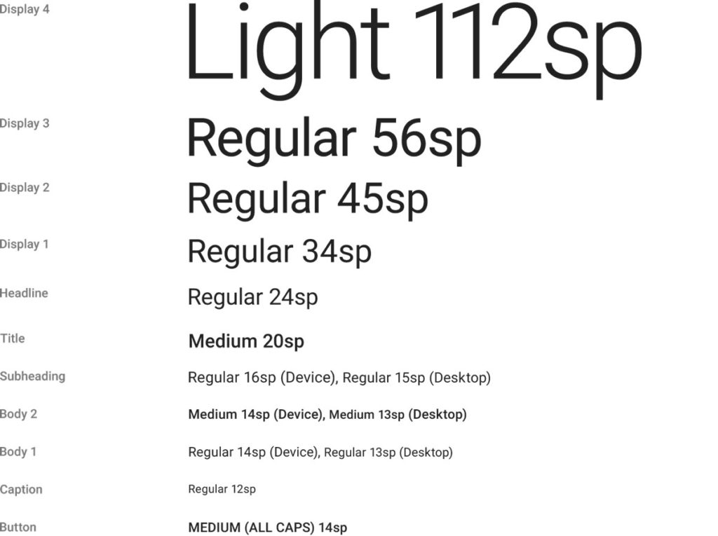
Most people tend to gravitate towards three main font sizes and lengths: large, medium, and small. Each font size typically has a corresponding amount of space allocated for it. Most designers recommend staying away from anything under 12 pt online. The ideal amount of space for a headline, however, varies with the type of content:
Small – 8-12 pts
Medium – 12-18 pts
Large – 18-60 pts
6 – Keep it simple
Your font choice can be as important as your colour scheme. While your readers are accustomed to seeing all sorts of fonts, the truth is that specific fonts work better than others.
Fonts too simple tend to fall flat on the eyes and look childish. However, some of the world’s most recognisable brands are known for using simple fonts—think Nike and Apple.
Font choice is easy to overlook, but choosing the right font for the job is essential because it’s your first impression on your readers. Make sure you choose a font that you feel comfortable reading on your computer, phone or tablet.
7 – Match the typography with your colours

The typography is just one part of your design aesthetic. Don’t think of typography as a stand-alone component; it’s just another tool in your arsenal of design elements.
Typography gives you many options to choose from and can significantly affect the overall visual appeal of your site. But, if you don’t use typography properly, it can also make your site look unprofessional.
You need to match the typography with your colours to convey urgency. This is a powerful combination. When the text is bolded and the colour matches the content, people are more likely to click on it because it feels urgent and thinks it’s important.
If your call-to-action button is a vibrant shade of red, consumers will be more likely to click it than one that’s a light blue.
8 – Make sure your text stands out from your background
The background is a crucial element of any design, and the same goes for a text-heavy design. If the background is busy, the text will appear unimportant.
Conversely, it can overpower the message if the text has a busy background. That means the text needs to stand out. When deciding which fonts to use, you need to avoid using ones too similar to the background. It’s also essential to choose a font size that matches the text and the size of the overall design.
Use white space wisely. White space can play a massive part in making your content stand out. There’s just something about the blank space between words that draws attention.
On top of that, white space creates negative space, which is the space surrounding any element that’s not white. For example, light grey text on a white background tends to get lost, while white text on a black background stands out. In the end, the white space is what makes your content pop.
9 – Avoid using text that is too small

Most people hate reading text that is too small. This is because your eye doesn’t take in all of the words at once, and thus it takes longer to read.
It’s a psychological thing; we don’t like feeling rushed. We also don’t want to waste our time reading things that aren’t interesting to us. Therefore, we read quickly, and when we finish the text, we wonder if we even read the whole thing. So, try not to use text that is too small.
Most websites display content in various sizes, from large blocks of text to smaller paragraphs, lists, and images. One size doesn’t fit all when designing for mobile devices.
Designers should ensure that the content on the page is easy to read. They should make sure that the text is readable and that there aren’t too many empty spaces between text and links and any graphics. Text that is too small or crammed into small areas will make it hard to read and navigate.
10 – Use typefaces that are legible, clear, and easily readable
There is no universal rule for choosing the best typeface for any given piece of text. One way to approach the problem is to consider the font’s purpose in the context of the piece of content.
For instance, if you are writing about a product aimed at children, you’ll want to choose a typeface that is easy to read while still visually appealing. On the other hand, if you’re writing about a complex subject, you may want to choose a relatively large typeface so that readers can quickly scan through the text.
There’s nothing like an unreadability problem to turn off your audience and cause you to lose credibility. Your readers must be able to understand your content to be persuaded to action. So, choose the best typeface and layout to ensure your readers can read, digest, and understand your message.
Conclusion
To choose a typeface, you should consider the needs of your audience. Is the content you’re writing for formal? Informal? Creative? If it’s an important document, you’ll want something more formal than a casual font such as Arial or Verdana.
If you’re trying to appeal to a younger audience, you’ll want to use a more playful or fun font. The best typefaces aren’t only eye-catching; they’re legible and easy to read.
How do you choose a typeface for your business branding? You need to be able to read it, and it needs to match your brand.
