15 Email Design Tips For Better Conversions
An average person receives 122 emails per day and has less than 13 seconds to notice you. Therefore, a mind-blowing email design is crucial to grab the reader’s attention.
It is an essential step when you work on securing your clients’ attention and compelling them to take the desired action. This article contains some email design tips you can implement to move one level ahead in designing emails.
Table of Contents
Top 15 Email Design Tips for Your Email Campaigns
1 – Use colours to evoke the right emotions
You can use colours to trigger the emotions of the client. Colour theory is the art of understanding the emotions triggered by colours.
When used correctly, you will quickly grab the reader’s attention. It can influence how they associate with the brand, product, or offer.
For example, you can use warm colours like red, orange, and yellow to convey happiness and positive energy. In contrast, colours like black and green convey seriousness.
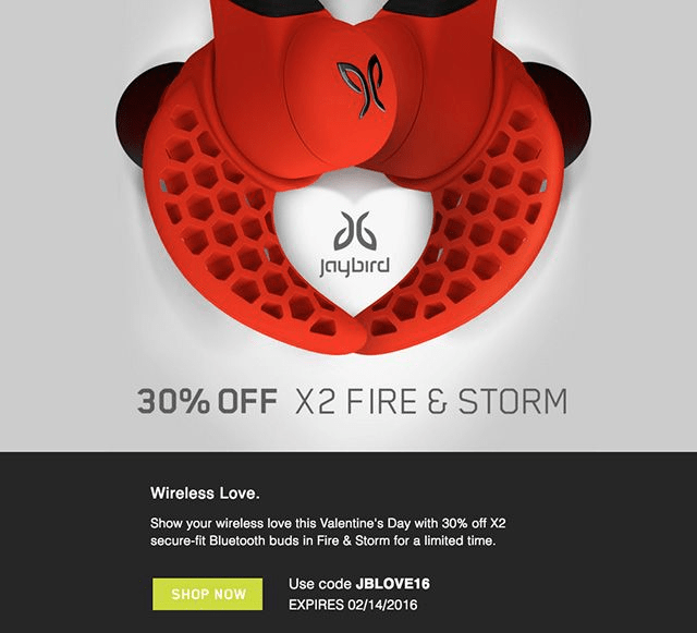
To promote its new X2 earbuds, Jaybird puts the bright red Fire & Storm version front and centre to show off the unique design in its offer. This approach has been a winning strategy as it increases email conversions. The combination of bold colours seems exciting and leads to a purchase.
2 – Add interactivity to your emails
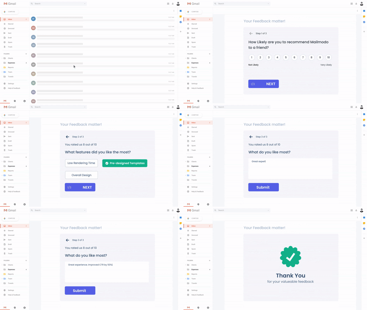
Crafting eye-appealing emails are fundamental to improving conversions. But email performance truly soars when emails go from a static experience to something that users can interact with. This is possible by using interactive emails or AMP emails.
Interactivity in emails can let your users play games, check out abandoned carts, and schedule meetings all inside an email.
You can use simple no-code tools like Mailmodo, which has a drag-and-drop editor to design interactive emails easily. The simple ability of users to complete actions in an email without opening a tab can increase conversions by as much as 280%.
3 – Use complementary font types
As web fonts come in diverse styles, you can create dynamic email campaigns and don’t have to settle for just one type. You can use multiple fonts with other fonts like big, bold serif fonts for the title and smaller non-serif fonts for the body. Moreover, you can experiment with colour to add some contrast without any fear of losing customers.
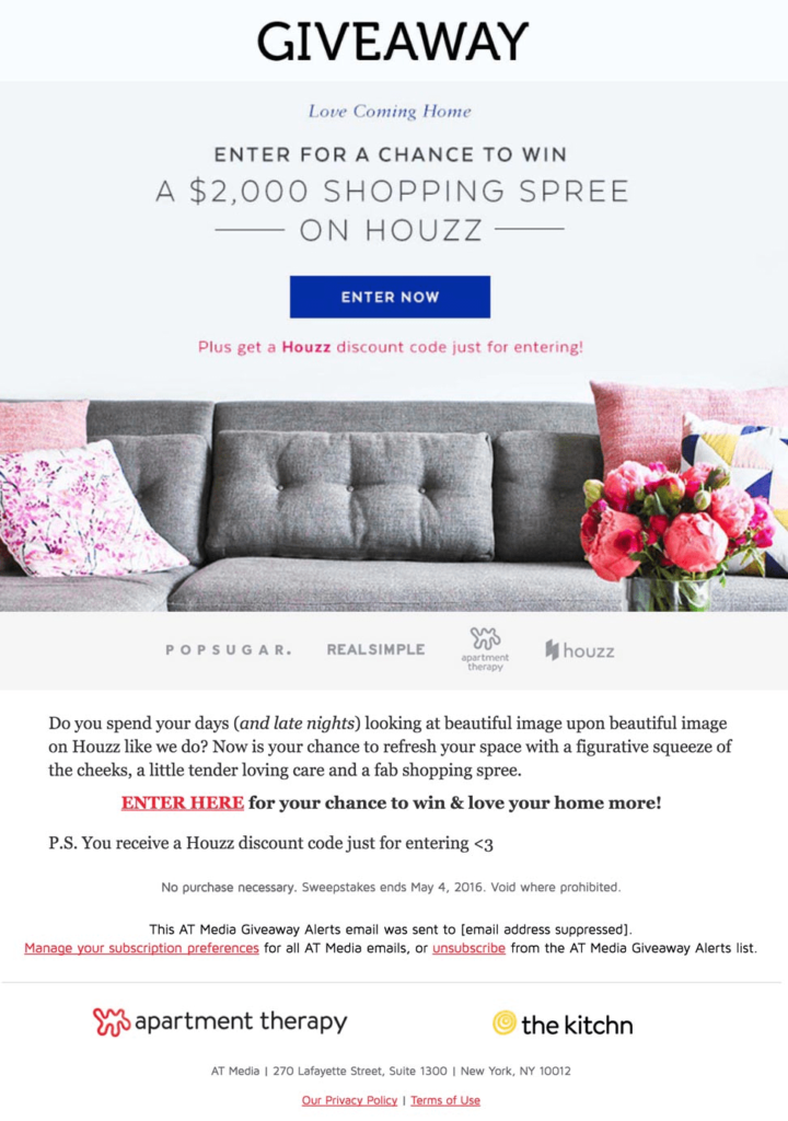
In the above picture, Apartment Therapy uses different fonts for its email campaigns. Their emails feature more than two font types and contrasting font colours to help readability and increase reader interest.
Subscribers are intrigued with Apartment Therapy’s baking lesson emails. These emails have a 55% open and click-through rate, while the average is 23%.
4 – Match email and website branding
Suppose your email campaigns continue your website design in terms of colour scheme, fonts, and layout. In that case, together, they offer a connection and tell a story about your brand, which helps build trust among your readers.
Such practice is beneficial in eCommerce email sequences. Maintaining a consistent brand colour palette in abandoned cart emails, product recommendations, or re-engagement emails improves your customers’ brand recall.
Email marketing services provide templates that can help you customise your campaigns to match your brand standards. You can customise these templates with a drag and drop method to suit your personal brand.
For instance, the Mercedes-Benz website uses dark colours to create the feeling of luxury, aesthetics, and prestige. Their emails offer something that audiences can easily connect to and are more likely to trust the campaign and click through to find out more.
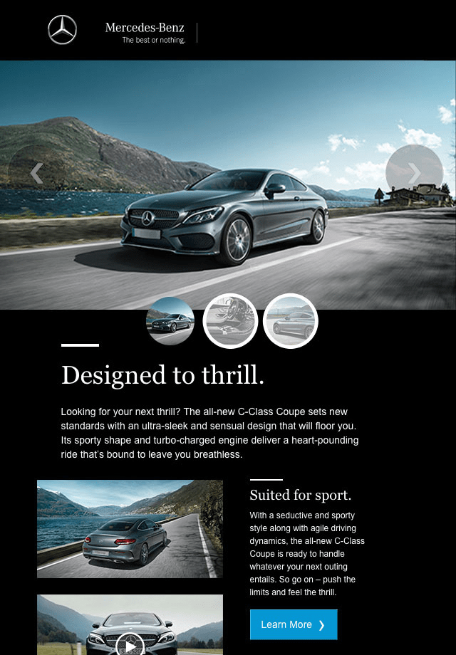
Surprisingly, Mercedes-Benz’s email campaign ROI is 3800%; therefore, for every $1 spent on an email campaign, they generate $38 in ROI.
5 – Follow minimalism, so critical features stand out.
One way to grab people’s attention is to cut to the chase. So, peter out distractions, use fewer colours and rely on minimal design. This will make the reader focus on the required item.
For example, use bright colours to highlight important texts.

In this email campaign, the ad is created so that the reader’s eye will automatically be drawn to the shoe and its design. They have made a simple background and bold white text. Also, your eye is drawn to the clear call to action (CTA) button.
The message combined with the shoe is the two most essential elements in the email. If you notice carefully, the text is a similar colour to the shoe. The blue hues represent calmness and trust.
Use bold and clear CTA buttons that aren’t crowded by overwhelming design. It will boost conversion by 28%. CTA easily stands out so that more readers are likely to click on it and convert.
6 – Delight your users with animated GIFs.
As not all email providers support video, GIFs are a great alternative. Plus, They add an element of surprise and delight to your emails. They add a sense of humour to the article and usually are approved by receivers. However, be careful that you do not distract readers from any valuable content using overpowering GIFs.
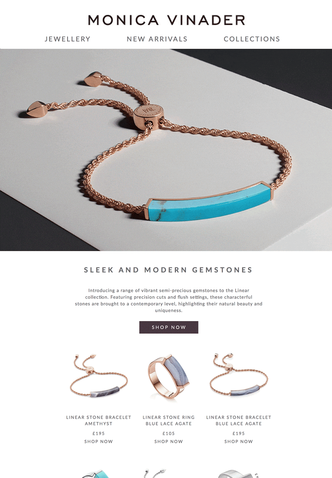
In the above picture, instead of showing a long list of the same product in different colours, Monica Vinader’s email uses a GIF to illustrate the available colours for this particular bracelet. The design is elegant and clean and gives the reader a quick look at the variety. GIFs can quickly grab attention, and that’s why they increase click-through rates by 26%.
7 – Add personalisation to your design.
Although design features are not exactly personalised design, emails treat readers as individuals and not as a long list of names. Therefore research your audience and segment your email list to send emails that customers can relate to.
So if your business caters to men and women, then do not just send them a single design but according to their gender. Another way is to send special offers to celebrate milestones like subscriptions, anniversaries, or birthdays.
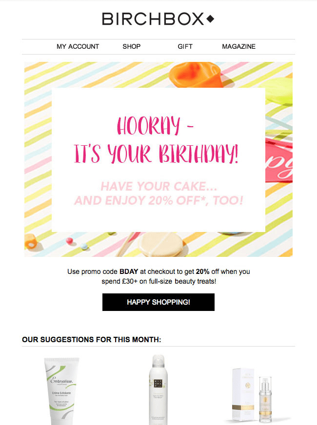
As you can see, Birchbox sends birthday emails and subtly includes product recommendations based on customers’ previous purchases. Personalised emails increase click-through rates by 14% and conversions by 10%. Moreover, you can boost open rates by 42% by adding your perspective’s first name in the email.
8 – Branding
Professional brand emails can help reduce your bounce rate as users interact with you across different channels.

As you can see, a brand tells a story. Hence, it’s essential to be conscious of your email branding. Whether email-to-email or email-to-website, advertising should be consistent across all channels.
9 – Avoid Design Shock
The success of an email can be impacted by design shock or presenting a significantly different tone email to your existing audience.
Consider repeatedly rolling out updates to your email designs or testing the new creative design on a small group of readers before distributing it to your entire audience.
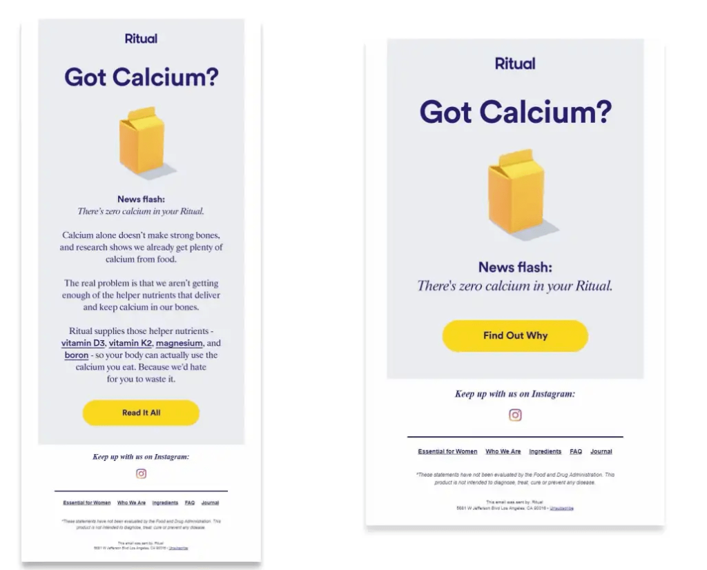
10 – Use a responsive design.
A responsive design means that your email design should change and fit as per the device’s screen it’s being viewed on, whether on a desktop, laptop, or mobile device.
It will help your readers quickly read the emails no matter which device or how they’re viewing them. Therefore, by including a responsive design, you’ll be able to enhance UX and improve email retention across all devices.
11 – A/B test your design.
To find out the best email design for your email campaigns, you will have to go through an iterative process similar to most marketing efforts. It would help if you made changes and updates to get the most out of your email design. This is called the A/B test.
You can modify your CTA, colours, images, layout, or tone to determine which design works best in terms of the ability to reach, resonate with, and convert the most significant number of readers.
12 – Design an email signature.
Designing a great email signature would help you establish a professional and personal feel over email. Email signatures can include your name or other defining and unique characteristics, role, contact information, and company.
Following are some other things you can include in your email signature:
- Link to your meeting calendar
- Social media links (e.g. LinkedIn profile)
- Pronouns
- Photo
- Industry disclaimer or legal requirements
13 – Keep your design lean and clean
Emails should draw attention with an attractive design but still be easy to digest. Don’t confuse the receiver with complicated designs.

This email design is simple and easy to read and visually highlights the most crucial information.
To make sure you have chosen the right design, you can follow these guidelines:
- Establish a visual hierarchy
- Build an excellent text-to-image ratio
- Include white space to give your content breathing room
- The headline should be in two lines or less
- Keep text on a simple background to enhance its readability
- Bold or highlight keywords
- Use directional cues to draw attention to important parts of your email
- Keep design short and relevant
14 – Place text strategically
Strike a good balance of text and images in the email design to make your email easy to read. Many readers scan their emails, skimming the text instead of reading every word.
Therefore, breaking the text and highlighting the most critical points makes your readers more likely to retain key points. You can also create a small section of text to accompany each image you include with its headline and one central point.
Apart from that, your copy needs to be top-notch, as it can help in skyrocketing email conversion rates.

As you can see, body brand Billie used fresh, straightforward language to promote its new summery product.
15 – Make your emails accessible.
Around 2.2 billion people worldwide have vision impairment, so it’s imperative to focus on email accessibility and impart an inclusive experience for all your prospects. The following are some email design tips you can incorporate that would come in handy for accessible emails:
- Firstly, organise the content from left to right and top to bottom to maintain a logical reading order.
- Use proper colour contrast, keeping in mind the colour blind people who might be checking your email. Check out the following picture for a better understanding:

- Avoid centre-aligned copy so that people with dyslexia can easily read your emails.
- It would help if you used the Lang attribute to let the screen readers know about the language used in the emails.
- Use Alt-text for all the visual elements as blind subscribers using screen readers will hear the alt-text; therefore, put the correct text to describe the image at hand accurately.
- For screen readers, Utilise semantic tags to understand the reading flow of the email clearly.
- Avoid using flashy images or animations. The flashing rate of GIFs should not be between 2 to 55 Hz. Otherwise, it can severely affect people with photosensitive epilepsy.
- Keep the CTA button size at least 44×44 px with the size of the CTA copy at 16 px or more so that It is easily clickable or tappable with the thumb.
Concluding the Email Design Tips
By following these email design tips, you will surely be able to make your emails more visually attractive and delightful to your subscribers, which will eventually help you achieve a high ROI.
Moreover, a great way to streamline the design process and incorporate the best practices is to use email design tools and software. This will further help you create and test designs faster with more accuracy.
You can incorporate these email design tips into your marketing strategy for better conversion and retention. So are you ready to implement all these tips and improve your email conversion rate?
Author Bio: Aquibur Rahman is the CEO of Mailmodo, an email marketing solution that enables users to send app-like interactive emails. He has marketing experience in inbound and outbound strategies, SEO, growth, CRO, and marketing automation. He has helped many B2C and B2B brands, including early-stage tech startups, fast-track growth using agile and data-driven marketing processes. When Google released AMP emails, Aquib saw great potential for reinventing email marketing. This led him to start Mailmodo to help businesses get better ROI from email marketing.
