Why Your Website Needs a Mobile-First Design
Across the world, more and more people favour browsing the internet using their smartphones instead of traditional devices such as desktop computers or laptops. This is why a mobile-first design should be a key consideration when developing your next website or amending your old one.
This mobile-first mindset was accelerated further during the Covid-19 pandemic, changing how people use the internet, their shopping preferences, and digital marketing. If your business fails to adapt, then it runs the risk of becoming outdated.
This article will discuss why your website needs to be mobile-first, the benefits of this approach, and how to achieve a successful mobile-first design.
Table of Contents
What Is a Mobile-First Website?
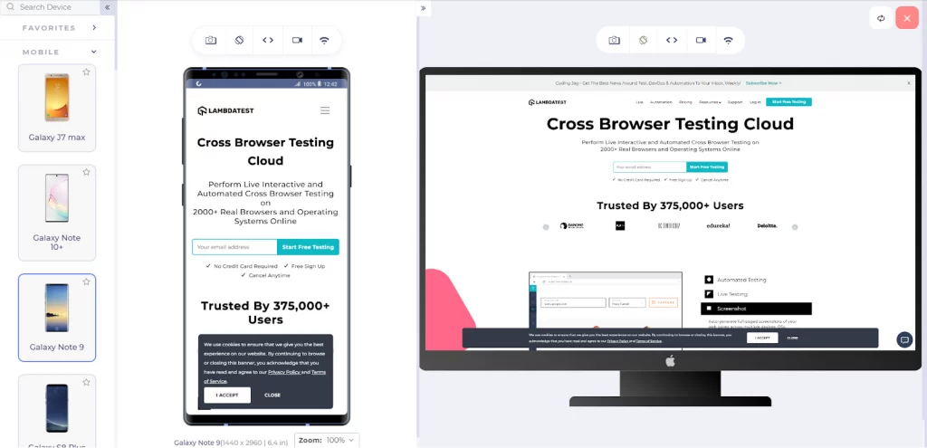
The name is pretty self-explanatory – a mobile-first website is a website that starts with a mobile-friendly design, which is then adapted to work on desktops and larger screens. It is the opposite of traditional design strategies, which begin with creating a desktop website and using coding techniques to make it respond to different screen sizes.
Should All Websites Be Mobile-First?
A mobile-first approach to web design is actively encouraged to increase the chances of mobile users engaging with your website and interacting with your brand. Furthermore, search engines strongly favour sites that offer a great mobile experience concerning indexing and ranking.
It is not only small businesses that are not doing enough to ensure their mobile users are left satisfied. Even some household names fail to make the necessary changes to keep up with current trends and are not delivering a satisfactory mobile experience.
Do not fall into this category and follow the necessary steps to create a website that does more than just tick boxes.
Demand for Mobile-First Websites
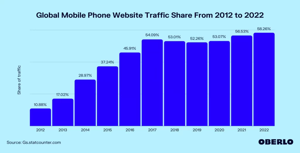
Demand for mobile-first websites has grown significantly, with mobile users accounting for almost 57% of all web traffic in 2021. Many web users will browse and engage with websites on different screen sizes, but trends show that the internet is quickly shifting to a mobile world, with the sale of desktop computers showing a rapid decline.
Research firm Gartner predicts that PC sales will drop by over 30 million units this year, from 342 million to 310 million, an annual drop of 9.5%.
The main reason for the increase in mobile traffic is that people prefer to browse on the go. They want to access information, shop and watch videos whenever and wherever they please. Mobile behaviours include engaging with social media, checking emails, making appointments, and managing multiple aspects of our everyday lives. Limiting this activity to just sitting at a desktop computer suddenly seems somewhat dated, and, likely, much of your target audience is now mobile-only!
There were over 300 million smartphone users in the US in 2021, and these numbers are even more significant in other parts of the world, especially Asia.
Why mobile-first design is important
By 2025, there are expected to be over 7.3 billion smartphone users worldwide, which is pretty impressive, considering the current global population is 7.97 billion.
Let's look at some other vital stats surrounding mobile web users:
- Mobile devices accounted for almost 59% of all web traffic in Q2 2022.
- There were over 300 million smartphone users in the US alone in 2021.
- The number of smartphone users in the US is expected to rise to 290 million by 2024.
- Around 24% of the top 1 million websites are not mobile-friendly.
Mobile-First Websites – Impact on SEO
Search Engines, such as Google and Bing, place a considerable emphasis on mobile-friendly and mobile-first websites. Failing to offer a great mobile experience can severely hurt your rankings, regardless of whether you follow other SEO best practices.
For more than five years, Google has used a website's mobile experience to determine where a site will rank in the SERPs. Since then, any website not optimised for mobile or tablet has taken a significant hit.
However, over the last few years, simply having a mobile-friendly website has not been enough. Instead, Google's ranking algorithms are now favouring mobile-first websites. So if your website has not been updated for a few years and its mobile experience is ok at best, it may be a good idea to consider a new, mobile-first web design this year.
Google Mobile-First Indexing Best Practices
Mobile-first indexing means that Google predominantly uses the mobile version of a website to determine how to index it and where to rank it. Previously, Google crawled the desktop version of a website first but has now acknowledged that mobile is the primary medium for web browsing. From July 2019, mobile-first indexing became the Google default for all new websites.
Below is a checklist to ensure your current website meets Google's indexing best practices guidelines:
- Make sure your website is accessible and can be rendered by Google. Check your meta robots tags, ensure Google can see ‘lazy-loaded' content, and ensure they can crawl all mobile pages easily.
- Ensure your mobile website has the same content as your desktop website and vice versa, including page headings.
- Use the same structured data on all versions of your website.
- Make sure metadata is consistent.
- Ensure ads don't impact the user experience on your mobile website.
- Ensure all images and videos are displayed correctly on the mobile version of your site.
- If your mobile website uses a different URL from your desktop website (m-dot), you need to make sure that:
- The error page is the same on all versions of your site.
- Your mobile website does not use fragmented URLs
- You have verified both versions of your website in Google's Search Console.
- Your hreflang links point to the correct URLs
Why Your Website Needs To Be Mobile-First
Here's a summary of why you should design your website with mobile users in mind:
- A large percentage of your audience will access your website using their smartphones.
- More and more internet users are only accessing websites using their mobile phones.
- Desktop computers are becoming less and less popular, year on year.
- Search engine algorithms place great importance on the mobile experience.
- New Google algorithms favour mobile-first websites.
The Difference Between Mobile-First Design and Traditional Web Design
We have touched upon this already, but it is crucial to understand the differences between mobile-first web design and traditional, responsive design techniques.
A responsive website is reactive, adapting to work well on mobile devices instead of specifically designed for mobile use. It would be unfair to say that responsive web design no longer has its place in the world but has lost its crown as the king of web design strategies.
Considering the latest Google algorithm changes, mobile-first designs favour elements such as readability on smartphones, page load speeds, and social media integration. Meanwhile, responsive websites focus on delivering a consistent look and feel across all screen sizes, making maintaining your website more accessible.
Key Features of Mobile-First Design
Before considering your design strategy, we will look at some of the critical features of a successful mobile-first design, focusing on navigation and the delivery of text.
Navigation
When designing a mobile-first website, developing a navigation system that is as simple and intuitive as possible is essential. Users are unlikely to have a good experience if they are required to perform numerous clicks to reach a specific destination or if the website opens numerous tabs.
Another common grievance is buttons and links in inconvenient places that can result in the user accidentally clicking away from the page they were on or being sent back to a previous page.
A mobile-first approach must ensure that navigating your website is straightforward and that the user journey requires only a few clicks.
Consider how you use your phone when navigating a website or social media. You generally use your thumbs to click elements and move around the screen. Therefore, buttons and links must be larger, with adequate spacing between menu items to make this process less fiddly.
Example of Mobile-Friendly Navigation
One solution is accordion-style navigation, combining HTML, CSS, and Javascript to create an extremely user-friendly system that Google loves. These menus are vertically stacked, with headers that expand and collapse when clicked, so content is only shown when the user wants to see it.
Everyday use for accordion menus is to display frequently asked question (FAQ) sections.
- McNeil, Patrick (Author)
- English (Publication Language)
- 266 Pages – 11/29/2013 (Publication Date) – HOW Books (Publisher)
Text Delivery
When using a mobile website, nobody likes to be greeted with swathes of long paragraphs that are difficult to read and require excess scrolling. You must condense heavy content to be easily digestible on a small screen.
This will create an enjoyable experience while delivering the necessary information to encourage engagement. If your mobile website is filled with text, then it is likely that users will ignore most of it.
The size of the text is also critical to guarantee that the content on your website is readable on a small screen. Make sure your text is no smaller than 16 pixels so readers don't have to zoom in to read page sections.
Header text needs to be larger so the user can quickly glance across a page to find what they want.
Eye-catching headers can help break up the page, splitting it into easily defined sections so users can quickly scan it.
Mobile-first web design is about user experience (UX), making each page element simple and usable.
Your Mobile-First Web Design Strategy
Creating a mobile-first web design strategy is an uncomplicated process when you know the fundamental elements that must be incorporated. Once you have finished the mobile design, you can think of desktop-only features to create a better user experience for people engaging with your website on a larger screen and using a mouse or touchpad.
In addition, you must also consider how you can integrate mobile technologies such as GPS, data collection tools, camera functionality, and near-field communication (NFC). These features will not be compatible with a desktop computer.
When creating your website, you must consider the two key web design strategies – graceful degradation (traditional) and progressive enhancement (mobile-first).
Graceful Degradation
Graceful degradation relates to functionality across multiple devices and screen sizes, choosing the optimal design that works on smartphones, tablets, laptops, and desktop computers. In simple terms, it removes design elements, content, and functionality each time the website is shown on a smaller screen.
For example, you may have some heavy blocks of text on your desktop version that would impair the experience on your mobile or tablet version; therefore, you should remove them.
This process is the opposite of mobile-first design.
Progressive Enhancement
With progressive enhancement, you would begin with the website in its simplest form, with minimal functionality, and then add more content, functions, and design features when optimising for larger screens. This is a mobile-first design at its core.
It differs from responsive design, based on media queries to deliver different versions for different devices and screen sizes. However, responsive design and progressive enhancement can work together as a strategy.
Creating a Mobile-First Website
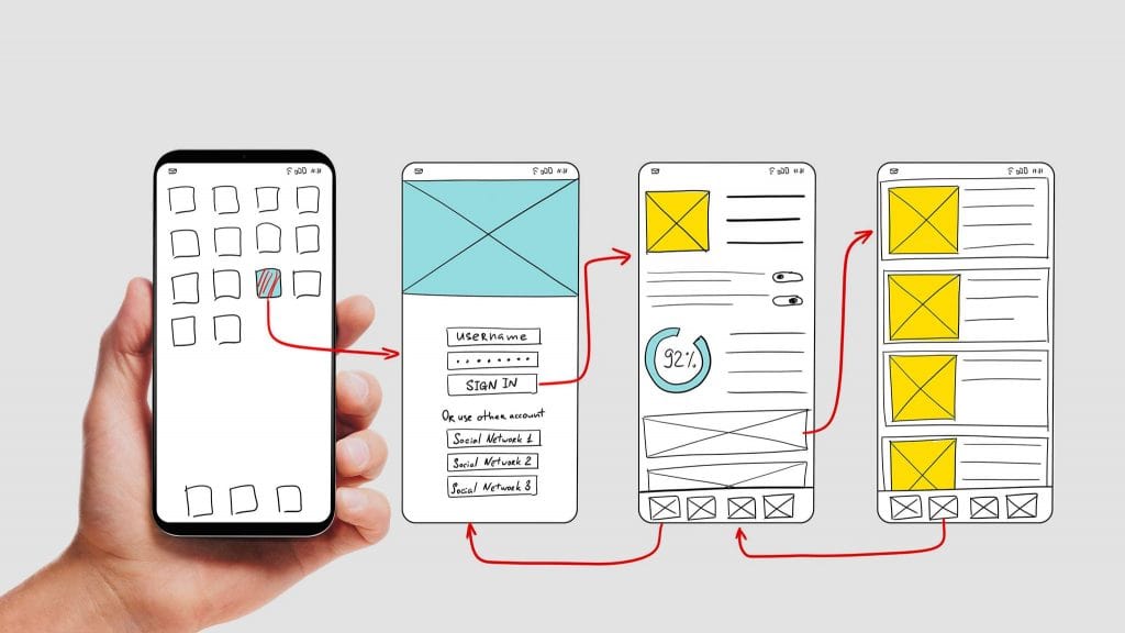
This section will provide a step-by-step guide for creating a mobile-first website, from the initial auditing process to the final testing phase.
1 – Auditing
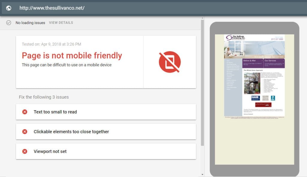
If you are amending an existing website, you need to make it mobile-friendly before it can be mobile-first. Thankfully, Google has launched the Mobile-Friendly Test that provides a range of insights and recommendations to help you improve, regardless of whether your website passes or fails.
Possible errors that Google's Mobile-Friendly Test could flag include:
- Slow load speeds
- Broken redirects
- Uncompressed images
- Coding elements that fail to load on mobile
- Unsupported content
- Intrusive interstitials
- Pop-up ads
- 404 errors that are exclusive to your mobile website
If the test highlights any of the above errors, you must fix them before designing your mobile-first website.
2 – Create a Mobile-First HTML Framework
Develop a grid-based HTML framework to make it easier to lay out your mobile-first design and add elements later. A pre-built theme or template isn't suitable, as they provide little flexibility, and ultimately you are just adapting another person's code.
3 – Page Speeds
Fast loading speeds are vital and are a minimum requirement for most mobile users who want their information to be almost instantaneous. Not only is it essential for the user, but it is also a critical factor in terms of SEO.
Methods for improving page-loading speeds on mobile are:
- Create a caching system or install a caching plug-in if using WordPress
- Install a Content-Delivery Network (CDN)
- Make sure all images and videos are fully optimised for mobile screens
- Use lazy loading to deliver images
- Use lightweight design elements that do not use excessive code
- Ensure your website is utilising an SSL certificate to upgrade to HTTPS
- Upgrade to the latest version of PHP
4 – User Experience (UX)
Page speed and navigation are not the only factors that make up the overall user experience. As well as quick loading speeds and easy navigation, you should ensure images are the correct size, content is concise and uses larger font sizes, links are easily clickable, and various functionality is installed to enable actions such as swipeable image galleries.
- Amazon Kindle Edition
- Hartson, Rex (Author)
- English (Publication Language)
- 868 Pages – 11/02/2018 (Publication Date) – Morgan Kaufmann (Publisher)
5 – Accelerated Mobile Pages (AMP)
Accelerated Mobile Pages are not as crucial as they once were from an SEO perspective, with Google now putting more weight into other factors that create an excellent mobile experience. That said, it doesn't mean AMP is obsolete and can't still play a significant role when creating a mobile-first website.
Accelerated Mobile Pages use a condensed form of HTML and custom tags to ensure pages load extremely quickly. This generally means the mobile page would be free of elements like Javascript and embedded images.
6 – Large Buttons With Ample Spacing
We discussed navigation earlier and how most users will move around and engage with your website using their thumbs. We won't cover old ground too much, but the importance of large, well-spaced buttons must be reiterated.
7 – Local Search
Local Search helps users find businesses that are close to their geographical location. You need to optimise your website so that you can reach local audiences who are interested in your services.
To optimise your website for local search, you should:
- Register your website with Google My Business
- Add good quality photos of your business, including your premises and maybe even you and your employees.
- Include detailed Schema Markup
- Maintain consistent contact details across your digital properties, including your web pages, social media, and directories
- Encourage your customers to leave positive reviews.
8 – Voice Search
As user behaviour adapts, more people use voice search to find what they are looking for on their smartphones. This is why voice search should be at the front of your thinking when developing your website content, especially for a mobile-first strategy.
When writing content, you should consider the questions a user may ask to find your business. Examples of these questions are:
- Where can I buy…?
- How can I…?
- What is the best…?
9 – No Intrusions
A mobile screen offers constraints regarding how much you can fit on the screen anytime. You can reduce this space even further by poorly placed advertisements or, worse yet, annoying pop-ups that stop the user in their tracks.
When designing your mobile-first website, it may be a good idea to avoid advertising altogether and save that for the desktop version and larger screens. Keep all intrusions and unnecessary distractions to an absolute minimum.
10 – Security
Your website should have an SSL certificate installed to upgrade to HTTPS and provide users with a safe and secure browsing experience. Mobile security helps to keep sensitive data safe, ensuring any information submitted to your website is fully encrypted and safe from cybercriminals.
Mobile security is even more pressing, considering that 89% of vulnerabilities can be exploited without physical access to the mobile device.
- Hoffman, Andrew (Author)
- English (Publication Language)
- 441 Pages – 02/27/2024 (Publication Date) – O'Reilly Media (Publisher)
11 – Testing
The final stage is testing your mobile-first design, ensuring it is fully functional and delivers a great user experience before fully launching to real users. Even amongst well-known brands, a common mistake is launching a website before any teething problems have been ironed out.
Test your website thoroughly so every page loads quickly, the content looks great, and the navigation is seamless. Don't rush your launch date; if you notice anything that doesn't perform as well as it should, optimise accordingly.
Conclusion
People's internet use has seen significant changes over the last several years, with most internet users favouring their mobile phone over a laptop or desktop computer when searching Google and using social media.
This is why mobile-first design has become the most important consideration for web developers. A mobile-first approach will give audiences what they want and provide a solid platform for websites when it comes to SEO performance.
Mobile-first is designing a website for mobile users first and other screen sizes and devices second. This means creating simple and highly-usable elements that allow users to navigate and engage with online content without hindrance.
It is highly recommended to consider a mobile-first redesign for your business website to avoid a drop in traffic, missed conversions, and a decline in search engine performance. The stats speak for themselves, and if an online business is to thrive, then its mobile experience needs to be flawless.
Last update on 2024-05-17 / Affiliate links / Images from Amazon Product Advertising API

