20 Weird and Wacky Websites To Inspire Creative UX Strategies
A website is built every three seconds. With more online users, tricks, and tools than ever, any brand can create a website with just a few clicks.
As we welcome AI-powered website builders, formatted WIX and WordPress templates and a digitally native generation to the mix, it is becoming more challenging than ever to create a website experience that is well remembered.
According to Forbes data, 94% of user impressions are based on website design alone.
With personalisation now a key concern for both the consumer and the company, your website design must be in check if it is to attract qualified leads. Not only do consumers expect a website to offer them a seamless navigation experience, but to score more engagement, your website must also attract interaction sharability and keep your targets coming back.
The question is, how can you make sure your UX design stands out? In response, we’ve put together twenty weird and wonderful website designs that have got their users talking in the past year. From out-of-the-box styles and creative navigation, they are excellent sources of inspiration for 2024. Explore these sites to discover effective practices that set them apart.
Table of Contents
Gapsy

First up, we have Gapsy Studio’s website homepage. With a playful yet usable home screen design, they take navigation one step further with their ultra-realistic studio walkthrough.
Featuring twists and turns in 3D, followed by hyper-realistic typography gilding users forward, it’s such a fun way to approach a UI navigation in 2024.
Utilising the studio’s actual walls and art features to greet site visitors, the gallery website has an ‘exhibition mode’ that allows all consumers to sift through a compelling video showreel before embarking on a click-based gallery tour.
Quick, Draw!
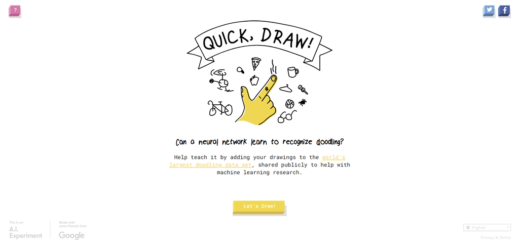
The following website on this list is Quick, Draw! Leveraging the beauty of generative AI, this weird website design churns out original prompts for each user to draw a picture. The neural network then guesses the doodle in just 20 seconds.
While the simplistic meaning behind this site may not seem like much, it is an excellent demonstration of how AI can be used within generative content experiences.
Better still, this fun little website was built to contribute to further machine learning research. So, each time you engage, the data contributes towards making AI even better in the UX design industry.
ZoomQuilt

ZoomQuilt is a collaborative art project that has excited in the form of a website for over 20 years. While most UX design experts will have heard of it, its wacky approach to user experience earns it a spot on this list.
The site is made up of paintings. As you scroll and click, each painting morphs into another image as you speed through each window and opening. These paintings are endless, trippy and well-optimised to enhance discovery from all angles.
Scepter & Sword

Scepter & Sword’s website is on this list for its use of jaw-dropping visuals. Visual elements play a huge part in website design success in 2024, and 75% of users actively look out for a visually appealing website.
Wine Producer Scepter & Sword use visuals to their advantage within their themed UX design strategy. Using ancient style imagery to represent their mission of: “building a wine-oriented, experiential platform to help inspire curiosity, provoke discussion and challenge perceptions around social equality while celebrating female empowerment,” they know exactly how to position their brand in their design.
Their design aims to apply the essence of female rulers through history to their wine marketing. This includes choosing dark colours, post-renaissance painting style photos and, of course, a few tremendous easter eggs relating to the brand itself.
Binary Music Player
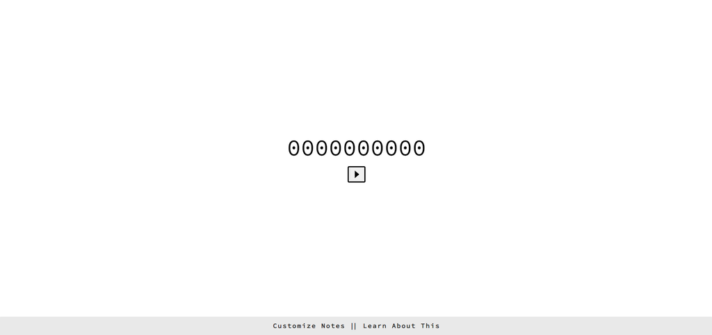
This next website design needs no introduction. A unique design that plays stunning piano notes based on binary code says it all.
This website is built cleverly using JavaScript. The design is minimalistic as you enter and focuses on a binary counter in the middle of the screen. Users can choose any pattern they desire, and the website will playback the binary tune once the user clicks on the play button.
This wholesome website use demonstrates a fun twist on the interactive experience. While the design is minimalistic, engagement rates are high as users create unique content.
Mustafa Celik's Online Portfolio
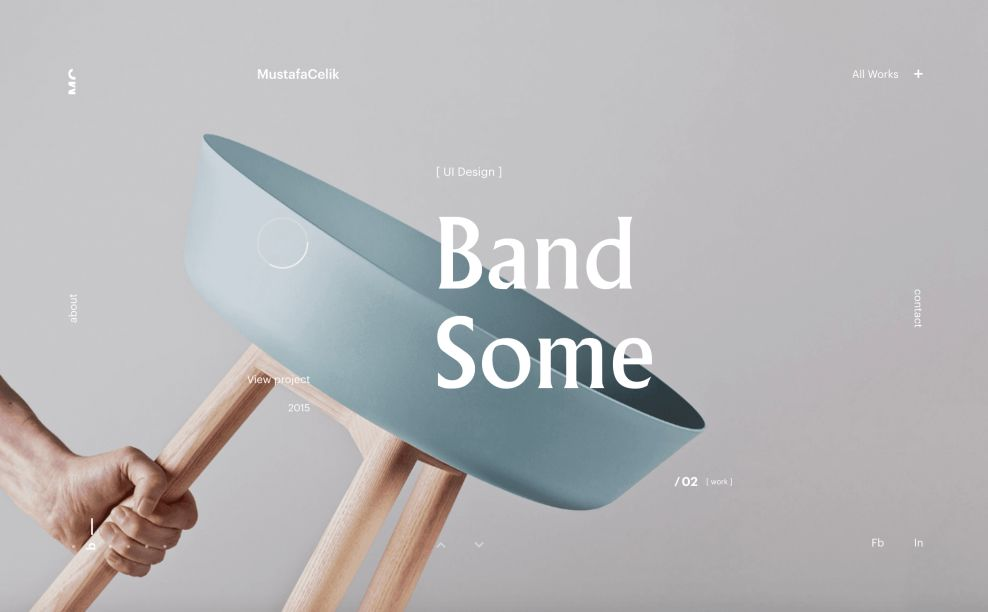
Zurich-based art director Mustafa Celik uses his website design as a testament to his UI and UX capabilities. Using the homepage as an online portfolio, he’s made his way onto the list with his dynamic illustration, out-of-the-box navigation, and clever typography.
Celik uses parallax scrolling to enhance viewing flow by embracing a modern approach to UX design.
“I get inspired by novel ideas, original design and creativity. My work has been varied – from branding, print, apps, UX/UI, websites and digital tools – but always with a human-centred approach and a keen eye for detail. I like to take influences from nature, architecture, and cinematography, and I always lean towards minimalism and simplicity,” he says in his portfolio.
His design encapsulates that and demonstrates how UX experts can push the boundaries with contemporary design.
NKI Studio

Our following website is the perfect example of creative navigation. Instead of encountering a standard homepage design, users of NKI Studio are greeted with a grid layout. They can then use their cursor to guide their way across each grid section and enlarge each box with a click.
This is an excellent demonstration of thinking outside of the box regarding user experience. Those who spend time on how users interact with their site are more likely to stand out amongst competitors. If you blend something as basic as a navigation flow with creative interaction strategies, you’ll quickly increase engagement and reduce your bounce rate.
Bruno Simon

In the same way as art director Mustafa Celik. Bruno Simon also uses his UX design to help enhance his online portfolio. Turning his website into an interactive 3D game, the UX expert uses elements designed as objects to describe each area of his skill set.
The website design prides itself on interactivity. The user is positioned as a car on the homepage and can use their cursor to ‘run over’ any objects they like. Once run over, these objects become text elements that delve further into Simon’s work experience.
The Eames
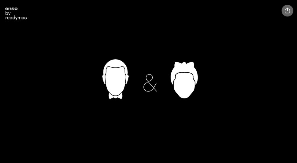
The Eames is an excellent testament to the benefits of using traditional animation and colour placement within your UX design strategy. As a tribute to two legendary people of design past, the website is centred around the subjects of Charles Eames and Ray Eames. Both Ray and Charles were WW2 designers of furniture that were used within the military force.
This tribute website encapsulates that with its use of black and white colour to signify a simpler time. Better still, designers here have axed ultramodern imagery, embedded videos and VFX animation and replaced them with old-school stop-motion graphics.
What a fantastic way to show UX designers that traditional methods are sometimes the most inviting for users so saturated by innovation and innovative technology in 2024.
Falling Falling

Next, we have Falling Falling. This fun website design may have no branded purpose, but it demonstrates how creative you can get with UX design in 2024.
Created by Rafaël Rozendaal, this website consists of an endless loop of coloured screens that appear to fall on each other to reveal a new colour.
While the objective is simple, it has a fantastic engagement rate, as consumers with short attention spans enjoy seeing constant changes within the site design.
Rozendaal claims that the website aims to remind users that technology continues to change the nature of art and that UX designers should be the first to adapt to those changes as we move online.
Neverthink

Neverthink is next on our list of weird and wacky websites to enjoy in 2024. First founded in Finland, this website design encourages viewers to actively engage with video content instead of passively scrolling through it.
Working like a TV guide, Neverthink is a website full of curated content that is set out as if each video were a TV show on a streaming service. It aims to help promote less popular creators, and this site forces users to be actionable about the content they consume.
Better still, Neverthink works with the YouTube app, making it easy for users to jump from one video to another without changing channels.
Sonja Van Duelman

Sonja Van Duelman’s one-page website has made its way onto our list for its use of colour and space when it comes to creative navigation.
This one-page website is accessible to scroll through from top to bottom. Even though she mixes layouts to change each user's course, the website aims not to disorientate but to demonstrate the full potential of interactive UX design.
As a designer, Sonja has developed her landing page to resemble one of her famous magazine covers. With an intelligent curve in the cover image portraying a real-life magazine cover, she used strips and columns to detail her navigation system.
These call-to-actions simply take you to a new space on the landing page, meaning fewer loading times and more scrolling.
The Quake
The Quake’s website is an excellent example of interactive storytelling. This weird and wacky earthquake educator begins to shake as you move your cursor along the page, mimicking a tremor and immediately gaining the user’s interest.
Better still, as you start scrolling, the typography begins to split and shake before dividing the screen into two halves, just like an earthquake would do.
This fun technique ensures that users retain the information shared and emphasises the importance of great interactive graphics in the future of UX-powered storytelling.

Once the initial earthquake tremor is over, the site uses attention-grabbing graphics to guide users into a new form of storytelling that delves into how earthquakes occur and what effects they may cause.
As you scroll, the site has several shocking visuals, 2D world maps packed full of earthquake alarms and even an interactive Richter scale that educates each user on the severity of earthquake tremors.
The scrolling takes you to the bottom of this one-page website, where you’ll find lifesaving survival tips alongside in-depth photography for a great combination of realism and animation for the most engaging user experience.
Jodi
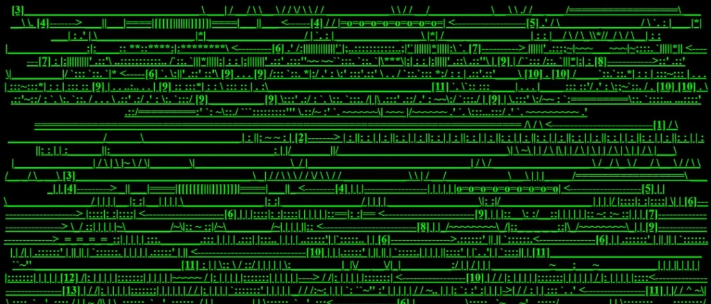
Next, we have Jodi, a fabulously confusing website created by artists Joan Heemskerk and Dirk Paesmans.
While this website may look confusing, digital artists Heemskerk and Paesmans designed the site using internal linking structures to create a digital art piece.
Users can click on different site elements and be transported to a random page. Each path leads to a unique journey and can lead users anywhere from Google Maps to image searches or even new websites worldwide.
It’s This January

It’s This January comes from a digital agency. In a sea of competitors, it can be challenging to stand out, but this advertising company created a tremendously weird website to grab the attention of its demographic.
Using a great range of humouristic video clips and clever brand positioning, It’s This January knows how to catch your eye with their website; for example, as you enter the landing page, you’re greeted with a montage of some of their wackiest ad designs.
Better still, as you scroll, many of the brand’s featured campaigns pop up on the screen and begin playing as you hover over them. When engaged, the cursor turns into a ‘view more’ icon that can be accessed with a button click. What a great way to stand out as a creative ad agency.
MapCrunch
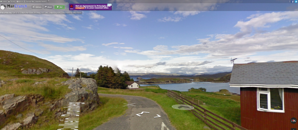
While the website design of MapCrunch may not match some of the other weird and wacky designs we've seen so far, it deserves mention for the website’s concept alone.
MapCrunch is a Google-powered site. As soon as you enter the landing page, you are instantly transported to a hotspot that you can begin immediately exploring.
One fun fact about MapCrunch is that the popular social media platform Tumblr first invented the website. After seeing great success on the platform, the live website saw a 1500% increase in usage in just 24 hours.
The Opportunity Agenda
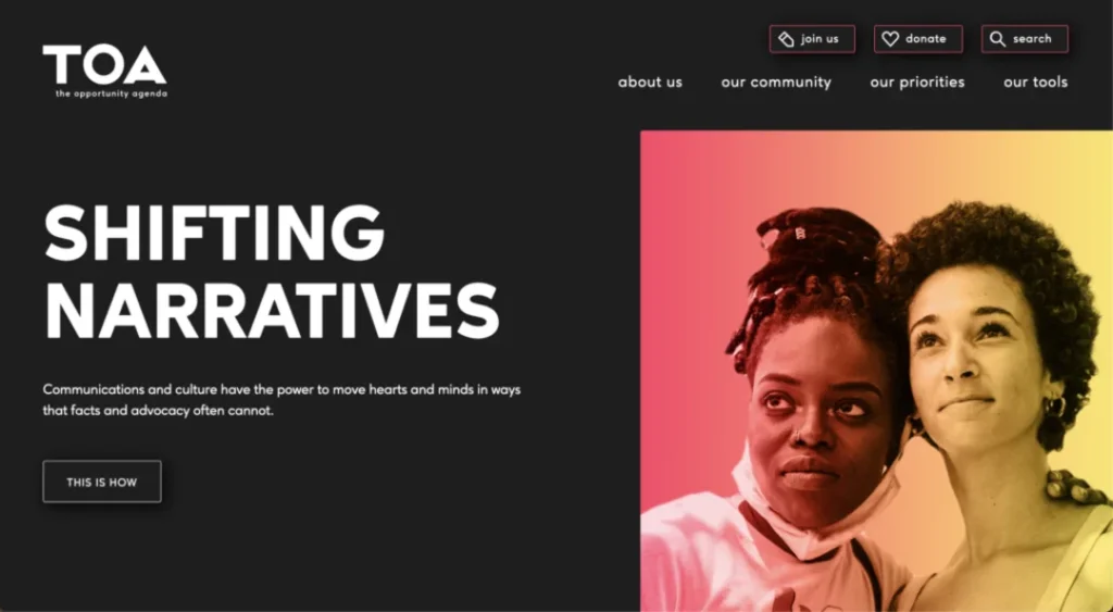
Let’s talk dark mode. The Opportunity Agenda know precisely how to use dark colours and negative space to make an impact with their brand message. Founded over 25 years ago, TOA has become a resource for many progressive organisations that want to improve their messaging technique.
Since its release, the TOA has redesigned its digital presence to reflect its newest brand message: reemerging white supremacy.
To do this, they have created a visually bold, hard-hitting, and relatively minimalistic website to ensure that the user is driven straight to the necessary messages behind the UX design.
To embody the brand’s true mission, the website has been set to dark mode, which, while still fully immersive, paints an understanding of their cause. Better still, their use of dark mode also also makes the website more user-friendly. After experts found that dark mode improved content focus and engagement while reducing eye strain, more UX designers than ever before have jumped on the new trend.
The Opportunity Agenda’s website also gets creative with content transitions. No matter where you land on the site, users can easily navigate from one end of the website to another through a series of scrolling transitions that twist and twirl to keep you engaged as you consume the content from top to bottom.
Pointless Sites

This weird and wacky website is the perfect timewaster. While we may have collated just a few of the most bizarre websites on the internet, this website lists thousands to choose from and engage with.
While it’s exciting to click through several creative sites, the Pointless Sites design is excellent in itself, offering a nostalgic approach to web design. Actively choosing to appear in an early 2000s format it’s a great form of nostalgic targeting for millennial browsers.
Better still, the website lists a unique ranking of the ‘Trending Top 4’ weird and wacky websites every month, giving each consumer the chance to vote. This encourages a user to spend more time interacting with every hyperlink, raking in engagement for a hefty amount of time.
Buzzworthy Studio

The first thing you instantly notice about Buzzworthy Studio’s website is the giant, interactive jelly blob on their landing page. Moving your cursor along the ball ripples like water and changes form to fit your mouse motion.
Users can play around with the font's shape and many other website elements alongside this captivating interactive animation. This UX design ripples and moves like water, an attention-grabbing approach to website building.
Website designer Gary Stout has done a brilliant job paying homage to the brand’s ‘buzzworthy’ nature. Offering users beehive-shaped loading icons when entering the landing page to follow the agency’s red and blue colour theme through several interactive case study presentations, this site is very aesthetically pleasing.
Better still, the interactive blob follows the user from page to page, adding a fun interactive element to the entire website experience.
UX professionals regarded This site so highly that it won Design Rush’s Best Design Award in 2023.
Cat Bounce

Last but not least, we have Cat Bounce. It wouldn't be a lineup of the weirdest and wackiest websites if there weren't at least one full of bouncing kittens.
As you move your cursor around the site, the cats jump over it in many funny positions. While this design may poke at pointless fun, users can also discover a hidden message button on the right-hand corner of the screen revealing that the site was designed to support cat rescue fundraisers.
Weird and Wacky Websites of Tomorrow
Well, there you have it. Each one of these sites gives UX designers something to think about when approaching new projects in 2024.
The question is, where could website design go next? As we see an increase in the use of AI to enhance website design, we’re likely to see many more interactive and ‘sentient’ landing pages that aim to boost interaction online.
This, coupled with advancements in video technology, animation and high-quality image insertion, will make the sites of tomorrow a visual masterclass for today's websites.
