10 Logo Design Principles for Effective Branding
In a competitive business landscape, it is essential to differentiate oneself to stay ahead. Visual communication is invaluable in creating lasting impressions and establishing brand identity.
A logo design should be unique, easily recognisable and accurately reflect the company's core message – all of which can be challenging amidst intense competition.
Paul Rand once said: “A logo does not sell (directly); it identifies.” This highlights the importance of crafting logos that stand out from the rest while still being simple enough for customers to remember quickly; a study by the University of Amsterdam revealed that 71% of consumers find more straightforward logos more memorable than complex ones.
Branding through visual communication has been proven repeatedly as having great potential when done well – Lucidpress found revenue could increase up to 33%. Conversely, according to survey results, poor branding can cost businesses billions annually.
Skilful navigation through market forces requires thoughtful consideration towards one's brand identity – with this comes the responsibility of designers who must abide by fundamental principles when designing successful logos, such as simplicity, core values and recognisability.
It is paramount for businesses today to pay close attention to their product or idea and how it communicates visually if they want any chance at succeeding in this ever-evolving world where competition is always lurking around every corner.
Table of Contents
1 – Industry Research

A logo is a powerful tool for visual communication; it speaks volumes about a company's identity and values. As the saying goes, “a picture is worth a thousand words”, – so why not make those words meaningful?
Before beginning the design process, designers must have an in-depth conversation with their clients to gain insight into who they are and what image they want to portray. Research is essential in understanding client requirements, whether small businesses or global enterprises.
By delving into the industry landscape and studying competitors closely, logos that stand out from the crowd can be crafted. Clients often provide briefs specifying their needs, but this should go beyond stating facts – designers need to ask thought-provoking questions that allow them to understand the brand more deeply.
This could include learning its story or targeting specific audiences. A great logo has transformative power: it transcends simple visuals by conveying an organisation's core values without uttering a single word! Creating one successfully requires extensive research and delicate conversations between designer and client – each aspect influencing how incredible (and successful) your final product will be!
2 – Simplicity
When it comes to designing a logo, the key is simplicity. Brands like Honda, Nike, Mcdonald's and Coca-Cola have all proven that straightforward logos are not only easier to remember but also become instantly recognisable.
However, there's more to creating a compelling design than just its simplistic nature – attention must be paid to a logo to capture the brand's essence in an impactful way. For example, some iconic logos may seem intricate at first glance, yet upon closer inspection, they reveal themselves as having undergone simplification processes over time for increased consumer recognition.
It is also essential that designers consider how their logo will appear across various mediums when creating it – from tiny phone screens to giant billboards – and ensure that whatever elements were chosen can maintain their integrity despite size changes or other external factors affecting them negatively.
Ultimately what needs to be conveyed by any successful logo design is the core values of the company along with its vision towards target audiences; this should all be presented visually using minimalistic elements so as not only to give longevity but establish a strong identity people can quickly identify with each time they see it displayed somewhere else.
In summary: Simplicity plays a significant role when constructing memorable logos which age well over time while still being capable of adapting under different circumstances without losing effectiveness or meaning behind them altogether; such designs require careful consideration if brands want consumers to recognise them quickly and associate those attributes directly with their perception of said company's values and vision combined into one single cohesive package able enough withstand tests thrown at it by varying sizes and formats seen throughout today's marketplaces whether digital or physical ones alike!
3 – Memorable
It is universally recognised that a well-designed logo holds immense power in encapsulating a brand's ethos and identity in a concise and memorable visual form. However, as consumers, people only spend a second observing a logo, which necessitates the importance of designing a logo that is easy to remember.
Herein lies the invaluable property of simplicity- logos that contain simple shapes are easier to recall than intricate designs. Iconic symbols like Nike's ‘swoosh' or Apple's ‘bitten apple' testify to this fact.
While designing a logo, it's imperative to consider that consumers can describe the essential elements of the logo without any complications or overthinking. Creating a multifaceted or complicated logo may need to be clarified for consumers and limit brand recognition, resulting in the brand's failure to establish a unique identity.
Colour is equally crucial in creating an extraordinarily memorable logo. As Brazilian designer Paula Rupolo rightfully states, “colours are the first thing you notice in a logo, what gets fastest to our brains, then you read a logo's shape, icons, or typography.” Colours undoubtedly play a significant role in enhancing brand recognition and recall value. For instance, ‘green' is synonymous with Starbucks, and ‘yellow' represents McDonald's. It emphasises that the colour of the brand's logo can influence consumers' perception, ultimately leading to how they identify with the brand.
Paula Rupolo demonstrated this fact experimentally by swapping the colours of rival brands, which resulted in consumers taking more time to recognise the logo with the colour that did not relate to it. This experiment shows that businesses must choose their colours wisely when identifying and creating their brand identity. Thus, designing a logo that is simple in shape and uses a colour that is relevant to the brand can aid in creating a memorable and recognisable brand identity that will endure.
Designing a logo that is easy to remember is essential, as a consumer's initial reaction to a logo determines how they perceive the brand. Creating a logo that uses simple shapes and colour that is easily identifiable as relevant to the brand aids in effective brand recognition. Thus creating a memorable and recognisable brand identity that is long-lasting.
4 – Distinctive
When crafting a logo, it's essential to consider the brand and the industry in which it operates. It is paramount for a brand to stand out from its competitors while maintaining relevance within its niche. To achieve this goal of being unique and memorable, designers should research their competition first and then create something that looks completely different from any other logos in the field.
Unfortunately, many companies are too complacent with their logo design approach and fail to recognise how important visual communication is for establishing an emotional connection or cognitive impact with audiences. Extraordinary logos don't just connect with target customers; they embody the company's core principles and values while always remaining distinctive.
Generic designs will never allow a business's branding efforts to leave an impression on consumers' mindsets – so opting for such approaches would be unwise! To create an effective logo that stands out, specific characteristics must be implemented – such as typography, shapes, icons or colours – to make them easily recognisable yet sophisticatedly striking at once!
Using visual elements through a well-crafted logo is twofold: effectively communicate your message whilst connecting emotionally with potential buyers; second, establish yourself as trustworthy by distinguishing yourself against rivals within your market segmentation.
Investing time and effort into designing something unforgettable can significantly increase customer loyalty and recognition towards your specific brand name. In conclusion, when aiming for success via developing a unique logotype, creativity and knowledge regarding competitive markets must merge before commencing operations!
By implementing clever typography, shape, icons, and colour tones, tailoring each element towards conveying relevant messages about what you do best, businesses can make an everlasting statement within consumer mindset levels!
5 – Modern Yet Timeless
Creating a logo that is both modern and timeless is essential for the success of any brand in the long term. While it can be challenging, striking a balance between incorporating current design trends and creating an enduring symbol is possible by following certain principles.
Minimalist designs, bold typography, simplicity, and meaningful shapes or symbols should be considered when designing a logo to ensure its lasting relevance. The Bata example is a prime illustration of longevity through subtle changes; since 1938, only minor revisions have been made to their iconic shape while retaining the same recognition and familiarity with their audience. By adding just some colour, they could keep up with modern times while maintaining sight of what made them so successful in the first place: staying true to themselves throughout years and generations.
What's more important than keeping up with design trends, however, is conveying fundamental messages that will remain relevant regardless of time passing by; logos need to capture something at their core which people can relate to no matter how many years pass afterwards – like wisdom transmitted from one generation onto another unchanged yet still applicable nonetheless.
Designers must understand there isn't such thing as achieving perfection but instead striving towards excellence – where each word chosen has meaning behind it so your message not only stands out but remains recognisable over time even after fleeting design fads have disappeared into oblivion.
6 – Appropriate

The importance of a logo in representing a company cannot be overstated. A logo is the visual representation of a brand, and it is critical to convey the brand's personality and values accurately. One significant factor to consider is appropriateness. The logo should be appropriate to the industry of the company it represents. A logo that looks good for one type of business may not be suitable for another.
For instance, using a black and professional typeface for a mainstream children's clothing brand would seem out of place. The same would be valid for a hospital's overly colourful and playful typeface. The choice of colour and font style significantly impacts a brand's perception.
Graphic designer Hanna Giles once conducted an experiment in which she swapped the styling elements of famous brands to see how fonts and colours affected their perception. The results were eye-opening. The font style and colour change significantly influenced how people viewed the brand.
Hence, all the small details and choices made when creating a new logo must be considered thoroughly. Every design element, including colour, typography, and style, should be selected based on its appropriateness to the target audience and the brand values. A logo that sells to the right audience will resonate and connect with them, boosting brand awareness, recognition and recall.
When designing a logo for a brand, it is crucial to select design elements that accurately represent its industry and values. A logo that appropriately reflects a brand's personality and values can resonate with the target audience and help to build a strong brand identity. As Hanna Giles aptly puts it, “All the small details and choices you make when creating a new logo matter, so be thorough and make sure you're selling to the right audience.”
7 – Adaptable
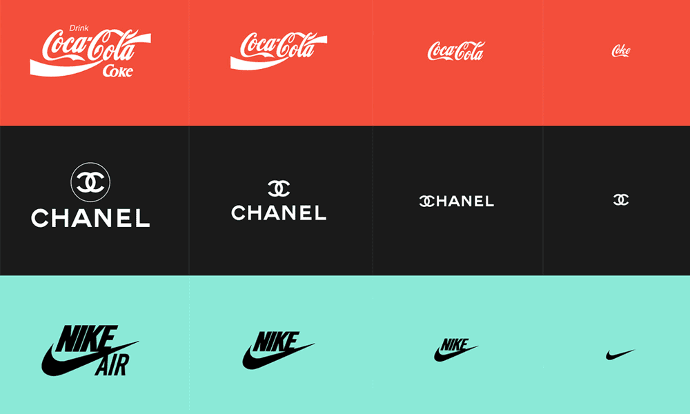
When creating a logo, it's essential to consider how it will appear on various surfaces. Not only do logos need to look great on traditional items such as business cards and billboards, but they must also be optimised for the rapidly advancing electronic displays of this latest today's world.
With modern smartphones featuring incredibly high-resolution screens, logos must have a high pixel density to remain clear and legible when viewed at different sizes. The best way to ensure this is by designing your logo using vector graphics which are infinitely scalable with no loss of detail or clarity. Unlike raster graphics (which contain pixels that become blurry if resized beyond their original size), vector graphics use mathematical equations defining shapes, making them flexible enough for any resolution or size requirement.
Designers need to remember that due to the multiple devices available today – laptops, tablets, phones etc., each one requiring its distinct pixel density – logos should be developed from the outset as vector designs to adapt to new technologies and resolutions in the future quickly. Considering this during the design stages, you'll create an enduring branding strategy against changing trends.
8 – Typography
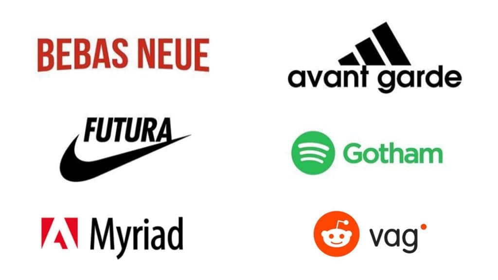
Regarding logo design, typography is pivotal in creating an impactful and memorable brand. Selecting the right font is essential in differentiating yourself from competitors using the same overused fonts such as Times New Roman or Arial. Therefore, custom-made fonts are crucial to make your logo stand out while keeping readability in mind. After all, if customers can't easily decipher what you're trying to communicate visually, they won't remember it!
While choosing something unique will draw more attention than standard options, designers must ensure that legibility isn't sacrificed for aesthetics. In conclusion, when designing a logo, remember that typography is just as crucial as selecting colours and images; choose wisely and thoughtfully when deciding on a typeface to create an unforgettable impression on potential customers.
9 – Monotone
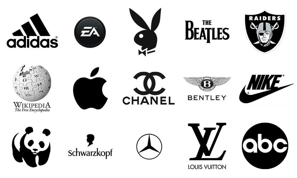
When designing a logo, it's critical to consider the various mediums and formats it may appear in, such as business cards or even social media icons. Some of these formats may be incredibly small, making it difficult to distinguish between colours, especially if they are similar.
To ensure that the logo is impactful, it's necessary to make sure it looks just as good in black and white as in colour. Stipping away the colours challenges the designer to create a logo that stands out even with limited design elements.
A great approach to ensuring the design principles work well is sketching out the logo's initial form in black and white. This approach allows the designer to focus on the elemental composition of the design rather than being tied down by colour considerations.
While colour plays an essential role in communicating the brand's personality and values, it's crucial not to let it overpower the overall design. Colours elicit different emotional responses, so choosing them thoughtfully is essential. For example, blue can create a sense of trust and security, while red can evoke passion and energy.
By starting with a black-and-white design, you can quickly evaluate whether the core message of the logo is getting communicated effectively. You can judge if the shape, form, and composition are impactful and effectively convey the brand's message.
The elemental design principles of a logo should be the primary focus, its shape, form, and composition, stripped of anything else that may detract from the message. Therefore, designing a logo in black and white first can allow designers to focus on the main elements of the logo without being sidetracked by the many connotations that colours can bring.
10 – Brand Heritage
When redesigning an existing brand's logo, respecting the brand's heritage and history is essential. A company's logo is not merely a visual representation; it's an identity that communicates the brand's personality, values, and unique selling propositions.
It's common for brands to refresh their logos to stay relevant and appeal to a changing customer base. However, this approach can be dangerous, especially if designers go overboard with the “make it simpler” strategy. In attempting to create a new look, some designers forget about the brand's history and subtle nuances, which can have profound implications.
The iconic Black & Decker brand redesign is a prime example of this misstep. The old logo was imposing and bold, conveying a message of robustness and durability, suitable for a company that manufactures power tools and heavy-duty appliances. The replacement logo, however, has a more delicate look with a cleaner, sans-serif font and a more straightforward ‘+' sign, replacing the iconic ampersand. The rugged quality of the old logo is lost completely.
The new logo might be appropriate for a company that manufactures beauty or health products, but it's not a good match for an industrial brand like Black & Decker. The worst decision was redesigning the iconic nut icon, symbolising the brand's association with power tools. The new logo is entirely dissimilar to the old one, which is a misstep.
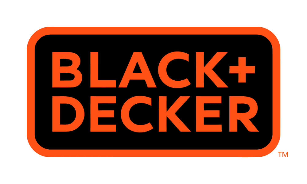
When redesigning an existing brand's logo, it is vital to keep the core elements of the original design intact. These could include the colour palette, font, imagery, or brand iconography. A redesign should always align with the brand's values and identity and respect the brand's heritage. A successful redesign should improve how the brand is perceived, reinvigorating an original brand while preserving its legacy. It's a challenging task that requires a delicate balance between respecting the past and moving the brand forward in a modern, thoughtful way.
Concluding Logo Design Principles
A strategically designed logo is essential for a company's success in today's fiercely competitive market. A study conducted by Business Insider found that nearly half of the consumers consider the brand logo to be an integral part when determining their perception of the product or business. As such, crafting an emblem that accurately portrays your brand's identity and values is critical.
One major factor to bear in mind when crafting your logo design is simplicity – Zippia determined that 95% of modern logos only use one or two colours at most, with just 5% featuring three hues or more; this demonstrates how effective a straightforward design can be in grabbing attention from viewers quickly and easily.
Another critical aspect for any successful branding strategy should be memorability: creating an immediate connection between customers and your logo will increase recognition across all platforms significantly – research carried out by Loyola University revealed that customer familiarity towards specific brands increases by 13%, simply through including certain images into their logos.
To ensure versatility across multiple mediums, scalability should also play its role within every designed piece; 60%, according to Logo Maker, reported experiencing issues with scaling down logotypes into smaller sizes without losing impactful elements along the way.
Colours, too, have extraordinary influence over consumer opinions towards businesses – Shopify concluded that up to 90% of initial impressions are based on colour choice alone! Therefore you must select shades wisely with due consideration given both psychologically what each hue represents and aesthetically whether they fit together harmoniously.
Last but not least, competitor research must be carefully considered before launching any new marketing campaign – 33 per cent surveyed by 99designs experienced illegible typography as the main issue leading to failure and misconstrued results within the target audience instead of the expected response hoped for initially intended! Subsequently, testing via surveys/focus groups is advantageous, ensuring resonation amongst potential buyers and portraying desired messages successfully representing the brand's appropriately chosen outcome.
What logo design principles have we missed? Leave a comment below to let us know!
