Only Studio creates new branding for cultural research hub network BIRI
Manchester-based Only Studio has created a new identity for BIRI, the British International Research Institutes, described as a network of hubs acting as “centres of research excellence” for arts, humanities and social sciences
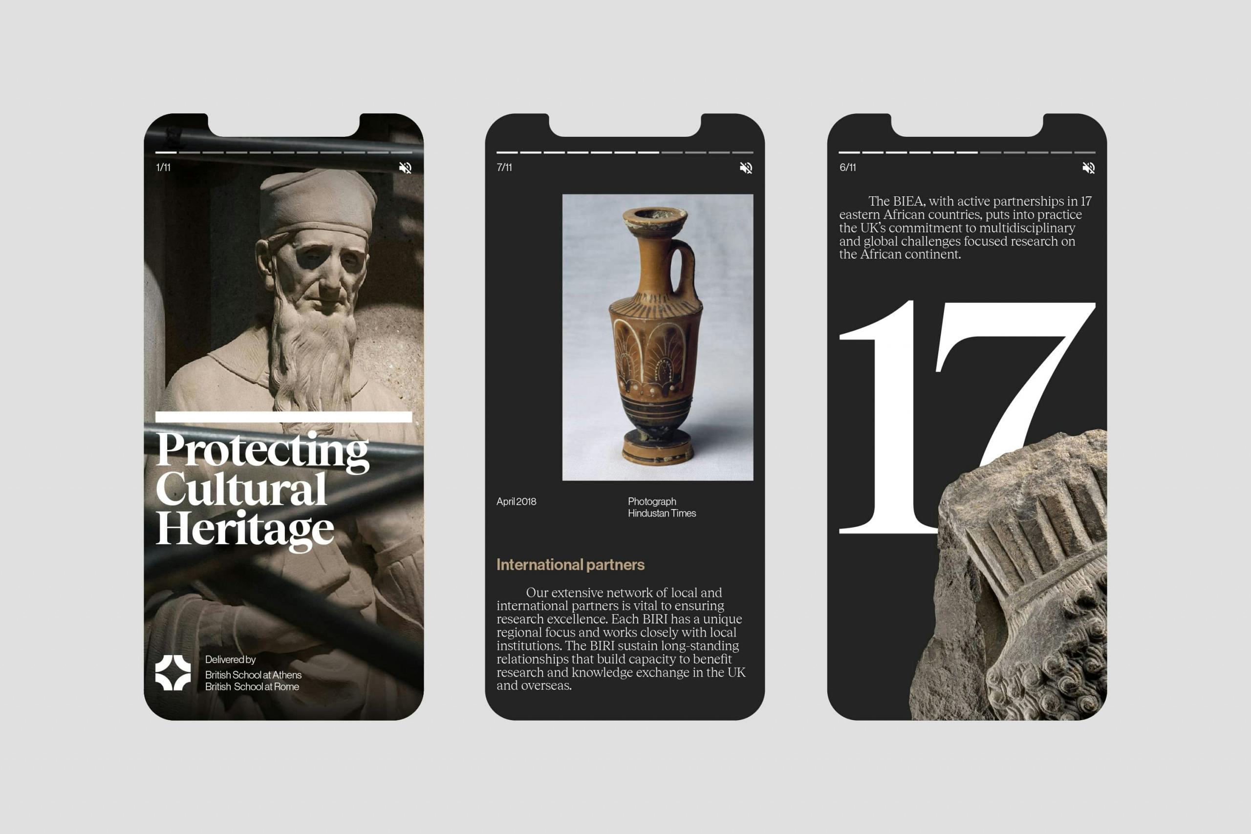
Spread across the Black Sea and southern Europe, Africa, the Middle East and Central Asia, the BIRI play a key role in connecting researchers in the UK with communities around the world “and in sustaining vital cultural and diplomatic relationships that build capacity to benefit research and knowledge exchange in the UK and overseas,” according to Only. Each institute has its own distinctive history and research profile, based on locally and regionally focused expertise and experience.
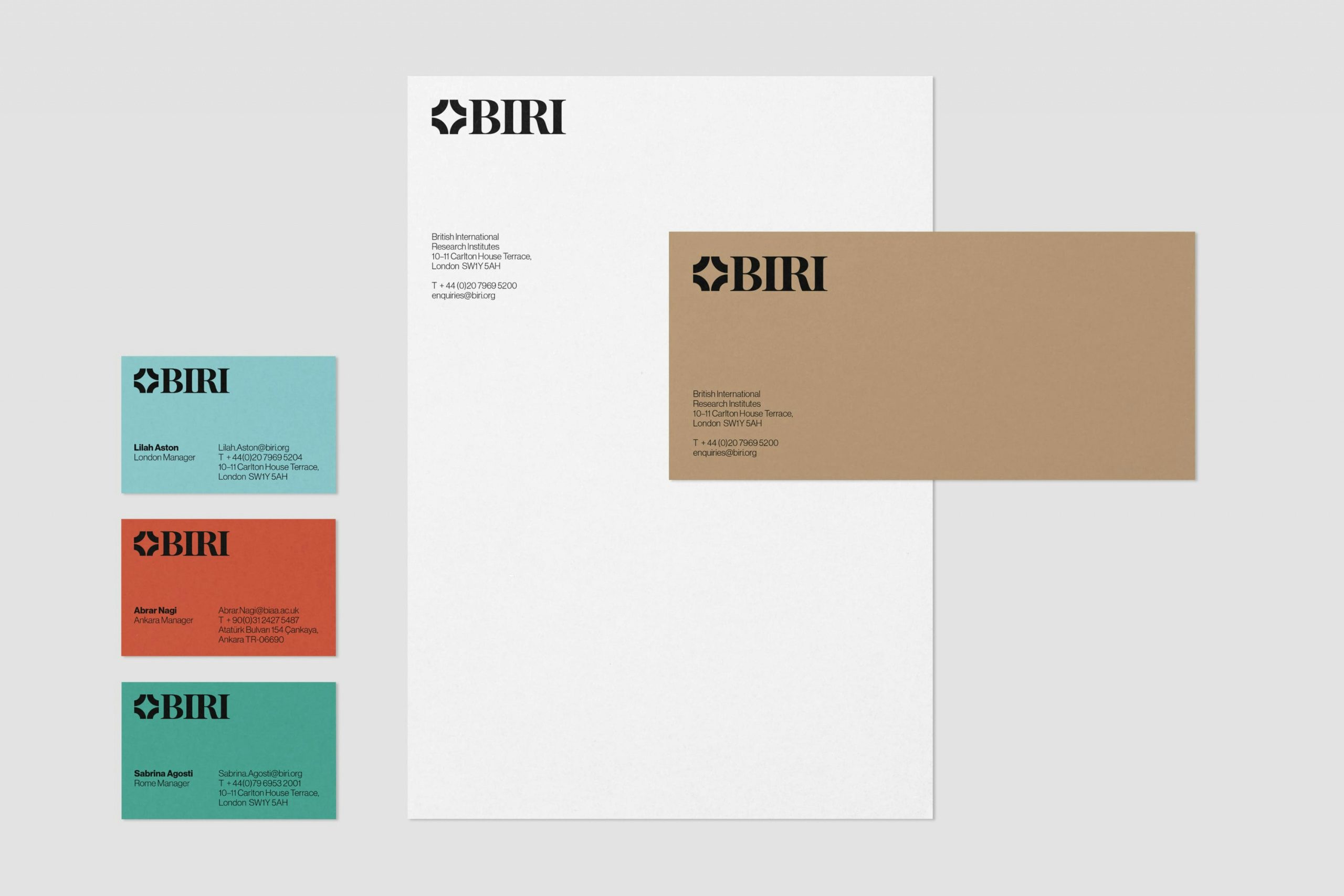
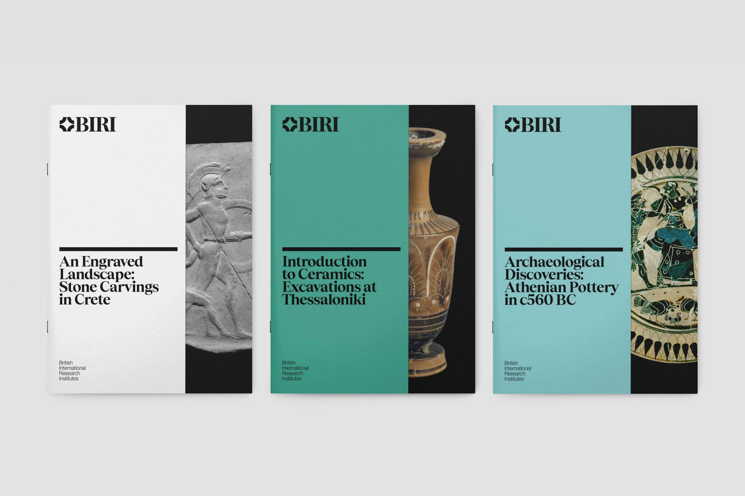
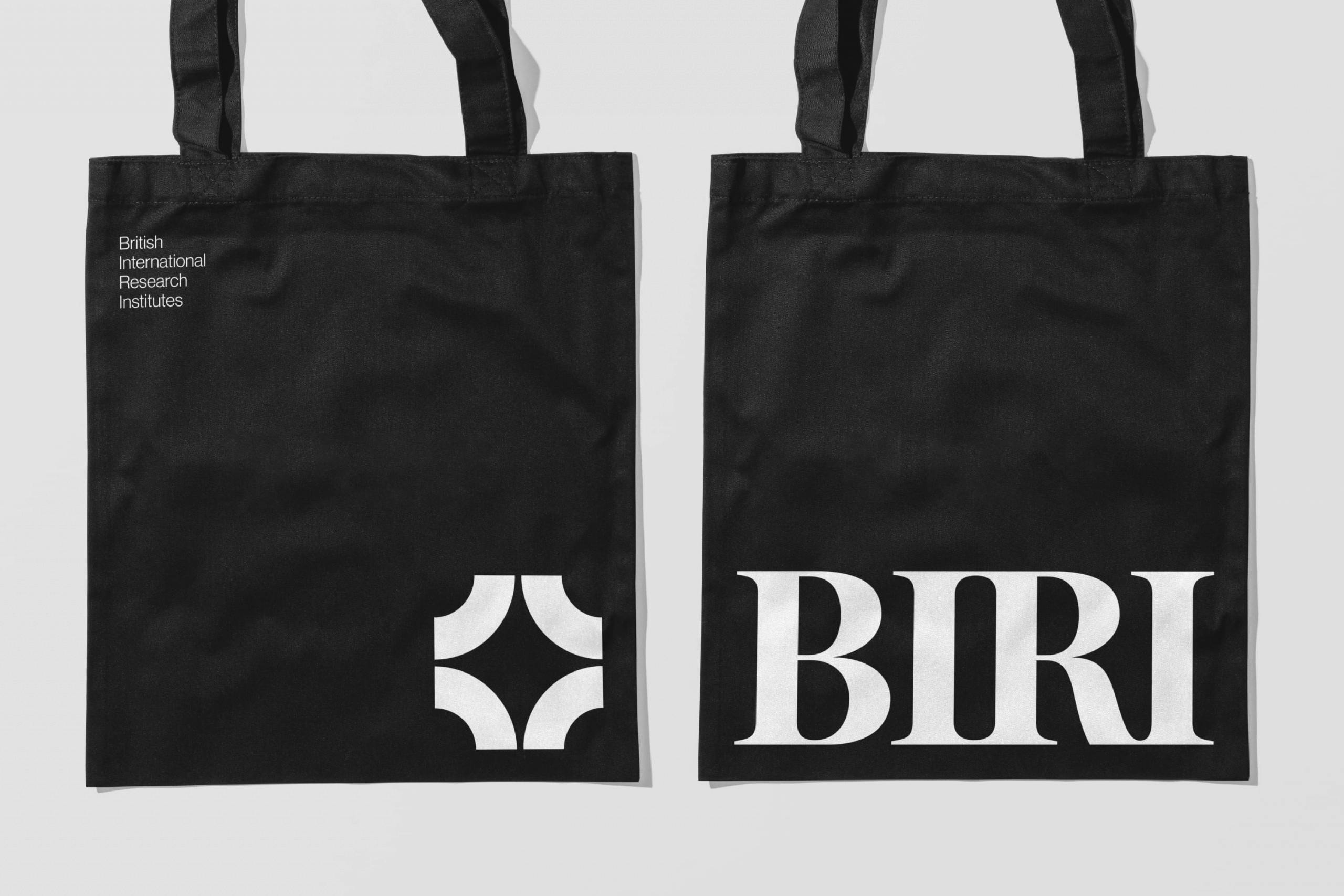
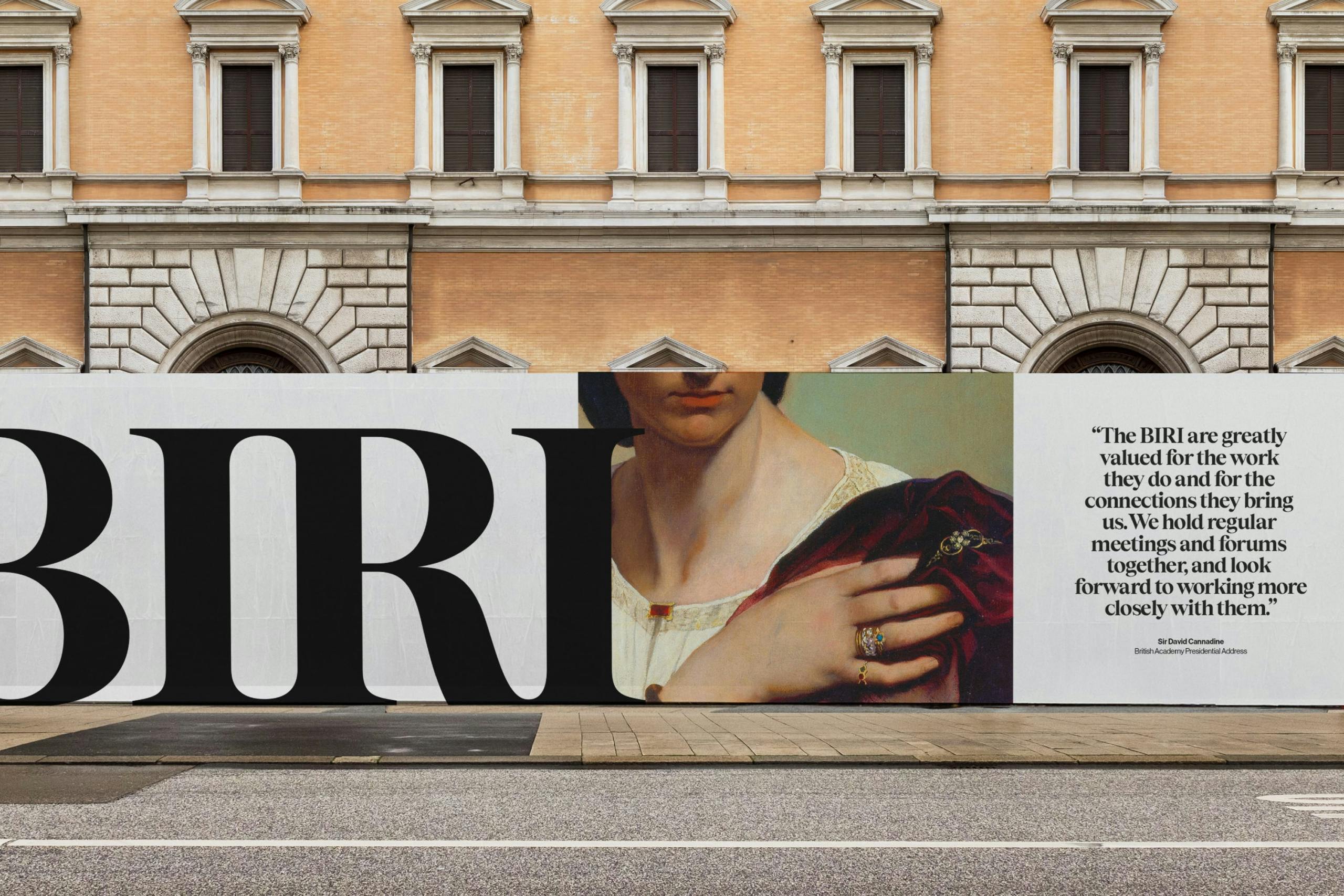
The new logo from Only uses modern serif forms, which were chosen to “balance a feeling of historic permanence and enduring relevance, with the unique forms of the ‘I’s inspired by the Doric order that has influenced so much of the region’s architecture,” says Only co-founder and creative director, Matthew Tweddle.
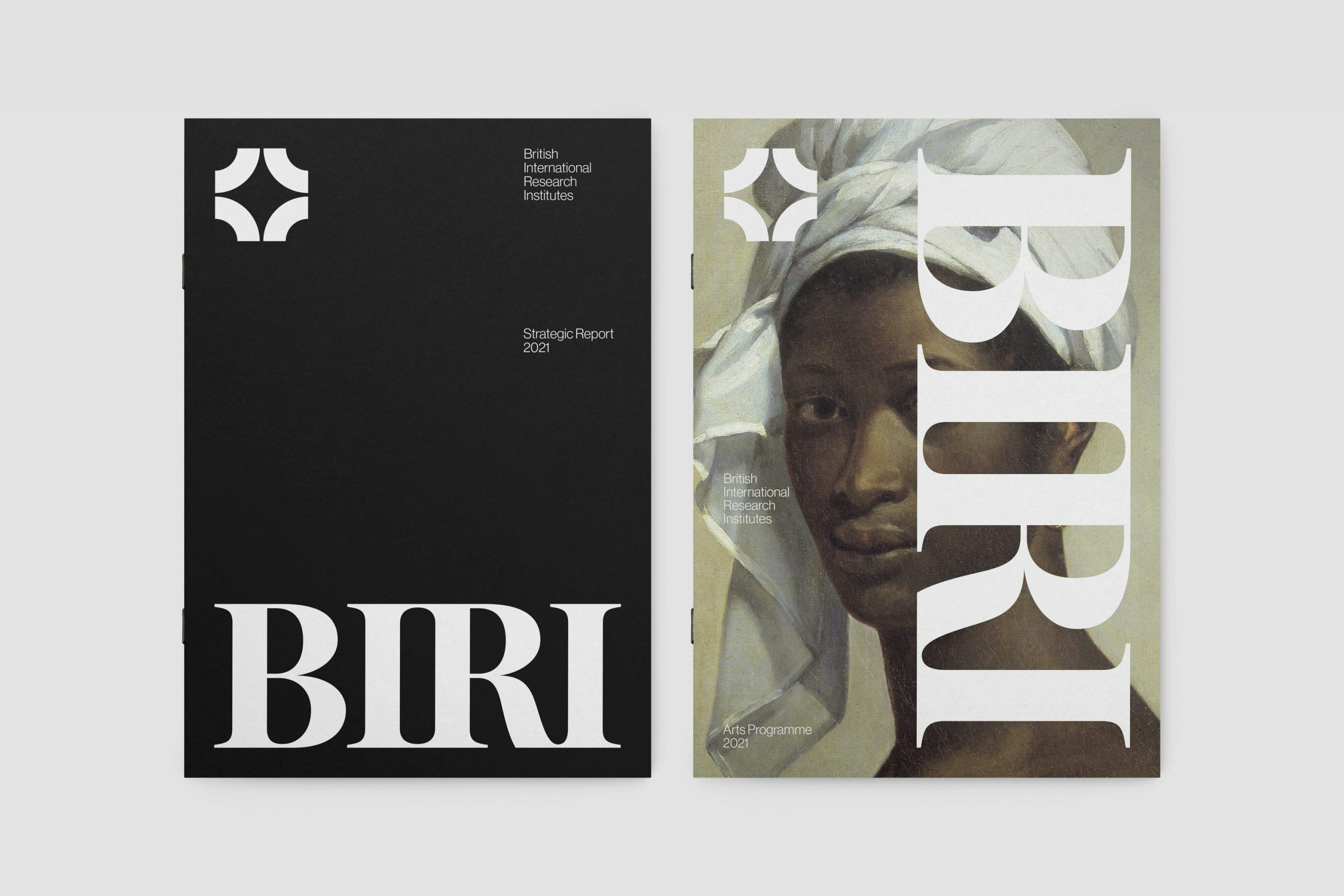
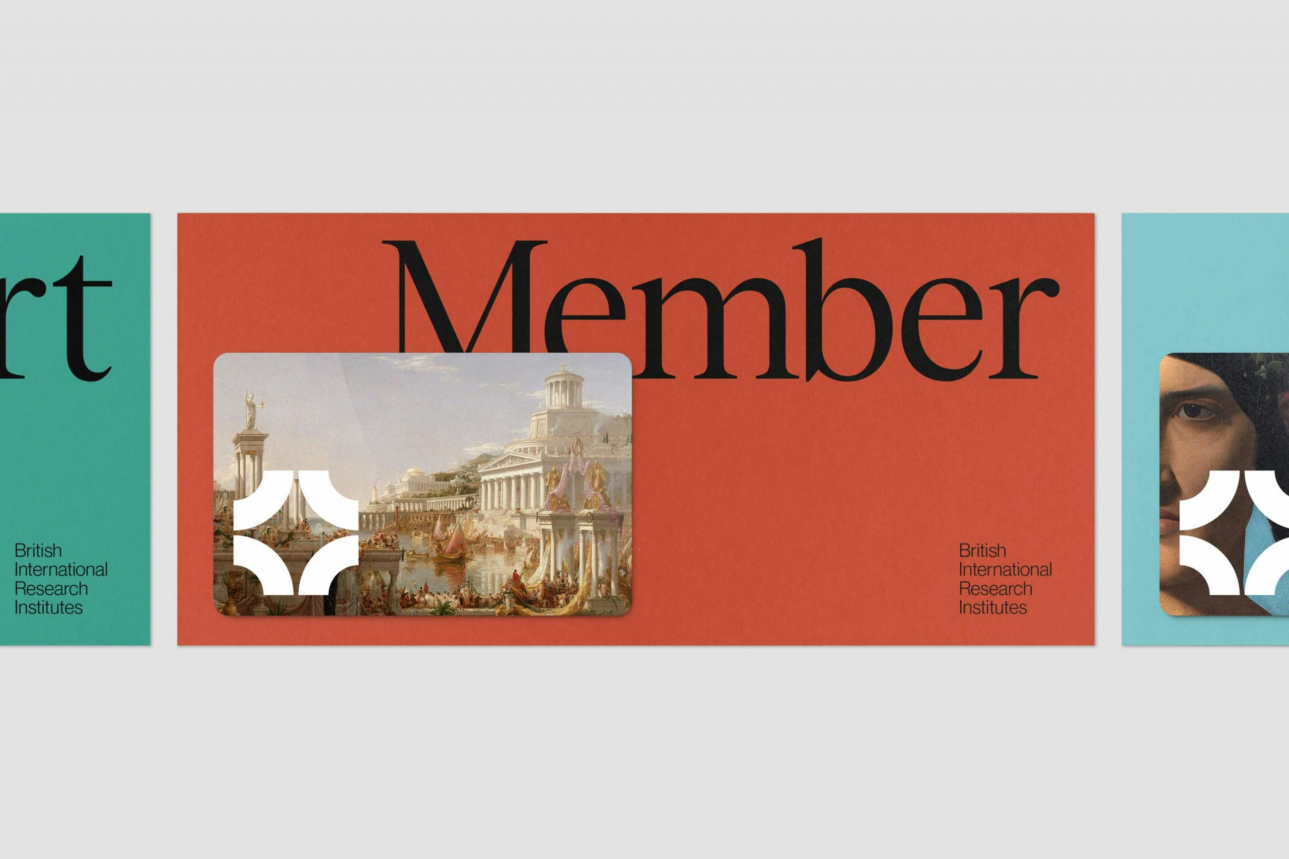
A new marque was also created, which aims to form a “symbol of collaboration and connectedness”. This is formed from eight points, representative of the eight founding institutes, with a star shape created in the negative space. This references BIRI as a “leading light in arts, humanities and social sciences research,” says Only.
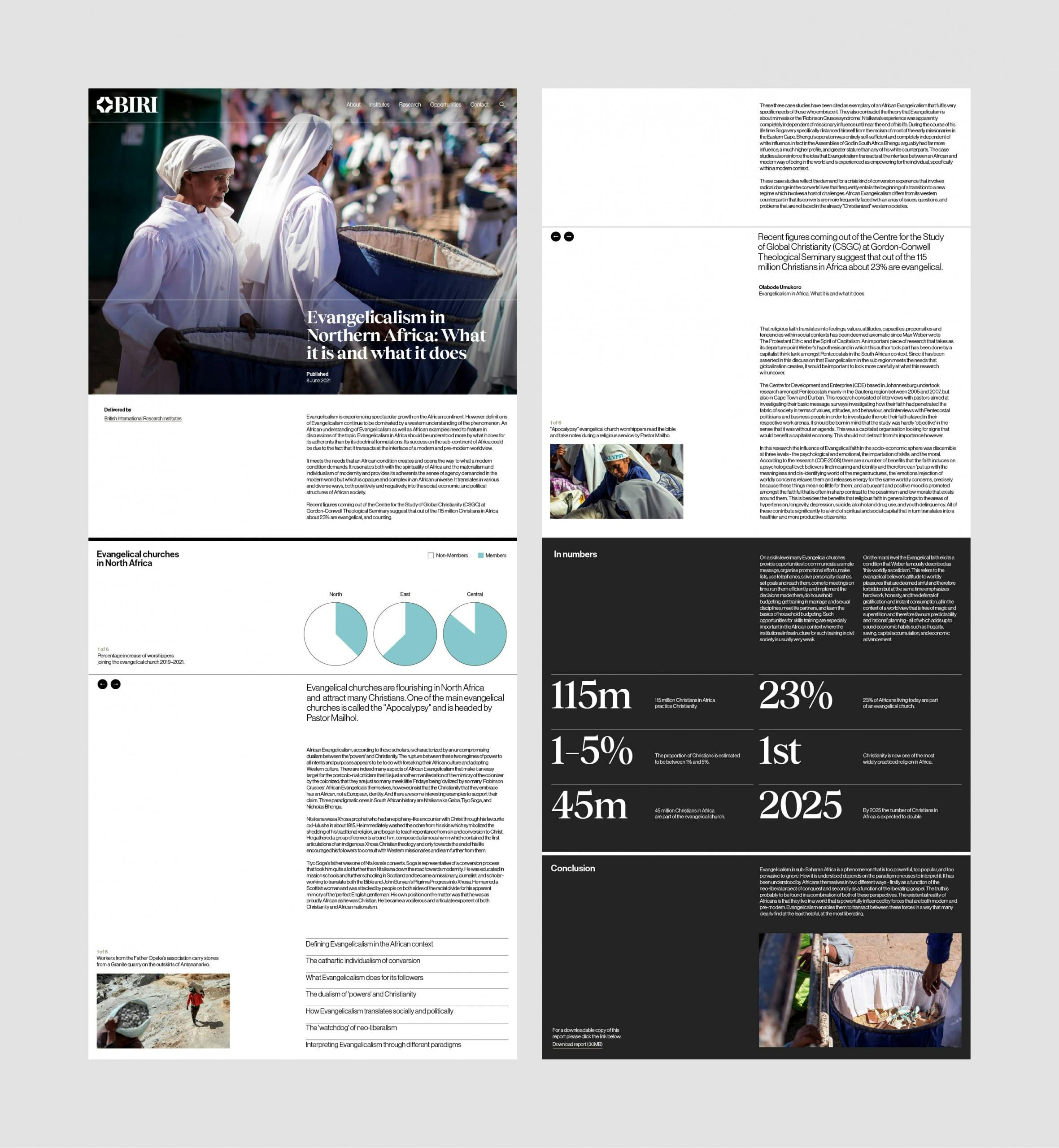
The new branding uses the typefaces Tobias by Displaay type foundry and Haas Grotesk by Commercial Type, with Rob Clarke working on wordmark refinement.
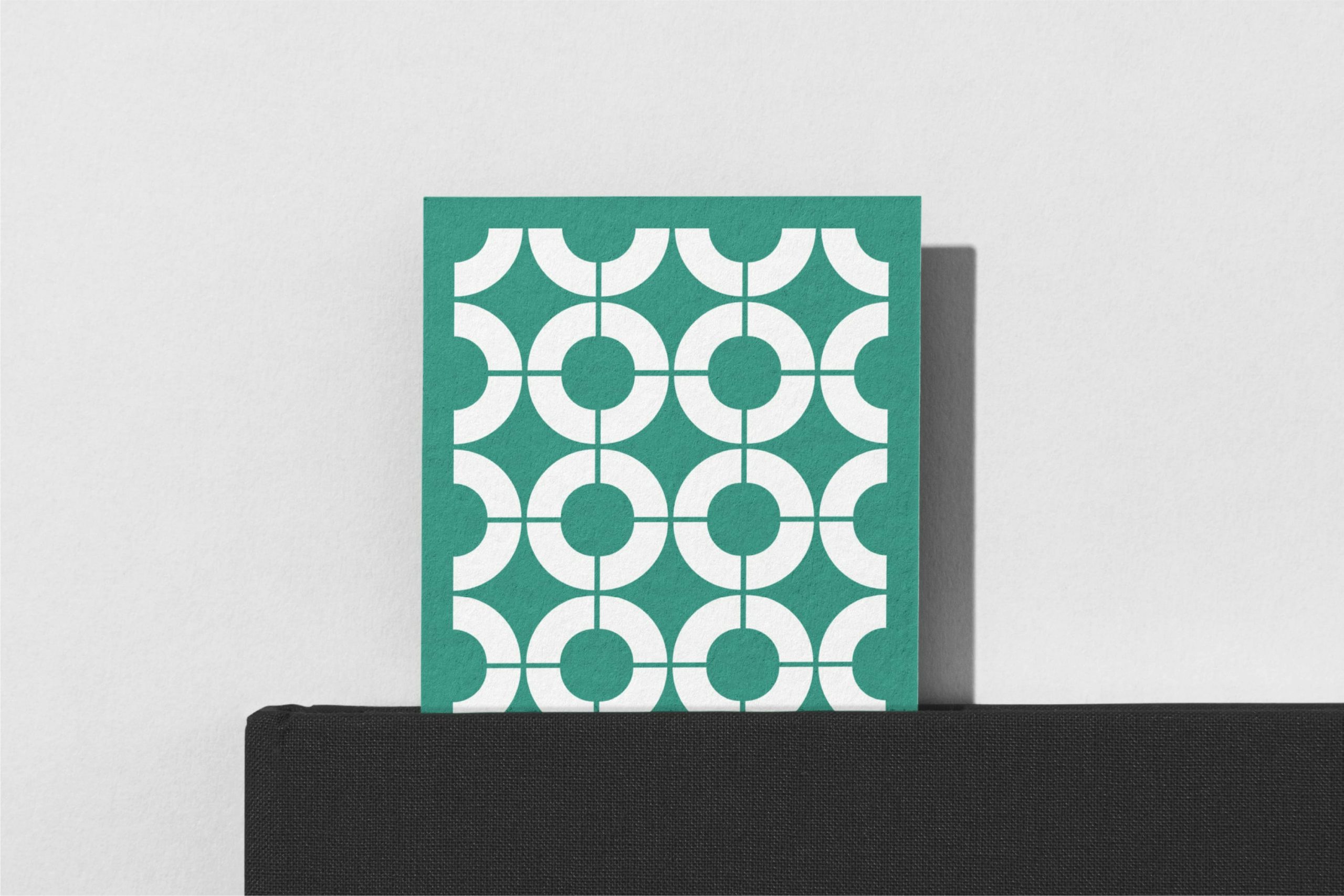
The new brand colours are inspired by the regions in which the BIRI hubs are based, using a broad range of hues including Persian Green and Levantine Blue, in a palette that Only says “works to highlight and promote the broad range of academic disciplines supported by the Institutes”.
The main challenge in working on the project was that the eight BIRI institutes operate as independent research centres of vastly different scales, determining their own agendas and operating in very different regions. “The brand would be shaped and informed by leaders of all of the institutes, coming together for the first time under the BIRI umbrella,” says Tweddle.
As such, the brand had to both demonstrate the common ground between the various institutes without suppressing the unique contributions of each of the individual institutes. “A major challenge for the identity would be striking a careful balance — celebrating the network’s unique contribution to the UK’s research and academic landscape, whilst being sensitive to the often challenging social and political contexts in which several of the institutes operate,” Tweddle adds.


The decision to shorten the name from British International Research Institutes to BIRI was because of “political sensitivities in some BIRI territories”, says Only, with the acronym serving to soften the suggestion of British influence overseas.
The BIRI are supported by the British Academy, which Only Studio rebranded in 2018. “We have a good understanding of the arts, humanities and social sciences, so we were quite a natural fit for the [BIRI] project,” says Tweddle.

The studio began work on the project in January 2021, working with various stakeholders around the world through Zoom, and completed the project in November.
The new branding has helped to unite the leaders of the eight different institutes “behind a shared vision for the future”, according to Only. The studio adds: “Most significantly, the brand has inspired BIRI leadership to launch a joint bid to become a ‘Independent Research Organisation’, a move that if successful will enable the BIRI to compete with universities for research grant funding from the seven major research councils of the United Kingdom. A successful bid to become an ‘IRO’ would help to ensure the future of the Institutes for many years to come.”